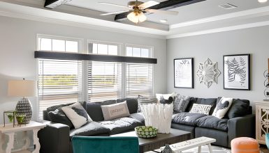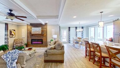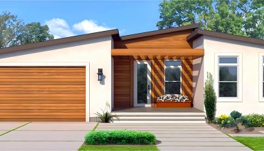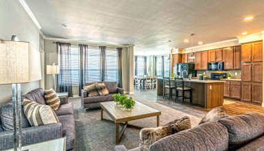
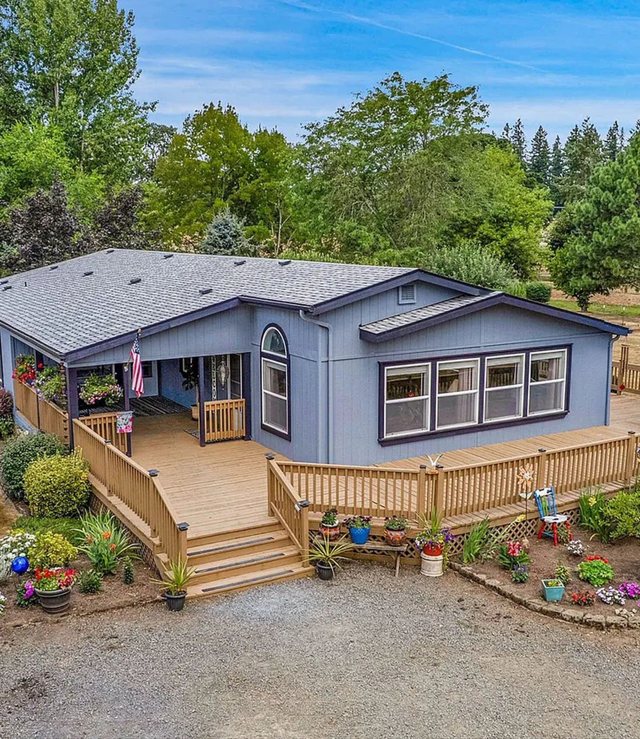
Could a spacious home feel both polished and relaxed? This triple-wide manufactured home shows how it can. A blue-gray exterior, broad deck, bright open rooms, and soft blue accents give it a warm, easygoing style. The rooms feel roomy, yet the details keep them from feeling formal.
The design also offers useful ideas for everyday living. It shows how a large deck can extend the home outdoors, how an open plan can connect the kitchen and living room, and how color can tie separate spaces together. Here’s a closer look at the design cues that make this home feel welcoming.
1. A blue-gray exterior with a calm, classic look
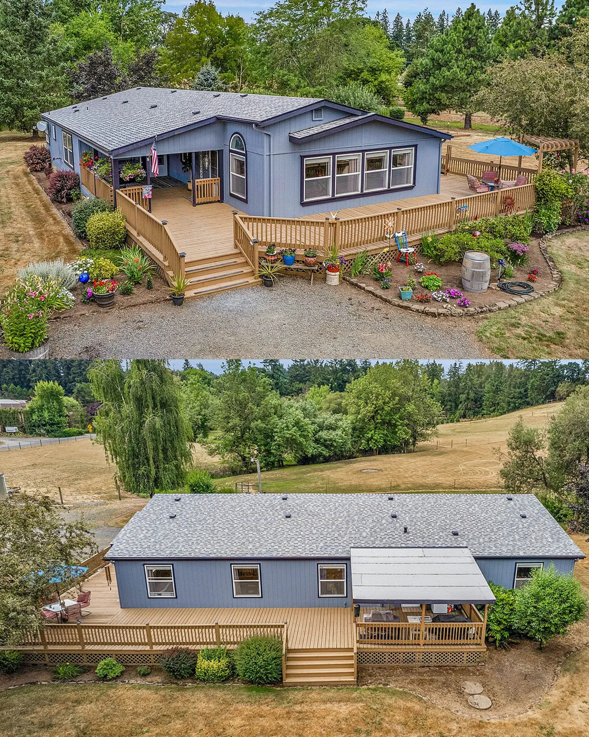
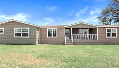
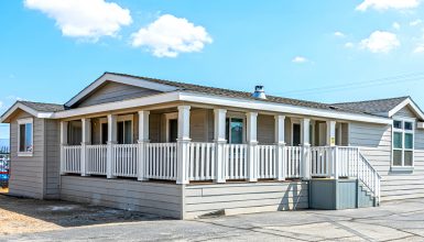
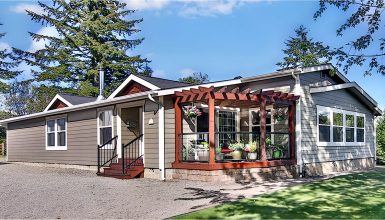
The home’s blue-gray siding sets a quiet tone. It feels softer than a deep navy, yet it has more character than plain gray. White trim frames the windows and gives the exterior a crisp finish. A dark gray roof adds contrast without pulling attention away from the siding.
The long, low shape gives the home a broad profile. That wider look suits a triple-wide plan and helps the exterior feel balanced. The roof stays simple, too. Its clean lines keep the home from looking too busy, while the window groupings add rhythm along the walls.
The setting adds to the appeal. Trees surround the home, and the open ground gives it room to breathe. The landscaping stays modest, with small shrubs and simple garden beds near the deck. This approach lets the home’s shape and outdoor space take the lead.
You can use this palette on many kinds of homes. Start with a mid-tone blue-gray for the siding. Then add white trim, a charcoal roof, and a few black accents. Keep the colors steady across the porch, steps, and railings. That simple plan creates a finished look without needing many decorative details.
Design cues
- Blue-gray siding with a soft, muted finish
- White window trim for a clean edge
- Dark gray shingles that anchor the palette
- A long, low exterior profile
- Simple planting beds that frame the home
- Trees and open space that create a natural backdrop
2. A wide deck that adds space outside
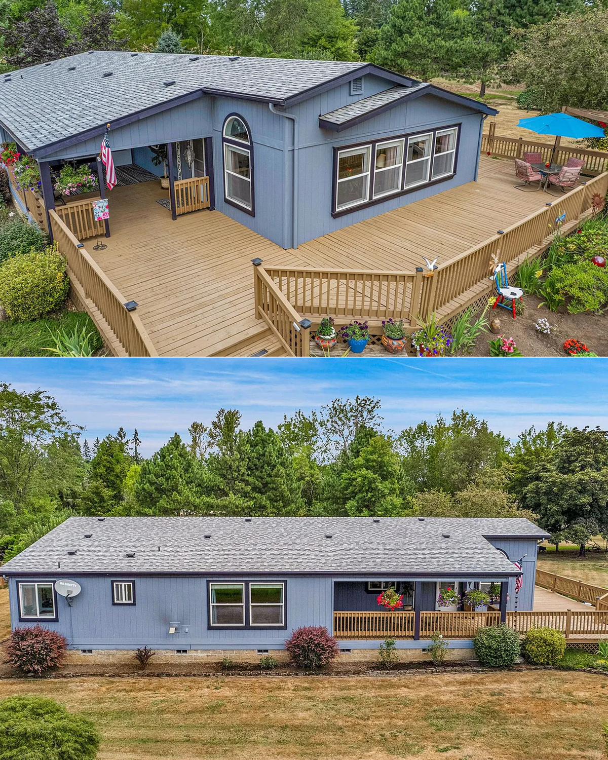
The deck is one of the home’s most useful features. It runs along the front and side, creating room to sit, walk, and gather. That extra outdoor space makes the home feel larger. It also gives the family more ways to use the yard.
The deck’s warm wood tone stands out against the cool siding. This contrast helps define the outdoor area. The broad steps create an easy path between the deck and the ground. They also make the entry feel open and approachable.
A deck like this can serve several purposes. Set a small table near the door for breakfast or coffee. Place lounge chairs where they catch the afternoon sun. Keep the main walking path clear so people can move from the door to the steps with ease. If the deck has enough room, create separate zones for dining and relaxing.
Good planning matters as much as size. Measure the furniture before you place it. Leave space to open doors and move around chairs. Add sturdy rails where the deck sits high above the ground. Choose outdoor finishes that can handle sun, rain, and daily use.
The deck can also tie the home to its landscape. Use large planters near the steps. Add a few low shrubs around the edge. Let the planting stay simple, so it does not block views or crowd the walking area.
Design cues
- A broad deck that follows the front and side of the home
- Warm wood tones against cool blue-gray siding
- Wide steps that connect the deck to the yard
- Room for both dining and lounge seating
- Clear paths between the doors, seating, and stairs
- Low planting that softens the deck’s edge
3. A covered porch for shade and shelter
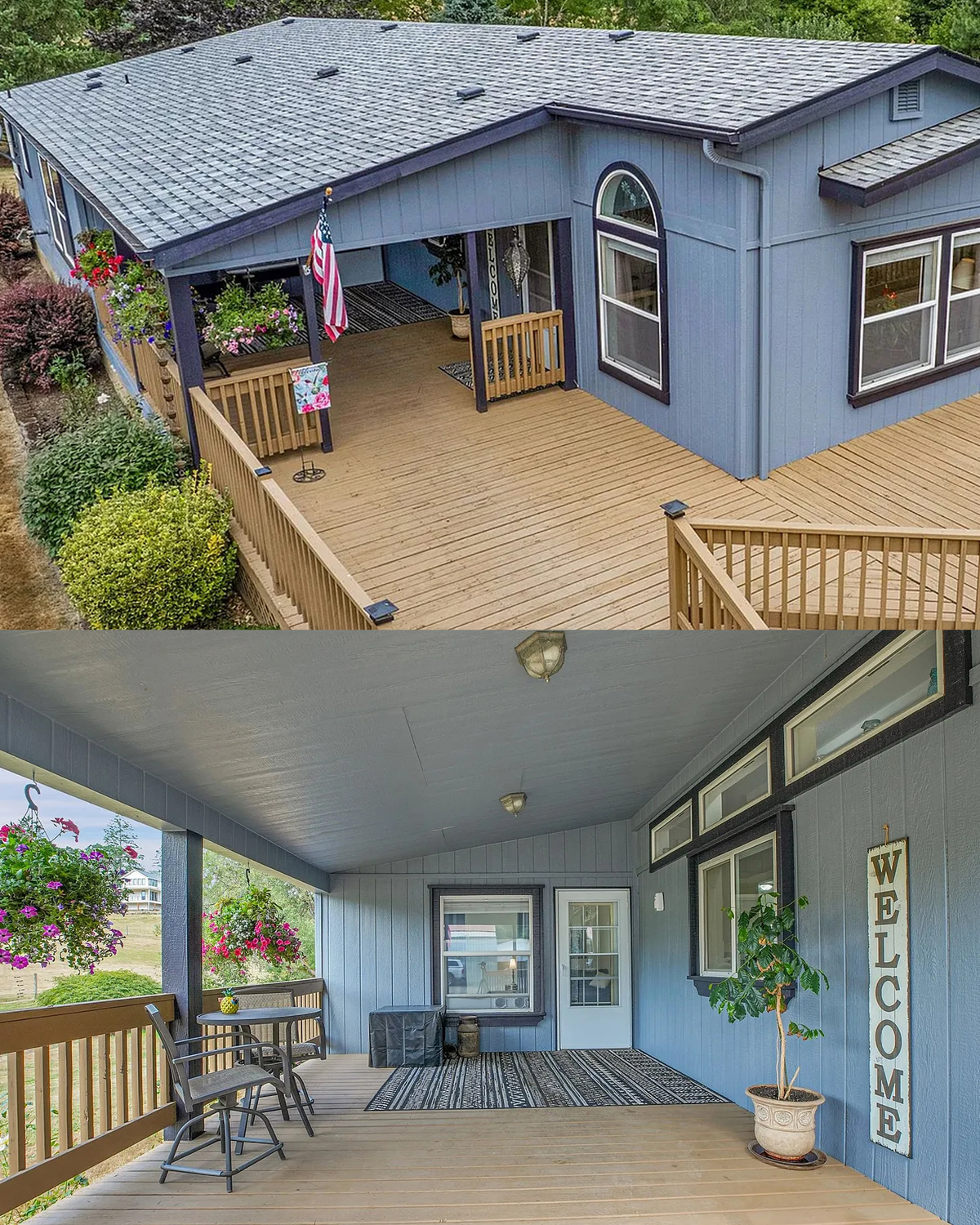
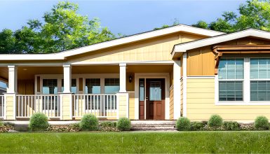
The covered porch gives the home a more relaxed entrance. Its roof offers shade and helps protect the seating area from light rain. The blue ceiling and matching wall color make the porch feel like an outdoor room. White trim brightens the edges and keeps the darker blue from feeling heavy.
Simple furniture suits the space. A small table and chairs provide a place to sit without taking up the whole porch. A potted plant adds color near the entry. A “Welcome” sign gives the porch a personal touch, but the design still feels open and uncluttered.
A covered porch works best when it supports daily routines. Leave room to set down bags or parcels. Keep the doorway clear. Choose chairs that can stand up to outdoor use, and add cushions that dry quickly. A small outdoor mat can help catch dirt before it reaches the interior.
Lighting also makes a difference. A ceiling fixture can brighten the porch after sunset. Wall lights near the door help guests find the entry. Warm bulbs create a softer glow than bright, cool bulbs. If the porch already has a ceiling fan, it can help move air on warm days.
The porch does not need a lot of décor. A few useful pieces can make it feel finished. Keep the color palette close to the rest of the exterior. Blue, white, natural wood, and leafy green work well together here.
Design cues
- A covered roof that shades the porch
- Blue walls and ceiling for a cozy outdoor feel
- White trim to frame the windows and doorway
- Compact seating that leaves room to pass
- One or two plants for a natural accent
- Warm porch lighting for evening use
4. A bright living room with an open feel
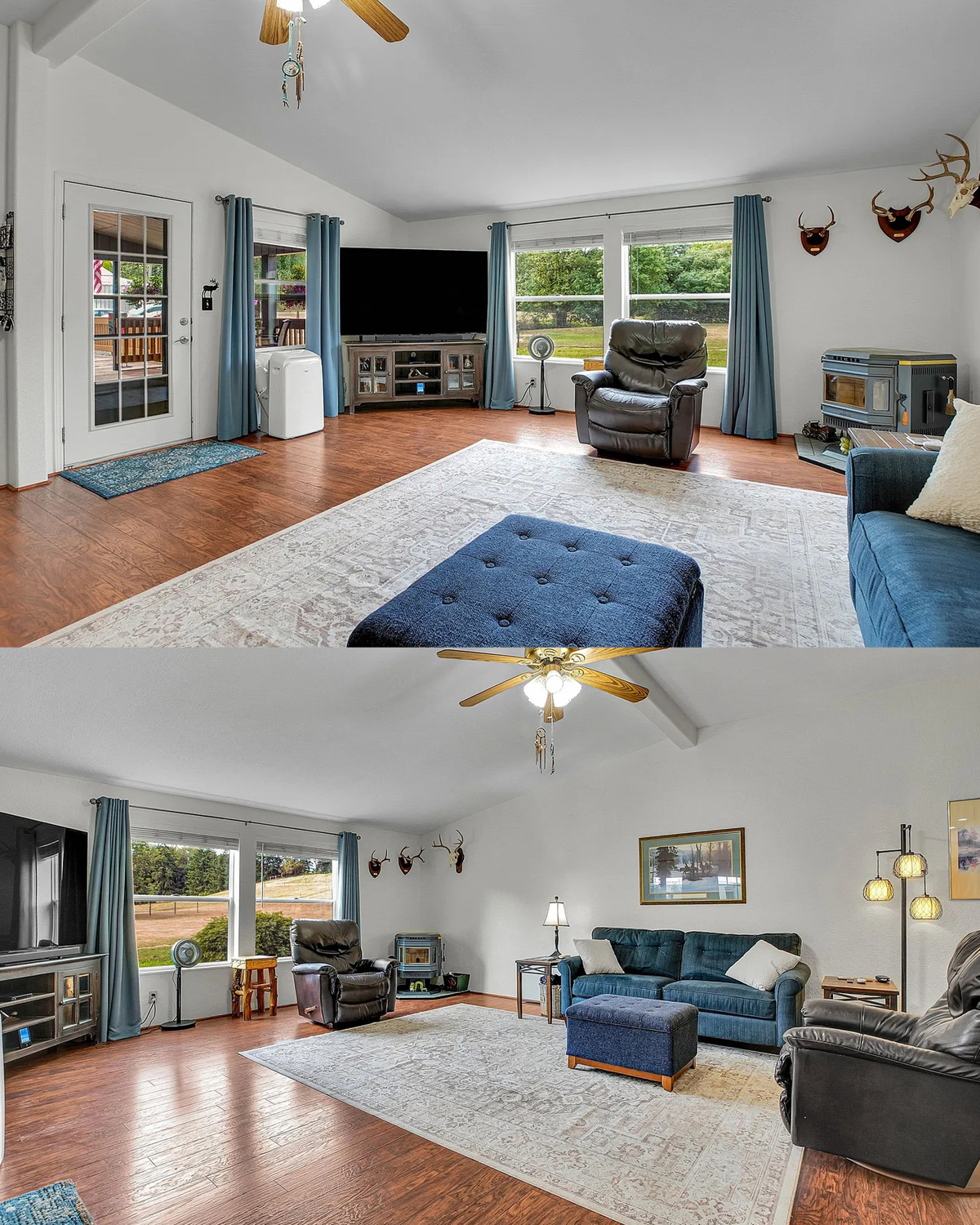
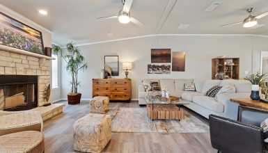
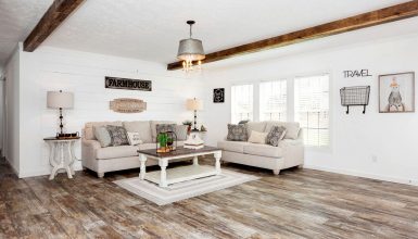
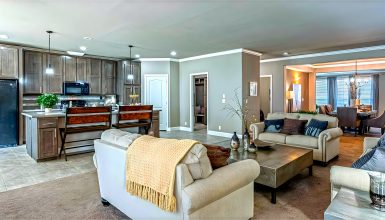
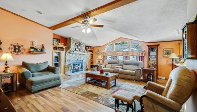
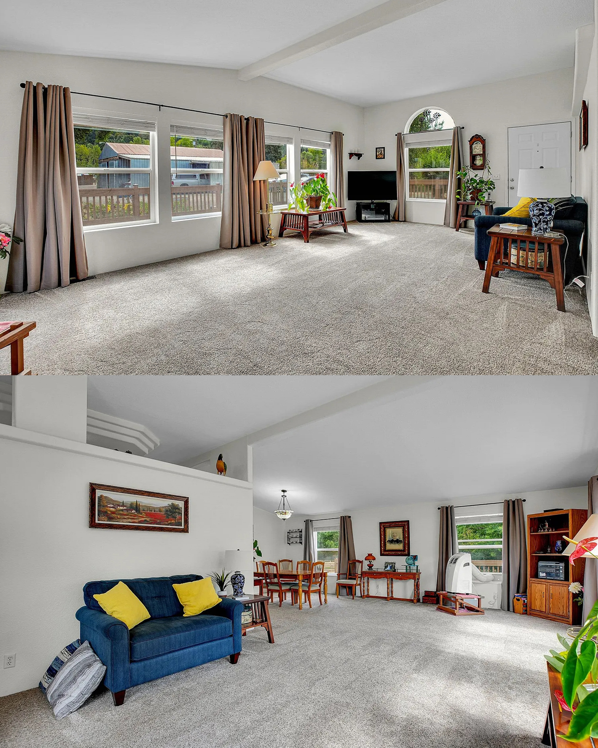
Inside, the living room feels bright and spacious. White walls and a light ceiling help the room reflect daylight. Large windows bring in views of the yard. The open layout also lets the eye travel from the seating area toward the rest of the home.
A blue sofa adds color without overwhelming the room. Darker chairs bring contrast, while a patterned rug defines the main seating zone. The wood-look flooring adds warmth and gives the room a practical surface for daily use.
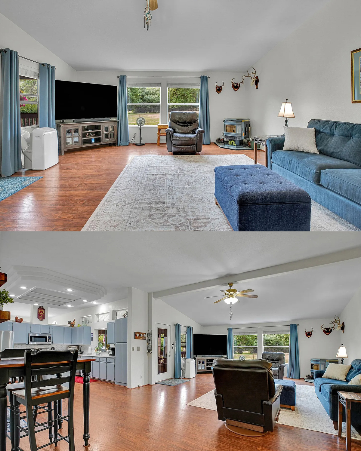
The furniture layout leaves a clear route through the room. That matters in a large open space. A sofa can anchor one side of the seating area. Chairs can face it from the opposite side. A coffee table brings the group together, while a rug helps mark the zone.
The room’s size allows for more than one activity. A family can watch television, read, or talk with guests without feeling crowded. Still, it helps to keep the furniture focused. Too many small tables or accessories can make a large room feel scattered. A few larger pieces often look calmer.
Use window coverings that soften light without hiding the windows. Curtains in blue or a neutral shade can connect with the sofa and other accents. Keep the hardware simple. This lets the windows remain a strong feature.
Design cues
- White walls that help the room feel open
- Large windows that bring in natural light
- Blue seating as a clear color accent
- A patterned rug to define the seating area
- Warm wood-look flooring
- Furniture arranged for conversation and easy movement
5. Open sightlines that link living and dining
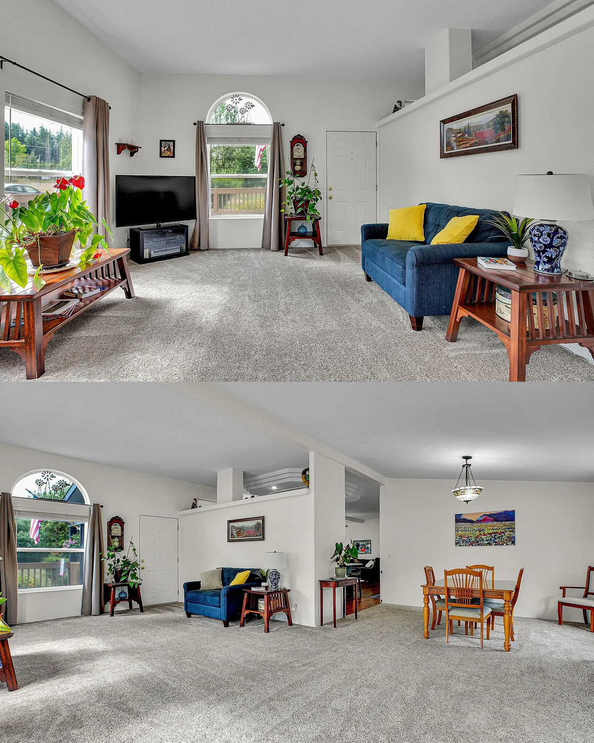
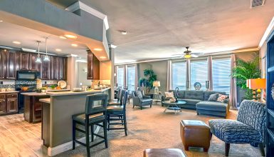
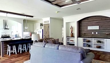
The main living area connects with the kitchen and dining space. This layout makes the home feel social and easy to use. People can talk across the rooms while someone cooks or sets the table. The open plan also helps daylight move through the home.
Open rooms need a few visual anchors. The sofa and rug mark the living area. The kitchen island signals where cooking and meal prep happen. The dining table gives the room another clear purpose. These pieces help define each zone without adding walls.
Keep the same finishes in view when you plan an open layout. In this home, the flooring runs through much of the living area. That creates a smooth visual link between spaces. Repeating blue in the sofa, kitchen cabinets, and nearby accents creates another connection.
Lighting can help define each zone, too. A pendant above the island can mark the kitchen. A dining fixture can center the table. Lamps can make the living area feel softer in the evening. Each light should serve its own task, yet still suit the overall style.
An open plan also benefits from thoughtful storage. Use cabinets, baskets, or closed shelves to keep daily items tidy. Clear counters and open walkways help the rooms feel calm, even when the family is home.
Design cues
- A connected living, dining, and kitchen area
- Rugs and furniture that define each zone
- Shared flooring that links the rooms
- Repeated blue accents for a steady color story
- Separate lighting for cooking, dining, and relaxing
- Clear walking paths through the open plan
6. A blue kitchen with room to work
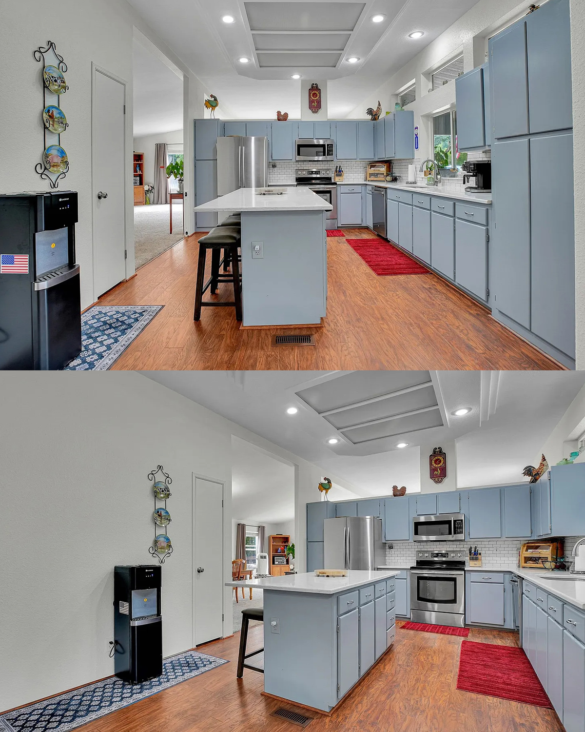
The kitchen makes a strong impression with its blue cabinets. The color adds personality, while the white counters and backsplash keep the room bright. Stainless steel appliances give the space a clean, modern finish. Together, these details create a kitchen that feels fresh but still welcoming.
The island offers a useful work surface. It gives the cook room to prep food and creates a natural spot for casual meals. Stools tuck beneath the counter, so they do not take up much floor space when no one is sitting there.
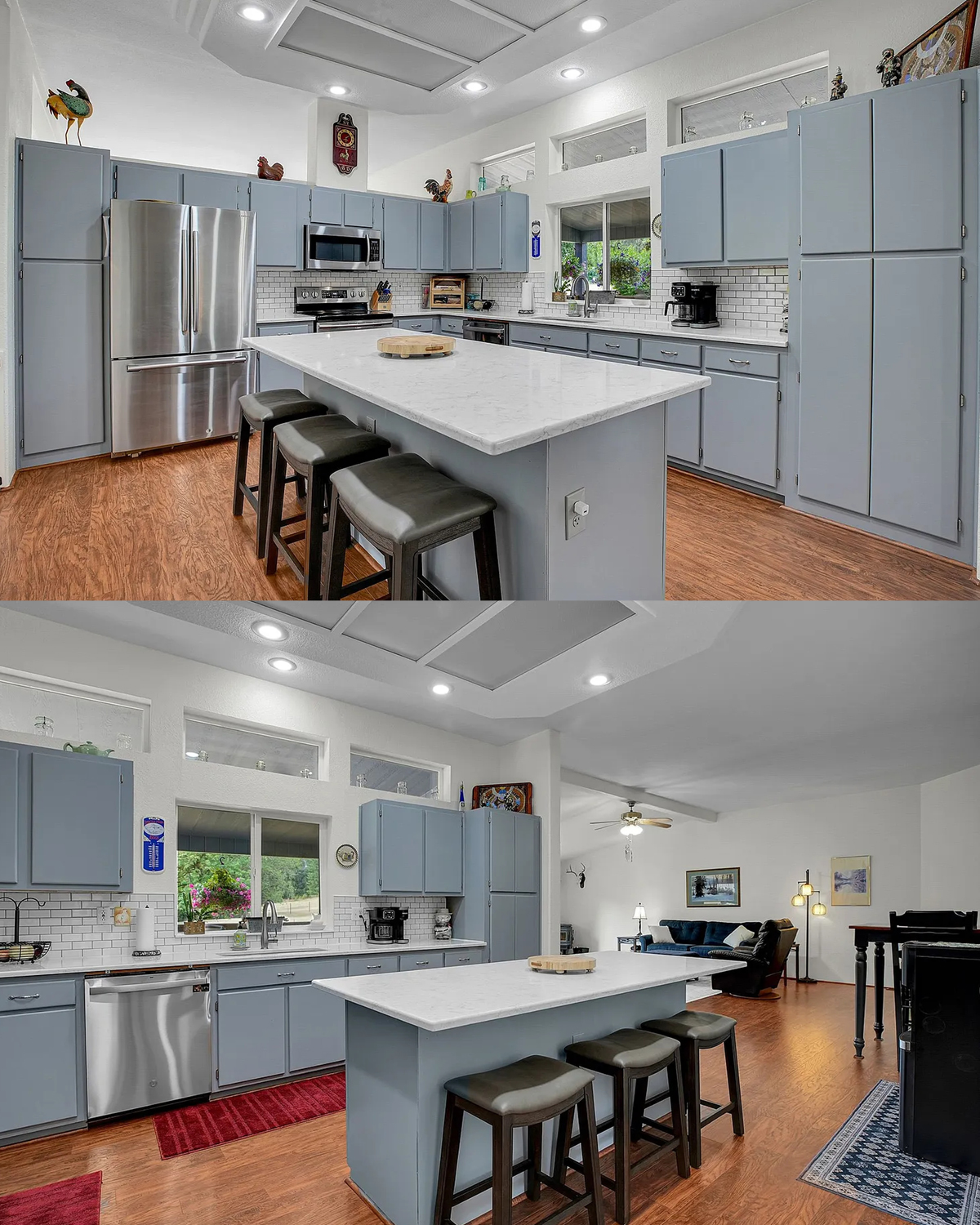
A good kitchen needs more than a pretty color. The layout should make everyday tasks simple. Keep the sink, stove, and refrigerator easy to reach. Place the items you use most near the work zones. Store dishes close to the dishwasher, and keep cooking tools near the range.
White counters help bounce light around the room. They also give the blue cabinets a crisp contrast. A pale backsplash keeps the wall area from feeling too dark. If you use blue cabinets in your own kitchen, choose a shade that works with the room’s natural light. A deeper blue can feel rich in a sunny room. A softer blue may suit a room with less daylight.
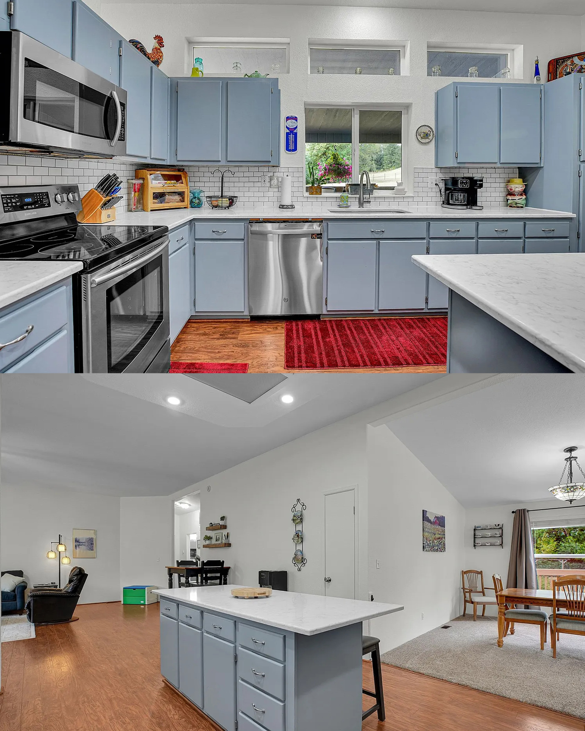
Small accents can warm the palette. A wood cutting board, a bowl of fruit, or a simple runner can bring in natural color. Keep counters open where you can. That makes the kitchen easier to clean and gives the cabinet color room to shine.
Design cues
- Blue cabinetry as the main feature
- White counters and backsplash for contrast
- Stainless steel appliances
- An island with prep space and seating
- Task lighting above the work areas
- A few warm wood or fruit accents
7. A dining area made for daily meals
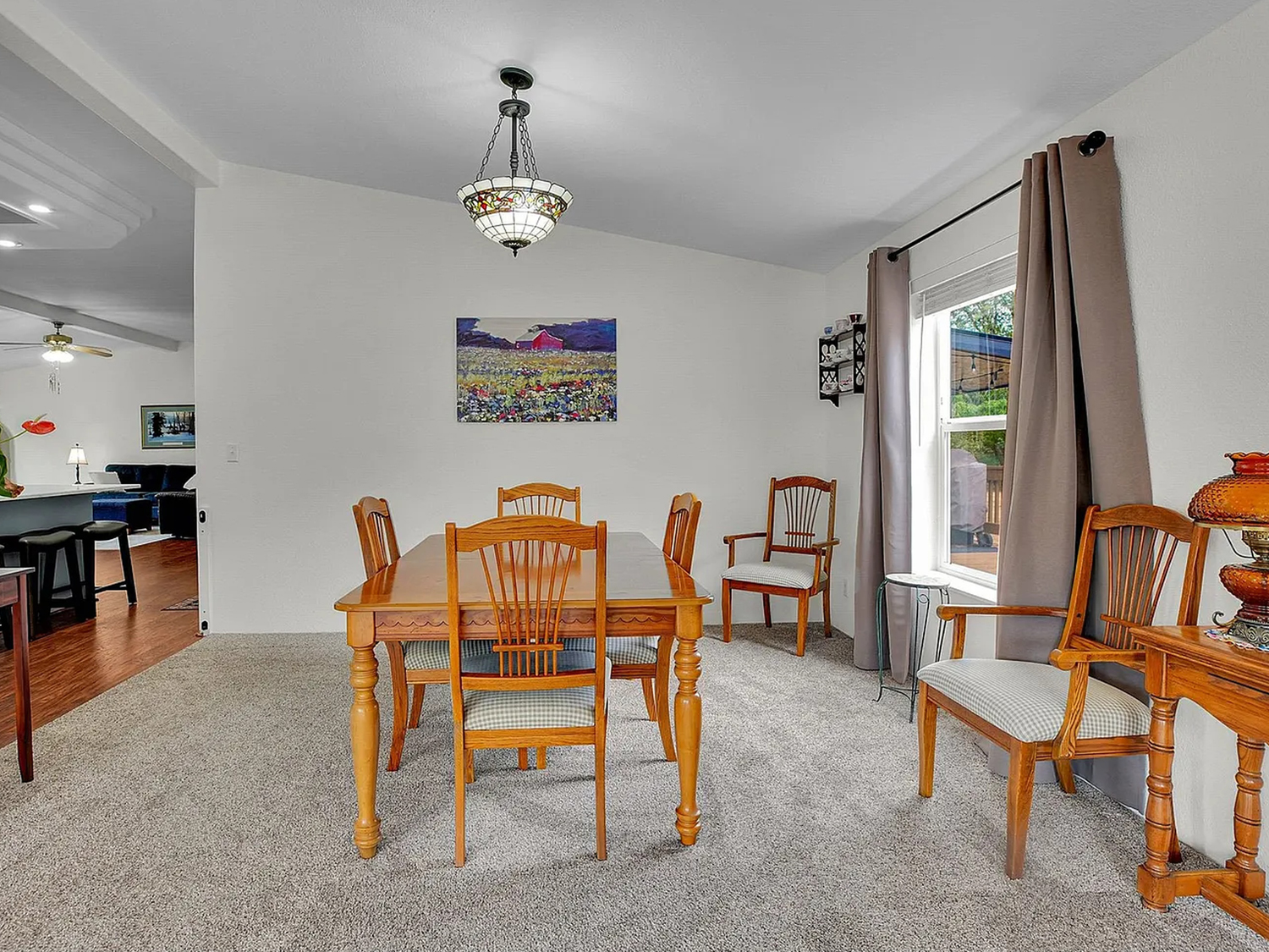
The dining area sits close to the kitchen. That makes it easy to carry food to the table and clear dishes after a meal. A wood dining set brings warmth to the pale walls and light finishes nearby. Its classic shape feels relaxed and familiar.
The table also gives the open plan a clear center. A light fixture above it can make the area feel more distinct. The fixture in the home adds a decorative touch while still keeping the table as the focus.
Choose a table size that fits the room and the people who use it. Leave enough space to pull out each chair. If the room is open to the kitchen, keep the route between the island and table clear. That helps prevent the dining area from becoming a bottleneck.
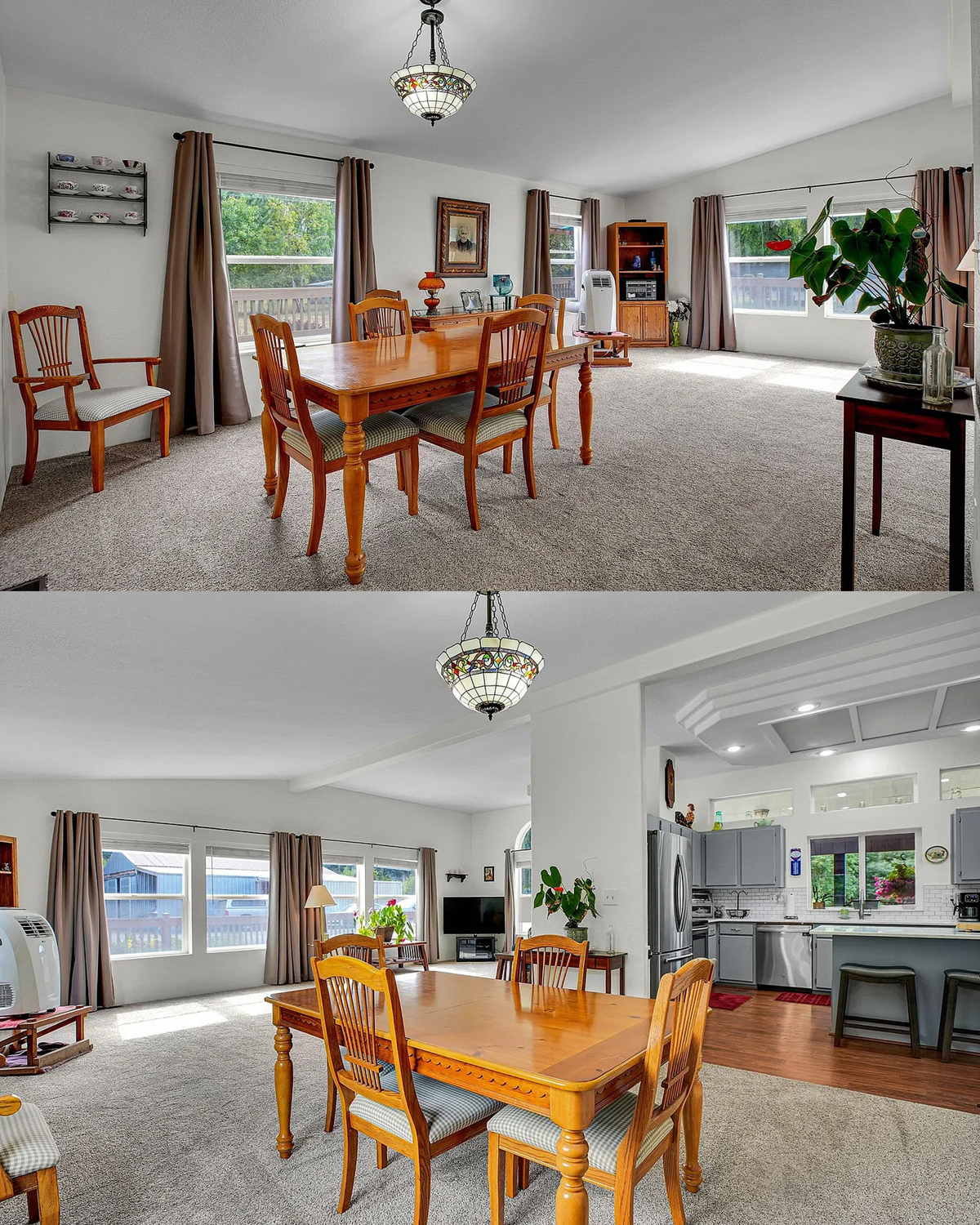
The tabletop does not need a large display. A low vase, a bowl, or a simple runner can add detail without blocking conversation. Use chairs that feel comfortable for long meals. If you need extra seats for guests, choose a table with an extension leaf or keep folding chairs nearby.
The dining area can echo the rest of the home through color and material. Wood brings a natural note. Blue in a table runner or wall art can tie the room to the kitchen and living space. A rug under the table can add comfort, though a flat weave is often easier to clean.
Design cues
- A wood table that adds warmth
- Seating placed close to the kitchen
- A pendant or chandelier centered over the table
- Room to pull out chairs and walk around
- A simple centerpiece that leaves space for meals
- Small blue accents that repeat the home’s palette
8. A bedroom with soft blue walls
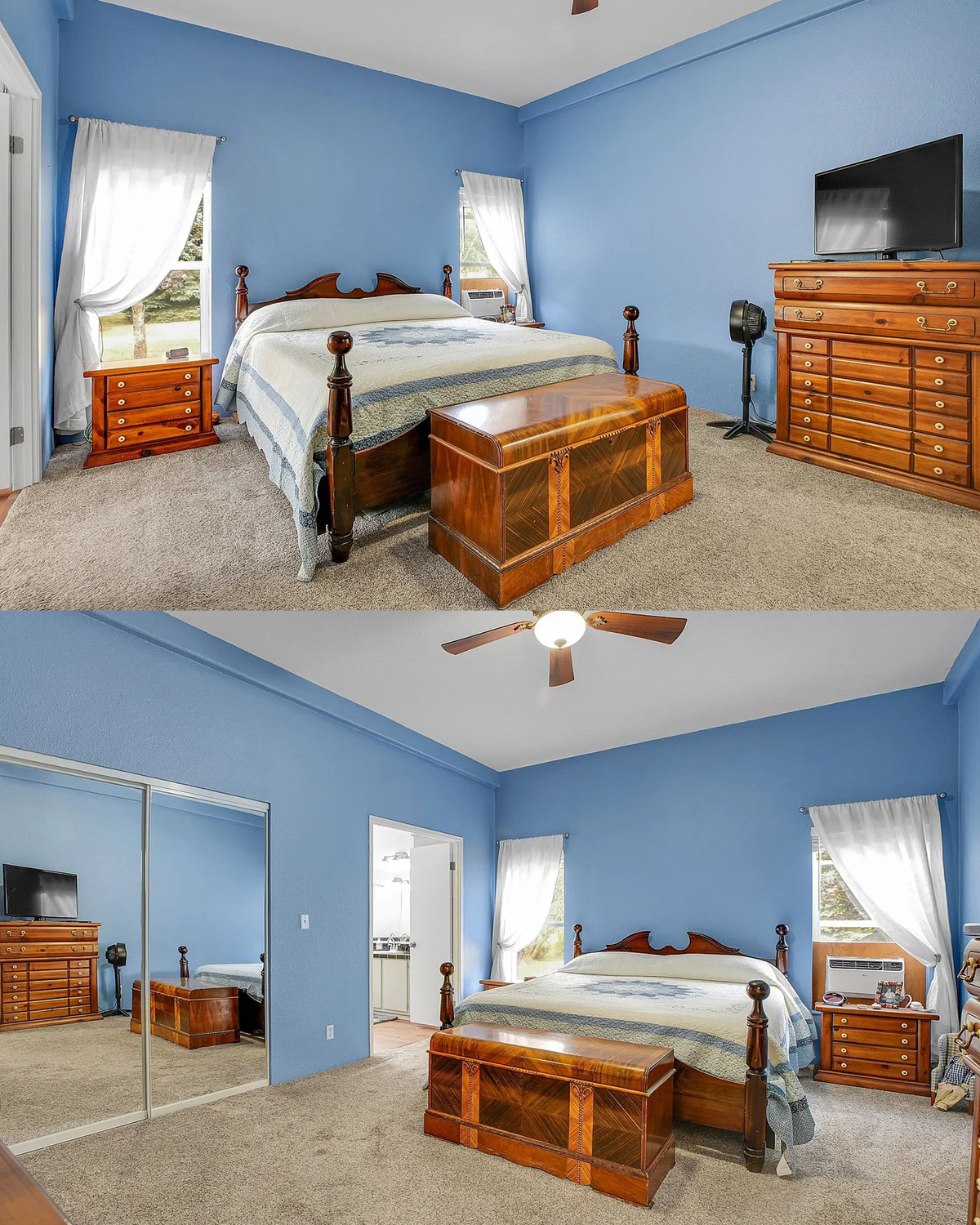
The bedroom shown in the images uses blue walls and warm wood furniture. The color makes the room feel calm, while the wood tones keep it from feeling cold. A light ceiling and pale curtains add balance. Together, these choices create a simple place to rest.
The bed is the main focus. Placing it against the blue wall gives the room a clear center. Matching dressers add storage and help the furniture feel connected. A ceiling fan can move air and provide light, which makes it useful in a warm climate.
Bedroom colors should help the room feel restful. Blue can work well for this because it feels soft and steady. If you use a richer blue, balance it with light bedding, curtains, and trim. If the room is small, use blue on one wall and keep the others pale.
Keep the bedside area practical. Add a lamp or wall light within reach. A small surface can hold a book, glasses, or a phone. Use closed storage for clothing and spare bedding. This keeps the room from feeling crowded.
Textiles can soften the hard surfaces. A quilt, layered pillows, and curtains add texture. Keep the patterns simple if the wall color is bold. A few well-chosen pieces will make the room feel finished without making it busy.
Design cues
- Blue walls that create a calm backdrop
- Warm wood furniture for contrast
- Light curtains and bedding to balance the color
- A ceiling fan for air movement and light
- Bedside lighting for reading
- Closed storage to keep surfaces clear
9. A bright bathroom with clean lines
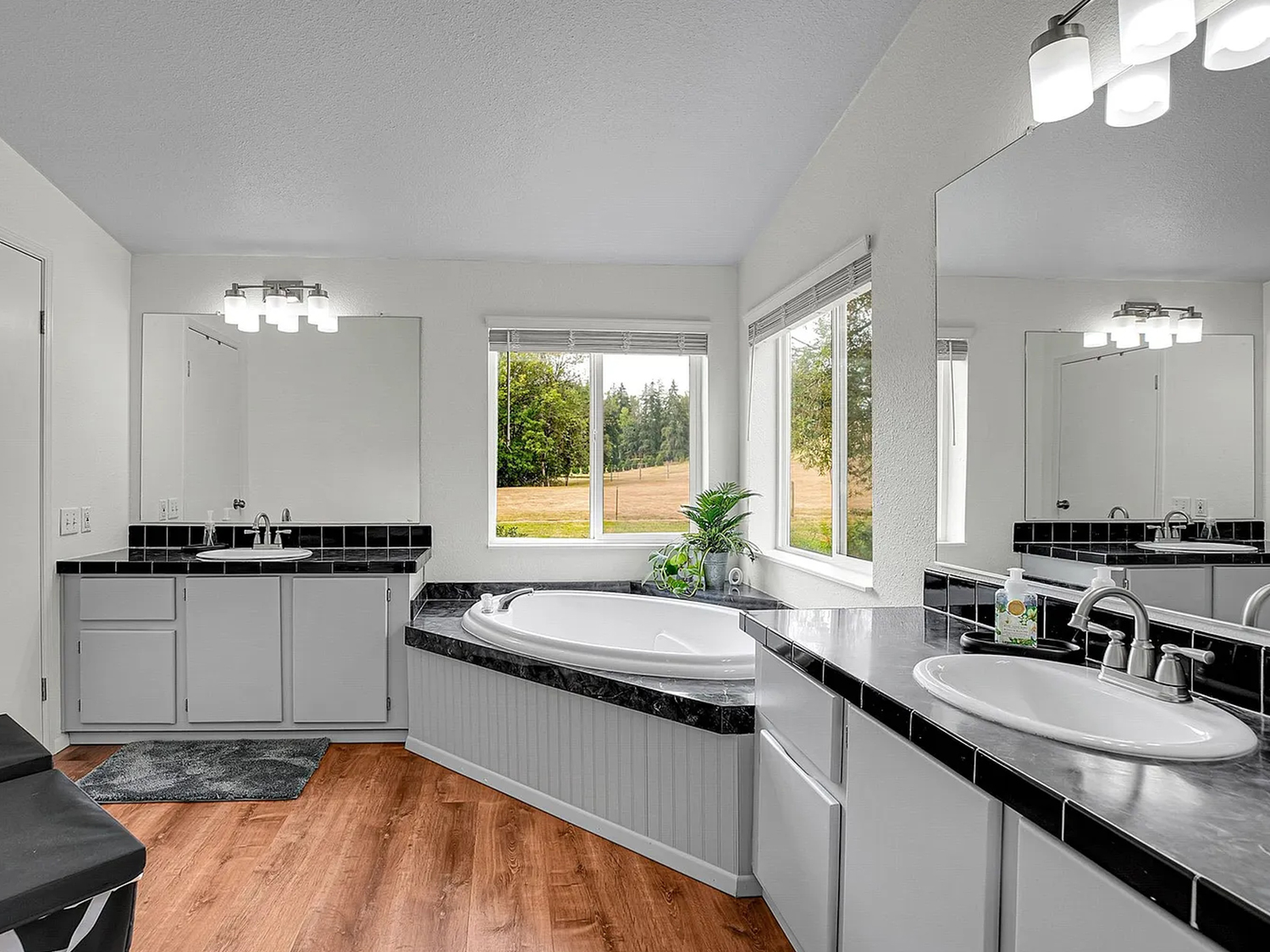
The bathroom uses light finishes to create a fresh look. A broad vanity offers space for daily routines. The mirror reflects light, and the white surfaces help the room feel clean. Gray flooring adds a little contrast without making the space feel dark.
A bathroom works best when storage and surfaces support daily use. Keep personal items in drawers or baskets. Place hand soap and a small tray on the counter, but leave room for grooming. If two people share the space, assign drawers or shelves to each person.
Lighting matters here, too. Use bright light near the mirror for tasks like shaving or applying makeup. Softer overhead light can make the room feel more restful at night. A mirror with a simple frame can suit many styles and will not compete with the vanity.
Light colors can make a bathroom feel larger, but they still need texture. Towels, a bath mat, and a small plant can add softness. Pick items that are easy to wash and replace. A few dark accents, such as hardware or a frame, can add definition.
The bathroom’s clean palette also links it to the rest of the home. White, gray, and blue sit well beside the blue kitchen and bedroom. That keeps the overall design cohesive, even as each room serves a different purpose.
Design cues
- A light vanity and pale wall finishes
- Gray flooring for a small amount of contrast
- A large mirror that reflects light
- Clear counter space for daily tasks
- Bright mirror lighting
- Towels and simple accessories for added texture
10. A simple color plan that ties the home together
The home uses a small group of colors in many ways. Blue appears on the exterior, porch, kitchen cabinets, and bedroom walls. White keeps the interiors bright. Gray grounds the roof and bathroom floor. Natural wood adds warmth inside and out.
This kind of color plan makes a large home feel connected. Each room can have its own look, but the repeated colors create a familiar thread. The kitchen feels lively, the bedroom feels restful, and the living room feels open. The palette brings them together without making every room match.
Start with one main color, then choose two or three supporting tones. In this home, blue acts as the main accent. White serves as the base. Gray and wood provide balance. You can follow the same plan with another color, such as green, warm beige, or soft charcoal.
Repeat colors in small ways. A blue pillow can echo the kitchen cabinets. White trim can appear in each room. Wood furniture can bring warmth to the dining area and bedroom. These small links help the home feel planned.
Texture matters as much as color. Wood, woven fabric, smooth counters, and soft rugs make the rooms feel layered. Use a mix of finishes so the home does not look flat. Keep the surfaces simple, though. A calm palette works best when the rooms have space to breathe.
Design cues
- Blue as the main accent color
- White walls and trim to brighten the rooms
- Gray details for contrast
- Natural wood for warmth
- Repeated colors across connected spaces
- A mix of smooth and soft textures
Conclusion
This triple-wide manufactured home pairs a calm blue-gray exterior with a broad deck and bright, connected rooms. Blue accents carry through the kitchen and bedroom, while white, gray, and natural wood keep the palette balanced. The result feels open and welcoming, with details that support daily life.
The most useful ideas are easy to adapt: make outdoor space comfortable, give each open-plan zone a clear purpose, and repeat a few colors from room to room. With those choices, a home can feel roomy, personal, and ready for everyday living.