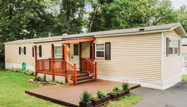
Dive into the world of a 1972 mobile home, and you’ll find a charm that stands the test of time. With its mix of vintage appeal and lived-in comfort, this home tells a story with every nook. On the outside, it boasts a classic design, wrapped in cream siding paired with dark wood trim. It’s a look that feels both inviting and homey. Let’s dive in!
Exterior
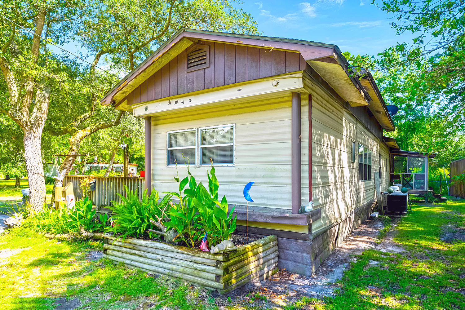
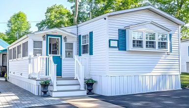
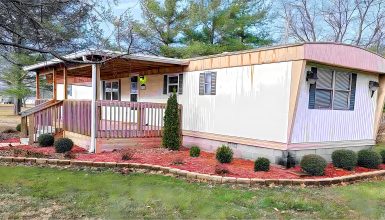
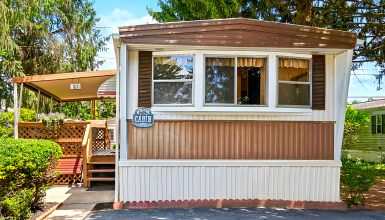
Stroll around this 1972 mobile home, and you’ll see a sight that exudes timeless appeal. The cream siding softens the structure and perfectly contrasts the dark wood trim that outlines its edges. This combination gives off a feeling of warmth that beckons you closer.
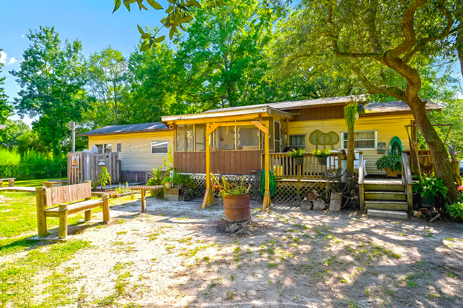
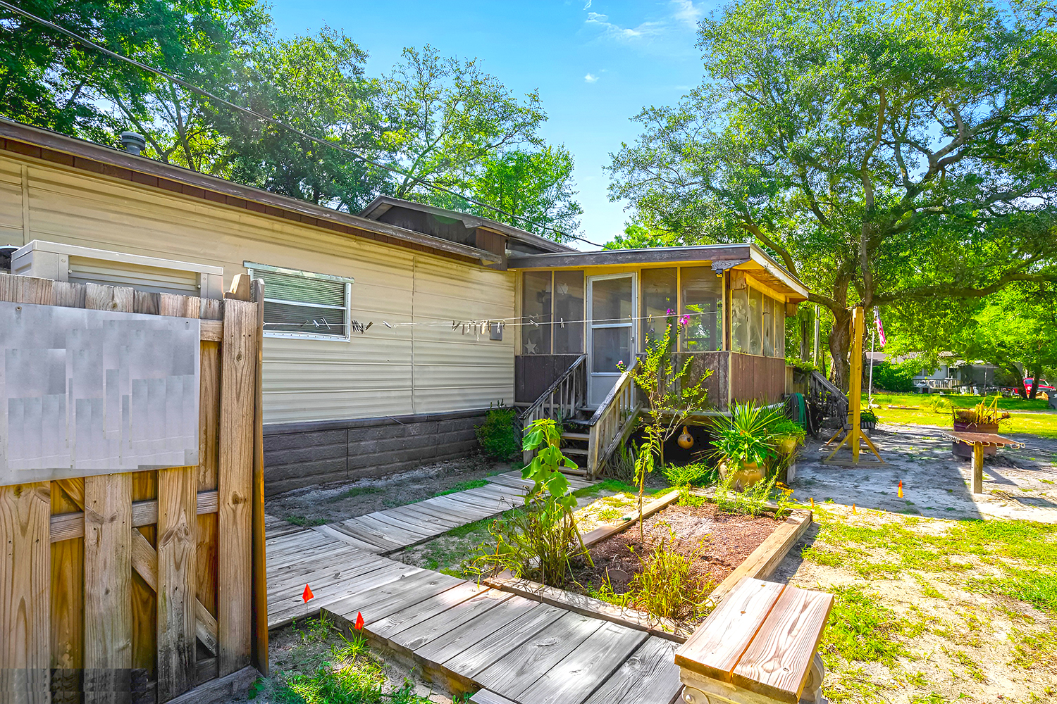
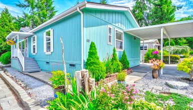
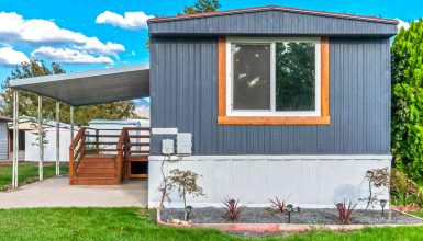
As you continue your walk, the outdoor spaces unfold like chapters of a book. The porches and decks are not mere additions; they’re vital parts of the home’s character. They invite you to sit down, relax, and soak in the serenity of the natural surroundings. Each plank of wood and every rail has a story to tell.
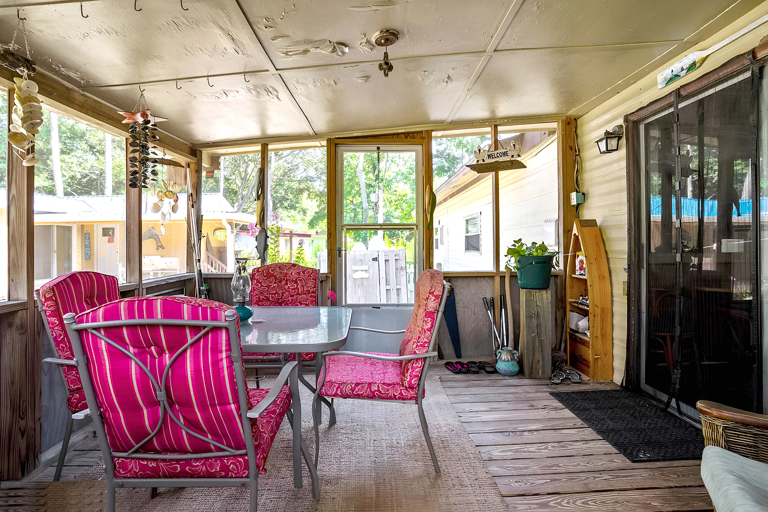
Then, there’s the screened porch. This isn’t just another room; it’s a sanctuary. It is a testament to the joy of outdoor living minus the hassle of uninvited flying guests. Whether sipping lemonade or losing yourself in a good book, this screened porch promises peaceful moments.
And don’t miss the raised flower beds. They’re not just practical, preventing soil erosion and improving drainage. They’re also strokes of beauty, adding splashes of color and life against the home’s exterior. These beds result from someone’s time and care, combining the home’s practicality with its aesthetic charm.
Living Room
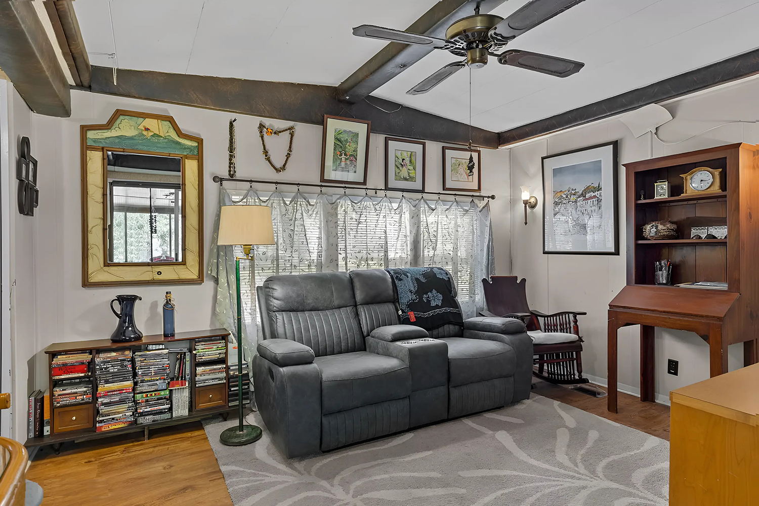
Step into the living room of this 1972 mobile home, and you’ll feel the warmth and history enveloping you. The room is a tapestry of past and present, where every piece tells its story. Clearly, this space is designed for living well and making memories.
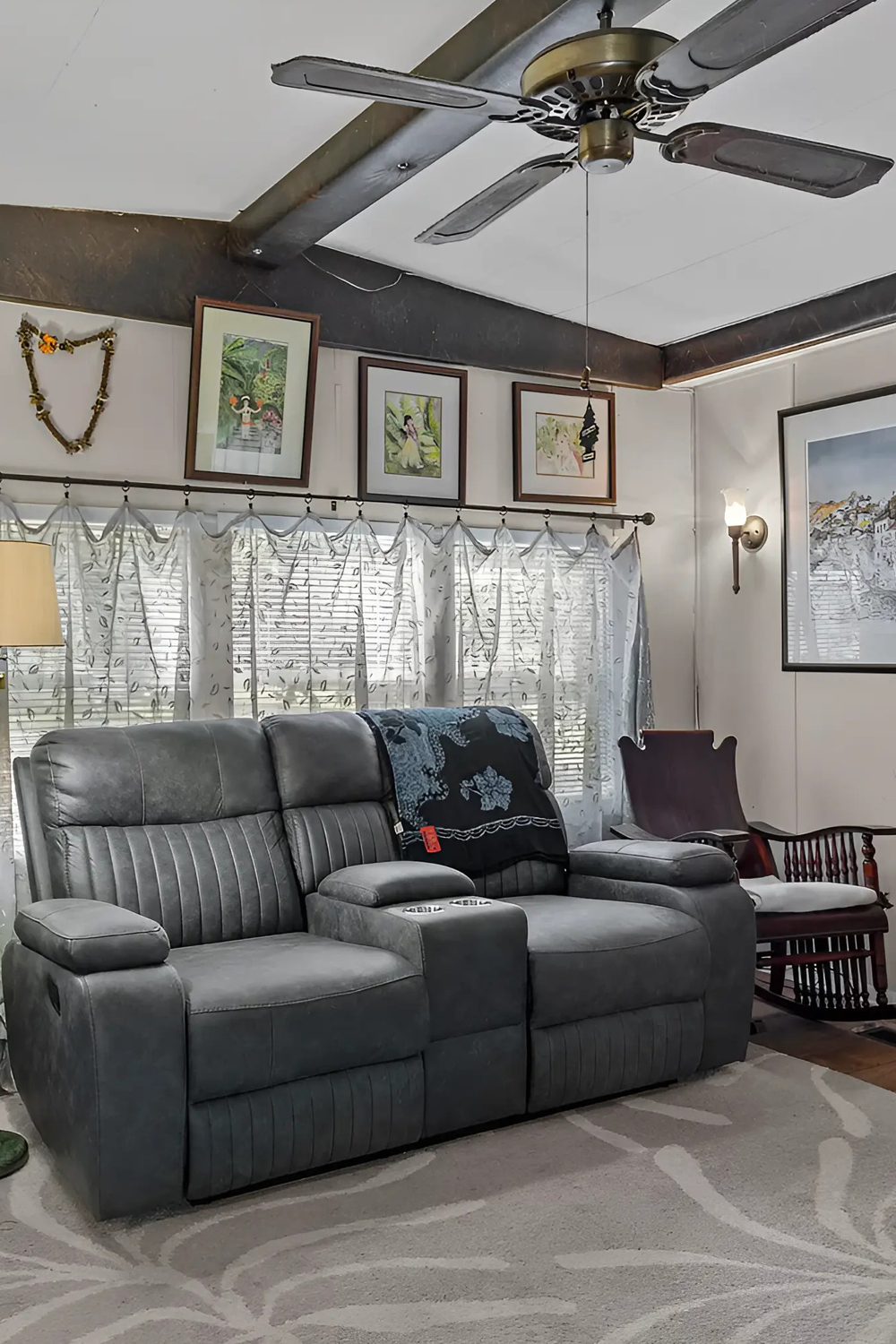
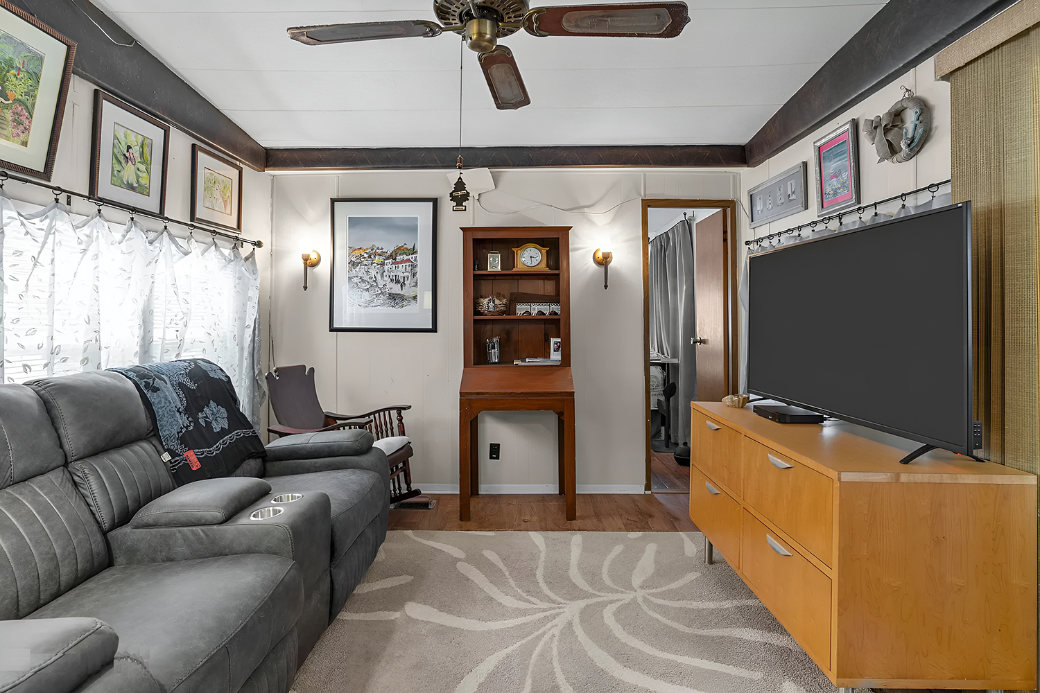
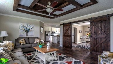
Look up, and you’ll see dark wood beams that cross the ceiling. They bring a rustic charm that’s hard to find in modern homes. These beams are like the home’s own lines of age, proudly showing its history, and they bring a specific strength to the room’s design.
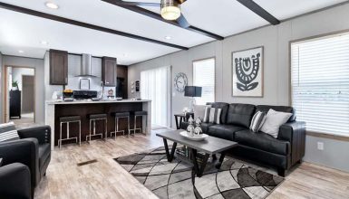
Now, let’s talk about the furniture. Here, comfort meets style in a seamless blend. Each sofa and chair isn’t just a place to sit; they’re invitations to relax. The furniture, with its cushiony feel and warm fabrics, creates a haven for family and friends. They echo the home’s era with a nod to modern needs.
Lighting plays a big role, too. The large windows drape the room in sunlight, making it bright and welcoming. When the sun sets, the soft glow from the lamps adds to the coziness. It’s all about using light to enhance the room’s best features.
And then there’s the smart use of space. Nothing feels cramped. There’s a place for everything, and everything is in its place. From the TV to the little desk in the corner, it’s clear that this living room is meant to be lived in. It’s a blend of form and function that offers a lesson in living room design—it’s not just about looking good; it’s about feeling good, too.
Kitchen
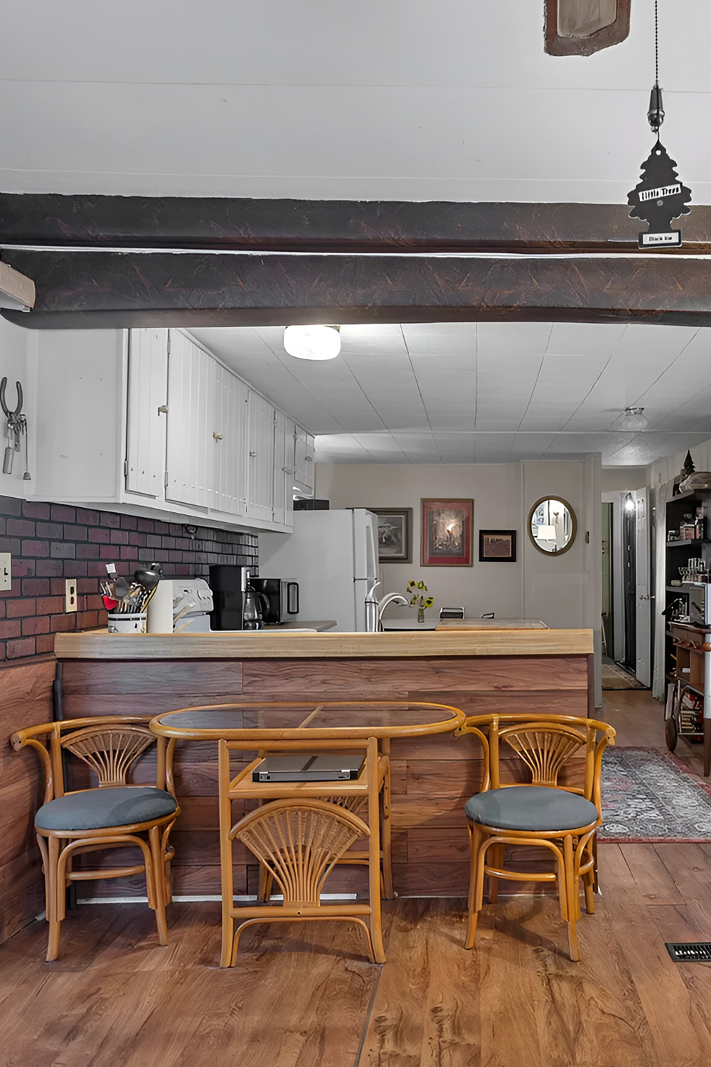
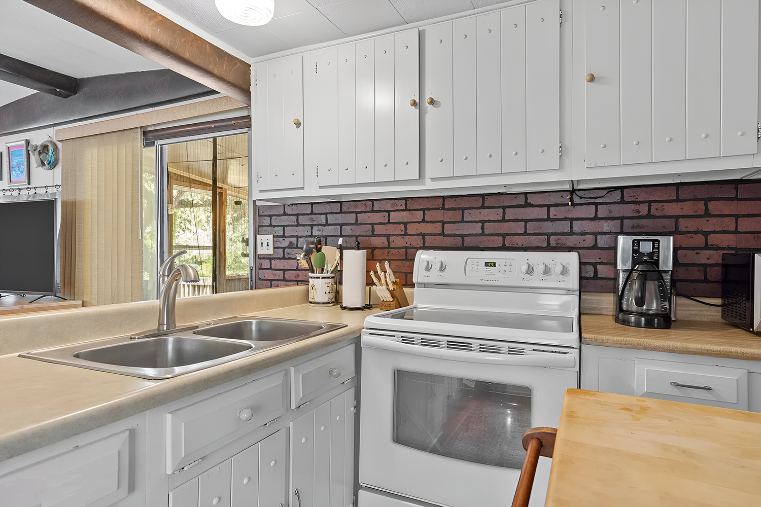
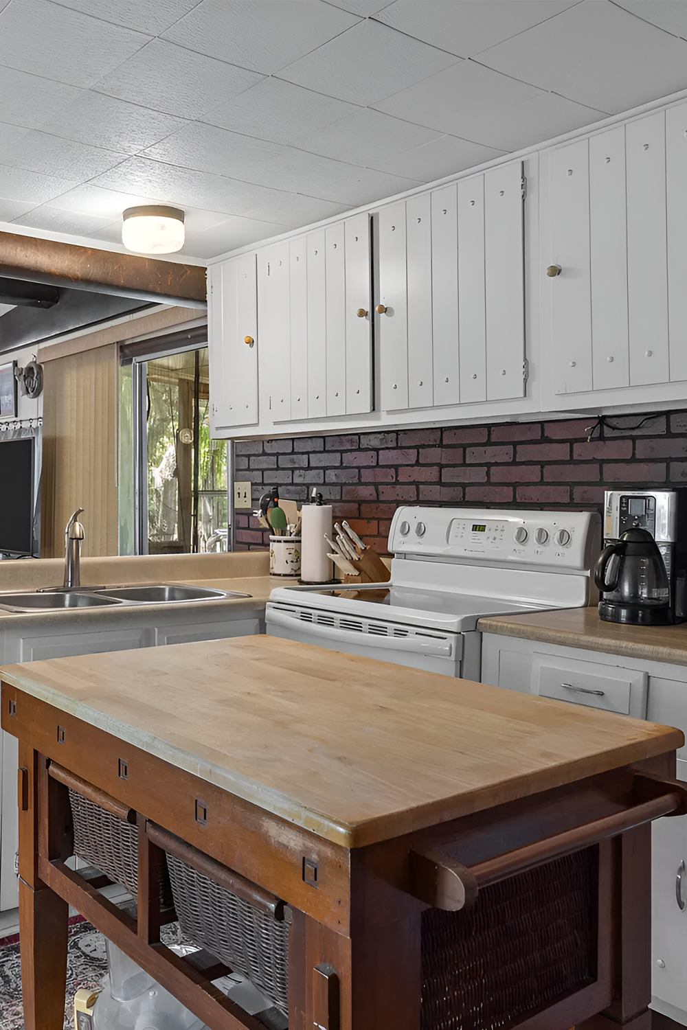
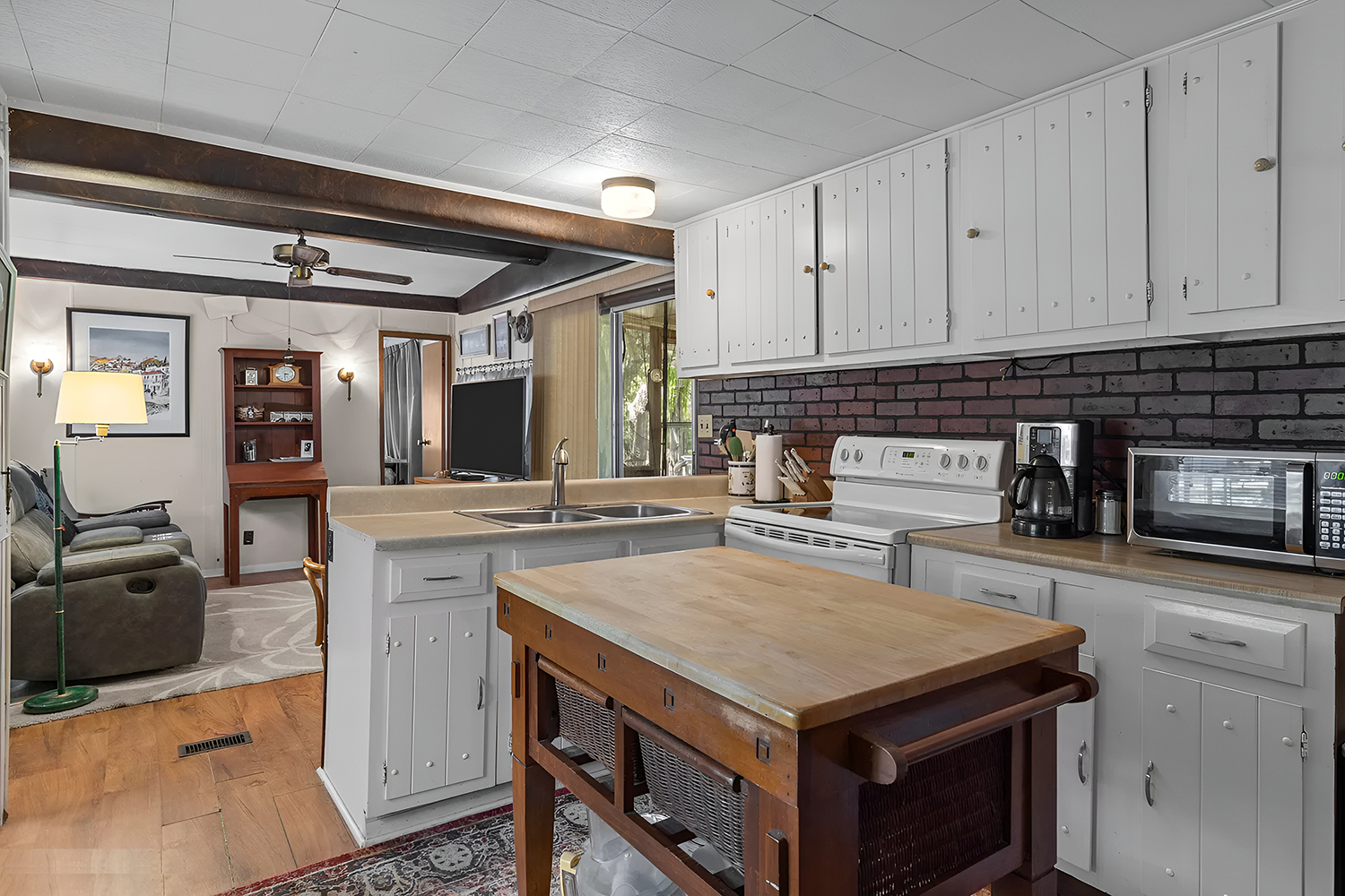
The kitchen marries classic design with practicality, creating a space that’s as welcoming as it is functional. The timeless appeal of white cabinetry stands out, offering a crisp, clean look and a wealth of storage. These aren’t just cabinets; they’re the kitchen’s trusty sidekicks, keeping clutter at bay and beauty on full display.
Now, cast your eyes on the brick backsplash. This isn’t your average wall covering. It’s a style statement with a purpose, protecting the walls from splashes and spills while adding rustic charm. The bricks, with their muted tones, bring a bit of the outdoors inside, connecting the kitchen to nature.
At the heart of this culinary haven stands an island topped with a solid butcher block. This isn’t just a surface for chopping and prepping. It’s the centerpiece of the kitchen, where meals are prepared, conversations happen, and laughter echoes. With open shelving below, it’s as versatile as it is robust and ready for whatever the day brings.
Let’s not overlook the light and layout. This kitchen’s open design lets light pour in from the windows, making the space feel larger and more open. It’s a place where memories simmer on the stove and where new recipes are tried and tasted. This kitchen isn’t just for cooking; it’s a place for living, sharing, and enjoying the moments that make life sweet.
Dining Room
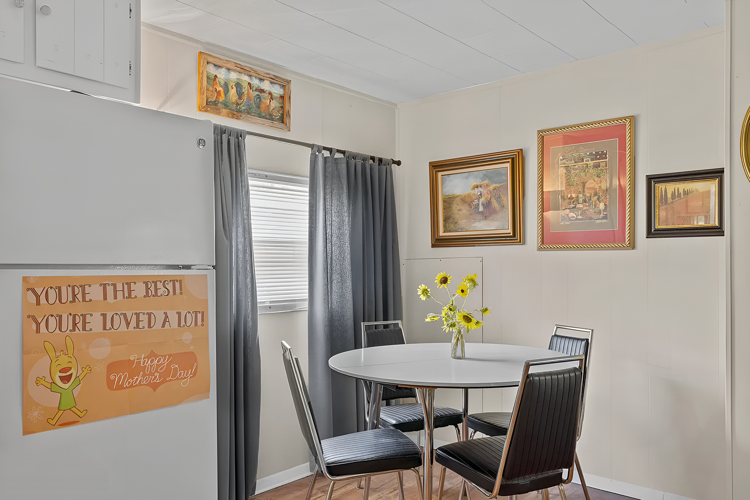
The dining room is a testament to simplicity and efficiency. Its compact design proves that small spaces can still host big moments. The round table sits at the center, a stage for meals, conversations, and connections, all without wasting an inch of space. The room’s design is thoughtful, ensuring every meal is comfortable and stylish.
Light plays a key role here. It streams through the windows, brightening the room and lending a natural spotlight on the meals served. The overhead fixture’s natural brightness and soft glow create an inviting and intimate ambiance.
Artwork dots the walls, each piece carefully chosen to add its voice to the room’s story. These are not just decorations; they’re expressions of personality and style. They add color, life, and conversation to the walls, enhancing the dining experience.
Then there are the personal touches. Perhaps a hand-drawn card on the fridge or a vase of fresh flowers in the middle of the table. These details are the final strokes on the canvas of this dining room. They make the space not just a place to eat but a place to live and love, a place that is truly special and uniquely yours.
Bedroom
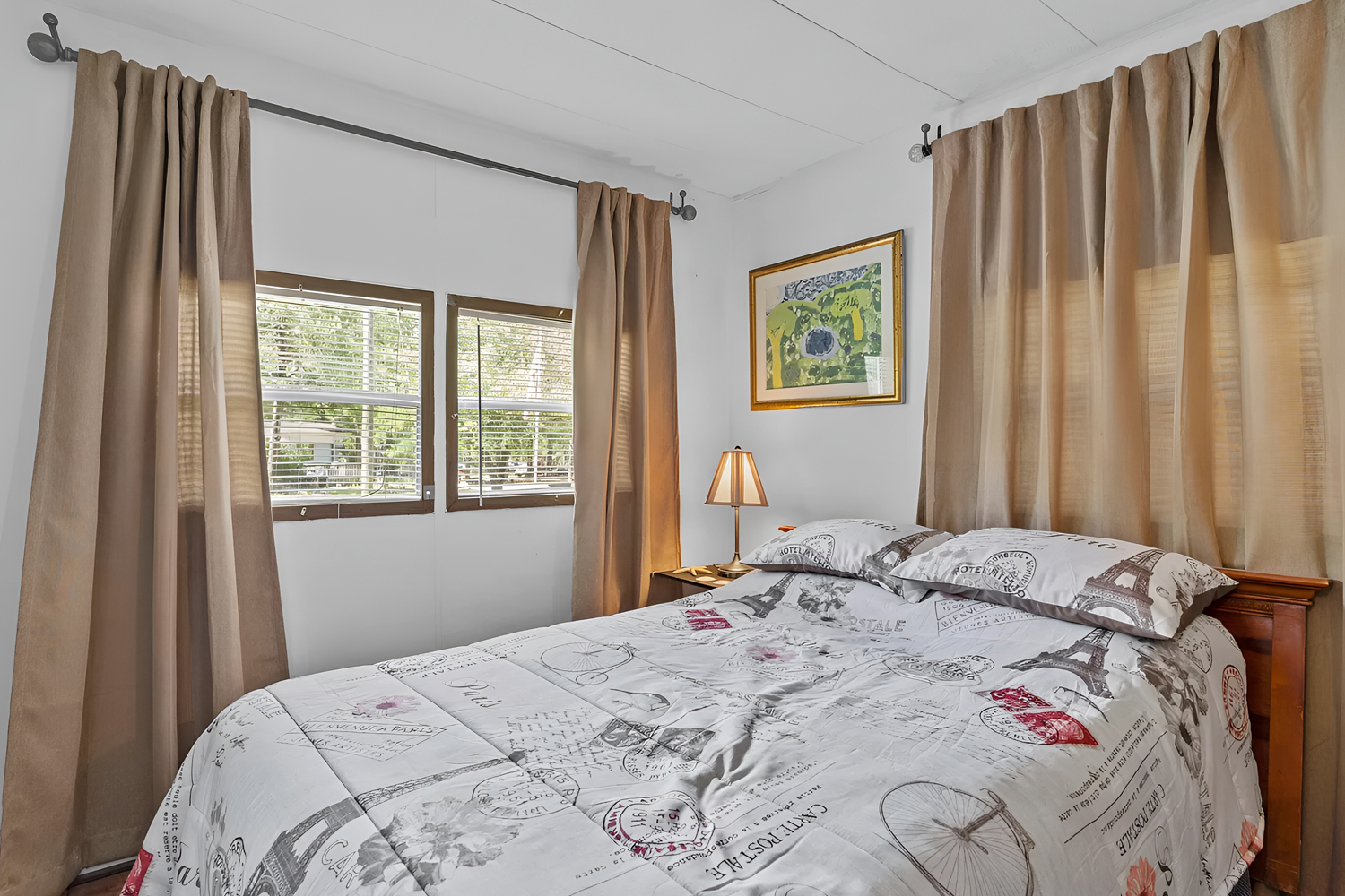
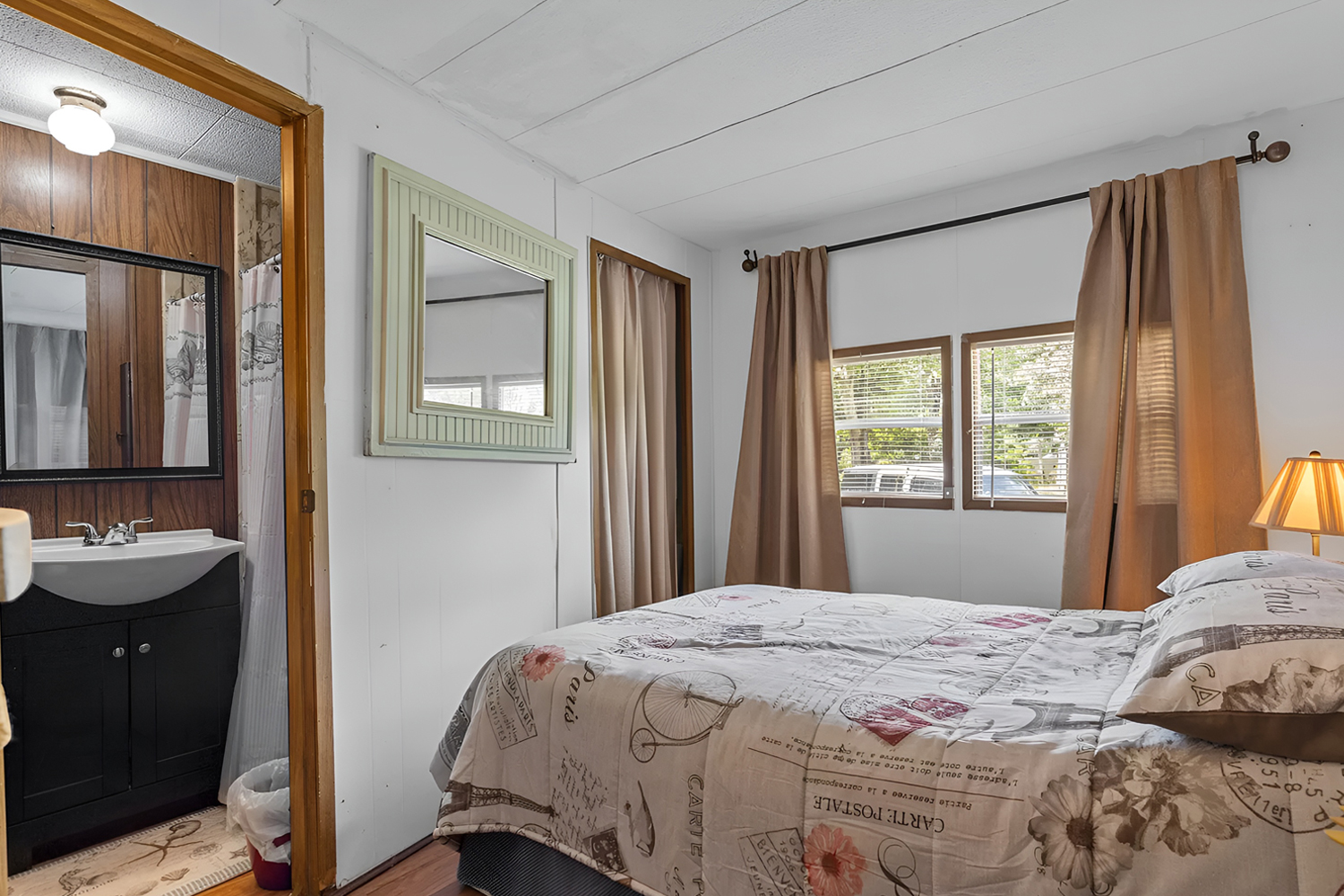
The bedroom is a cozy sanctuary designed for tranquility and rest. As you enter, you’re greeted by an aura of calm that invites you to leave your worries at the door. The design is a nod to comfort, with colors and textures that speak to restful nights and lazy mornings.
The room’s color scheme plays a pivotal role in crafting this haven. The crisp white walls are a blank canvas, reflecting the natural light that dances through the windows. This interplay of light and color gives the illusion of more space, making the room feel open and airy. The warm drapes add a soothing contrast to the eyes, wrapping the room in a gentle embrace.
Furniture placement is key in this intimate space. Every piece has its place, creating an easy and natural flow. There’s no feeling of clutter here, just the essentials arranged with purpose and care. The result is a bedroom that functions seamlessly, maintaining its charm without sacrificing convenience.
Vintage elements echo the home’s history, tying the room together. Perhaps it’s a classic bedside lamp or an heirloom quilt that tells its own story. These pieces are more than decor; they’re connections to the past, making the room not just a place to sleep but a space to cherish and reminisce.
Bathroom
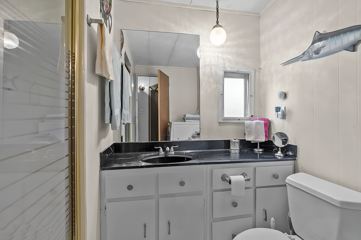
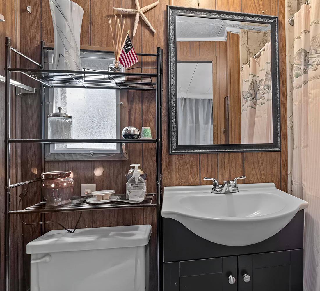
Lastly, the bathroom combines function with retro flair. The design pays homage to the past with touches that feel just as right today. Walking in, you’re wrapped in the warm embrace of classic wood paneling, which lines the walls in a deep, rich tone reminiscent of the home’s vintage roots.
Yet, this space is not stuck in the past. The modern fixtures, like the sleek sink and the crisp, white toilet, offer a fresh twist. They stand in striking contrast to the wood, showing that the old and new coexist harmoniously. This balance of eras brings a unique character to the room—a timeless style always in fashion.
Storage is clever and discreet. Look at the metal shelves: a practical, space-saving solution that keeps towels and toiletries within arm’s reach. The interplay of textures and lines here is a subtle nod to the home’s thoughtful design. Metal against the wood and straight lines beside flowing curtains all create a pleasing visual rhythm.
This bathroom isn’t just a place to rinse off the day’s troubles; it’s a study of how spaces can serve our needs while delighting our senses. It’s proof that in design, as in life, the right mix of yesterday and today can make a space functional and memorable.

