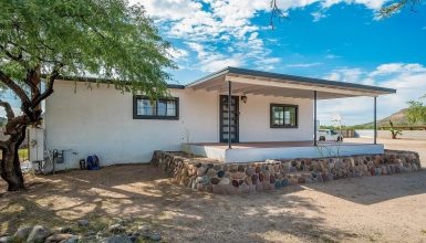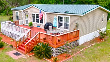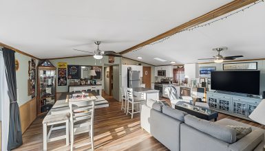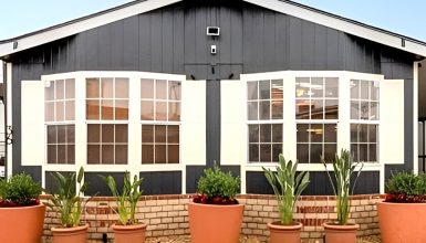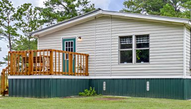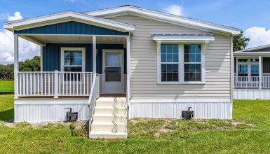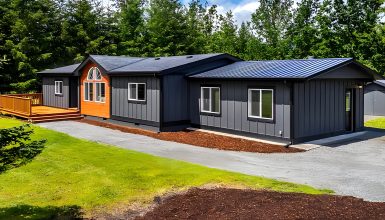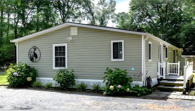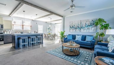
What makes a 1978 double-wide mobile home feel charming nearly five decades later? This home has the answer. Its low roofline, wide windows, painted panel walls, and roomy floor plan still show their vintage roots. Yet fresh gray cabinets, warm wood floors, and a large covered porch bring the design into the present. The result feels bright, cozy, and full of character.
Here is a closer look at the design and the visual cues that give this 1978 double-wide mobile home its character.
1. A Simple Double-Wide Exterior With Cottage Appeal
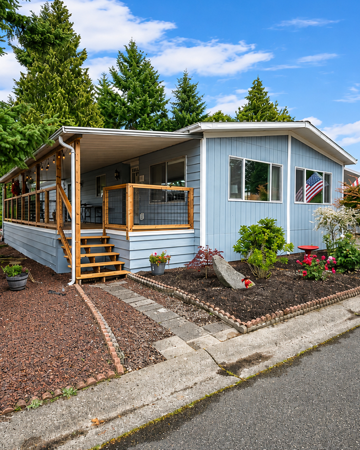
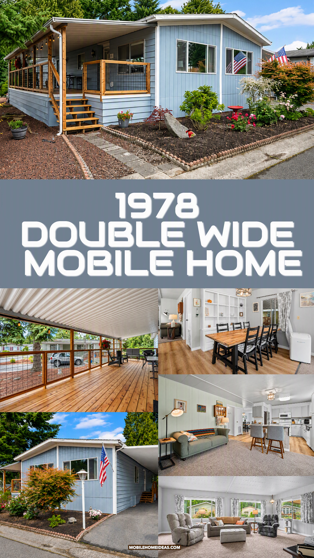
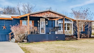
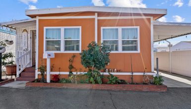
The exterior keeps the long, low form that gives many older double-wide homes their clear identity.
Pale blue siding softens the shape. White roof trim adds a crisp edge. Meanwhile, mature trees and garden beds help the home settle into its site.
The front end has vertical siding. Along the longer walls, horizontal siding takes over. That small shift gives the exterior more depth.
It also keeps the large wall surfaces from looking flat.
The roof has a low pitch. This is one of the strongest visual clues to the home’s age and construction style. Instead of a tall attic-like roof, the roof stays close to the main structure.
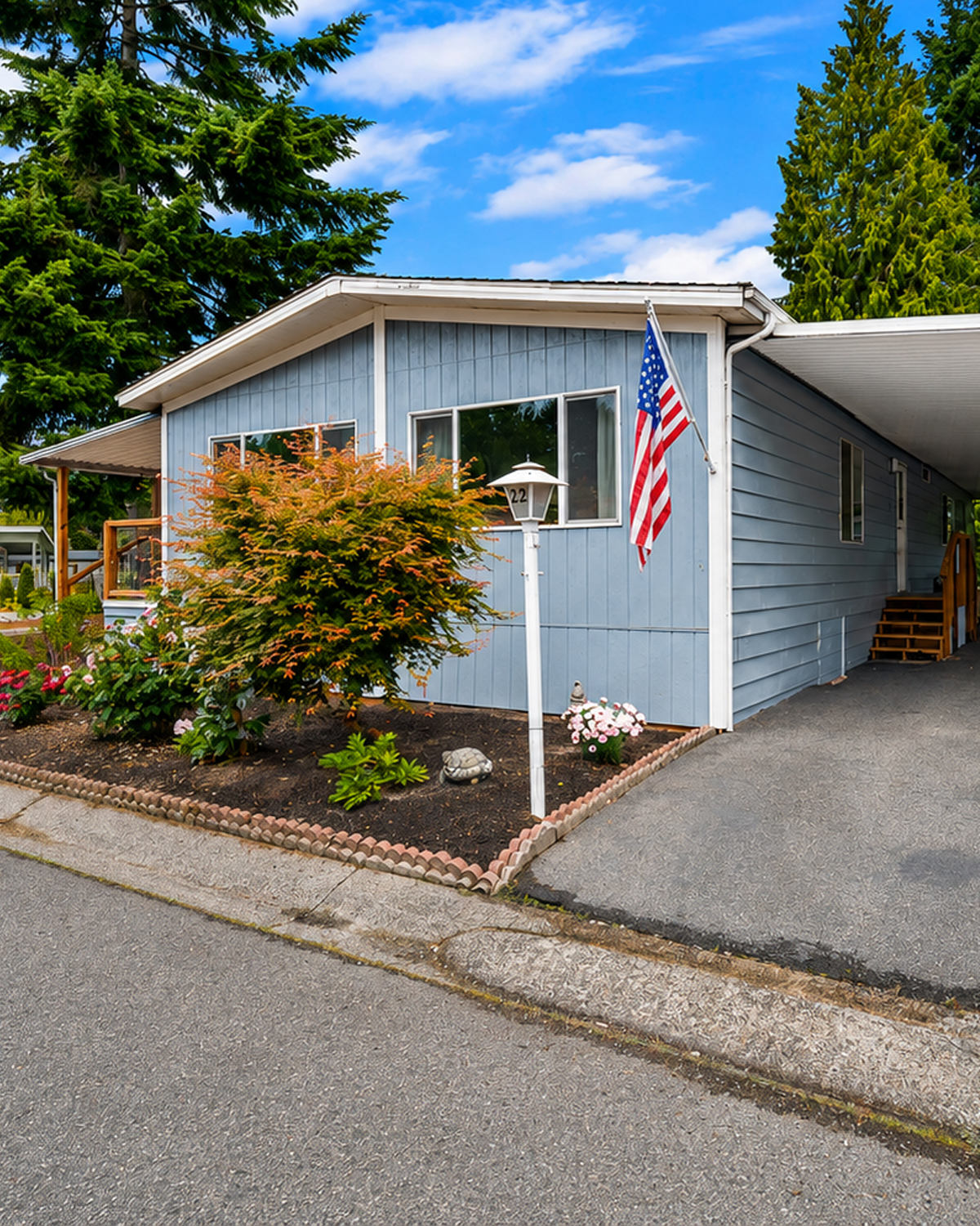
Yet the light color and clean trim keep the home from feeling heavy.
Design cues
- Long and low double-wide profile
- Shallow roof pitch
- Pale blue exterior
- White fascia and trim
- Vertical siding on the front end
- Horizontal siding along the side
- Large front windows
- Simple rectangular form
- Mature landscaping
- Low-maintenance garden beds
2. A Front Garden That Softens the Structure
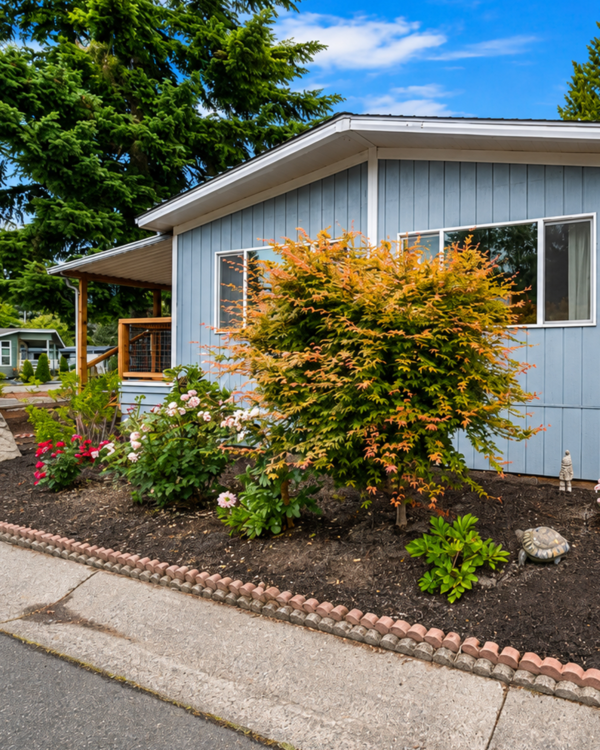
Landscaping plays a big part in this home’s curb appeal.
Without the shrubs and flowers, the front wall could feel broad and plain. Instead, the garden breaks the wall into smaller visual zones.
A Japanese maple becomes the star.
Its fine leaves and warm red-orange tips stand out against the cool blue siding. Smaller flowering plants sit below it. Dark mulch helps the green plants look richer.
Even the curved garden edging adds charm.
This is a smart approach for a mobile home. A manufactured home often has a strong horizontal shape. Plants with different heights can soften that line.
The taller tree also draws the eye up. That helps balance the low roof.
Design cues
- Japanese maple as a focal point
- Dark mulch
- Small flowering shrubs
- Low garden edging
- Layered plant heights
- Warm plant colors against blue siding
- Simple, low-care planting
- Trees used to soften the roofline
3. A Long Covered Porch That Adds Real Living Space
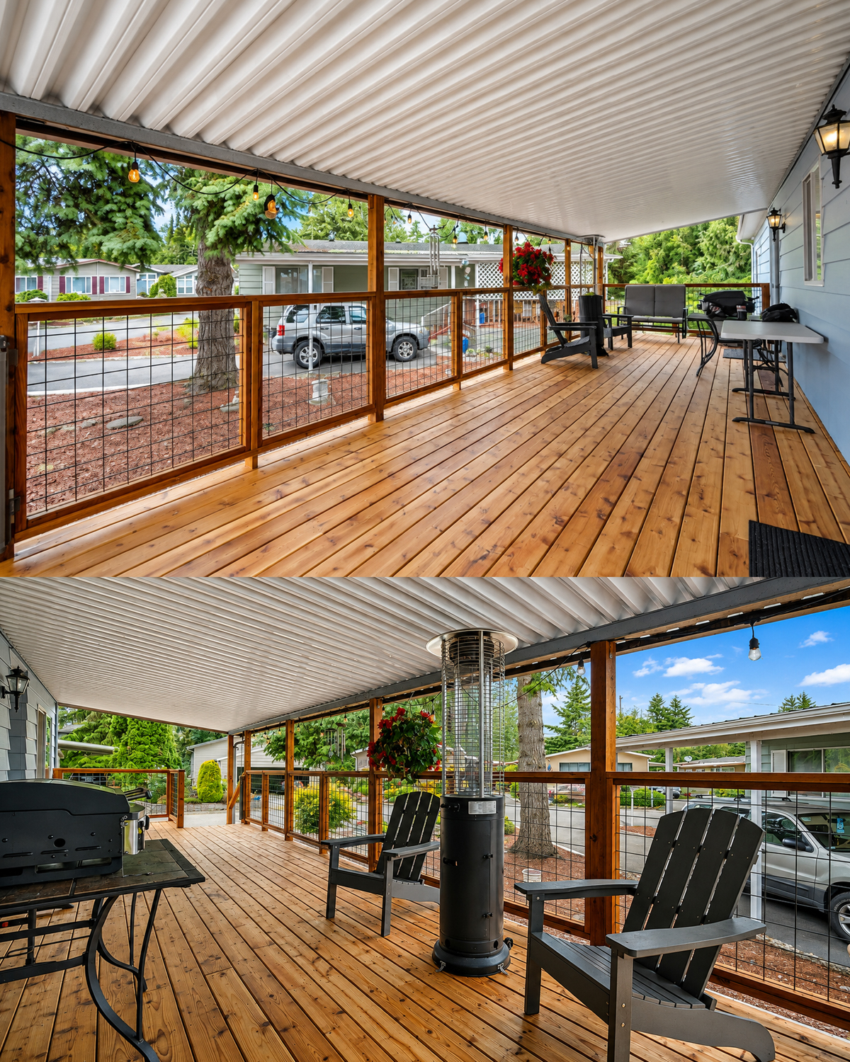
The covered porch may be one of the best features of the whole home.
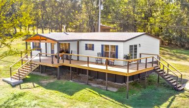
It stretches along a large part of the side wall. That gives the house another usable living zone without changing the core structure.
The porch uses warm wood flooring and posts. Wire-panel railings keep the edge safe without blocking the view.
This detail feels more current than solid wood balusters.
The porch roof also creates shade. That makes the space far more useful in warm weather. String lights add a soft, casual touch.
There is enough floor space for chairs, a grill, a heater, and small tables.
In other words, this is not just a landing outside the door. It acts more like an outdoor room.
The natural wood also adds warmth to the cool blue exterior.
Design cues
- Full-length covered porch
- Natural wood decking
- Wood posts
- Wire-panel railing
- String lights
- Outdoor seating
- Grill area
- Freestanding patio heater
- Deep roof cover
- Clear indoor-outdoor connection
4. A Large Carport That Fits the Mobile Home Shape
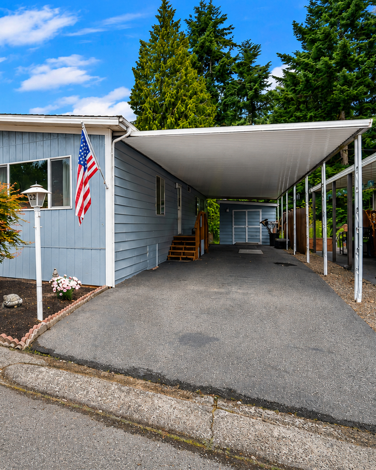
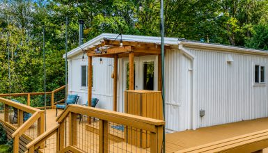
On the other side sits a long attached carport.
It follows the length of the home. This makes good use of the narrow space beside the structure.
The roof is simple and light in appearance. Slim posts support it along the outer edge.
More important, the carport does more than protect a vehicle.
It creates a covered path to the side door. It also gives the home another sheltered work or storage zone.
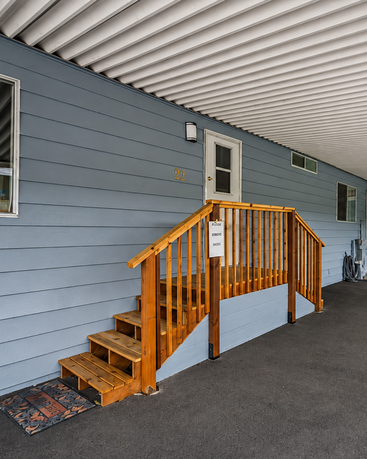
A small storage shed stands near the rear. That helps keep tools and outdoor items out of the main house.
The broad paved surface also makes this side of the home easy to maintain.
Design cues
- Extra-long carport
- Slim support posts
- Covered side entrance
- Paved parking surface
- Rear storage shed
- Simple utility layout
- Roofline that follows the home
- Easy-care exterior zone
5. A Bright Living Room With Classic Mobile Home Bones
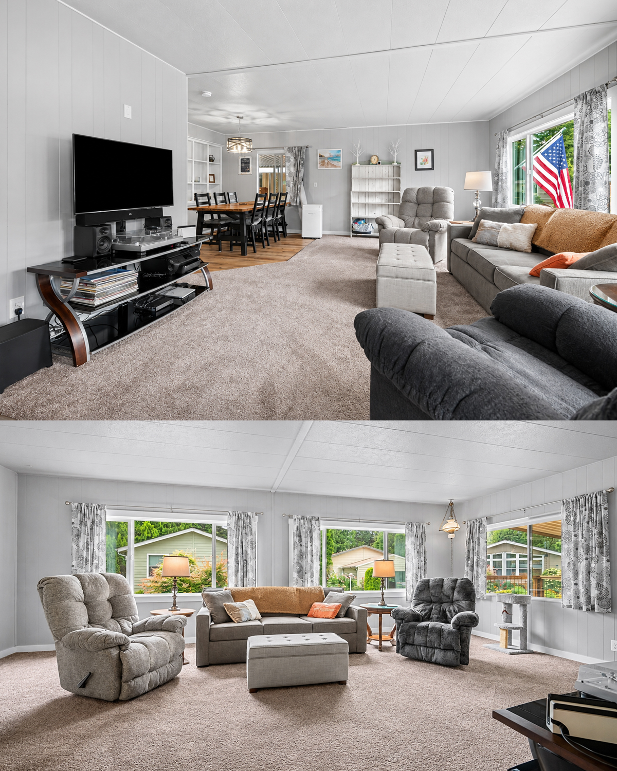
Step inside and the home feels much wider than the exterior may suggest.
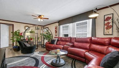
The main living room has a broad, open shape. Large windows span two walls, so daylight reaches deep into the space.
That amount of glass is important.
Older mobile homes can feel dark when they have small windows and heavy finishes. Here, the light gray walls and white ceiling reflect the natural light.
The wall paneling is still visible.
Instead of removing every trace of the original interior, the grooves have been painted. This keeps a bit of the home’s older character while making the room feel lighter.
Soft carpet adds comfort. The neutral furniture keeps the look easy and relaxed.
Nothing feels too formal.
Design cues
- Large living room
- Wide windows
- Painted wall paneling
- White paneled ceiling
- Soft neutral carpet
- Gray seating
- Simple window curtains
- Low-key color palette
- Open path to the dining room
6. The Low Ceiling Becomes Part of the Look
One detail gives away the home’s age more than almost anything else: the ceiling.
It is low, flat, and made from large panels.
Visible seams run across the room. In a newer house, designers may try to hide this detail. Here, the white paint helps it blend into the space.
That is a good lesson for updating an older mobile home.
You do not always need to rebuild a feature.
Sometimes, a simple color change can make it work.
White paint makes the ceiling look brighter. It also reduces the contrast between each panel.
As a result, the room feels more open.
Design cues
- Low ceiling height
- Large ceiling panels
- Visible ceiling seams
- White finish
- Flush or semi-flush light fixtures
- Simple trim where wall meets ceiling
7. An Open Living and Dining Layout
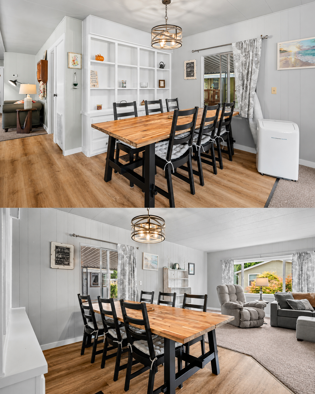
The living and dining zones flow into each other.
This is one of the best parts of the double-wide plan.
A large wood dining table sits between the main living room and kitchen. It gives the home a clear center for meals and gatherings.
Black chairs add contrast.
Above the table, a round metal light fixture gives the dining zone its own identity. That helps define the room without adding a wall.
The flooring also marks the change.
Carpet covers the living room. Warm wood-look flooring begins near the dining space.
It is a simple shift, but it tells you where one zone stops and the next begins.
Design cues
- Open living and dining plan
- Large rectangular dining table
- Black dining chairs
- Warm wood tabletop
- Round metal pendant
- Mixed flooring zones
- Clear sight lines
- Wide openings instead of tight halls
8. A Second Sitting Area Makes the Home Feel Bigger
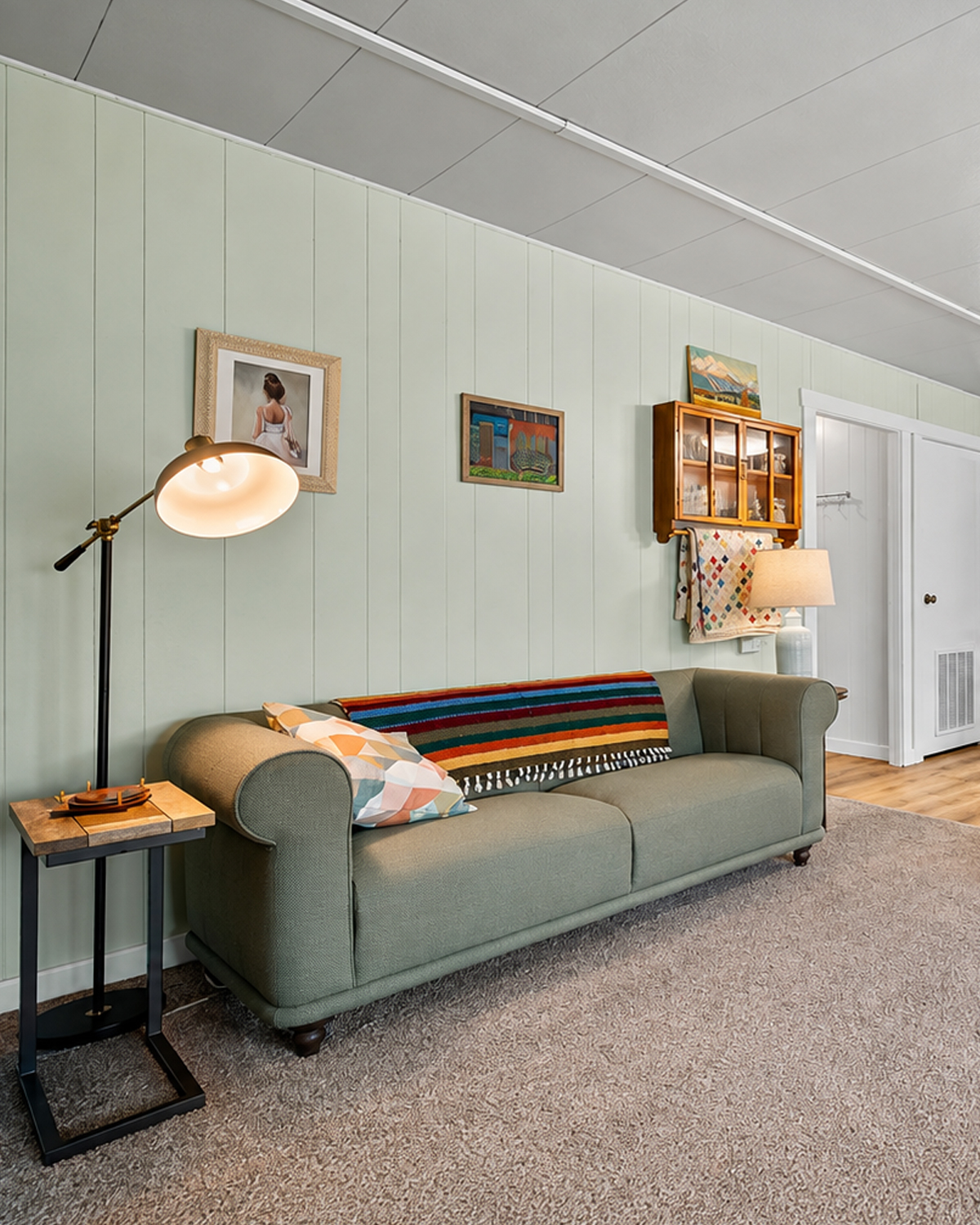
Another seating area sits close to the kitchen.
This smaller space has a green sofa, side table, and floor lamp. It works well as a reading corner, morning coffee spot, or casual family area.
This is where the width of a double-wide becomes useful.
Rather than forcing all activity into one narrow living room, the home can hold several small zones.
The green sofa adds soft color.
A striped throw adds a bit of red, blue, and gold. These warmer shades stop the pale interior from feeling cold.
Design cues
- Secondary sitting area
- Compact sofa
- Floor lamp
- Small side table
- Warm textile accents
- Open connection to kitchen
- Flexible use of space
9. A Gray Kitchen With a Clean, Updated Feel
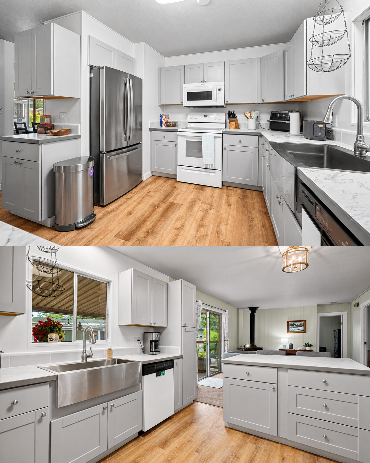
The kitchen feels much newer than the 1978 structure around it.
Soft gray Shaker-style cabinets cover most of the walls. White appliances keep the space bright.
The layout is practical.
Upper cabinets provide plenty of storage. Lower drawers and cabinets keep cooking tools within reach. Meanwhile, the counters wrap around the room.
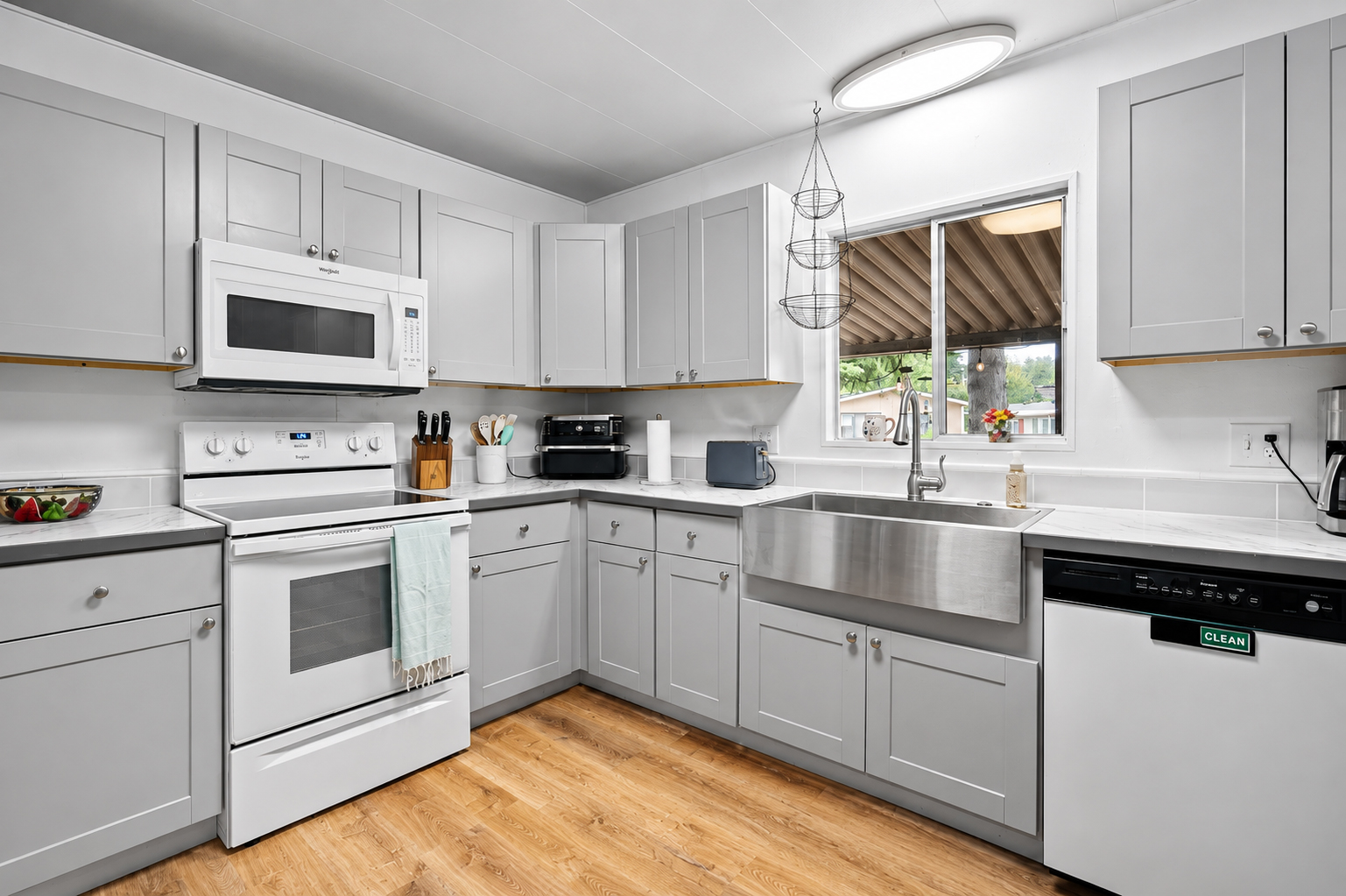
The warm wood-look floor keeps the gray cabinets from feeling cold.
A large stainless farmhouse sink becomes the main feature.
Placed below a window, it also gives the person at the sink a view outside.
That small touch makes everyday work feel better.
Design cues
- Gray Shaker cabinets
- White appliances
- Stainless farmhouse sink
- Window above sink
- Light countertops
- Wood-look flooring
- U-shaped work area
- Simple silver hardware
- Bright ceiling light
10. A Peninsula That Works Like a Small Island
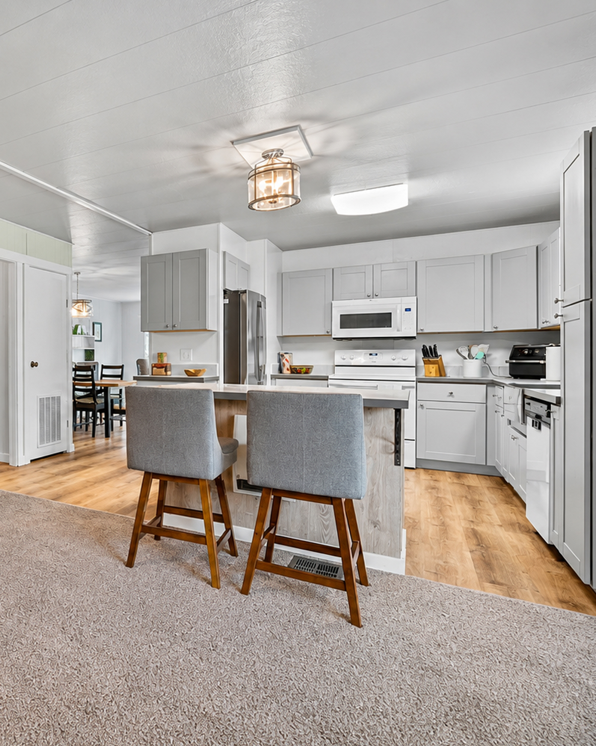
A short peninsula separates the kitchen from the nearby sitting space.
Two upholstered stools turn it into a casual eating area.
This is a smart choice for a double-wide.
A full island can take up too much floor space. A peninsula gives some of the same benefits while staying connected to the cabinetry.
It adds prep space.
It also gives people a place to sit without crowding the main dining table.
The stools use gray fabric with warm wood legs. That mix repeats colors already found around the house.
Design cues
- Compact kitchen peninsula
- Two counter stools
- Extra prep space
- Casual breakfast seating
- Gray upholstery
- Warm wood stool legs
- Open kitchen connection
11. Built-In Storage Adds a Custom Touch
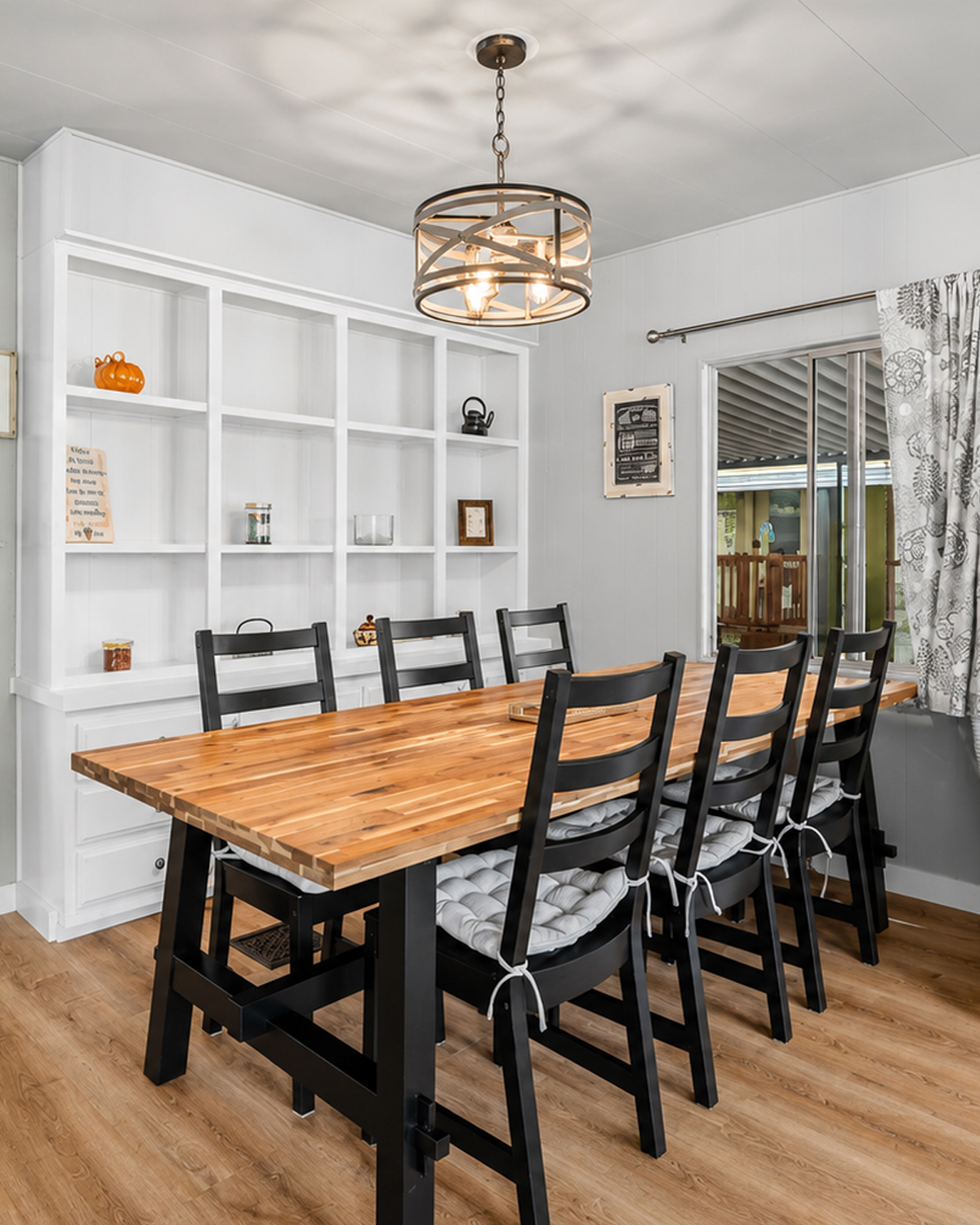
The dining room has a large white built-in unit.
It stretches across much of the wall and includes shelves, cabinets, and drawers.
This feature makes the space feel more permanent.
Built-ins are especially useful in a manufactured home. Floor space matters, so storage that hugs the wall can work better than several freestanding cabinets.
White paint keeps the unit from looking heavy.
It almost blends into the wall.
That lets the wood dining table remain the star.
Design cues
- Full-wall built-in
- Open display shelves
- Lower drawers
- White finish
- Shallow storage depth
- Furniture-like trim
- Dining room storage
12. A Wood Stove Brings Back Cozy 1970s Character
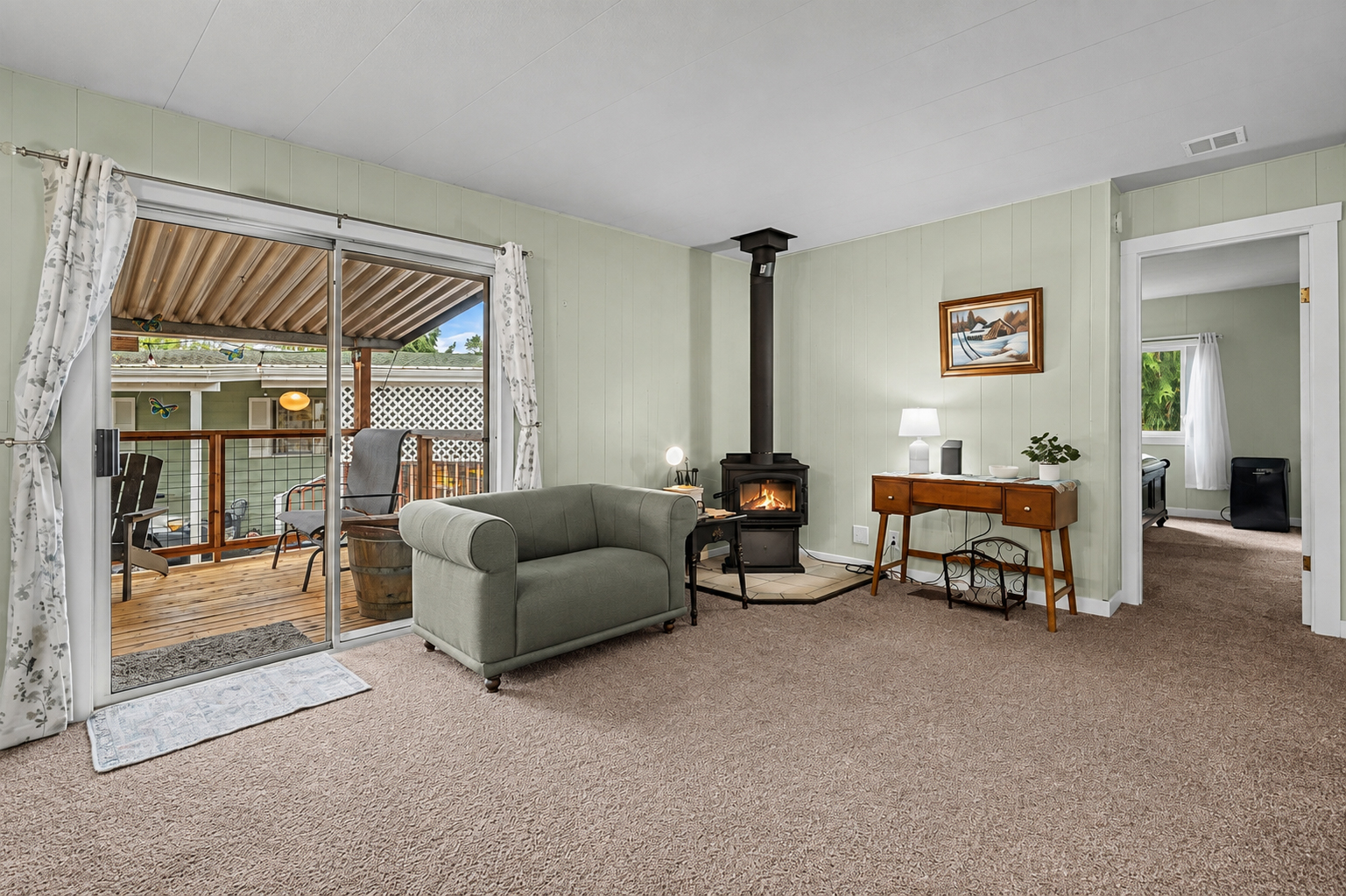
One of the most charming features appears near the porch doors.
A freestanding wood stove sits against the pale paneled wall.
This single feature changes the mood of the room.
It gives the space a rustic feel. It also connects well with the age of the home.
Wood stoves and freestanding heating units suit the practical spirit of many homes from this era.
Here, the black stove creates strong contrast against the light walls.
The tall black flue draws the eye up.
Nearby sliding glass doors lead to the covered porch. That makes this corner feel warm, casual, and connected to the outdoors.
Design cues
- Freestanding wood stove
- Black metal flue
- Compact hearth zone
- Large sliding glass doors
- Porch views
- Pale paneled walls
- Simple rustic styling
13. The Main Bedroom Keeps Things Calm and Simple
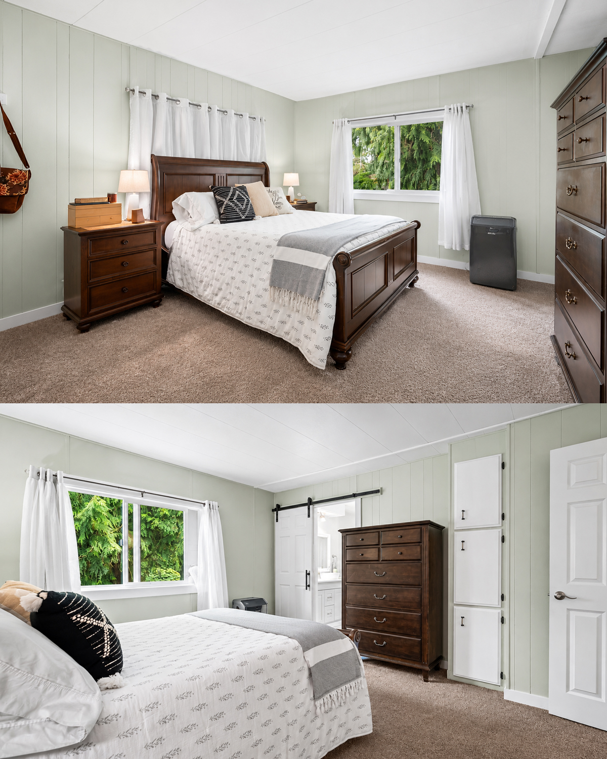
The main bedroom follows the same soft color story.
Light sage-gray walls make the room feel restful. White curtains keep the windows bright.
Dark wood furniture gives the room weight.
The large bed and tall dresser have a traditional style. Their rich brown finish creates a strong contrast against the pale walls.
The room also has generous floor space.
That is another benefit of the double-wide footprint. The bedroom does not feel squeezed between narrow walls.
Instead, there is room to walk around the bed and add full-size furniture.
Design cues
- Soft sage-gray walls
- White curtains
- Dark wood bed
- Matching wood nightstands
- Tall dresser
- Neutral carpet
- Large window
- Spacious furniture layout
14. Barn-Style Hardware Gives the Bedroom a Modern Update
A sliding barn-style door appears near the bedroom storage or bath area.
This detail is clearly newer than the home’s 1978 shell.
Still, it works well here.
A sliding door saves the floor area that a swinging door would need. That makes it practical as well as decorative.
Black hardware also ties into the darker furniture and other black details around the house.
Built-in cabinets beside the door add even more storage.
Design cues
- Sliding interior door
- Black rail hardware
- White door panel
- Built-in vertical storage
- Space-saving door design
- Updated farmhouse influence
15. The Mustard Tub Is the Best Retro Surprise
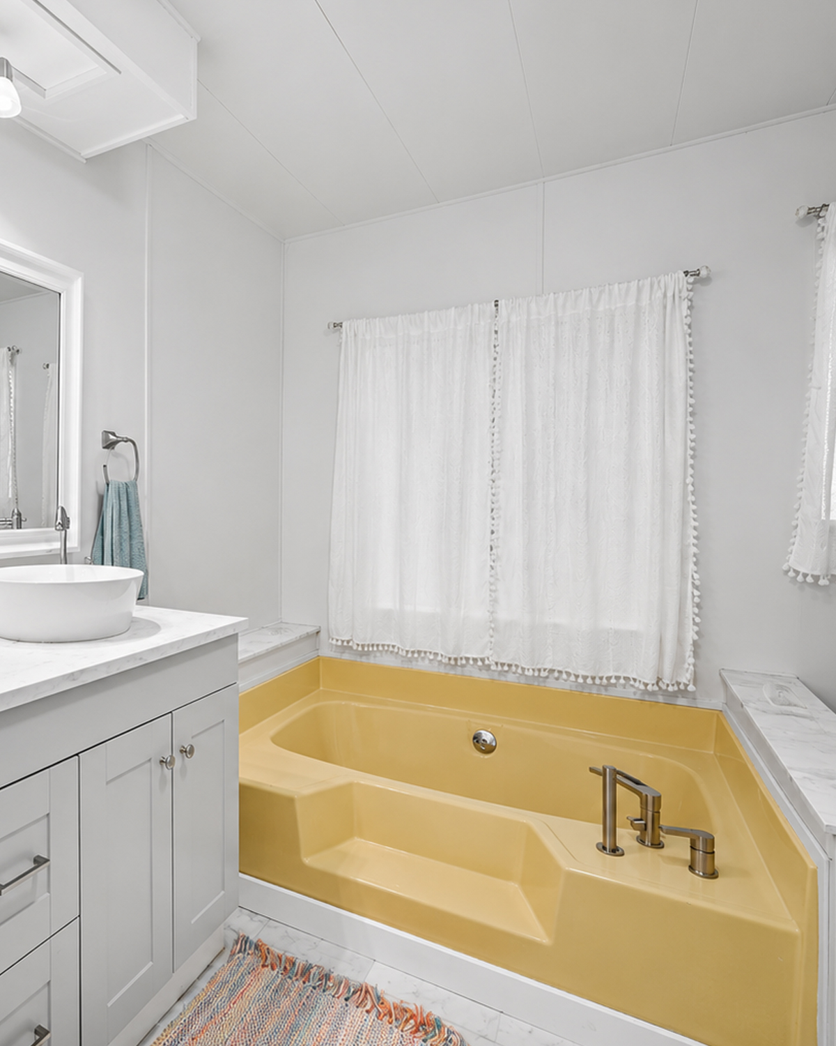
Then comes the bathroom.
Most of the room has been made bright and neutral. There is a long gray vanity, a white top, and a white vessel sink.
But the tub tells another story.
Its rich mustard-yellow color feels straight out of the 1970s.
Rather than hiding the home’s age, this feature celebrates it.
The tub has a deep, angular form with built-in steps or ledges. That makes it feel more like a soaking tub than a basic bath.
Against the pale room, the yellow surface becomes the clear focal point.
It is quirky.
It is bold.
And it may be the strongest vintage design cue in the entire home.
Design cues
- Mustard-yellow bathtub
- Deep soaking shape
- Built-in tub surround
- Long gray vanity
- White vessel sink
- Marble-look counter
- Large framed mirror
- Bright white walls
- Modern faucet paired with retro tub
16. A Practical Laundry and Utility Room
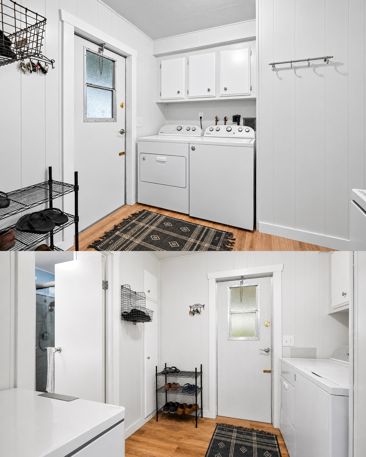
The laundry room proves that simple spaces can still work hard.
A washer and dryer sit side by side. Upper cabinets provide closed storage.
A door leads outside.
There is also room for shoe racks, hooks, and other everyday items.
This makes the area work like a mudroom as well as a laundry space.
The wood-look flooring continues into the room, which helps it feel connected to the kitchen and dining spaces.
White walls keep this small area bright.
Design cues
- Side-by-side washer and dryer
- Upper storage cabinets
- Exterior door
- Shoe storage
- Wall hooks
- Wood-look flooring
- Utility-focused layout
- Light wall color
Conclusion
This 1978 double-wide shows how well an older mobile home can age with thoughtful updates. The pale blue exterior, spacious porch, warm wood accents, and light interior create an easy, welcoming feel. Better yet, vintage details like the paneled walls, low ceilings, wood stove, and mustard-yellow tub keep its story alive. It is a great example of updating an older home without erasing everything that made it special.