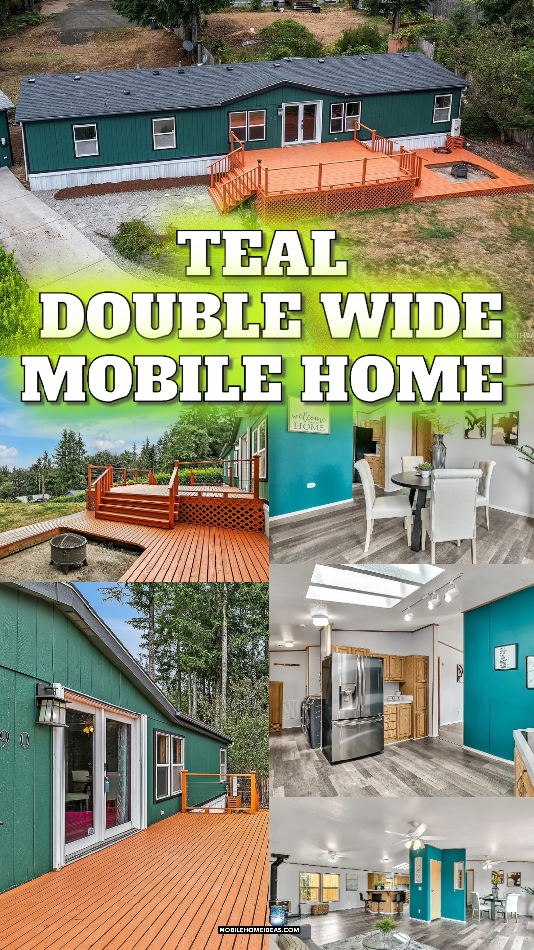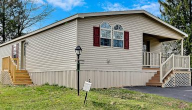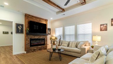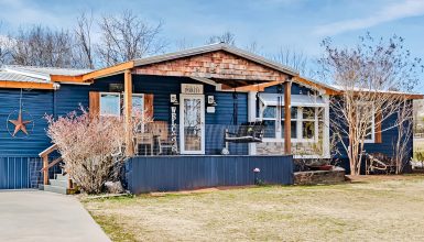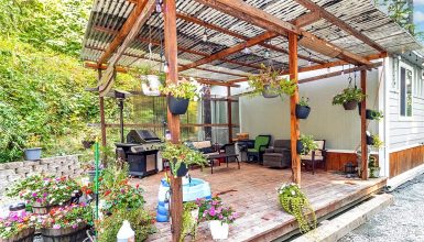
What makes a home feel bigger the moment you walk in? In this double wide mobile home, the answer starts outside. A deep teal exterior catches your eye. A wide wood deck draws you toward the front doors. Then, inside, the living room opens to the kitchen and dining area, so the whole home feels connected.
The rooms have their own charm, too. Teal accent walls bring energy to the main space. Wood cabinets warm up the kitchen. Soft gray walls and simple furniture keep the bedrooms calm. Even the laundry room gets a useful spot in the plan.
Here’s a closer look at the design, from the driveway to the floor plan, with cues you can use in your own home.
1. A Teal Exterior That Stands Out
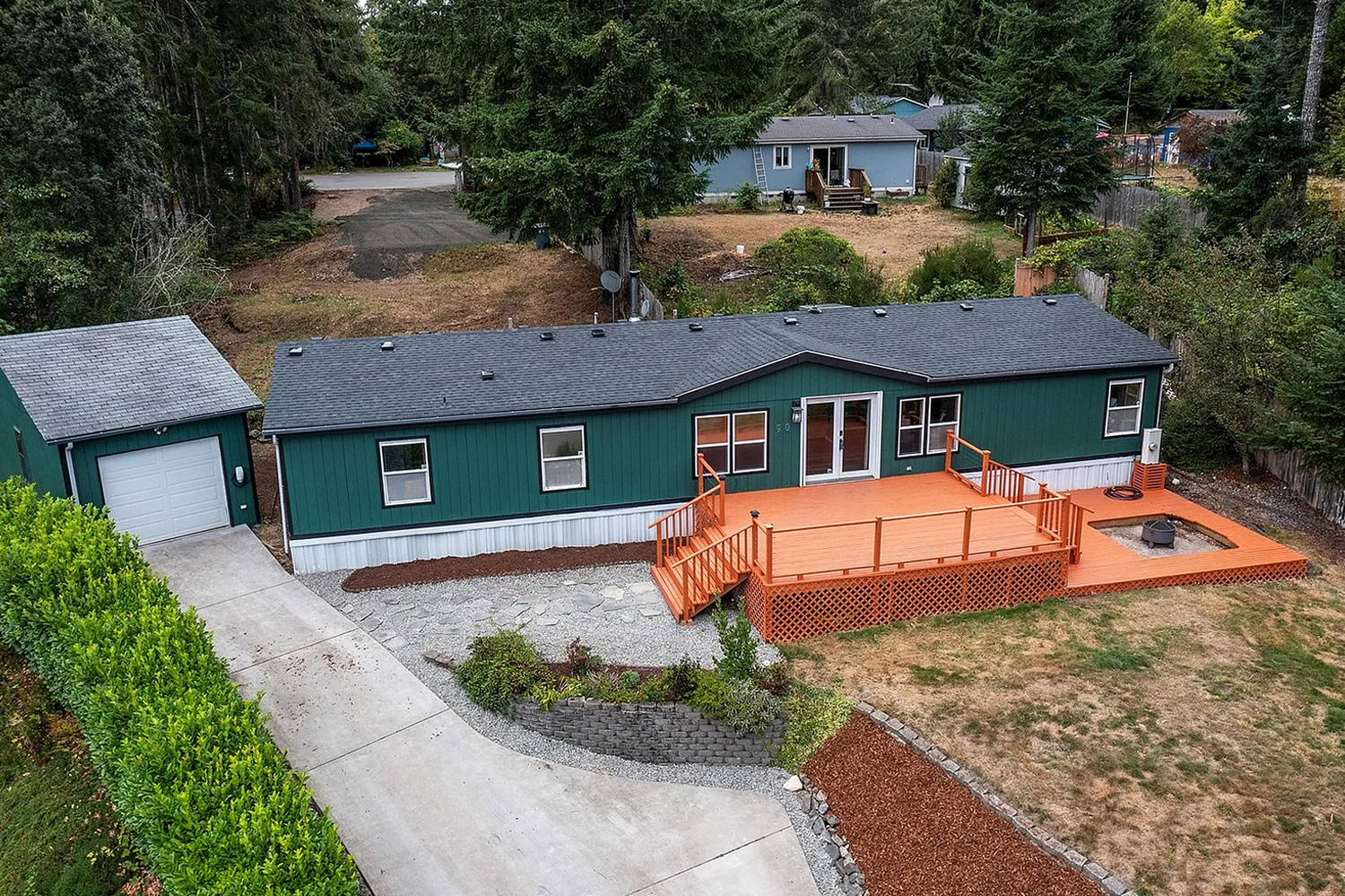
This home makes a strong first impression. Deep teal siding gives its long shape a rich, fresh look. White trim outlines the windows and doors, while a pale lower section breaks up the dark color. The result feels crisp without looking stark.
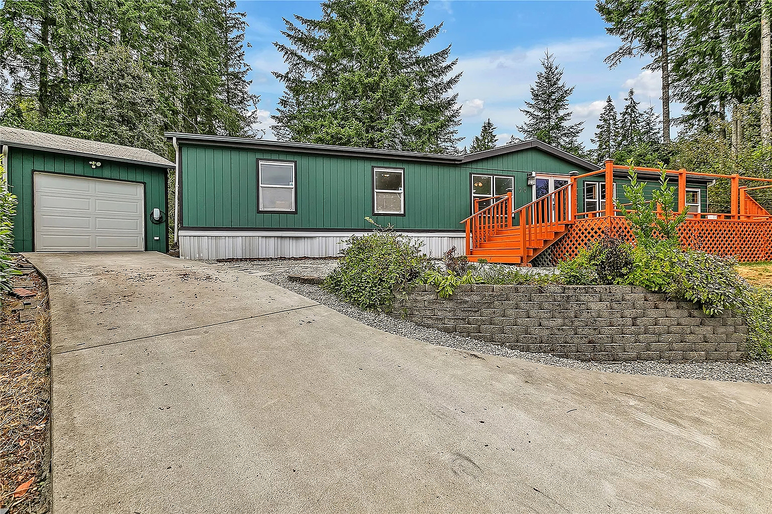
The exterior also has a clear path from the driveway to the deck. That matters on a double wide. A long front wall can seem flat if there is no focal point. Here, the deck and paired doors give your eye a place to land.
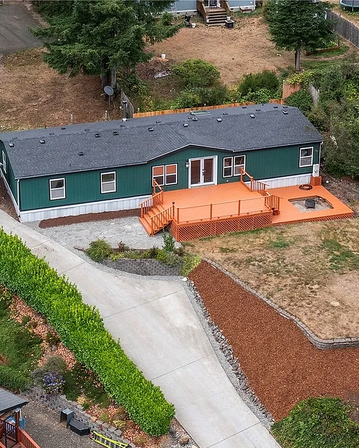
The wooded setting helps the color shine. Teal looks at home beside green trees, yet it still feels bold. A small matching outbuilding carries the color across the property. Together, the two structures make the site feel planned.
Design cues:
- Deep teal siding with bright white trim
- A pale base that lightens the long front wall
- Paired front doors as a focal point
- A wood deck that links the home to the yard
- Matching color on the nearby outbuilding
2. A Deck With More Than One Purpose
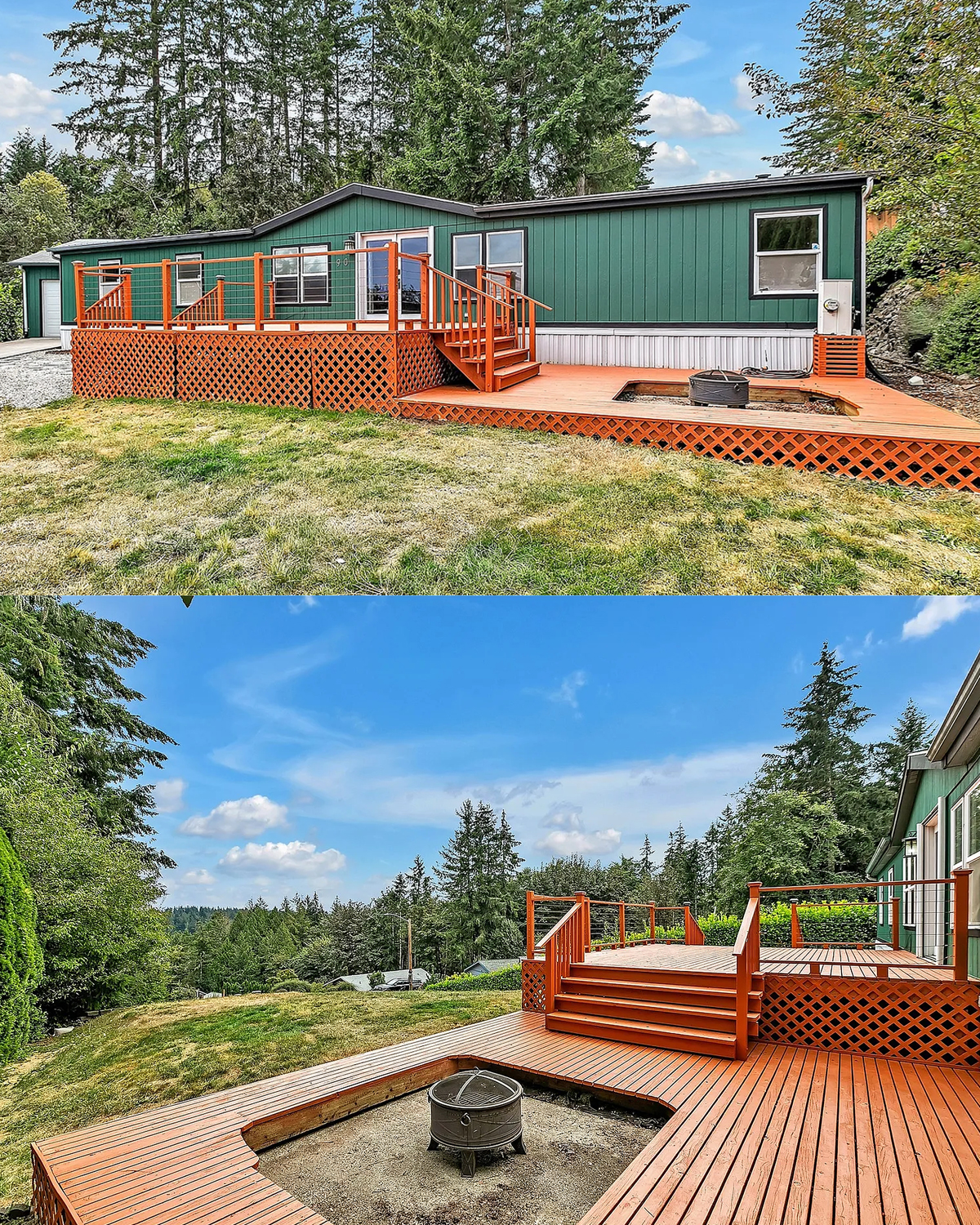
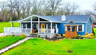
The large deck adds real living space outdoors. Its warm wood tone looks bright against the dark siding. Wide steps lead up from the yard, so guests can approach with ease. Open rail sections keep the view clear.
One part of the deck surrounds a lower, square area with a fire pit. This change in level helps define a place to sit without adding a wall. There is still plenty of open deck for chairs, a table, or a grill.
This setup shows why an outdoor space works best when it has a few jobs. You can gather by the fire, eat near the house, or step back and enjoy the view. The deck feels generous because each activity has room to breathe.
If you take this idea home, think about how you will use the space before you choose its size. Leave enough room to pull out chairs and walk around them. Then place the seating where you can enjoy the best view.
Design cues:
- Broad wood decking along the front of the home
- Wide steps for an easy approach
- A sunken area that marks the fire pit zone
- Open sight lines toward the landscape
- Space for both quiet breaks and group meals
3. Doors That Make the Yard Feel Close
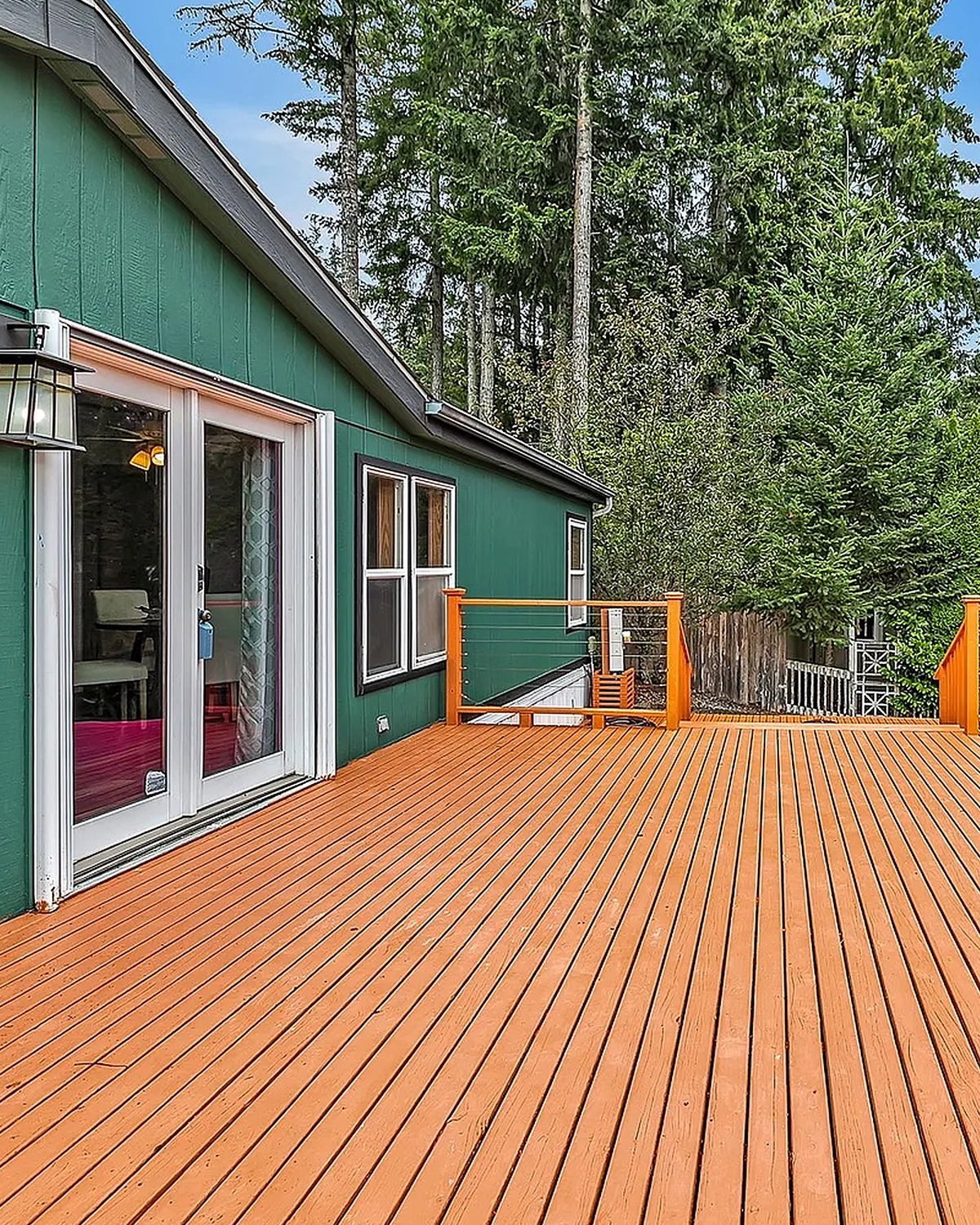
The glass doors do more than provide a way outside. From the interior, they frame the deck and pull daylight into the home. When the doors stand open, the threshold almost fades away. The living area and deck feel like parts of one larger space.
That connection gives a double wide a welcome sense of reach. You can see past the walls to the trees and sky. The view adds depth, even when you stay indoors.
The doors also help the deck feel like a natural place to go. You do not have to pass through a narrow hall or a small back room. The route is direct. That makes it easy to carry drinks outside or keep an eye on guests moving between the two spaces.
Design cues:
- Glass doors that bring in light
- A direct route from the main room to the deck
- A clear view of the trees from inside
- An outdoor area that feels tied to daily life
4. An Open Living Room With Room to Move
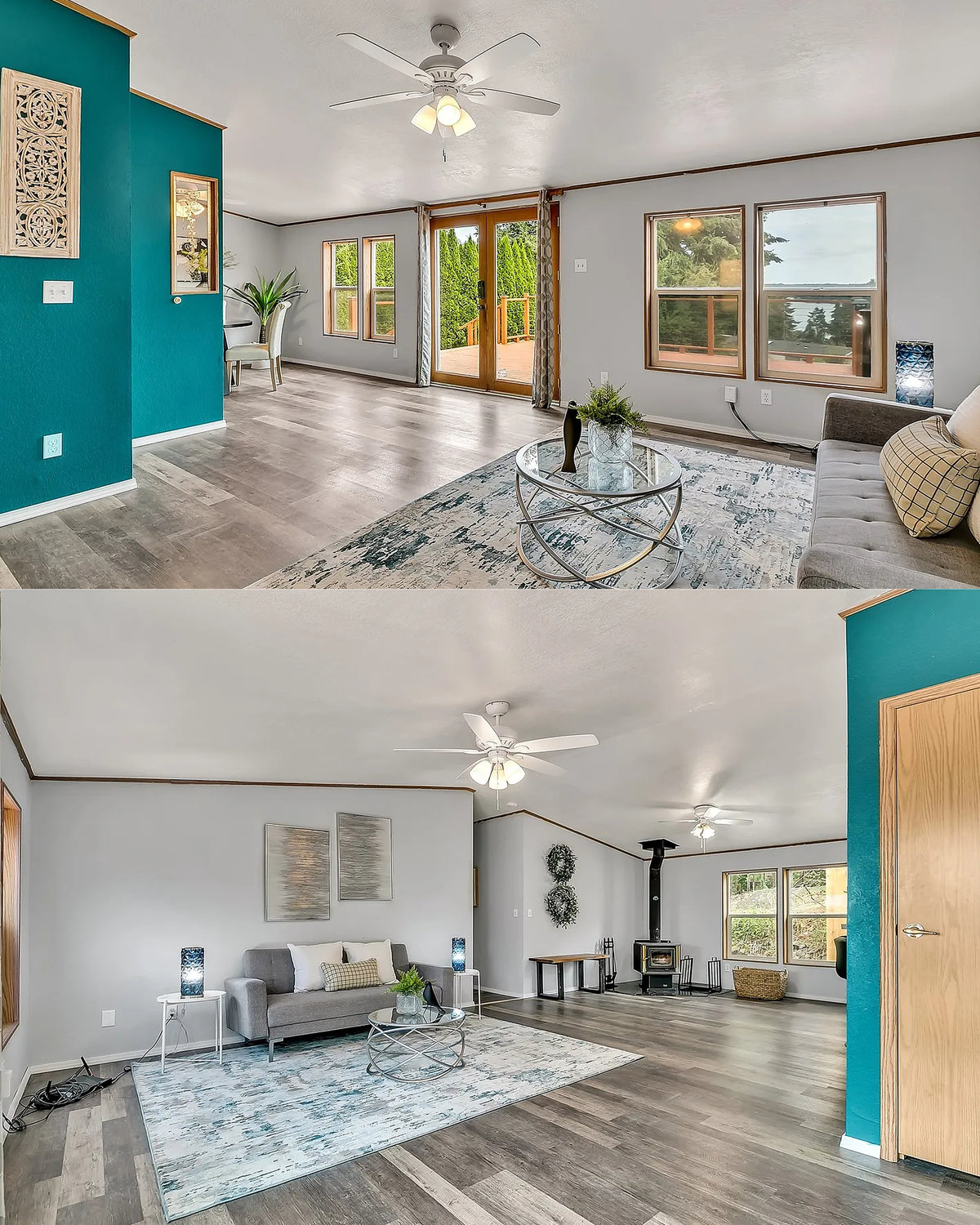
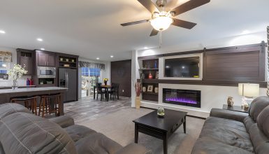
Inside, the living room feels broad and bright. Pale walls reflect the light, and gray wood-look floors run through the main space. That steady floor color helps the rooms flow together.
A light sofa, soft rug, and glass coffee table keep the seating area from feeling heavy. The rug marks where the living room begins. Yet you can still see beyond it to the kitchen and dining space.
The furniture leaves clear paths around the room. This is a small detail with a big effect. In an open plan, too much furniture can turn the center into an obstacle course. Here, the seating feels settled, while the routes to the doors and kitchen stay open.
The room also avoids a cold look. Wood trim and warm light add contrast to the gray floor. A few plants bring in a softer shape.
Design cues:
- Pale walls that reflect daylight
- One floor finish across the shared rooms
- A rug that defines the seating area
- Light furniture with space around it
- Plants and wood trim for warmth
5. Teal Accent Walls That Guide the Eye
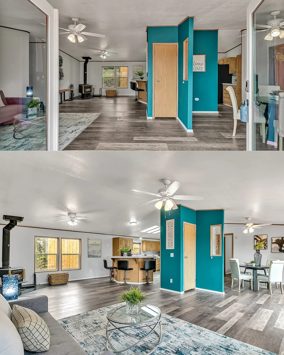
A bright teal wall gives the living space its spark. It ties the interior to the exterior color, but in a lighter, livelier way. The color appears near the dining area and along key parts of the open room. It helps each zone feel distinct.
The rest of the palette stays quiet. Gray walls, white ceilings, and simple furniture let teal take the lead. That balance keeps a bold color from taking over.
This is a useful idea for an open double wide. You do not need to paint every wall to give the home a strong point of view. A small stretch of color can mark an entry, frame a dining spot, or draw attention toward the deck.
The key is to repeat the hue with care. One main accent and a few small touches will feel more at ease than a different bold color in every corner.
Design cues:
- Teal used on select walls
- Soft gray and white around the bold color
- A visual link between inside and outside
- Accent walls that help define open areas
6. A Dining Spot That Feels Part of the Room
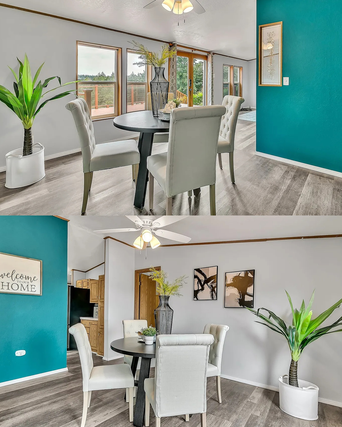
The dining area sits near the living room, yet it has its own identity. A light table and upholstered chairs make it feel relaxed. A plant adds height beside the setting, while wall art gives the table a backdrop.
This spot shows how you can make a dining area without closing it off. The table does the main work. It gives the space a clear purpose. The teal wall nearby adds another gentle boundary, and the open layout still lets conversation move across the room.
A simple table also suits the home’s easy mood. It can handle a quick breakfast, a board game, or dinner with friends. Nothing about the setting feels too formal for daily use.
If your dining area shares space with a living room, choose chairs you can move with ease. Keep enough space behind them for people to pass. A light fixture or piece of art can then mark the spot without adding bulk.
Design cues:
- A compact table with soft, light chairs
- Wall art to anchor the dining area
- A plant that adds life and height
- Open space between dining and living zones
- A setup that works for more than meals
7. A Kitchen That Puts Daily Work First
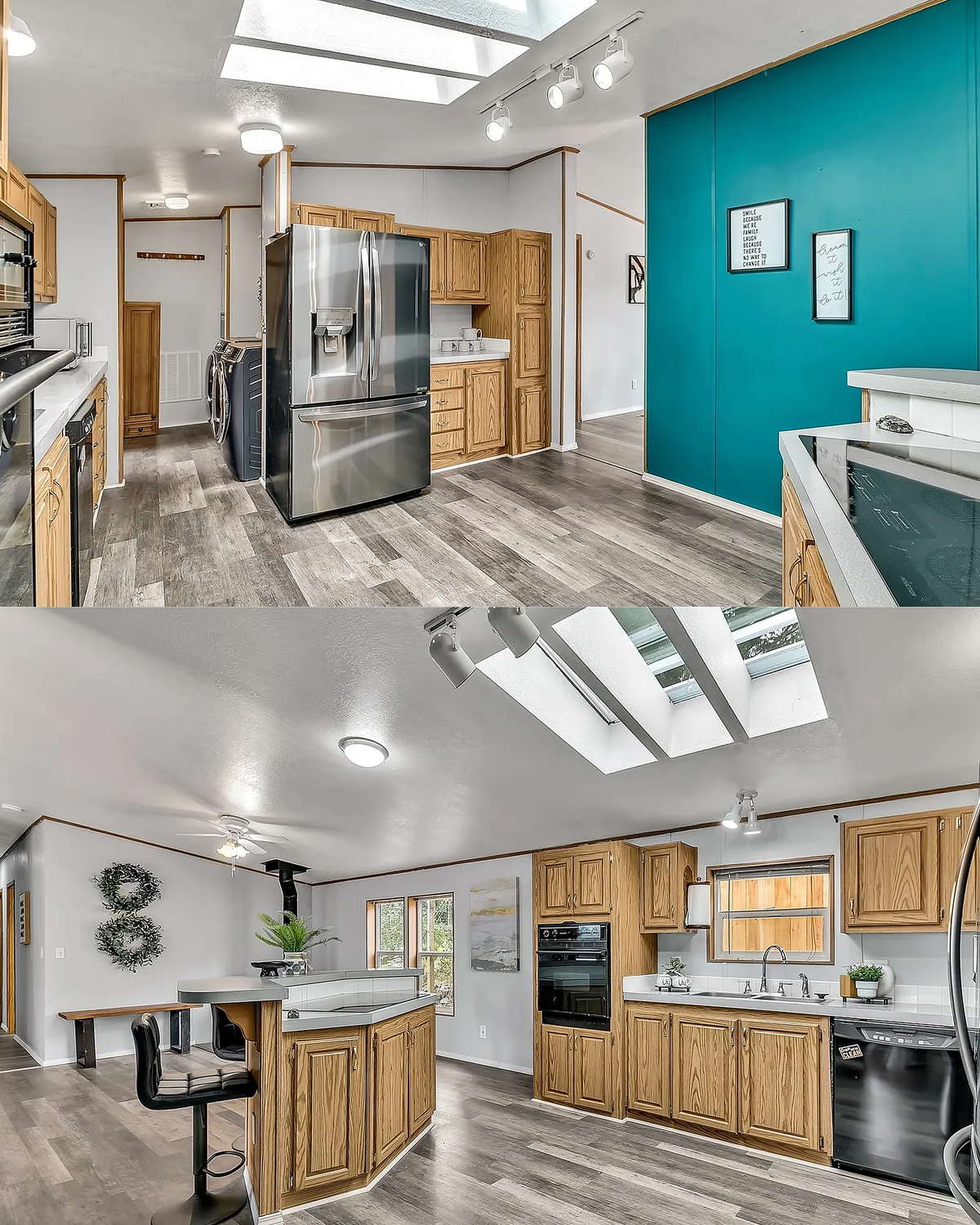
The kitchen stretches along one side of the main living area. Wood cabinets give it a warm, familiar feel. The grain adds texture against the pale walls and gray floors. Dark appliances bring contrast, while the long counter offers room for food prep.
A small island sits near the center. It adds another work surface and a place to perch, yet it does not shut the kitchen off from the living room. You can cook and still take part in what is happening nearby.
This kitchen has a practical strength: you can see where everything belongs. Cabinets line the walls. The sink sits below a window. Appliances have clear positions. The layout leaves an open path through the shared space.
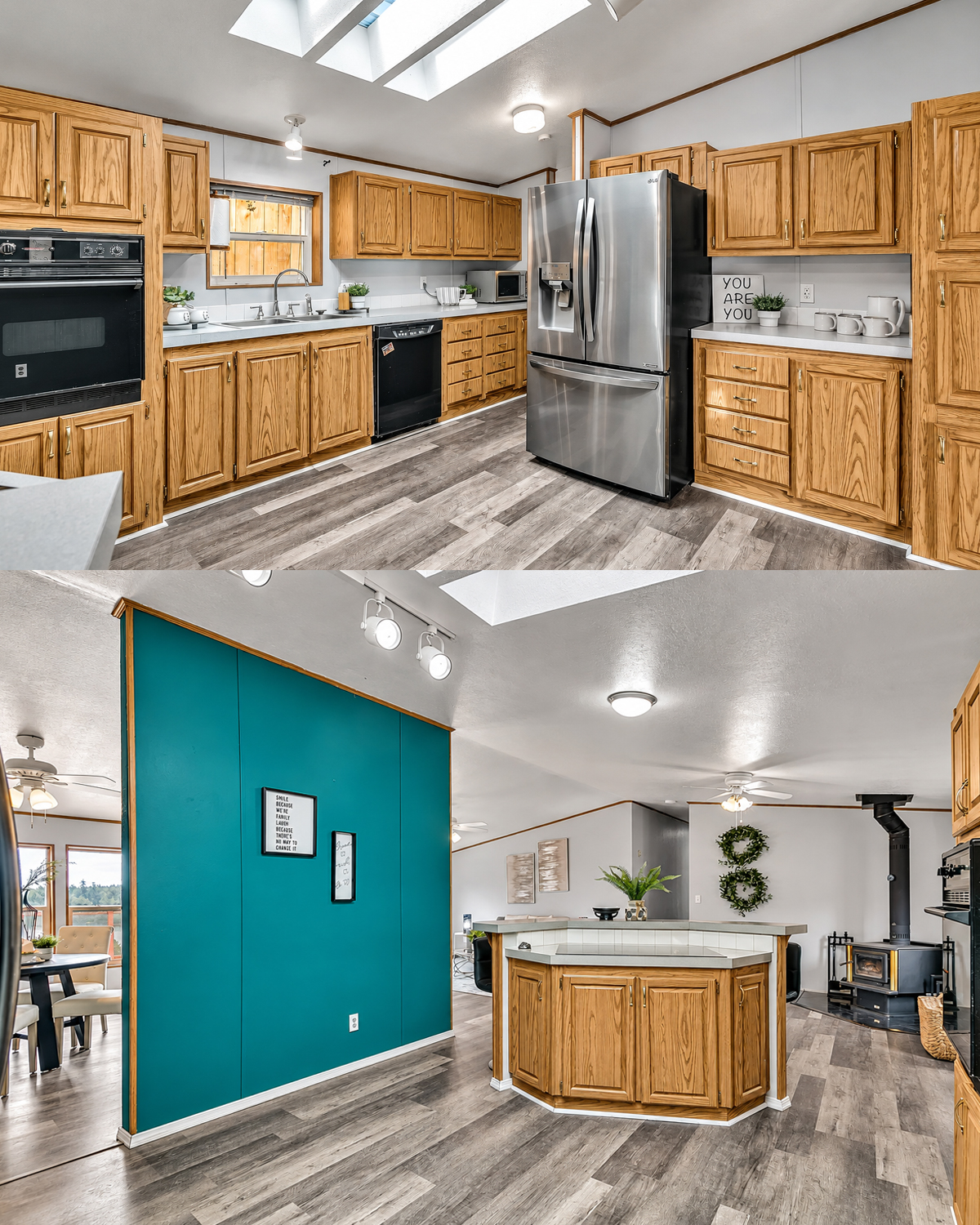
The wood cabinets also keep the home from feeling too gray. In a room with cool flooring and light walls, that warm finish makes a real difference. You could bring out its color with a wood bowl, woven basket, or simple cutting board.
Design cues:
- Wood cabinets that add warmth
- A sink below the window
- Dark appliances for contrast
- A small island with extra prep space
- Open views between kitchen and living room
8. A Breakfast Nook for Slow Mornings
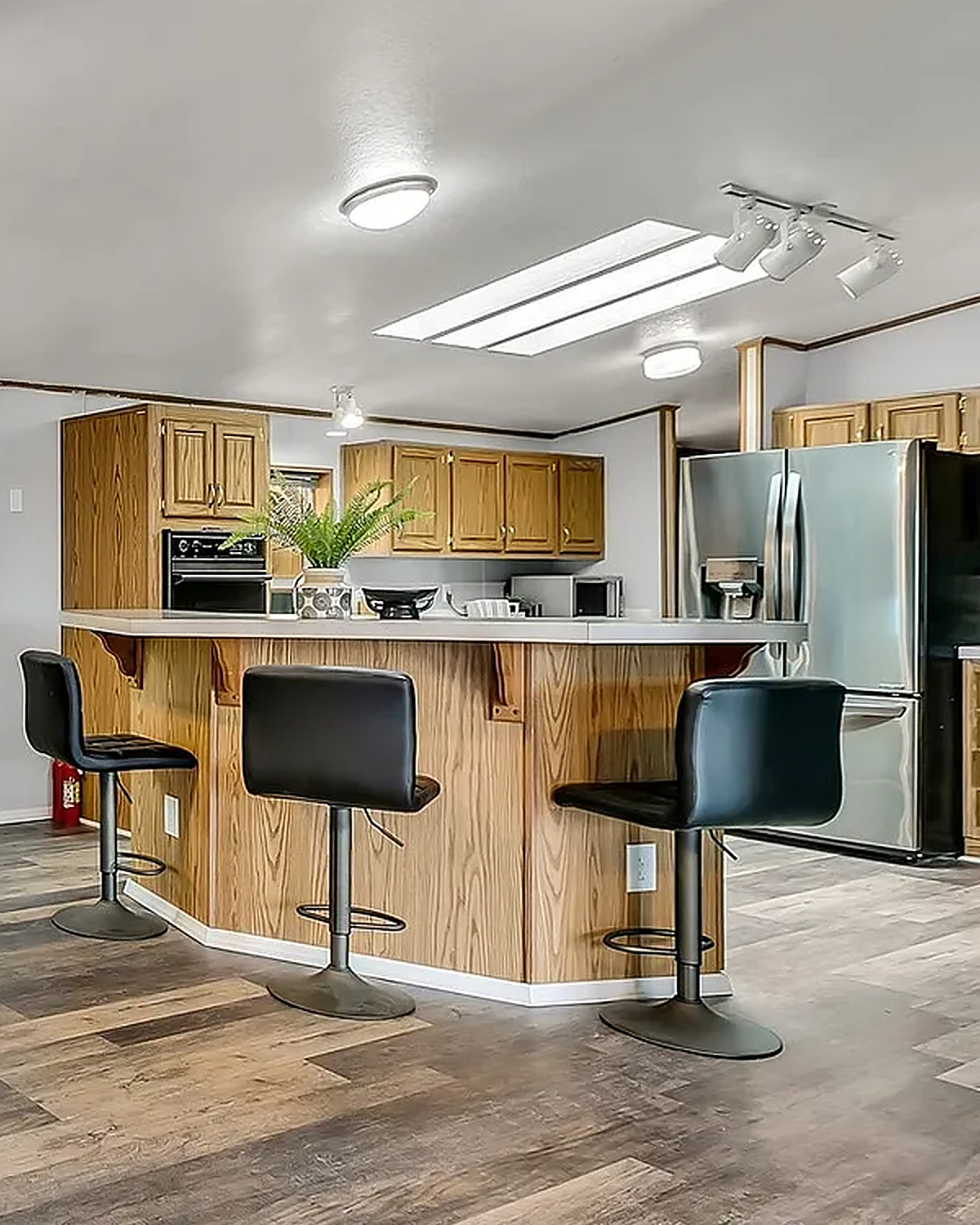
Beyond the main dining area, the floor plan marks a breakfast nook near the kitchen. It offers another way to use the open space. A small table here could suit morning coffee, homework, or a quiet meal for two.
The nook sits where the kitchen can serve it with ease. You can move from the counter to the table in a few steps. Meanwhile, the larger dining area can stay ready for family meals or guests.
Two eating spots may sound like a lot, but they can serve different needs. Keep the nook casual and the dining area a bit more flexible. A round table could soften the straight lines of the cabinets and leave a clear path around it.
The plan also leaves this area open to the living room. That helps the home feel roomy. Instead of a set of small, closed rooms, the shared spaces work together.
Design cues:
- A casual eating spot beside the kitchen
- Room for a small round or square table
- Short, easy paths from counter to seat
- Open views across the main living area
9. A Cozy Corner by the Stove
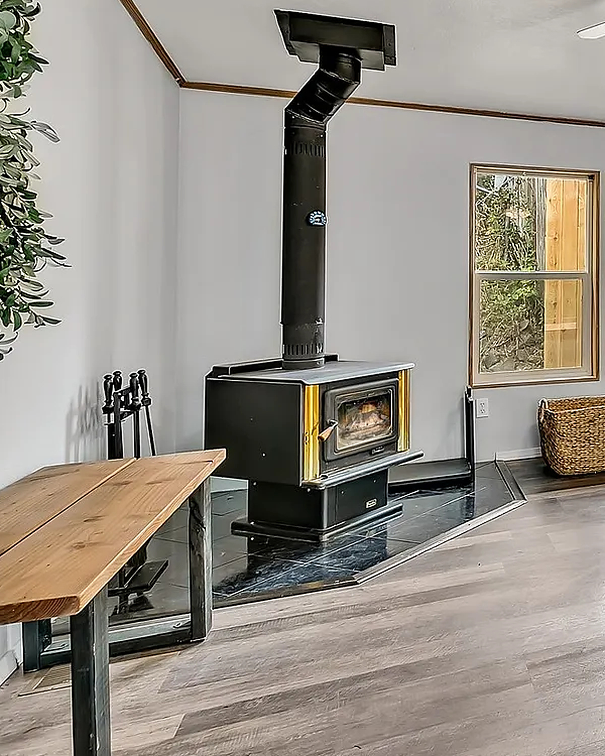
A black stove stands near the living area. It gives the open room a clear focal point and a cozy feel. Its slim pipe draws the eye up toward the ceiling, while its dark finish stands out against the light wall.
The stove also adds a rustic note to a room with clean lines and smooth floors. That mix gives the space more character. The home does not lean on one style alone. It pairs simple, modern surfaces with a few warm, grounded features.
A chair or small table nearby could turn this spot into a reading corner. You would still feel part of the main room, but the stove would give the area a mood of its own. Any furniture placed near it should follow the stove maker’s required clearances.
Design cues:
- A dark stove against a light wall
- A vertical feature that draws the eye up
- A cozy focal point within the open plan
- Simple furnishings that let the stove stand out
10. A Primary Bedroom With a Calm Palette
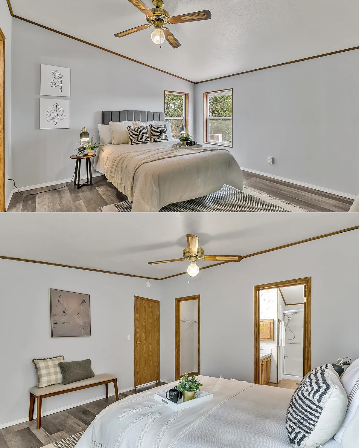
The primary bedroom takes a quieter path. Light gray walls, soft bedding, and a woven-look rug create a restful mood. The ceiling fan adds a useful layer of comfort without drawing too much attention.
The bed has room to stand as the center of the space. A narrow side table and simple art add what the room needs, while the floor stays clear. That open area makes the bedroom feel more peaceful.
Wood doors and trim bring warmth back into the palette. They also connect the room to the kitchen cabinets and other wood details in the home. This kind of repeat helps a house feel whole, even when each room has its own look.
The bedroom does not need a bold wall to feel finished. Texture does the work. Soft fabric, a rug, and a few small pieces make it inviting.
Design cues:
- Light gray walls and soft, pale bedding
- A rug that adds texture underfoot
- Wood trim and doors for warmth
- Simple art and a small bedside table
- Open floor space around the bed
11. A Second View of the Primary Suite
From another angle, the primary bedroom looks open and easy to use. The furniture sits along the walls, so the middle of the room stays clear. That gives the room a relaxed feel and makes it simple to move from the bed to the door.
This view also shows how a plain wall can help a bedroom rest. You do not have to fill every spot with art or shelves. A bench, a plant, or one larger print can be enough. The quiet space gives your eyes a break.
The nearby bath and closet shown on the floor plan add to the suite’s daily ease. They put getting dressed and winding down close to the bedroom. The arrangement gives the primary room a more private place at one end of the home.
Design cues:
- Clear space at the center of the room
- Furniture kept to the edges
- Simple decor with room to breathe
- A nearby bath and walk-in closet on the plan
12. A Bright Bath With Familiar Finishes
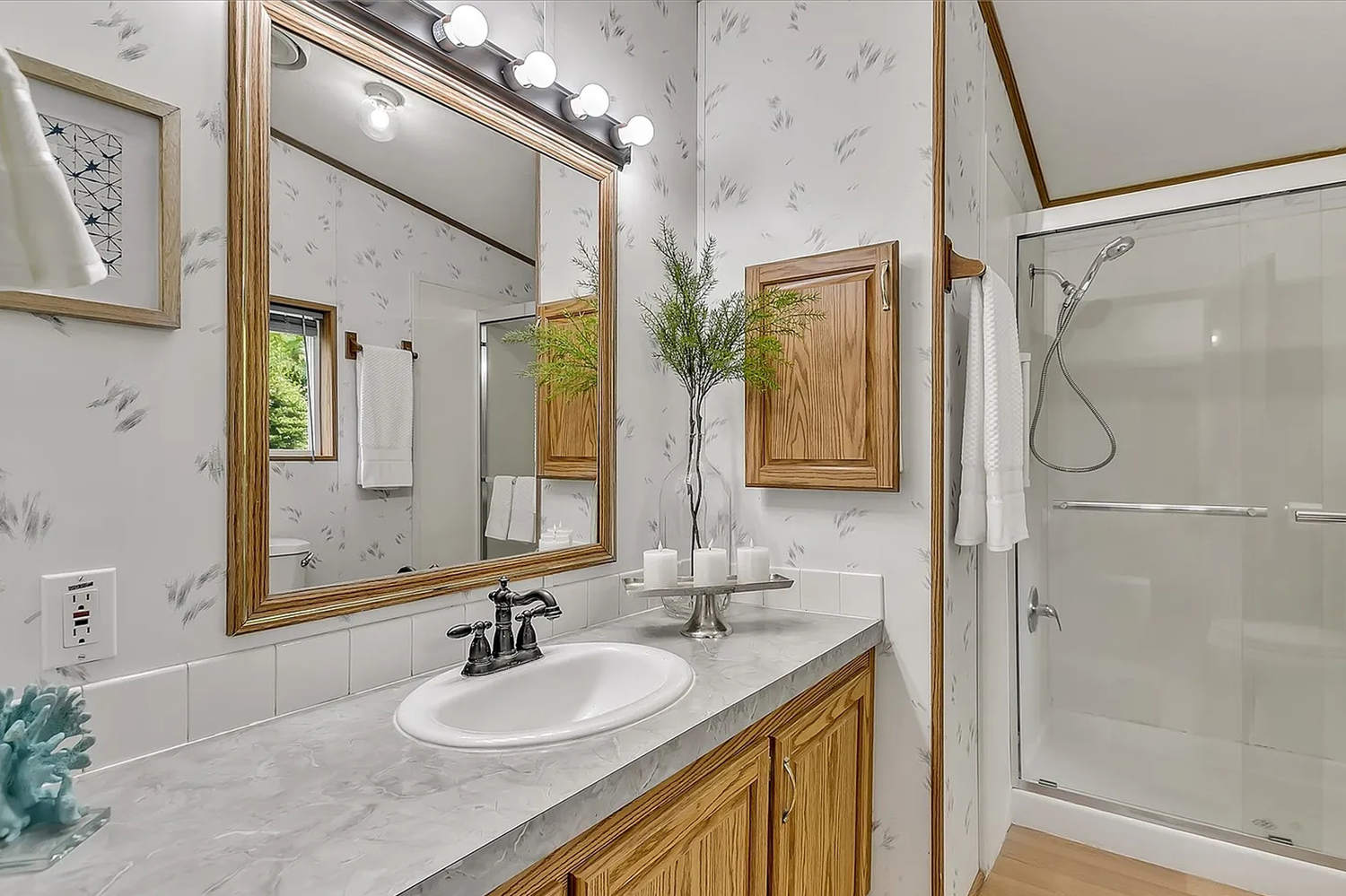
One bath pairs a wood vanity with a light counter and a large framed mirror. The finishes feel warm and useful. Soft wall color and simple fixtures keep the room bright.
A shower sits beside the vanity. The glass panels let the room feel more open than a solid wall would. The mirror helps, too. It reflects light and gives the vanity wall more presence.
This bath works because the parts feel in balance. The wood cabinet adds color. The pale counter keeps the look fresh. A plant and a few small items make the room feel lived in, but the surfaces still have space.
For a similar look, start with one warm finish, such as wood. Then keep the larger surfaces light. You can change towels or small decor as your taste shifts without redoing the whole room.
Design cues:
- A wood vanity with a pale counter
- A large framed mirror
- Glass shower panels
- Soft wall color and simple fixtures
- Small decor that leaves counter space free
13. An Office That Can Change With Your Needs
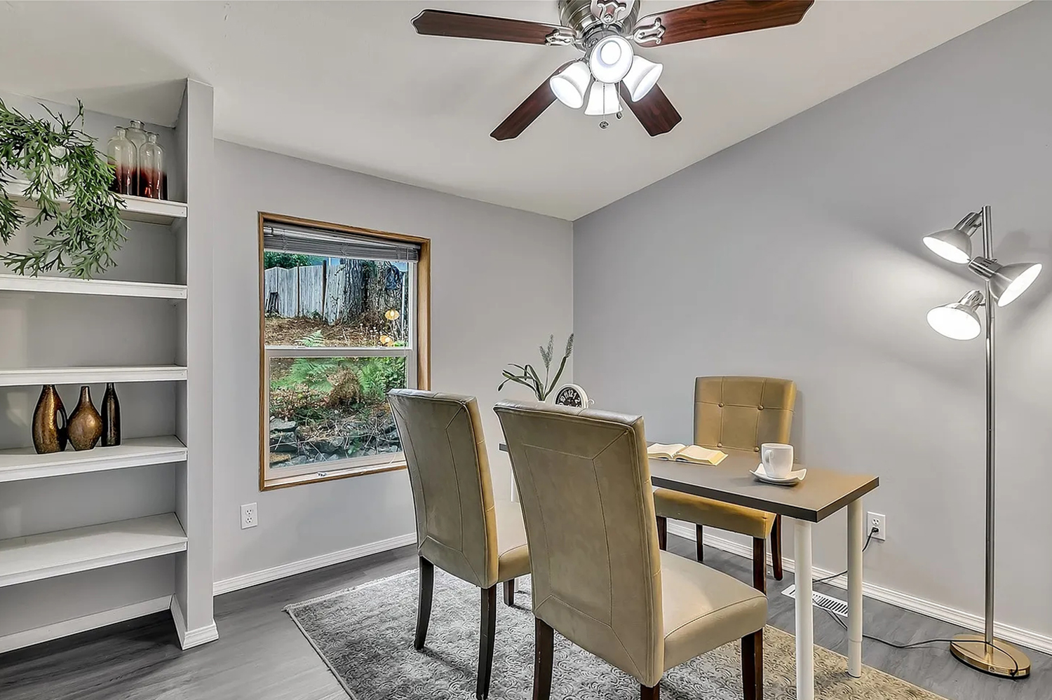
The home has a room marked as an office on the floor plan. In the photos, a small table and chairs make it a pleasant place to work, read, or sit with a guest. Built-in shelves give books and decor a home.
That flexibility is one of the plan’s best features. The room can support work from home without taking over the dining table. At another time, it could hold crafts, school supplies, or a hobby.
The room has a window, which makes the small space feel brighter. Pale walls and lean furniture also help. A big desk and tall, heavy cabinets could crowd it fast. Here, the open floor and shelves keep it useful.
When you plan a room like this, think first about what you do each day. Choose furniture for that task. Then leave room to change the setup later.
Design cues:
- A separate room for work or hobbies
- Built-in shelves for books and supplies
- A window that brings in daylight
- Light furniture that keeps the floor open
- A layout that can shift as needs change
14. A Guest Bedroom That Keeps Things Simple
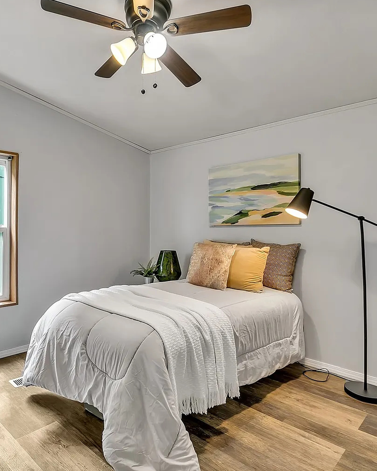
Another bedroom follows the home’s calm style. It has a bed, a ceiling fan, light walls, and warm wood-look flooring. A few soft pillows and one piece of art make it feel ready for a guest without crowding it.
The simple setup leaves room for choice. You could add a nightstand, a small dresser, or a desk, based on who uses the room most. That freedom matters in a home with several bedrooms. Each space can change with the people who live there.
The window gives the room a link to the outdoors. The pale walls help spread the light, while the floor adds warmth. These basic choices give the bedroom a clean starting point for any color scheme.
Design cues:
- A simple bed as the main feature
- Light walls and warm floors
- A window for daylight
- A ceiling fan for comfort
- Room to add storage or a desk
15. A Second Bath With an Easy, Warm Look
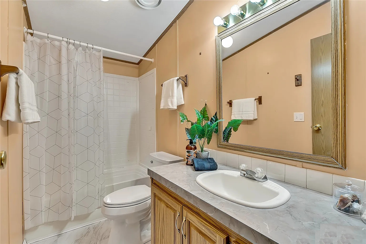
Another bath uses a wood vanity, a wide mirror, and a shower curtain. The wall color brings a warmer tone into the room. That small shift makes this bath feel distinct from the brighter one.
The layout puts the sink close to the shower and toilet, so the room stays compact and easy to use. A broad mirror helps it feel more open. The vanity gives space to store daily items out of sight.
This is a good example of how a simple bath can still feel welcoming. You do not need many colors or fancy fixtures. Keep the counter tidy, add a soft towel, and choose a shower curtain that works with the wood cabinet.
Design cues:
- A wood vanity for closed storage
- A wide mirror over the sink
- Warm wall color
- A simple shower curtain
- Clear counter space for daily use
16. A Laundry Room With Its Own Place
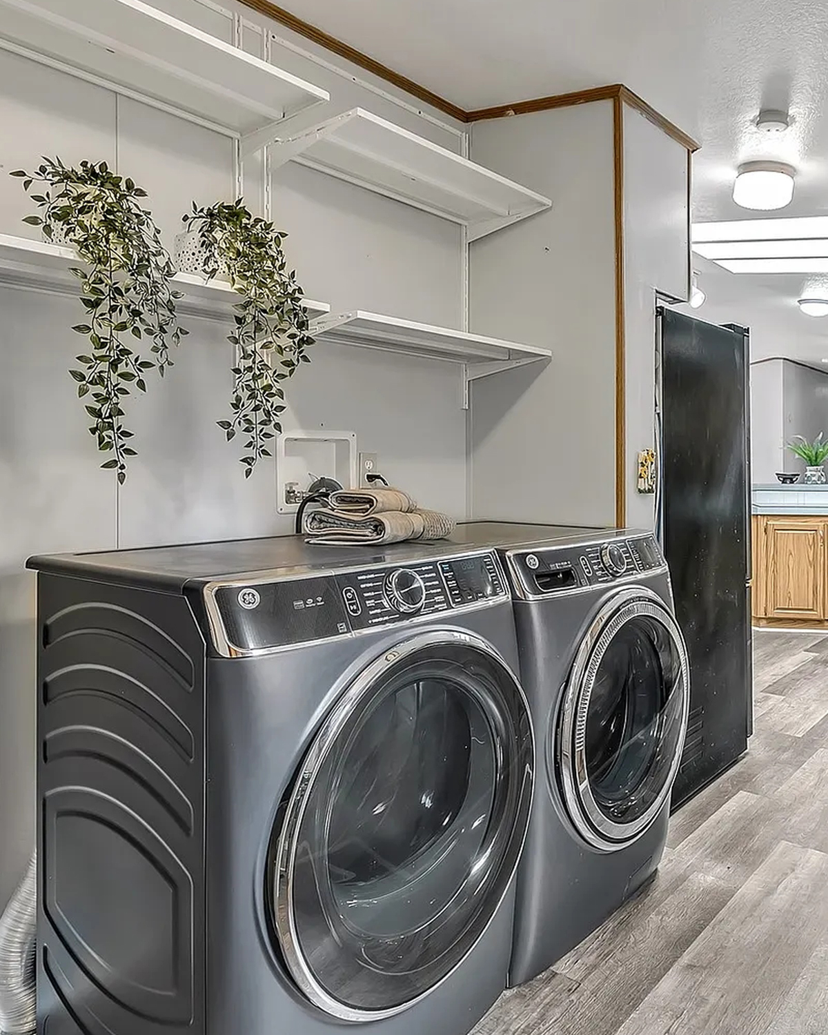
The laundry area has a dedicated spot near the kitchen side of the plan. In the photo, a side-by-side washer and dryer sit below open shelves. That makes it easy to store soap, baskets, and other supplies close at hand.
The room is narrow, but it uses the wall well. Shelves take storage up high, so the floor stays clear. A bit of greenery softens the useful setup and makes the space feel like part of the home.
The location also helps daily life flow. Laundry has its own zone instead of sitting in the middle of a bath or bedroom. When chores have a clear home, it is easier to keep the rest of the house neat.
If you want to borrow the idea, use baskets or bins on open shelves. They hide small items and make the shelves look calm. Keep the things you use most often within easy reach.
Design cues:
- Side-by-side washer and dryer
- Open shelves above the machines
- Baskets for small supplies
- A separate laundry zone near the kitchen
- A clear floor in a narrow space
17. A Floor Plan Built for Shared Time and Privacy
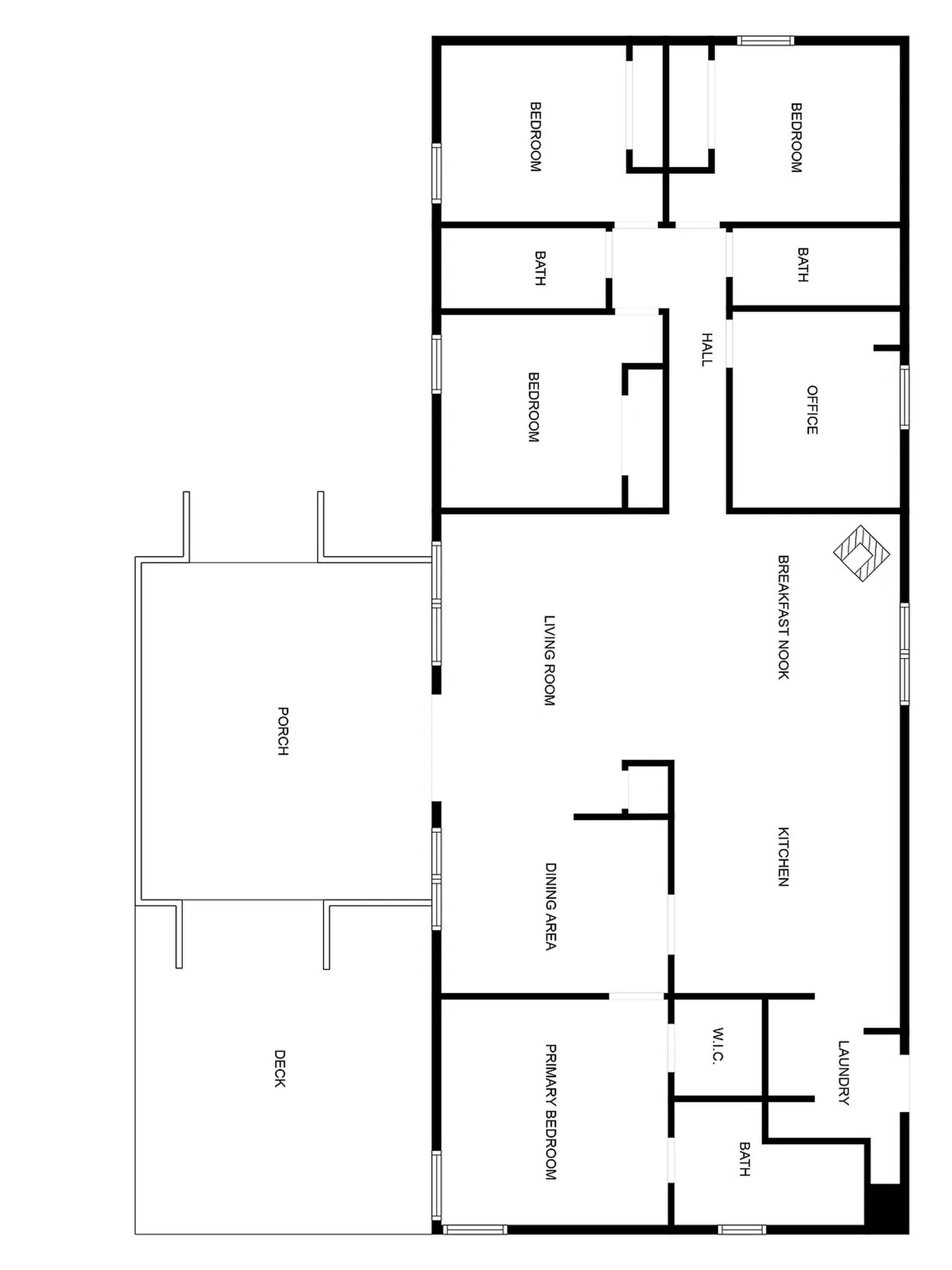
The floor plan helps explain why this home feels so open in the photos. The living room, dining area, breakfast nook, and kitchen form one large shared zone. The porch and deck extend that zone outdoors.
The plan labels four bedrooms, three baths, an office, laundry, and a walk-in closet. The primary bedroom sits at one end. Three other bedrooms and the office sit toward the opposite end, off a hall. This gives the main bedroom some distance from the busier side of the home.
That split can work well for many households. Guests or family members can have their own rooms, while everyone still meets in the center. The office adds one more place to work or enjoy a hobby without using a bedroom.
As with any floor plan image, check room sizes and door positions against the home itself before you make furniture or remodel plans. The big idea is clear, though: this layout gives plenty of space to gather and several spots to step away.
Design cues:
- Open living, dining, and kitchen areas
- Four bedrooms and an office shown on the plan
- Three baths for the household
- A primary suite set apart from the other bedrooms
- A porch and deck beside the shared living space
Conclusion
This double wide makes room for both busy days and quiet moments. The open living area brings people together, while the bedrooms and office offer space to unwind. Best of all, the deck extends daily life outdoors. It’s a home that uses color, light, and a smart layout to make every space count.