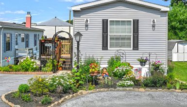
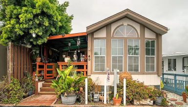
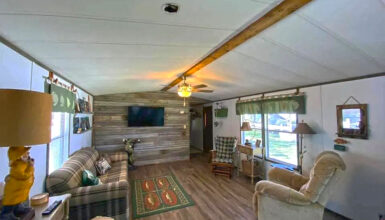
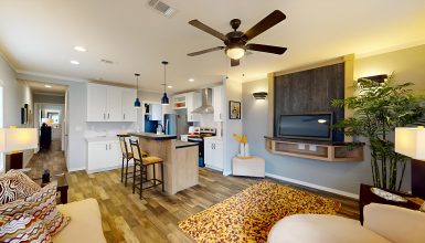
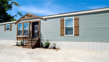
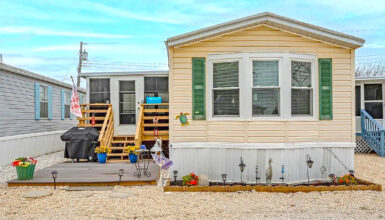
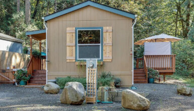
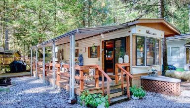
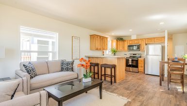
This mobile home stretches a neat 48 feet long and a snug 13 feet wide. It’s not just about being compact; it’s about embracing a lifestyle that values every inch of space.
In these 48×13 homes, cozy isn’t just a feeling—it’s a clever design strategy. The space is arranged to maximize comfort, minimize waste, and invite you to live larger within a smaller footprint. Every corner is crafted to serve a purpose, turning the idea of a simple home into a sanctuary that’s just right for relaxed living. It’s all about maximizing what you have and creating a charming and practical place. Let’s dive in!
Floor Plan
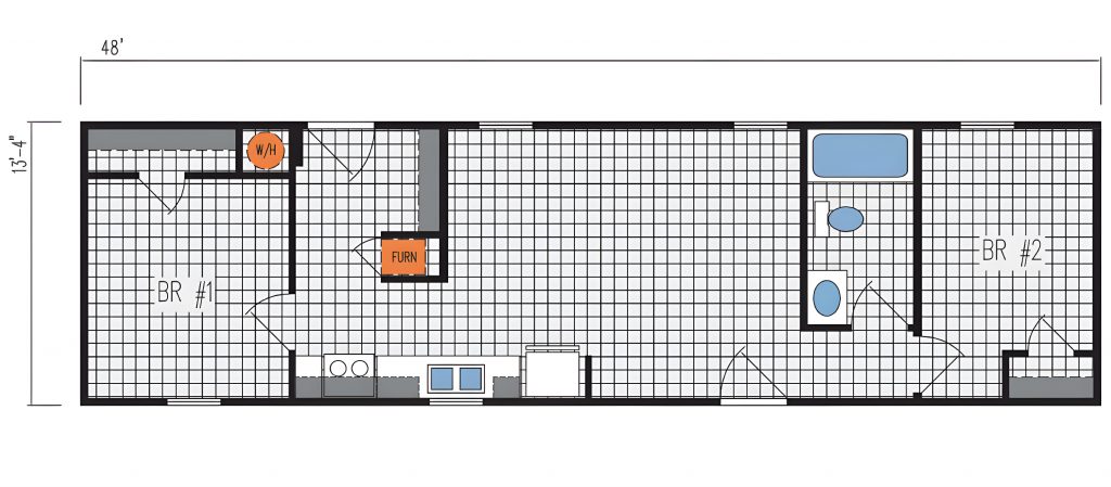
This snug single-wide mobile home stretches 48 feet by 13 feet and is cleverly fitted with everything you need. It’s designed with two bedrooms, BR #1 and BR #2, giving you the perfect spot to snooze away. The living room is bright thanks to two windows, making it an excellent spot for friends or just chilling out.
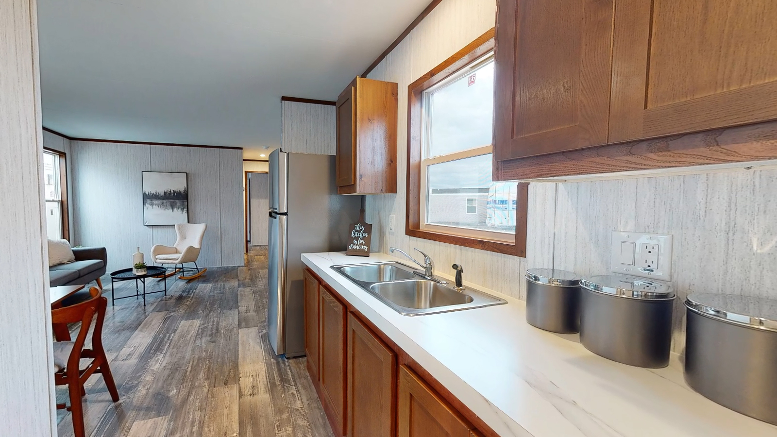
Right by the living room, the kitchen may be small, but it’s got it all—think double sink and places to stash your stuff. And don’t worry about the water heater; it’s out of the way, so you’ve got more room for what matters.
Need a bath? The bathroom is right through BR #2. It’s got you covered with full amenities and keeps things private.
And for those chilly days, the furnace is smartly placed right in the middle of the home for heat that hits every corner.
What’s cool here is how the place splits the hangout spots and sleep zones. This means you can host game nights or have quiet time whenever you want.
Living Room
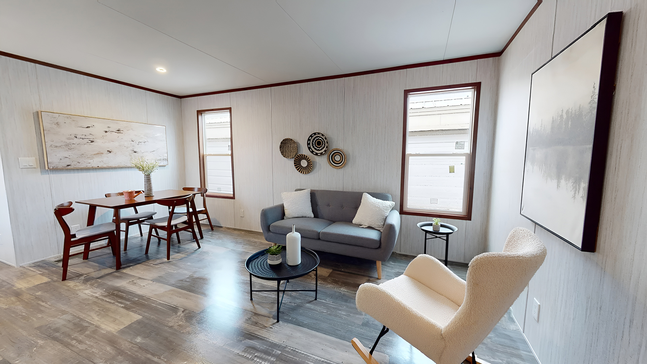
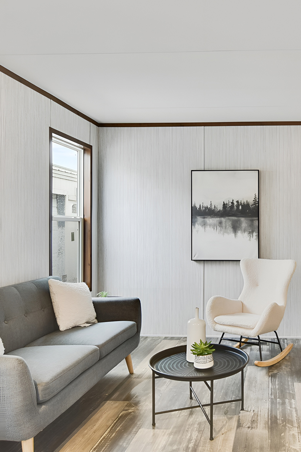
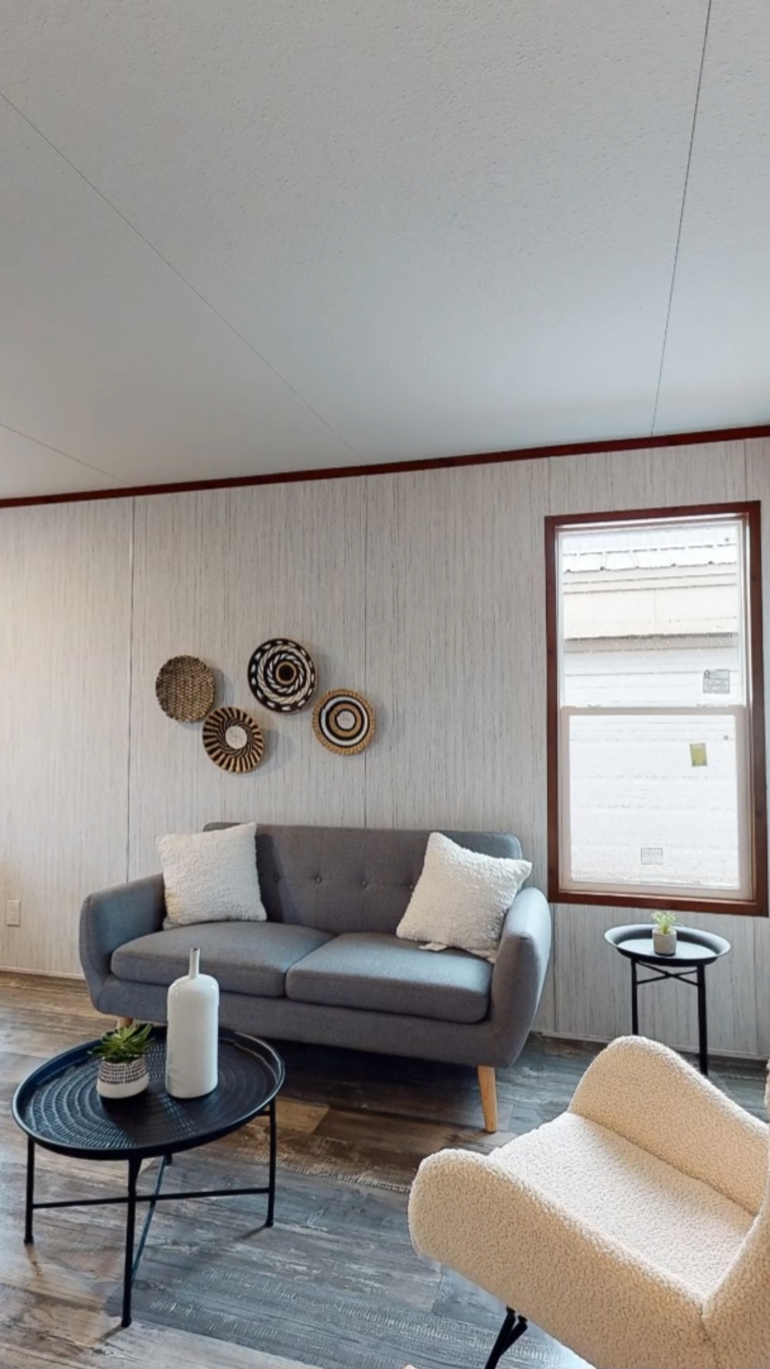
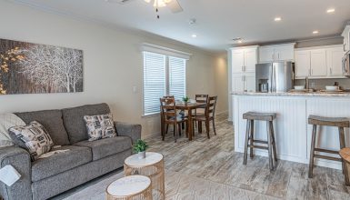
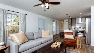
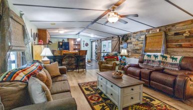
This sweet living room in a 48×13 single-wide mobile home is all about getting cozy without skimping on style. Picture this: floors that look like soft wood under your feet, setting the stage for some comfy furniture. There’s a neat gray couch and a fluffy white chair that screams, “Relax!” Plus, plenty of sunshine shines through the windows, and the dark trim looks sharp.
Now, let’s talk walls. They have some cool art that makes the dining spot look extra classy. Above the couch are these round baskets that pop off the wall and add fun vibes. The dining spot has a neat wooden table and chairs, which are great for meals or typing on your computer.
The way this room is set up is clever. There’s lots of room to walk around; it feels open and free. It shows that even a little space can be big on charm if you plan it right.
Kitchen and Dining Area
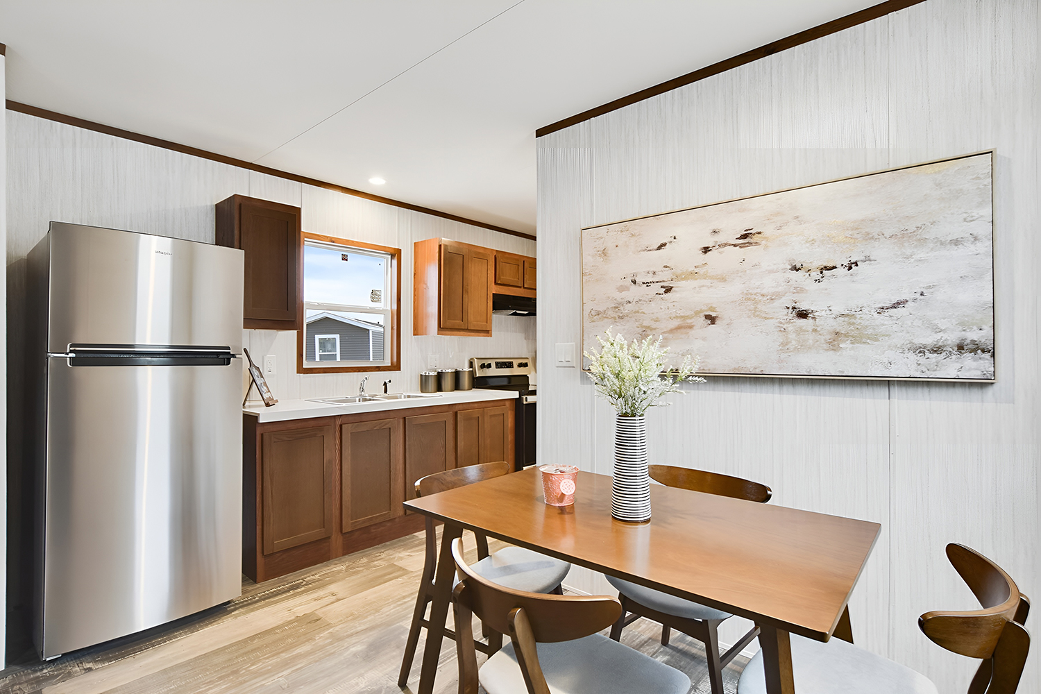
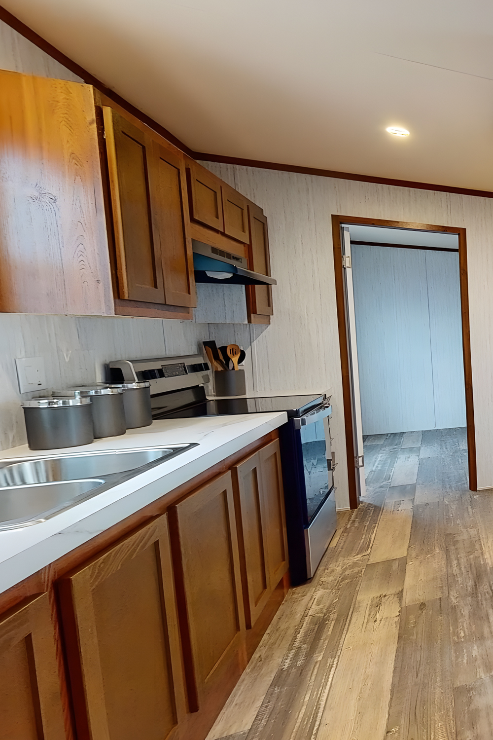
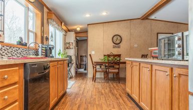
Check out the kitchen and dining space in this 48×13 mobile home—it’s where style meets smarts. The cabinets have this rich wood look and can hold all your pots and pans.
A shiny fridge and other modern appliances prepare this kitchen for action. There is a window over the sink, so you can daydream while doing dishes.
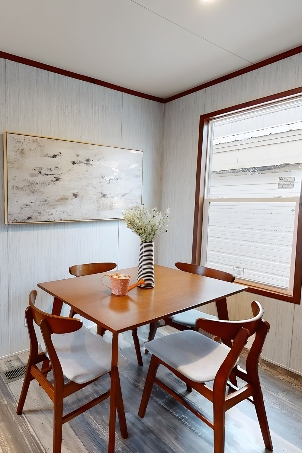
Next up, the dining area has a solid wood table with room for four to sit down and dig in. It’s the spot to enjoy your favorite meals or chat over coffee. And hey, there’s a vase with stripes and flowers on the table that spruces things up.
Don’t miss the big art piece hanging over the table. It’s got soft colors that go great with the kitchen vibe. This whole area shows you can have a good-looking space that does it all without feeling cramped. It’s got everything you need, plus a sprinkle of cozy and cool.
Bedroom
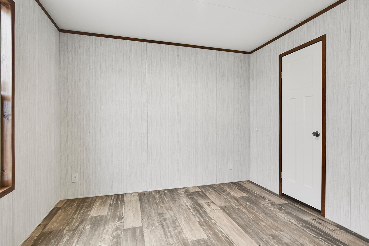
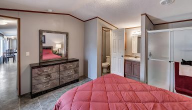
This bedroom in the 48×13 mobile home is like a fresh start for your decorating ideas. The walls have this cool, subtle pattern that gives the room some oomph without being too much. Around the edge, there’s trim in a darker shade that makes the whole thing pop.
Down below, the floor has different shades of wood that look both homey and hip, and it’s tough enough to handle day-to-day life. The room’s got a big window and a door, so you get lots of light and a breeze when you want it. Now, all it needs is whatever you want to make it yours. Throw in a soft bed, a corner to curl up with books, or a spot for your crafty side. It’s a chill place ready for anything, a little nook just for you.
Bathroom
Lastly, the bathroom in this 48×13 mobile home keeps things nice and simple but with some neat details. Everything’s white—the sink and the tub—make the place look clean and bright. These dark wood cabinets under the sink stand out and give you room to hide your towels and stuff. Plus, this mirror cabinet bounces around the light and keeps your toothpaste at arm’s reach.
There’s also a cool picture on the wall that makes you feel like you’re outdoors. And the floor is just right – it looks good with everything and is a breeze to keep clean. This bathroom shows you can have a little spot that’s big on looks and smarts, even when you’re not working with a lot of space.

