
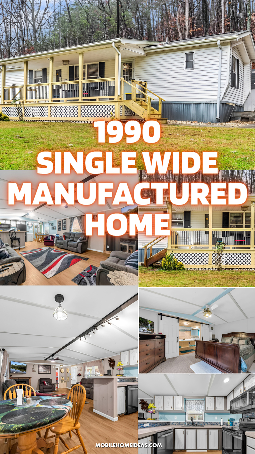
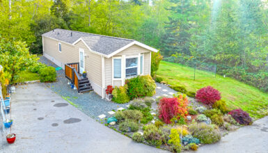
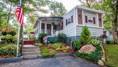
Think a 1990 single wide mobile home cannot feel charming, spacious, and full of personality? This home says otherwise. From the wide covered front porch to the open living area and the surprisingly stylish bathroom, every space feels warm, practical, and inviting. If you love smart mobile home updates that make an older home feel fresh and welcoming, this one is packed with ideas worth saving.
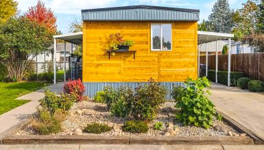
A Front Porch That Changes Everything
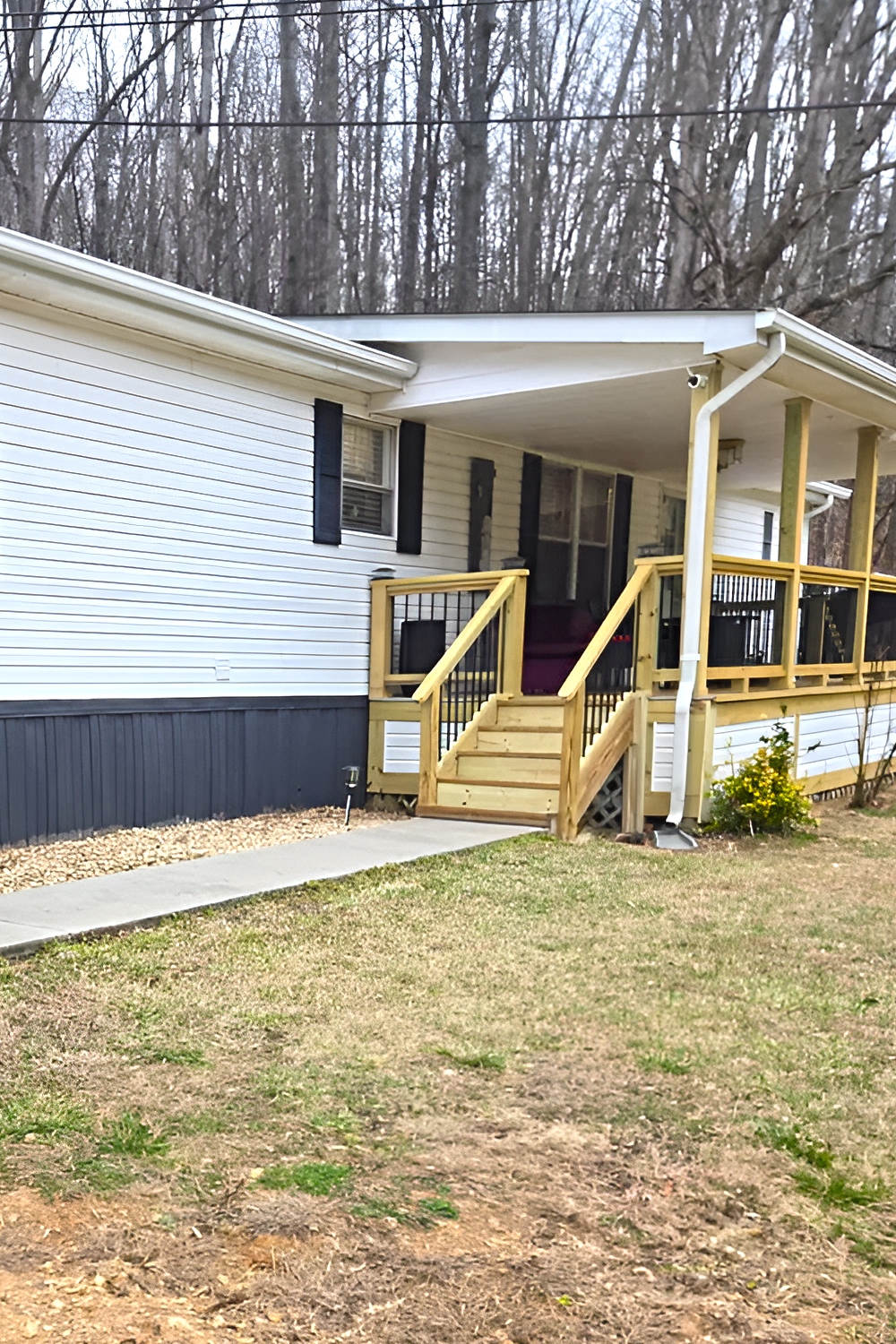
The most eye-catching feature on the exterior is, without question, the porch.
This is the kind of addition that can completely shift how a single wide mobile home feels from the street. Without it, the home might read as simple and straightforward. With it, the house feels warmer, larger, and more inviting. It gives the front elevation depth. It creates a clear entry moment. And it adds the kind of everyday outdoor living space that makes a home feel more personal.
The porch stretches across a large portion of the front facade, which helps balance the long horizontal shape of the home. That matters because single wides can sometimes look visually flat from the outside. Here, the strong porch line breaks that up. The posts create rhythm. The railing adds structure. And the stairs bring a natural focal point to the entrance.
Another smart detail is the roof over the porch. Because it is covered, the space feels usable in more kinds of weather. It also helps the porch feel like a true outdoor room instead of just a platform at the front door. That one move adds comfort and function at the same time.
Design cues to borrow:
Use a long covered porch to give a single wide more presence and dimension. Keep the structure simple and sturdy. Then let the porch become both a design feature and a lifestyle feature.
Fresh Wood and Black Railing Create Contrast
One of the best exterior choices here is the contrast between the natural wood porch framing and the black railing accents.
The light wood feels clean, fresh, and practical. It brings warmth to the pale siding and adds a casual, updated look without trying too hard. At the same time, the black vertical balusters sharpen the design. They give the porch a more current feel and stop it from looking too plain.
That mix works especially well on a modest home like this. If every part of the porch had been finished in the same material and color, the result might have looked flat. Instead, the dark railing lines create visual movement. They also tie in nicely with the black shutters on the home, which helps the whole exterior feel more cohesive.
This is a great lesson in how contrast can lift a simple design. You do not need ornate trim or expensive finishes. You just need a few elements that balance each other well.
Design cues to borrow:
Pair natural wood with black metal-style railing for a cleaner, more updated porch design. Repeat the black tone in shutters or light fixtures so the look feels connected.
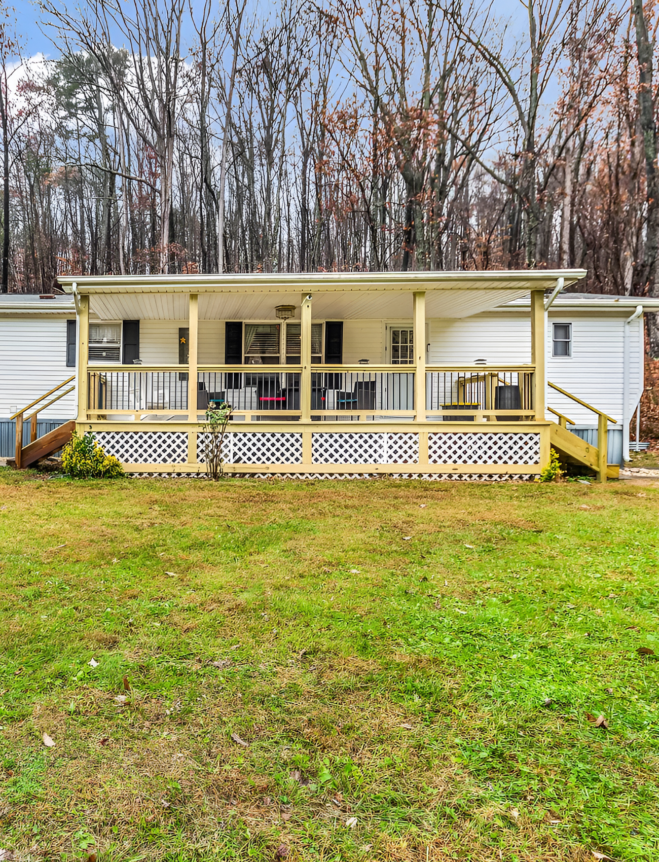
A Gentle Color Palette Keeps the Exterior Timeless
The exterior palette is soft and approachable. Light siding, black shutters, white trim, and natural wood all come together in a way that feels easy on the eyes. Nothing feels harsh. Nothing feels trendy in a way that will date quickly.
That is important for a home like this because the goal is not to fight the structure. The goal is to make it look cared for, balanced, and comfortable. This palette does exactly that.
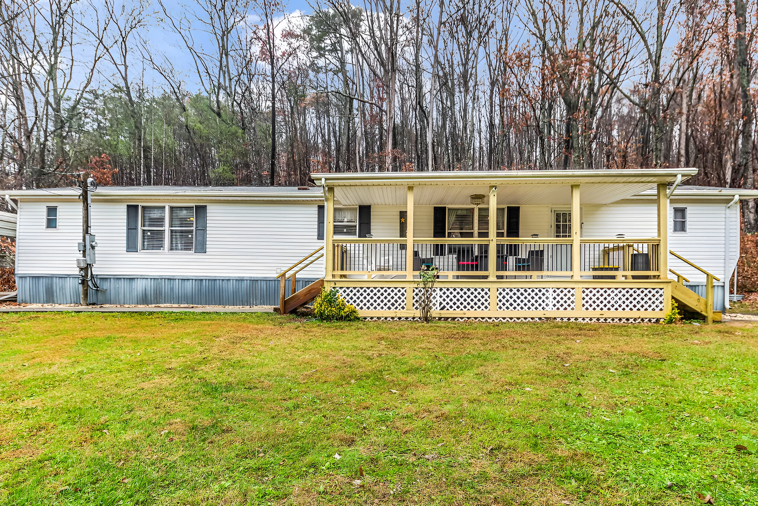
The pale siding also helps the porch stand out more clearly. Since the house itself stays neutral, the new porch becomes the star. Meanwhile, the dark shutters frame the windows and give the facade just enough contrast to keep it from feeling washed out.
The result feels classic and practical. It suits the wooded setting. It also makes the home feel brighter and cleaner from the curb.
Design cues to borrow:
Choose light neutral siding with dark accents if you want a single wide to feel timeless and crisp. Then use warm wood to soften the look and make it more welcoming.
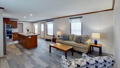
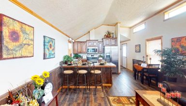
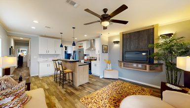
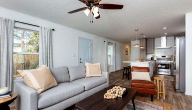
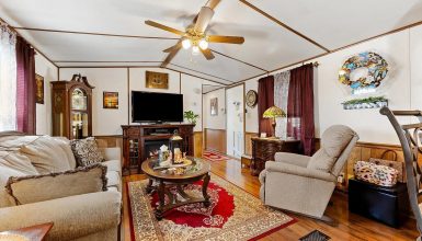
An Open Living Area Makes the Home Feel Bigger
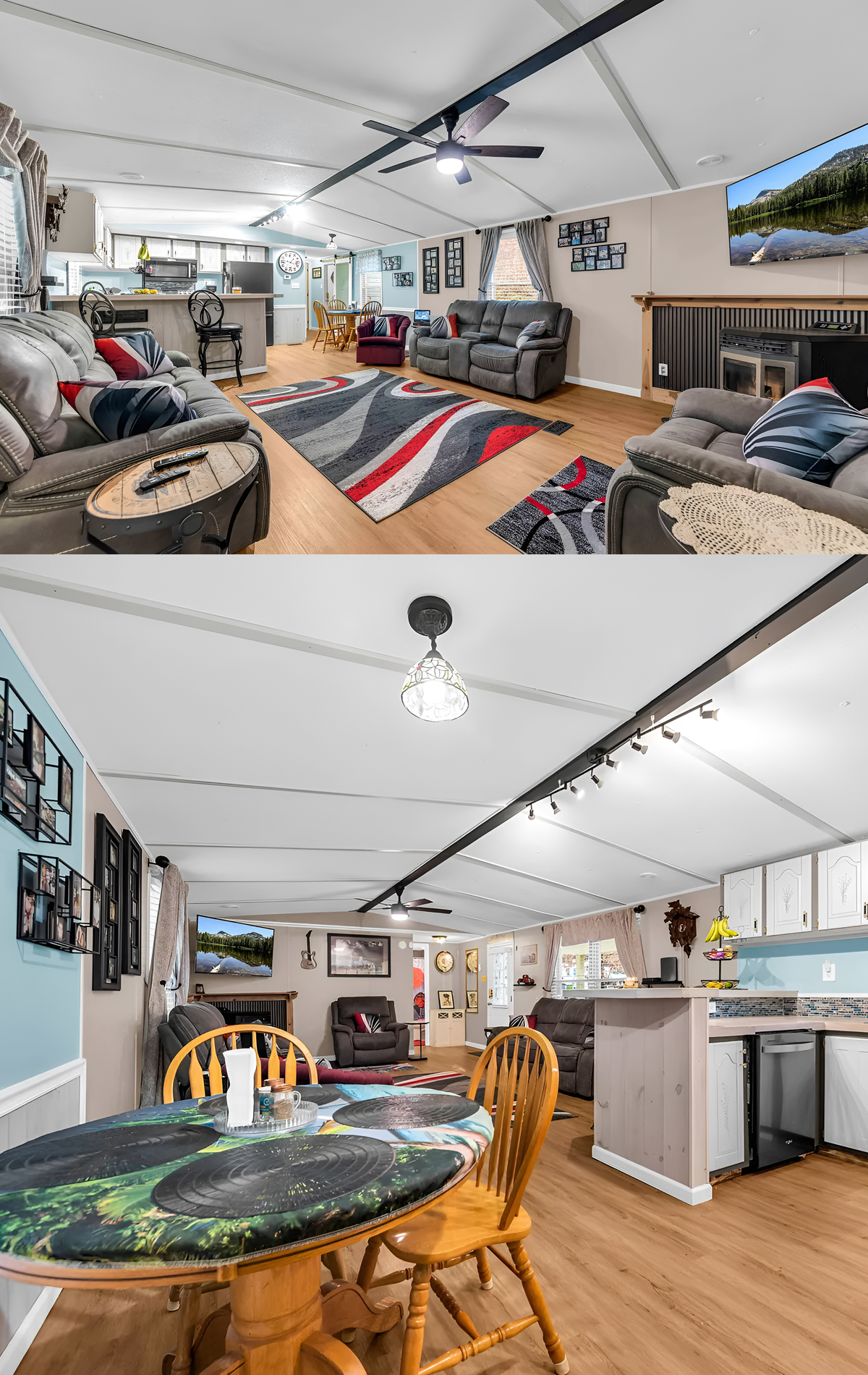
Inside, one of the strongest design moves is the open main living area.
The living room, kitchen, and dining area all flow together, which helps this single wide feel much larger than its footprint suggests. Instead of chopping the space into tight little rooms, the layout allows sightlines to stay open. That gives the interior more air, more light, and more flexibility.
This is one of the smartest ways to make an older mobile home feel updated. Even when walls stay in place, the feeling of openness can come from visual continuity. Here, the same flooring runs through the shared spaces. The ceiling line stays uninterrupted. And the furniture placement leaves plenty of space for movement.
The result is comfortable and easy. You can imagine family life unfolding here naturally. People can relax in the living room, sit at the dining table, or gather around the kitchen bar without feeling disconnected.
Design cues to borrow:
Use one flooring material across connected living spaces to make a small home feel larger. Keep sightlines open and avoid overcrowding the room with too much furniture.
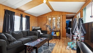
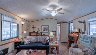
The Living Room Feels Spacious, Casual, and Family-Friendly
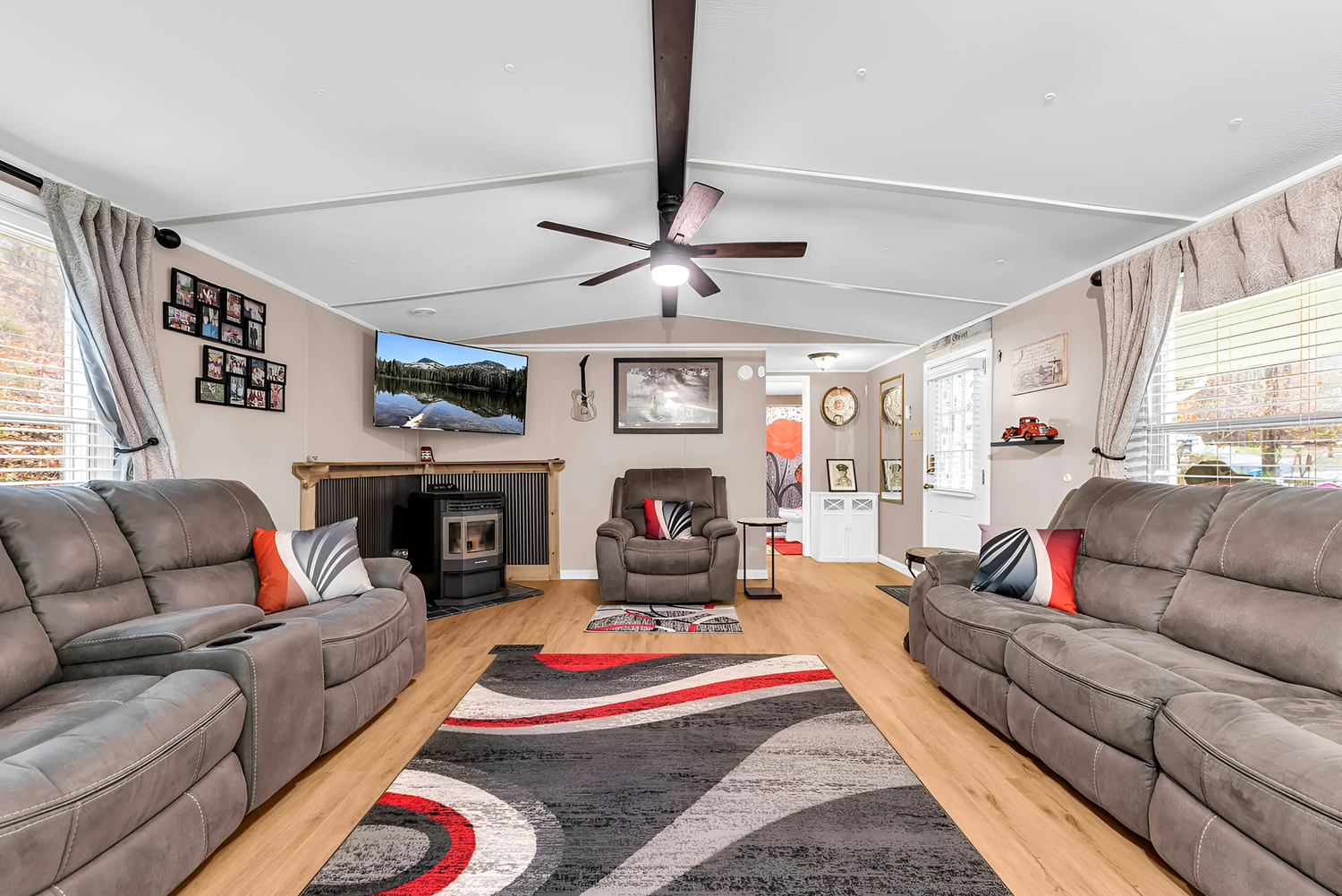
The living room is one of the most surprising parts of the home because it feels genuinely roomy.
That sense of space comes from several smart details. First, the furniture is scaled to fit the room without blocking circulation. The sofas and chairs create a clear conversation zone, yet there is still open floor area around them. Second, the large area rug helps anchor the seating arrangement and define the room without closing it in. Third, the light flooring and pale walls keep the room from feeling heavy.
The ceiling details help too. The dark center beam adds visual length and draws the eye across the room. The ceiling fan brings function and creates a central focal point overhead. Together, they make the space feel more designed.
There is also a comfortable, lived-in quality here that matters. This room is not staged to look untouchable. It looks like a place where people gather, watch television, talk, and unwind. That is part of its charm.
The soft gray seating works well with the neutral walls, while the red and black accents in the rug and pillows give the space a little energy. It is not a complicated palette, but it keeps the room from feeling flat.
Design cues to borrow:
Choose a neutral sofa set in a medium tone if you want a practical living room that still feels polished. Add one bold rug with a few accent pillows to bring movement and color into the space.
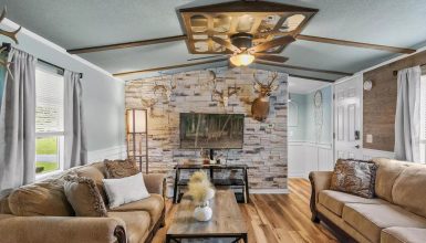
A Fireplace Wall Adds Character
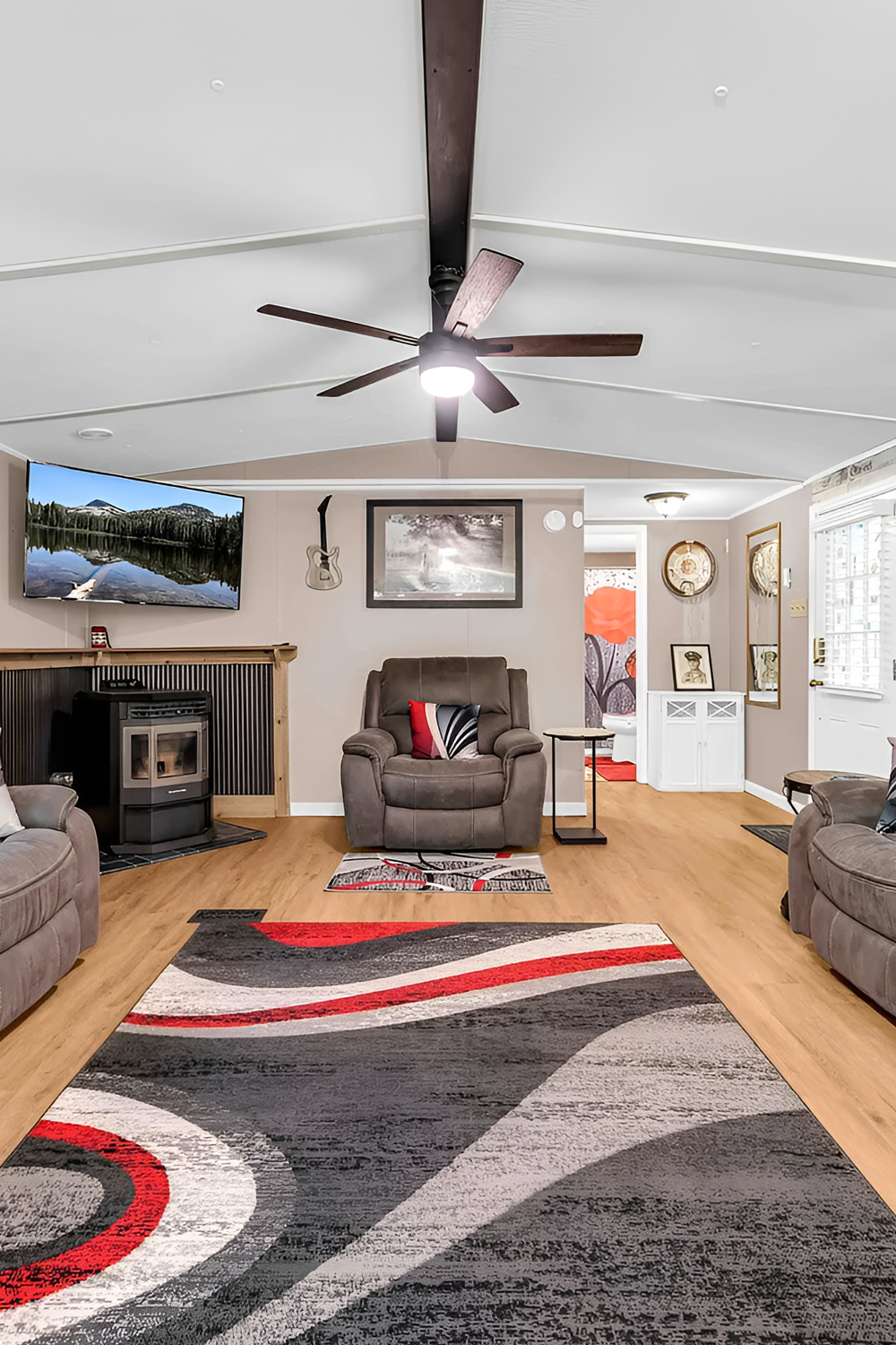
The fireplace wall gives this living room something many modest homes need: a focal point.
Without it, the room might feel like one long open box. With it, the seating arrangement has a visual anchor. The fireplace adds warmth in both a literal and visual way. It also gives the room a stronger sense of purpose and coziness.
The surrounding detail is simple, yet effective. The contrast between the wood trim and darker inset creates definition. The television above turns the wall into an entertainment zone. And the centered chair nearby helps the arrangement feel balanced.
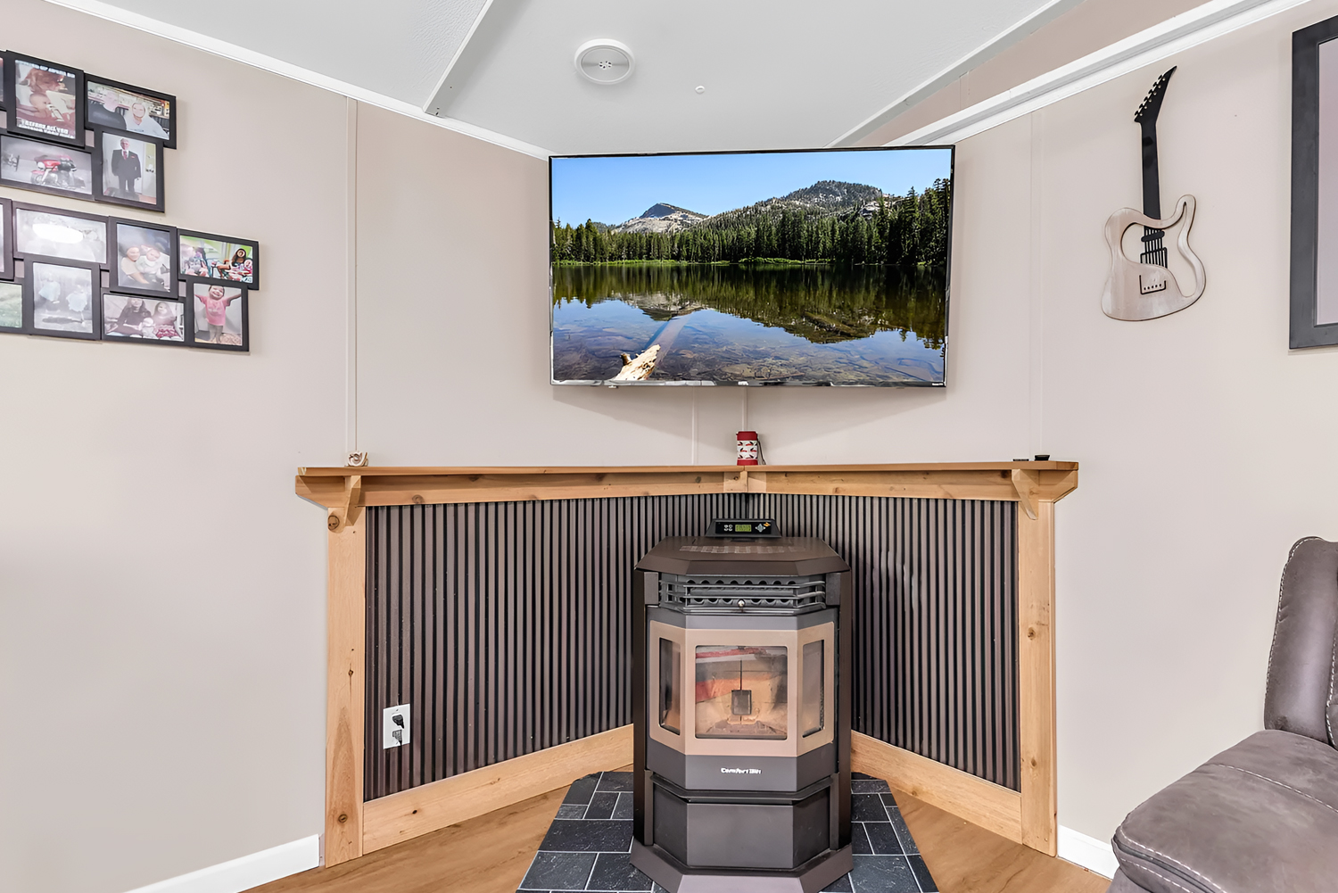
This is a good example of how even a compact feature can make a room feel more finished. A focal wall tells the eye where to land. In open layouts, that matters a lot.
Design cues to borrow:
Create one clear focal point in an open living room. It could be a fireplace, a media wall, or a feature cabinet. Use it to organize the furniture around it.
The Kitchen Feels Cheerful and Functional
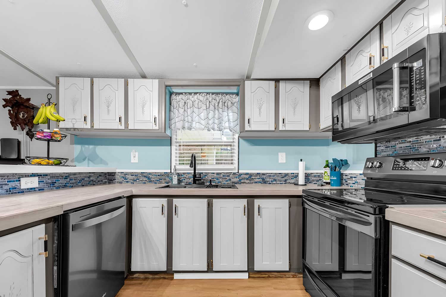
The kitchen has an upbeat, practical charm that suits the home very well.
The first thing that stands out is the color. The soft blue wall tone brightens the room and keeps it feeling fresh. It brings personality without overwhelming the space. Since the cabinetry is white, the blue reads as light and clean rather than loud.
The cabinets themselves have a traditional look, which fits the age and style of the home. But because they are painted in a bright finish and paired with updated counters and backsplash, they still feel cared for and inviting. The dark appliances add contrast and ground the room visually.
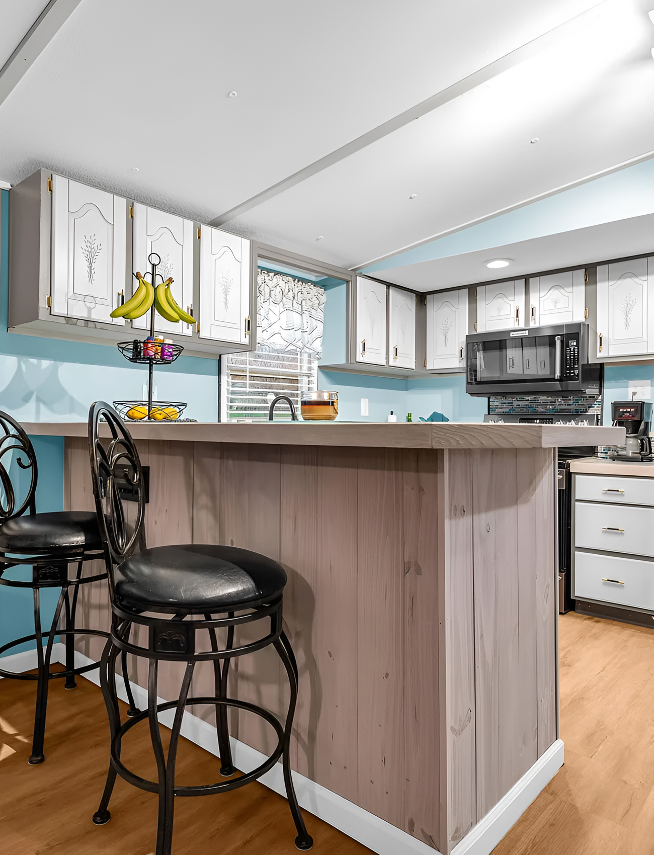
Then there is the peninsula. This is one of the most useful features in the entire home. It creates a casual spot for eating, chatting, or serving food. It also helps separate the kitchen from the living area without closing either one off. That is a big win in a single wide.
The track lighting above the kitchen zone also helps define the space. It adds needed task lighting and subtly marks the transition from living room to kitchen.
Design cues to borrow:
Use cheerful paint on the walls if your cabinets are neutral. Add a peninsula or breakfast bar whenever possible, because it adds function, storage potential, and visual structure.
The Dining Area Keeps Things Bright and Relaxed
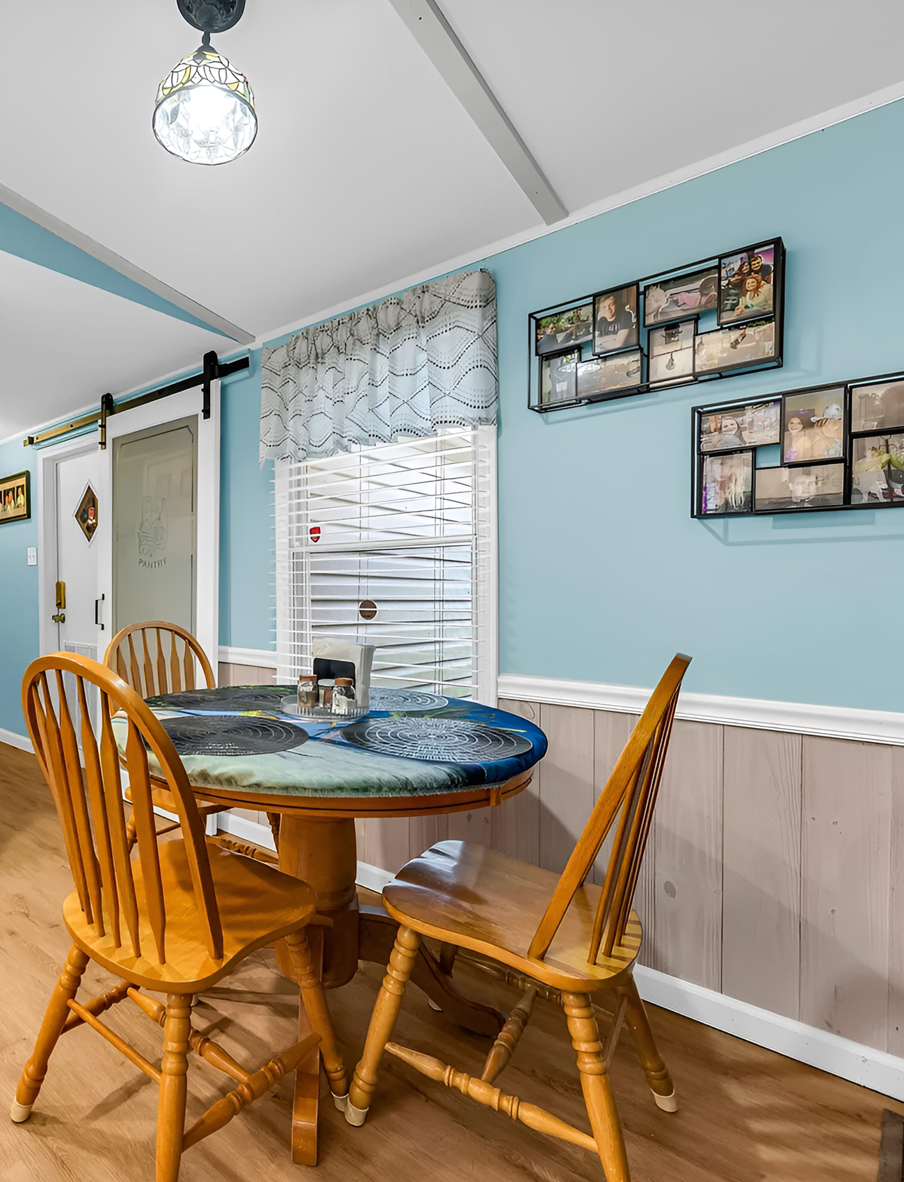
The dining area may be small, but it works well because it feels open and cheerful.
The round table is a smart choice. In a compact area, a round table often feels easier than a rectangular one because it softens the corners and improves movement around the room. The wood chairs bring warmth and keep the space casual.
Again, the blue wall color helps. It gives the dining area its own personality while still connecting it to the kitchen. The white trim and lower wall treatment add a little detail and make the room feel more finished.
This part of the home shows how smaller dining spaces can still feel pleasant and intentional. You do not need a huge formal table to create a nice place to gather. You just need the right scale and enough lightness in the room.
Design cues to borrow:
Choose a round dining table for tighter spaces. Use wall color and trim to make the dining nook feel special, even if it sits within a larger open-plan room.
Consistent Flooring Unifies the Main Spaces
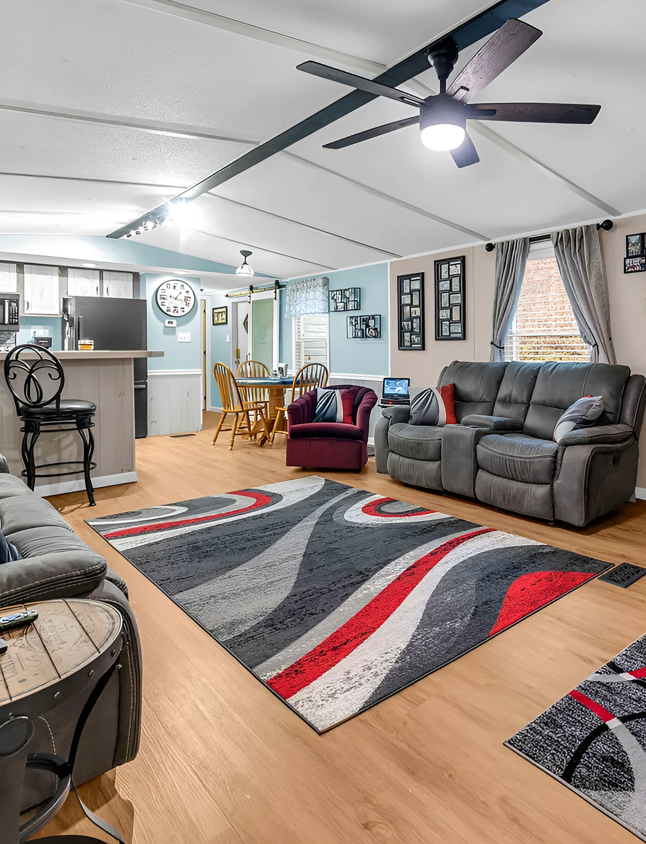
One of the strongest visual decisions in this home is the flooring.
The wood-look floor runs through the main shared spaces and does a lot of quiet work in the background. It makes the living room, kitchen, and dining area feel connected. It also adds warmth that balances the cooler wall tones in the kitchen and dining area.
This kind of flooring is especially helpful in older mobile homes because it creates instant continuity. Instead of seeing each area as a separate zone, your eye reads the whole space as one bigger environment. That makes the home feel calmer and more updated.
The tone of the floor also lands in a nice middle range. It is warm, but not orange. It is natural-looking, but not too rustic. That flexibility helps the different rooms relate to one another.
Design cues to borrow:
Use one warm wood-look floor throughout the main areas of a smaller home. It helps the layout feel seamless and gives the whole interior a more current look.
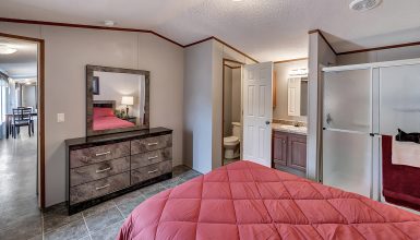
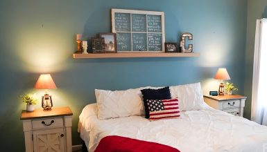
The Bedroom Feels Calm and Surprisingly Generous
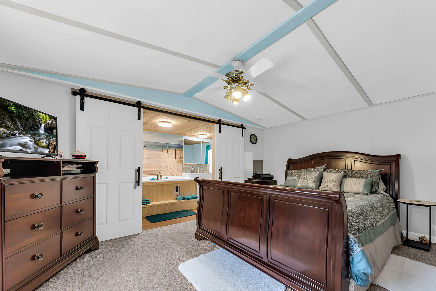
The bedroom stands out for its size and simplicity.
There is enough room here for a large sleigh bed, nightstands, and a dresser without the space feeling cramped. That alone gives the room a more comfortable, upgraded feel. Many older single wide bedrooms feel tight. This one feels breathable.
The neutral wall color keeps the room calm. The carpet underfoot adds softness and warmth. The dark wood furniture grounds the room and gives it a more traditional, established feel. Then, the sliding barn-style doors leading to the bath area add a more updated touch.
Another good detail is the uncluttered look. The room does not rely on lots of decor to feel complete. Instead, it lets scale and layout do the work. That is often the smartest move in bedrooms. Too many accessories can make the room feel busy. This space keeps things clean and restful.
Design cues to borrow:
In a bedroom, focus on clear floor space, warm textiles, and furniture that fits the room well. A calm layout often feels more luxurious than extra decoration.
The Bathroom Becomes a Surprise Showpiece
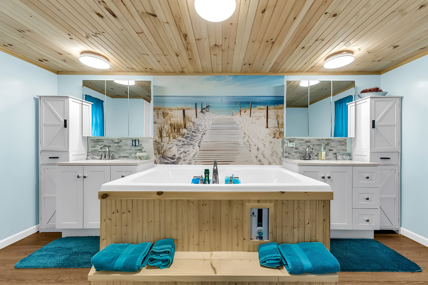
The bathroom is, without question, one of the most memorable parts of this home.
At the center is a large soaking tub with a wood-clad surround and a built-in bench. That feature instantly makes the space feel more special and more custom. In many mobile homes, bathrooms are purely practical. Here, the bathroom tries to create an experience.
The symmetry helps a lot. Matching vanities on both sides create balance. The mirrors make the room feel bigger. And the large beach mural at the back wall gives the whole space a focal point that adds depth and personality.
Then there is the ceiling. The wood plank finish overhead warms up the room beautifully. It softens the cooler blue walls and white cabinetry and makes the bathroom feel more like a retreat. The bright blue towels and curtains tie back to the wall color and give the room a cheerful, coastal energy.
This bathroom is a great example of how one bold idea can elevate a home. The tub zone turns a functional room into a standout feature.
Design cues to borrow:
If you want an older bathroom to feel memorable, create one strong focal point. That could be a soaking tub, a statement wall, or a dramatic vanity setup. Then use symmetry to make the room feel polished.
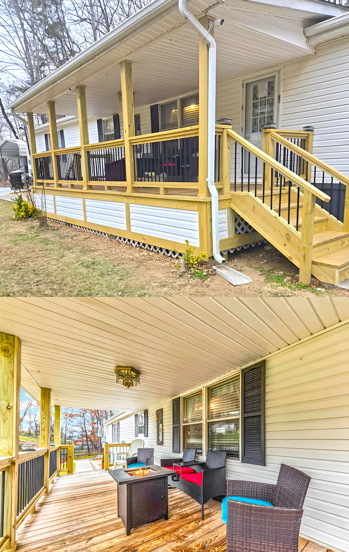
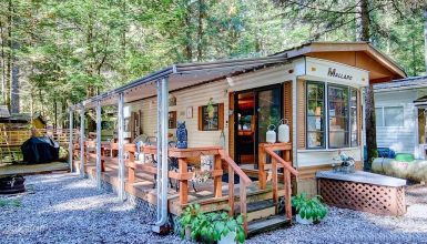
The Covered Porch Extends the Living Space Outdoors
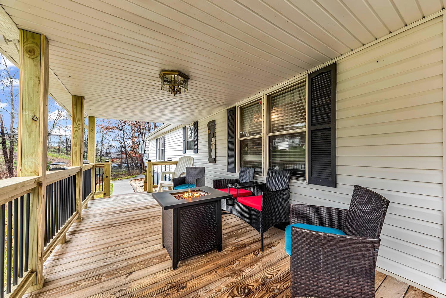
Back outside, the porch deserves one more look because it does more than improve curb appeal. It also expands the way the home can be used.
The furniture arrangement shows how this porch can work as a true outdoor lounge. There is room for seating, a fire feature, and conversation. Because the porch is deep and covered, it feels protected and comfortable rather than exposed.
That makes this space especially valuable for a single wide. When indoor square footage is limited, outdoor living space becomes even more important. A good porch gives the home another room, even if it is not enclosed.
The stained deck boards also add richness and texture. Compared to plain concrete steps or a narrow stoop, this porch feels generous and inviting.
Design cues to borrow:
Treat a front porch like an outdoor living room. Add seating, a small table, and layered texture so the space feels intentional and useful.
Conclusion
This 1990 single wide mobile home proves that simple design choices can make a huge impact. The large porch adds curb appeal and outdoor living space. The open layout makes the interior feel bigger. The mix of warm flooring, cheerful color, and comfortable furniture gives the whole home an easy, lived-in charm. Altogether, this home feels cozy, functional, and full of inspiration for anyone planning a single wide makeover.