Mobile homes from 1957 have a unique charm. Picture this: it’s the era of rock ‘n’ roll and classic cars. People are looking for smart ways to live comfortably and still be free to move around. This is where the ’57 mobile home shines. It’s not just a cozy place to live; it’s a slice of American history. Each one tells a story of how we lived back then and what home felt like in a time so different from our own. It’s like stepping into a time machine, with all the comforts of home rolled into one neat, movable package. Let’s dive into this cozy 1957 single wide mobile home with 1 bed and 1 bath.
Exterior
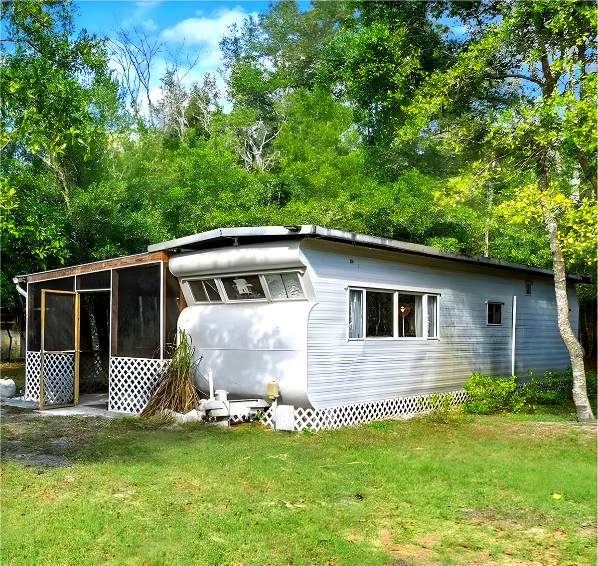
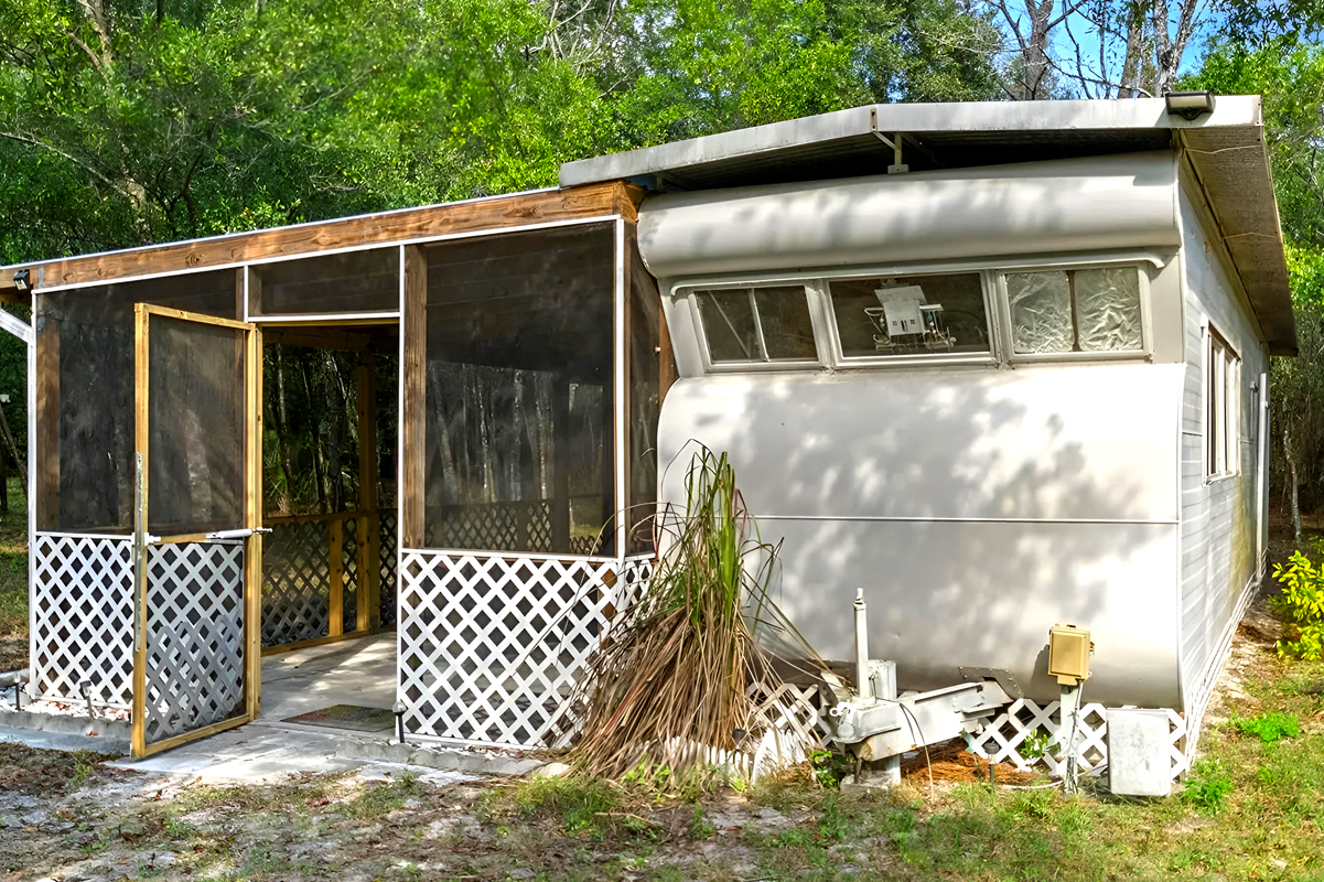
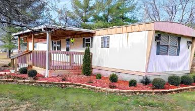
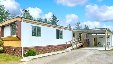
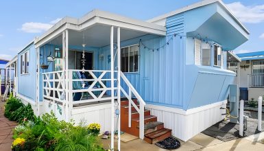
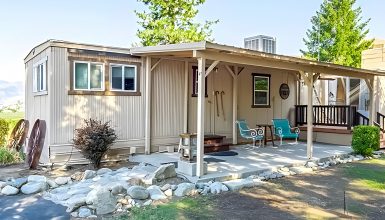
The exterior of this mobile home from 1957 has a cool, old-timey look. The roof curves like you’d see on travel trailers from back then. It’s strong and has stood the test of time. The sides are made of a light, tough metal that’s good for all kinds of weather.
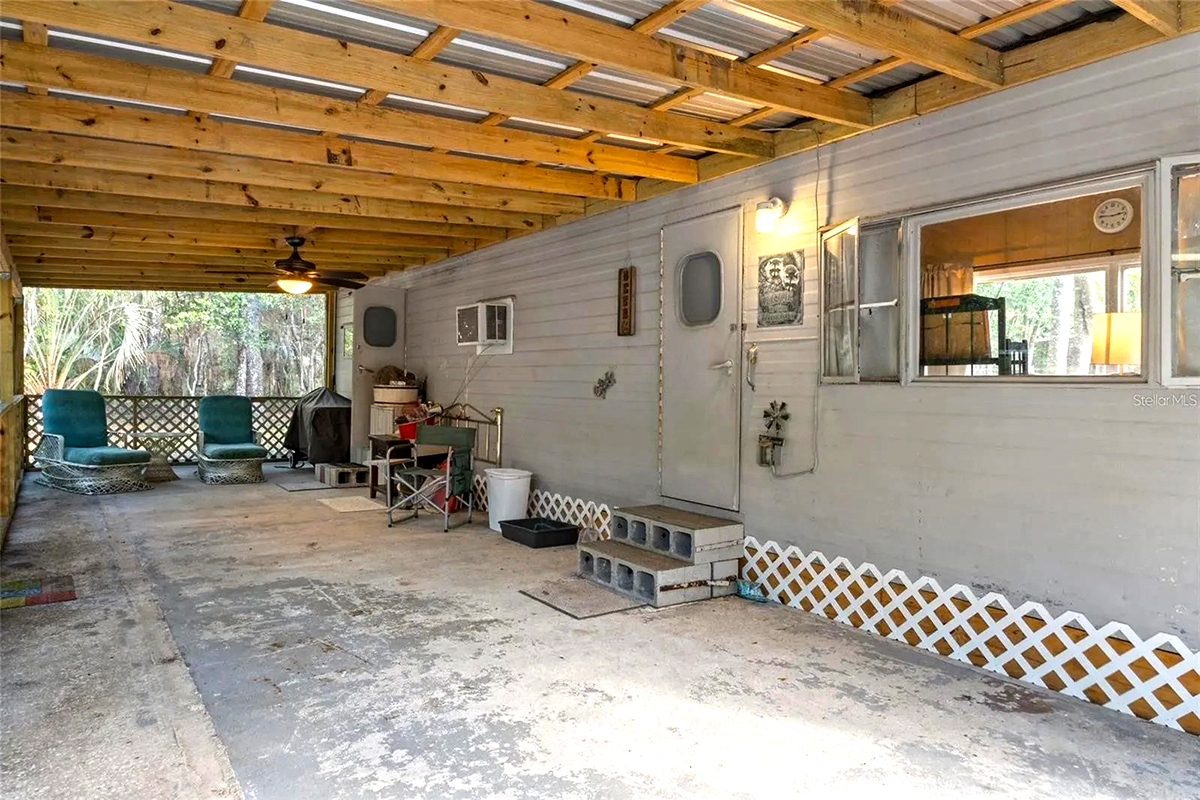
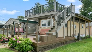
There’s a porch with screens added to the side. It’s smart to make more room to hang out and keep bugs out. The white criss-cross pieces you see could hold up plants if you want to grow some.
See the white tank on the left? That means the house uses gas for heat or cooking. The bottom part of the house covers the wheels, which makes it look like it’s not going anywhere and keeps the cold out.
This mobile home really takes you back and shows how these homes were built to last and have been made even better over time. They’re still great places to live.
Living Room
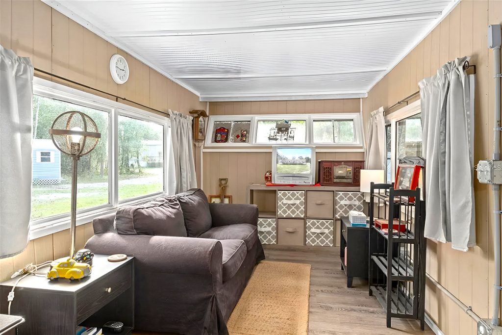
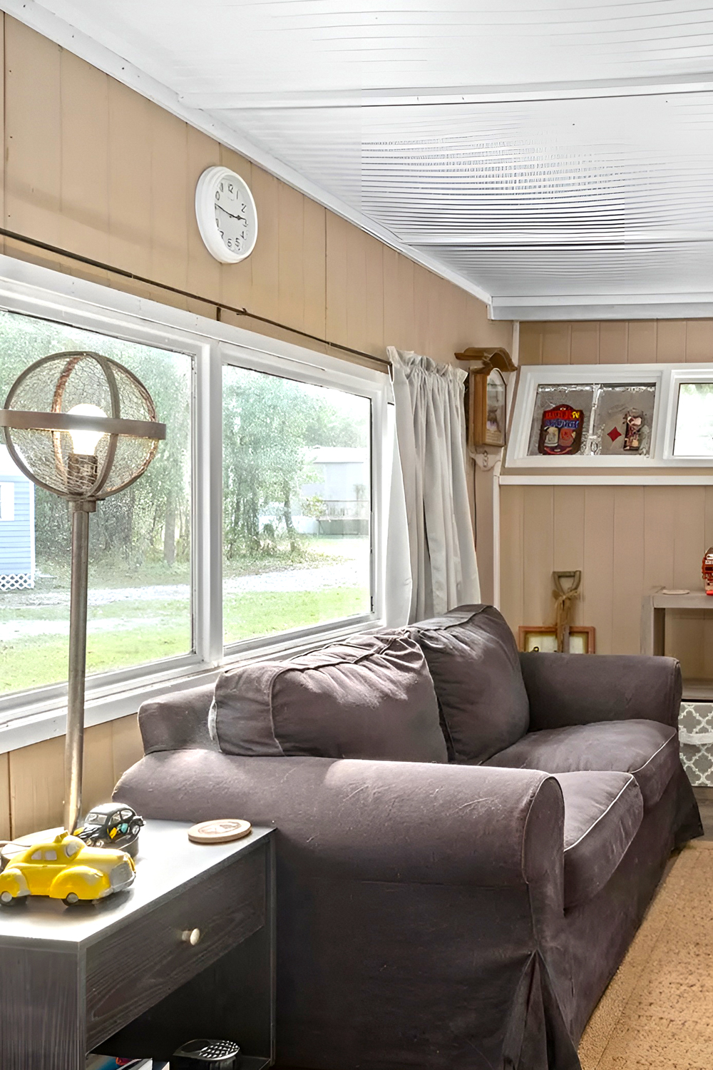
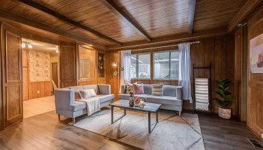
Take a peek inside this living room from a 1957 mobile home. It’s the kind you’d see back in the day, snug and smartly laid out. The place mixes old-school cool with what we need today.
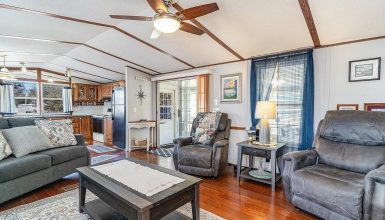
The ceiling has these neat white panels, making the room look bigger and brighter. That’s a neat trick for a smaller room.
The walls are a soft beige, a good match for the darker couch and stuff. It makes the room feel warm and cozy. Big windows let in a lot of sunlight, making the room feel bigger. You can close the curtains to keep things private or block out too much sun.
The sofa is big, comfy, and looks newer, standing against the light walls and floor. And speaking of the floor, it’s got this wooden look that’s tough and easy to clean.
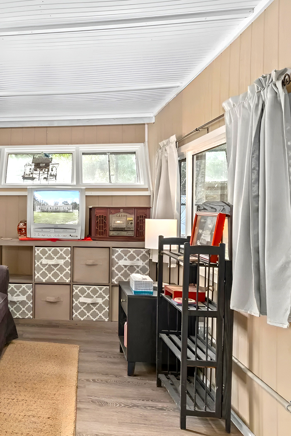
They’ve found a sweet spot between keeping things and showing them off. There’s a shelf with an old-timey radio and knick-knacks, and below that are boxes with patterns for hiding away your things.
A cool lamp over on the left has a real 1950s vibe and lights up the place. And a tiny table with an old yellow phone is pretty neat.
Over on the right, there’s more space to put stuff on the shelves. It goes to show in a little room, you’ve got to think about using the space up high.
This living room is a smart mash-up of the 1950s style and what’s handy now. It feels both classic and comfy, showing how these older homes still rock for today’s living.
Kitchen
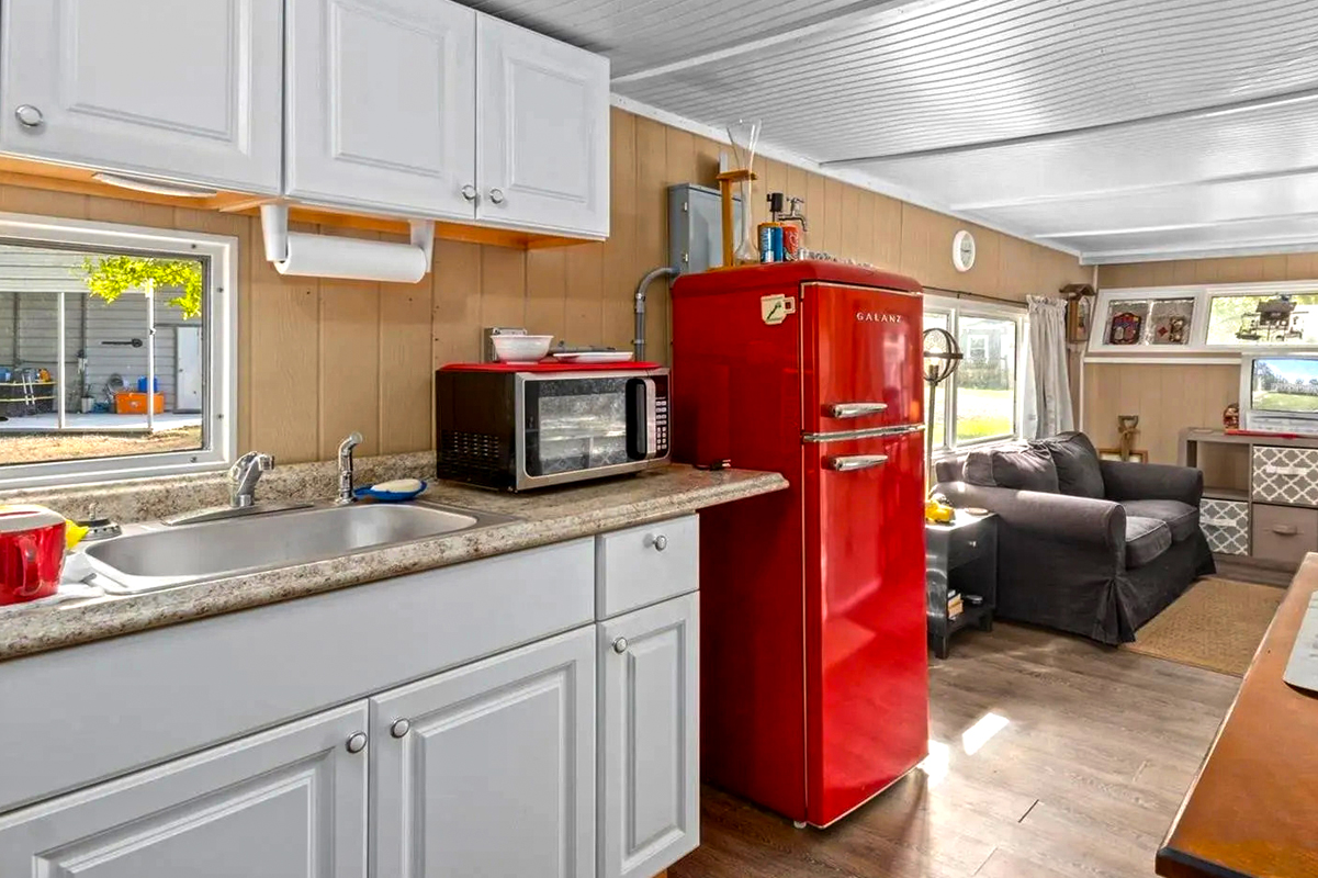
Step into this kitchen from a 1957 mobile home, and you’ll spot an excellent mix of old and new. The white ceiling panels are just like in the living room, making everything look big and bright.
The light beige walls keep things calm and connected to the rest of the home. The white cabinets give you plenty of room to store your kitchen stuff and look sharp against the beige. These new handles work well but still keep that old-timey feel.
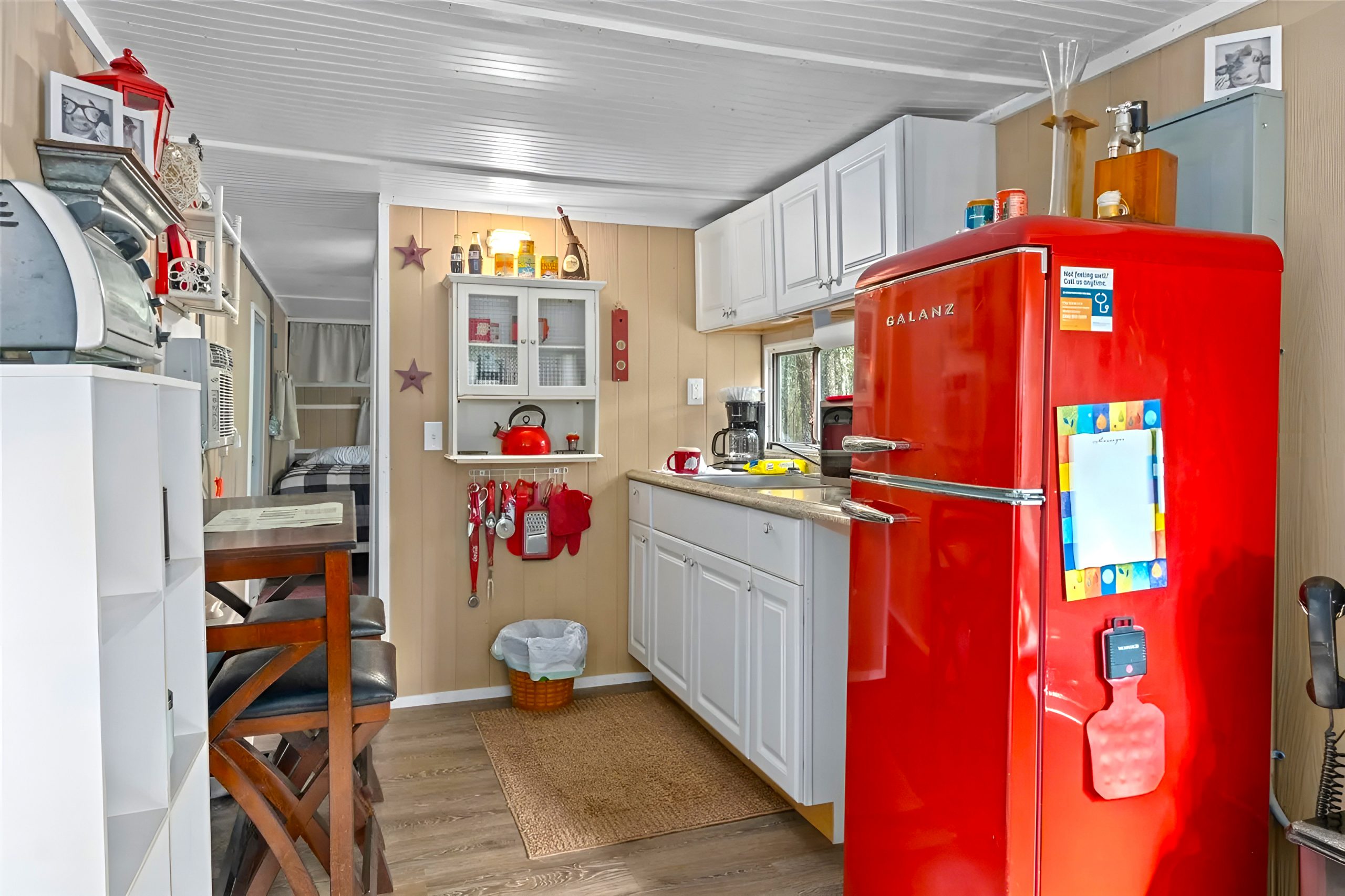
Now, check out the big red fridge. It’s got a retro look and brings the room to life with a splash of color. The red bits and pieces, like the kettle and oven gloves, all add to the fun, friendly vibe.
There’s a neat little spot to eat with a tall counter and stools, perfect for a quick bite or when you need extra room to get cooking.
You’ve got modern gadgets like a coffee machine and toaster, which are handy and blend in with the old-school style. They’re all set up to make the most of your space.
The window over the sink lets in sunlight and fresh air, two must-haves for any kitchen. Plus, it’s great for when you’re doing the dishes.
Little decorations, like star shapes on the wall and stuff on the shelves, give the place its unique look. And look down there—a basket under the counter for more things and a simple rug that makes it all a bit cozier.
Overall, this kitchen is a brilliant combo of pretty and practical, keeping the home’s classic charm while ensuring it works for today.
Bedroom
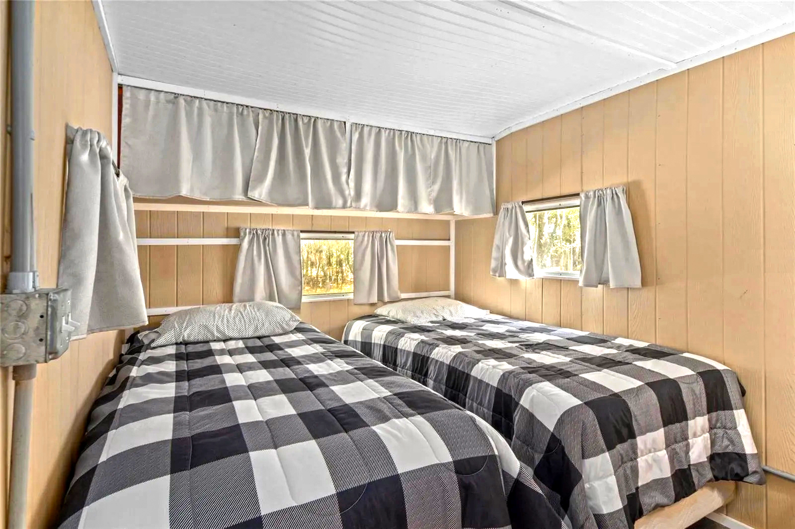
This bedroom in a 1957 mobile home is all about using space wisely. It has the same white ceiling and beige walls you see in the rest of the house, keeping everything neat and tied together. The ceiling’s design makes the room seem taller, which is great for a small space.
Two beds are beside each other, making the most of the room. They have black and white checkered covers that look sharp against the walls, giving the room a cool, modern touch without losing the old-timey feel.
Above the beds are shelving for your things and a few decorations. It’s a clever way to store stuff without filling the room with big pieces of furniture.
The windows have plain gray curtains that fit the room’s colors. They let you keep things private and manage the light. Plus, the sunlight makes the room feel bigger and brighter with open curtains.
In a cozy room like this, the little things really matter. Skipping the big, bulky stuff and going for neat, straight lines in the bedding and curtains makes the room more open. This bedroom shows off how homes back then were designed to be comfy and make every inch count.
Bathroom
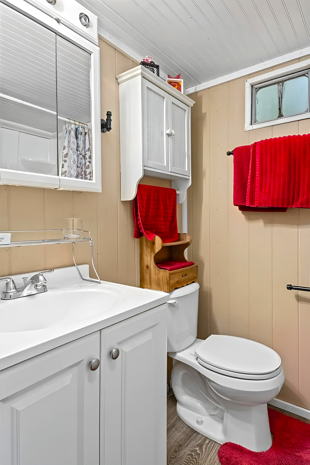
The bathroom in a 1957 mobile home is small but set up well. The classic stuff is mixed with new bits, giving you the best of both worlds.
Like in other parts of the house, the white ceiling makes the room feel open and bright. That’s a big plus in a tight space.
Over to the left, there’s a sink with a white top that doesn’t take up too much room. It looks neat and has a cabinet below to hide your bathroom stuff.
Right above the toilet, there’s a wooden shelf that’s perfect for keeping more of your things. And those red towels? They match other red things in the house and make the room pop with color.
The window’s got a simple shade that lets you have as much light or privacy as you want. And up high, there’s a handy cabinet for the stuff you don’t use all the time.
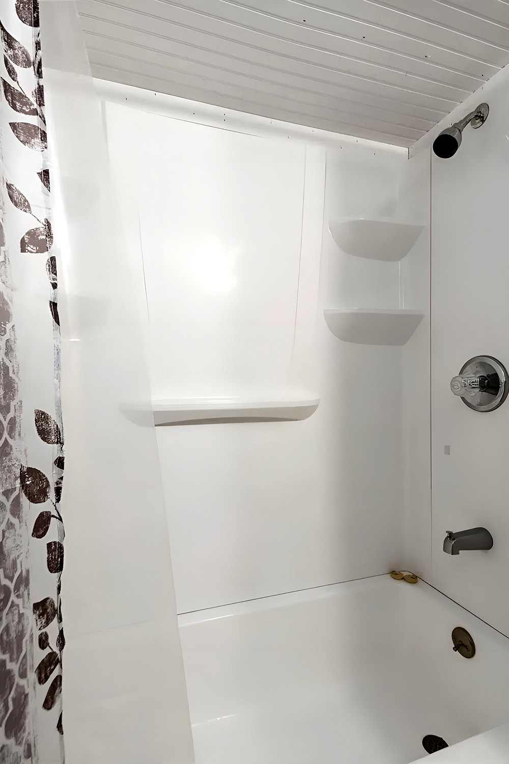
Now, over on the right is the shower. It’s a regular size with shelves for all your shower stuff. The shower curtain has a leafy design, making the shower look nice and giving you privacy.
They’ve made every inch count in here, picking things that are super useful but still make the room comfy and stylish. Adding colorful towels and things keeps the old-school charm and makes it feel welcoming.
Image credit: Realtor

It is ugly.
No stove.
Article poorly constructed.
Where is the bathroom? I know they showed a bathroom, but when you look at the pictures there is no place for that bathroom.
AI?
Where’s the range/cook top?
I love it I am currently looking at a 1957 myself that has been partly remodeled and am on the fence about purchasing. This was very helpful.
I love it