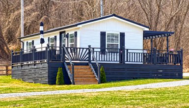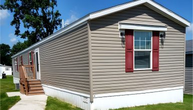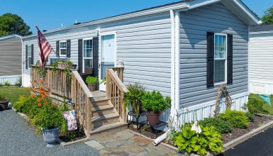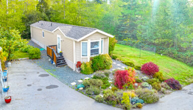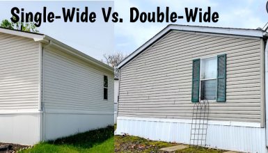
What makes a single wide mobile home feel warm, bright, and full of charm? Often, it comes down to simple choices. This home pairs a soft green exterior with a cozy covered porch, fresh white interiors, warm wood tones, and smart furniture placement. The result feels relaxed, cheerful, and easy to live in.
Here is a closer look at the design choices that make this single wide mobile home so inviting.
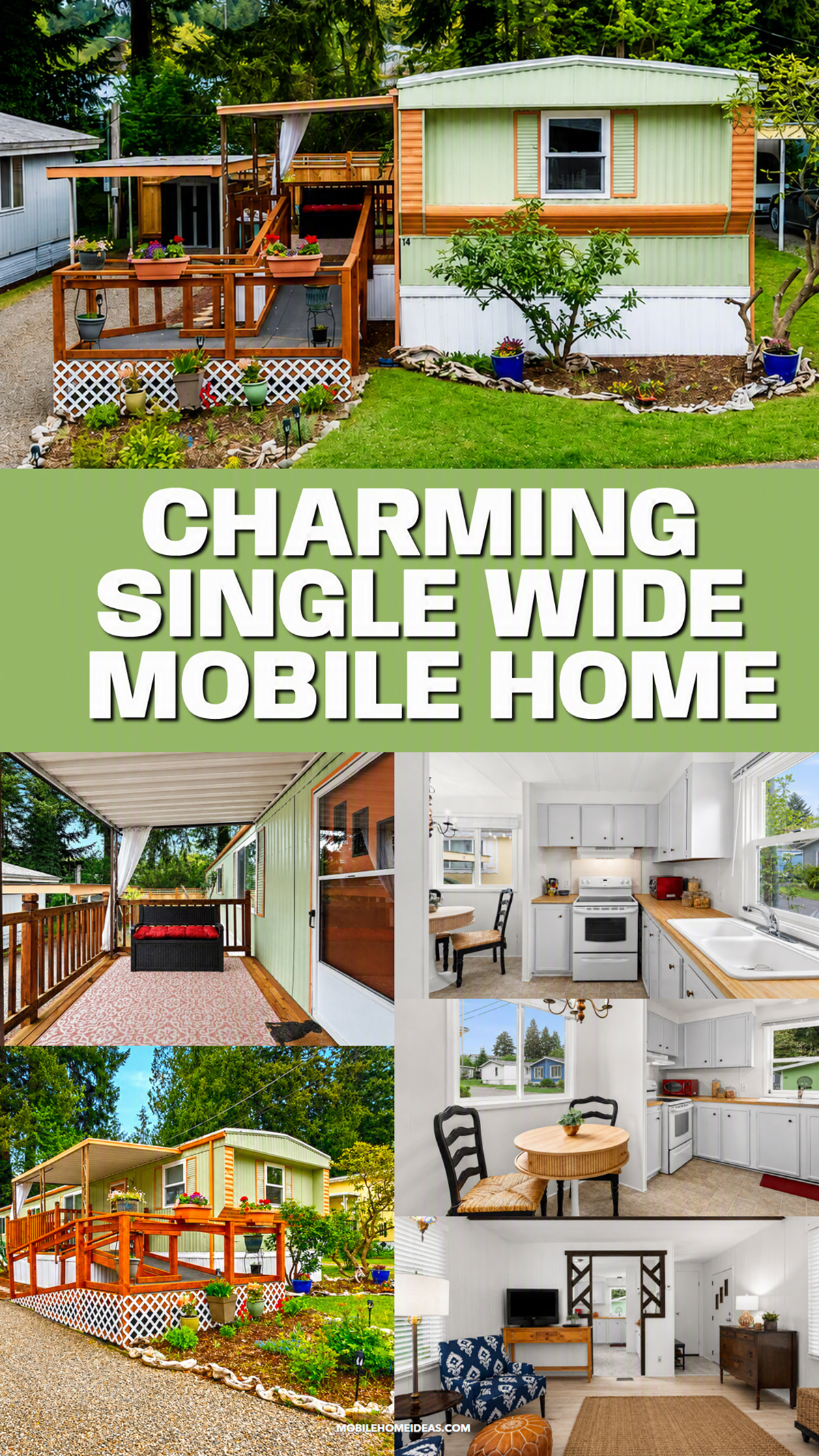
1. Soft Green Exterior Gives the Home a Fresh Look
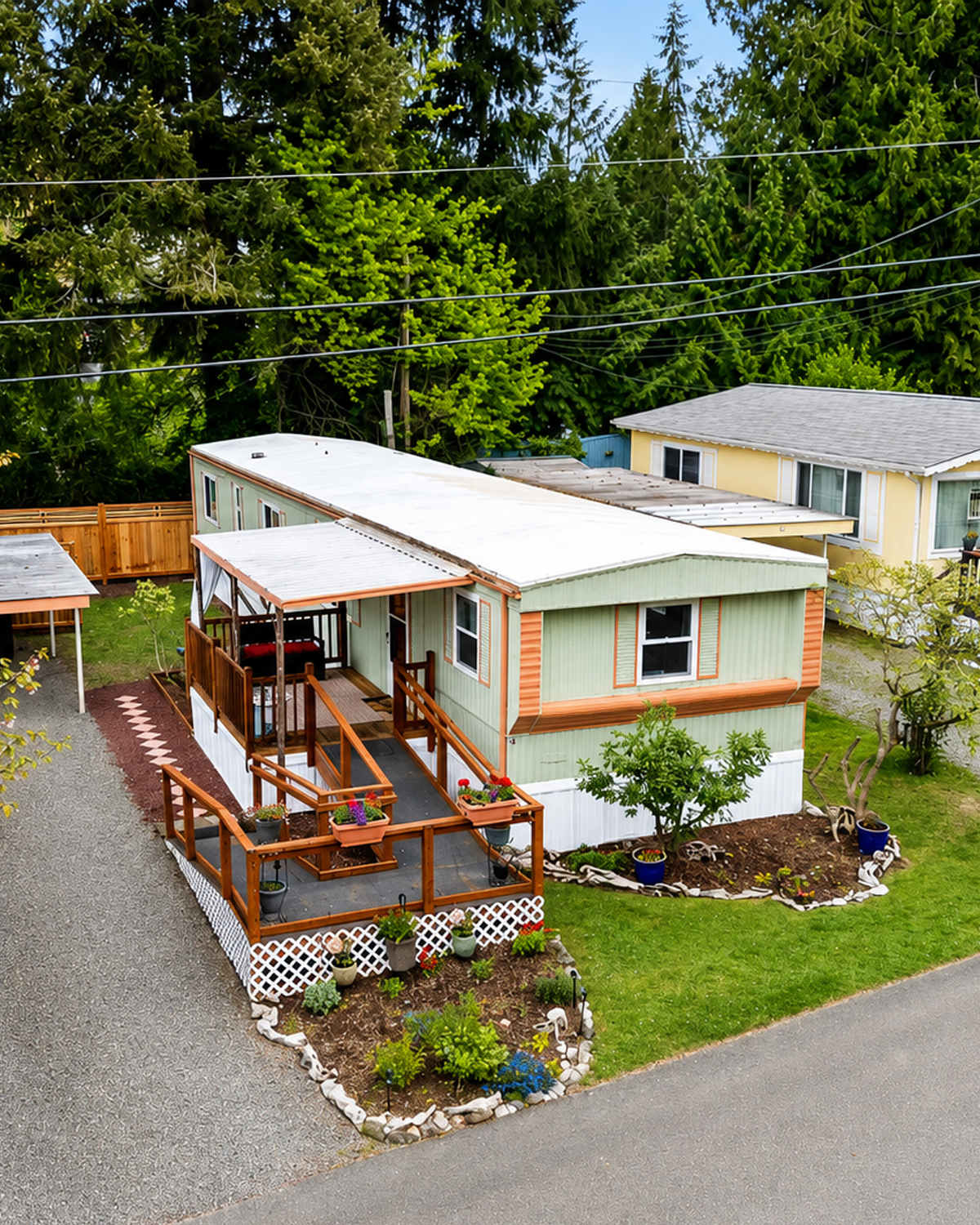
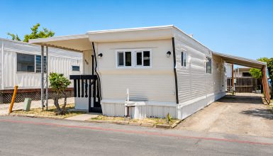
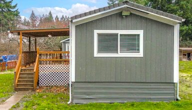
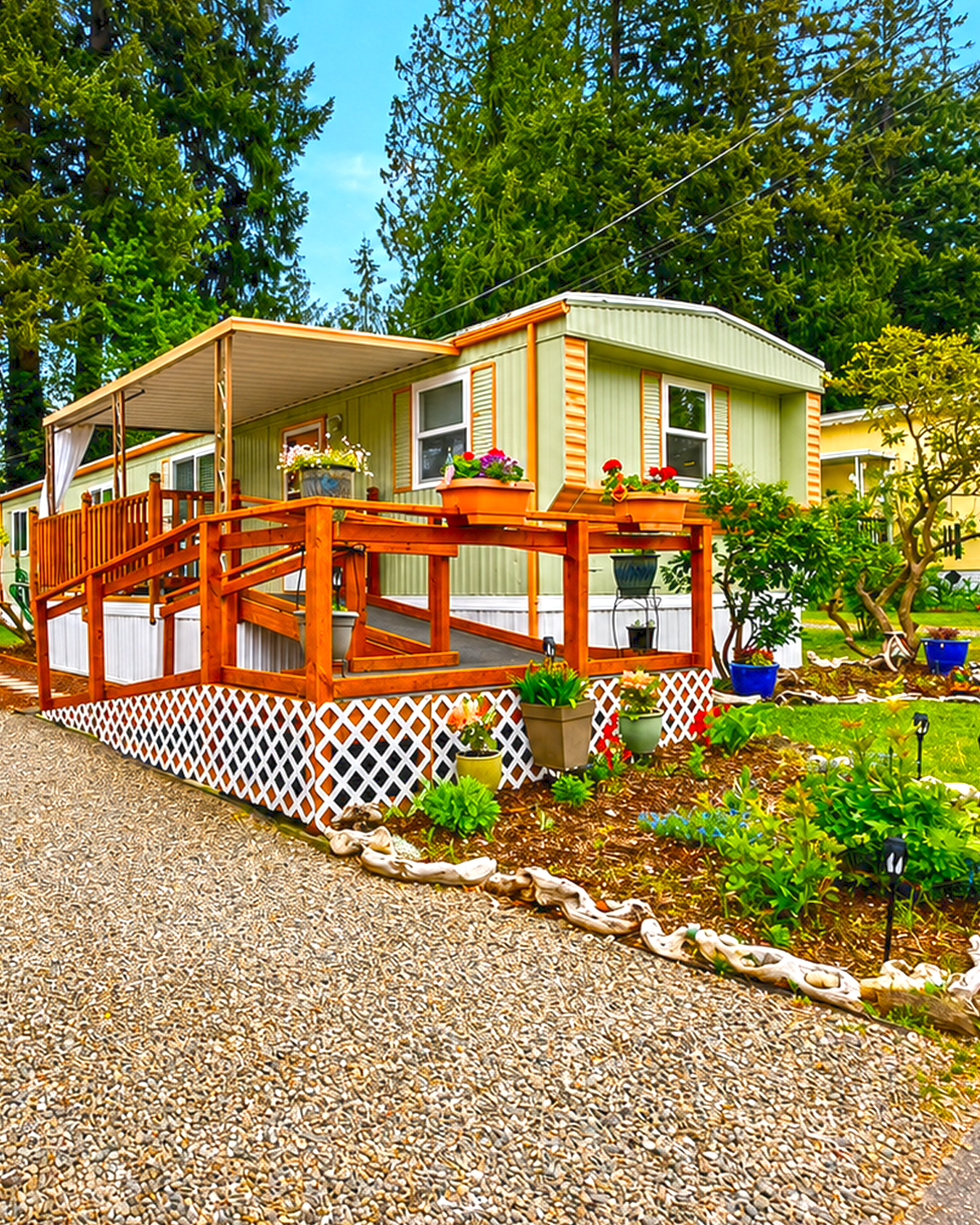
The exterior makes a sweet first impression. Pale sage green covers most of the siding. It feels calm and natural, which works well with the tall trees and green lawn around the home.
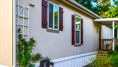
Warm peach and copper-toned trim adds contrast. You can see it around the windows, corners, roofline, and horizontal bands. This color choice gives the exterior more depth. It also keeps the pale green from looking flat.
White skirting creates a clean base. Since it is much lighter than the siding, it visually lifts the home. That can be useful on a single wide because a long wall can otherwise look heavy.
The modest front shape also has an interesting detail. The raised center of the front roofline gives the facade more character. It breaks up the boxy form without making the design too busy.
The overall palette feels cheerful and a little retro. Yet it still looks fresh.
Design cues:
- Soft sage green exterior siding
- Warm peach or copper-colored trim
- White skirting
- Contrasting horizontal trim bands
- Decorative window shutters
- Simple raised front roofline
- Light, nature-inspired color palette
- Clean and uncluttered exterior details
2. A Front Deck Makes the Single Wide Feel Larger
One of the smartest parts of this home is the front deck.
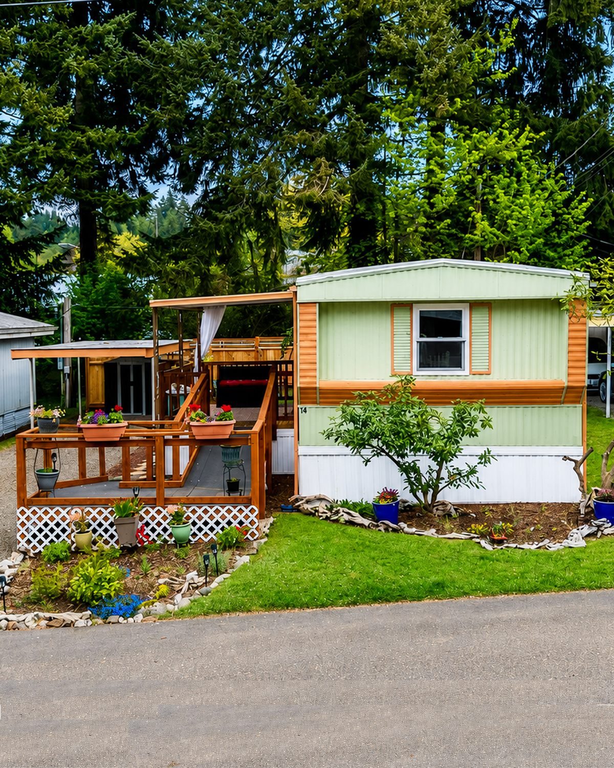
It does more than provide a way to reach the front door. It creates another living zone. That extra space can make a smaller mobile home feel much more generous.
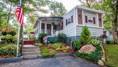
Warm stained wood gives the deck a rich look. The color also ties in with the warm trim on the home. As a result, the house and deck feel connected rather than added at different times.
The railing gives the area a clear edge while still keeping it open. A wide landing near the bottom of the stairs makes the entry feel more relaxed. It also provides room for planters.
Most important, the deck has enough space for seating. That turns an ordinary entrance into a place where you can sit with coffee, read, or enjoy the yard.
White lattice below the lower deck adds another nice touch. It hides the underside but still allows air to move through the space.
Design cues:
- Warm stained wood deck
- Matching wood railings
- Wide entry landing
- Easy-to-use stairs
- White lattice panels
- Built-in spots for planters
- Outdoor seating zone
- Strong connection between home and yard
3. The Covered Porch Creates an Outdoor Room
Move closer to the home and the porch becomes even more appealing.
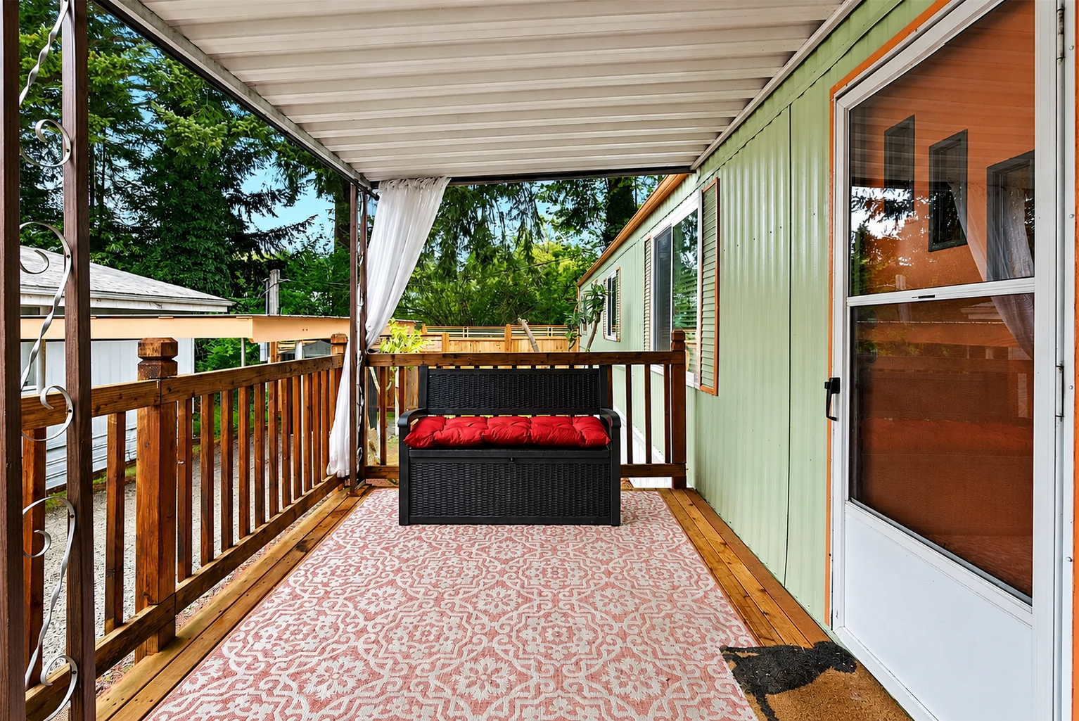
A simple metal roof covers the seating area. That small feature makes the porch far more useful. It provides shade on sunny days and some shelter during light rain.
The roof also makes the deck feel like a true outdoor room.
A large outdoor rug softens the wood floor. Meanwhile, a dark bench with red cushions gives the porch a strong focal point. The red adds energy without taking over the space.
Light curtains hang near the outer edge of the porch. They create a soft, almost cabana-like feel. They can also add shade and a bit of privacy.
Nothing here feels too formal. That is part of the charm. The porch looks easy to use every day.
Design cues:
- Covered outdoor seating area
- Simple metal porch roof
- Warm wood floor and railing
- Large outdoor rug
- Dark bench or storage seat
- Bold seat cushions
- Soft outdoor curtain panels
- Casual, everyday styling
4. Simple Landscaping Softens the Long Exterior
A long single wide can look very straight and narrow from outside. Landscaping helps change that.
Here, curved garden beds add soft lines around the home. Rocks form casual borders. Low plants, flowering pots, and small trees create several levels of height.
The garden does not rely on large shrubs or expensive hardscaping. Instead, many smaller touches work together.
Bright blue pots stand out against the pale green siding. Flower boxes on the deck rail also draw attention toward the entry. This helps make the front porch the star of the exterior.
The lawn remains open, which is also smart. Too many large plants could make a compact lot feel crowded.
Design cues:
- Curved planting beds
- Natural stone edging
- Small ornamental trees
- Low-growing plants
- Colorful flower pots
- Deck rail planters
- Open lawn areas
- Simple solar path lights
5. The Side Yard Stays Practical and Neat
Good small-home design is not only about decoration. It also needs to handle everyday life.
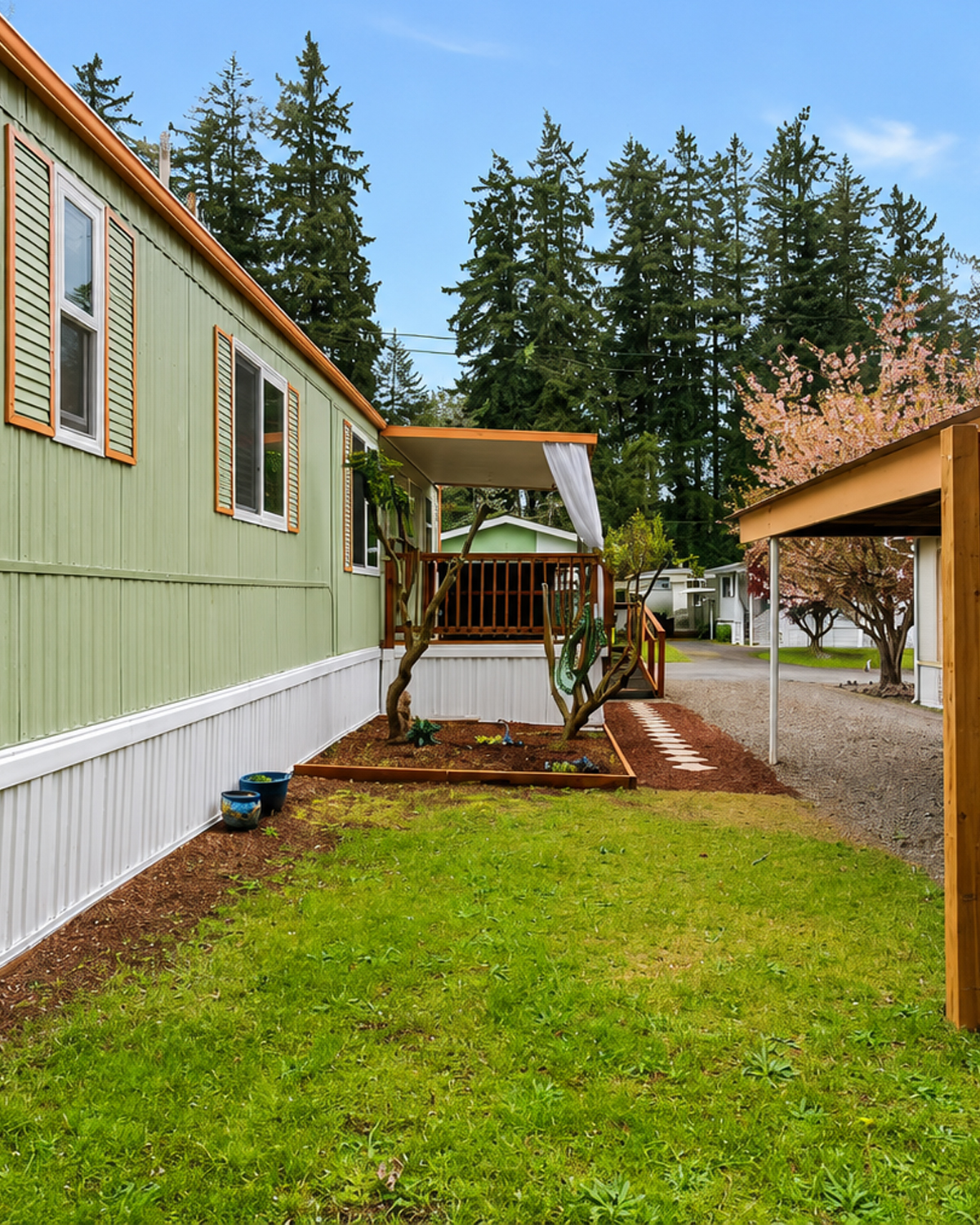
The side of this single wide shows a practical approach. A gravel drive runs alongside the home. There is also a covered parking or storage structure farther back.
The yard stays fairly open. That makes it easier to walk around the home and reach outdoor equipment.
A wood privacy screen near the rear creates a more private zone. It also adds warmth beside the green siding.
Even the garden beds remain narrow. This keeps plants away from the main walking area.
It is a simple setup, but it uses a compact lot well.
Design cues:
- Gravel driveway
- Covered parking or storage space
- Wood privacy fencing
- Clear walking paths
- Narrow side garden beds
- Open lawn
- Easy access around the home
- Practical outdoor storage
6. White Walls Make the Living Room Feel Wide and Bright
Inside, the mood changes right away.
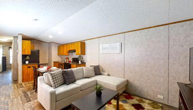
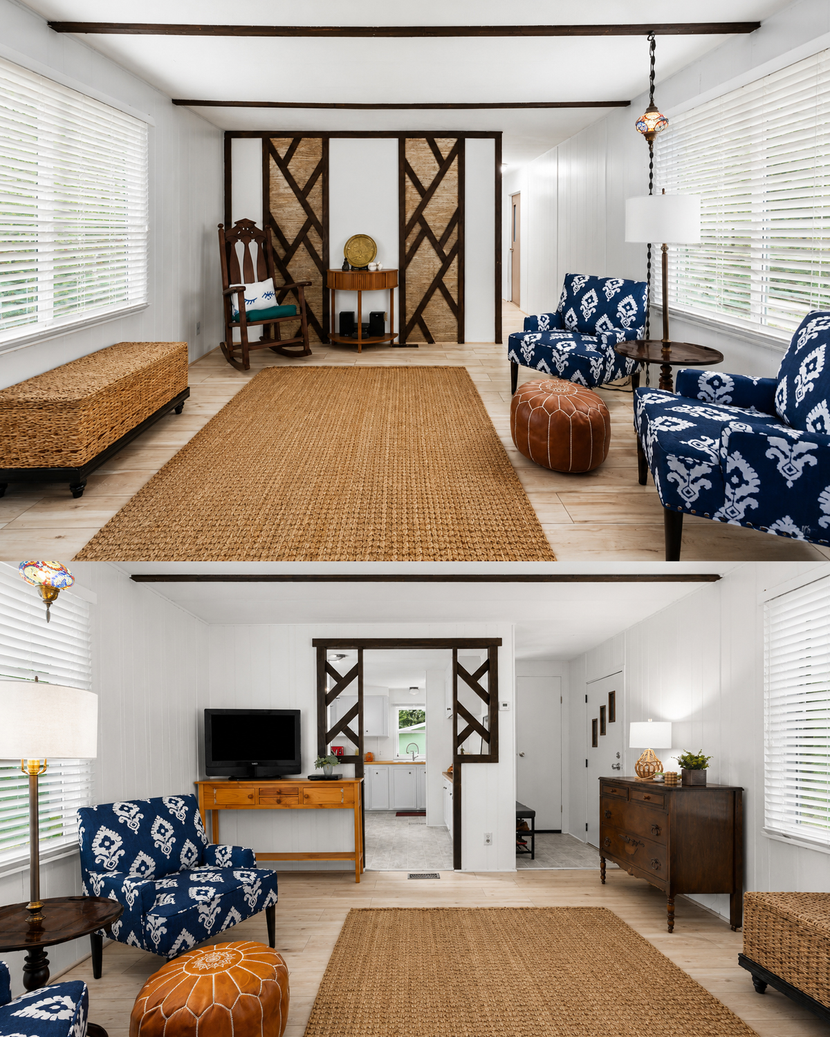
White wall paneling covers the living room. The ceiling is white as well. This light backdrop reflects daylight from the large windows and makes the room seem bigger.
That matters in a single wide. Dark walls can visually pull the sides inward. A pale palette does the opposite.
The vertical lines in the wall panels also give the room gentle texture. They keep the white from feeling blank.
Meanwhile, dark ceiling strips run across the width of the room. These create rhythm overhead. They also add a little contrast without lowering the visual height too much.
The result feels clean, relaxed, and surprisingly spacious.
Design cues:
- Bright white walls
- White ceiling
- Subtle vertical wall paneling
- Dark ceiling accent strips
- Large windows
- Light wood flooring
- Simple window blinds
- Open sight lines
7. Natural Texture Warms Up the Living Room
An all-white room can sometimes feel cold. This living room avoids that problem with texture.
A large woven jute-style rug covers much of the floor. Its warm tan color creates a soft center for the room. It also balances the pale wood-look flooring.
A woven storage bench adds another layer of natural material. Then an orange-brown leather pouf brings in a richer shade.
These pieces work because they share earthy colors. They do not match exactly, yet they belong to the same warm family.
This is a useful idea for mobile homes. You do not need many colors. Instead, use texture to make a simple palette feel finished.
Design cues:
- Large natural-fiber area rug
- Woven storage bench
- Tan and caramel accents
- Leather pouf
- Light wood-look flooring
- Natural materials
- Warm neutrals
- Minimal decorative clutter
8. Navy Accent Chairs Add Bold Personality
The living room also proves that a small space can handle pattern.
Two navy blue chairs feature a large white print. The pattern is bold, but the deep blue grounds it. Since most of the room is white and tan, the chairs stand out without making the space feel chaotic.
They also create a clear seating zone.
Instead of squeezing in a bulky sectional, the room uses smaller pieces. This keeps more floor visible. It also makes the walkways easier to use.
A slim side table and tall floor lamp provide function without taking much space.
This is a strong lesson for any narrow living room. Choose furniture with the right scale first. Then add personality through fabric.
Design cues:
- Navy patterned accent chairs
- White and blue color contrast
- Compact furniture
- Slim side tables
- Tall floor lamp
- Open floor space
- Small leather ottoman
- Limited but bold pattern
9. Decorative Woodwork Defines the Open Floor Plan
One of the most unusual details appears between the living room and kitchen.
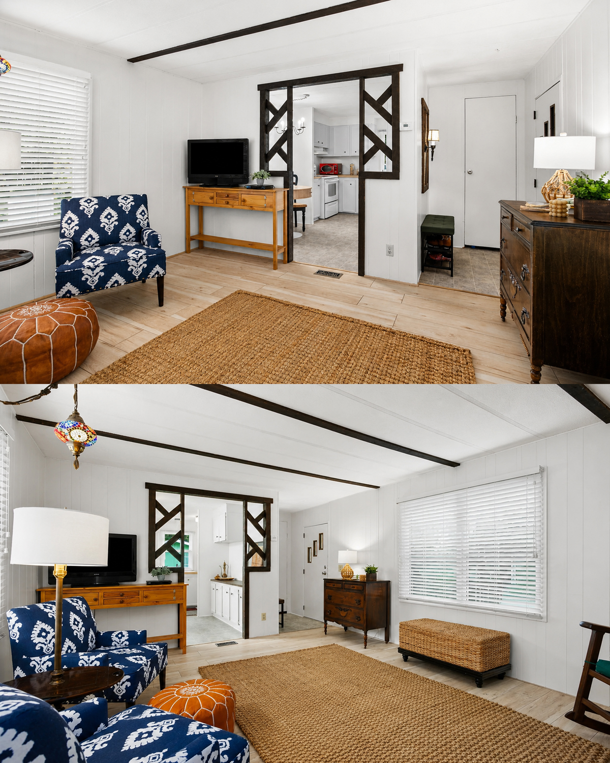
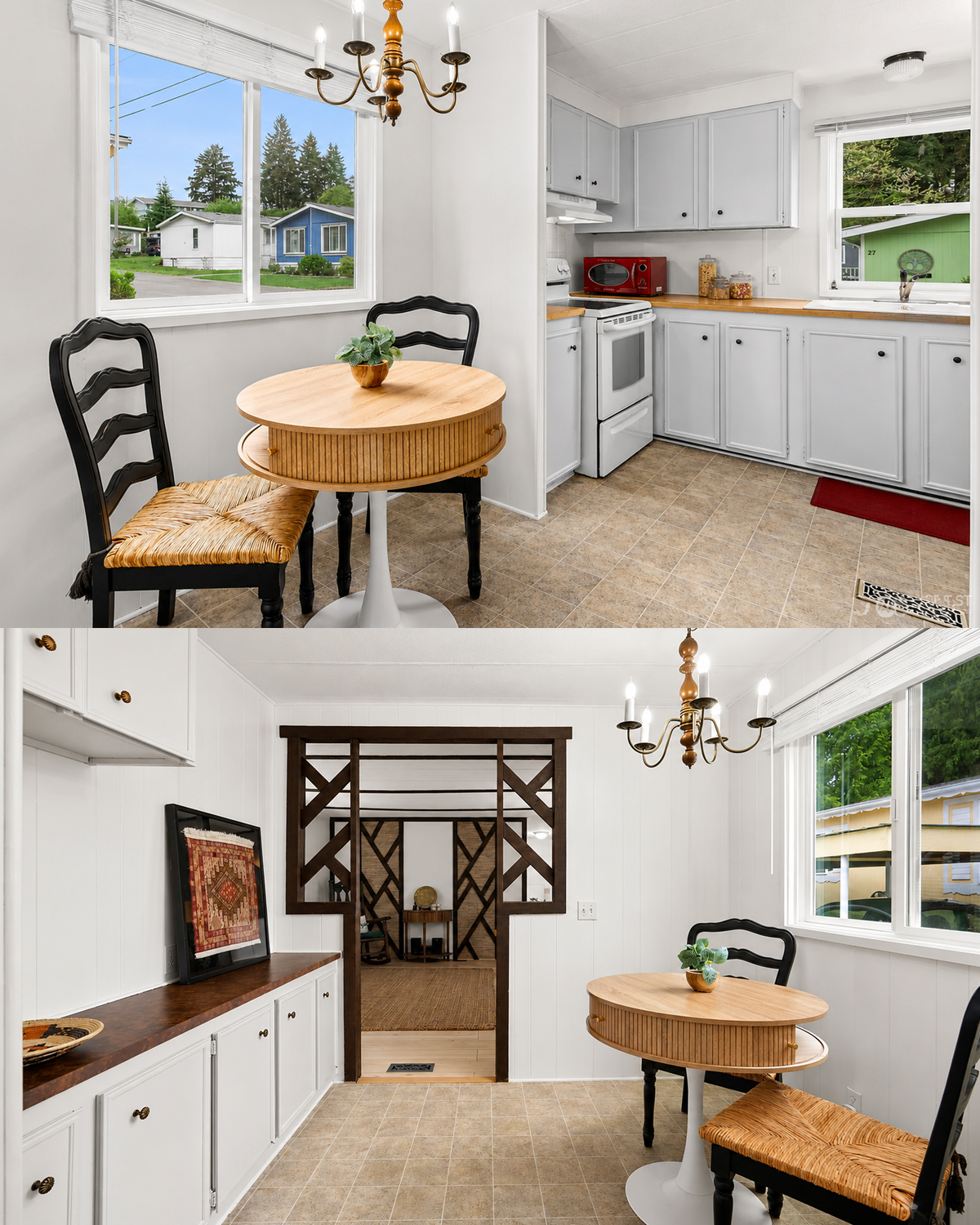
Dark wood trim frames the opening. Diagonal pieces form a geometric pattern. Similar decorative panels appear on another wall in the living space.
This woodwork gives the home character. More important, it creates a soft division between rooms.
That is useful in an open single wide. Completely open rooms can sometimes feel like one long hallway. A framed opening gives each area a sense of place while preserving the view through the home.
The dark stain also repeats the darker wood furniture. This helps the design feel connected.
Design cues:
- Dark wood room divider
- Geometric diagonal trim
- Wide open doorway
- Partial visual separation
- Repeated dark wood accents
- Open sight line to kitchen
- Handmade character
- Strong contrast against white walls
10. The Kitchen Uses a Light Palette to Gain Visual Space
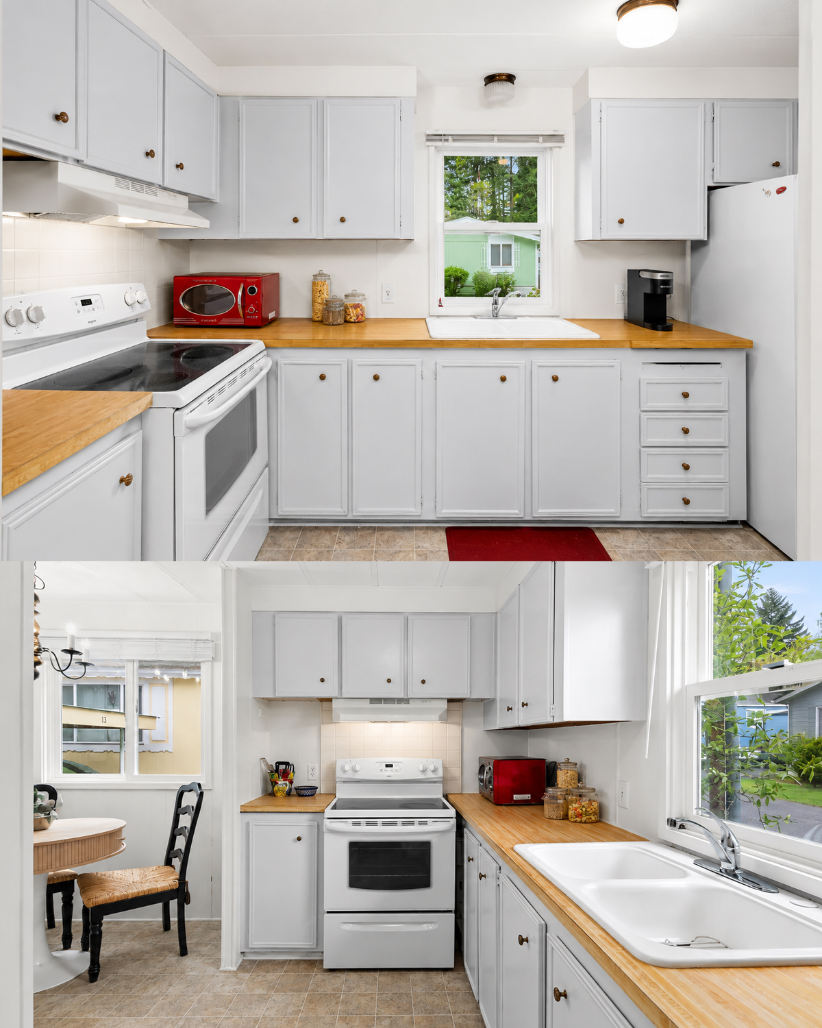
The kitchen continues the bright theme.
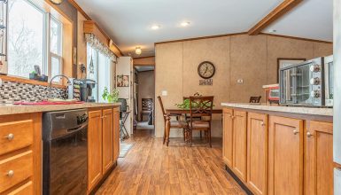
White cabinets fill the upper and lower walls. White appliances blend into the cabinetry instead of standing out. Pale walls continue the same effect.
Together, these surfaces make the kitchen seem larger than it is.
Warm wood counters stop the room from becoming too stark. Their honey tone also connects with the natural finishes used in the living room.
The cabinets have simple raised-panel doors and small dark or brass-toned knobs. Nothing feels overly ornate.
This restraint works especially well in a narrow kitchen. Too many colors, materials, and hardware styles could make the room feel tight.
Design cues:
- White cabinetry
- White appliances
- Warm wood countertops
- Small traditional cabinet knobs
- Pale neutral walls
- Simple cabinet fronts
- Light-colored backsplash
- Bright, low-contrast surfaces
11. A Window Above the Sink Brings Nature Inside
The sink sits directly beneath a window.
That is a small feature, but it has a major effect. The view adds depth to the room. Instead of looking at a wall while using the sink, you see greenery outdoors.
Natural light also falls directly onto the work surface.
The white double-basin sink blends with the rest of the kitchen. Its simple shape suits the modest style of the home.
Open counter space sits on both sides. That leaves room for everyday items while keeping the main prep area usable.
For a small mobile home kitchen, that balance matters.
Design cues:
- Sink beneath a window
- Outdoor green views
- Double-basin sink
- Long work counter
- Bright natural light
- Simple faucet
- Minimal counter decor
- Easy-to-clean surfaces
12. Small Details Give the Kitchen a Cheerful Personality
A few stronger colors stop the kitchen from looking too plain.
The red microwave is the clearest example. Against all the white, it becomes a fun focal point. A small red floor mat repeats that warm color nearby.
The accents work because there are only a few of them.
Meanwhile, glass jars store dry goods on the counter. Their clear finish keeps them visually light. They also bring an everyday, lived-in feeling to the room.
This approach is easy to copy. Start with a neutral base. Then choose one bright accent color and repeat it two or three times.
Design cues:
- Red countertop appliance
- Small red floor accent
- Clear storage jars
- Simple countertop styling
- Warm wood worktops
- White background
- One main accent color
- Useful decor rather than clutter
13. A Small Dining Nook Fits Comfortably Beside the Kitchen
The dining area shows how well a round table can work in a narrow home.
A small pedestal table sits near a large window. Because it has no corner legs, chairs can pull in close. The round top also makes it easier to walk around.
Two woven-seat chairs add texture. Their dark frames connect with the dark wood details seen elsewhere.
A traditional chandelier hangs overhead. Its warm metal and wood tones give the nook a slightly vintage feel.
The large window is another key part of the design. Daylight makes this small corner feel open.
The dining area is modest, but it has everything it needs.
Design cues:
- Compact round dining table
- Pedestal base
- Two dining chairs
- Woven chair seats
- Large window
- Traditional chandelier
- Warm wood accents
- Clear walking space
14. The Bedroom Keeps Things Calm and Simple
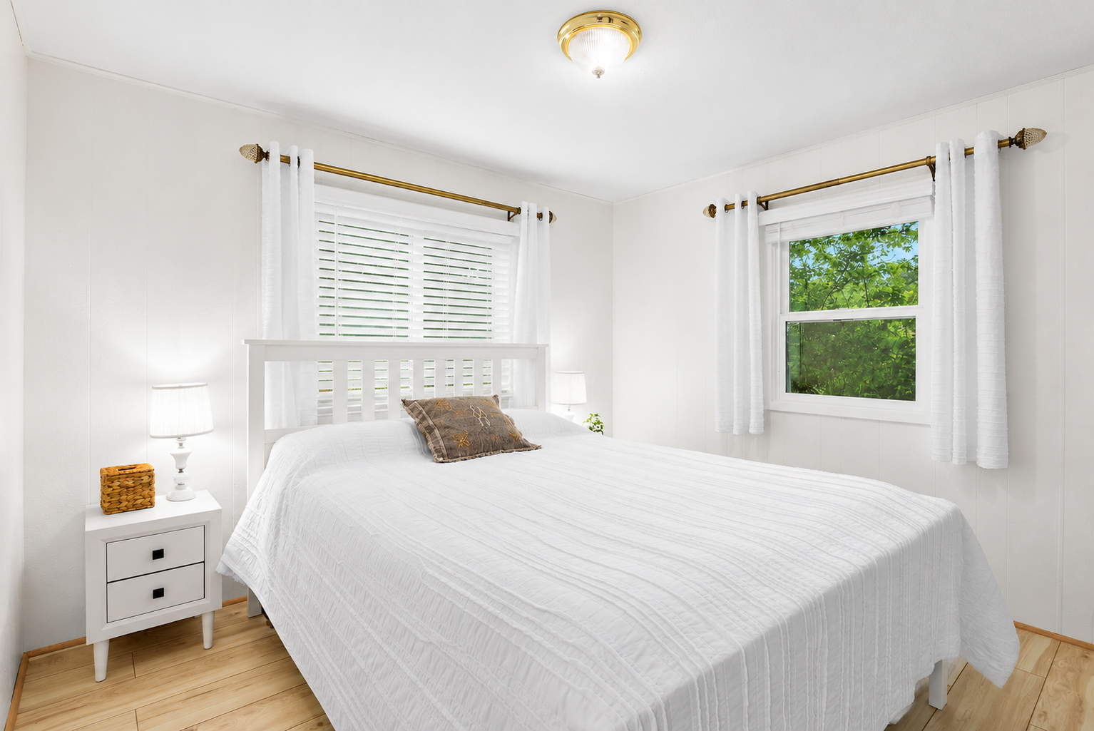
The main bedroom uses a very quiet palette.
White walls, white bedding, and white curtains create a soft backdrop. Light flooring keeps the room bright from top to bottom.
The bed has a simple slatted headboard. Its open design looks lighter than a thick upholstered headboard would.
Two windows bring daylight from different directions. This can make a modest bedroom feel much less enclosed.
Gold curtain rods add a small touch of warmth. They also dress up the otherwise simple white window treatments.
There is very little visual clutter. That helps the room feel restful.
Design cues:
- White bedding
- White paneled walls
- Light wood flooring
- Simple white headboard
- Two windows
- White curtains
- Gold curtain rods
- Minimal accessories
15. The Bathroom Uses Light Surfaces to Feel More Open
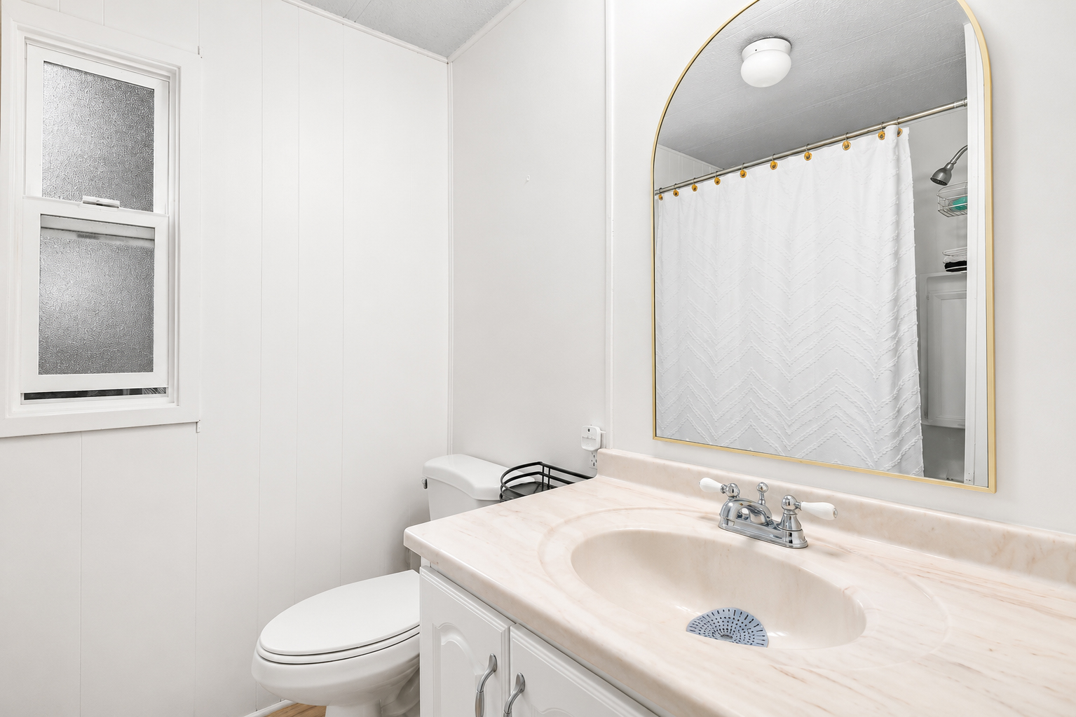
The bathroom follows the same basic formula.
Nearly every visible surface is light. The wall panels are white. The vanity is white. The countertop is a soft cream. The shower curtain is white as well.
A large arched mirror becomes the main feature.
Its curved top softens all the straight lines in the compact room. A thin warm-toned frame adds just enough contrast.
The large mirror also reflects light, which helps the bathroom appear more open.
A frosted window adds daylight while still giving privacy. That is a practical choice in a small bath.
Design cues:
- White wall panels
- White vanity
- Pale countertop
- Large arched mirror
- Thin warm metal frame
- Frosted privacy window
- White shower curtain
- Simple chrome faucet
16. A Bonus Room Adds Flexibility
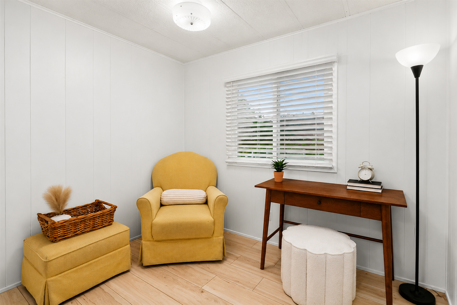
One smaller room has been set up as a quiet sitting or work area.
This is a clever use of extra space.
A mustard yellow chair and matching ottoman bring warmth to the otherwise white room. A slim wood desk sits beneath the window. A small upholstered stool can slide under it when not in use.
The room could easily serve several purposes. It might become an office, reading room, hobby room, or guest space.
That flexibility is valuable in a single wide. Every room should work hard.
The furniture also stays close to the walls. This leaves open space through the center and keeps the room from feeling crowded.
Design cues:
- Compact writing desk
- Small desk stool
- Accent armchair
- Matching storage ottoman
- Mustard yellow upholstery
- Simple floor lamp
- Window above work area
- Multi-use room layout
17. The Laundry Area Makes Use of a Transition Space
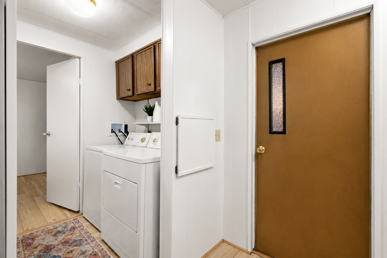
The laundry zone sits near an exterior door.
That location makes good sense. It turns a hall or utility area into useful working space.
The washer and dryer sit side by side. Wall cabinets above them add storage without taking up floor space.
The darker wood cabinet finish also creates a small break from the home’s mostly white interior.
A narrow rug adds comfort underfoot and introduces a subtle pattern.
This space is not large, yet it does not waste an inch.
Design cues:
- Side-by-side washer and dryer
- Upper storage cabinets
- Utility area near exterior door
- Narrow runner rug
- Light walls
- Wood-look flooring
- Compact circulation path
- Easy-access laundry setup
Conclusion
This charming single wide mobile home proves that a smaller footprint can still offer plenty of comfort and style. Light colors help the rooms feel open, while natural wood, woven textures, and colorful accents add warmth. Outside, the deck, covered porch, and simple landscaping create even more usable space. Together, these details make the home feel welcoming from front to back.