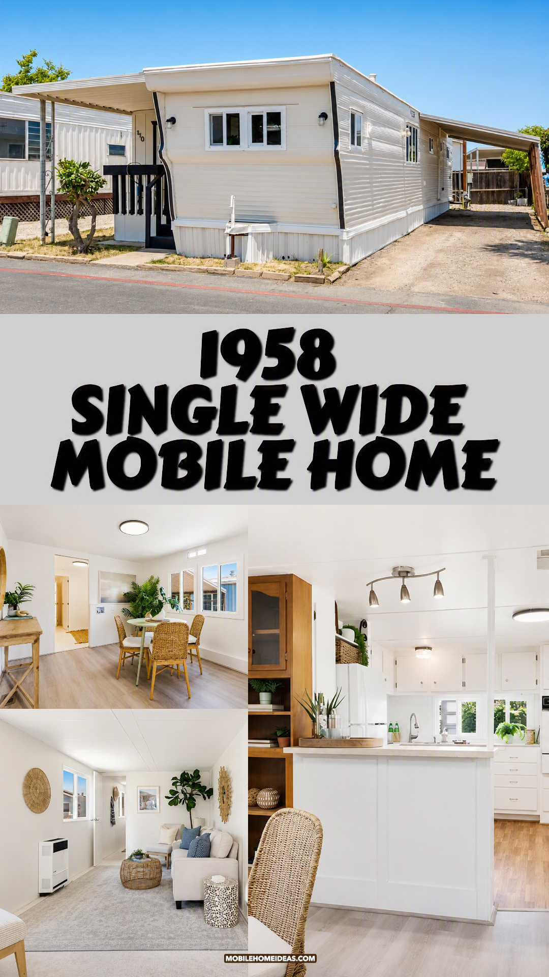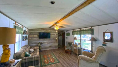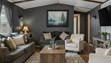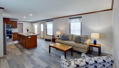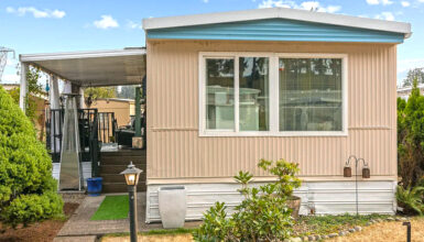
Can a 1958 single-wide mobile home feel bright, stylish, and easy to live in today? This charming home proves it can. Fresh white walls, soft blue accents, woven textures, and vintage details give the narrow layout a light and relaxed feel. Best of all, the makeover keeps enough original character to remind us where this little home began.
1. A Classic Long and Low Single-Wide Exterior
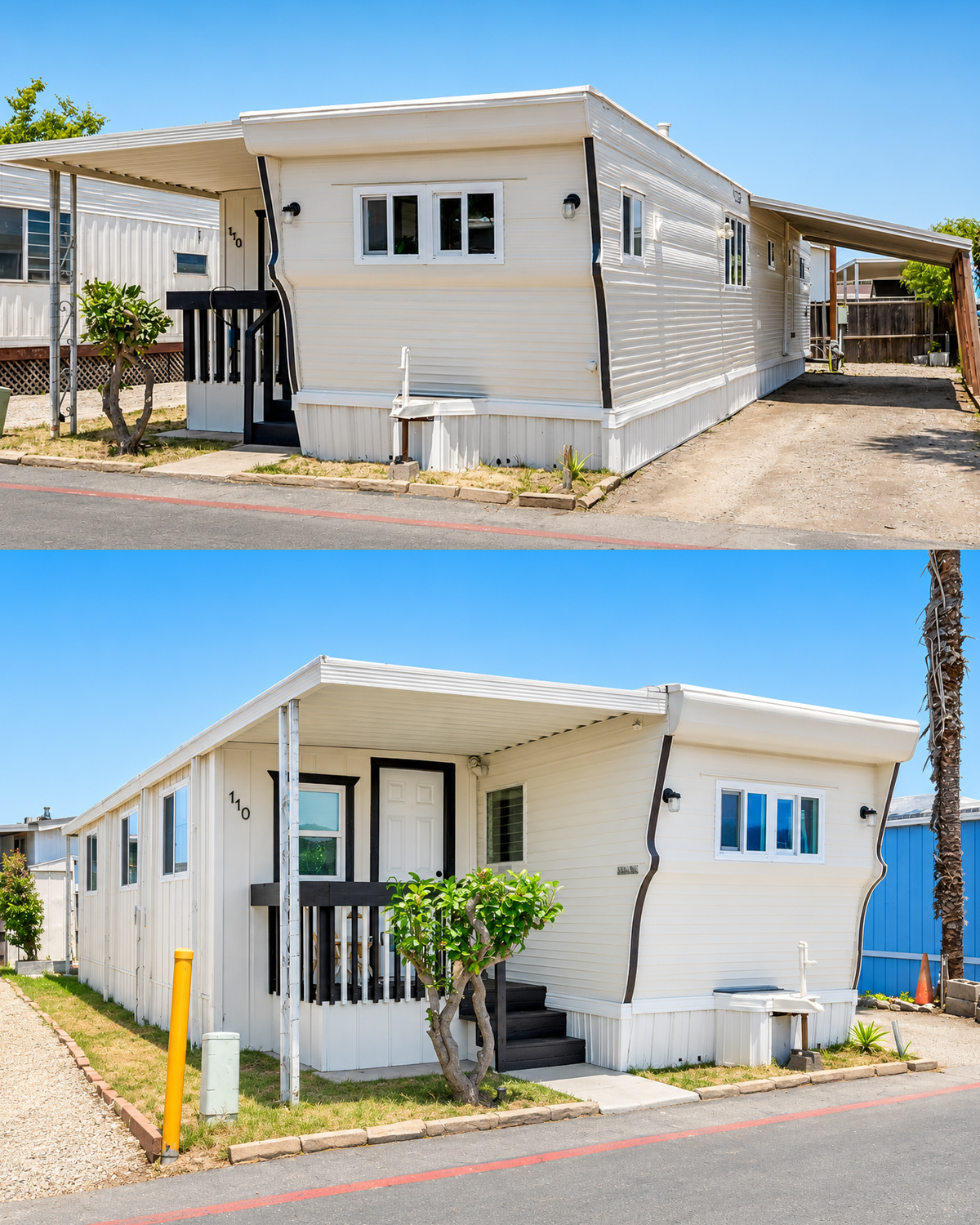
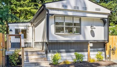
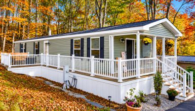
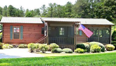
The exterior gives away the home’s mobile-home roots at once.
Its body is long, narrow, and low to the ground. The roofline stays almost flat. That shape was practical because early mobile homes needed to remain easy to transport.
Today, the same form gives the house a fun retro look.
The pale exterior color helps a lot. Creamy white siding softens the long walls and keeps the home from looking heavy. Matching white skirting creates a clean base. Even the trim blends into the body of the home.
As a result, the whole exterior reads as one simple shape.
Dark details add just enough contrast. Black porch rails, exterior lights, and hardware frame the entrance. They also make the white finish look more crisp.
The small covered entry is another smart feature. It gives the front door a sense of place. Without it, the door could get lost along the long wall.
Meanwhile, the larger side canopy works as a carport. It stretches with the shape of the home instead of fighting it.
Design cues to notice
- Long, narrow single-wide form
- Low roofline
- Light cream or white siding
- Matching white skirting
- Small covered front entry
- Long attached carport
- Black exterior hardware
- Simple rectangular windows
- Minimal front landscaping
2. The Vintage Shape Is Still Easy to Read
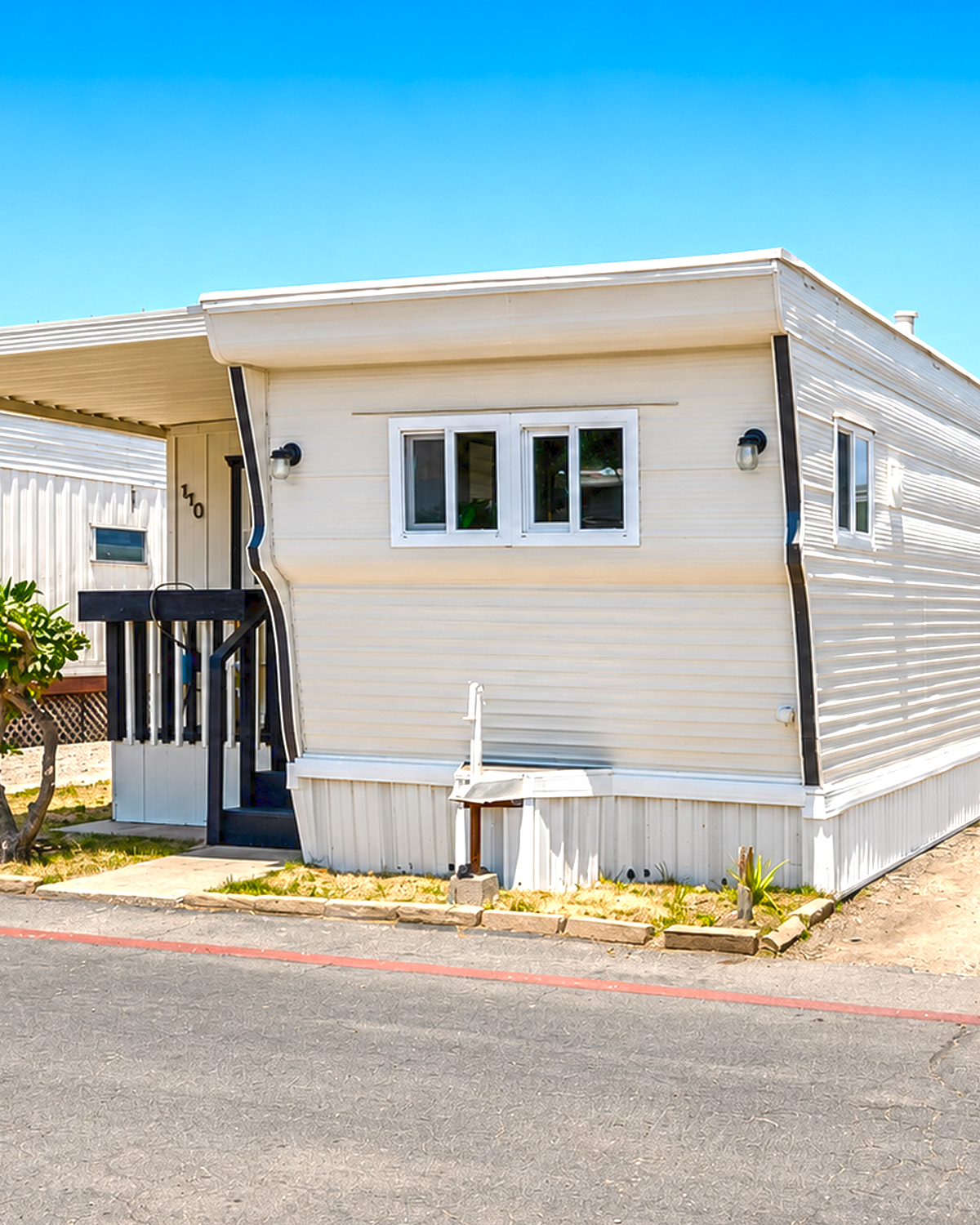
One of the best things about this makeover is that it does not erase the home’s basic form.
Many newer homes use tall ceilings and wide open rooms. This 1958 home takes the opposite approach.
The ceilings stay low. Rooms run in a straight line. Openings between spaces remain modest. The proportions feel long and horizontal.
Those traits may sound like limits. Yet they can create a cozy home when the colors stay light.
Painting nearly every wall and ceiling white makes a huge difference. The white surfaces reflect daylight. They also blur some of the hard edges between the ceiling and walls.
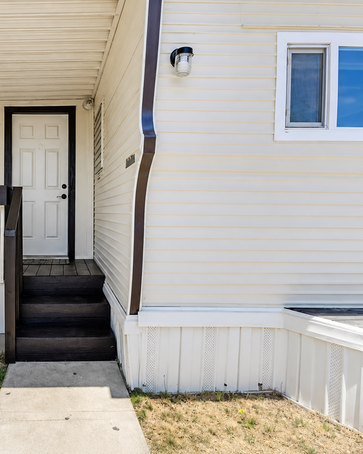
That visual trick helps the interior feel wider.
The old ceiling panel lines remain visible in several rooms. Rather than hiding them, the white paint turns them into soft texture.
Those lines are part of the home’s history.
They remind us that this is not a new-build trying to look old. It is an older mobile home that has learned how to feel current.
Design cues to notice
- Low ceilings
- Long horizontal rooms
- Visible ceiling panel seams
- Simple wall construction
- Straight-through room layout
- Small changes in floor height
- Compact interior doorways
- Bright white paint used throughout
3. A Living Room That Feels Wider Than It Is
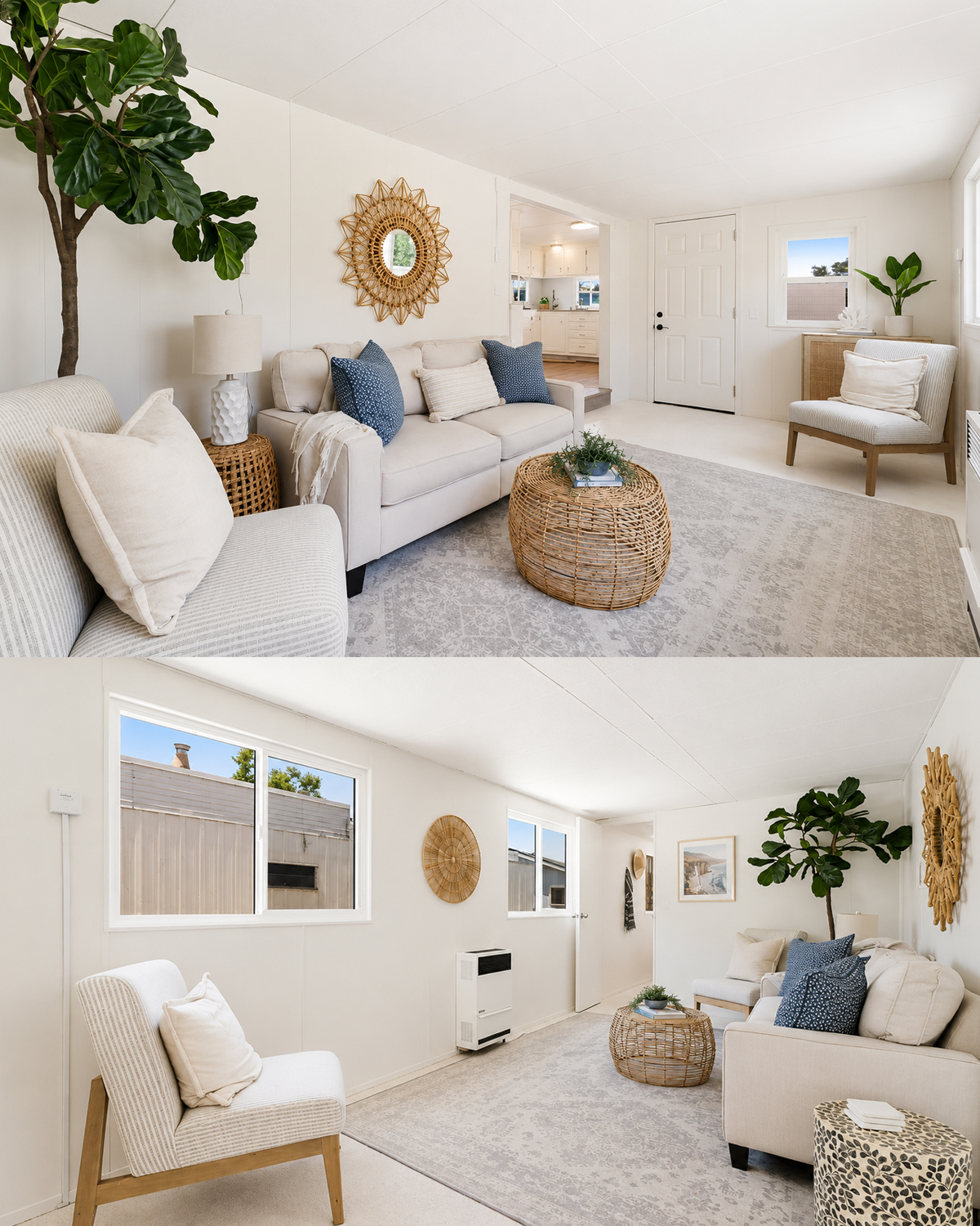
The living room shows how much good styling can change a narrow space.
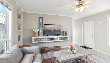
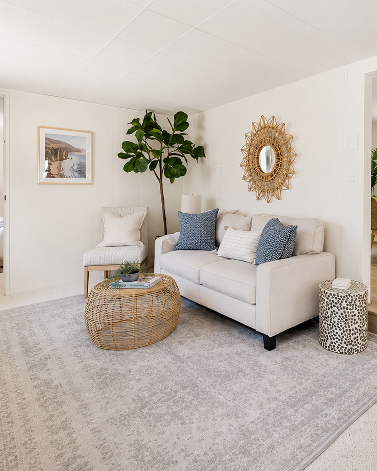
Instead of filling the room with bulky furniture, the design uses a compact sofa and light accent chairs. Their pale fabric almost blends into the walls.
That keeps the room from feeling crowded.
A large rug defines the seating zone. Its soft gray pattern brings just enough detail to the floor without making the space busy.
Then there is the woven coffee table.
Its round shape is a smart choice. Sharp corners can make a narrow room harder to move through. A round piece keeps traffic flowing.
The woven finish also adds warmth. That matters because the room has so much white.
Plants do the same job. A tall leafy tree draws the eye upward and brings life to the plain walls.
The blue pillows are small, but they matter. They create a cool accent that works well with the light palette.
Overall, the room feels casual and easy.
Nothing looks too precious.
Design cues to notice
- Small-scale sofa
- Light upholstered chairs
- Pale area rug
- Round woven coffee table
- Large indoor plant
- Natural fiber decor
- Soft blue accent pillows
- Simple wall art
- Limited color palette
- Open walking paths
4. White Walls Help the Narrow Floor Plan Breathe
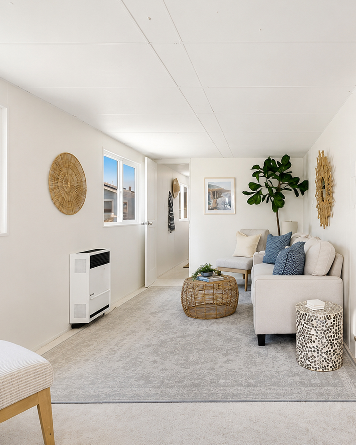
Color is doing some serious work in this home.
Almost every main surface is white or off-white. That includes the walls, ceilings, trim, doors, cabinets, and much of the furniture.
In a large home, that much white could feel plain.
Here, it feels smart.
Single-wide mobile homes can have limited width. Dark colors would make those walls feel closer together. White has the opposite effect.
It reflects light from the windows and spreads it around the room.
The effect becomes even stronger because many windows lack heavy curtains. Daylight can move through the space with few barriers.
Still, the home does not feel cold.
Warm wood tones help balance all the white. So do baskets, rattan chairs, woven tables, and leafy plants.
This is an easy design lesson to copy.
When you use a very pale base, bring in texture instead of adding too many colors.
Design cues to notice
- Warm white walls
- White ceilings
- White interior doors
- Pale furniture
- Light flooring
- Warm wood accents
- Woven textures
- Green plants
- Small doses of blue and tan
5. A Dining Area That Works Hard in a Small Space
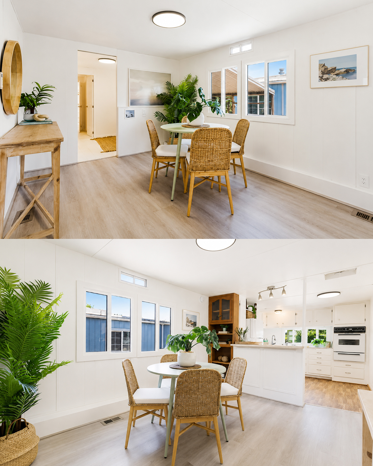
The dining room sits between the living area and kitchen.
That central spot makes sense in a narrow home. Instead of creating a closed dining room, the layout lets the table sit inside an open passage.
A small round table fits the scale.
Round tables work well in tight spaces because they have no hard corners. They also make it easier to pull out chairs.
Four woven dining chairs bring a beachy feel to the room. Their natural finish gives the pale interior some contrast without looking dark.
Large windows sit beside the table. This makes the dining zone one of the brightest parts of the house.
Plants fill the corners and help soften the straight lines.
There is also a subtle change in floor level between some of the spaces. Rather than trying to hide it, the layout uses the step as a natural break between zones.
The furniture then helps explain what each area is for.
Design cues to notice
- Compact round table
- Four woven chairs
- Large windows
- Pale wood-look floor
- Indoor plants
- Simple artwork
- Minimal dining decor
- Open connection to living room
- Open connection to kitchen
- Furniture used to define zones
6. The Kitchen Keeps Its Wonderful Vintage Character
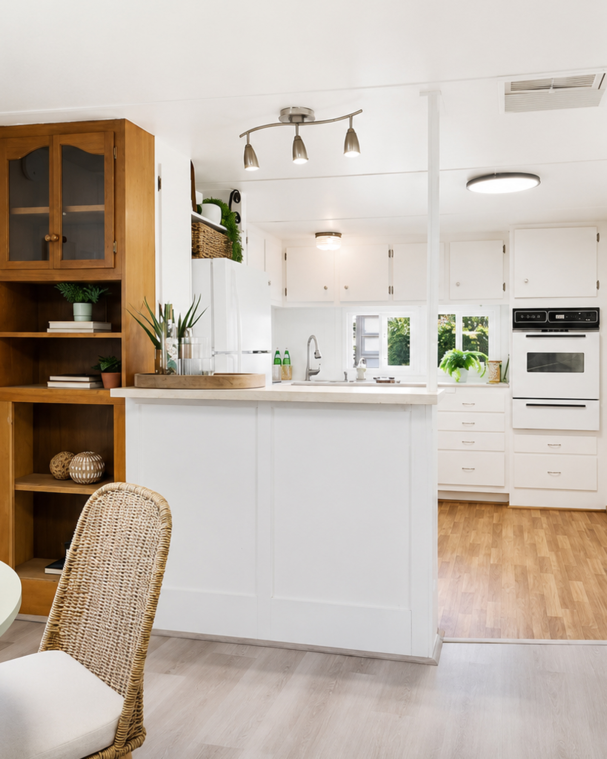
The kitchen may be the most interesting room in the home.
It has been brightened, but many features still have a strong mid-century mobile-home feel.
White cabinets line the walls. They are simple and practical. Small metal knobs keep the doors understated.
The cabinet layout makes use of almost every inch.
There are cupboards above. Drawers below. Storage fills the corners. Even the area over the refrigerator becomes useful.
That was important in a small mobile home.
The white refrigerator also helps the kitchen look larger because it blends with the cabinets.
Then there is the wall oven.
Its compact size and black control panel give the kitchen a strong vintage note. Instead of replacing it with a huge modern range, the room keeps a small-scale appliance arrangement that suits the home.
The countertops stay simple too.
Nothing tries to turn the kitchen into a luxury showroom.
That restraint is part of its charm.
Design cues to notice
- White flat-front or simple cabinet doors
- Small metal knobs
- High upper cabinets
- Numerous narrow drawers
- Compact refrigerator
- Built-in wall oven
- Small cooktop
- Corner sink area
- Bright window over the counter
- Efficient use of vertical storage
7. A Compact Kitchen Layout That Makes Sense
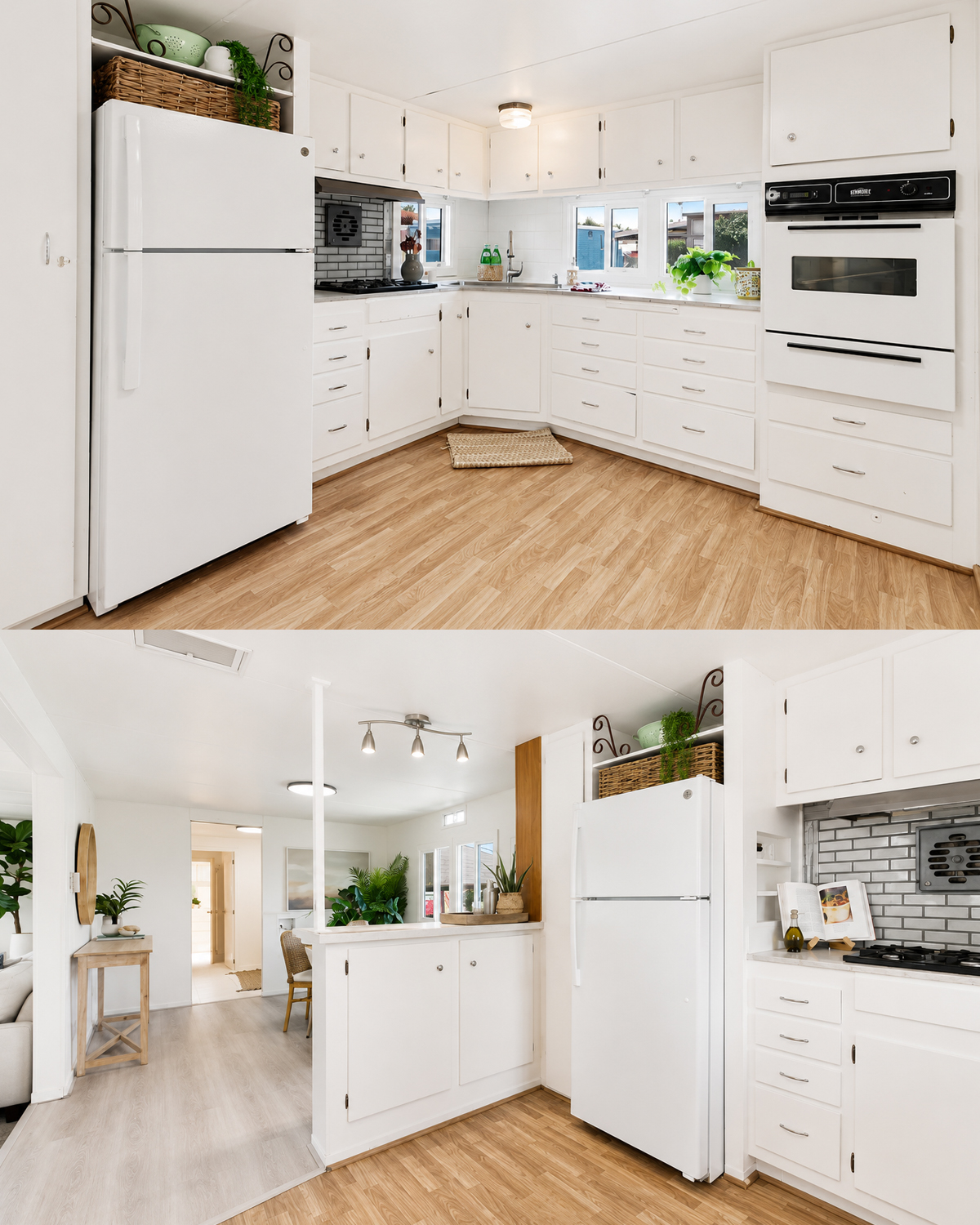
The kitchen also shows how older mobile homes handled limited floor area.
Instead of adding a large island, the design uses a modest peninsula.
It creates extra counter space while still letting people move through the room.
One side also acts as a divider between the kitchen and dining area.
The layout is compact enough that the main work zones sit close together. The refrigerator, sink, oven, and cooktop do not require long walks.
That makes the small size useful rather than limiting.
The warm wood-look floor adds contrast under the white cabinets.
Meanwhile, the countertop stays light.
A small wooden shelving unit brings another warm tone into the room. It also gives the space room for display without using precious counter space.
This is a good example of letting the house tell you what it needs.
A giant island would not improve this kitchen.
A smaller work surface does.
Design cues to notice
- Compact work triangle
- Short peninsula
- Narrow pathways
- Floor-to-ceiling storage
- Light counters
- Warm wood-look flooring
- Open shelving accents
- Simple ceiling lights
- Small-scale appliances
8. The Bedroom Keeps Things Calm and Simple
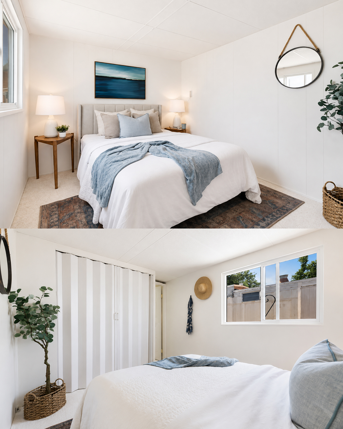
The bedroom follows the same light approach.
White walls create a clean shell. White bedding makes the bed feel soft but not heavy.
Then muted blue adds gentle color.
The blue throw and pillows connect the bedroom to the blue accents in the living room.
That kind of repetition helps a small house feel more connected.
The bed sits between two small side tables. Their dark wood finish provides needed contrast.
Matching lamps create symmetry.
Above the bed, one large piece of art replaces several small decorations. This keeps the wall simple.
A round hanging mirror adds another shape to the room. Its dark frame echoes the dark details seen elsewhere.
The bedroom also includes an older folding closet door.
That detail feels right for the age of the home. It takes little floor space, which makes it practical in a tight bedroom.
Design cues to notice
- White bedding
- Muted blue textiles
- Dark wood bedside tables
- Matching table lamps
- One large artwork
- Round wall mirror
- Folding closet doors
- Small bedroom footprint
- Simple floor covering
- Limited furniture
9. The Bathroom Holds Onto Its Mid-Century Spirit
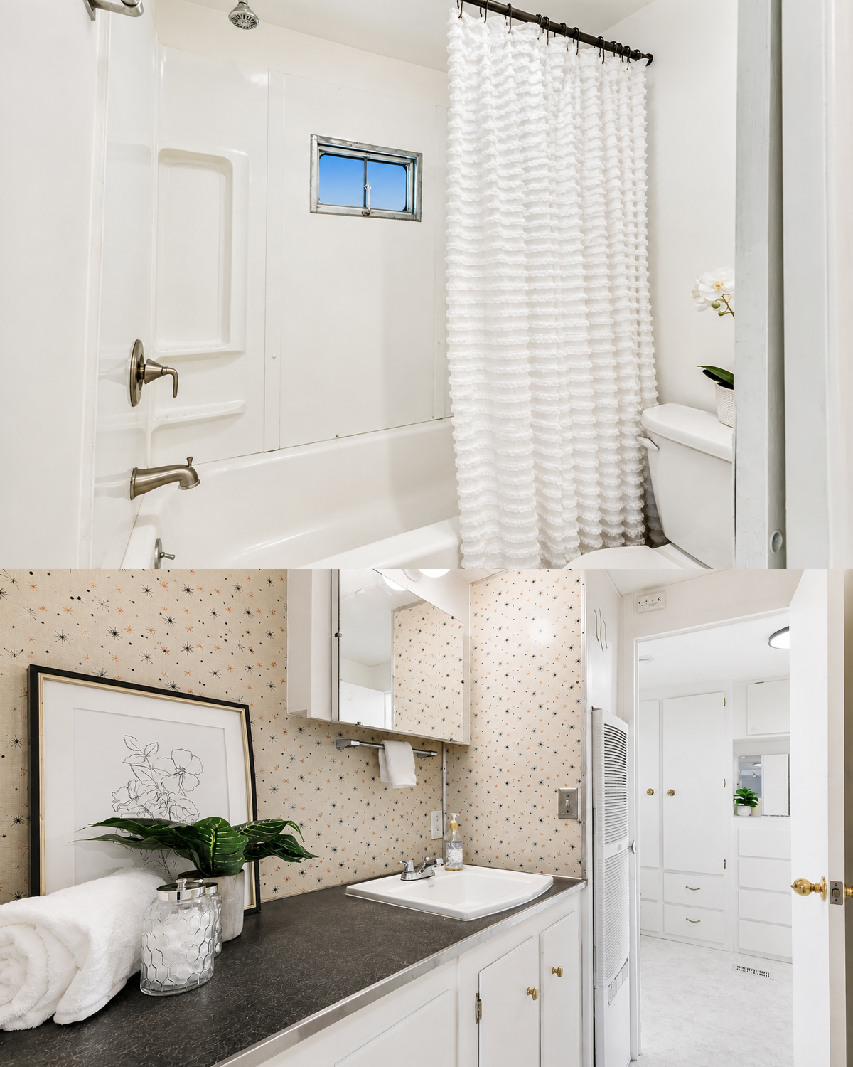
The bathroom offers some of the clearest vintage clues.
Its layout is narrow and very efficient.
A long vanity uses the wall for storage. White cabinet doors keep the base bright. A dark countertop creates contrast.
Above it, mirrored medicine cabinets add storage without taking up much room.
The wall covering stands out too.
Its tiny star-like pattern brings a playful mid-century feel into the space.
That print has much more personality than a plain white wall would.
It also gives the bathroom a sense of age without making it feel worn.
The tub and shower area stays simple.
White wall panels surround the tub. A small horizontal window brings in daylight while keeping privacy.
A white textured shower curtain softens the hard surfaces.
Black curtain hardware adds one modern contrast note.
This bathroom is not huge. Yet every piece serves a purpose.
Design cues to notice
- Narrow bathroom plan
- Long vanity
- Dark countertop
- White base cabinets
- Mirrored medicine storage
- Small-scale patterned wall covering
- Compact tub and shower
- Small high window
- White shower curtain
- Black curtain rod
10. Woven Texture Warms Up the Whole House
Rattan, wicker, cane, and basket weave appear again and again.
That is not an accident.
Without these warm textures, the all-white interior might feel flat.
Instead, the woven materials make it feel relaxed.
The living room has a woven coffee table and side pieces. The dining room uses woven chairs. Baskets appear in several rooms. Even wall decor brings in natural fiber.
These items also fit the age of the home in an interesting way.
Natural woven furniture became popular in many casual American interiors during the mid-century years. Today, the same materials feel coastal and bohemian.
That makes them a good bridge between old and new.
They do not make the 1958 home feel like a museum.
They simply help it feel warm.
Design cues to notice
- Rattan dining chairs
- Wicker coffee table
- Basket planters
- Woven wall pieces
- Natural fiber accessories
- Light wood furniture
- Handmade-looking texture
- Simple shapes
11. Plants Make the Pale Interior Feel Alive
Greenery plays a big role here.
Large plants fill empty corners. Smaller plants sit on tables, counters, and cabinets.
The green leaves stand out against the white background.
That contrast keeps the rooms from looking washed out.
Plants also soften many of the hard lines in a mobile home. The home has straight walls, flat ceilings, square windows, and simple cabinets.
Large leaves break up those lines.
They also make the decor feel less formal.
That is important because this home works best when it feels easy.
The plants do not look placed with perfect symmetry. Instead, they appear where the room needs height, color, or texture.
Design cues to notice
- Tall statement plants
- Potted tabletop greenery
- Leafy tropical shapes
- Woven plant baskets
- Green used as a natural accent
- Plants placed in empty corners
12. Simple Lighting Fits the Low Ceilings
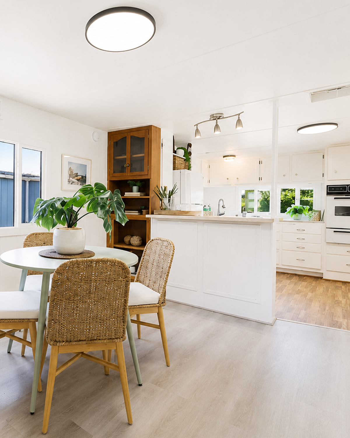
The low ceiling creates one clear rule.
Lighting cannot hang too far down.
So most of the fixtures sit close to the ceiling.
Round flush-mount lights appear in the living, dining, and kitchen areas. Their shape is simple and clean.
They provide light without making the ceiling feel lower.
The kitchen also uses a short track-style fixture. Again, it stays close to the ceiling.
Meanwhile, table lamps provide softer light in the living room and bedroom.
This layered approach works well.
Ceiling lights handle general light. Lamps add warmth at eye level.
Design cues to notice
- Flush-mount ceiling fixtures
- Low-profile kitchen lighting
- Small track light
- Matching bedside lamps
- Simple black exterior sconces
- Few hanging fixtures
13. Small Windows Become Part of the Vintage Look
Window size and placement offer more clues to the home’s age and mobile design.
Some windows are wide and low. Others are narrow. Several sit high on the wall.
That mix reflects the practical needs of a compact floor plan.
A small bathroom window allows privacy. Wider living and dining windows bring in more daylight.
The bright white frames help every opening feel larger.
Most windows also stay visually simple.
There are few heavy curtains or bulky treatments.
That choice makes sense.
In a narrow home, thick window treatments can take up valuable visual space. Bare or lightly dressed windows keep the walls feeling open.
Design cues to notice
- Mixed window sizes
- High-set bathroom window
- Wide living room windows
- White frames
- Minimal window treatments
- Strong natural light
14. Old and New Details Work Side by Side
The most successful part of this home may be its balance.
Some features clearly look older.
The low ceiling feels vintage. So do the cabinet proportions, folding doors, wall oven, ceiling panels, and bathroom storage.
Other details feel current.
The pale floors, black hardware, simple furniture, blue accents, oversized plants, and woven decor could appear in a home today.
Neither side takes over.
That is the secret.
A good renovation does not always need to remove every old feature.
Sometimes the better choice is to decide what still works.
Then you can build around it.
In this home, white paint acts as the bridge.
It takes older surfaces and gives them one shared background. Once that happens, modern pieces can sit next to vintage ones without feeling out of place.
Design cues to notice
- Vintage features left visible
- Fresh white paint
- Updated black hardware
- Modern pale floors
- Older built-in storage
- Vintage-scale appliances
- Current woven furniture
- Simple modern artwork
- Coordinated blue accents
15. The Narrow Layout Feels Like a Feature, Not a Flaw
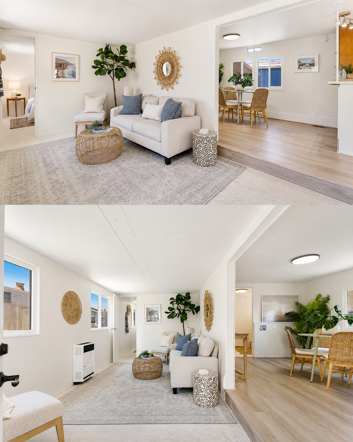
A single-wide will never have the same proportions as a large house.
That is fine.
Trying to force a narrow mobile home to behave like a huge open-plan house can create awkward results.
This 1958 home takes a smarter path.
Furniture follows the length of the rooms.
Traffic paths stay clear.
Dining furniture remains small.
Storage hugs the walls.
Large decorative pieces stay limited.
The result feels balanced.
You can still read the long shape of the home, but it does not feel like a hallway.
Instead, the floor plan becomes a series of small zones.
There is a place to sit. A place to eat. A place to cook. A quiet bedroom sits farther away.
Each room has a clear job.
Design cues to notice
- Furniture placed along walls
- Clear walking routes
- Compact dining set
- Small-scale seating
- Wall-based storage
- Few bulky pieces
- Clearly defined zones
- Consistent decor from room to room
16. The Soft Coastal Style Suits the Vintage Home
The finished interior has a light coastal feel, although it does not rely on obvious beach decor.
There are no seashells covering every shelf.
Instead, the look comes from color and texture.
White creates the base.
Pale blue adds a soft water-inspired tone.
Rattan and light wood suggest natural materials.
Plants add fresh green.
Simple landscape art brings in another gentle coastal cue.
Because those details stay subtle, the home does not feel themed.
It feels calm.
That mood works especially well inside a small home. Too many patterns or dark colors could make each room feel busy.
Here, almost every piece gets room to breathe.
Design cues to notice
- White and cream base
- Soft blue accents
- Pale natural wood
- Rattan furniture
- Coastal-style artwork
- Green plants
- Light gray rugs
- Minimal patterns
- Casual furniture
Conclusion
This 1958 single-wide mobile home shows how simple updates can give an older home a fresh new life. White finishes make each room feel larger, while rattan, wood, plants, and soft blue accents add warmth. Vintage details still shine through, giving the home personality that a brand-new space could never quite copy.