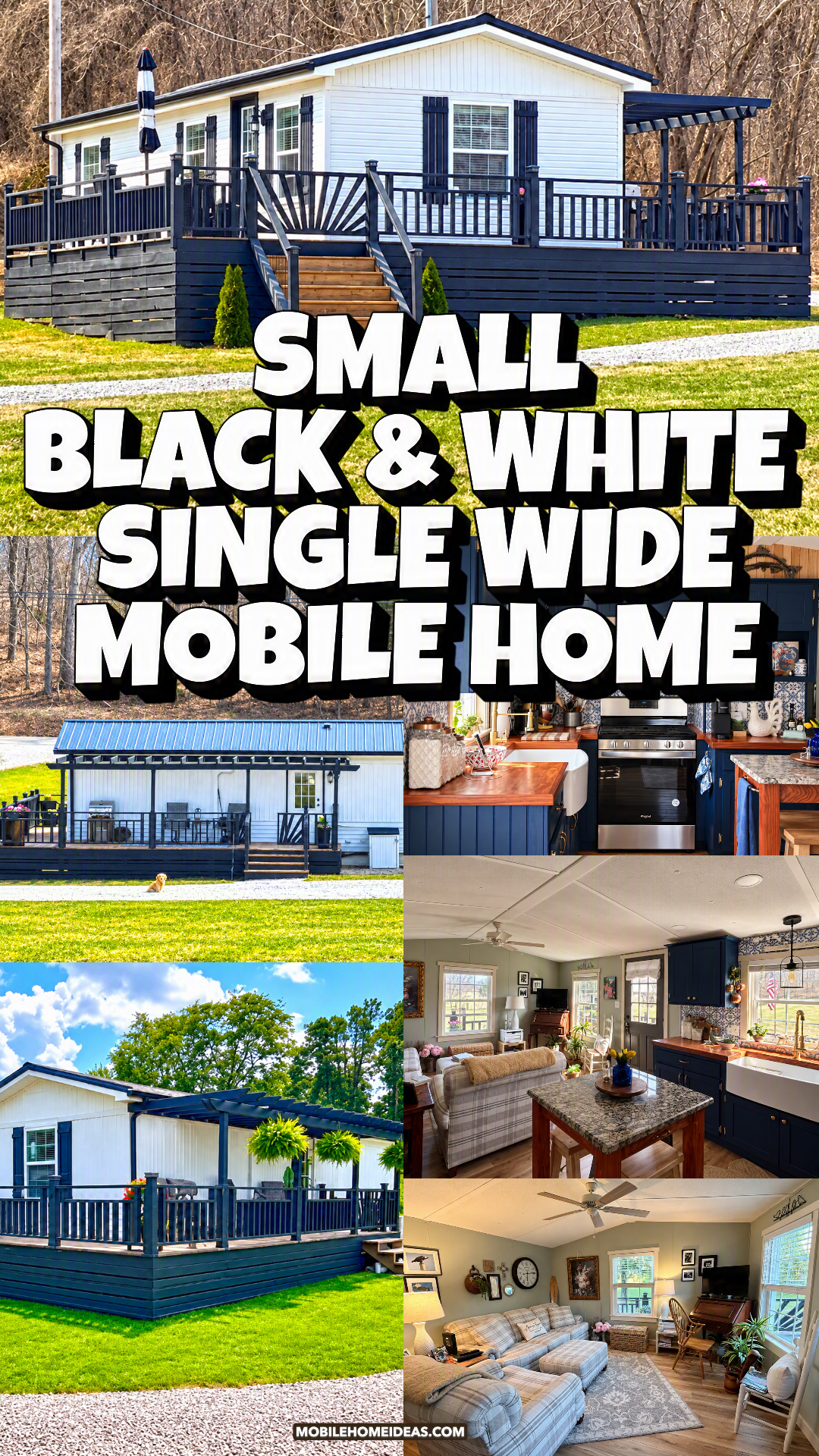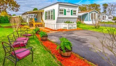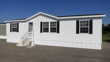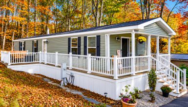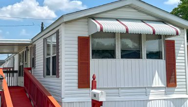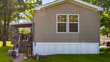
What makes a single wide mobile home feel truly inviting? It often comes down to smart color, cozy textures, and spaces that work hard. This home blends a crisp black-and-white exterior with a warm cottage-style interior. Navy cabinets, sage green walls, plaid furniture, natural wood, and a large outdoor deck give the home plenty of charm without making it feel crowded.
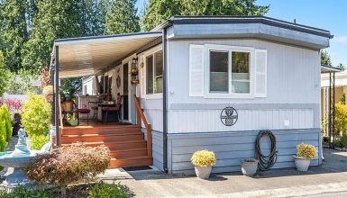
1. A Black-and-White Exterior That Gives the Home Instant Character
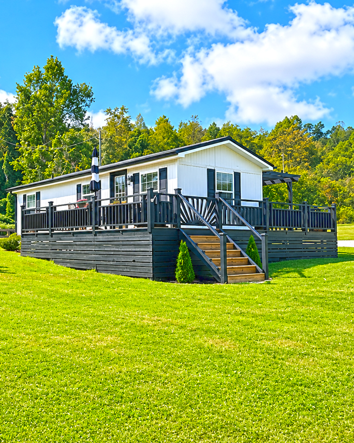
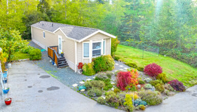
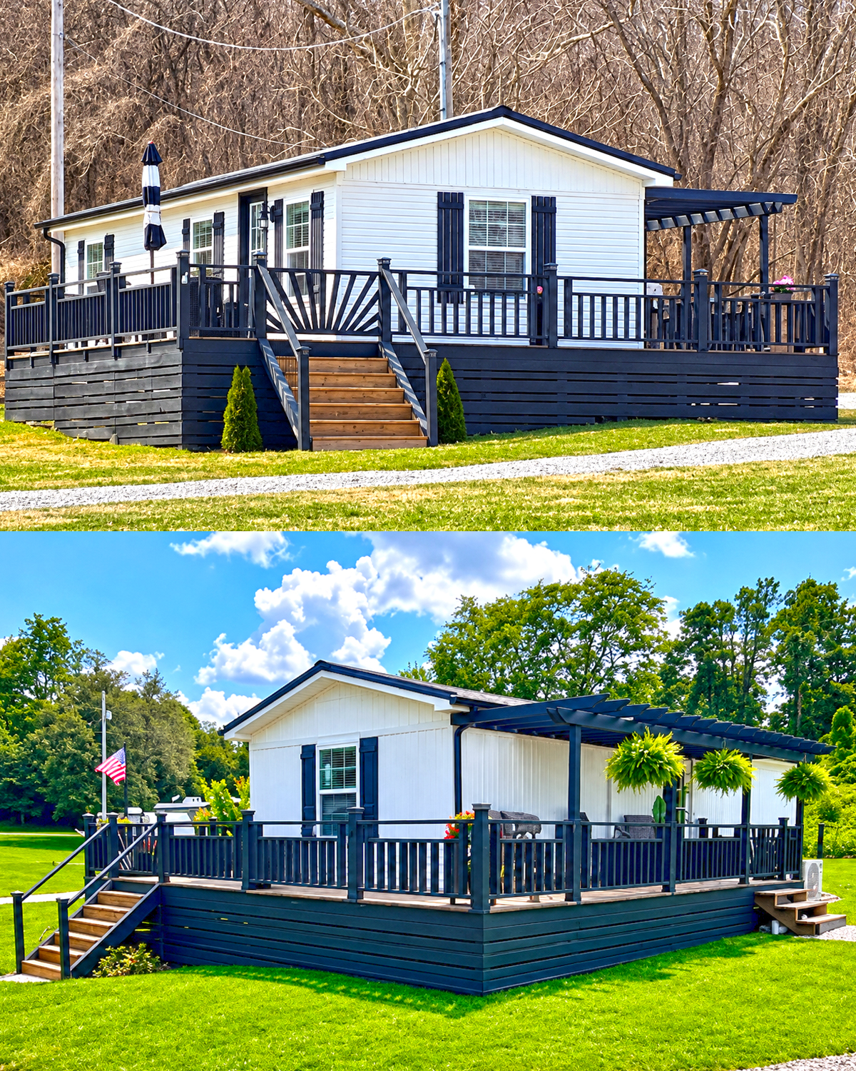
The exterior makes a strong first impression without relying on a complicated design.
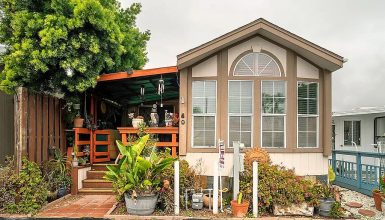
White siding creates a bright and clean base. Then black details frame the home. The dark shutters, roof trim, deck railing, and skirting create sharp contrast. Together, they make the simple shape of the mobile home look more finished.
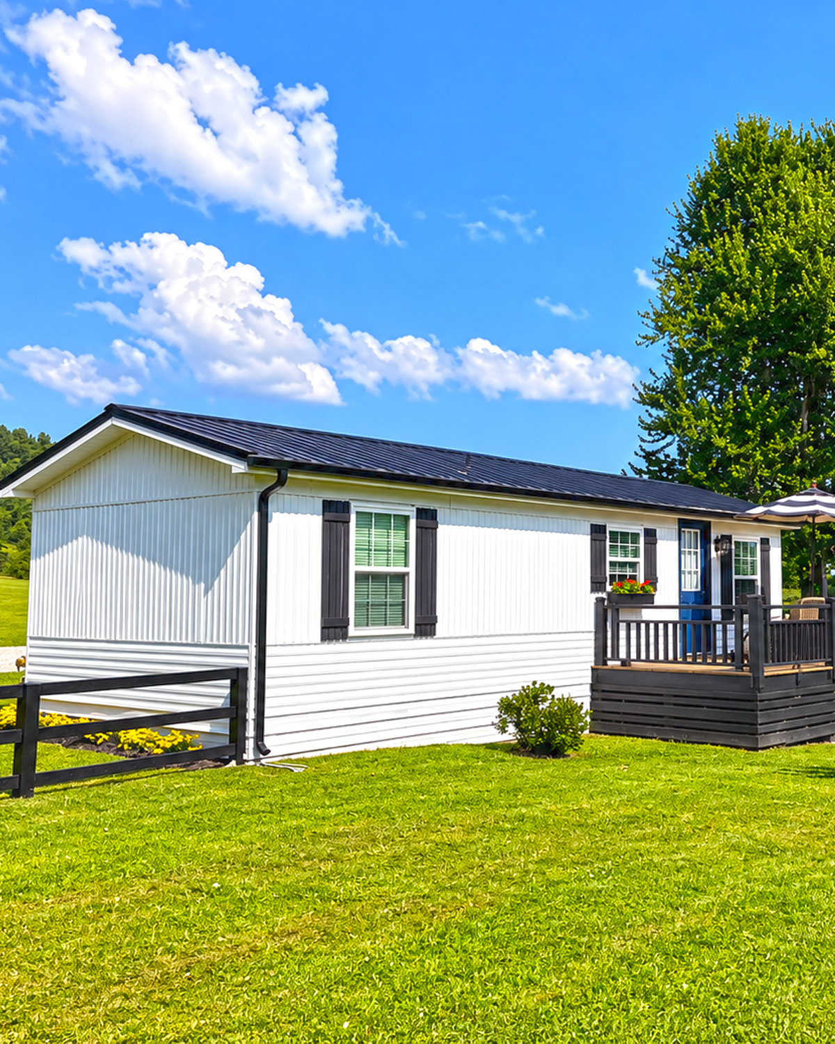
This color plan works especially well on a single wide. A long exterior can sometimes look flat when every surface uses the same color. Here, the dark details break that length into smaller visual sections.
The shutters also help. They frame the windows and give each one more presence. Although they are decorative, they make the windows look taller and more substantial.
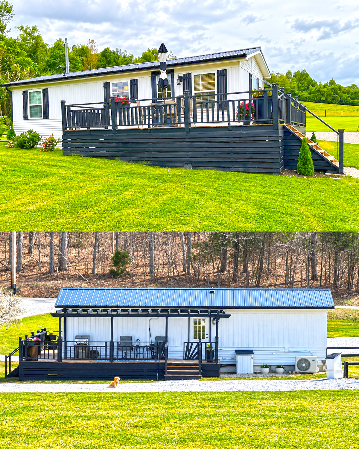
The front gable adds another nice detail. Vertical siding inside the gable changes the direction of the lines. That small shift creates texture without adding another color.
Then there is the deck.
Rather than treating it as a small set of steps, this design turns the deck into a major part of the home’s exterior. The black railing ties directly into the shutters and roofline. As a result, the addition looks connected to the home instead of added later.
Natural wood steps soften all that black. They also add warmth before you even enter the house.
Design cues
- Bright white exterior siding
- Black window shutters
- Black roof and fascia details
- Black horizontal deck skirting
- Dark deck railing
- Natural wood stair treads
- White gable with vertical siding
- Simple, high-contrast color palette
2. A Large Deck That Works Like an Outdoor Room
One of the smartest features of this single wide is the amount of usable outdoor space.
The deck runs along a large portion of the home. That gives the owners room for chairs, dining furniture, plants, and a grill. It is not just an entry platform. It acts more like an outdoor living room.
The black pergola makes this idea even stronger.
Its open beams define one section of the deck without blocking the view. Hanging ferns bring color overhead and soften the dark structure. Because the plants sit above eye level, they add greenery without taking away valuable floor space.
That is a helpful idea for any compact deck.
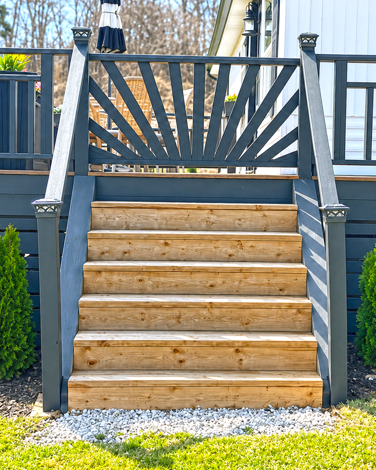
The deck also has access from more than one direction. Steps at different points make it easier to move between the yard and the home. Plus, the railing creates a sense of enclosure while still keeping everything open.
The horizontal skirting below the deck deserves attention too. It hides the underside and makes the whole structure feel solid. Its lines also stretch across the base of the home, which helps unite the porch and house.
Even the contrast with the lawn works in the home’s favor. Green grass, white walls, and black wood create a simple but bold outdoor palette.
Design cues
- Full-length outdoor living area
- Black pergola
- Hanging ferns
- Multiple seating zones
- Outdoor dining space
- Grill area
- Dark horizontal skirting
- More than one stair access point
- Open railings that preserve views
3. A Cozy Living Room Built Around Soft, Familiar Colors
Step inside, and the mood changes.
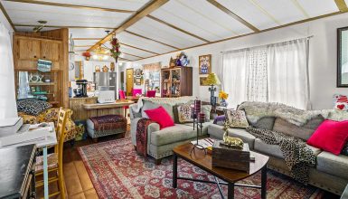
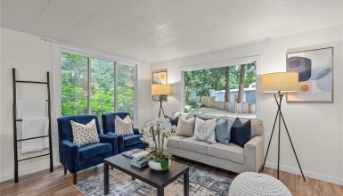
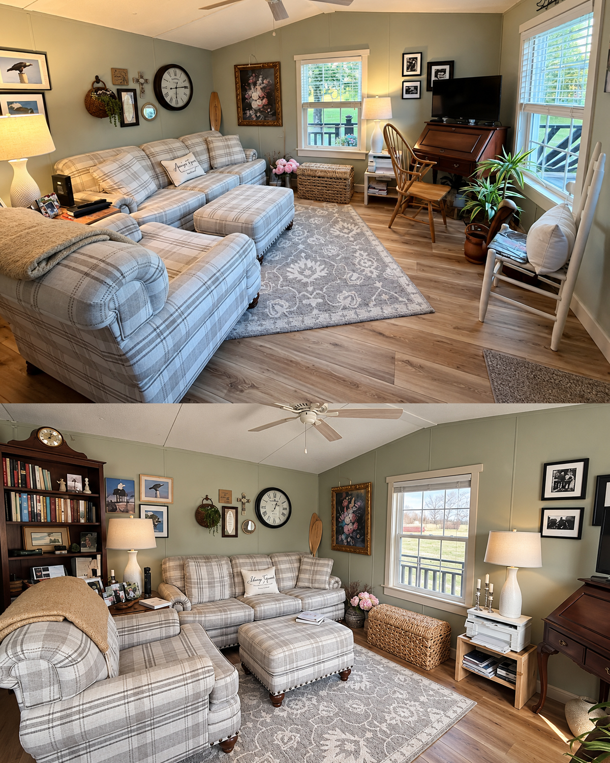
The bold black-and-white exterior gives way to softer shades. Sage green walls create a calm background. Warm wood flooring runs through the room. Cream and gray furniture keeps the palette light.
The plaid sofa and chair are the most noticeable pieces.
Plaid could make a small room feel busy. However, this pattern stays soft because it uses pale, neutral colors. There is enough detail to give the furniture character, but the pattern does not overpower the room.
Matching upholstery also helps.
Instead of filling the space with unrelated furniture styles, the coordinated sofa, chair, and ottoman create a clear set. That gives the living room order.
The large patterned area rug performs another useful job. It visually groups the seating. In an open layout, that matters. There are few walls separating the living room from the kitchen, so the rug becomes an invisible boundary.
Warm lamps add another layer of comfort. Rather than depending only on ceiling lights, the room uses table lamps near the seating area. This creates softer evening light.
Personal art, framed photos, clocks, plants, and small collections make the room feel lived in. There is plenty to see, but the muted wall color prevents the room from becoming too chaotic.
Design cues
- Soft sage green walls
- Pale plaid seating
- Large neutral area rug
- Warm wood-look flooring
- White table lamps
- Family photographs
- Vintage-style artwork
- Woven storage chest
- Houseplants
- Coordinated sofa, chair, and ottoman
4. Smart Furniture Placement Makes the Narrow Room Work
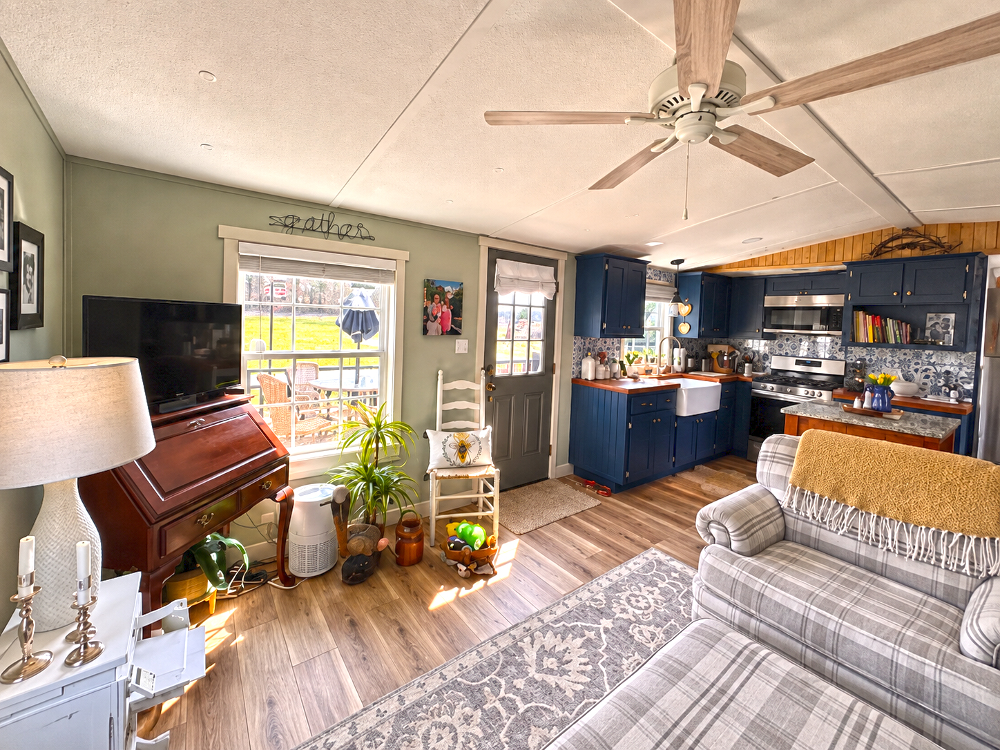
Furniture placement matters more in a single wide than it does in many larger homes.
The rooms tend to follow the home’s long shape. That means poor placement can quickly block the path from one end of the house to the other.
Here, the seating hugs the edges of the room.
The sofa sits along one wall. The chair occupies the nearby corner. The ottoman stays in the center but remains easy to walk around. This arrangement preserves an open path toward the kitchen.
Large furniture does not automatically make a small room feel smaller. What matters is how the pieces fit.
These chairs have generous proportions, but they do not float in awkward spots. They use the perimeter of the room. As a result, the center feels open.
A tall bookcase takes advantage of vertical space. This is another strong choice for a mobile home. When floor area is limited, going upward often makes more sense than adding short, wide storage pieces.
The writing desk also shows how one room can do more than one job. It sits against the wall near the television and creates a small work zone without needing a separate office.
That makes the living room flexible. It can handle relaxing, reading, television, storage, and desk work.
Design cues
- Furniture placed along walls
- Clear central walkway
- Tall bookcase
- Compact writing desk
- Ottoman instead of a bulky coffee table
- Multipurpose living area
- Small furniture zones within one room
- Open route to the kitchen
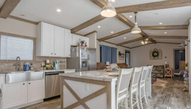
5. An Open Living and Kitchen Layout Keeps the Home Connected
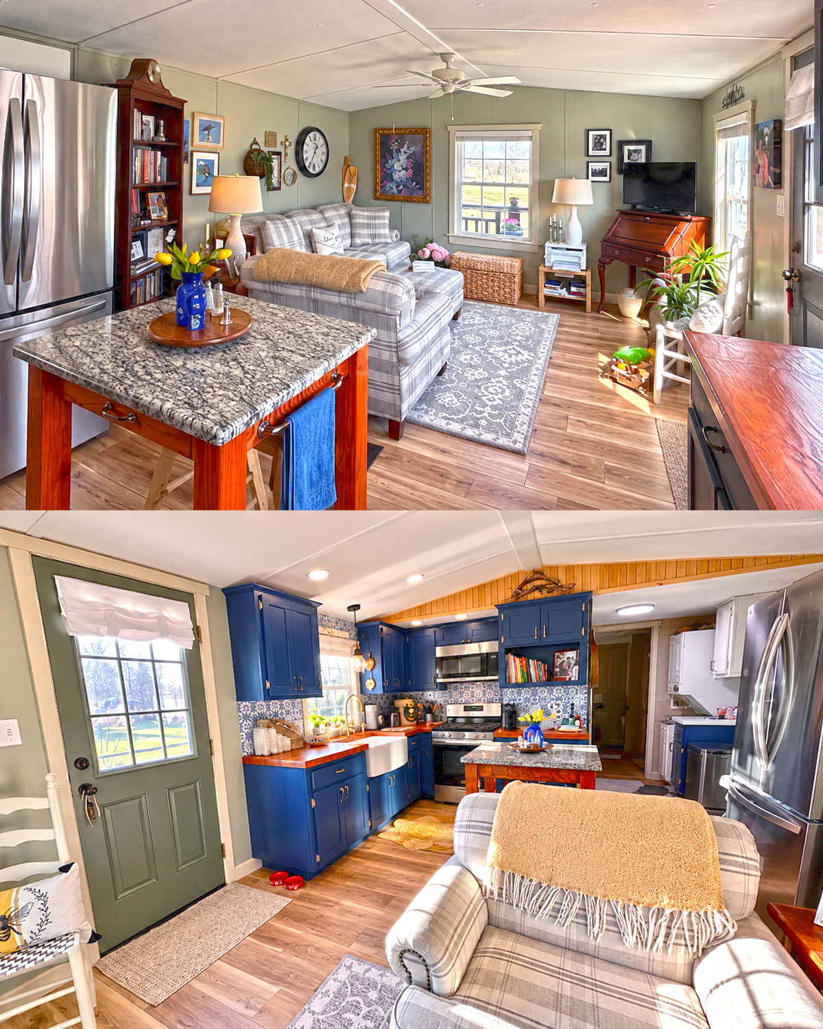
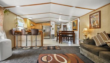
One of the biggest visual advantages of this design is the connection between the living room and kitchen.
There is no heavy wall dividing the two areas. Instead, flooring, ceiling lines, and color changes define each space.
This makes the main living area feel longer and brighter.
From the living room, you can see directly into the kitchen. That visual connection gives the home depth. Your eye does not stop at a wall.
Yet the rooms do not feel identical.
The living room uses sage green, pale plaid, and soft neutrals. The kitchen introduces deep navy, patterned tile, metal appliances, and warm wood. Each room has its own mood.
Still, a few details connect them.
The wood flooring continues from one area to the next. Warm brown tones appear in the furniture and kitchen counters. Navy accents repeat in smaller decor pieces. White trim runs throughout.
The ceiling also helps.
Its gentle pitch gives the main space more height than a flat ceiling might. Light colors keep that surface from feeling low. Ceiling fans also add function without taking up any wall or floor space.
Design cues
- Open living-to-kitchen sightline
- Continuous wood flooring
- Light ceiling finish
- Vaulted or gently pitched ceiling
- Repeated warm wood tones
- White trim throughout
- Separate room colors with shared accents
- Unblocked central circulation path
6. A Navy Kitchen That Becomes the Star of the Home
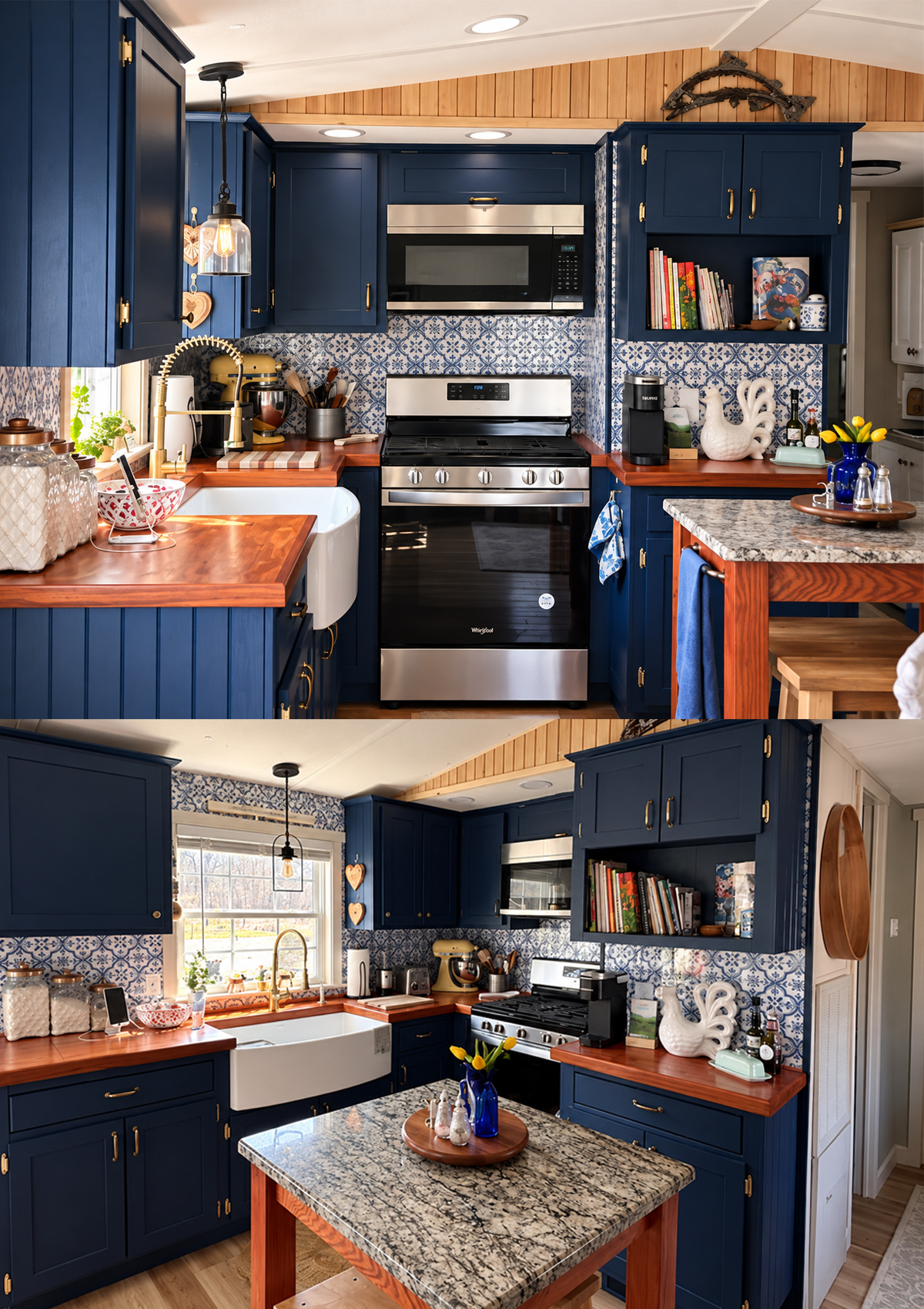
The kitchen provides the biggest design moment.
Deep navy cabinets cover most of the room. In a small kitchen, that might sound risky. Yet the color works because it has plenty of lighter details around it.
White ceilings keep the top of the space bright. Stainless steel appliances reflect light. A large white farmhouse sink breaks up the darker lower cabinets. Blue-and-white backsplash tile adds pattern instead of another solid dark surface.
Then warm wood countertops change the mood again.
Without them, the navy and stainless steel could feel cool. The reddish-brown wood adds warmth. It also links the kitchen with the wood flooring and traditional furniture elsewhere in the home.
Brass hardware adds another warm note.
The result feels layered. Navy provides depth. White provides freshness. Wood adds warmth. Brass adds a small touch of shine.
The cabinets also make good use of the walls. Upper storage extends across much of the cooking area, while smaller open shelves create room for cookbooks and decor.
This blend keeps the room practical without turning every wall into a solid bank of cabinetry.
Design cues
- Deep navy cabinets
- Shaker-style doors
- Brass pulls and hinges
- Warm wood countertops
- White farmhouse sink
- Stainless steel appliances
- Blue-and-white backsplash
- Built-in cookbook shelf
- Strong mix of warm and cool colors
7. Patterned Backsplash Gives the Small Kitchen a Big Personality
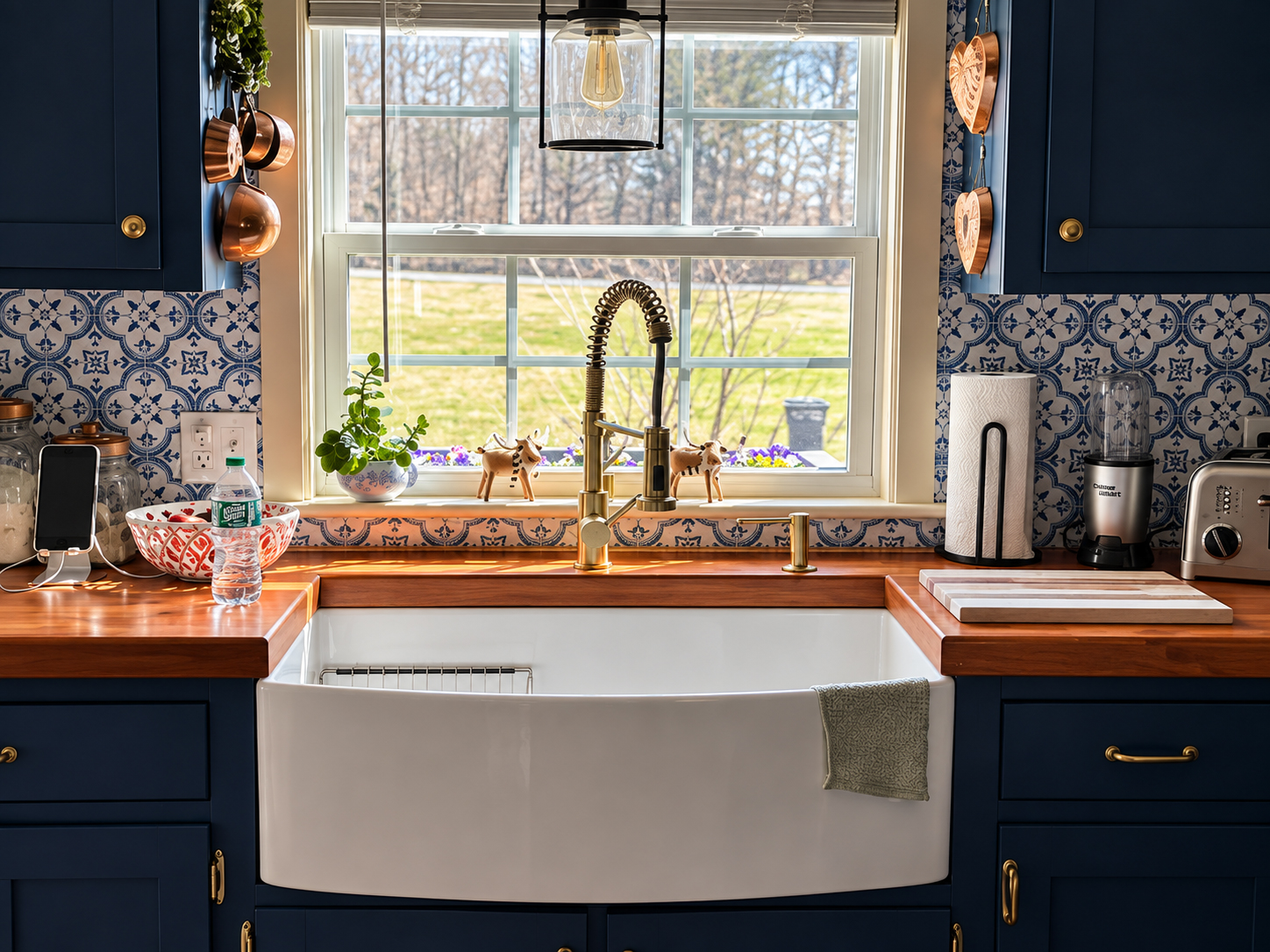
The blue-and-white backsplash deserves its own look because it changes the entire kitchen.
A plain wall would make the navy cabinets feel much heavier. Instead, the patterned tile creates movement and brightness between the upper and lower cabinets.
The repeating design feels almost like classic European or country tile. That fits nicely with the farmhouse sink and wood countertops.
It also gives the kitchen a custom feel.
In smaller homes, homeowners sometimes avoid pattern because they fear it will make the space look crowded. This room takes the opposite approach.
The pattern stays limited to one main surface. The cabinets use one strong solid color. The countertop remains mostly simple. Because each finish has a clear role, they do not compete too much.
The backsplash also repeats the blue already found in the cabinets. This keeps the palette controlled.
Small details continue that look. Blue pottery, a blue vase, and kitchen towels pick up the same color. Yellow flowers provide a bright accent without changing the overall scheme.
Design cues
- Repeating blue-and-white pattern
- Backsplash used as a focal surface
- Pattern limited to a defined area
- Navy repeated throughout the kitchen
- Small blue decor accents
- Warm wood to balance the pattern
- White sink for visual relief
- Yellow flowers as a small accent
8. A Compact Island Adds Work Space Without Closing the Room
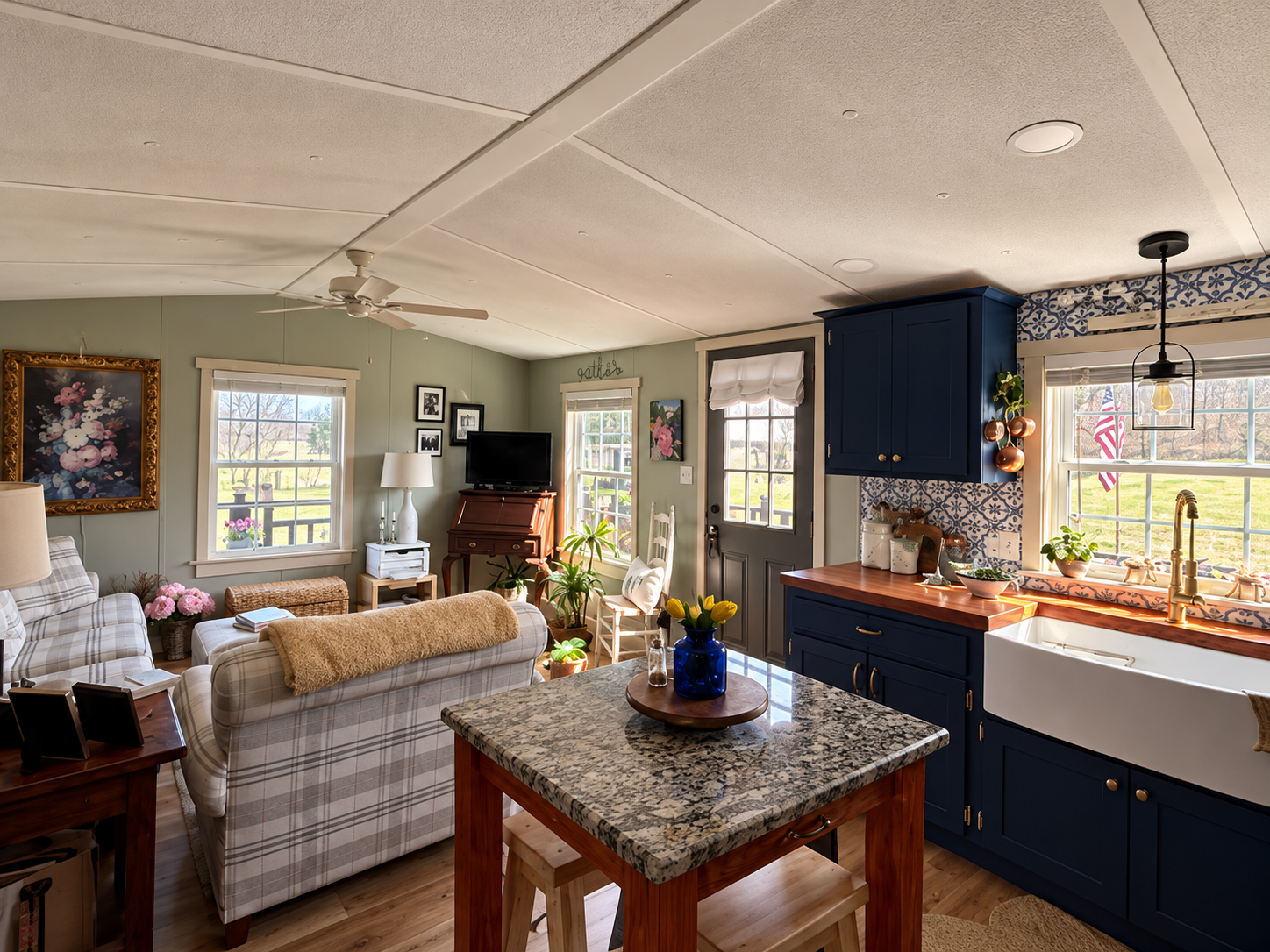
The center island is modest in size, and that is exactly why it works.
A larger island could block movement between the kitchen and living room. Instead, this piece gives the kitchen extra prep space while preserving a comfortable walkway.
The wood base has a warm tone that stands apart from the navy cabinets. A stone-look top adds another practical work surface.
Stools tuck beneath one side.
That allows the island to serve several roles. It can become a breakfast bar, prep station, serving area, or casual work surface. In a small mobile home, furniture that performs more than one job is always valuable.
The island also acts as a soft divider.
It tells you where the kitchen ends without using a wall. Someone can prepare food while still talking with people in the living room.
That kind of connection is one reason open layouts work so well in narrow homes.
Design cues
- Small central island
- Open wood base
- Stone-look worktop
- Tuck-under stools
- Extra prep area
- Casual eating space
- Clear walkways around the island
- Visual divider between kitchen and living room
9. Warm Wood Details Keep the Bold Kitchen Feeling Inviting
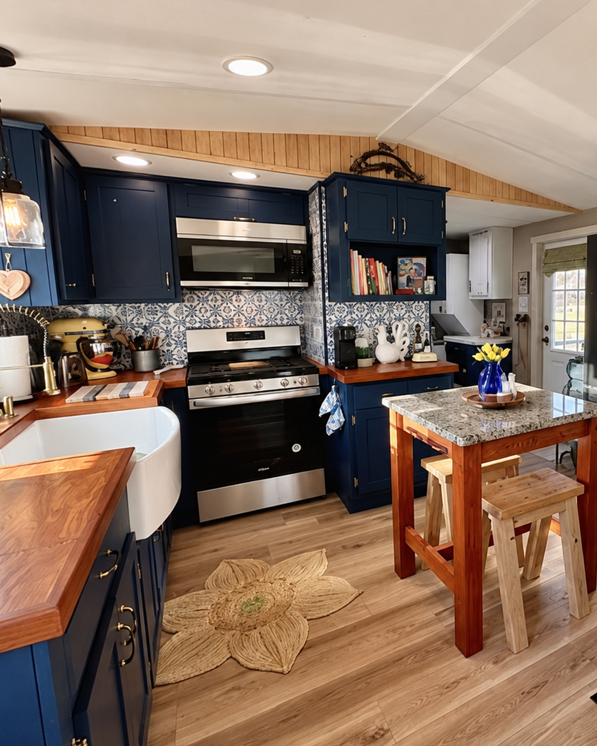
Color gets most of the attention in the kitchen, but wood may be the element that makes everything work.
The counters have a strong natural tone. The island frame adds more wood. Flooring continues the same warm story. Even the trim near the upper part of the kitchen introduces another wood surface.
These details prevent the navy cabinets from taking over.
They also connect the updated kitchen with the more traditional furniture in the rest of the home.
That is important because the house does not follow one strict style.
The kitchen leans toward updated cottage and farmhouse design. The living room feels more traditional. The bedroom uses antique-inspired wood furniture. Instead of forcing every room to match, the home uses repeated materials to connect them.
Wood is one of those links.
It appears again and again. Yet the tones are close enough that they feel related.
This is a useful lesson for small-home decorating. Matching every item is not necessary. Repeating a few materials and colors can create enough unity.
Design cues
- Warm butcher-block-style counters
- Natural wood island base
- Wood-look flooring
- Wood ceiling accent
- Brown furniture tones repeated nearby
- Warm brass hardware
- Mix of new and traditional finishes
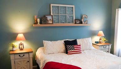
10. A Traditional Bedroom That Feels Calm and Grounded
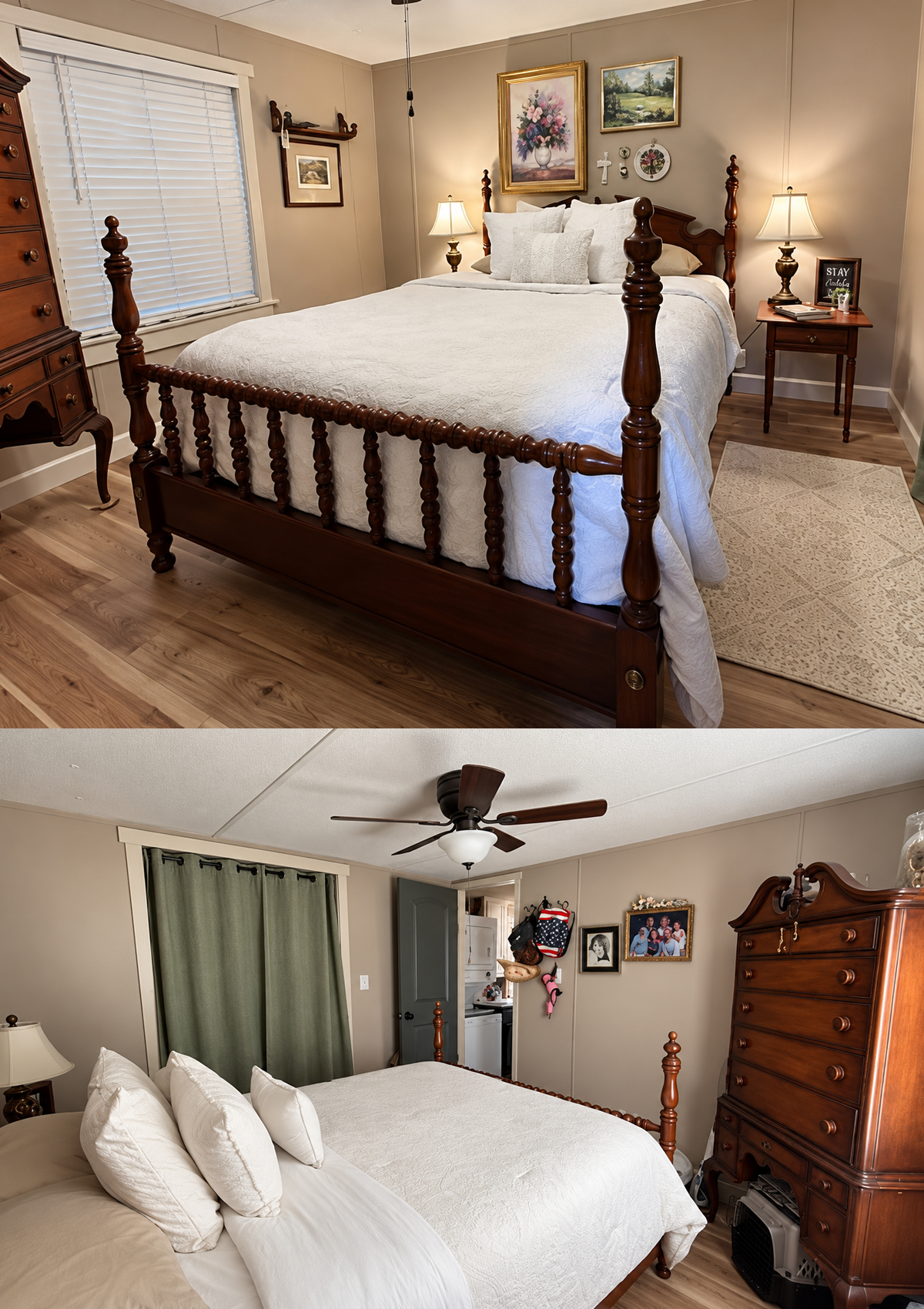
The bedroom takes a much softer approach.
A dark wood bed becomes the clear focal point. Its turned posts and detailed frame give the room traditional character. A tall chest adds another large wood element.
Because these pieces are visually strong, the rest of the room stays simple.
White bedding is the perfect counterweight. It makes the bed feel fresh rather than heavy. Layers of pillows bring softness without adding bold color.
The walls use a warm neutral shade. This creates a quieter mood than the sage living room or navy kitchen.
Artwork above the bed adds gentle color. Gold-toned frames complement the rich brown furniture. Small bedside lamps provide soft light.
Window coverings stay simple as well. White blinds allow daylight into the room, while muted green curtains on another wall introduce a subtle color connection to the rest of the home.
Even though the bedroom is not huge, the larger furniture works because each piece has a clear position.
The bed remains the main feature. The chest sits against the wall. The center stays open.
Design cues
- Dark traditional wood bed
- Turned bedposts
- Tall wood chest
- Crisp white bedding
- Warm neutral walls
- Vintage-style framed art
- Small bedside tables
- Classic lamps
- Soft green curtains
- Clear floor space around major furniture
11. A Small Bathroom Uses Color to Create Continuity
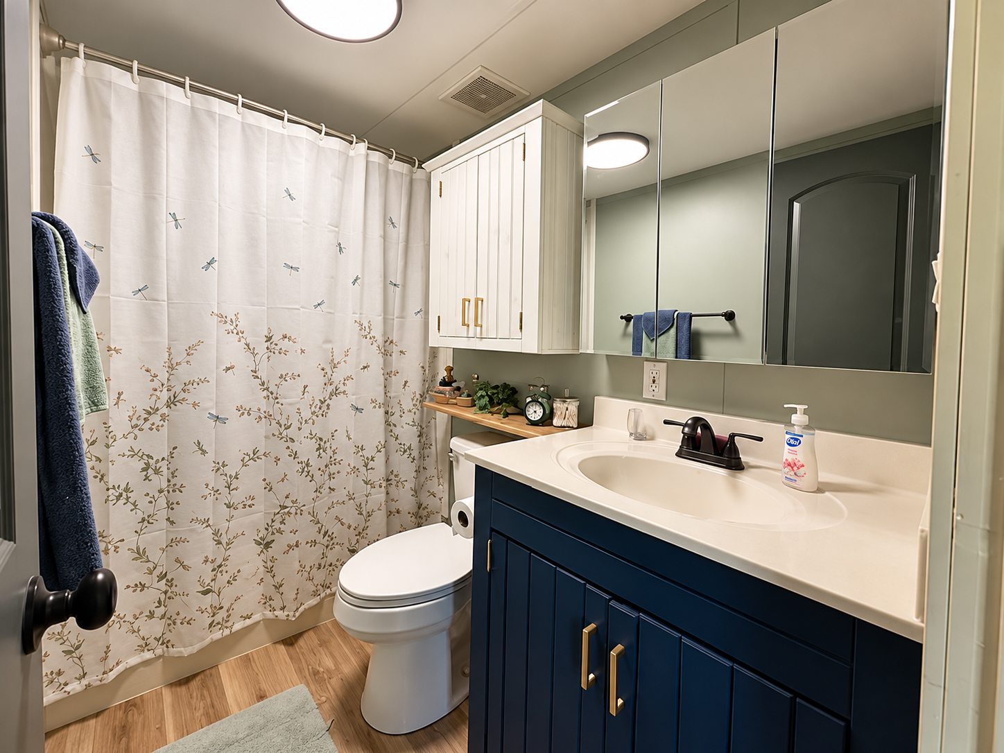
The bathroom carries the home’s navy color into another room.
The vanity uses the same deep blue family found in the kitchen. Brass pulls repeat the kitchen hardware too. That makes the bathroom feel connected to the rest of the house.
The white countertop keeps the vanity from appearing too heavy.
Above it, a wide mirrored cabinet serves two important purposes. First, it provides hidden storage. Second, the mirrors reflect light around the compact room.
That can make a small bathroom feel more open.
A tall white cabinet adds even more storage. Its narrow shape fits the room without using much floor area. Vertical storage works especially well in tight spaces because it leaves more room for movement.
The sage wall color feels familiar after seeing it in the living room.
Then the shower curtain adds a gentle pattern. Small dragonflies and leafy branches introduce color without overwhelming the bathroom.
Nothing feels too bold. Yet the room still has personality.
Design cues
- Navy vanity
- Brass cabinet hardware
- White countertop
- Large mirrored medicine cabinet
- Tall white storage cabinet
- Sage green walls
- Nature-inspired shower curtain
- Blue and green towels
- Wood-tone flooring
12. A Laundry Zone That Uses Every Inch Well
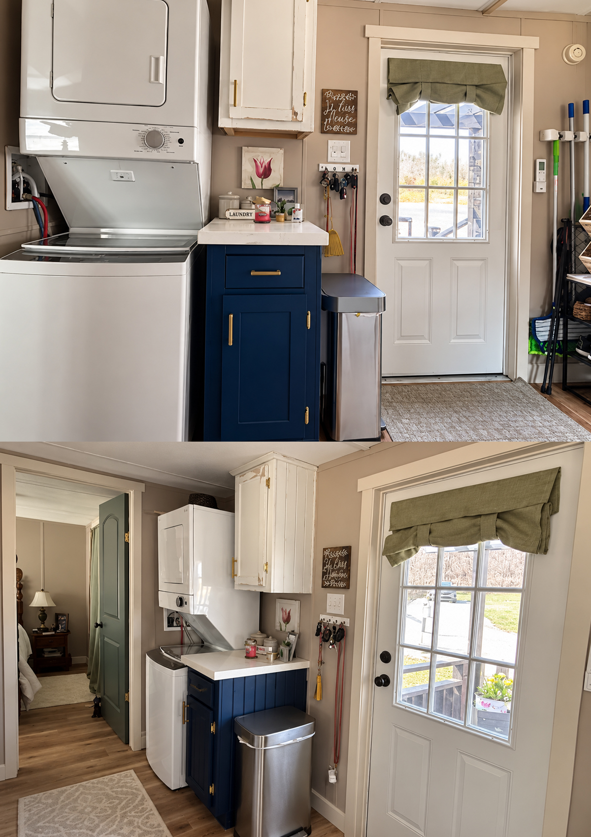
The laundry area proves that a utility space can be compact and still work hard.
A stacked washer and dryer use vertical space instead of valuable floor area. This leaves room for a small counter and cabinet beside the appliances.
That little surface matters.
It can hold laundry products, folded clothes, cleaning supplies, or everyday items. A navy base cabinet also brings the home’s main accent color into the space.
The wall cabinet above adds more closed storage.
Nearby hooks keep keys and small household items easy to reach. Cleaning tools hang on the wall rather than leaning in a corner. A narrow shelving unit holds baskets and other supplies.
The exterior door brings light into the area through its large glass panel. That helps the narrow utility zone feel more open.
Even the small window shade adds a finished touch.
This area shows a key rule for single wide living: walls should work as hard as floors.
When items hang, stack, or store vertically, the room remains easier to move through.
Design cues
- Stacked washer and dryer
- Narrow work counter
- Navy lower cabinet
- Wall-mounted upper storage
- Key hooks
- Hanging cleaning tools
- Slim shelving unit
- Storage baskets
- Glass-panel exterior door
- Compact floor plan with vertical storage
Conclusion
This single wide mobile home proves that a narrow floor plan can still feel stylish, comfortable, and full of character. Bold navy accents add depth, while soft greens, white finishes, warm wood, and classic furniture keep the rooms welcoming. Best of all, each space has a clear purpose. From the open kitchen to the cozy bedroom and spacious deck, the design makes everyday living feel easy and personal.