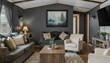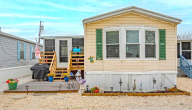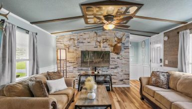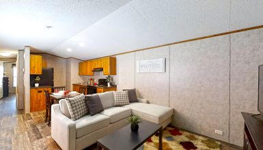
Can a simple single wide mobile home feel warm, open, useful, and full of charm at the same time?
This home proves it can.
From the wooded setting and wide outdoor deck to the bright kitchen and cheerful sunflower decor, every part of the design feels personal. The home does not try to hide its modest size. Instead, it uses smart updates, practical storage, and bold details to make each space work harder.
The result feels relaxed and welcoming. It suits family life, quiet weekends, outdoor meals, and daily routines. Best of all, many of the ideas are easy to adapt. You do not need a full remodel to bring the same sense of comfort into your own home.
Here are the design choices that make this single wide mobile home stand out.
1. Create a Strong Front Entrance With a Covered Porch
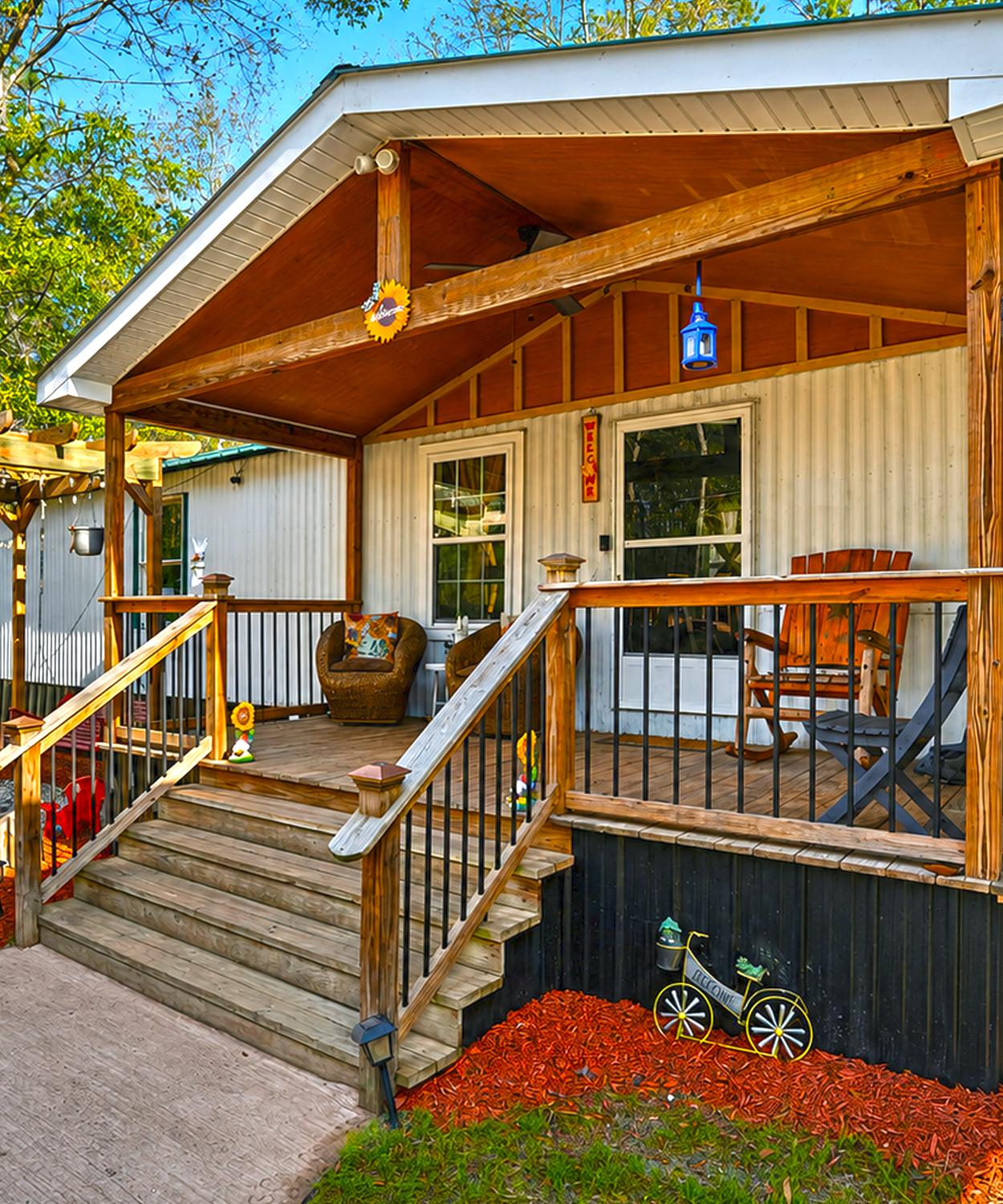
A covered porch can change the whole look of a single wide mobile home. It gives the front wall more depth. It also creates a clear place to enter the home.
Here, the porch has a simple gabled roof. Exposed wood posts and beams add rustic charm. The warm wood stands out against the light exterior. Black metal railings bring contrast and help the design feel more finished.
The porch also gives the home a friendly face. A pair of chairs turns it into a small sitting spot. Decorative signs, hanging planters, and soft lighting add more character.
The wide stairs make the entrance feel open. They also improve the flow between the yard and the front door.
A porch like this works well because it adds both beauty and function. It protects the doorway from rain and sun. At the same time, it creates a place to pause, talk, or enjoy the view.
Design cues:
- Simple gabled porch roof
- Exposed wood posts
- Wide front steps
- Black metal railings
- Porch seating
- Hanging plants
- Rustic outdoor lights
- Warm wood against pale siding
2. Use an Open Carport to Add Useful Covered Space
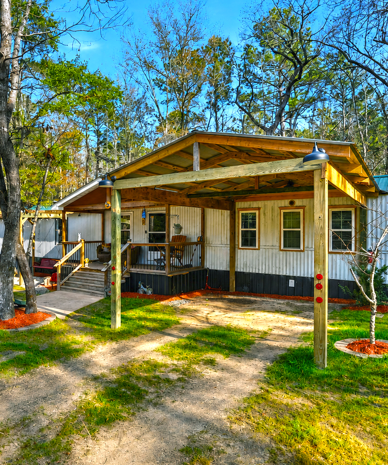
The open carport gives this home another layer of function. Its simple wood frame and sloped roof match the relaxed country setting.
A carport can make a single wide home feel larger from the road. It stretches the exterior footprint and adds a strong visual anchor. It also offers shade for a vehicle, tools, bikes, or outdoor gear.
The design stays light because the sides remain open. This keeps the structure from blocking views or making the front yard feel crowded.
The roof angle looks clean and modern. However, the raw wood frame keeps the style warm and casual. This mix helps the carport blend with the porch and wooded lot.
For the best result, repeat materials across the exterior. Use the same wood tone on the porch, carport, deck, and pergola. This simple step makes separate additions feel like one plan.
Design cues:
- Open-sided structure
- Simple sloped roof
- Thick wood posts
- Matching porch materials
- Black outdoor lights
- Clear driveway access
- Unfinished or lightly stained lumber
3. Add a Pergola for Shade and Outdoor Character
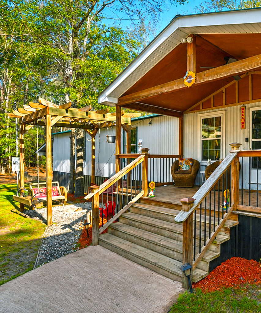
A pergola adds shape and charm without closing off the yard. It creates a small outdoor room beside the home.
The exposed rafters cast soft shadows below. They also add a handmade look. A bench swing makes the area feel playful and welcoming.
This type of feature works well near a front porch or side entrance. It can mark a path, frame a seating spot, or support climbing plants. Over time, vines can add shade and help the structure blend into the landscape.
The pergola also balances the long shape of the home. It gives the exterior another focal point and breaks up the straight roofline.
Keep the design simple. A small pergola often looks better than a heavy one beside a single wide. It should support the home, not overpower it.
Design cues:
- Open wood roof
- Thick support posts
- Curved rafter ends
- Hanging bench
- Gravel base
- Space for climbing vines
- Natural wood finish
4. Finish the Base With Dark Skirting
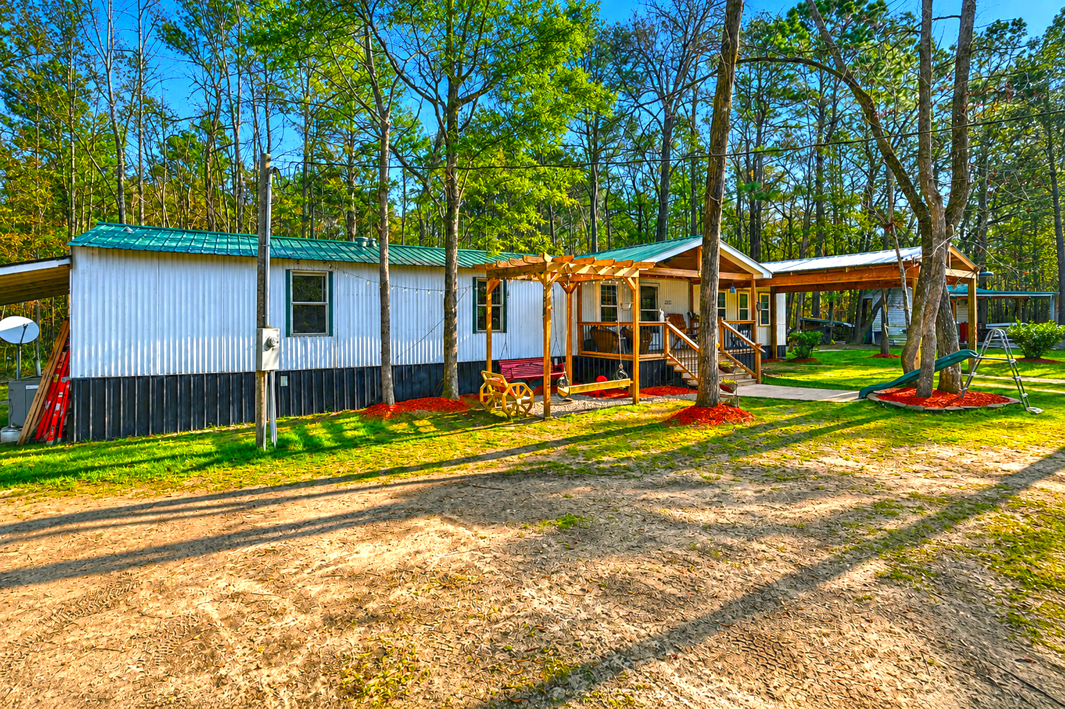
Dark skirting gives the home a neat and grounded look. It hides the open space beneath the structure and creates a clear base line.
Black skirting works especially well with light siding. The strong contrast makes the exterior look crisp. It also ties in with black railings, light fixtures, and other small details.
A dark base can make a mobile home look lower and more settled into the land. It draws the eye across the full length of the home. As a result, the exterior feels more unified.
The skirting should stay simple. Too many textures can make a long wall look busy. Plain vertical panels create a clean finish and let the porch and landscaping stand out.
Good skirting also has a practical role. It can help protect pipes, insulation, and the underside of the home. However, it still needs proper vents and access panels.
Design cues:
- Black or charcoal skirting
- Vertical panel pattern
- Light siding above
- Matching black railings
- Hidden access panel
- Proper foundation vents
5. Use Red Mulch as a Bold Landscape Accent
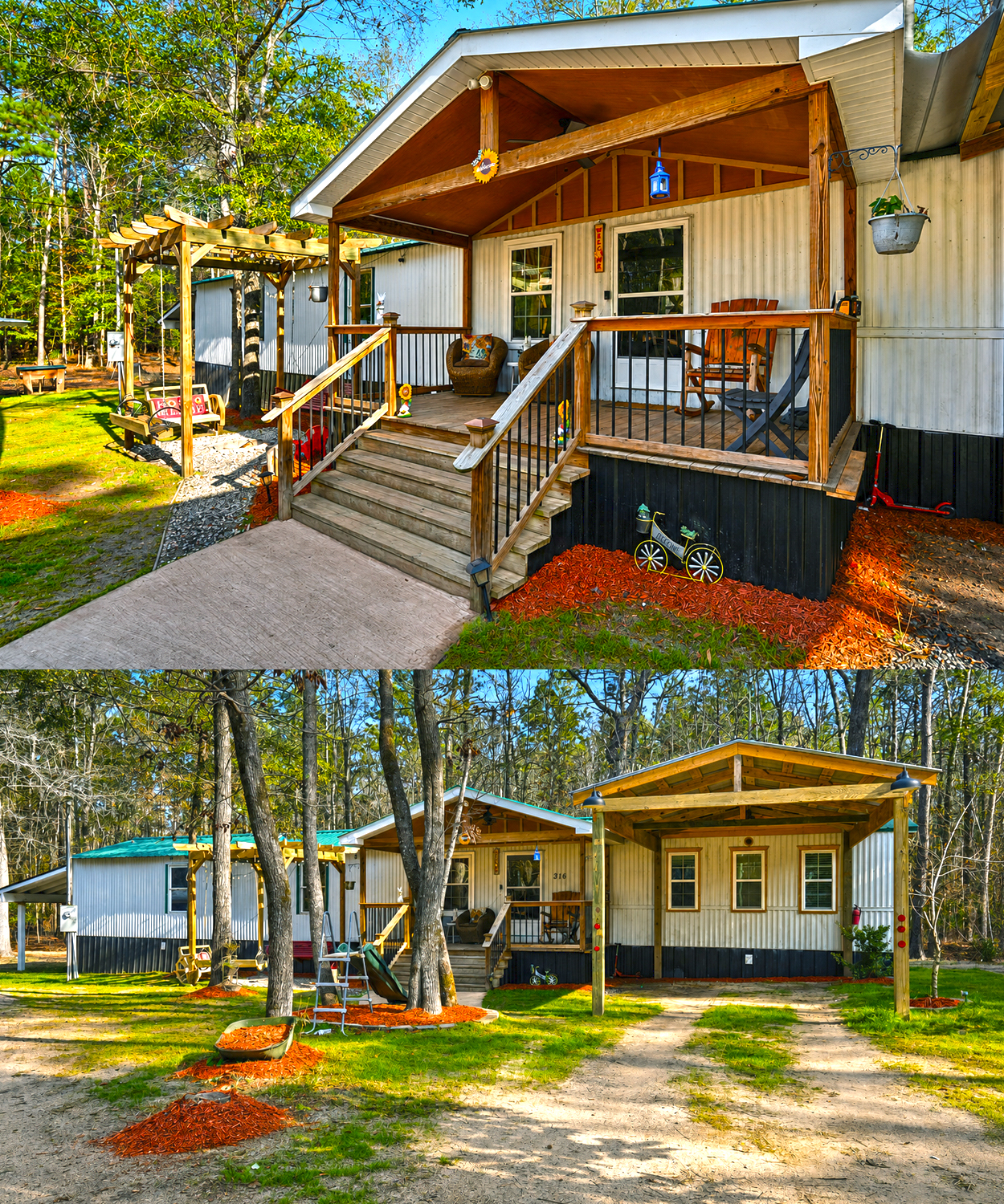
The bright red mulch adds color around the trees, porch, and front steps. It stands out against green grass and neutral siding.
This is a simple way to give a wooded yard more structure. The mulch rings define the planting areas. They also help the home feel cared for, even with minimal planting.
Because the exterior has a quiet palette, the red color does not feel too busy. Instead, it brings warmth to the setting. It also links well with small red accents around the porch and yard.
Mulch can guide the eye toward the entrance. Place it near steps, walkways, trees, and foundation beds. Keep the edges neat so the look feels planned.
For a softer style, use pine bark or dark brown mulch. For a bolder country look, red mulch can work well.
Design cues:
- Defined mulch rings
- Bright color contrast
- Simple foundation beds
- Clean garden edges
- Small decorative yard pieces
- Low-maintenance planting
6. Build a Large Side Deck for Outdoor Living
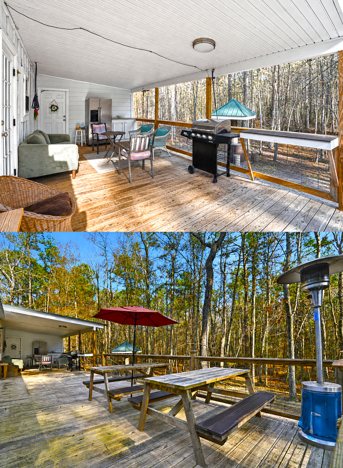
The side deck may be one of the most useful parts of the whole home. It extends the living space far beyond the interior walls.
Because the deck runs along the side, it fits the long shape of the single wide. It creates room for dining, grilling, relaxing, and hosting guests.
Simple wood picnic tables keep the mood casual. A large umbrella adds shade and color. A patio heater makes the deck more useful during cool weather.
The wire railing is another smart choice. It keeps the view open and suits the rural setting. The wood frame still feels warm, while the dark wire adds contrast.
A deck like this can change how a small home functions. It gives people more space to spread out. It also makes the wooded surroundings part of daily life.
Design cues:
- Long side deck
- Natural wood flooring
- Wire-panel railing
- Picnic tables
- Outdoor umbrella
- Patio heater
- Grill station
- Forest-facing layout
7. Add a Roof Over Part of the Deck
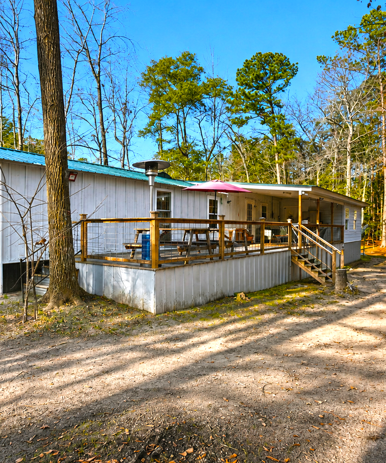
Part of the deck has a solid roof. This creates a protected outdoor room.
The covered section holds seating, a grill, a refrigerator, and prep surfaces. In many ways, it works like a second kitchen and family room.
A roof also makes the deck useful in more weather. It offers shade on hot days and shelter during light rain. Ceiling lights allow the area to work after dark.
The pale ceiling helps bounce light around. Meanwhile, the exposed posts maintain a rustic feel.
This mix of open and covered deck space works especially well. The open part feels sunny and social. The covered part feels calm and protected.
Design cues:
- Full roof over one zone
- Light-colored ceiling
- Outdoor ceiling lights
- Lounge seating
- Grill and prep counter
- Small outdoor refrigerator
- Open view toward the trees
8. Use One Flooring Style Through the Main Interior
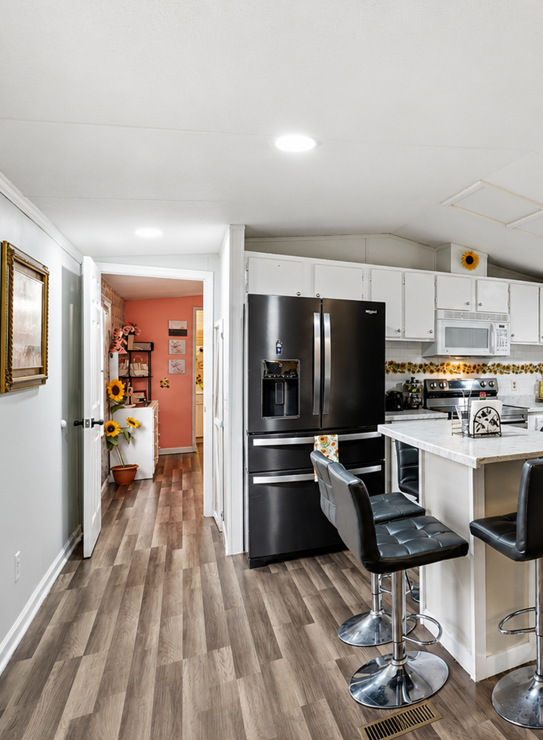
The same wood-look flooring runs through the living room, kitchen, halls, and bedroom. This makes the home feel larger.
Too many flooring changes can break a small home into narrow pieces. One continuous finish creates a smooth visual path. It helps each room connect to the next.
The gray and brown tones feel practical and relaxed. They hide daily wear better than very pale floors. They also work with white cabinets, warm wood walls, dark furniture, and colorful decor.
The plank pattern runs lengthwise in several areas. This supports the long shape of the home and draws the eye forward.
For a single wide, durable vinyl plank can be a smart choice. It offers the look of wood with easier care.
Design cues:
- Continuous flooring
- Wide wood-look planks
- Mixed gray and brown tones
- Durable surface
- Minimal floor transitions
- Lengthwise plank direction
9. Make the Living Room Feel Cozy With a Feature Wall
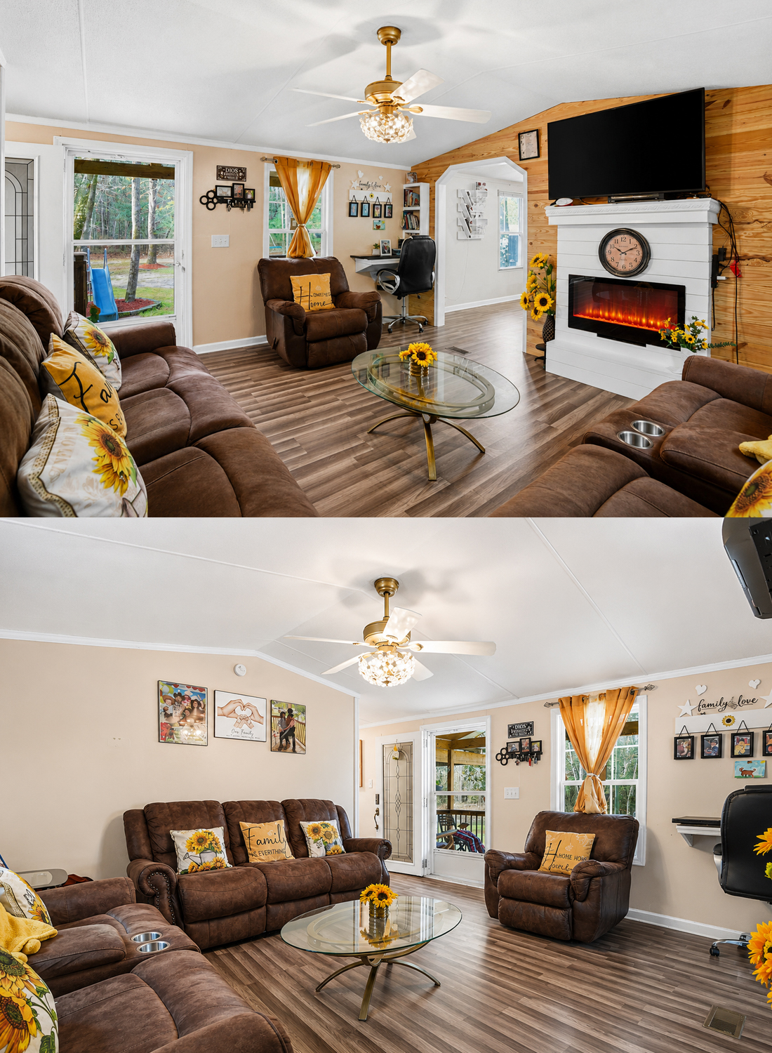
The living room uses a warm wood feature wall to add character. Without it, the white and beige room might feel flat.
The horizontal boards create a rustic backdrop. They also bring the outdoor setting inside. The natural knots and grain add texture without using strong color.
A white electric fireplace stands in front of the wall. The pale finish keeps the feature from feeling heavy. It also adds a bright break between the wood and the large television.
This wall works as the room’s main focal point. It gives the furniture a clear direction and helps organize the layout.
The design feels casual rather than formal. That makes it a good fit for a family home.
Design cues:
- Horizontal wood planks
- Natural knots and grain
- White electric fireplace
- Television above the mantel
- Simple mantel shelf
- Warm rustic contrast
10. Choose Deep Seating for Family Comfort
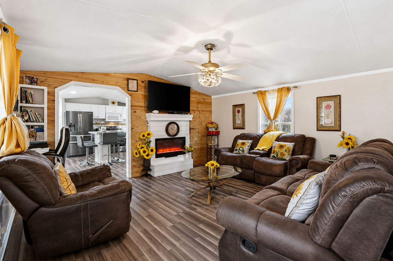
The living room uses large reclining sofas and chairs. They fill much of the floor space, yet they match how the room gets used.
The key lesson is not that every small room needs tiny furniture. Instead, choose pieces that support daily life. A large sofa can make sense when the family spends a lot of time together.
The dark brown upholstery brings warmth. It also hides marks and wear. Soft curves make the room feel cozy.
The open center keeps the furniture from feeling too packed. A glass coffee table adds function without adding too much visual weight. Because light passes through the top, the floor still feels open.
The seating faces both the fireplace and television. This creates a clear and comfortable layout.
Design cues:
- Plush reclining furniture
- Dark brown upholstery
- Open central walkway
- Glass coffee table
- Clear view of television
- Soft accent pillows
- Family-friendly arrangement
11. Repeat One Cheerful Accent Theme
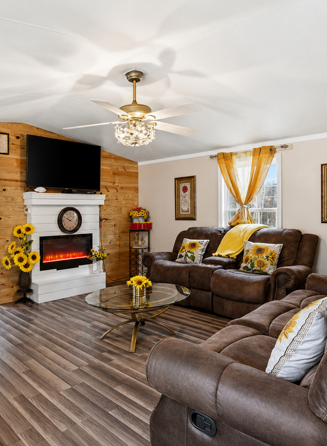
Sunflowers appear throughout the home. They show up on pillows, wall art, flowers, kitchen trim, towels, and bathroom decor.
A repeated motif can make a home feel personal and connected. However, the best approach is to vary the scale. Use large prints in a few places. Then add smaller touches elsewhere.
The yellow color brings energy to the brown, white, gray, and wood palette. It also gives the interior a sunny mood.
Because the background colors stay calm, the theme feels clear rather than chaotic. The black and yellow combination creates strong contrast in the bedroom and bathroom. In the living room, yellow softens the dark seating.
A personal theme works best when it reflects what the homeowner loves. It gives a home a story.
Design cues:
- Sunflower pillows
- Yellow curtains
- Floral wall art
- Small flower displays
- Matching kitchen details
- Black-and-yellow bedroom accents
- Repeated motif in each room
12. Open the Kitchen With White Cabinets
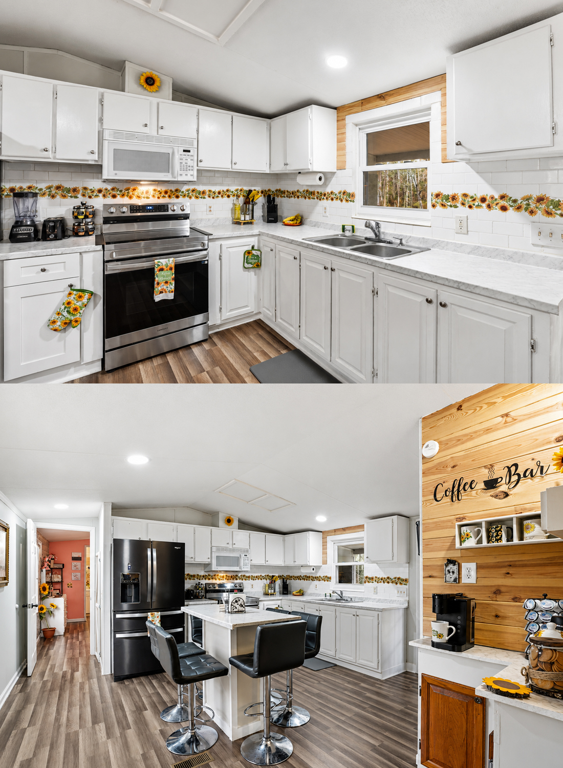
White cabinets make the kitchen feel clean and bright. They reflect natural and artificial light, which helps the space feel wider.
The cabinet layout uses the walls well. Upper and lower cabinets provide storage without closing in the room. A light countertop keeps the look soft and simple.
Dark appliances add contrast. They also connect with the black bar stools and other dark accents in the home.
The cabinets have a familiar raised-panel style. This suits the relaxed country design. Simple round knobs keep the doors easy to use.
The kitchen does not need high-end custom cabinets to feel fresh. Paint, clean hardware, and bright counters can make a big difference.
Design cues:
- White painted cabinets
- Light countertops
- Dark appliances
- Simple cabinet hardware
- Full wall storage
- Bright ceiling lights
- Clean neutral base
13. Add a Small Island for Dining and Prep
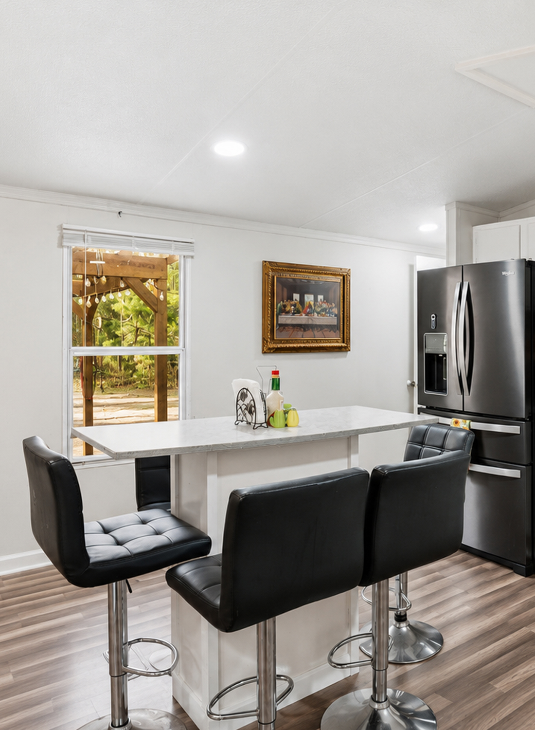
The center island gives the kitchen a useful work surface. It also creates casual seating for four.
This is a smart choice for a home without a large dining room. The island handles breakfast, homework, snacks, and meal prep.
The light countertop blends with the rest of the kitchen. It keeps the island from looking heavy. The simple base leaves room for stools and legs.
Black padded stools bring a modern touch. Their metal bases reflect light and make the seating feel less bulky.
Before adding an island to a small kitchen, protect the walkways. People should be able to open the refrigerator, oven, and cabinets with ease.
Design cues:
- Compact center island
- Seating on two sides
- Light countertop
- Simple base
- Backless or low-back stools
- Clear appliance zones
- Open circulation path
14. Turn an Empty Wall Into a Coffee Bar
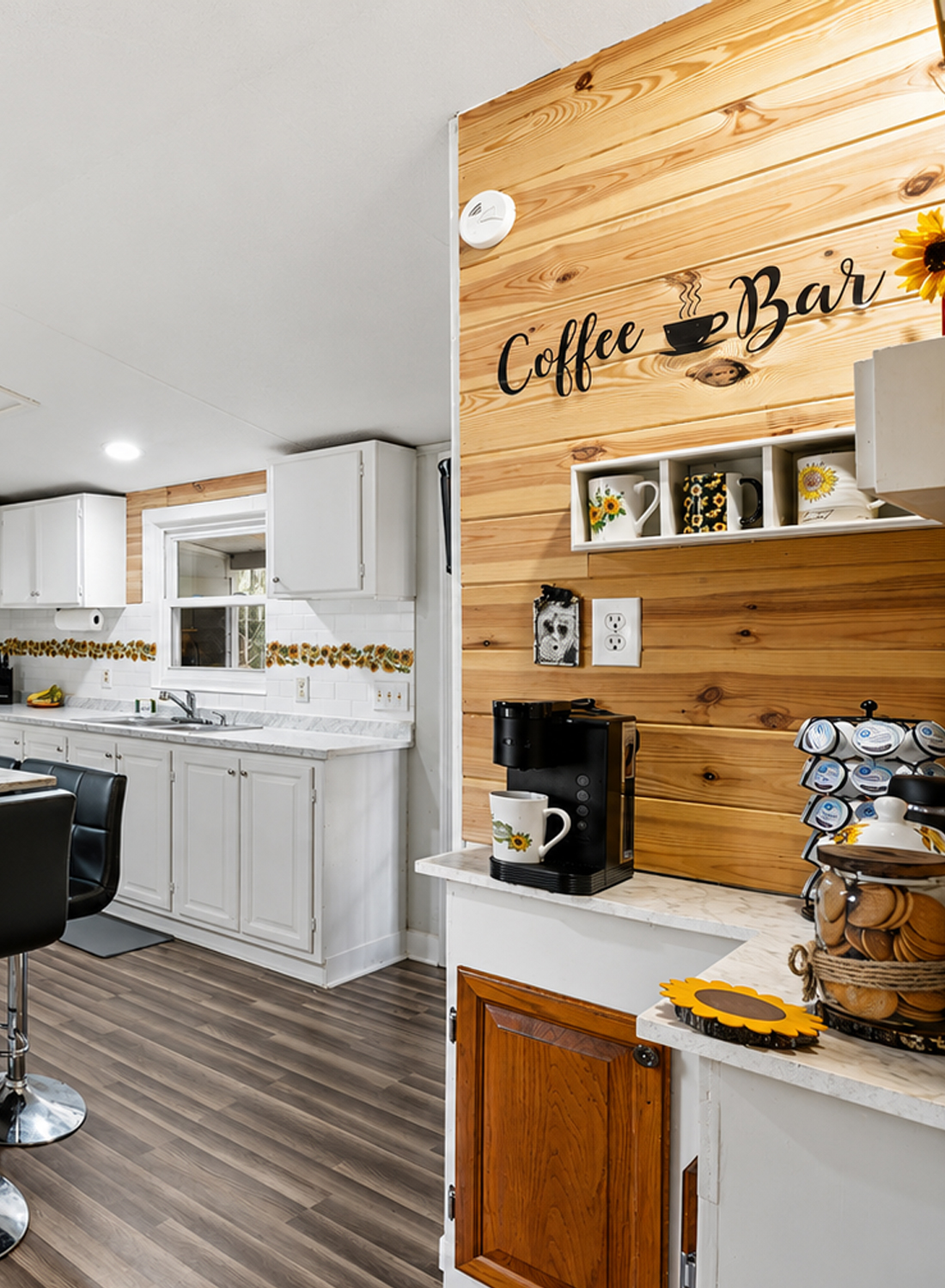
The coffee bar gives an unused corner a clear role. It includes a machine, cup storage, small shelves, and a short counter.
The wood wall makes the zone easy to spot. It also connects the kitchen to the wood feature wall in the living room.
This small station keeps coffee supplies away from the main cooking area. That can reduce crowding during busy mornings.
The design feels personal because it mixes useful storage with decorative signs and mugs. A few sunflower details tie it into the larger theme.
A coffee bar does not need much room. A narrow counter or spare cabinet can work. Use wall shelves to store mugs and keep the surface clear.
Design cues:
- Narrow counter
- Mug shelf
- Coffee machine
- Pod storage
- Wood accent wall
- Decorative sign
- Small themed accessories
15. Use Wide Openings Between Main Rooms
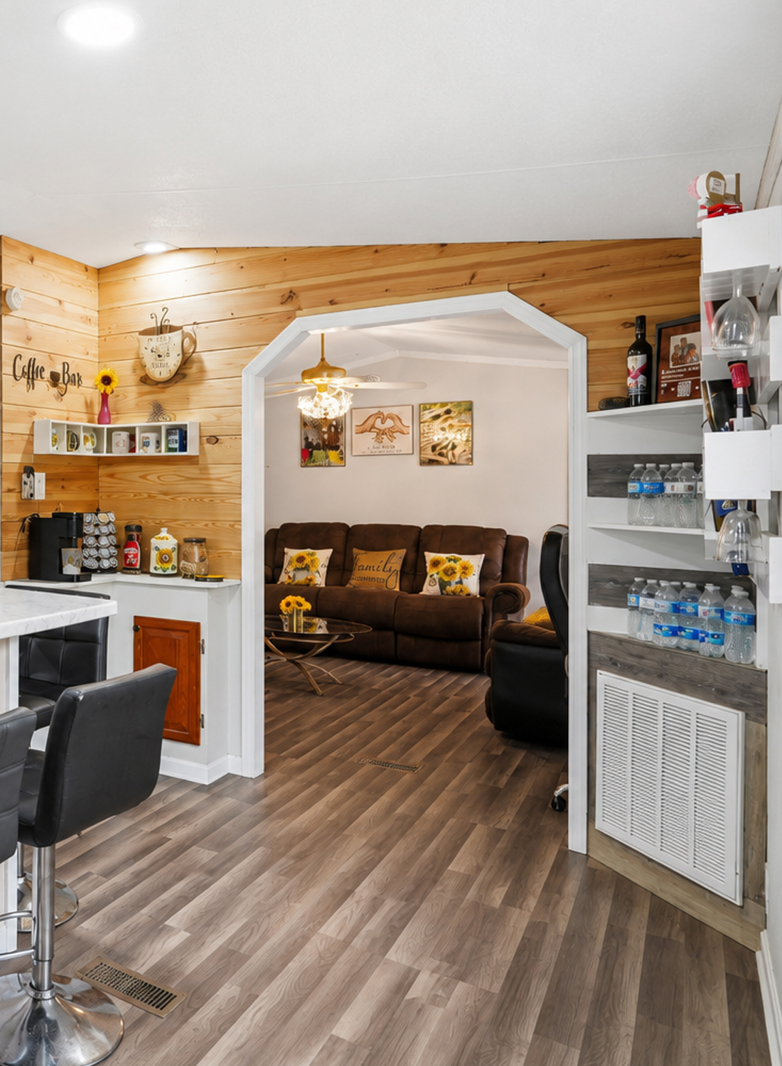
The wide opening between the living room and kitchen improves sight lines. It makes both rooms feel more connected.
The angled corners add a touch of character. White trim creates a crisp border around the warm wood wall.
Openings like this work well when a full wall removal is not possible. They allow light to pass between spaces while keeping some separation.
The living room still feels like its own room. The kitchen also keeps a clear edge. Yet people can talk and move between the two spaces with ease.
This balance suits family life. It creates connection without turning the whole home into one large open box.
Design cues:
- Wide interior opening
- Angled upper corners
- White trim
- Clear sight line
- Partial room separation
- Easy flow between spaces
16. Add a Small Work Zone Without Taking Over the Room
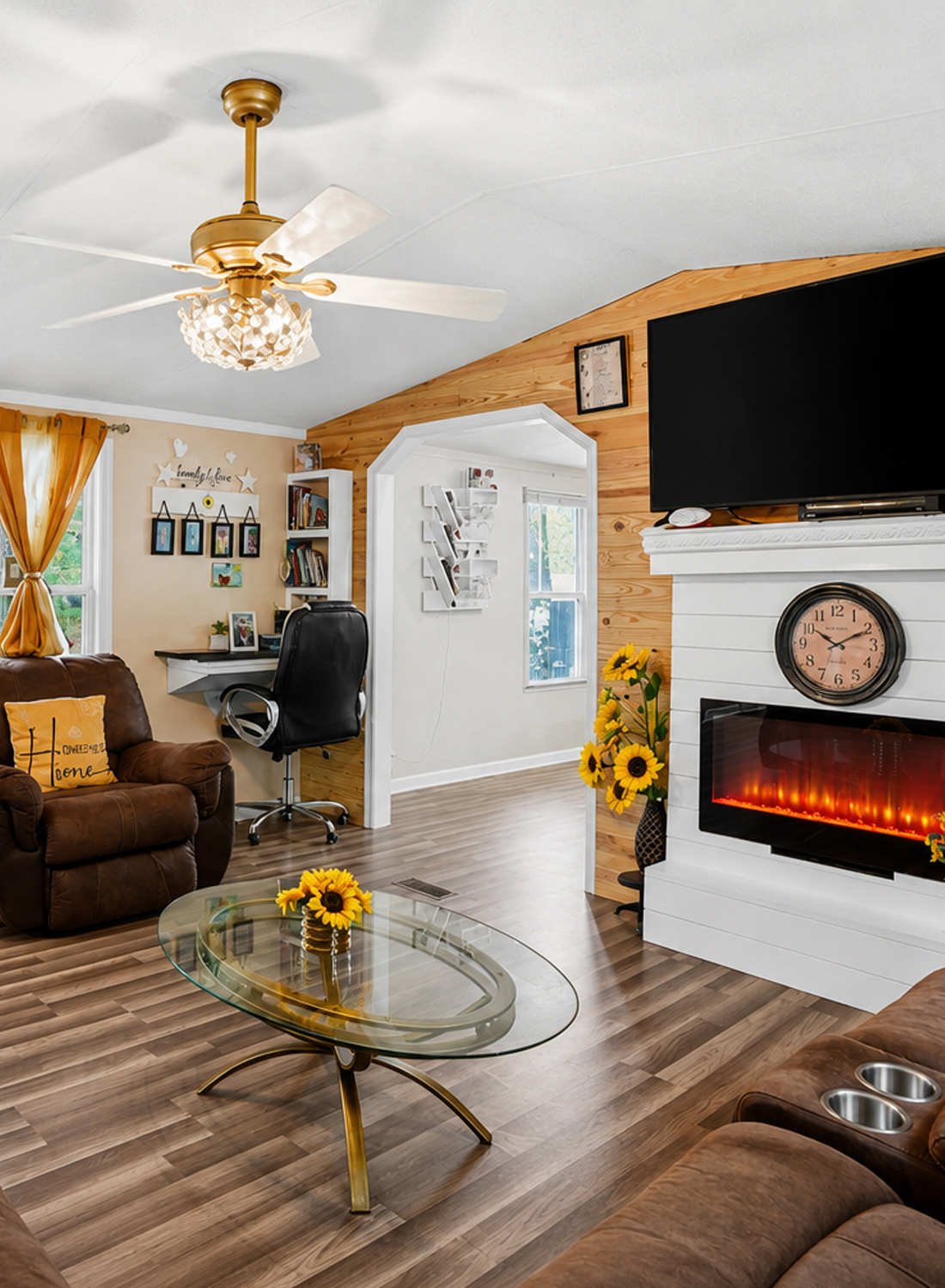
A compact desk sits along the living room wall. It creates a useful home office without needing a separate room.
The narrow work surface fits into an open area near a window. Shelves and wall decor use the vertical space above it.
The black office chair blends with the dark living room furniture. This helps the desk feel like part of the room rather than a separate office setup.
A small work zone can support bills, schoolwork, hobbies, or computer use. The best spot often sits near natural light and away from the busiest walkway.
Keep the desk surface simple. Wall storage can hold papers, books, and small supplies.
Design cues:
- Wall-mounted desk
- Compact office chair
- Nearby window
- Vertical storage
- Small photo display
- Clear floor space below
17. Give the Main Bedroom a Bold Color Story
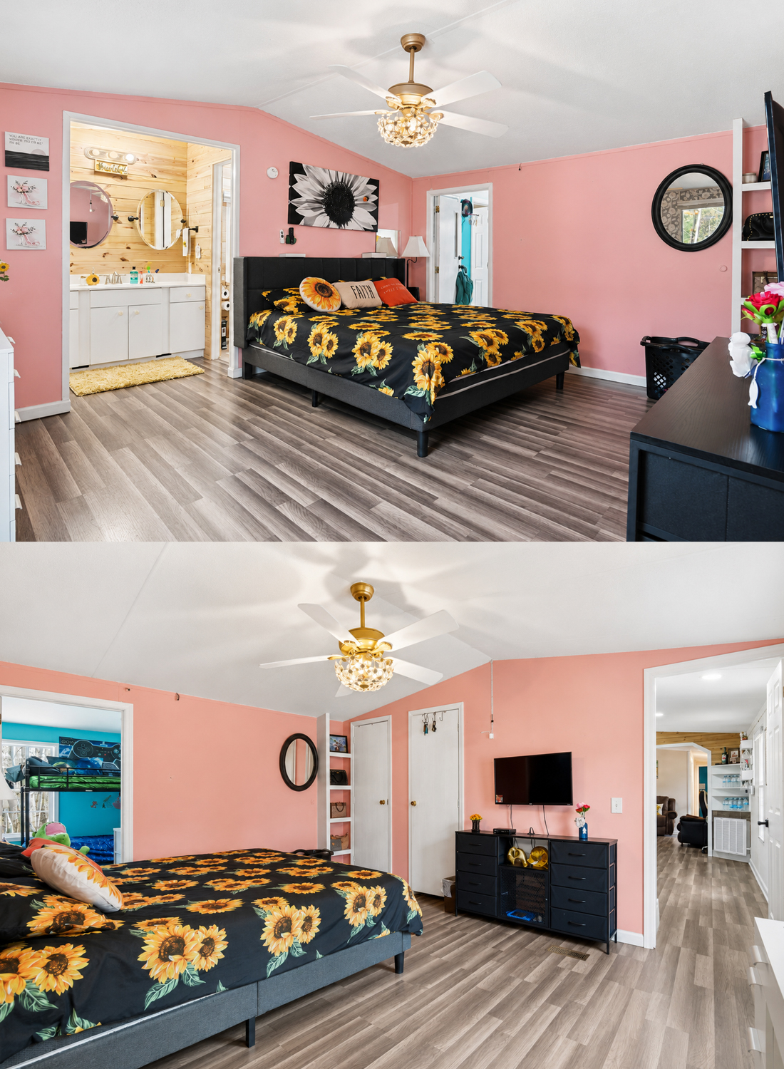
The main bedroom uses pink walls, black furniture, and bright sunflower bedding. The mix feels playful and personal.
The black bed frame gives the room a strong center. It balances the soft wall color and keeps the yellow floral print from feeling too sweet.
The vaulted ceiling helps the bedroom feel open. A ceiling fan adds comfort and a decorative light source.
The room also has generous floor space around the bed. This makes it feel calm, even with bold color.
A simple color plan keeps a bright room under control. Here, pink acts as the base. Black adds contrast. Yellow and orange bring energy.
Design cues:
- Soft pink walls
- Black bed frame
- Sunflower bedding
- Dark dresser
- Round black mirror
- White trim
- Vaulted ceiling
- Decorative ceiling fan
18. Connect the Bedroom to the Bathroom
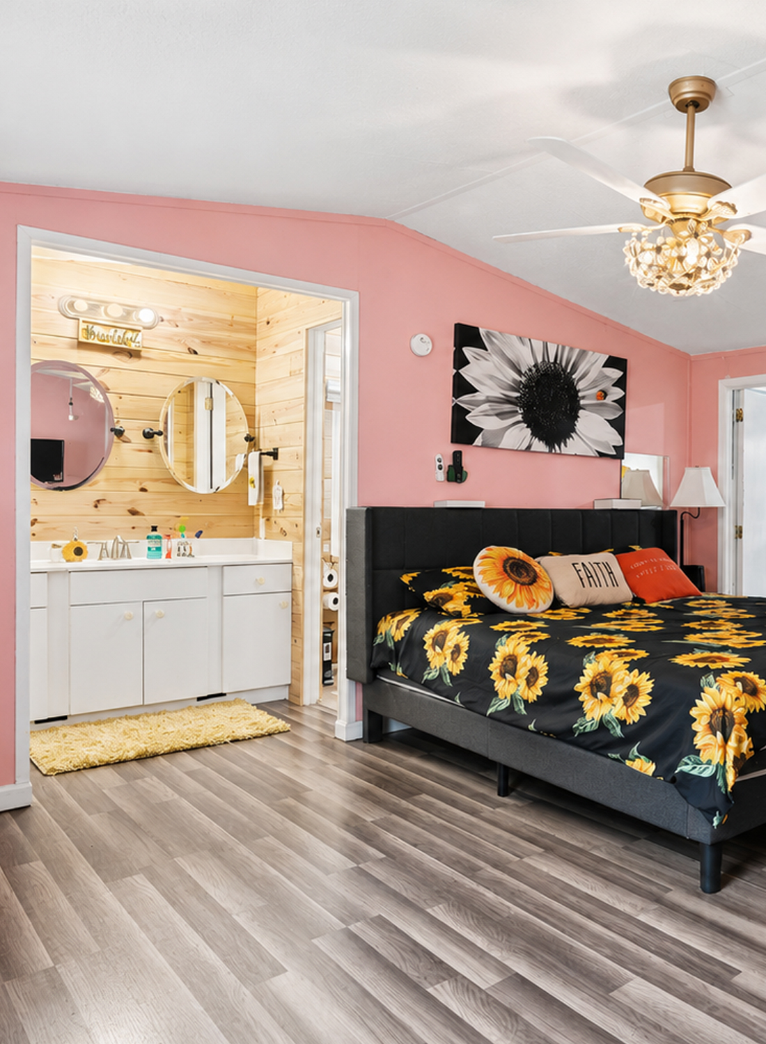
The bathroom sits directly beside the main bedroom. This creates a convenient private suite.
A wide vanity area sits just inside the bedroom side. The sink and storage remain open and easy to reach. The toilet and shower sit in a more private room beyond.
This layout can work well in a mobile home because it uses each square foot with care. It also allows two people to use different parts of the bathroom at the same time.
The open vanity area feels brighter than a tight enclosed room. Two mirrors help reflect light and make the wall look wider.
Wood walls connect the bathroom with the rest of the home. Meanwhile, the white vanity keeps the space from becoming too dark.
Design cues:
- Open vanity zone
- Two mirrors
- Long white counter
- Bedroom access
- Separate shower room
- Wood plank walls
- Bright vanity light
19. Warm the Bathroom With Wood Walls
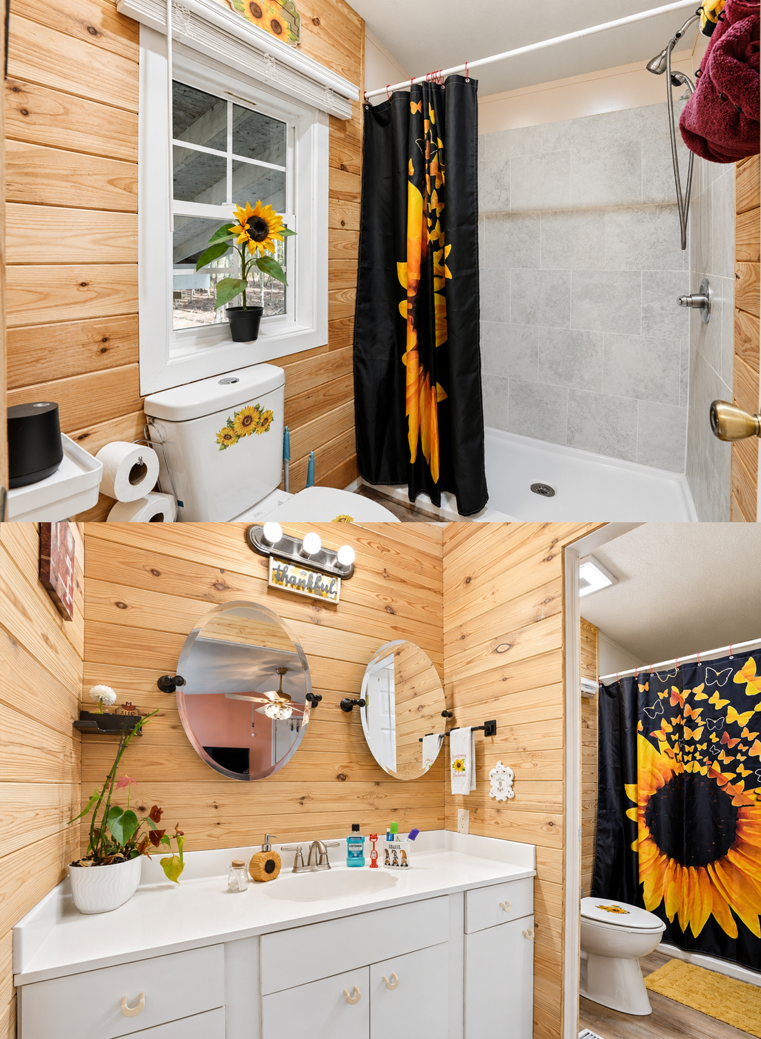
Wood walls give the bathroom a cabin-like feel. The natural color brings warmth to the white fixtures and pale tile.
Horizontal boards also make the narrow room feel wider. The long lines guide the eye across the walls.
The wood works because the other finishes stay simple. A white vanity, white toilet, and pale shower surround keep the room bright.
In a wet space, wood needs the right care. Seal it well and provide good ventilation. Keep direct water contact to a minimum.
A full wood bathroom can feel intense in some homes. Another option is to use wood on one wall and moisture-safe paint or tile on the others.
Design cues:
- Horizontal wood planks
- Warm natural finish
- White fixtures
- Pale shower tile
- Strong ventilation
- Sealed wall surface
- Simple black accessories
20. Use a Patterned Shower Curtain as Art
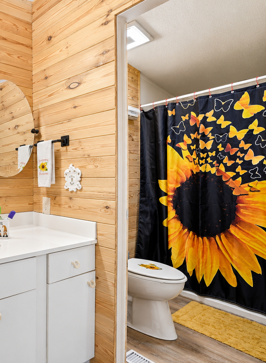
The sunflower shower curtain becomes a bold feature in the bathroom. Its black background adds drama. The large yellow flower ties into the home’s theme.
A shower curtain offers an easy way to update a small bathroom. It covers a large area, so it can change the room at once.
The strong print works here because the tile and fixtures stay neutral. The curtain gives the eye one clear place to land.
Textiles also cost less to replace than tile. This makes them a good place to try a bright color or bold pattern.
Design cues:
- Large floral print
- Black background
- Yellow accent color
- Neutral shower tile
- Matching bath mat
- Simple curtain rod
21. Combine Kitchen and Laundry Tasks
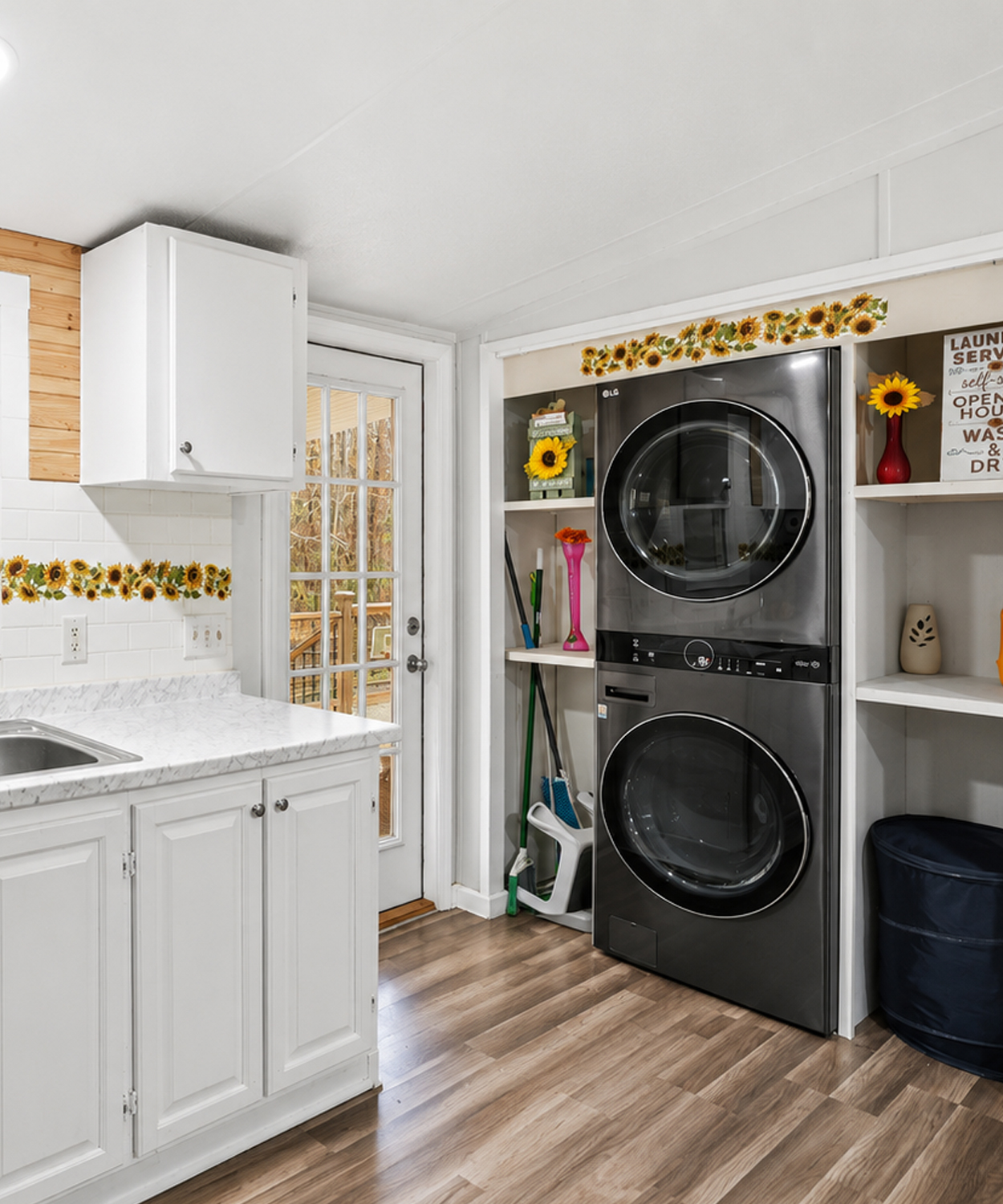
The stacked washer and dryer fit into a niche near the kitchen. This saves floor space and keeps daily chores close to the main work zone.
Built-in shelves sit beside the machines. They hold cleaners, baskets, and household supplies.
A stacked setup works well in a single wide because it uses vertical space. It can also free room for a longer counter or more cabinets.
The laundry area blends into the kitchen because the surrounding walls and storage use the same light palette. The dark machines add a sleek contrast.
A nearby exterior door makes the space even more useful. It offers quick access to the deck and yard.
Design cues:
- Stacked washer and dryer
- Built-in side shelves
- Nearby sink
- Exterior door
- Vertical storage
- Bright cabinets
- Easy-to-clean flooring
22. Build Storage Into Every Available Spot
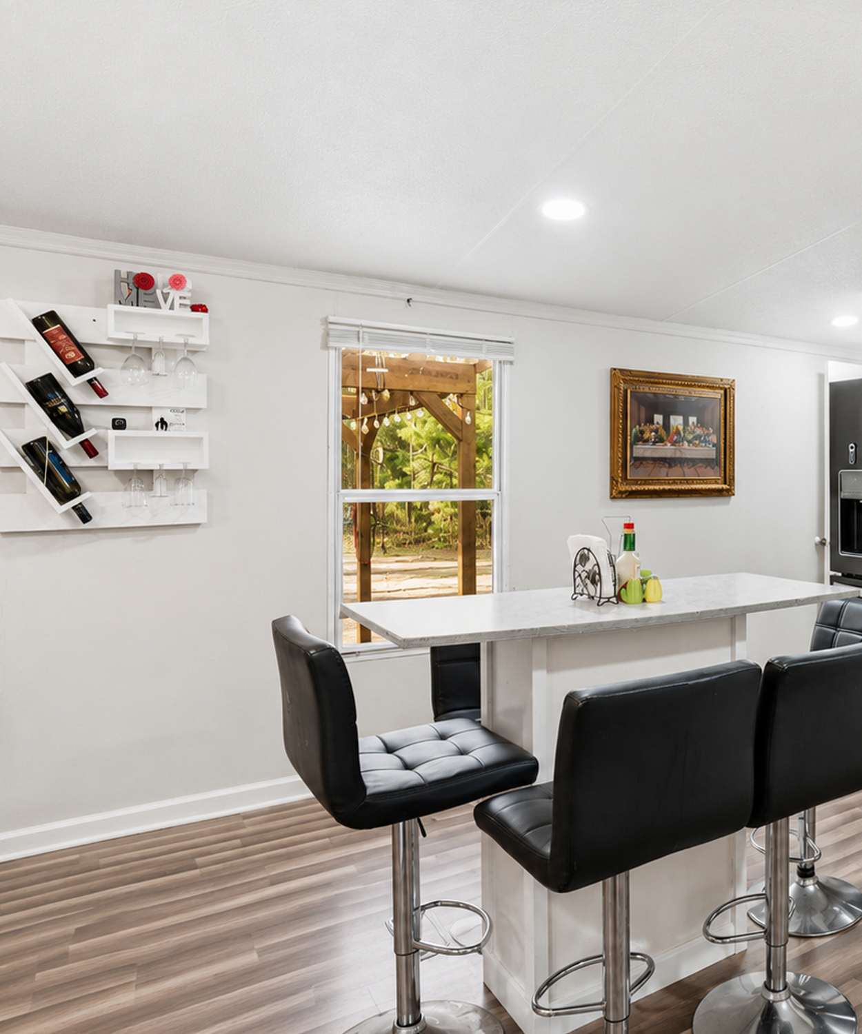
This home uses open shelves, upper cabinets, niches, small wall units, and built-in ledges throughout the interior.
That is a key lesson for any single wide. Storage should not depend on one large closet. It should appear in many small places.
Narrow shelves hold drinks and household goods. Wall racks hold mugs, bottles, and glasses. Small corner shelves hold personal items.
These features prevent counters from becoming crowded. They also make daily supplies easy to reach.
To keep open storage neat, group items by type. Use matching bins or containers where possible. Leave some empty space so the shelves do not look packed.
Design cues:
- Open wall shelves
- Corner storage
- Vertical bottle racks
- Built-in niches
- Upper cabinets
- Small display ledges
- Mixed open and closed storage
23. Let Personal Style Lead the Design
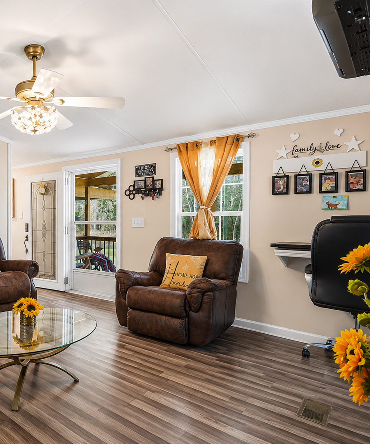
The strongest part of this home is not one paint color or piece of furniture. It is the sense of personality.
The sunflower theme appears with confidence. Family photos fill the walls. Signs, plants, mugs, and small finds make the rooms feel lived in.
This approach creates warmth. It also keeps the home from looking like a showroom.
A small home can hold plenty of personality. In fact, each choice often stands out more because the rooms sit close together.
The goal is not to make every item match. Instead, repeat a few colors, materials, and themes. Then allow special objects to tell the story.
Design cues:
- Family photos
- Favorite floral theme
- Handmade signs
- Collected mugs
- Small plants
- Personal wall art
- Repeated colors
- Useful items used as decor
Conclusion
This single wide mobile home proves that comfort does not depend on size. Warm wood, bright finishes, useful storage, and bold personal details help the home feel inviting from the front porch to the main bedroom. With a few thoughtful updates, even a simple layout can become a cozy place that supports daily life.