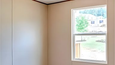
Color has power. It can make a room feel cozy or spacious, calm or vibrant. Choosing the right color scheme is vital in a mobile home, where space is precious. It’s not just about picking your favorite color. It’s about creating a feeling, making your space look good and feel right. Think about it – colors can change how we feel in a room. They can make walls seem to stretch out or bring them closer for a snug feel. So, let’s explore using colors to make the most of your mobile home.
1. Neutral Tones
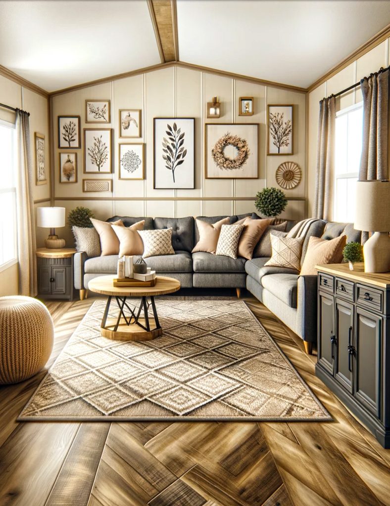
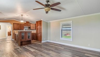
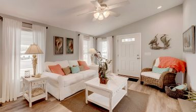
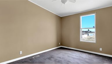
Neutral tones, like beige, gray, and cream, are like the Swiss Army knife of color schemes. They’re incredibly versatile. Think about beige. It’s warm, friendly, and inviting. Gray is like the cool cousin, sleek and modern. And cream? It’s the soft, comforting backdrop for any room. Now, why do these colors rock in small spaces? They have a secret power. They make rooms feel bigger, airier, and more open. It’s like magic. But wait, there’s more! You can spice up these neutral tones. How? Add some dark accents. Picture a beige room with rich, chocolate-brown pillows or a gray room with a deep navy throw. These pops of darker colors add layers and depth, making your space a room and a story.
2. Cool Tones
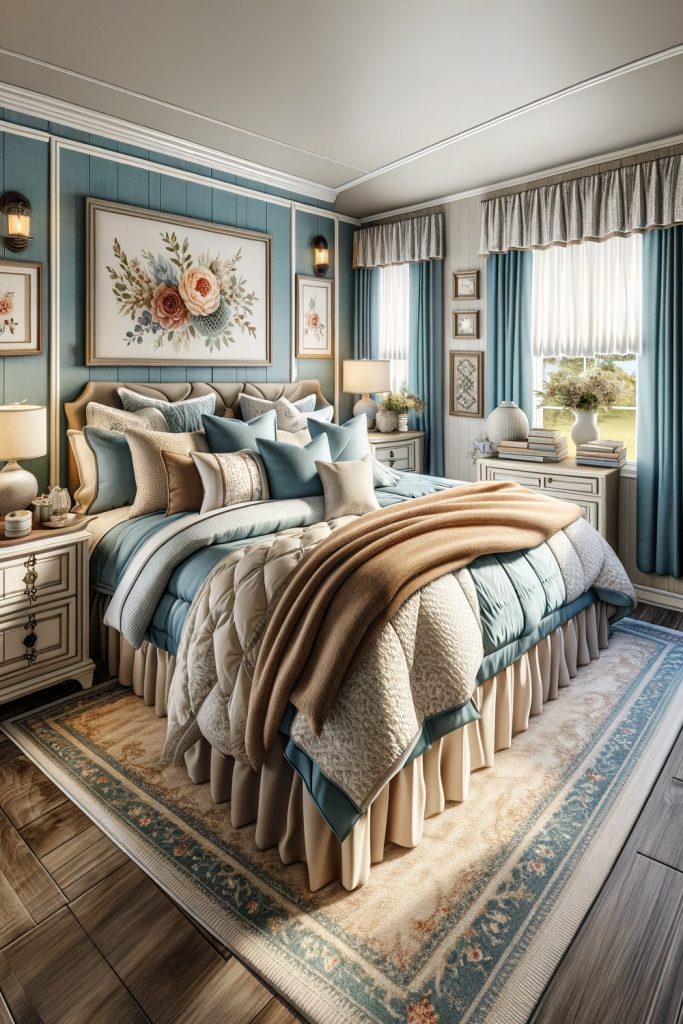
Moving on to cool tones, blues, and greens are like a breath of fresh air. They’re the colors of nature, right? Think of the sky, the ocean, a forest. These colors have a superpower – they can relax and calm you down. Imagine stepping into a bedroom painted in a soft sky blue or a bathroom in a gentle sage green. It’s like a mini-vacay for your senses. But here’s a pro tip: pair these cool tones with white trim. Why? The white makes the colors pop, giving a crisp, clean finish. It’s like adding a frame to a beautiful painting. The combination is perfect for creating a serene retreat in your mobile home. In this place, you can unwind and breathe easily.
3. Warm Earth Tones
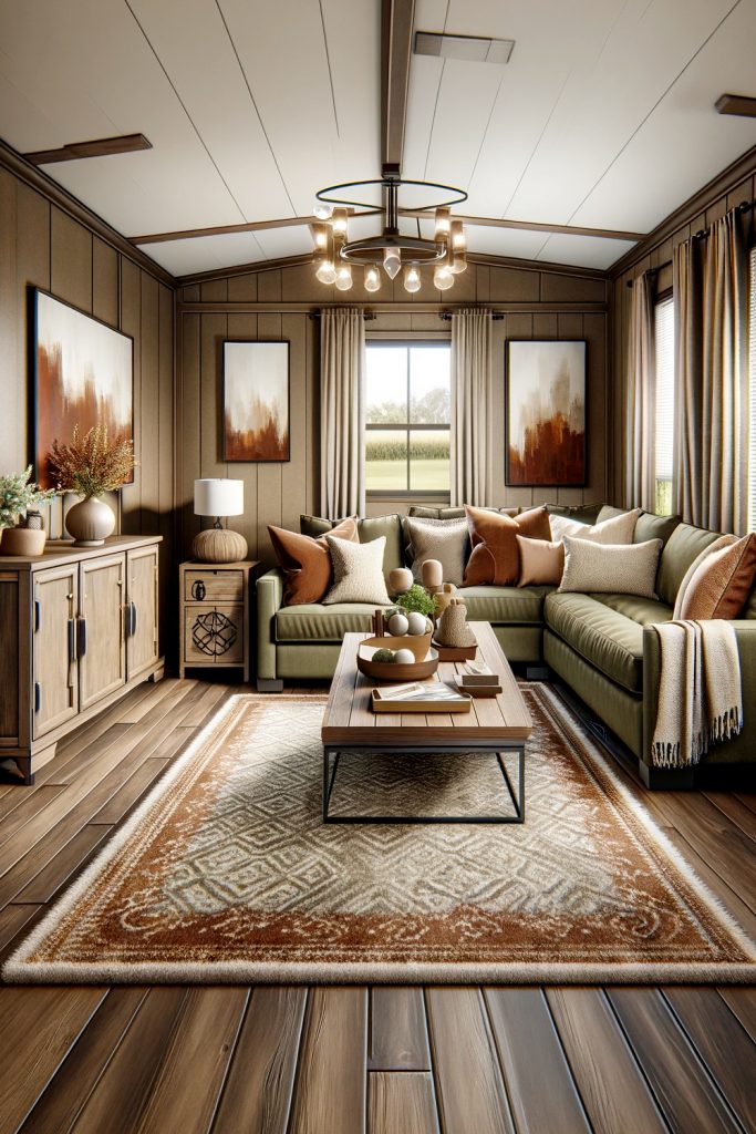
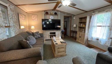
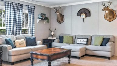
When we talk about warm earth tones, we’re bringing the colors of nature inside. Browns, rusts, olive greens – these colors wrap you up like a cozy blanket. Imagine sitting in a room painted in a rich, earthy brown. It feels like a warm hug, doesn’t it? Or think about rust-colored accents that add a splash of autumn warmth. Olive green is another star in this palette. It’s like bringing a piece of the forest into your home. Now, why are these colors so great for living spaces? They create an atmosphere of comfort and warmth. It’s like being in a cozy cabin in the woods, even in the middle of the city. To take it up a notch, combine these colors with natural elements. A wooden coffee table or stone vases, for example. These materials work hand in hand with warm earth tones to make your living space a cozy retreat.
4. Vibrant Colors
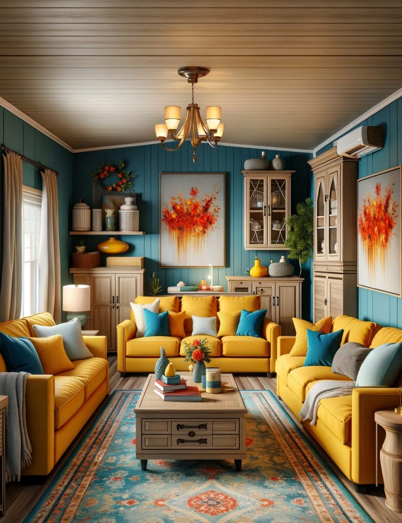
Ready for a splash of energy? Let’s talk about vibrant colors. Bright reds, electric blues, sunny yellows – these aren’t just colors, they’re statements. Using these bold hues in your mobile home brings life and energy to your space. But here’s the trick – moderation. Think of these colors like a spice. A little goes a long way. An accent wall in a bright color can transform a room. The room is saying, “Hey, look at me!” But the rest of the space? Keep it simple to let that vibrant color shine. The impact on your home’s vibe is huge. These colors don’t just change the look of a room; they change the feel. A bright color can turn a dull room into a fun, lively space. It’s like throwing a party for your eyes! So, if you’re ready to make a bold statement, vibrant colors are the way to go. Just remember, balance is critical.
5. Soft Pastels
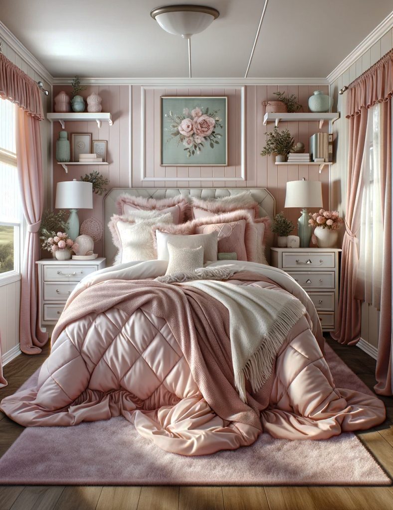
Soft pastels are like the whispers of color. They’re gentle, soothing, and oh-so-peaceful. Picture the soft hues of a sunrise – light pinks, baby blues, mint greens, and pale lavenders. These colors have a superpower; they can turn any room into a calm oasis. Imagine stepping into a room painted in a soft pastel blue. It’s like the walls are giving you a gentle, calming hug. Or a bedroom with light pink walls, where the vibe is so tranquil, it feels like floating on a cloud. Pastels are perfect for places where you want to relax and unwind. They’re like a visual lullaby, creating a serene and soothing space. It’s like living in your peaceful bubble, away from the hustle and bustle of the world.
6. Monochrome
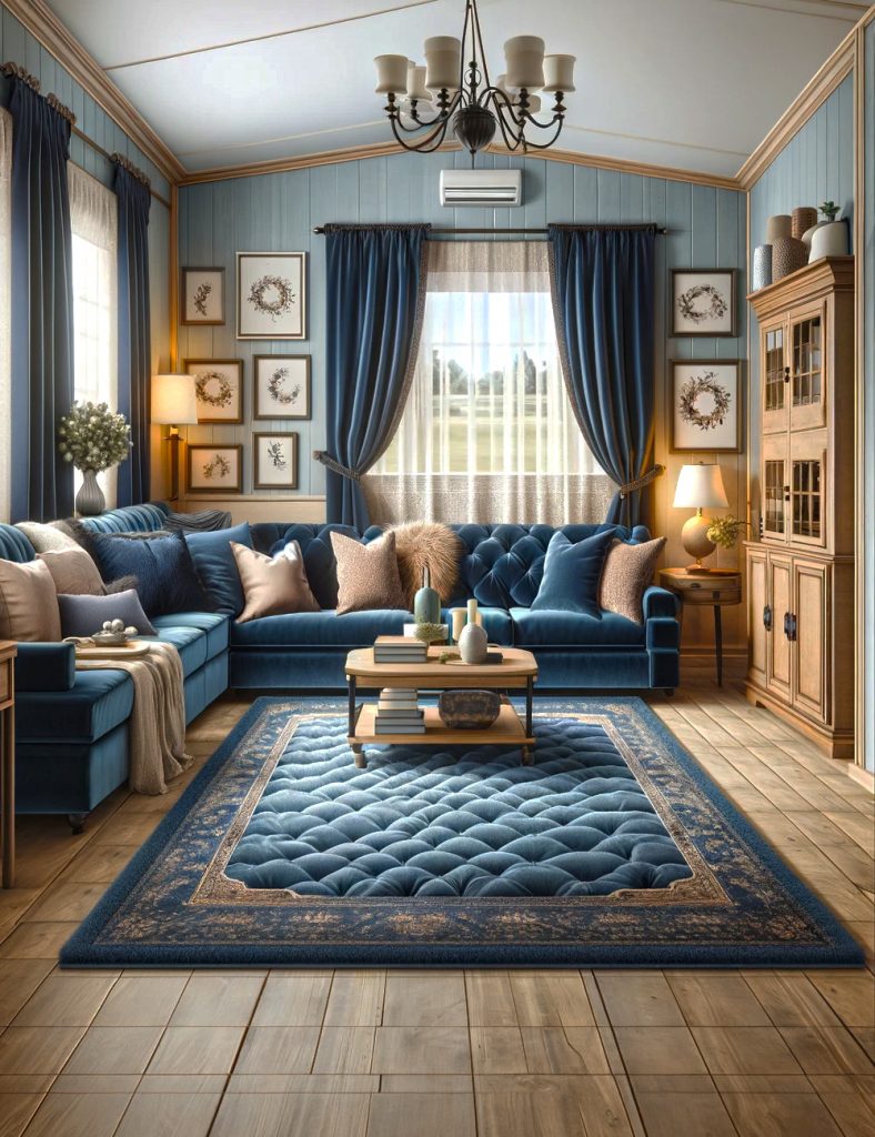
Lastly, let’s talk about monochrome. It’s not just using one color; it’s an art. Monochrome means taking one color and playing with its different shades to create a sleek, stylish, and oh-so-sophisticated look. Think of a room in shades of blue – from light sky blue to deep navy. It’s like watching the sea, with its many shades, all in one room. The key to nailing this look? Mix textures and tones. A velvet navy sofa, light blue walls, and dark blue curtains. This mix keeps the room exciting and lively. It’s like listening to a song with different notes, all in harmony. A monochromatic scheme gives a unified, modern look. It’s bold yet understated. It’s a style statement that says, “I know what I’m doing.” So, monochrome is your go-to if you’re after a trendy and timeless look.

