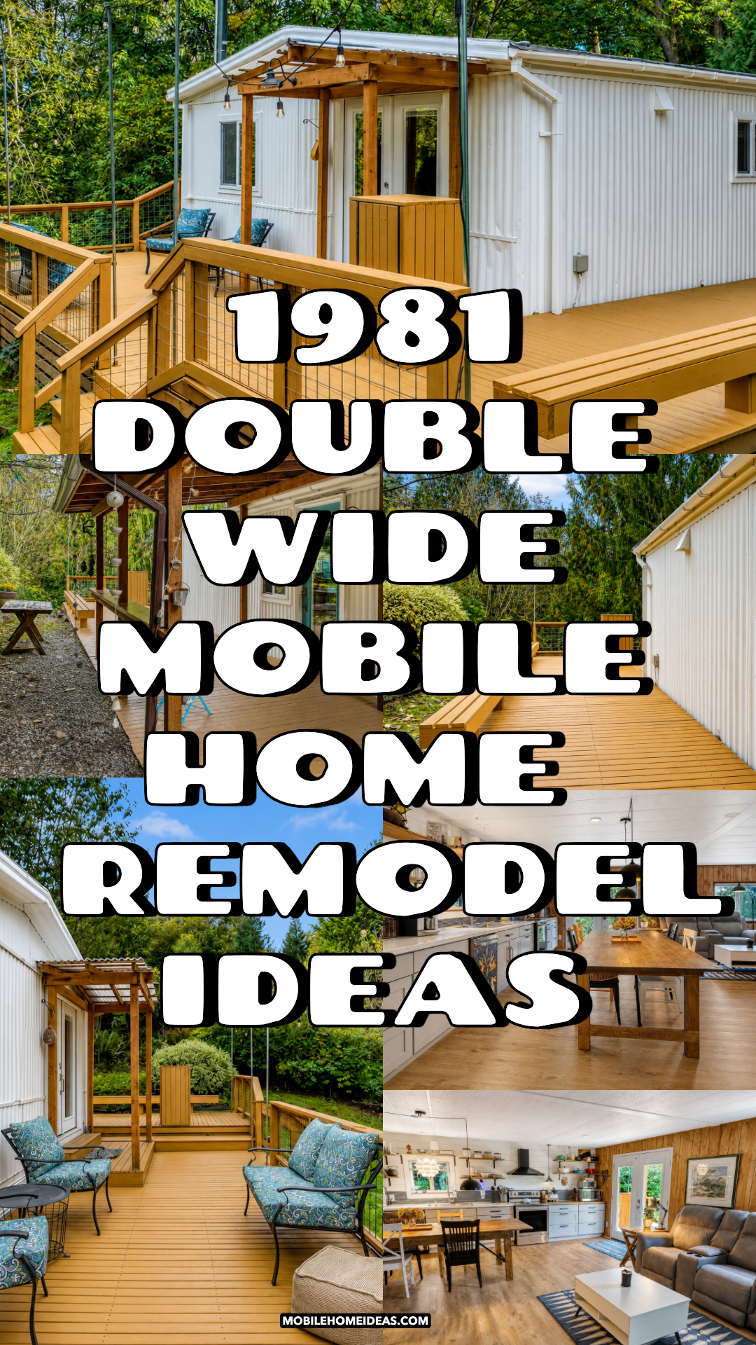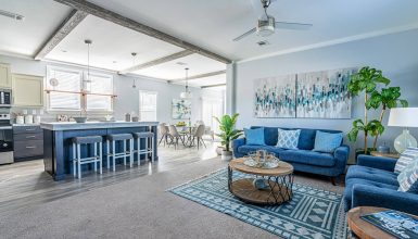
Can a 1981 double-wide mobile home feel open, fresh, and ready for modern life? This home gives a clear answer. It keeps the easy charm of an older manufactured house. Yet it adds a brighter kitchen, a wide outdoor deck, and warm spaces that feel useful and calm.
The design does not try to hide every sign of age. Instead, it works with the home’s simple shape. Wood-paneled walls add warmth. White surfaces bring light. Gray cabinets add a clean look. Large decks make the home feel much bigger than its indoor floor plan.
The result feels honest and welcoming. It is not too polished. It is not too rustic. It sits in a sweet spot between a woodland cabin, a modern farmhouse, and a practical family home.
A Simple Exterior With a Fresh New Look
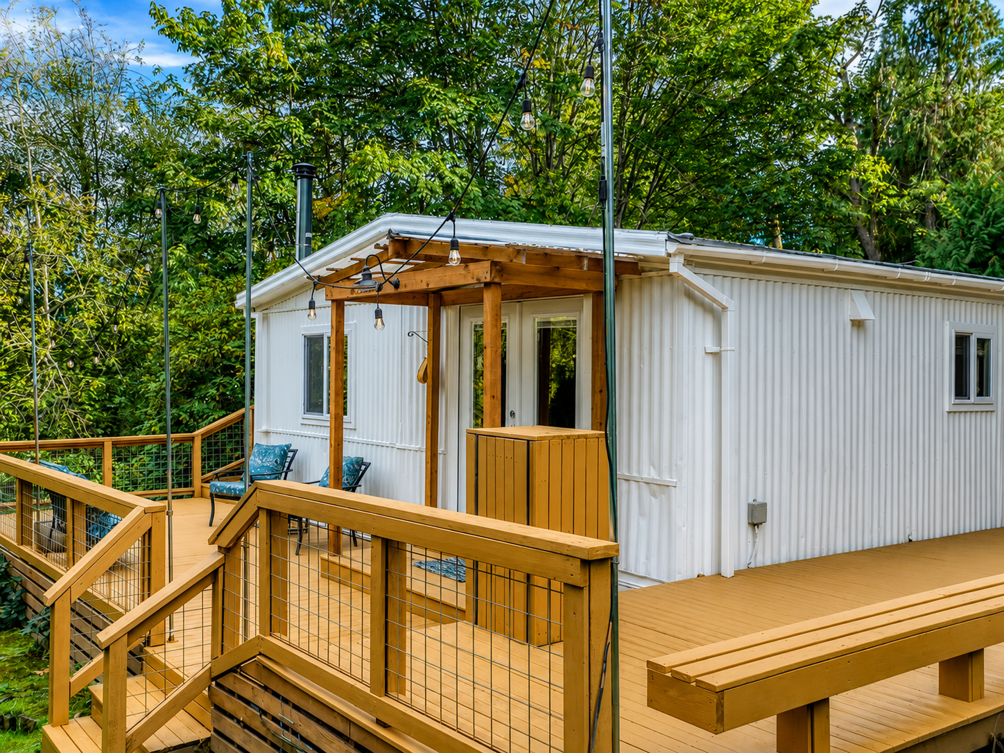
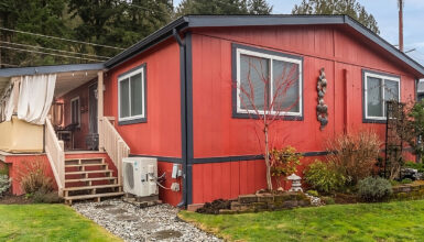
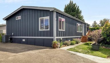
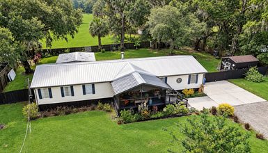
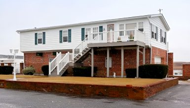
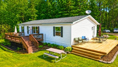
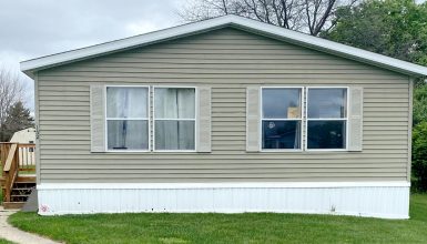
The outside keeps the long, low form that defines many older double-wide homes. The roof has a gentle slope. The siding has slim vertical lines. The windows stay simple and useful.
A coat of soft white paint changes the whole mood.
White helps the home blend with the sky and nearby trees. It also makes the older metal siding feel clean and current. The bright finish reflects more light, so the home does not feel heavy in its wooded setting.
The trim also stays white. This creates one smooth look across the walls, roof edges, gutters, and window frames. There are few sharp color changes. As a result, the long exterior feels calm instead of busy.
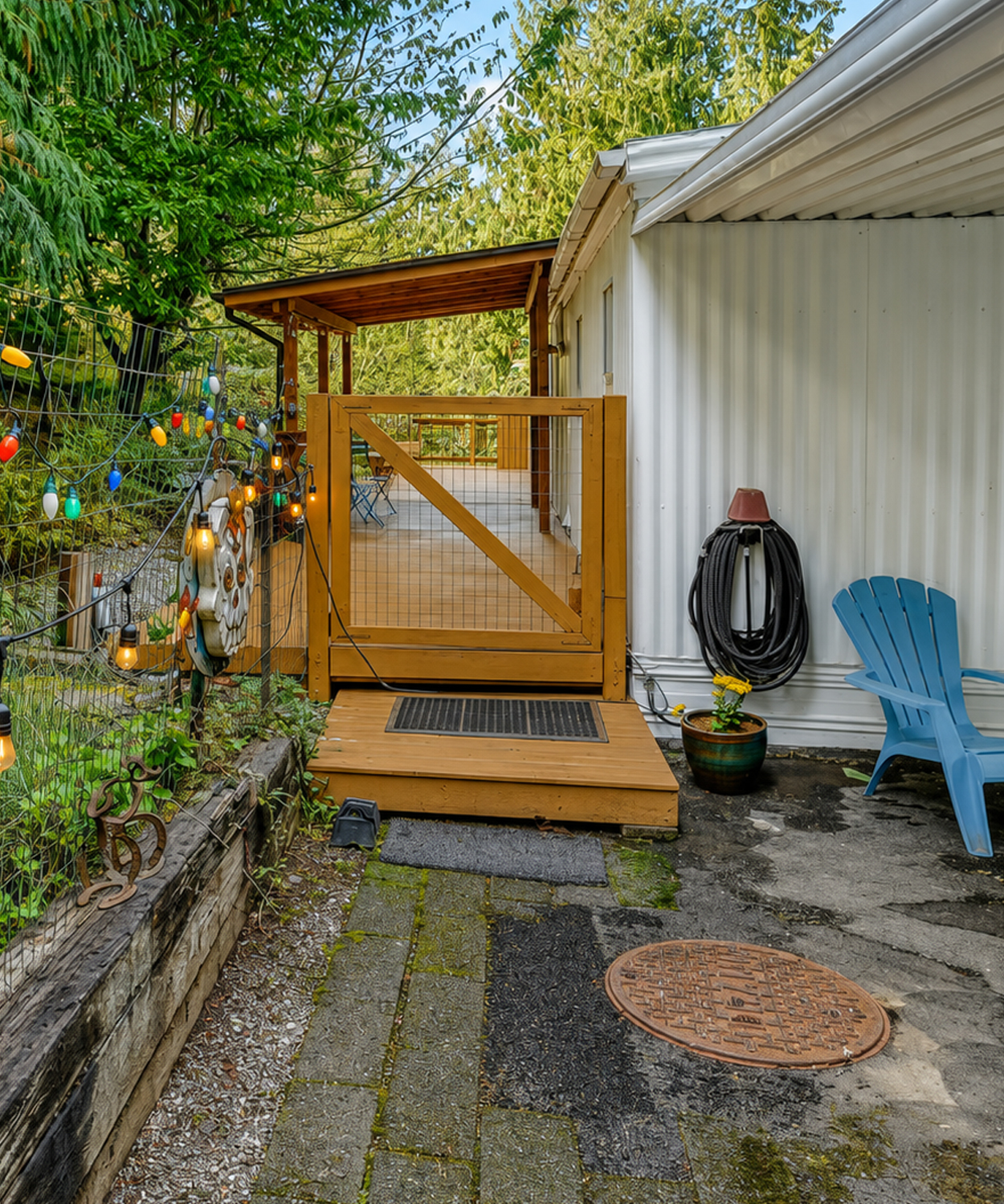
The design does not depend on fancy trim or bold details. It uses scale, light, and clean lines to create interest.
Exterior design cues
- Long and low double-wide shape
- White vertical metal siding
- Soft white trim and gutters
- Low-pitched roofline
- Simple rectangular windows
- Small exterior wall lights
- Minimal decorative trim
- Green wooded setting
- Gravel drive and work areas
- Natural wood accents near each entry
A Large Carport Adds Real Function
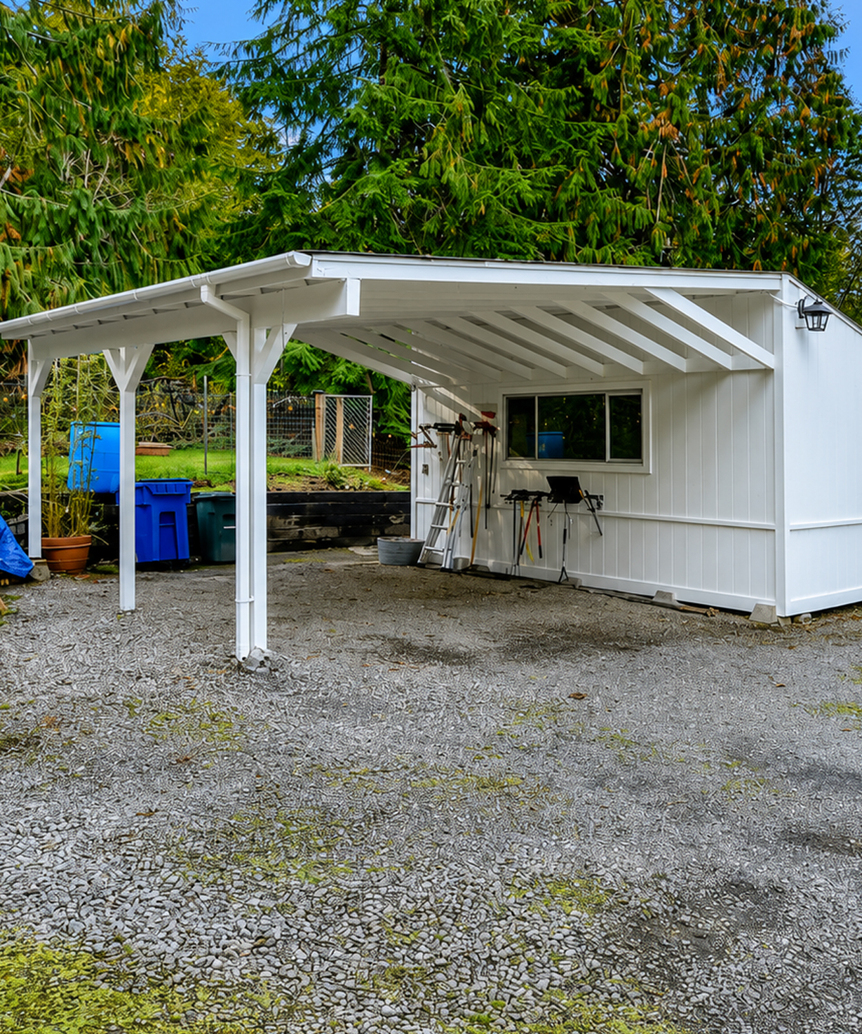
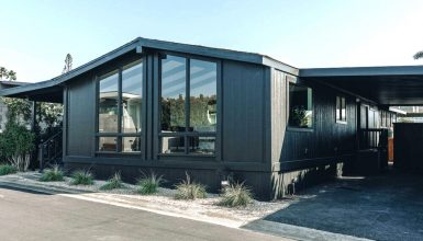
The covered carport creates a strong feature at one end of the home. Its broad roof gives the structure more depth. It also breaks up the long side wall.
The design feels light because the posts and roof stay white. Open sides allow views of the trees and yard. The roof protects a car, tools, bikes, or outdoor work areas from rain.
The exposed rafters add a hint of farmhouse style. Their simple form gives the carport a hand-built look. Small support braces add charm without making the structure feel ornate.
This feature also makes the home look more settled. Older manufactured homes can sometimes seem placed on a site rather than tied to it. The carport helps solve that issue. It gives the building a wider footprint and a more permanent feel.
Carport design cues
- Wide attached roof
- Exposed white rafters
- Square support posts
- Angled wood braces
- Open gravel floor
- Practical outdoor lighting
- Direct access to storage and tools
- Simple farmhouse construction
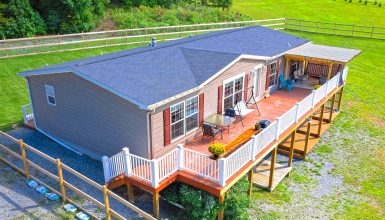
A Wraparound Deck Changes the Whole Home
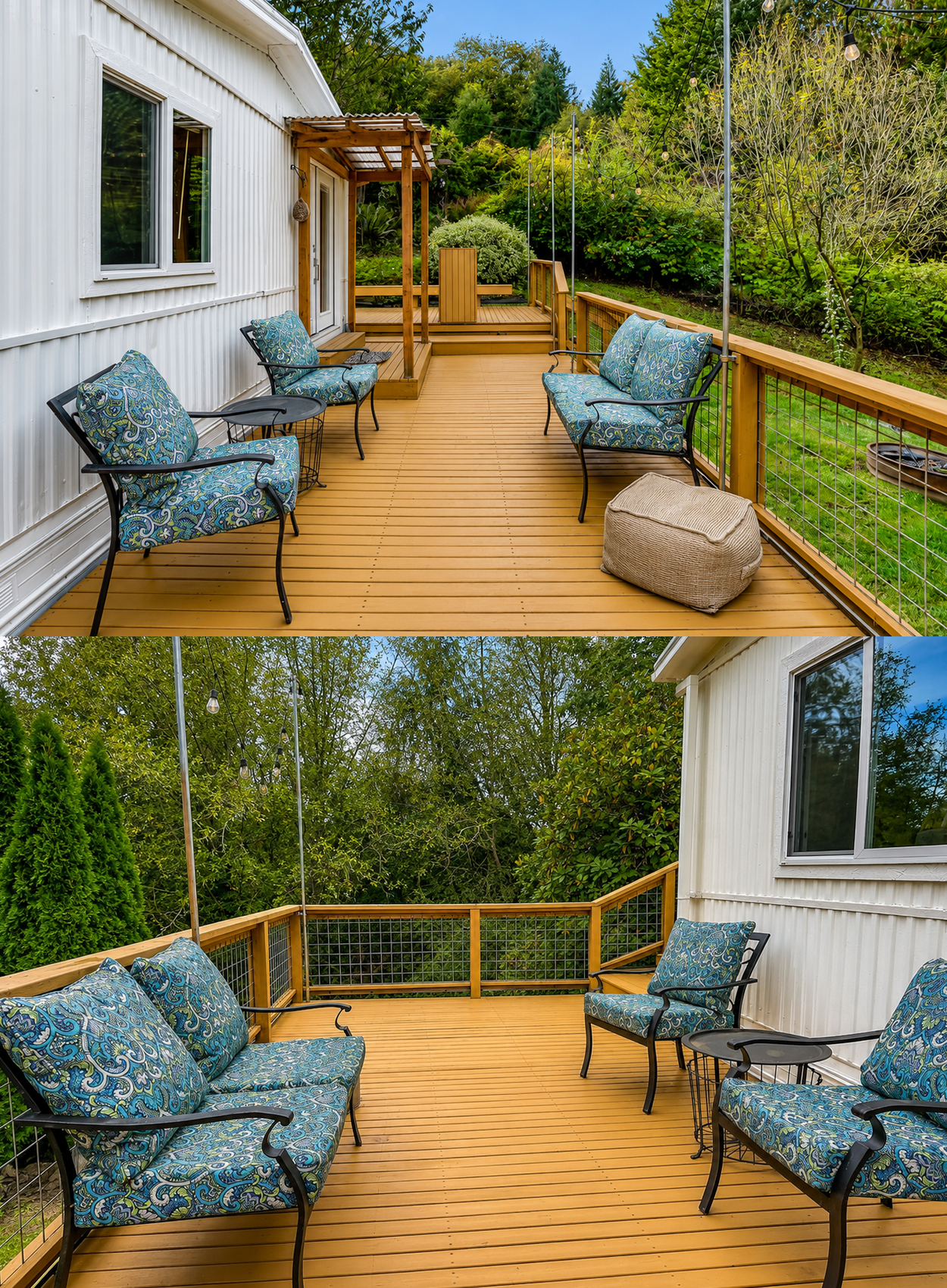
The deck may be the most important part of this remodel.
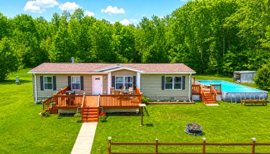
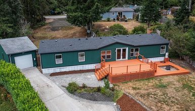
It runs along a large part of the exterior. It links the doors, seating areas, side yard, and covered porch. This creates a smooth path around the home.
The deck also acts like an outdoor hall. Instead of walking through narrow rooms to reach each part of the property, people can move outside. This makes daily life feel more relaxed.
A warm honey-brown stain helps the deck stand out from the white siding. The wood tone also matches the deep greens of the landscape. The color feels warm, but it does not look orange or too dark.
The deck boards run in long, clean lines. This draws the eye down the full length of the home. It makes the space feel wider and more open.
Wire panels fill the railings. They provide safety without blocking the view. The dark grid also adds a light industrial note. That small detail keeps the deck from looking too traditional.
Deck design cues
- Long wraparound layout
- Warm golden-brown stain
- Wide walking paths
- Simple wood railings
- Wire mesh railing panels
- Broad stairs
- Built-in bench seating
- Separate lounge zones
- Open views of the yard
- Easy links between doors
Covered Porches Create Outdoor Rooms
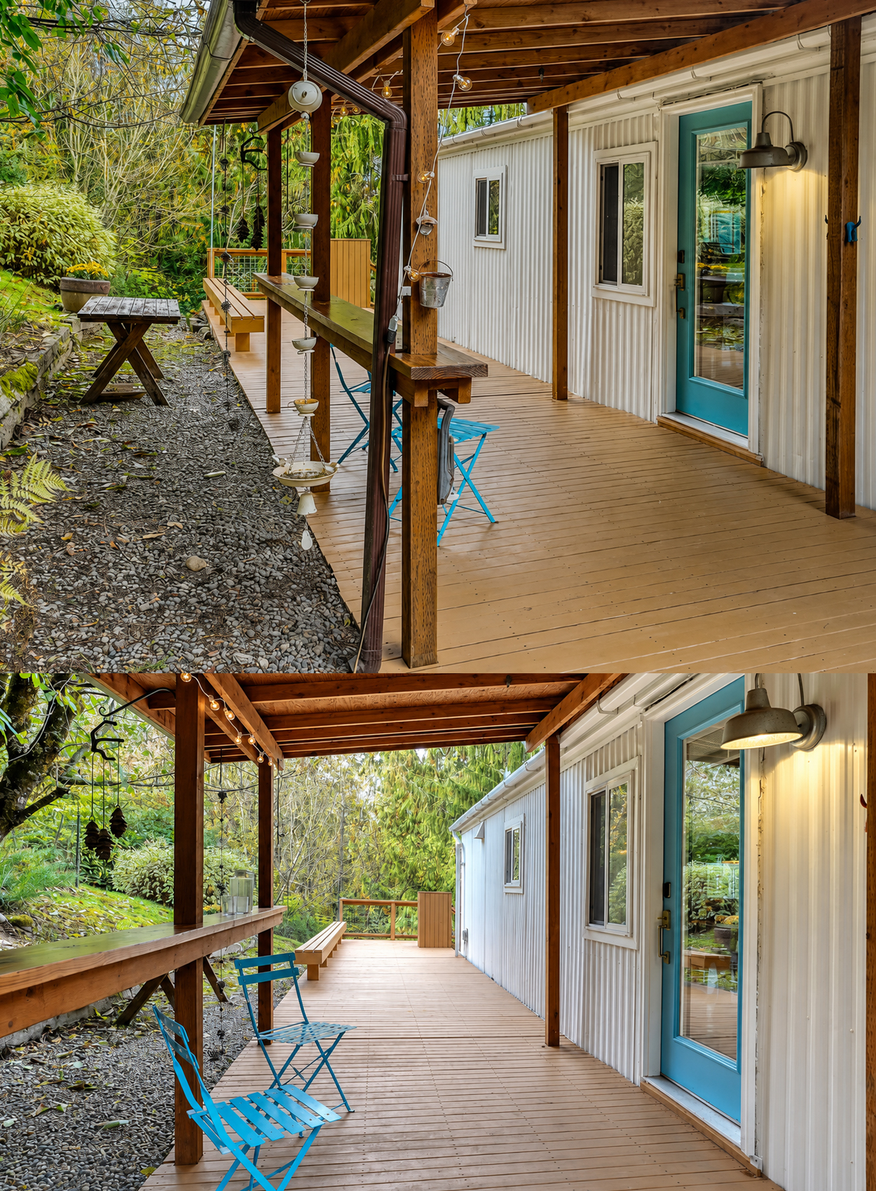
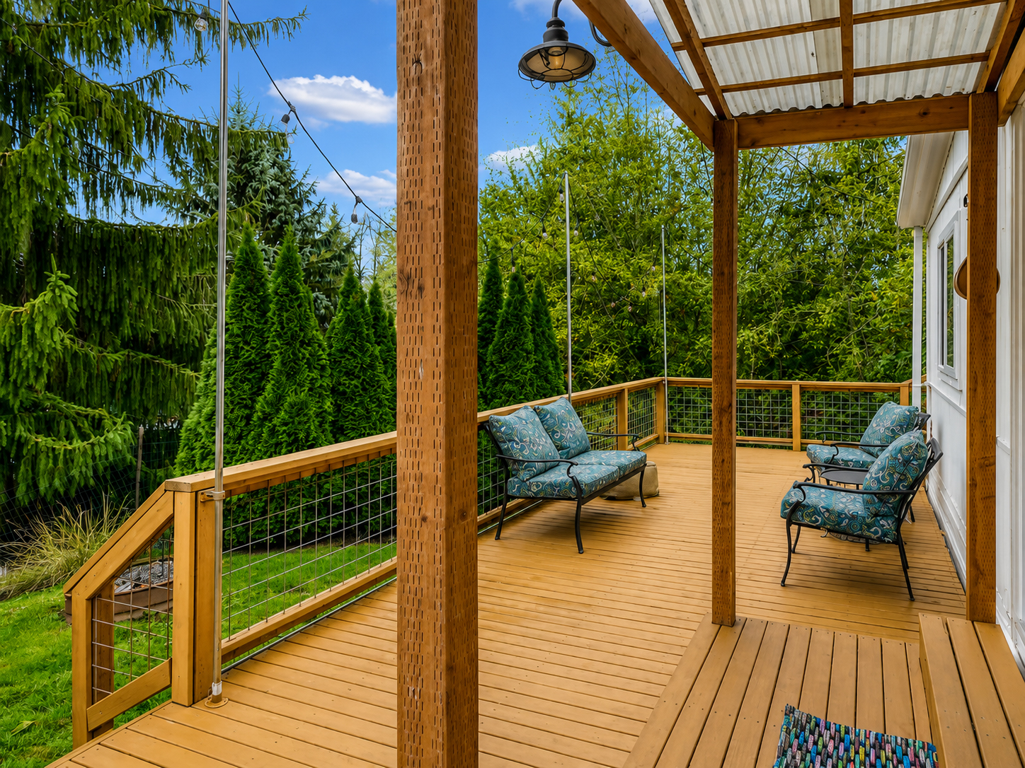
Several parts of the deck include a roof or pergola. These covered areas make the outdoor space more useful in light rain and strong sun.
The main covered porch has thick wood posts and exposed beams. A clear or pale roof panel allows daylight to pass through. This keeps the porch bright.
The open beam ceiling adds texture. It also creates a warm frame around the view. The unfinished look works well with the woods. It feels casual and relaxed.
A long rail along one side can serve as a bar ledge. It offers a place for drinks, plants, or small meals. Folding chairs add color without taking up much room.
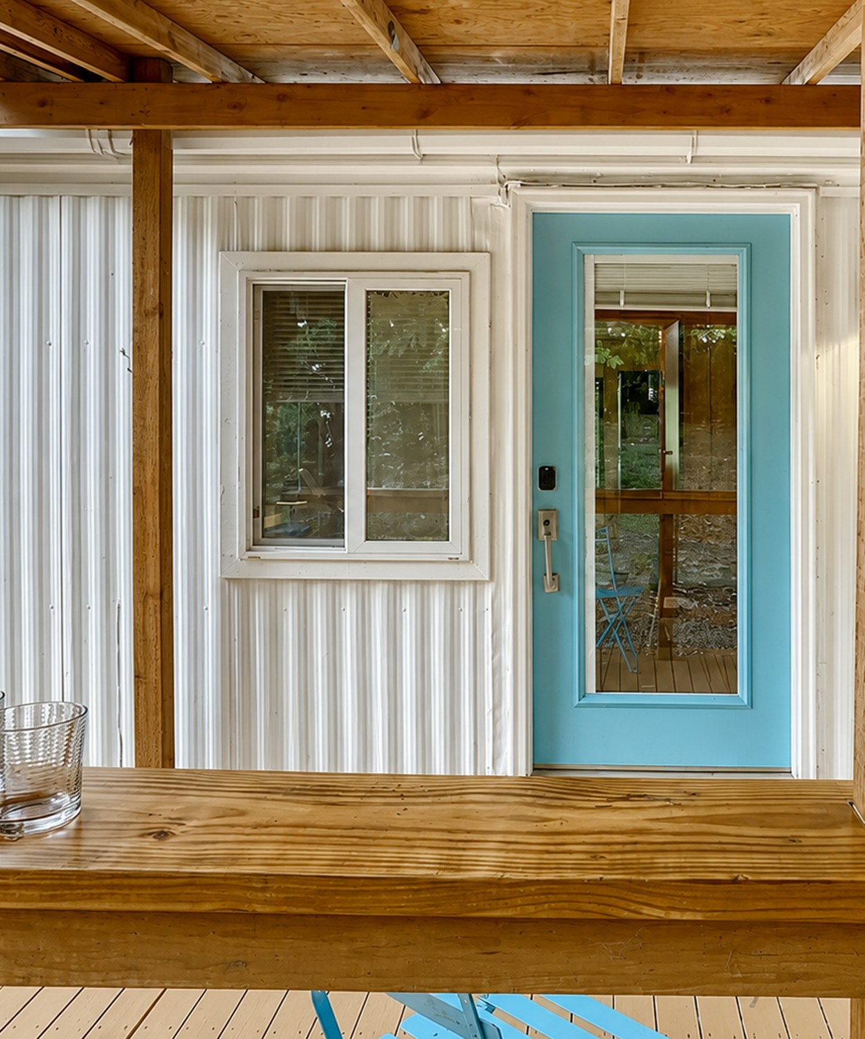
String lights run through the porch and yard. During the day, they look playful. At night, they can create a soft glow. This simple choice gives the deck a festive feel without adding large fixtures.
Covered porch cues
- Exposed wood posts
- Open rafters
- Clear or light roof panels
- Narrow bar-height ledge
- String lights
- Outdoor wall lamps
- Compact folding chairs
- Open views
- Warm wood finish
- Simple garden access
Built-In Benches Save Valuable Space
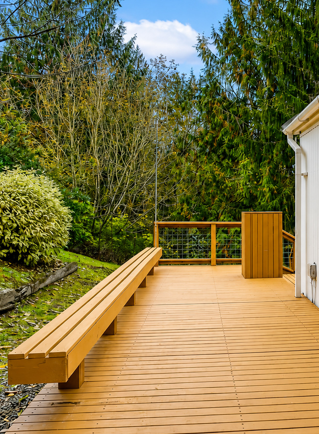
Long benches appear in several deck areas. Their simple shape fits the narrow outdoor layout.
Built-in seating works well around a manufactured home. It uses the edge of the deck instead of taking up the center. This leaves clear paths for walking.
The benches also make the deck feel custom. They look like part of the structure rather than furniture placed at random.
A bench can serve many needs. It can hold guests, plants, baskets, or outdoor gear. It can also act as a low table during a gathering.
The straight lines match the deck boards and railing. This helps every part of the outdoor design feel connected.
A Warm and Relaxed Living Room

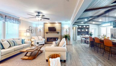
The living room keeps much of the home’s original character. Wood-look wall panels cover most of the space. Their warm brown tones create a cabin-like mood.
Instead of removing all the paneling, the design balances it with a white ceiling, pale floors, and soft gray furniture. This makes the room feel lighter.
Large reclining sofas offer deep comfort. Their shape feels practical rather than formal. Built-in cup holders suit movie nights and quiet evenings.
The seating has a soft gray-beige tone. This neutral color works well with the wood walls. It also creates less contrast than pure white or black furniture would.
A bold geometric rug adds pattern. Its blue, gray, and cream shapes bring energy to the room. The rug also helps define the seating zone within the open plan.
A low white coffee table brightens the center. Its clean form adds a modern note. Slim dark legs keep it from feeling heavy.
Living room design cues
- Original-style wood wall panels
- White paneled ceiling
- Pale wood-look floors
- Gray reclining sofas
- Low white coffee table
- Blue geometric rug
- Simple framed art
- Large windows
- Layered task lighting
- Open link to the kitchen
The Wood Stove Becomes a Cozy Focal Point
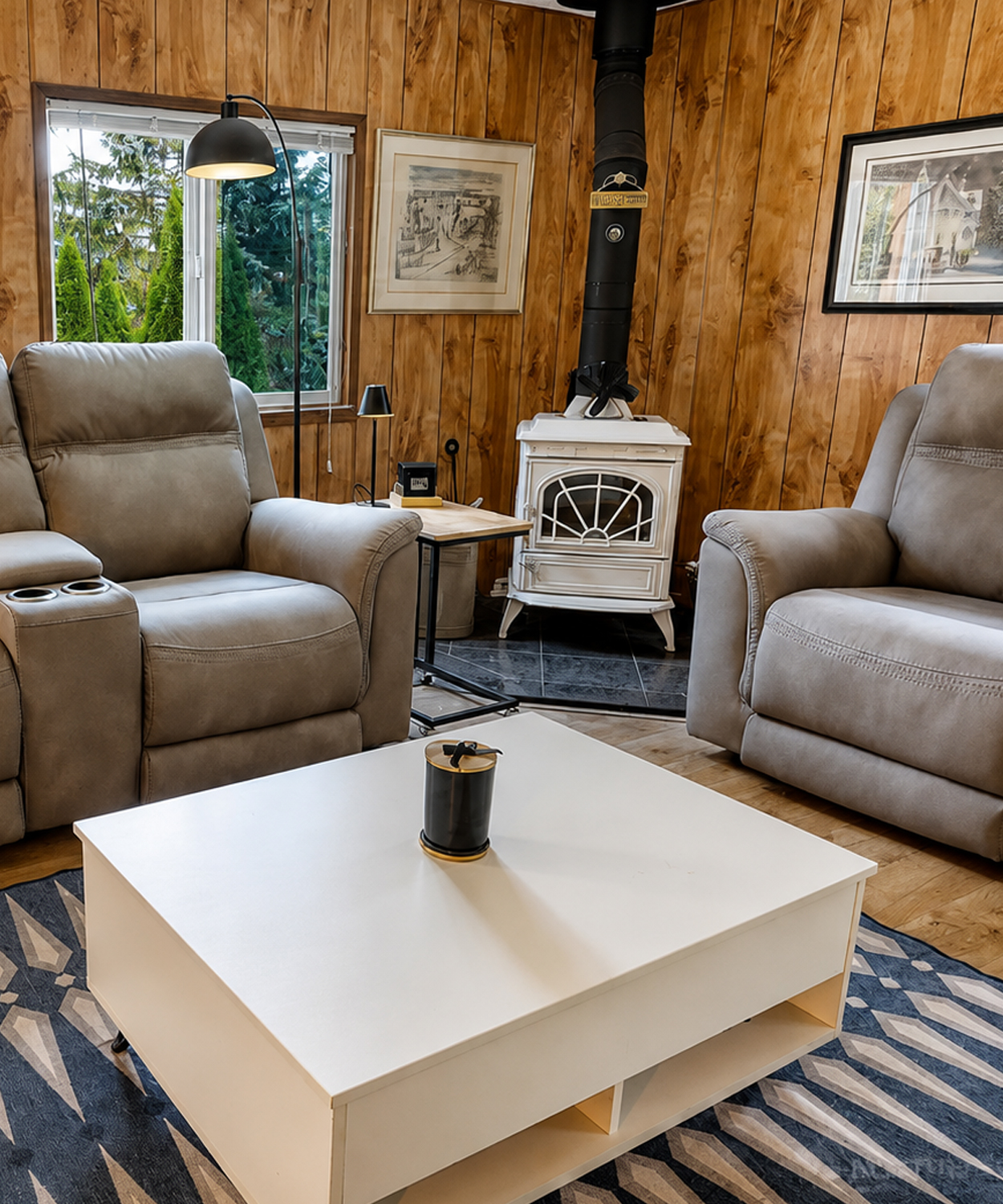
A compact wood stove sits near the corner of the living room. Its white body stands out from the dark floor pad and warm walls.
The stove adds both heat and charm. It also supports the home’s woodland setting. On cold days, it can make the room feel like a small cabin.
The black stovepipe draws the eye upward. This helps give the low ceiling more height. The strong vertical line breaks up the wide horizontal layout.
A simple dark hearth protects the floor and frames the stove. The design stays compact, which matters in a smaller living room.
The stove also creates a natural place for chairs to face. Even when it is not in use, it anchors the room.
Wood stove cues
- Compact size
- White enamel finish
- Black vertical pipe
- Dark square hearth
- Corner placement
- Simple fire tools
- Clear space around the unit
- Strong visual contrast
A Smart Open-Plan Layout
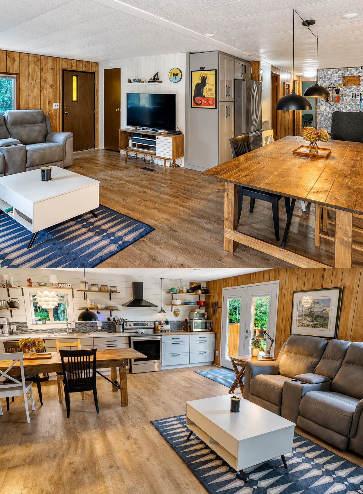
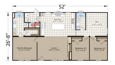
The living room, dining zone, and kitchen share one large space. This open layout makes the home feel wider than a set of closed rooms would.
A clear line of sight runs from the kitchen to the living room. This helps family members stay connected. One person can cook while another reads, works, or watches television.
The furniture creates zones without adding walls. The rug marks the living area. The long wood table marks the dining area. Pendant lights help define each section from above.
The floor continues through the whole space. This is a key move. One floor finish removes visual breaks. It makes the main room look longer.
The color plan also stays linked. Warm wood appears in the wall panels, dining table, shelves, and floor. White and gray soften those rich tones.
A Modern Kitchen With Farmhouse Warmth
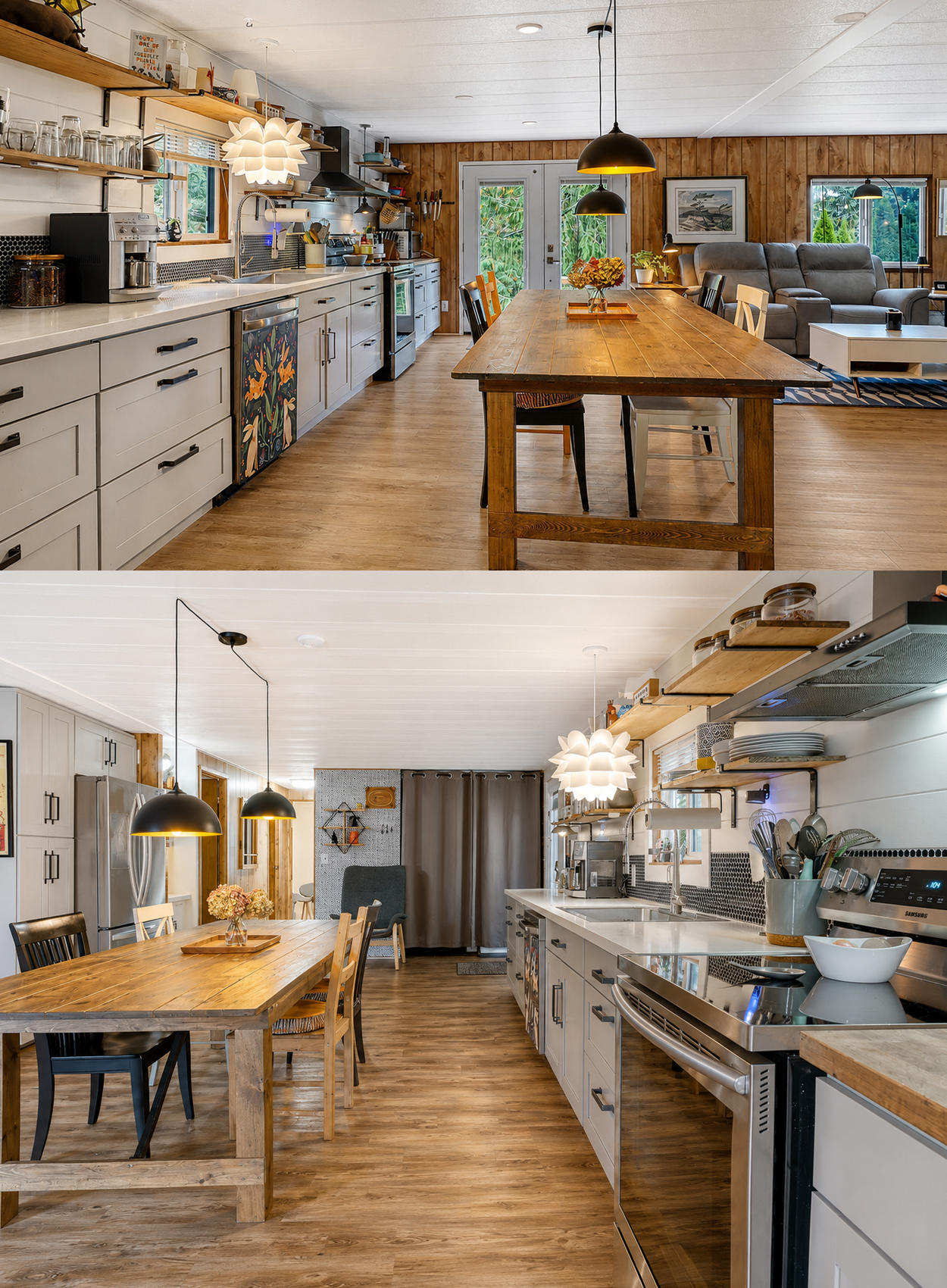
The kitchen brings the strongest modern update.
Soft gray cabinets create a clean base. Their simple shaker fronts add a classic touch. Dark metal pulls give each drawer and door a crisp outline.
The cabinets run along one long wall. This layout makes good use of the narrow shape. It also leaves a wide open space for the dining table.
A pale countertop reflects light. It looks fresh against the gray cabinets. The light surface also helps the kitchen feel less crowded.
Stainless steel appliances add a practical shine. The range, refrigerator, dishwasher, and hood share one finish. This creates a neat and unified look.
A large spring-style faucet gives the sink area a more modern feel. It also suits a busy kitchen.
Kitchen design cues
- Soft gray shaker cabinets
- Dark metal cabinet pulls
- Light solid-surface counters
- Stainless steel appliances
- Large pull-down faucet
- Long single-wall layout
- Deep drawer storage
- Open shelves
- White plank wall treatment
- Small dark backsplash tile
Open Shelves Keep the Kitchen Light
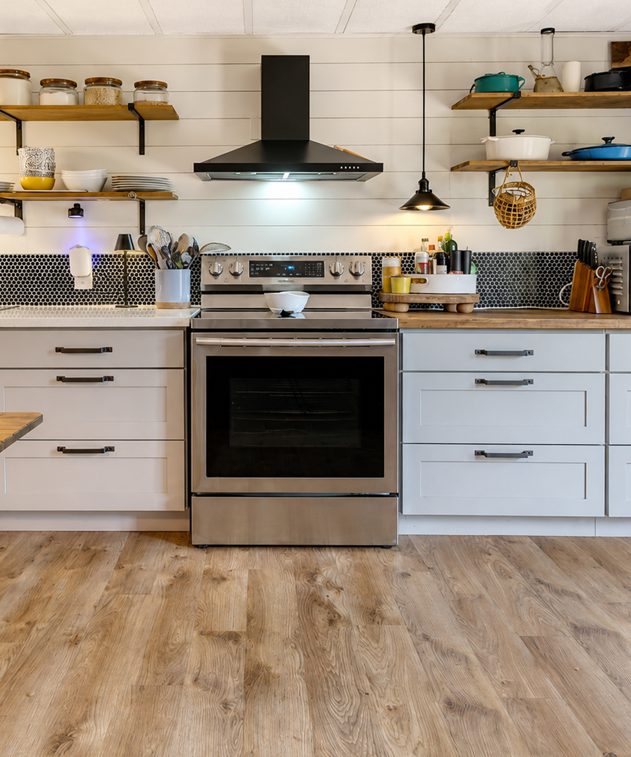
Instead of filling the upper walls with heavy cabinets, the kitchen uses long open shelves.
This choice makes the space feel wider. It also puts useful items within easy reach.
Wood shelves add warmth against the white wall. Dark brackets tie them to the cabinet hardware and range hood.
Plates, jars, cups, and cookware become part of the decor. This gives the kitchen a lived-in feel. It also prevents the room from looking too plain.
Open shelves work best when the items stay simple and useful. Here, the mix of white dishes, glass jars, and colorful pots creates a casual display.
The shelves reach across much of the wall. Their long lines make the kitchen appear larger.
Open-shelf cues
- Thick natural wood boards
- Slim dark brackets
- Everyday dishes on display
- Clear storage jars
- Colorful cookware
- Open space above the counter
- Easy access to daily items
- Long horizontal lines
A Small Backsplash With Big Impact
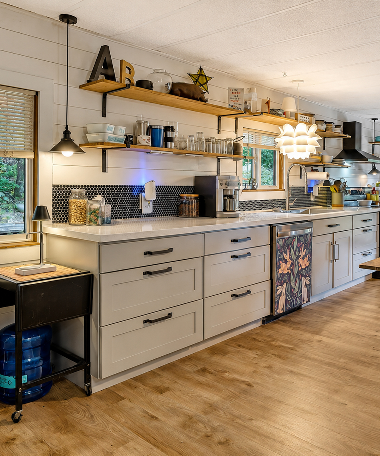
A narrow band of small dark tile runs along the countertop.
The scale works well in the kitchen. A large, bold tile could make the wall feel too busy. The tiny pattern adds detail without taking over.
The dark dots also connect with the black hood, shelf brackets, cabinet pulls, and light fixtures.
Above the tile, pale horizontal wall boards create a soft farmhouse look. This mix of tiny modern tile and simple planks gives the room more depth.
The contrast is strong, but the backsplash stays low. Therefore, the kitchen still feels bright.
The Dining Table Acts Like an Island
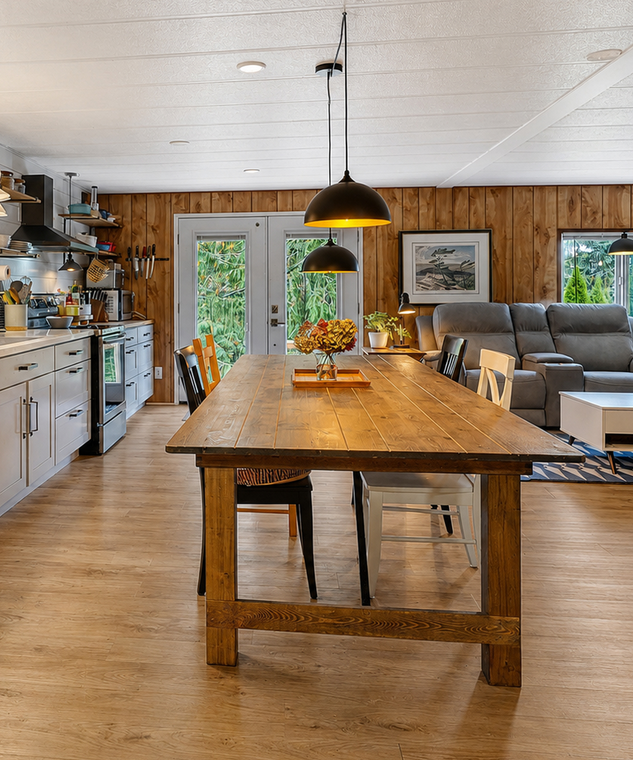
A long rustic table sits in the center of the open room. It serves as both a dining space and a work surface.
This is a smart choice for a remodel. A fixed island may cost more and reduce movement. A table offers more freedom.
The table can hold meals, baking trays, craft projects, or a laptop. Chairs can move as needed. The open base also makes the room feel less crowded.
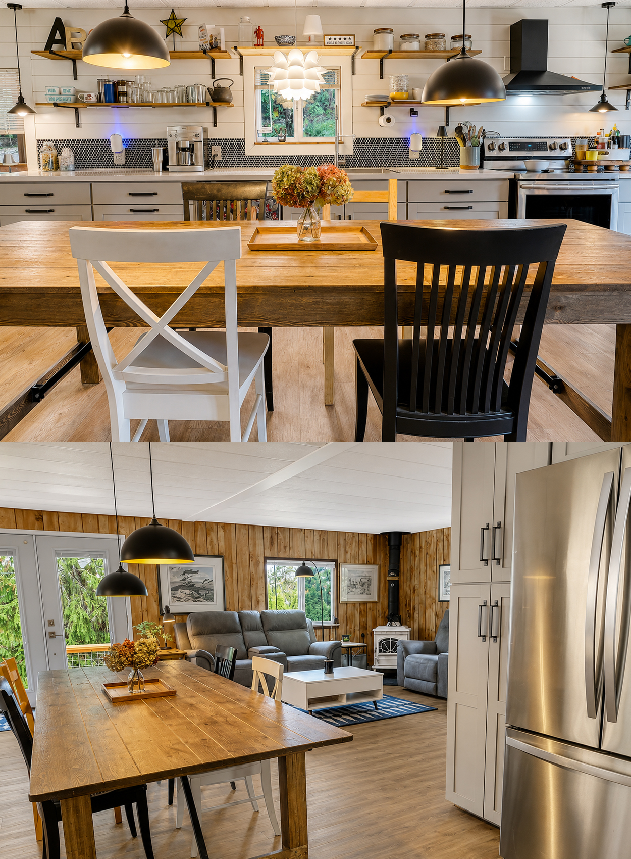
Its natural wood top adds warmth near the gray kitchen. Slight marks and grain give it a relaxed feel.
Mixed chairs add charm. The black, white, and natural wood finishes keep the look casual. They suggest that the space grew over time rather than arriving as one matching set.
Two large dome pendants hang above the table. Their dark finish adds weight and helps center the room.
Dining area cues
- Large farmhouse table
- Thick wood top
- Open base
- Mixed dining chairs
- Dark dome pendants
- Simple flower display
- Wide paths around the table
- Clear view of the living room
- Flexible use as prep space
Lighting Builds Mood Across the Open Room
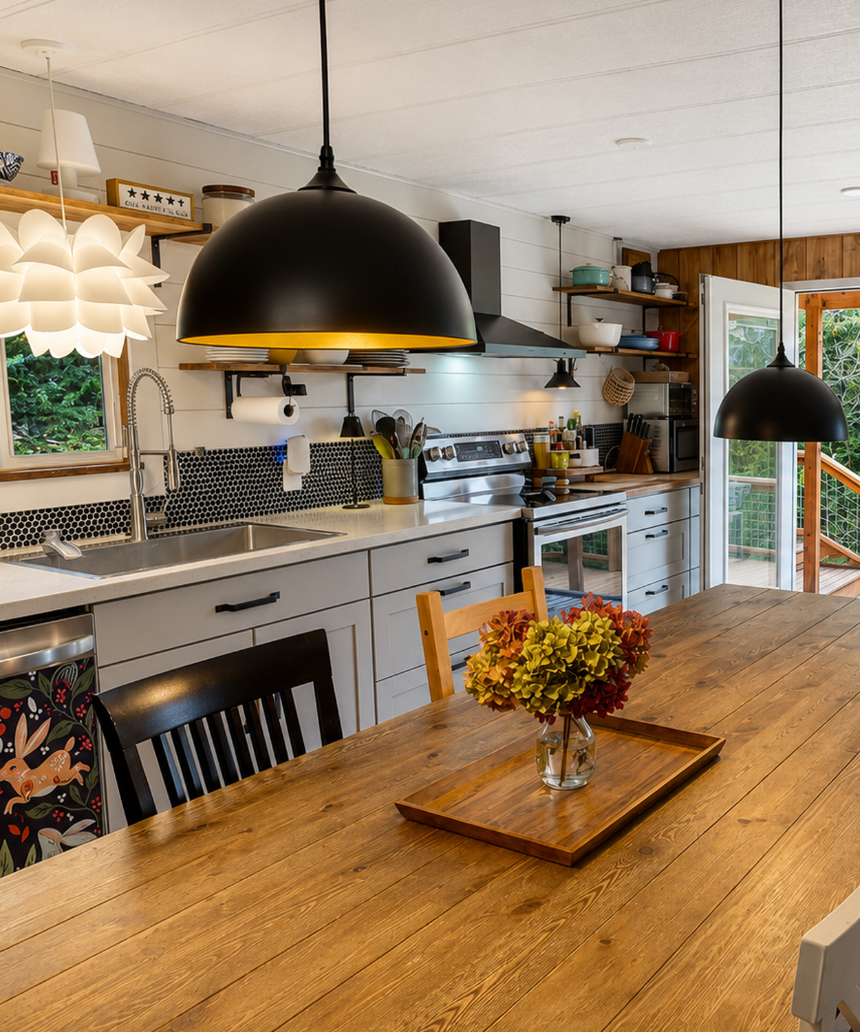
The home uses many small light sources instead of one large ceiling fixture.
Pendant lights mark the dining table. A flower-shaped lamp adds a playful note near the kitchen. Small metal pendants light the counters. Floor and table lamps warm the living room.
This layered plan makes the home feel cozy. It also lets each zone work on its own.
Task lamps suit reading and cooking. Warm pendants work well for meals. The outdoor string lights carry the same soft mood onto the deck.
The mix of styles feels personal. Some lights look industrial. Others feel modern or playful. Yet the warm glow helps them work together.
A Calm Primary Bedroom
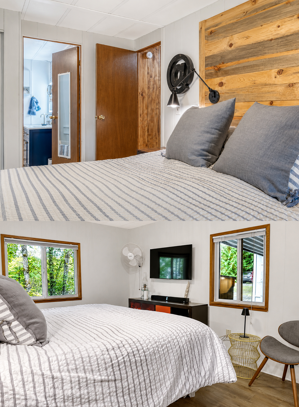
The primary bedroom has a quieter look than the living room.
Pale walls make the space feel clean and bright. Natural wood trim frames the windows. The floor continues the light wood tone used in the main room.
A large plank headboard adds the main feature. Its wide boards show knots and grain. This brings warmth without covering every wall in dark wood.
Soft gray and white bedding keeps the bed calm. Thin stripes add light pattern. Large pillows make the room feel restful.
Wall-mounted task lights save space beside the bed. They also add a slight industrial note.
Two windows bring in views of the trees. They help the small room feel connected to the outdoors.
Bedroom design cues
- Wide wood plank headboard
- Gray and white striped bedding
- Large soft pillows
- Pale wall panels
- Natural wood window trim
- Wall-mounted reading lamps
- Compact side tables
- Light wood-look floor
- Simple television wall
- Two-way natural light
A Small Bathroom With Bold Contrast
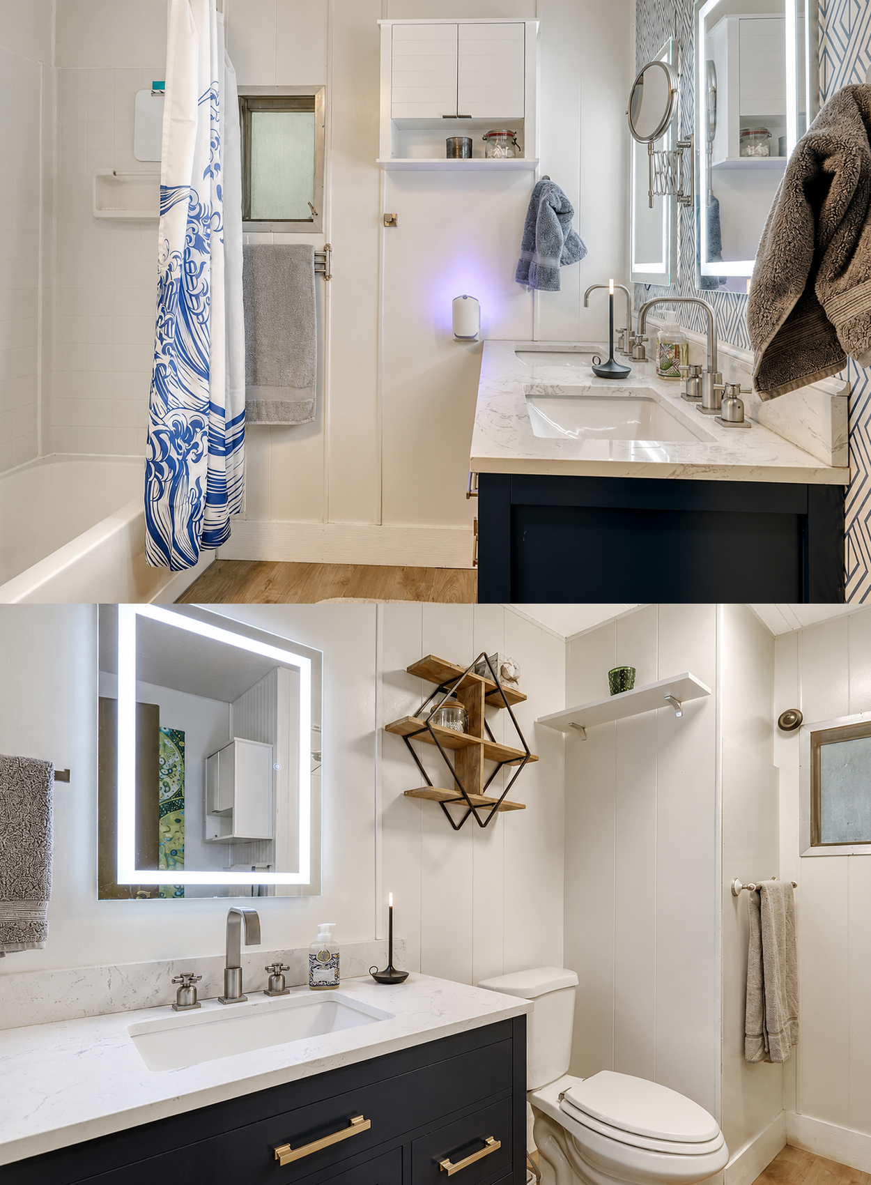
The bathroom mixes a bright white base with darker accents.
A black vanity gives the room weight. Its pale stone-look top keeps the sink area fresh. Two sinks add daily function.
Large lighted mirrors bring a modern touch. Their bright edges help the room feel larger. They also give clear light for grooming.
A blue and white geometric wall pattern adds energy behind the mirrors. This bold surface creates a clear focal point.
The tub and shower stay simple. White walls and a white curtain keep that side of the room light.
A small wall cabinet adds storage above the floor. Towels hang within easy reach. Every item has a clear purpose.
Bathroom design cues
- Dark double vanity
- Pale stone-look counter
- Two undermount sinks
- Brushed metal faucets
- Large lighted mirrors
- Blue geometric accent wall
- White tub and shower
- Compact wall storage
- Wood-look flooring
- Simple gray towels
A Home Office With Personality
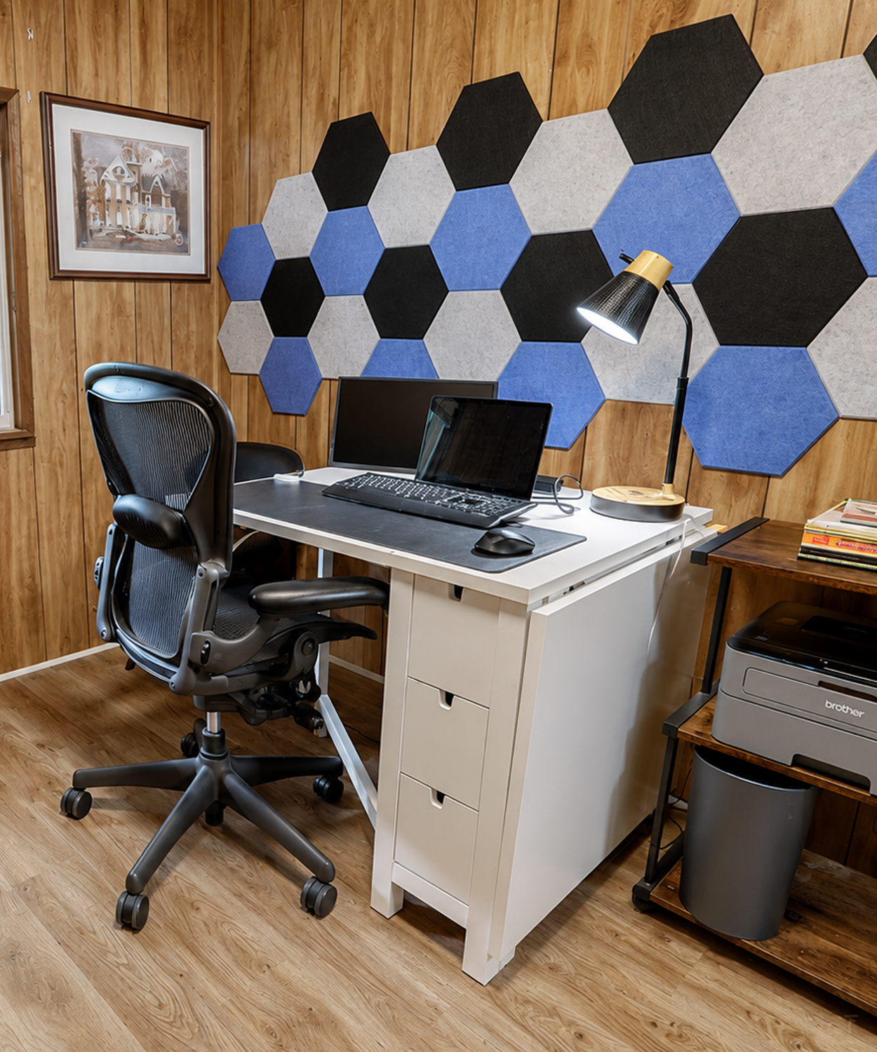
One smaller room serves as a work zone.
The wood-paneled walls continue the home’s original style. However, a pattern of blue, gray, black, and white hexagons gives the room a fresh focus.
These soft wall panels may help with sound. They also create a strong background for video calls or desk work.
A large office chair adds comfort. A compact desk holds two screens. Storage drawers keep papers close.
A cat tower sits beside the window. This small detail shows how the room supports real life. It is not a staged office with no personal use.
The window brings in green views and daylight. That helps the small room feel less closed in.
Office design cues
- Warm wood wall panels
- Geometric hexagon wall panels
- Compact desk
- Dual-screen setup
- Ergonomic chair
- Printer station
- Window beside the desk
- Open floor area
- Pet-friendly features
- Practical task lighting
Conclusion
This 1981 double-wide mobile home blends old character with smart new ideas. The warm wood, soft colors, open layout, and wide outdoor deck make the home feel larger and more welcoming. It is a great example of how thoughtful updates can turn an older manufactured home into a cozy place for modern living.