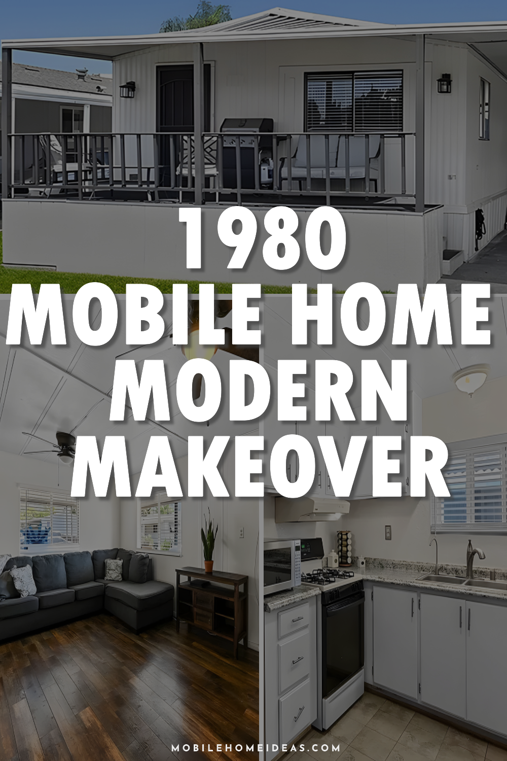
This 1980s mobile home has gotten a fantastic modern makeover. When it was built, it focused on compact and efficient living spaces. It’s been updated to fit the latest design trends, making it more comfortable and functional. The update features a soft, neutral color palette that opens up the space and lets in more light, giving it a warm and stylish feel. This smart layout change makes the home feel bigger and more welcoming. Let’s dive in!
Exterior
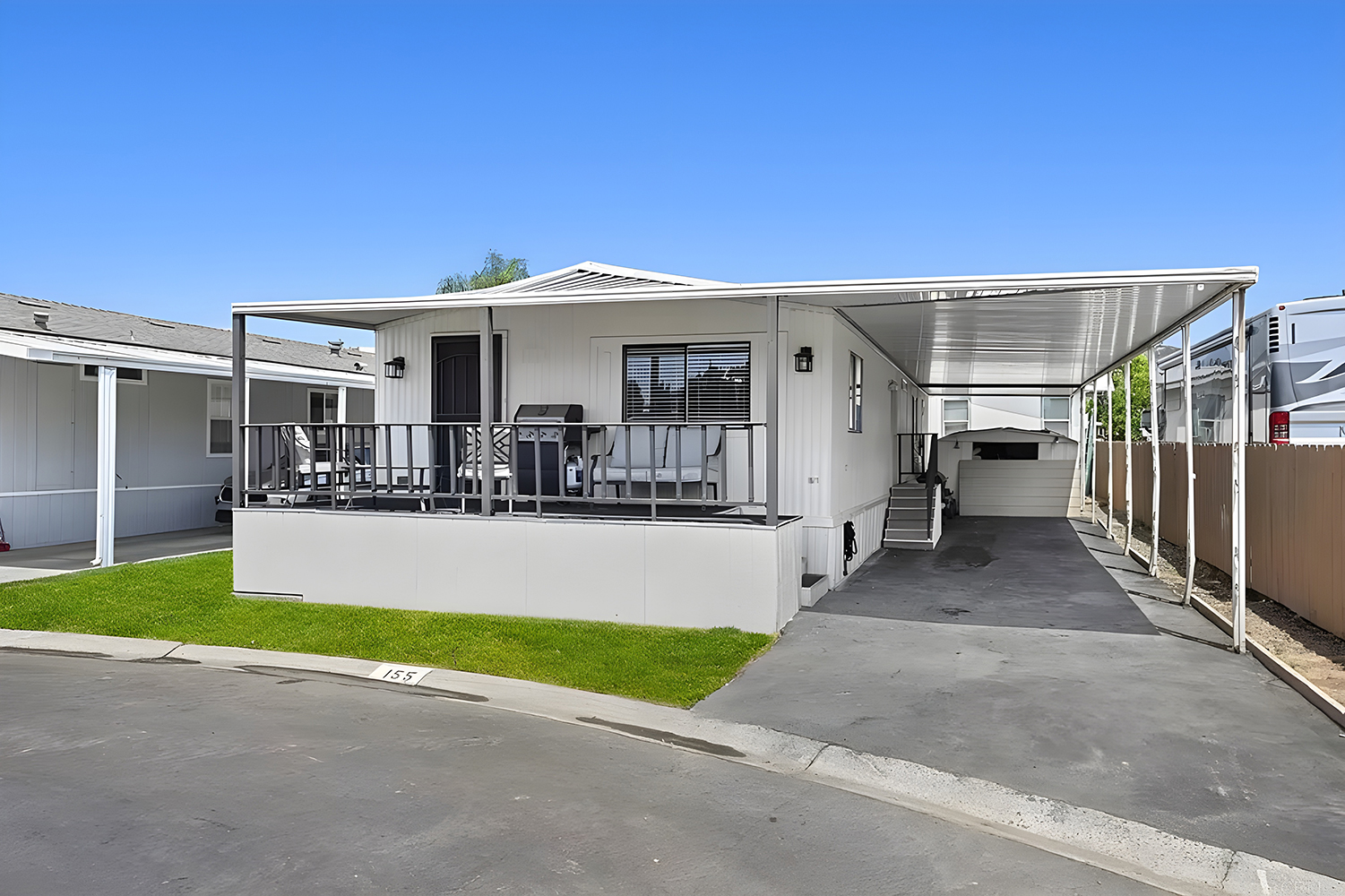
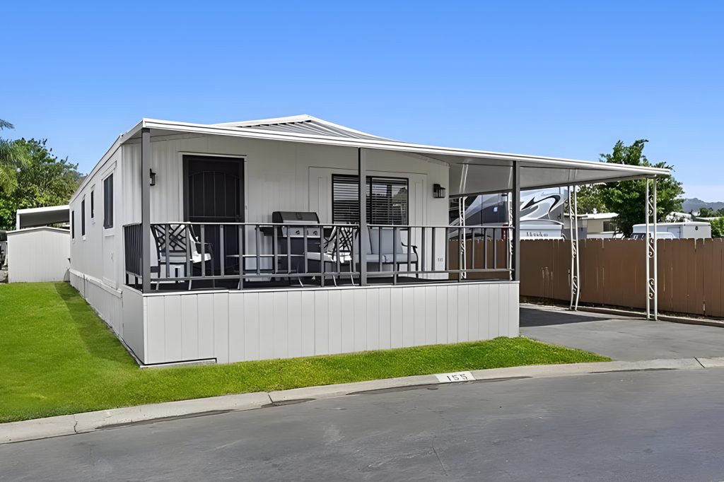
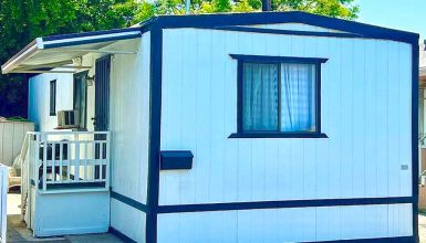
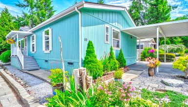
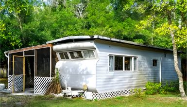
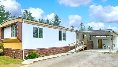
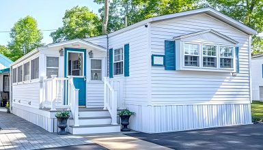
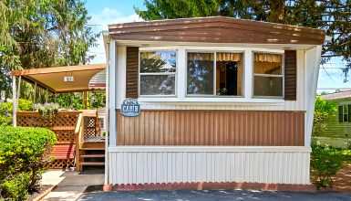
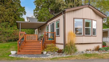
This 1980 mobile home shows off a neat and efficient design typical of the time. The exterior is decked out in clean white paneling, giving it a fresh and appealing look. One of the standout features is the metal roof. It’s solid and long-lasting and keeps the home’s traditional vibe alive.
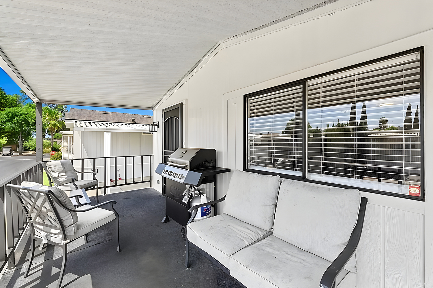
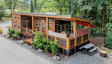
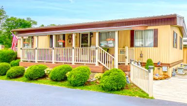
Another highlight is the spacious front porch. It’s covered to offer shade and decked with cozy outdoor furniture, perfect for enjoying a sunny day or a quiet evening. This area makes it easy to connect with nature right from your doorstep.
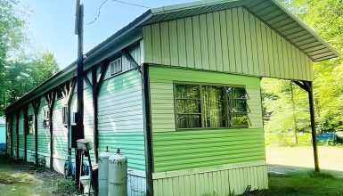
A neatly kept lawn and a paved driveway lead to a protective carport. The carport, built from light metal, matches the house and offers a safe spot for parking away from the weather.
In short, this mobile home mixes comfort, style, and function beautifully, making it a smart pick for a compact yet cozy living space.
Living Room
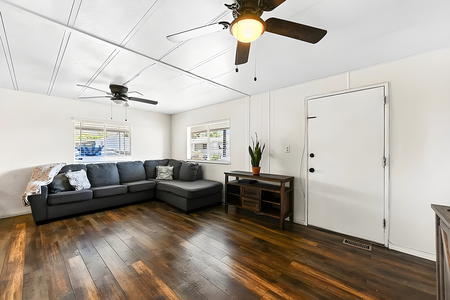
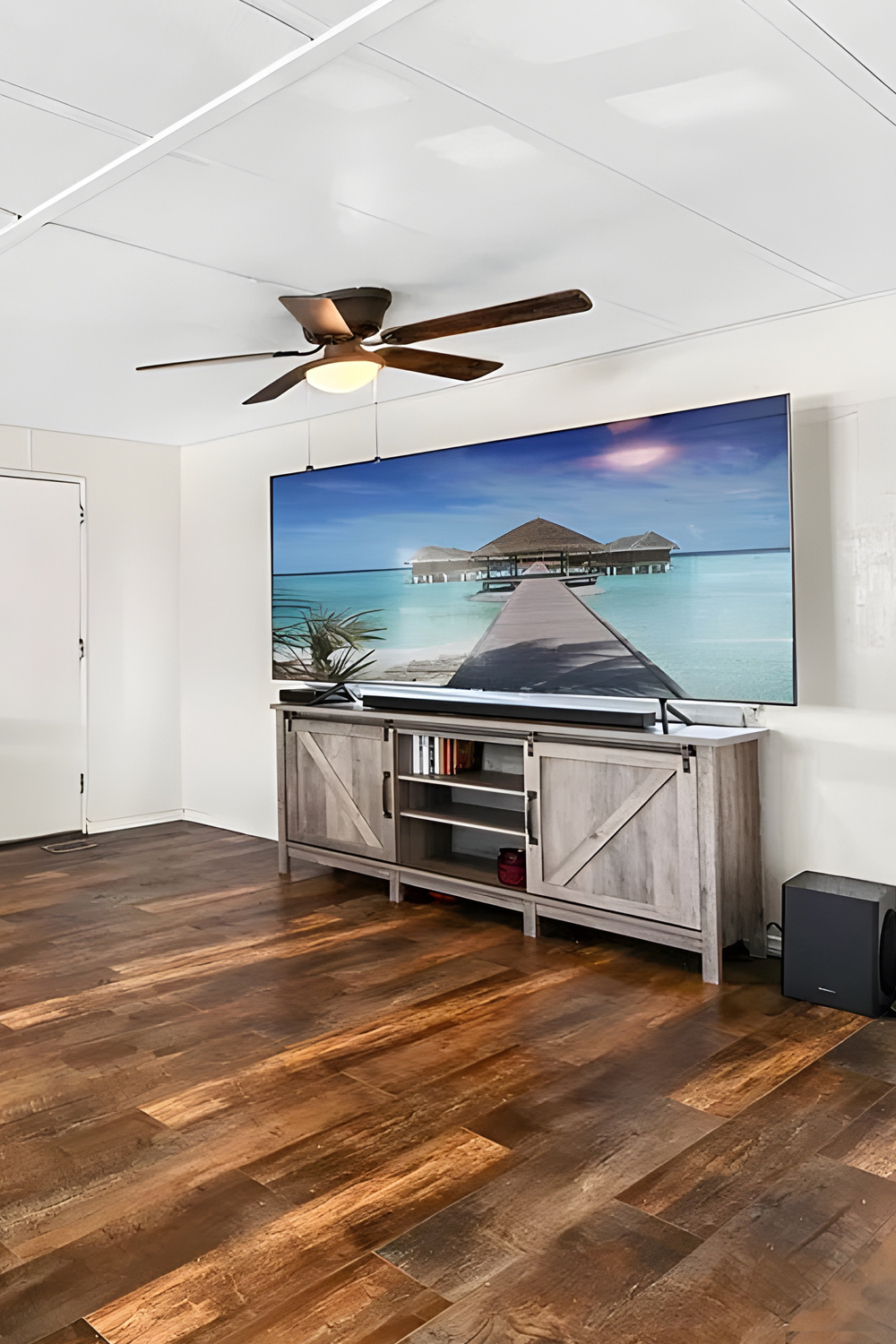
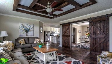
This living room really nails the modern yet cozy vibe. It is painted in bright white, which makes it feel open and airy. This clever trick makes the space seem bigger, something that’s always a plus in a mobile home.
The dark hardwood floors bring a warm and inviting feel to the room. They also create a striking contrast with the light walls and ceiling, adding depth and interest to the space. The large gray sectional couch is perfect for kicking back and relaxing, and there’s plenty of room for friends and family.
Above, the contemporary ceiling fans with dark blades are stylish and super practical. They keep the air moving, which is critical in smaller spaces. Plus, the natural light from the windows makes the room bright and highlights the rich textures of the furniture and floors.
Finishing off the room, you’ll find sleek pieces like a wooden console table and a simple TV stand. They’re functional without taking up too much space. Overall, this living room shows how smart design can make a mobile home living area both stylish and comfortable.
Kitchen
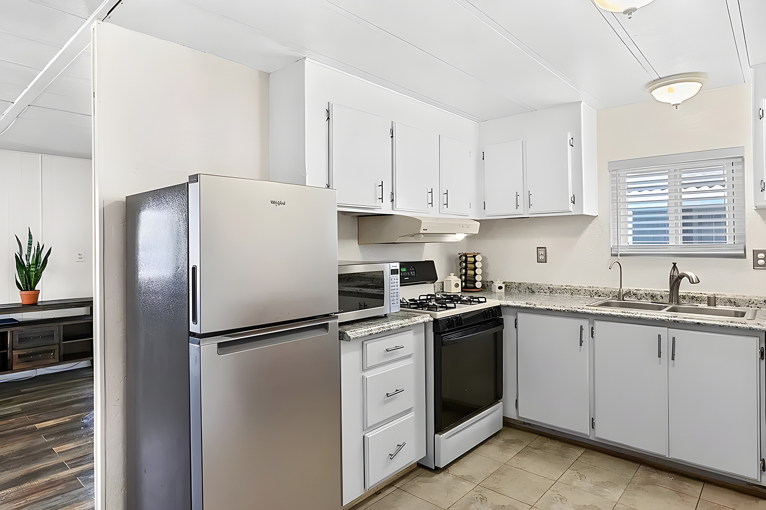
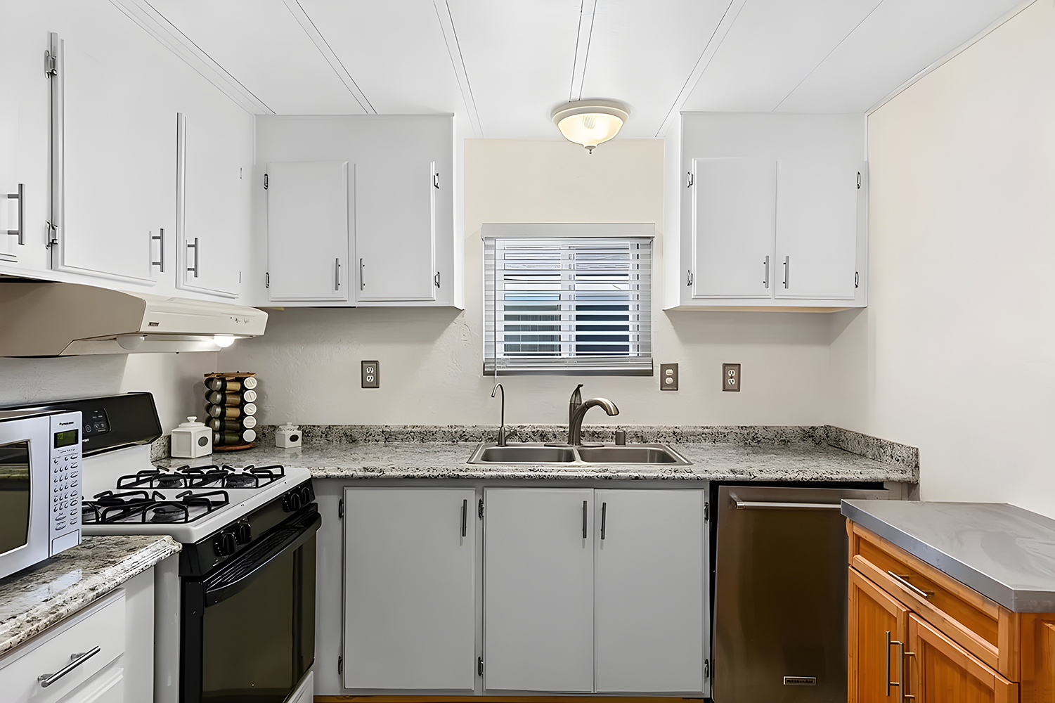
This kitchen combines modern updates with smart space-saving ideas. It’s decked out in white cabinetry that really opens up the room, making it look clean and organized. These cabinets are great for storing everything you need without cluttering the space.
The countertops are made of granite, which looks sharp, is super durable, and is easy to clean. The stainless steel appliances, including a shiny new gas stove and refrigerator, give the kitchen a modern edge and are perfect for cooking up a storm.
A central light fixture keeps the kitchen bright, while the window above the sink lets in lots of natural light, helping the area feel open and welcoming. This is especially helpful in a mobile home, where making the most of every inch is key.
Overall, this kitchen is a fantastic mix of style and function, creating a place that’s not just for cooking but also for hanging out and enjoying the space.
Bedroom
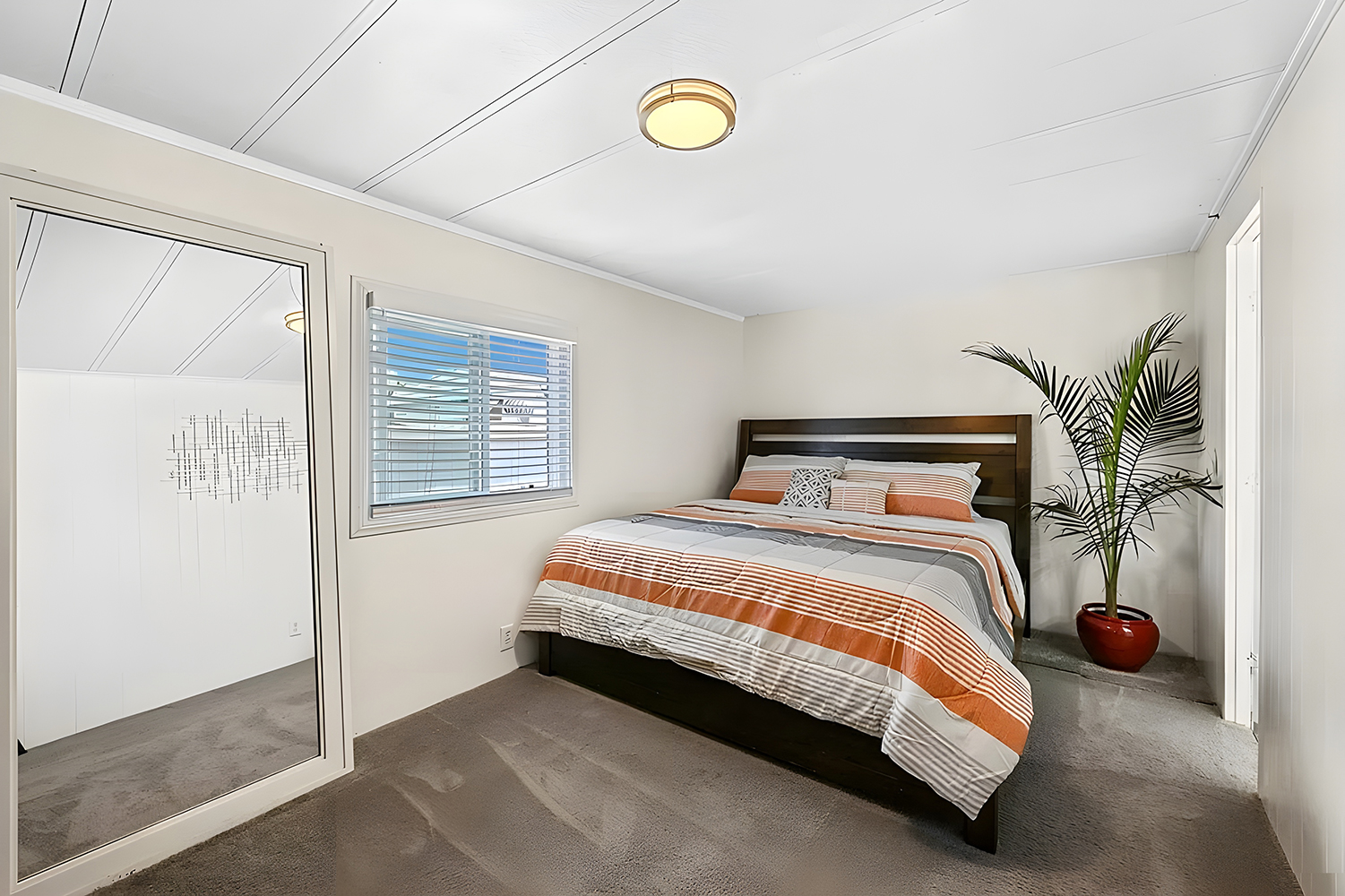
This bedroom strikes a great balance between modern style and practical living. With walls and a ceiling painted white, the room feels bright and spacious, which is always a plus in a mobile home where space can be tight.
The light gray carpet on the floor makes the room cozy and perfectly matches the simple color palette. With its colorful striped comforter, the large bed adds a lively touch and invites you to relax. Opposite the bed, a big TV on a dark wooden dresser lets you enjoy your favorite shows and offers handy storage space.
The windows let in plenty of natural light, adding to the room’s airy feel. Keeping the decor minimal helps keep the room neat and open, making it a nice spot to unwind.
Overall, this bedroom shows how you can create a comfy and appealing space even in a mobile home with the right touches.
Bathroom
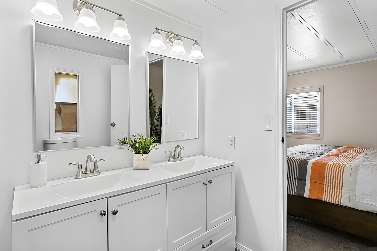
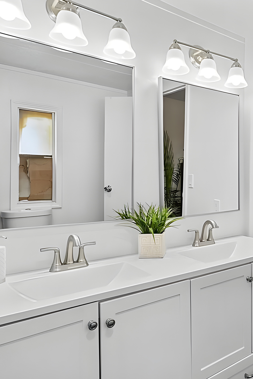
This bathroom showcases how smart modern updates can make any small space both stylish and functional. The walls and ceiling are painted white, which helps the bathroom look bigger and brighter.
The vanity area features a large mirror that adds depth and reflects light throughout the room—crucial in a compact space. Below the mirror, the white cabinetry offers plenty of storage to keep things neat, which is key in maintaining a clutter-free countertop. The sleek silver fixtures on the sink lend a modern touch without being too flashy.
Good lighting is essential in a bathroom, and the bright lights above the mirror illuminate the space for everyday routines. The white color scheme and clean lines throughout the bathroom give it a fresh, airy vibe.
Overall, this bathroom does a great job blending practicality with a clean, modern look, making the most of what a mobile home bathroom can offer.

