Step inside this 1977 mobile home remodel, where rustic charm meets modern comfort. The transformation is stunning—from the cozy wood-shingled exterior to the bright, open living spaces. With warm textures, clever storage solutions, and a seamless flow, this home combines functionality and style in every corner. Whether relaxing on the porch or admiring the sleek bathroom details, this mobile home proves that a vintage space can feel timeless and fresh. Get ready to be inspired by this rustic, fabulous makeover!
Exterior
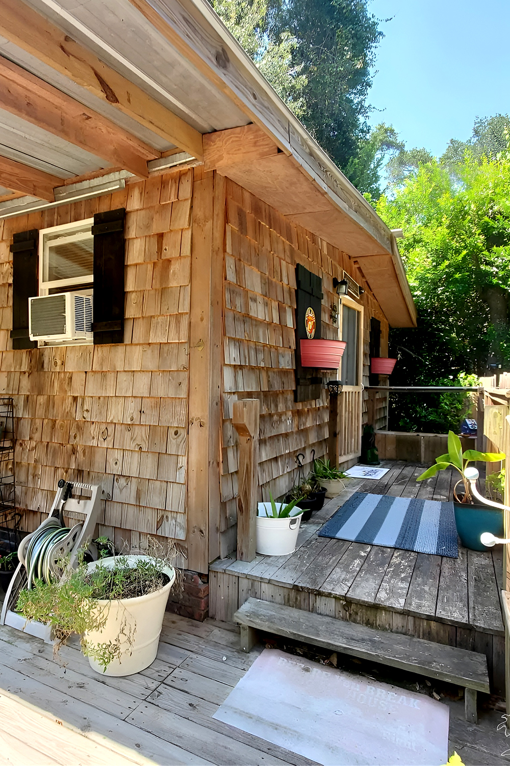
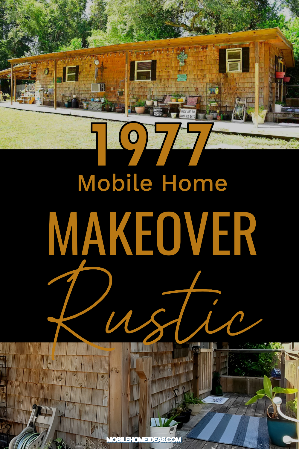
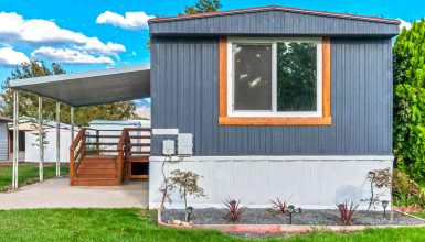
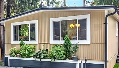
This 1977 mobile home has a unique and inviting exterior. The first thing you notice is the warm, rustic charm. The entire structure is covered in wood shingles, giving it a cabin-like feel. These wooden shingles add a textured look that blends naturally with the surrounding trees and greenery. The design creates a cozy, earthy vibe.
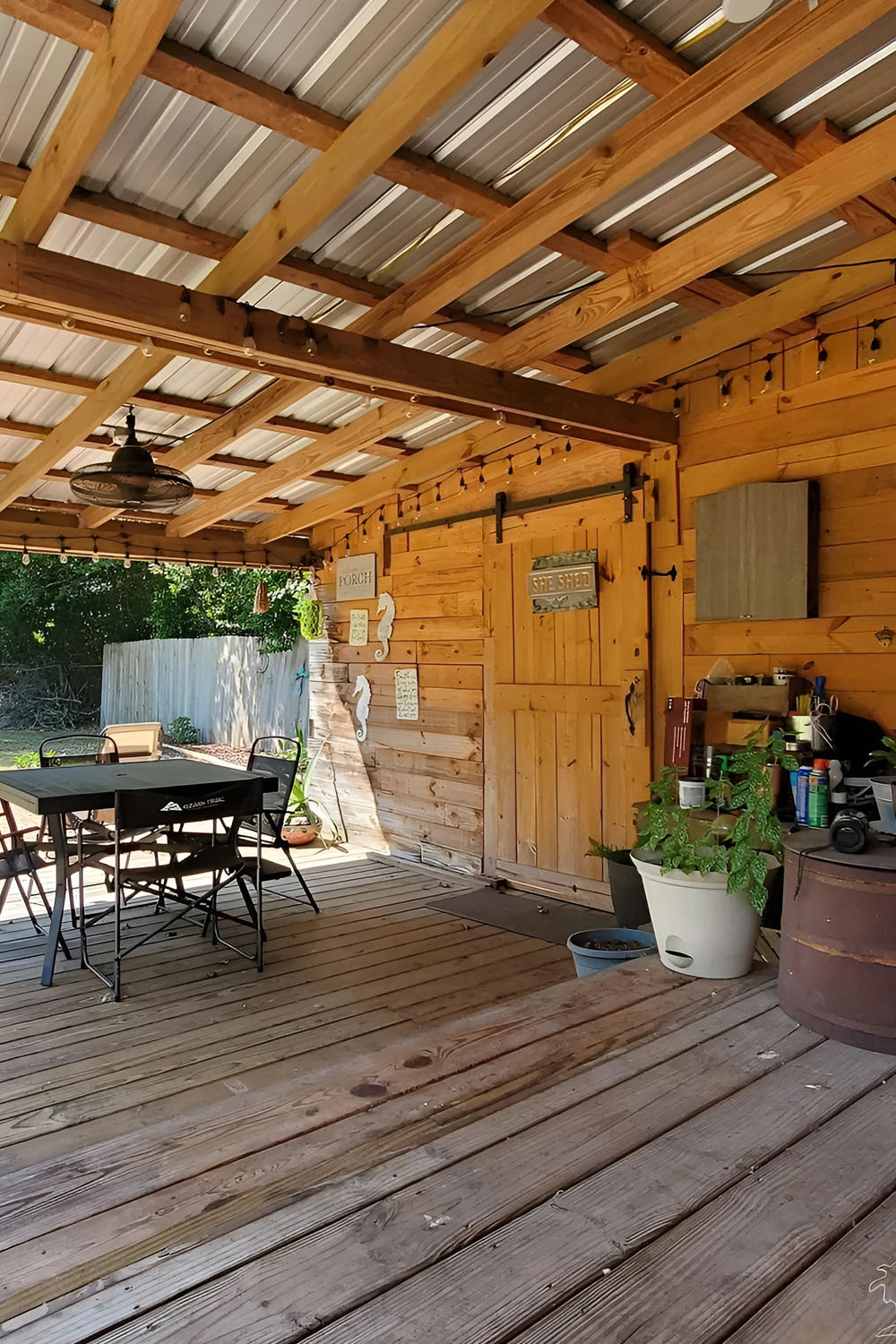
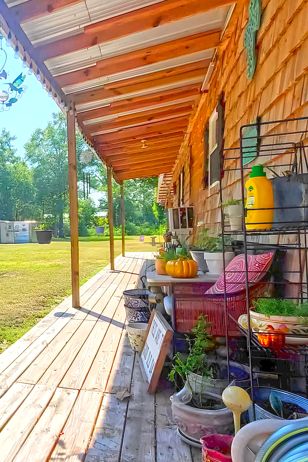
The large porch running along the front adds lots of character. This expansive deck feels like an extension of the living space, perfect for enjoying the outdoors. It’s set up with outdoor furniture and potted plants, which add personality and color. The porch also has string lights overhead, making it feel festive and relaxed. These lights bring a welcoming glow in the evenings, making it a great place to unwind.
On the walls, you’ll notice decorative accents. There are clocks and wall art, showing the homeowner’s touch of creativity. The two windows have simple shutters, and one of the windows is fitted with an air conditioning unit. This adds function while keeping the design minimal and unfussy.
The roof has a generous overhang, providing extra shade and protecting the front of the house. It also helps the porch feel like a sheltered outdoor room. This detail adds to the comfortable, lived-in look of the home.
Living Room
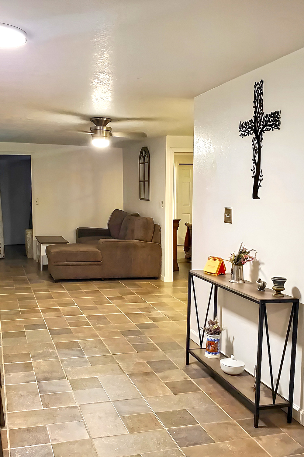
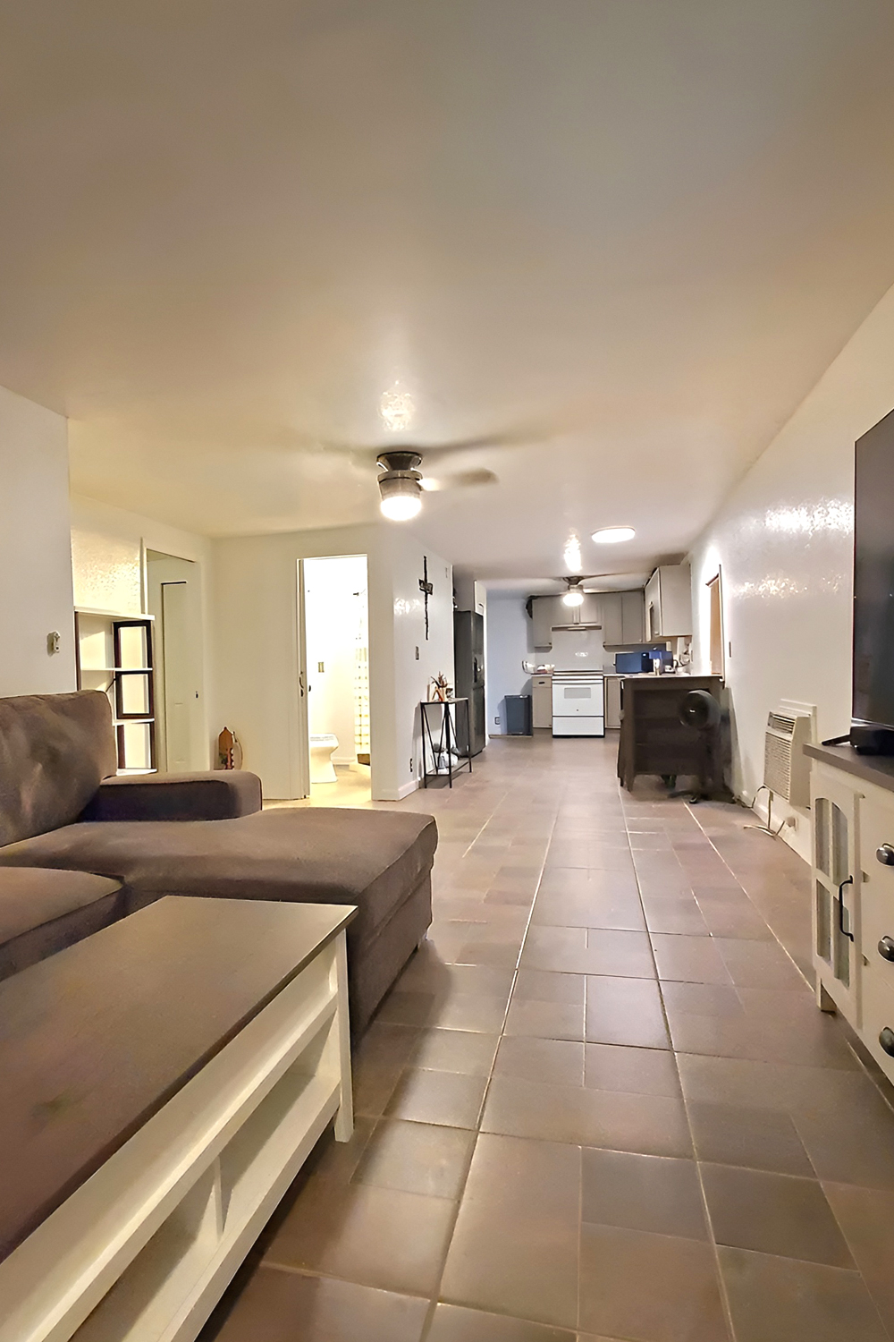
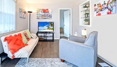
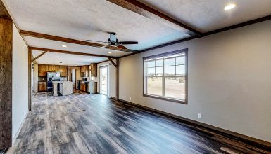
This living room has a clean, cozy, practical layout that fits a 1977 mobile home well. The room feels open and connected, flowing seamlessly into the kitchen. The design is simple but effective, making the most of the space.
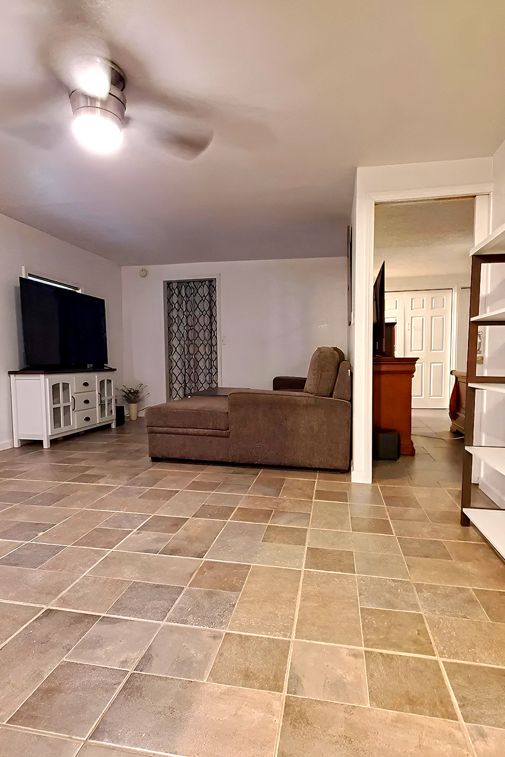
The floor is covered in large, square tiles. These tiles have a neutral tone that works well with the overall design, making the room feel bigger and brighter. Plus, the tile is easy to clean and durable, perfect for high-traffic areas like this one.
The large sectional sofa takes center stage in the room. It’s plush and comfortable, providing plenty of seating for relaxing or watching TV. The soft, gray upholstery gives a modern feel while staying neutral so it won’t overpower the space. The sofa faces a large, flat-screen TV mounted on a white, farmhouse-style media console. The console has glass-paneled doors and black handles, adding a hint of rustic charm to the otherwise minimal look.
On the wall opposite the sofa, there’s a decorative mirror with an arched design. It gives the room extra character and reflects light, making the space feel even larger. The ceiling fan in the middle of the room keeps the air moving and adds to the room’s comfortable atmosphere.
The lighting in the space is simple but effective. Recessed lights on the ceiling provide bright, even illumination, while the fan light adds a bit of extra light in the center of the room.
At the back, the room leads directly into the kitchen, which keeps the layout open and functional. The door to the bathroom is also easy to spot, making it clear how this home uses every inch of space wisely.
Bedroom
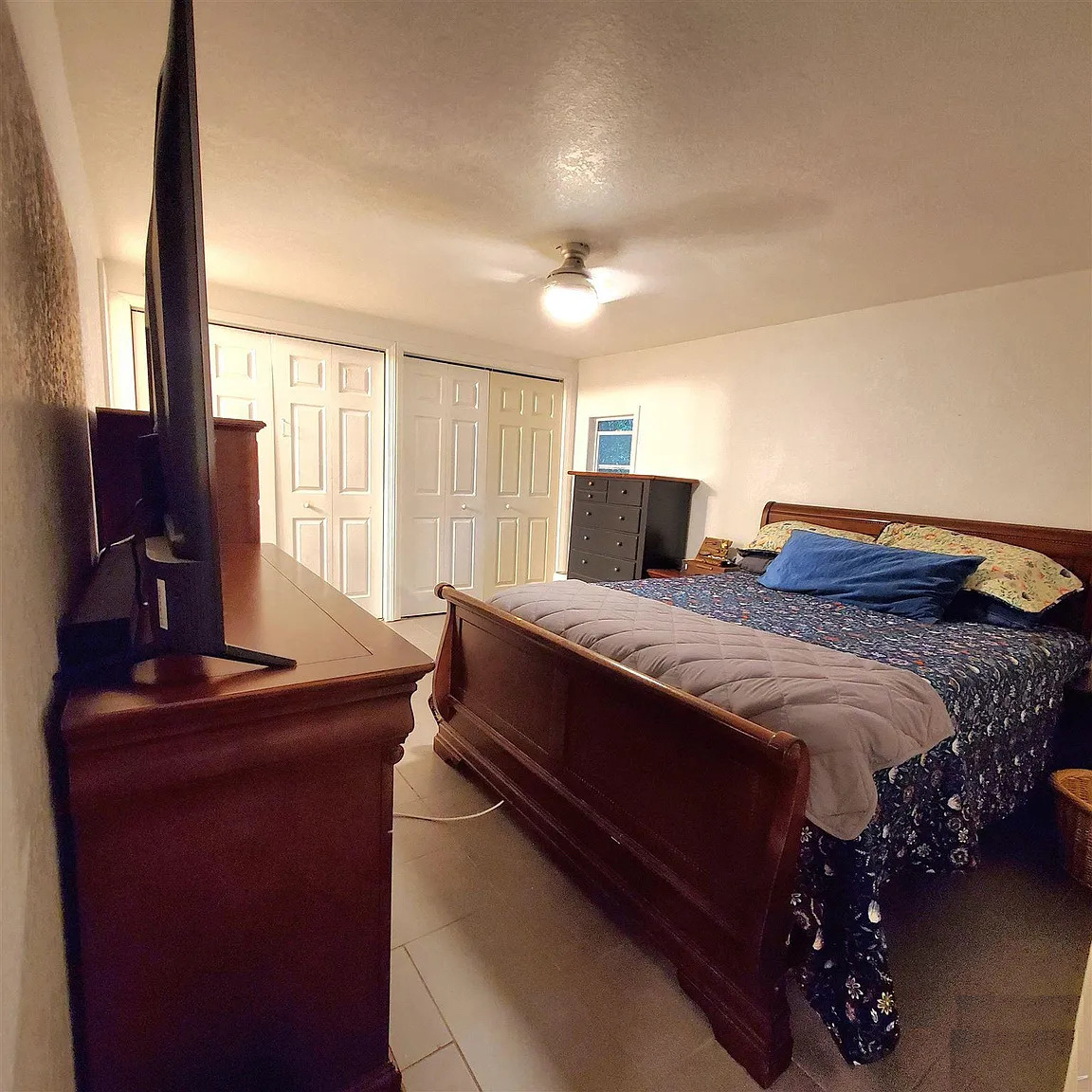
This bedroom design is simple yet functional, giving it a comfortable, laid-back feel. The large bed takes up most of the space and has a colorful floral bedspread, adding a touch of personality to the room. The bed’s position in the corner leaves ample space for movement, making it easy to navigate.
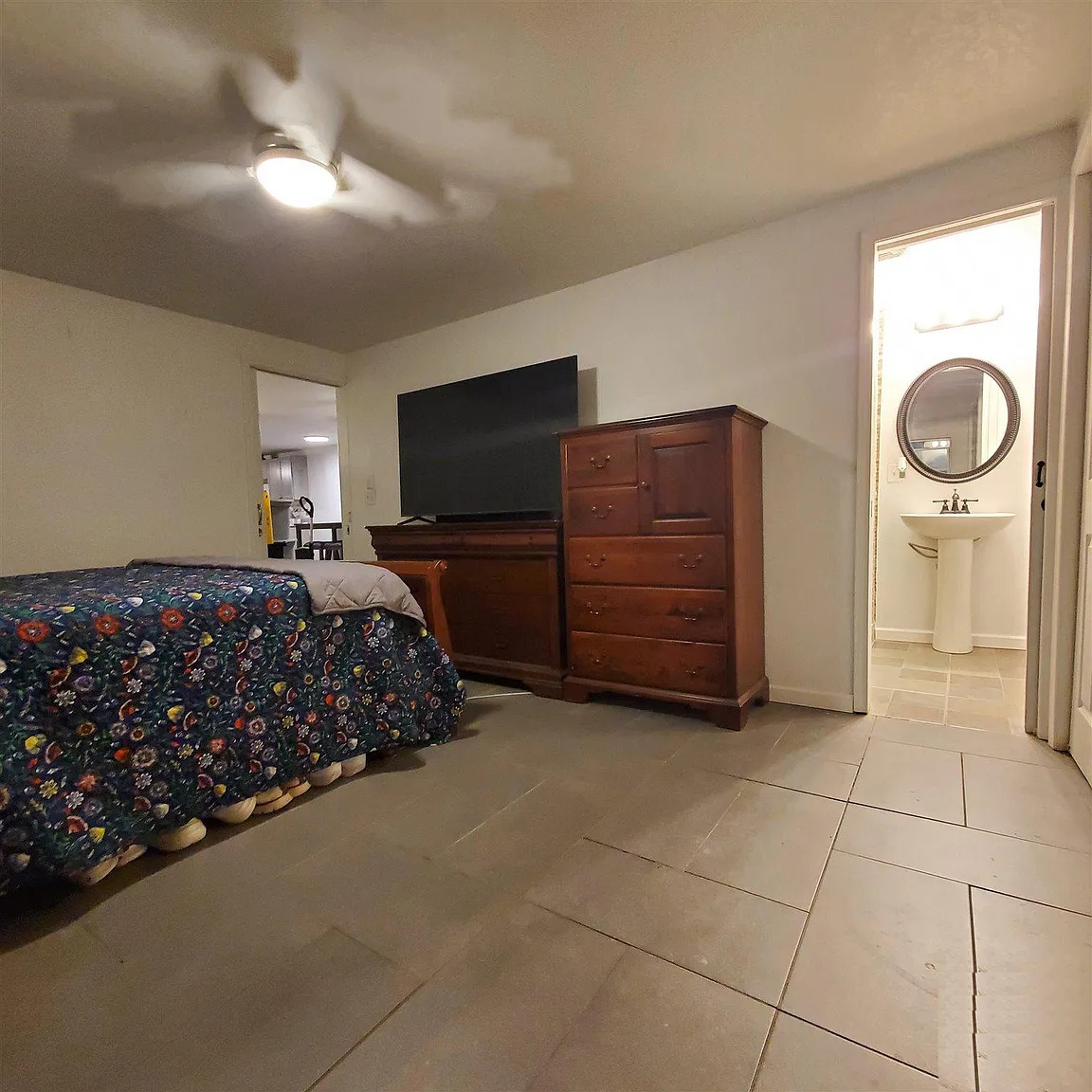
On the opposite side, there’s a wooden dresser and a matching TV stand. Both pieces have a traditional, sturdy look, providing storage and warmth to the otherwise neutral room. The dark wood contrasts nicely with the pale walls and flooring, adding visual interest without feeling overwhelming.
The flooring is tiled, similar to the rest of the home, creating a sense of continuity. The tiles are large and neutral in color, easy to maintain, and ideal for durability. This choice keeps the room practical while still feeling cozy.
The room connects to a bathroom, visible through the open door. The bathroom’s pedestal sink and circular mirror give off a clean, simple vibe. Having the bathroom right off the bedroom adds convenience, making the space more functional.
Finally, the ceiling fan with a built-in light keeps the room cool while offering soft lighting. The uncluttered layout, neutral colors, and functional furniture make this bedroom feel welcoming and easy to live in.
Bathroom
This bathroom has a clean, functional design with charming touches that make it feel cozy and stylish. The layout makes the most of the space, providing everything you need without feeling cramped.
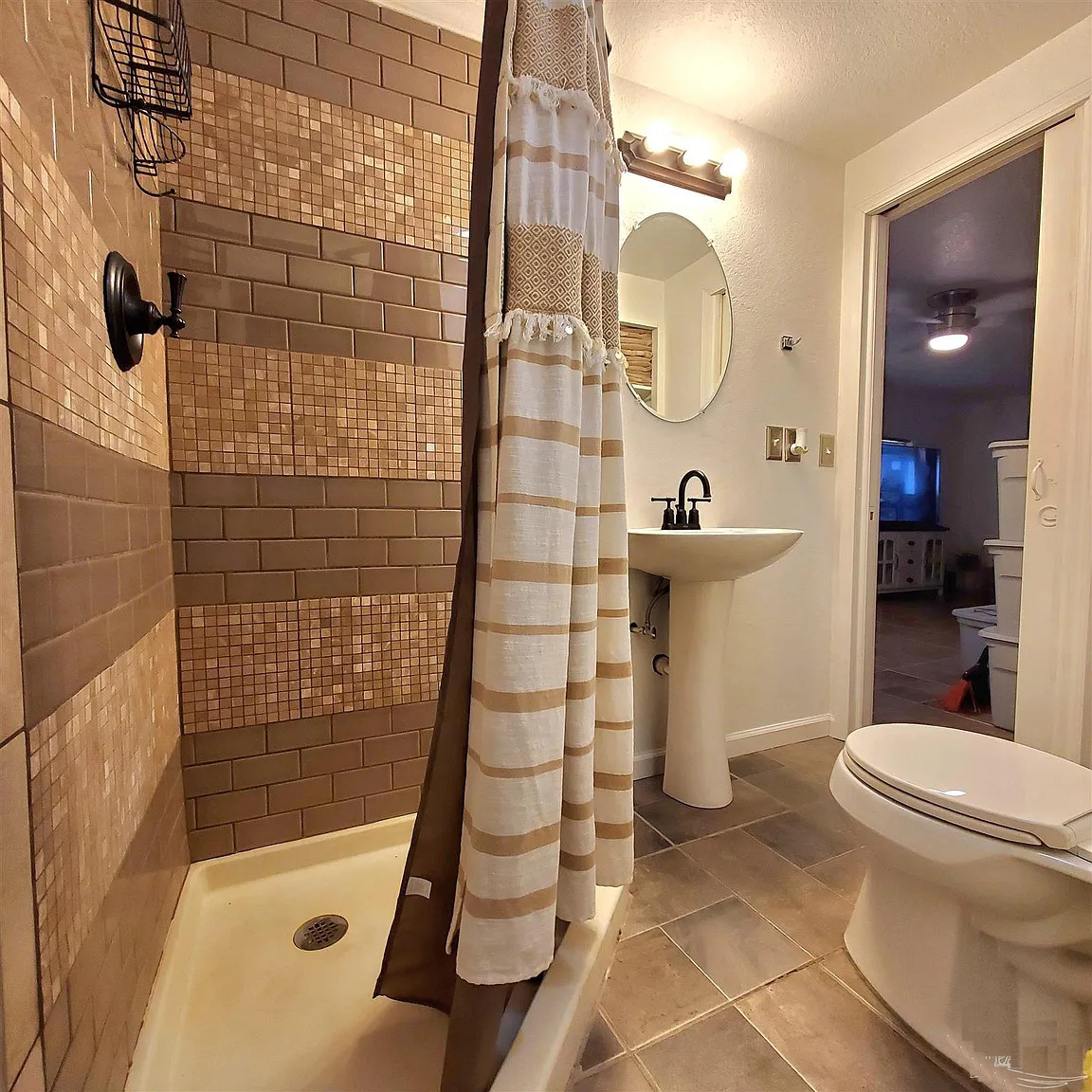
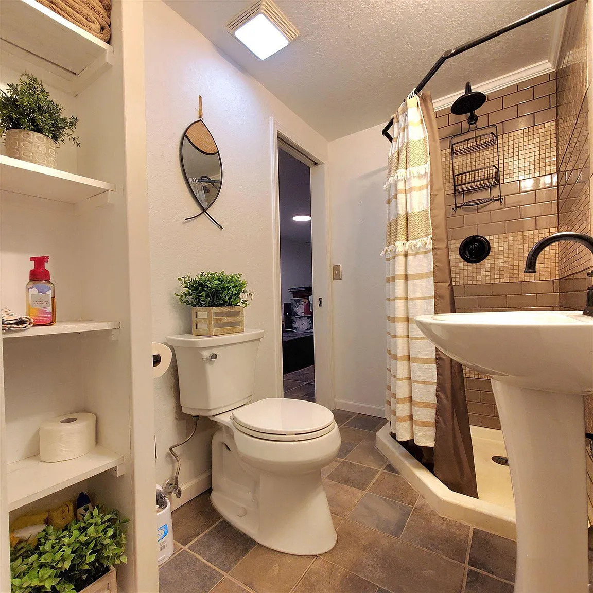
The shower is the standout feature here. It has shiny brown subway tiles that give off a warm, earthy tone. The tiles reflect the light, making the space feel bigger and brighter. A black showerhead and matching hardware give a modern edge, while the striped shower curtain adds a soft, homey touch. The mix of materials makes the shower area feel fresh and updated.
The pedestal sink is an excellent choice for this small space because it keeps things open. It doesn’t take up much floor room, leaving enough space for the essentials. Above the sink, there’s a round mirror with a sleek, minimal frame that gives a modern touch. The mirror also helps reflect light and makes the bathroom feel larger.
Next to the toilet, you see some smart storage solutions. A built-in shelf holds towels, toiletries, and a few decorative plants. This keeps everything within reach without cluttering the counter or floor space. The pops of greenery add life and a fresh vibe to the bathroom.
The floor is covered in neutral tiles, which ties the whole room together. These tiles are practical and easy to clean, adding warmth to the overall design. The overhead light keeps the room well-lit, making it feel clean and airy.

