
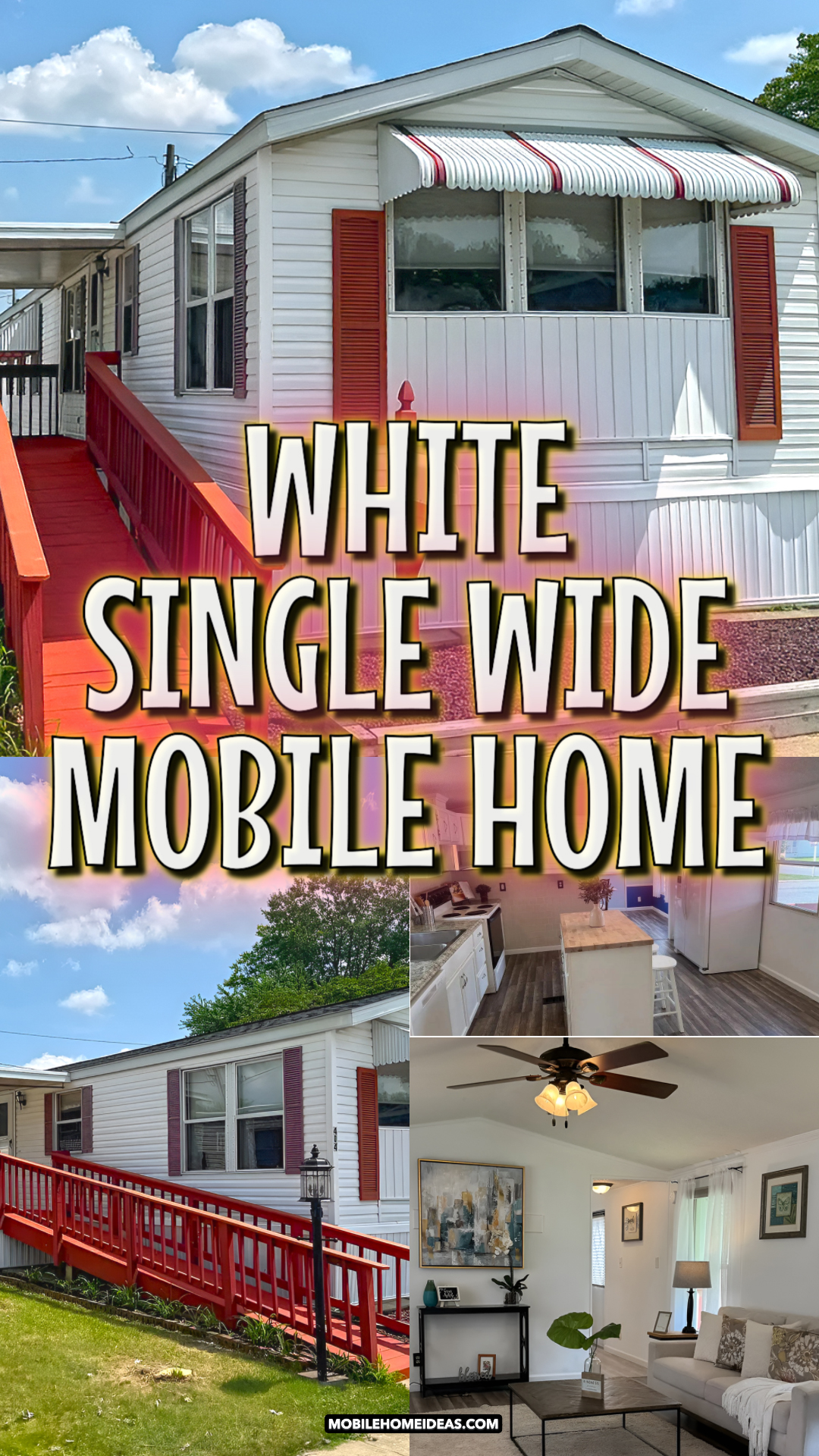
A single wide home does not need to feel plain, dark, or cramped. With the right colors, clean trim, smart furniture, and a few bold accents, it can feel fresh, cozy, and full of charm. This home is a great example. It keeps the bones simple, but every space gets a clear purpose. The outside feels crisp and cheerful. The inside feels bright, open, and easy to live in.
The best part? None of the design ideas feel too hard to copy. You can use paint, awnings, rugs, lamps, curtains, plants, and simple furniture to give a single wide home a polished look.
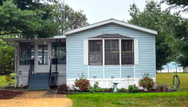
A Crisp White Exterior With Bold Red Details
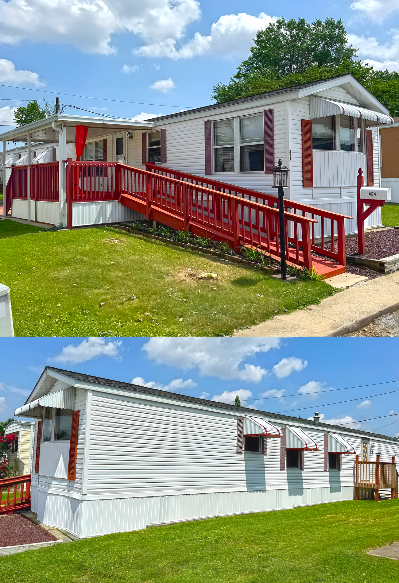
The exterior starts with a clean white base. That is a smart move for a single wide home. White siding makes the home look longer, brighter, and more open. It also gives the home a neat, cared-for look from the street.
Then the red accents bring in the charm. The red shutters, railing, mailbox post, and trim details add warmth. They also stop the white exterior from feeling flat. This is a simple color plan, but it works well because it feels clear and balanced.
The striped awnings are another standout feature. They add shade, but they also add personality. On a long single wide wall, windows can look small or spaced out. Awnings help frame each window, so the side of the home feels more finished.
The front planting bed keeps things tidy. Instead of a busy garden, the space uses a clean border and dark mulch. That makes the home look sharper. It also keeps upkeep simple.
Design cues:
- White vinyl siding for a bright, clean base
- Deep red shutters for a classic pop of color
- Matching red railings for a pulled-together look
- Striped awnings above windows for charm and shade
- Simple skirting to hide the underside of the home
- Dark mulch beds for contrast
- Straight landscape borders for a neat finish
- A matching mailbox post for curb appeal
- Small front planting areas for easy care
- A bold accent color repeated in several spots
A Welcoming Ramp and Covered Entry

The long red ramp does more than make the home easier to enter. It also gives the exterior a strong design line. Since single wide homes often have long, narrow shapes, a ramp can help create movement. It leads the eye toward the porch and makes the entrance feel more planned.
The red railing adds safety and style at the same time. It also matches the shutters and awnings, which helps the whole exterior feel connected.
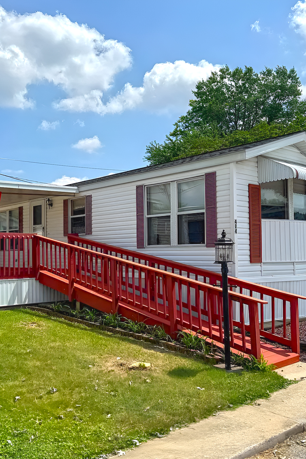
The covered porch area is another smart feature. It gives the home a soft landing spot. You can use it for a chair, a small table, or a few plants. Plus, the roof cover adds shade and keeps the entry more useful in rain or bright sun.
This kind of entrance works well for many single wide homes. It feels practical, but it still looks cheerful.
Design cues:
- Long ramp for easy access
- Painted railing in the same accent color
- Covered entry for shade and comfort
- Small porch space for seating or plants
- Simple rail style that does not block the view
- Clean walkway from the street to the door
- Repeated red details for a cohesive look
- Open side yard to keep the home from feeling crowded
- Porch roof that adds depth to the flat exterior
- Easy-care setup for daily use
A Backyard Patio With Room to Grow
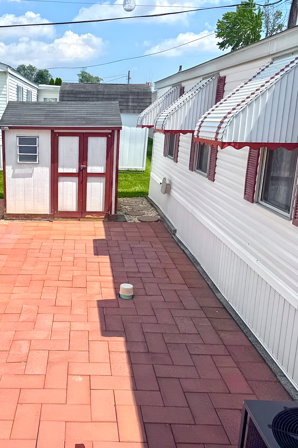
The back patio gives this home extra living space. That matters a lot in a single wide home. When indoor square footage is limited, outdoor areas can feel like bonus rooms.
The patio uses large pavers in a warm red tone. This matches the red exterior accents, so the backyard still feels connected to the front. The space is open, which gives it a lot of future potential. You could add a dining set, a grill zone, planters, string lights, or lounge chairs.
The shed also helps. Storage is key in a smaller home. A shed keeps tools, patio items, and seasonal decor out of the main living space.
This backyard keeps the layout simple. Still, it gives the home a strong sense of function. It feels like a blank canvas, but in a good way.
Design cues:
- Large paved patio for outdoor living
- Red-toned pavers that match the exterior accents
- Storage shed for tools and seasonal items
- Open layout for flexible furniture plans
- Side-yard lawn for green space
- Window awnings for shade and charm
- Clear walkway areas around the home
- Low-maintenance hardscape
- Room for dining, grilling, or lounging
- Simple backyard plan with future upgrade potential
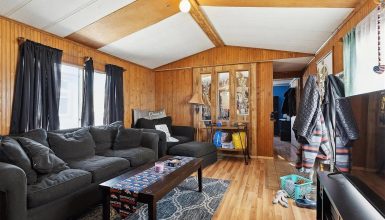
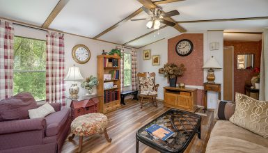
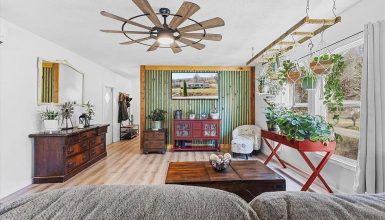
A Light-Filled Living Room With Soft Neutrals
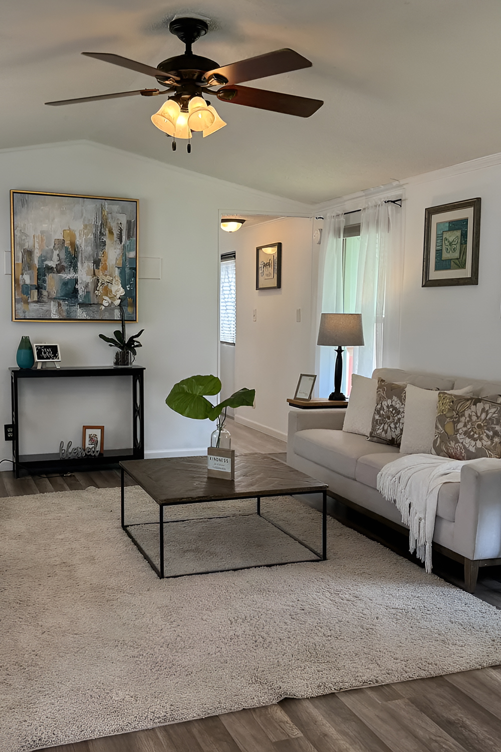
Inside, the living room feels calm and open. The soft white walls help light move around the room. Sheer curtains soften the windows and let daylight come in. This is a smart choice for a single wide living room because heavy curtains can make the space feel smaller.
The furniture stays light and neutral. Cream chairs, a pale sofa, and a light rug keep the room bright. Dark side tables and a black metal coffee table add contrast. That contrast is important. Without it, the room could feel too washed out.
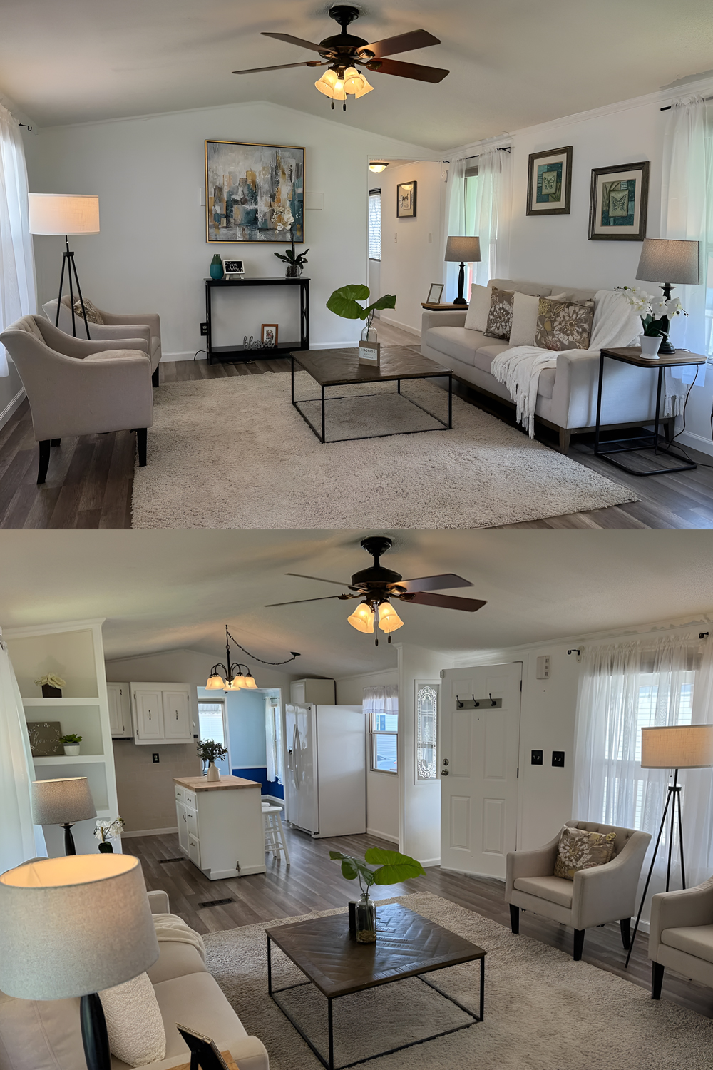
The large area rug helps define the living zone. In an open floor plan, this trick works very well. The rug says, “This is the living room,” without using walls. The coffee table also keeps the center grounded.
The room uses simple decor, but it does not feel empty. Lamps, wall art, pillows, plants, and a throw blanket add warmth. These small layers make the space feel lived in.
Design cues:
- White walls for a bright and open feel
- Sheer curtains to soften sunlight
- Neutral sofa and chairs for a calm base
- Large area rug to define the living room
- Slim black coffee table for light visual weight
- Dark side tables for contrast
- Floor lamps and table lamps for soft glow
- Framed wall art for personality
- Green plants for fresh color
- Simple pillows and throws for comfort
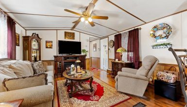
An Open Floor Plan That Feels Easy to Live In
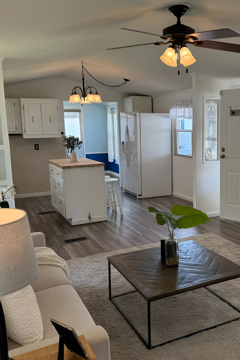
One of the strongest design ideas in this home is the open flow. The living room, kitchen, and dining areas connect without feeling messy. Each space has its own purpose, yet the home still feels open.
The gray wood-look floors run through the main areas. That creates a smooth look. When one floor style runs from room to room, a narrow home feels longer and more seamless.
The white walls and trim also help. They make the home feel clean and simple. Crown molding adds a nice touch. It gives the rooms a more finished look, even with simple furniture.
Lighting also plays a big role. Ceiling fans, lamps, and pendant-style lights create layers. In a long home, this matters. Each zone needs its own light so the space does not feel dark at the ends.
Design cues:
- Open layout between living, kitchen, and dining
- Matching floors for a seamless flow
- White walls to brighten the full space
- Crown molding for a finished edge
- Area rug to mark the living room zone
- Lamps to add warm light
- Ceiling fans for comfort
- Furniture with slim legs to keep the room airy
- Clear walk paths through the home
- Simple decor to avoid clutter
A White Kitchen With a Warm Butcher Block Island
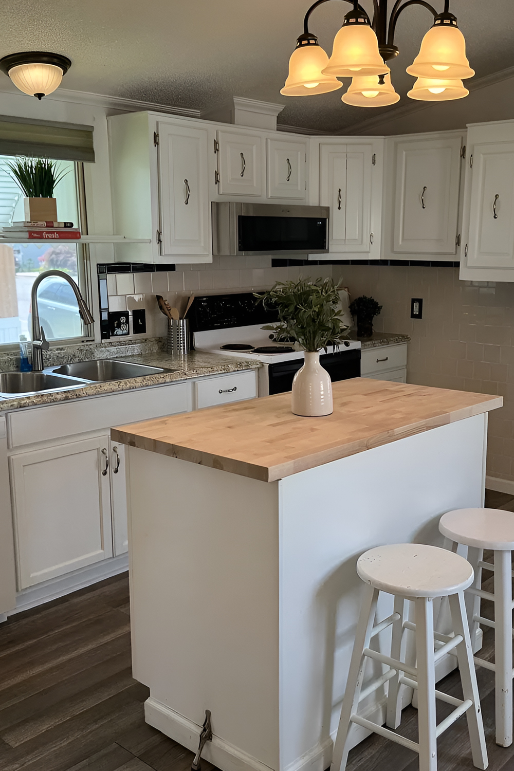
The kitchen keeps things bright with white cabinets and white appliances. This makes the space feel clean and simple. In a smaller kitchen, white can help cabinets blend into the walls. That keeps the room from feeling too heavy.
The island is the heart of the kitchen. Its white base keeps it light, while the butcher block top adds warmth. That mix works well. It gives the kitchen a soft farmhouse feel without making it too rustic.
The island also adds function. It gives extra prep space, casual seating, and a spot for a vase or plant. The small white stools tuck in neatly, which keeps the kitchen from feeling crowded.
The backsplash has a simple tile look. It adds texture, but it does not fight with the cabinets. The dark outlets and black trim details add small hits of contrast.
Design cues:
- White cabinets for a clean, bright look
- Butcher block island top for warmth
- White island base for a seamless feel
- Small stools for casual seating
- Simple backsplash for soft texture
- Neutral counters for an easy-care look
- White appliances to keep the palette light
- Black and metal hardware for contrast
- Compact island that does not block traffic
- Small plant or vase as a fresh focal point
Smart Kitchen Storage Without a Heavy Look
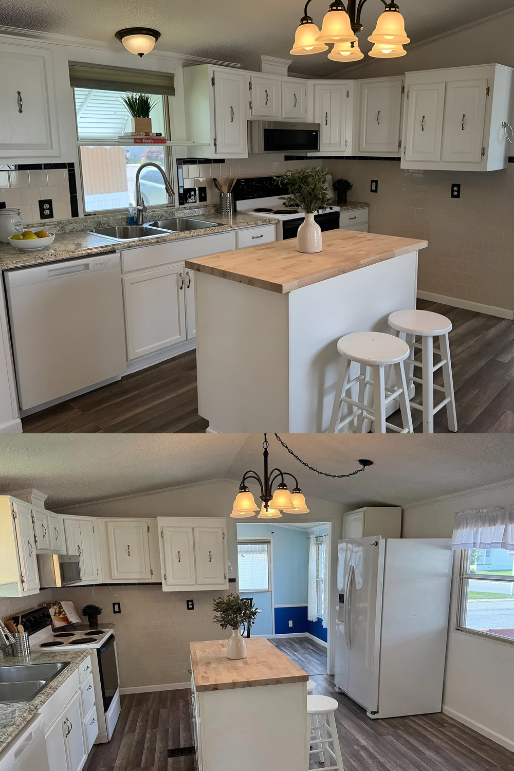
Single wide kitchens need smart storage. This kitchen uses upper cabinets, lower cabinets, and an island to get the job done. The cabinets reach across the wall, which gives the room useful storage without adding bulky furniture.
The layout also keeps the work zones close. The sink, stove, island, and fridge sit within easy reach. That makes cooking feel simple. You do not need a huge kitchen to have a useful kitchen.
The best idea here is balance. The kitchen has plenty of storage, but the white finish keeps it from looking heavy. The island creates a work zone in the center, but it still leaves enough walking space.
Design cues:
- Full wall of cabinets for storage
- Island storage for extra function
- Compact work triangle for easy cooking
- Light cabinet color to reduce visual weight
- Simple pulls and handles for a clean look
- Small stools that slide under the counter
- Clear floor space around the island
- Bright window near the sink
- Neutral backsplash to keep the wall calm
- Warm wood counter to break up the white
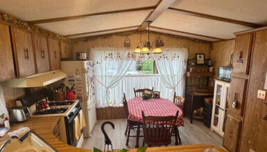
A Dining Nook With Personality
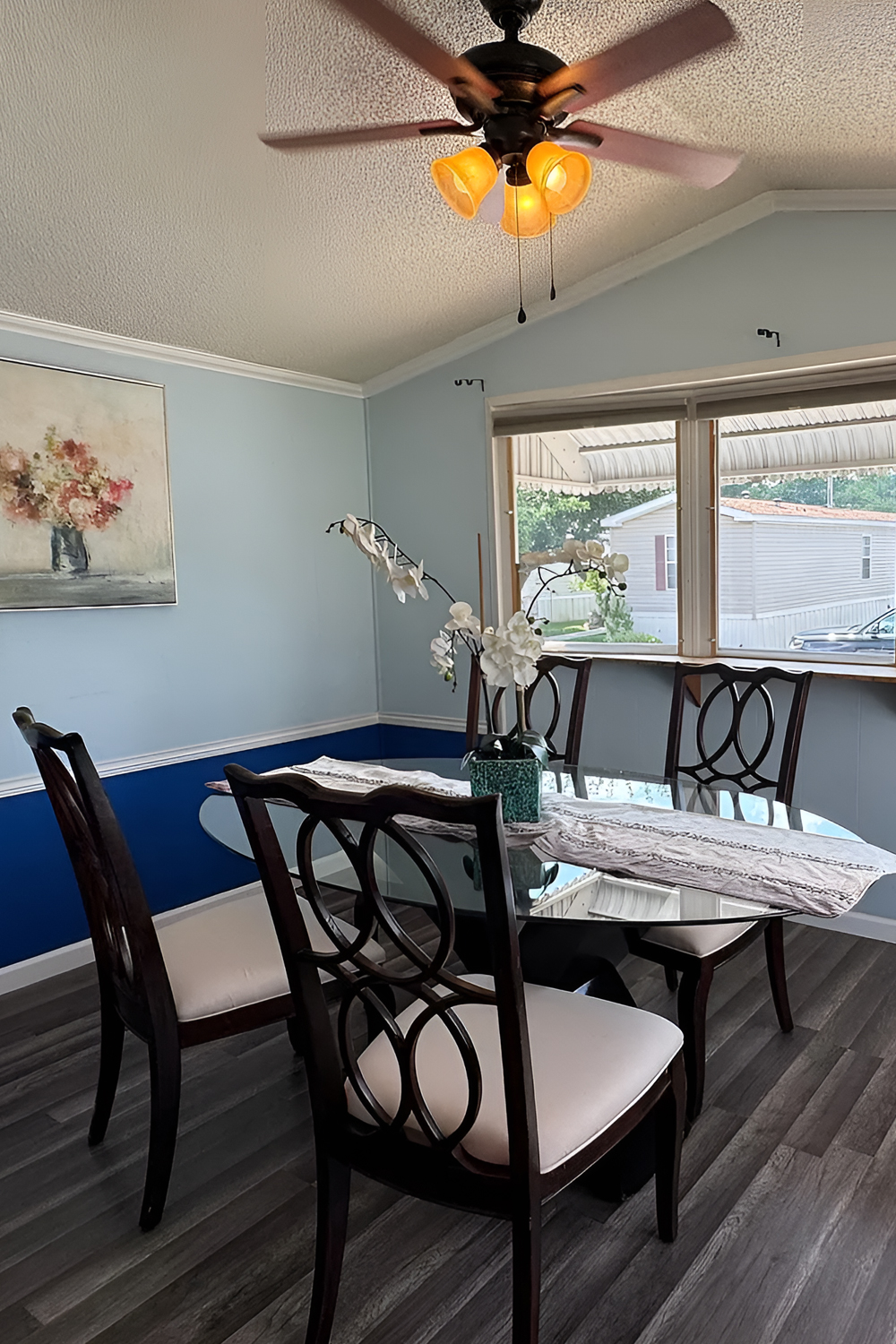
The dining room adds a fun twist. It uses soft blue walls with a deeper blue accent on the lower half. This gives the room a more custom feel. The chair rail adds structure, and the two-tone paint makes the space feel more designed.
The dining table has a glass top, which works well in a small space. Glass keeps the room feeling light because it does not block the view. The dark chairs add contrast and a more formal touch.
The wide front windows bring in lots of light. They also make the dining nook feel like a sunny corner. With the right curtains or shades, this space could feel even softer and more polished.
This room shows that small homes can still have bold color. The key is to use color in one area, then keep the nearby spaces calm.
Design cues:
- Two-tone blue walls for character
- Chair rail trim for a finished look
- Glass dining table to keep the room airy
- Dark wood chairs for contrast
- Large windows for natural light
- Simple centerpiece for softness
- Gray flooring to connect with the rest of the home
- White trim to sharpen the color
- Small-scale furniture for better flow
- A defined dining zone near the kitchen
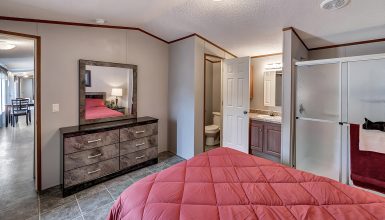
A Calm Bedroom With Soft Layers
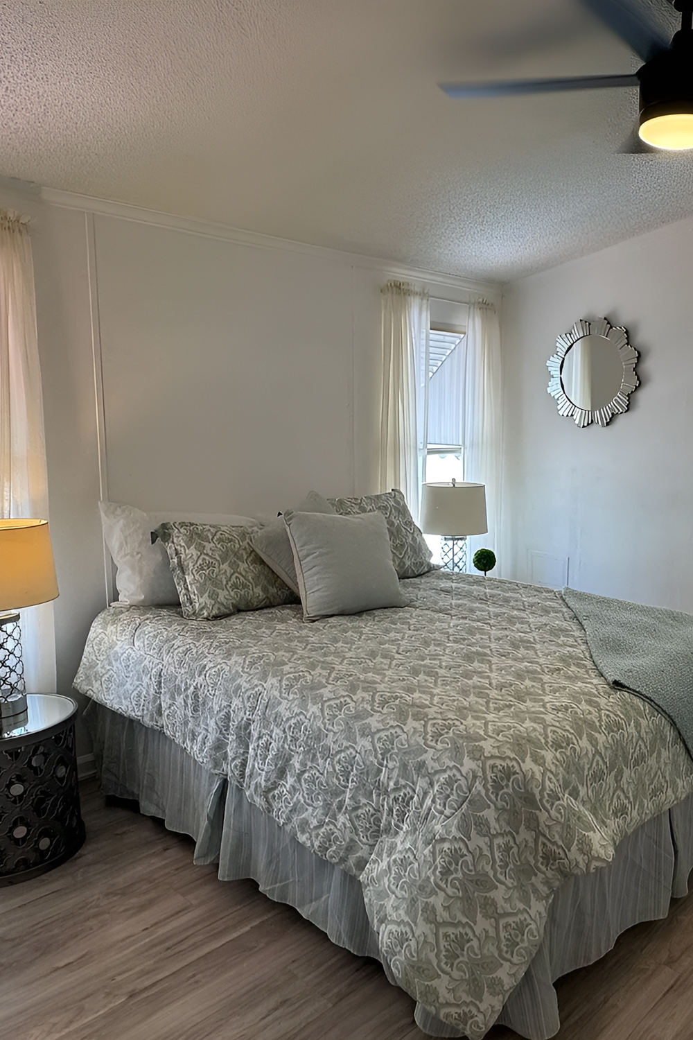
The bedroom feels simple, calm, and easy to update. The light walls and pale bedding keep the room peaceful. The patterned comforter adds interest without making the room feel busy.
The bed sits along the long wall, which is a common and smart layout for a single wide bedroom. It keeps the walking path open. The side table and lamp add function without taking up much space.
The closet doors keep storage hidden. That helps the room feel clean. The small mirror adds shine and reflects light. Also, the soft curtain panels make the windows feel more finished.
The bedroom could use more layers, but the base is strong. A larger headboard, taller curtains, or a pair of matching lamps would make it feel even more polished.
Design cues:
- Light wall color for a peaceful mood
- Soft bedding in pale tones
- Patterned comforter for gentle detail
- Small side table for function
- Table lamp for warm light
- Closet doors to hide storage
- Mirror to reflect light
- Sheer curtains for softness
- Wood-look floors for warmth
- Open wall space for art or a headboard
A Small Bathroom That Feels Clean and Practical
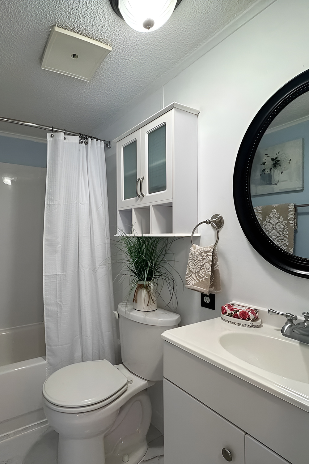
The bathroom keeps things simple with a white vanity, white tub, white shower curtain, and pale walls. This makes the room feel clean. It also helps a small bathroom look larger.
The round black mirror is the boldest feature. It adds contrast and gives the vanity wall a stronger focal point. The black frame ties in with the dark details used in other rooms.
The cabinet above the toilet adds smart storage. In a small bath, vertical space matters. This spot can hold towels, toiletries, and extra supplies without taking up floor space.
The shower curtain softens the tub area. It also keeps the room flexible. A curtain is easy to change when you want a new color or pattern.
Design cues:
- White vanity for a clean base
- Round black mirror for contrast
- Over-toilet cabinet for storage
- White shower curtain for softness
- Pale walls to brighten the room
- Simple tub and shower combo
- Small plant for a fresh touch
- Towel ring near the sink
- Light flooring to keep the space open
- Compact layout with clear function
Final Thought
This single wide home proves that good design does not have to feel fancy or fussy. A bright exterior, one bold accent color, a clean open layout, and soft neutral rooms can make the whole home feel fresh. Add smart storage, warm lighting, and a few personal touches, and a simple single wide can become a cozy home with real curb appeal.


