
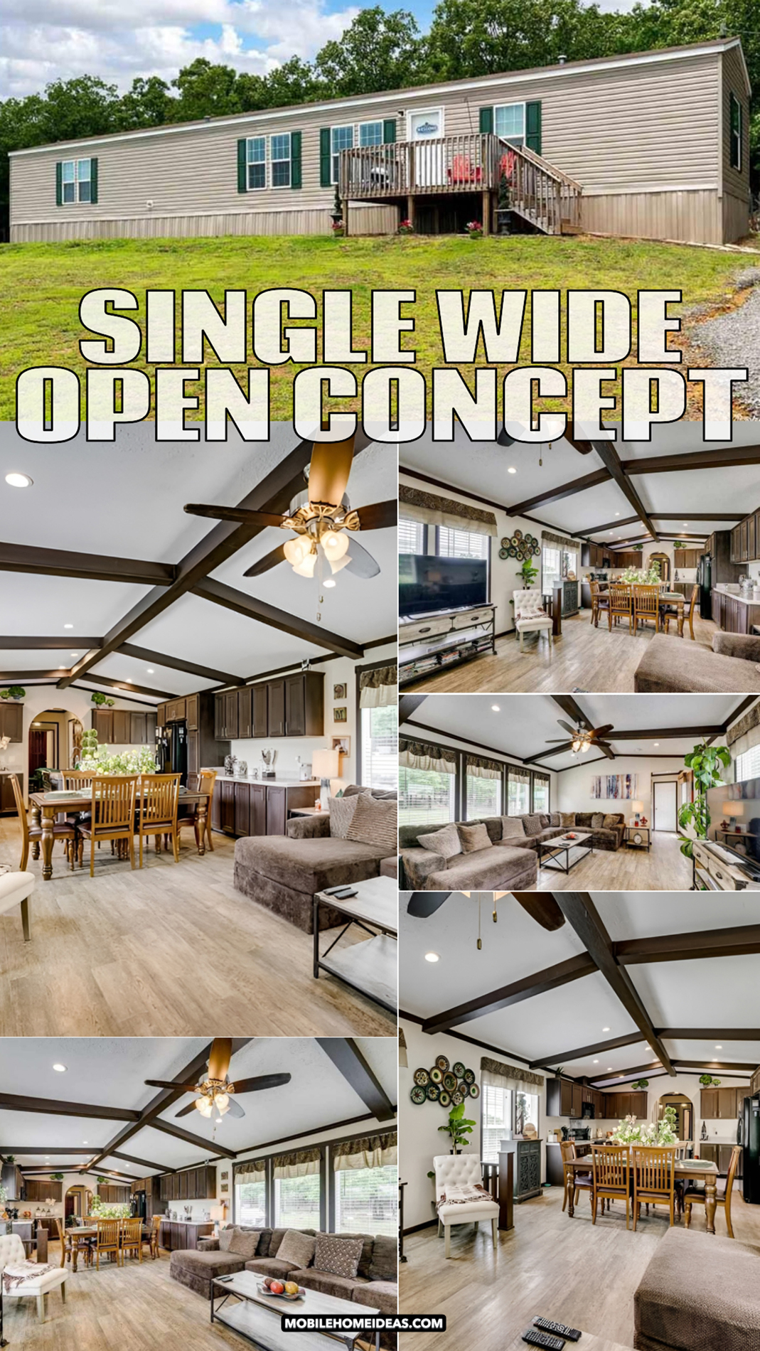
Think a single wide mobile home cannot feel stylish and spacious? Think again. This beautiful home shows how smart design can turn a simple layout into a warm, open, and inviting space. From the charming exterior to the beam-lined ceiling, rich wood finishes, cozy living room, and welcoming kitchen, every detail works together to make this home feel bigger and better. If you love practical design with lots of charm, these ideas are full of inspiration.
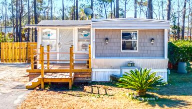
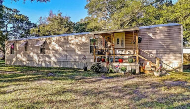
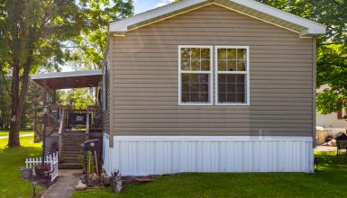
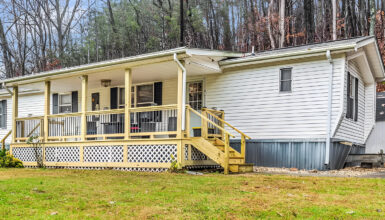
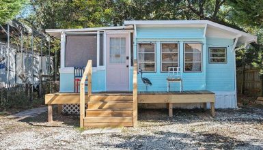
A Simple Exterior With Classic Curb Appeal
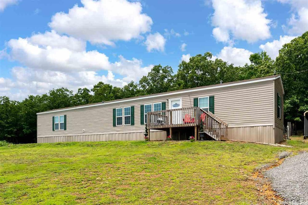
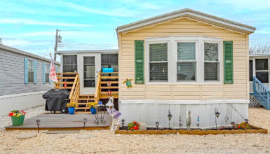
The outside of this single wide mobile home keeps things modest, but it still feels neat and welcoming. The long horizontal shape is typical of many single wide homes, and here, that shape works well with the clean siding lines. The light beige exterior gives the home a soft, neutral base. It feels timeless. It also helps the home blend well with the natural setting around it.
The green shutters add just enough contrast. They break up the siding and frame the windows in a way that gives the exterior more character. Without them, the façade might feel flat. With them, the front elevation feels more finished and more traditional.
Then there is the porch. It is not oversized, but that is part of its charm. The raised deck adds dimension to the front of the home and creates a clear entry point. The wood railing keeps the porch looking casual and approachable. Meanwhile, the pair of bright chairs brings in a pop of personality. That small splash of color tells you this is a lived-in home, not a stiff one.
The yard is open and uncluttered. That makes the home stand out more clearly. It also gives the property room to breathe. The gravel drive keeps the approach low-maintenance, which suits the practical style of the house.
Exterior design cues
- Light neutral siding for a clean and timeless look
- Dark green shutters for contrast and traditional charm
- Small raised porch that creates a welcoming entry
- Wood railing that adds warmth and an informal feel
- Simple skirting that visually grounds the home
- Open yard that makes the structure feel larger
- Straightforward roofline that fits the home’s clean profile
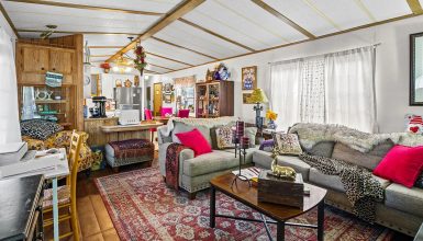
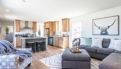
An Open-Concept Layout That Changes Everything
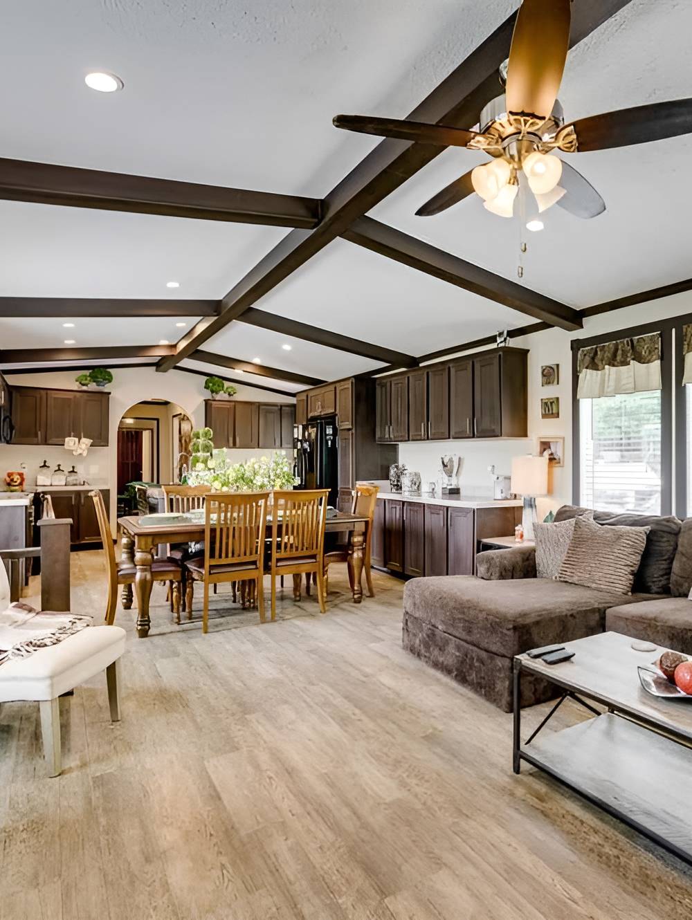
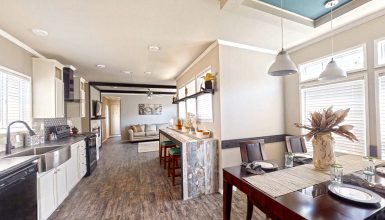
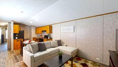
Inside, the biggest design win is the open layout. This is the feature that makes the home feel much larger than you might expect from the outside. The living room, dining space, and kitchen all flow together in one long shared zone. That layout allows light to travel from one end of the home to the other. It also helps the space feel social, relaxed, and flexible.
The furniture placement supports that openness well. Instead of breaking the room into tight, closed-off zones, the design uses each area to define the next. The sectional marks the living room. The dining table anchors the center. The kitchen island draws you toward the cooking area. Because of that, each part of the space feels clear, but none of it feels boxed in.
This kind of flow is especially smart in a single wide home. It keeps narrow dimensions from feeling cramped. It also makes daily life easier. Someone can cook, watch TV, and talk to family or guests all in the same connected area. That sense of togetherness gives the home a warm, everyday comfort.
Open-plan design cues
- Living, dining, and kitchen areas connected in one visual sweep
- Clear zones without heavy walls or barriers
- Strong sightlines that make the home feel longer and wider
- Natural light shared across multiple spaces
- Furniture used as subtle room dividers
- Easy movement from one area to the next
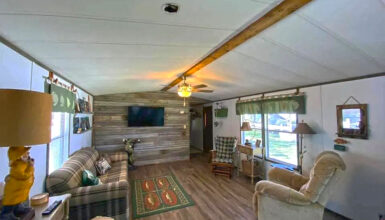
Dramatic Ceiling Beams Add Character and Height
One of the most striking features in the main living area is the ceiling treatment. The dark faux beams create a grid-like pattern that instantly adds depth and architectural interest. This is a smart move because mobile homes can sometimes feel plain overhead. Here, the ceiling becomes one of the room’s strongest design moments.
The white ceiling panels keep the room bright. At the same time, the dark beam trim adds contrast and structure. This combination draws the eye upward, which makes the ceiling feel higher than it is. That helps the main room feel more expansive.
The beams also tie beautifully to the cabinetry and trim throughout the home. Because those darker tones repeat across the space, the design feels coordinated rather than random. The ceiling fan fits right into that palette too, which helps it blend in while still acting as a focal point.
Ceiling and trim cues
- Dark faux beams that create architectural drama
- White ceiling surfaces that keep the room bright
- Repeating dark trim for a cohesive look
- Ceiling fan that matches the rich wood tones
- Grid pattern that adds order and visual interest
- Upward emphasis that makes the room feel taller
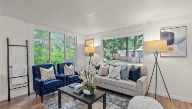
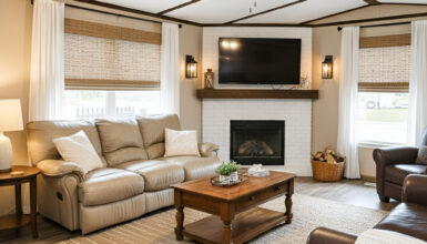
A Living Room Built for Comfort
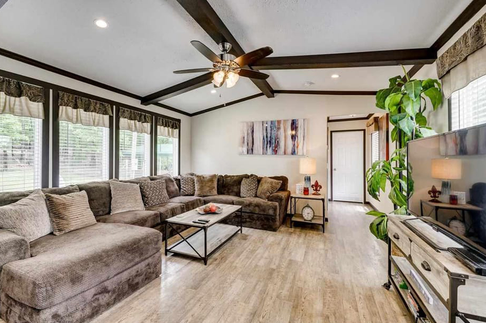
The living room is all about softness and scale. The large sectional takes center stage, and it works well because the room is long enough to handle it. This choice makes the space feel generous. It says comfort comes first.
The sectional’s deep brown tone grounds the room. It also connects with the darker cabinets and beams nearby. The throw pillows add texture without making the sofa feel busy. Across from it, the TV console has a lighter wood finish and black metal details. That mix adds a touch of farmhouse-industrial style without overpowering the room.
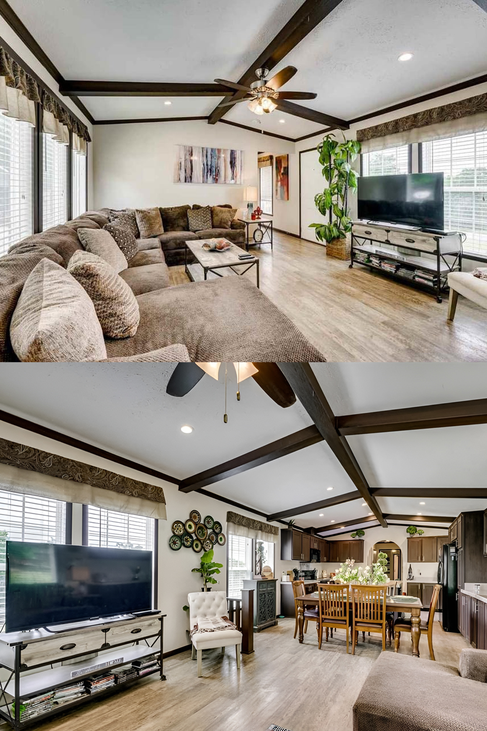
Large windows line the wall, and that is another major strength. They bring in daylight, open up the room visually, and prevent the darker furniture from feeling heavy. The valances soften the windows and add a traditional layer, while the blinds keep the look practical.
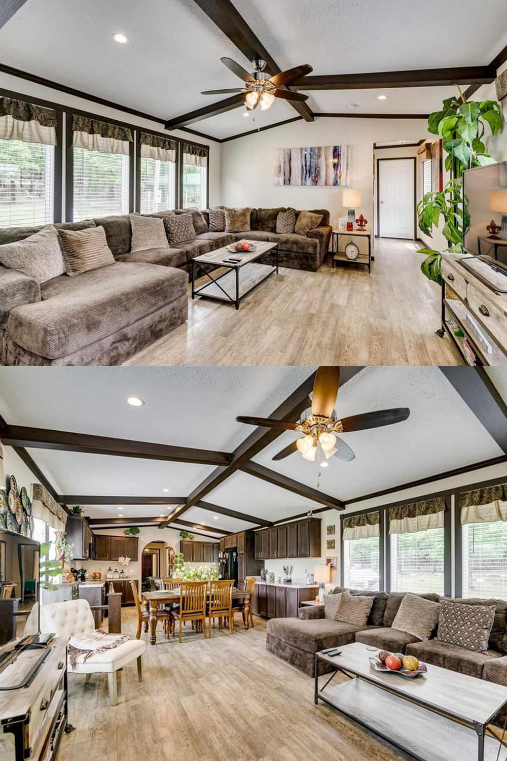
A simple coffee table in the center keeps the room functional. It has a clean metal frame and light top, which helps break up the deeper brown shades around it. A tall plant near the TV adds height and freshness. This small touch makes a big difference because it introduces a natural shape into a room full of straight lines.
Living room design cues
- Oversized sectional that emphasizes comfort
- Neutral brown upholstery that feels warm and grounded
- Light-and-dark contrast in the coffee table and TV stand
- Large windows that brighten the whole room
- Soft valances for a traditional finishing touch
- Minimal accessories that keep the room open
- Tall greenery that adds life and height
A Dining Area That Feels Like the Heart of the Home
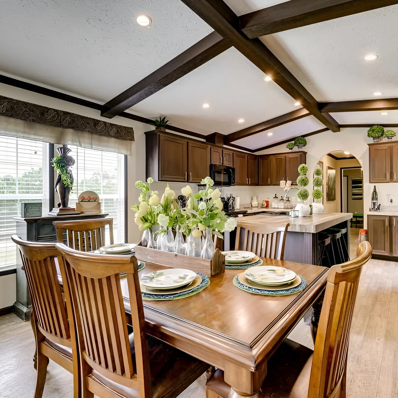
The dining space sits right in the middle of the open plan, and that is exactly where it belongs. It acts like a bridge between the kitchen and living room. Because of this placement, the dining table becomes a social anchor.
The wood dining set has a classic, familiar look. It feels sturdy, practical, and family-friendly. The warm finish also pulls together all the other wood tones in the home. On the table, a floral centerpiece adds softness and keeps the setup from feeling too plain.
What works best here is proportion. The table is large enough to matter, but it does not overwhelm the room. There is still plenty of walking space around it. That balance is important in a narrower home.
The nearby accent cabinet adds another layer of charm. Its darker, more decorative face gives the area a collected feel, almost like a piece you would find in a farmhouse or cottage-style home. Wall décor above it adds personality without clutter.
Dining room cues
- Central placement that connects the whole open plan
- Warm wood table and chairs for a grounded look
- Simple centerpiece that adds softness
- Good spacing around the table for easy flow
- Accent cabinet that brings in character
- Wall décor that warms up the blank surfaces
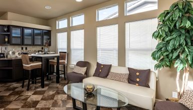
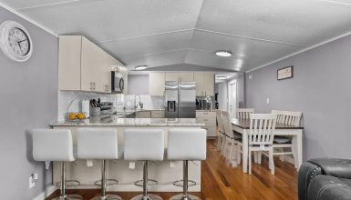
A Kitchen That Looks Custom and Functional
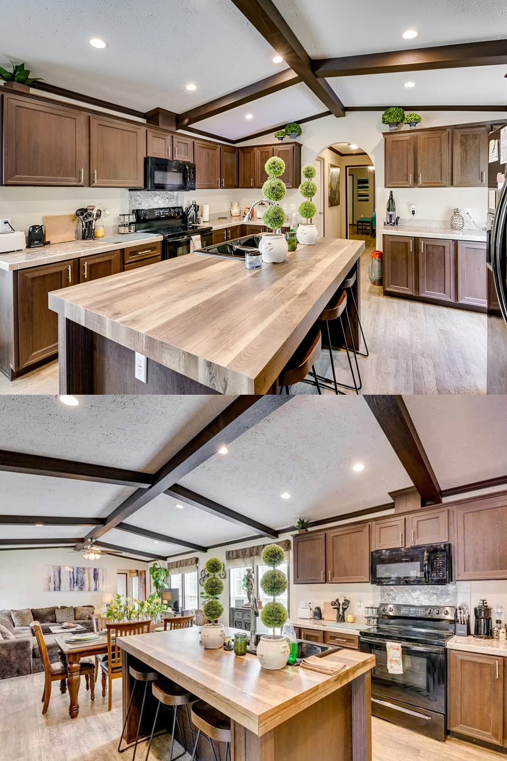
The kitchen is one of the strongest spaces in this home. It feels roomy, organized, and attractive. The long runs of cabinetry give the kitchen a built-in look, which helps it feel more upscale. Dark wood cabinets bring richness and visual weight. Meanwhile, the light countertops brighten the room and stop the cabinetry from feeling too heavy.
The island is a standout feature. It adds prep space, storage, and casual seating all at once. In a mobile home, that kind of multi-use feature matters a lot. It helps the kitchen do more without needing extra square footage. The wood top on the island also adds variation, which keeps the design from feeling flat.
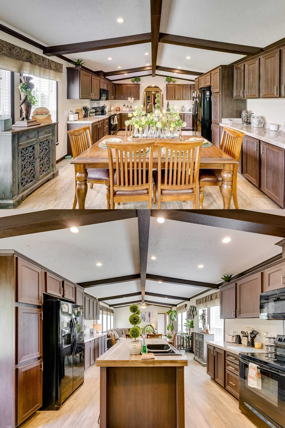
Black appliances work well here because they tie into the darker cabinetry and ceiling beams. The layout looks efficient too. Everything seems within easy reach, and the work zones feel practical for daily cooking.
Decorative topiary pieces on the island add symmetry and polish. Small countertop accessories keep the kitchen feeling styled but not crowded. That balance makes the room feel both useful and pretty.
Kitchen design cues
- Dark wood cabinets for warmth and depth
- Light counters for contrast and brightness
- Long cabinet runs that create a custom feel
- Multi-use island with seating and prep space
- Black appliances that reinforce the darker palette
- Clean, uncluttered counters for a tidy look
- Decorative greenery that softens the straight lines
A Bedroom That Feels Calm and Personal
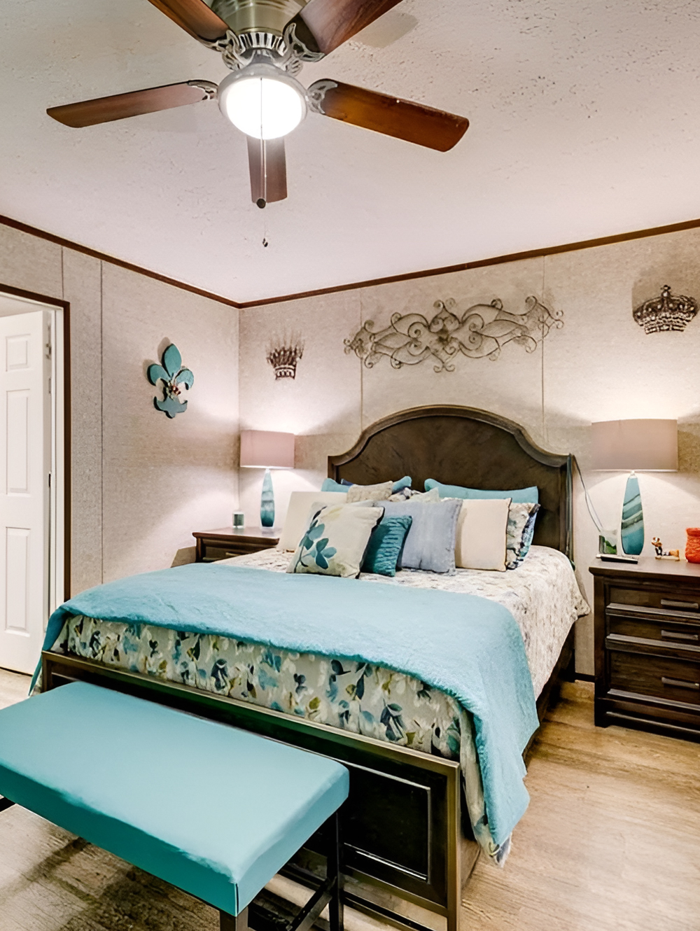
The bedroom continues the home’s warm, layered style, but it adds a softer and more personal mood. The first thing that stands out is the use of turquoise accents. That pop of color brightens the room and gives it energy. It keeps the brown furniture and neutral walls from feeling too serious.
The bed becomes the focal point right away. The curved headboard adds shape and helps soften the straight wall lines. Matching nightstands create balance. Lamps on both sides frame the bed and add symmetry, which makes the room feel restful.
Wall décor above the bed gives the room a slightly traditional, decorative feel. The bench at the foot of the bed is another smart detail. It adds function, another layer of color, and a hotel-like touch.
The flooring carries through from the rest of the home, which helps the bedroom feel connected to the overall design story. At the same time, the textiles make it feel more intimate.
Bedroom design cues
- Dark wood furniture that echoes the rest of the home
- Turquoise accents that bring life and freshness
- Symmetrical layout for a calm, balanced feel
- Bench at the foot of the bed for style and function
- Coordinated lamps that frame the bed nicely
- Layered bedding that adds softness and comfort
- Decorative wall art that personalizes the room
A Bathroom With Warm, Everyday Style
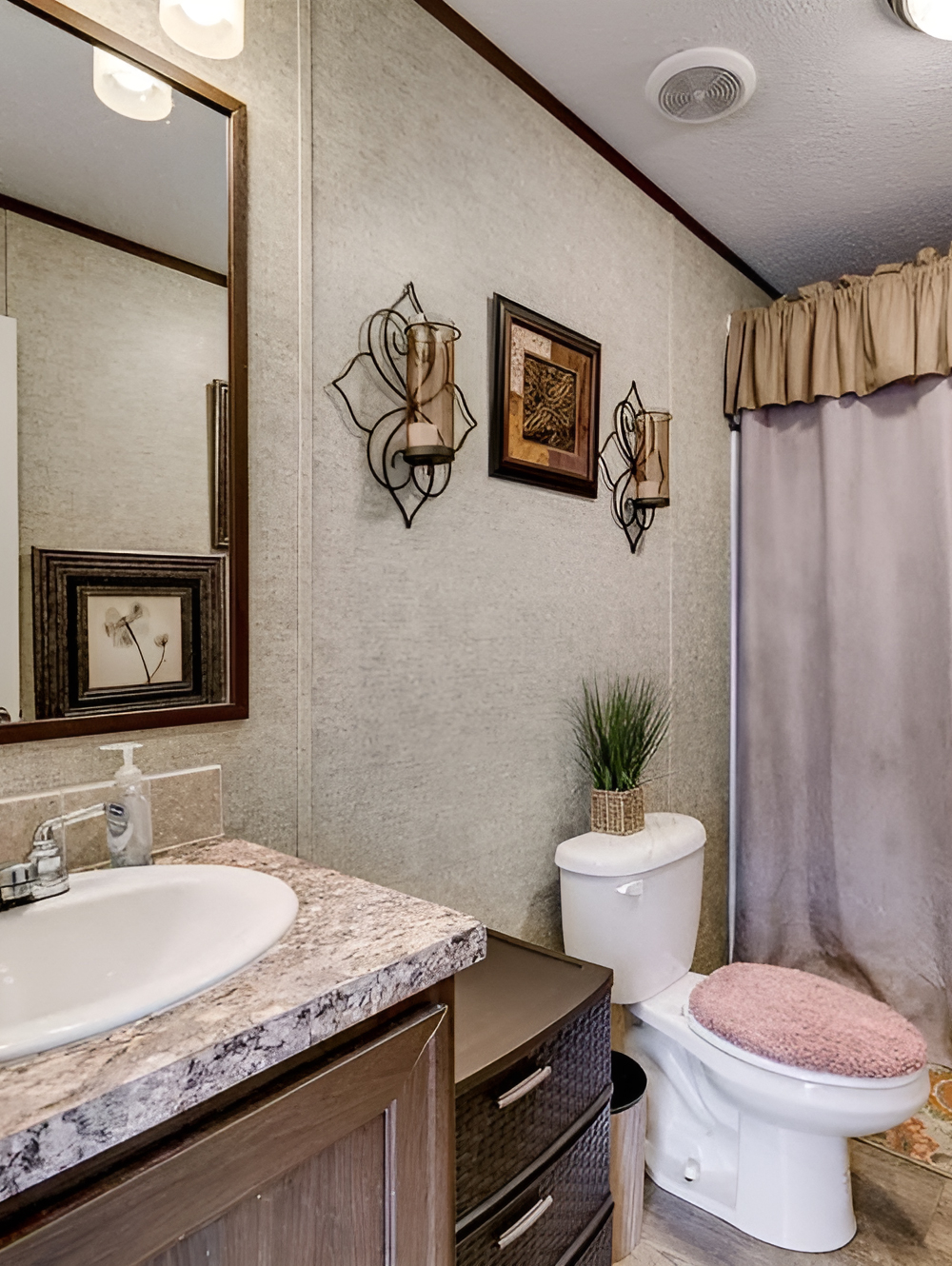
The bathroom is practical, but it still feels thoughtfully styled. The vanity has the same rich wood tone seen throughout the home, which keeps the design cohesive. The countertop has a stone-look finish that adds a little pattern and makes the space feel more polished.
The large mirror helps the bathroom feel bigger. It also reflects light, which is important in a narrower room. The wall color and texture keep the space warm rather than sterile. That works especially well in a home like this, where comfort is clearly part of the design goal.
Soft shower curtains and a valance bring in a dressed-up feel. The rug adds color and pattern at floor level, while the decorative wall sconces help turn a basic bathroom wall into something more charming. Even the small plant on the toilet tank adds a fresh finishing touch.
Bathroom design cues
- Wood vanity that matches the rest of the home
- Stone-look counter for added texture
- Large mirror to visually expand the room
- Warm wall finish that softens the space
- Fabric shower curtain and valance for a homey feel
- Decorative sconces that add charm
- Small rug and greenery for color and comfort
Conclusion
This single wide mobile home proves that good design is all about balance. The exterior feels clean and classic. The interior feels open, cozy, and full of warmth. Dark beams, soft neutrals, rich wood tones, and simple decor give this home a polished look without losing comfort. Whether you want to update your own mobile home or just gather ideas, this home offers plenty of easy inspiration to save.