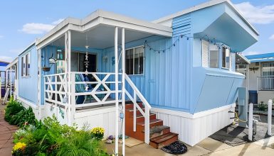
This 1971 mobile home is a charming blend of vintage style and cozy modern updates. Every detail, from the welcoming exterior to the thoughtfully arranged rooms inside, makes it feel like a true retreat. Whether it’s the sunny patio perfect for gatherings, the cozy living room with rustic touches, or the smartly designed kitchen and bathroom, each space has been maximized for comfort and practicality. Let’s look at what makes this home so special, one inviting space at a time.
Exterior
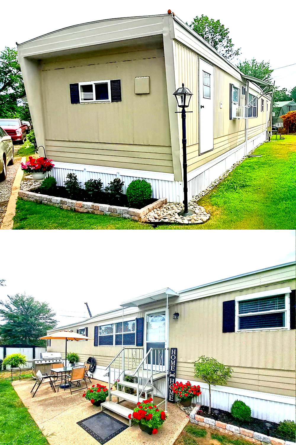
Let’s dive into the charming design of this 1971 mobile home. The exterior has been thoughtfully updated, giving it a cozy and inviting vibe.
Color Scheme
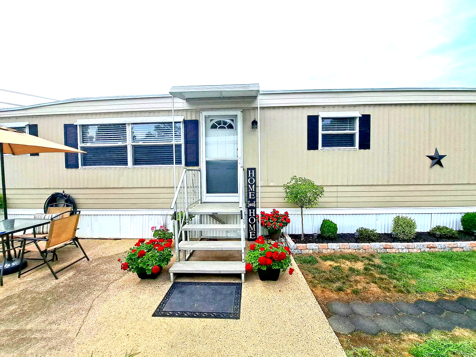
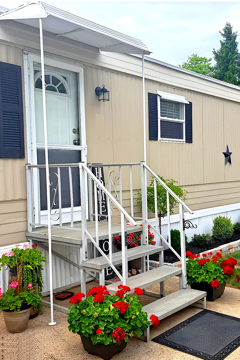
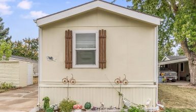
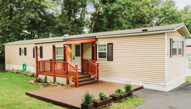
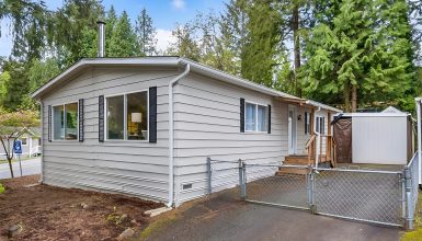
First, look at the siding. It’s a soft beige color that pairs perfectly with the black accents of the shutters and front door. The combination of neutral and dark shades creates a classic, timeless look. This color scheme makes the home feel well-balanced, while the shutters add a touch of personality. Black is a smart choice because it helps the windows pop, making them a focal point of the exterior.
Landscaping
The landscaping really enhances the entire design. Notice the flower beds along the side, filled with vibrant greenery and colorful blooms. The neat, curved garden bed edging helps add definition, making everything look organized and intentional. The red flowers at the front are eye-catching and add a pop of color that breaks up the home’s neutral tones. Plus, that small garden lamp at the corner gives a nostalgic, old-world feel that adds to the overall charm.
Entrance
On the right, the welcoming entrance area stands out. The simple metal staircase is functional, but the cheerful potted plants on each side give it a lovely, homey touch. There’s also a “Home Sweet Home” sign right by the door, which immediately tells guests they’re welcome. This type of decor makes the space feel warm and lived-in—like it’s more than just a house; it’s a home.
Patio
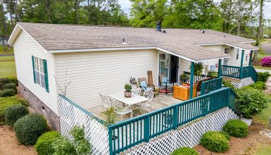
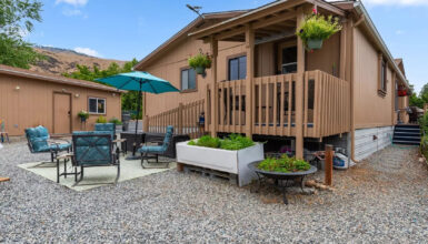
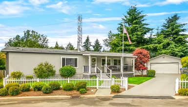
The patio area is another highlight worth mentioning. It features a small outdoor setup complete with a table, chairs, and an umbrella, which makes it perfect for enjoying a sunny afternoon or having a barbecue. The patio furniture is practical and cozy without being overwhelming, fitting the scale of the mobile home perfectly. This outdoor setup shows you can still create a spot for relaxation and entertaining friends, even in a compact space.
Skirting
The white skirting around the base of the home is a nice finishing touch. It keeps the look clean and prevents any of the underneath components from showing, which can sometimes make mobile homes feel less polished. KeepingKeeping the skirting bright white complements the siding and matches the fresh and tidy aesthetic.
Living Room
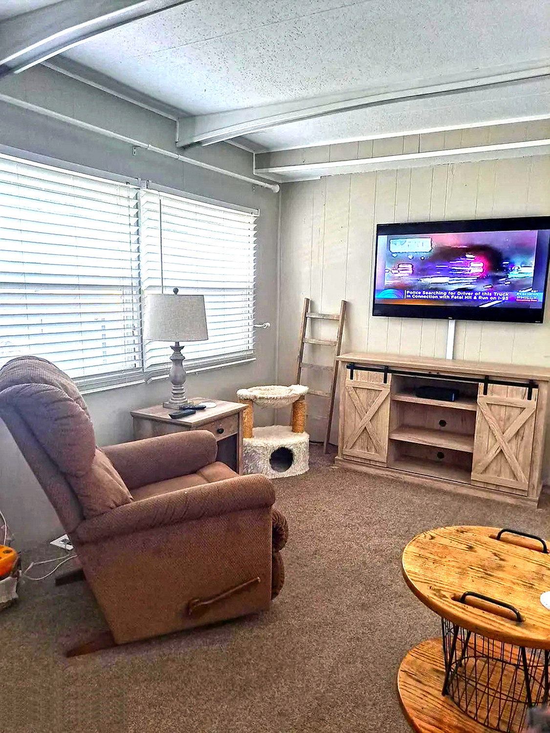
This 1971 mobile home living room is a great example of creating a cozy, functional space with a touch of charm. Let’s break down what makes it work so well.
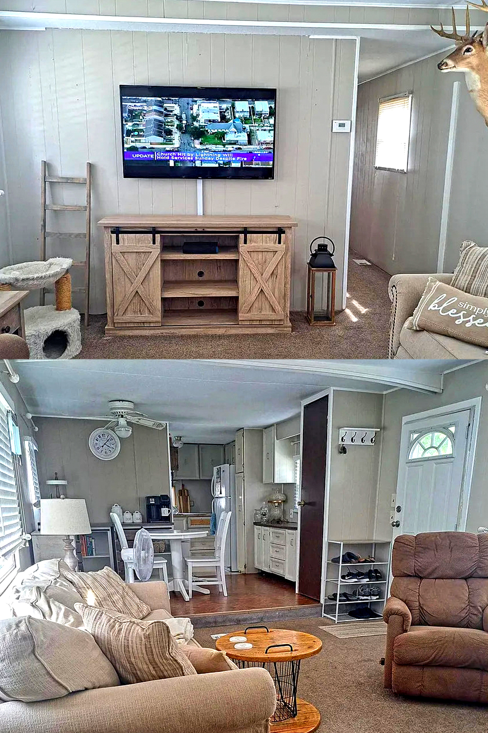
The color scheme is the first thing you notice. The neutral tones—like soft beige walls and cream furniture—create a calming atmosphere. Neutral shades are perfect for making small spaces feel open and relaxing. They make the room look airy and spacious, which is great for a mobile home. These warm, inviting hues allow the natural light from the windows to bounce around the room, enhancing its coziness.
The furniture is all about comfort and practicality. You have the plush sofa, perfect for lounging, paired with a set of pillows that add texture and warmth. The armchair, in a soft brown shade, is right by the entrance, which makes it a convenient spot for relaxing after walking in. These seating options are manageable, which is key for this smaller living space. They’re big enough to be comfy but small enough to maintain an open flow.
The media area has a charming, rustic vibe. The TV is mounted on the wall to save floor space, while a wooden entertainment console with a barn door style is below it. This gives the room a farmhouse feel, making it look stylish yet cozy. The sliding doors on the console help keep everything organized, hiding clutter like remotes or game consoles, so the room always looks tidy.
Look over at the small touches—like the cat tree near the media center—to show that the space is lived-in and pet-friendly. It’s a thoughtful addition that gives pets a place of their own without taking up too much space or looking out of place. The ladder-style shelf next to the entertainment center also adds a rustic accent while providing a spot for decor or personal items.
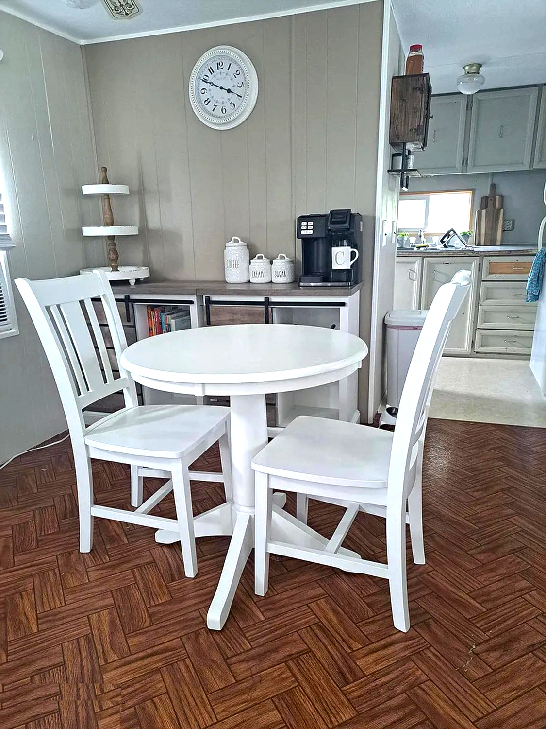
Moving into the dining area, it’s located just a step away from the living room, keeping everything close and connected. The white dining set is a great choice; it brightens the room and ties in with the soft color scheme. The circular table is just the right size for the space—it’s perfect for a cozy meal without taking over the room. There’s also a wall clock above, adding a bit of function and style, and its classic look fits the home’s overall vibe.
Kitchen
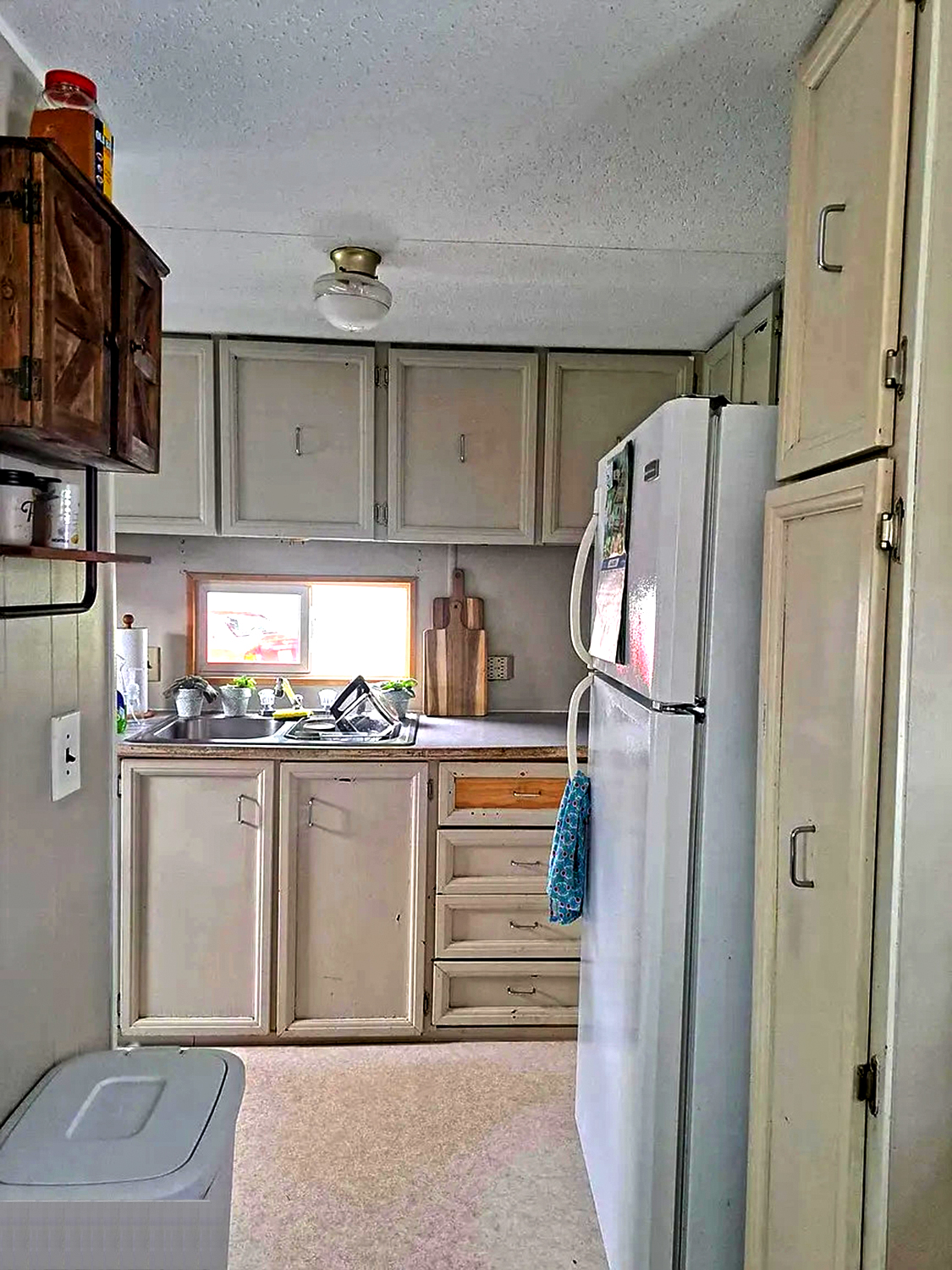
This kitchen in a 1971 mobile home has a cozy, compact design that greatly uses its space. Even though it’s small, the setup is smart, functional, and filled with charm.
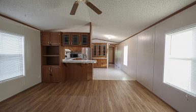
The first thing you notice is the cabinets. They have a vintage look that perfectly fits the mobile home’s age. Painted in a neutral off-white color, they keep the kitchen looking bright and open, which is key in such a compact space. The cabinets extend all the way to the ceiling, which is a practical touch—it makes sure that every bit of vertical space is used for storage. Having enough room to keep everything organized in a smaller kitchen can make a big difference.
The countertops are simple, which keeps the look clean and unfussy. There’s a small window right above the sink, letting in natural light. That sunlight makes the kitchen feel more open and helps brighten the work area, which is excellent when washing dishes or preparing meals. You can see a few small potted plants on the windowsill, which add a lovely, homey feel to the space. These little touches of greenery bring life into the kitchen without taking up much space.
The fridge is tucked neatly along the side, fitting well into the layout without feeling cramped. It’s positioned conveniently, so everything you need is right within arm’s reach. The kitchen may be narrow, but the layout is smart—it forms a practical work triangle between the fridge, stove, and sink, making cooking here easy and efficient.
The drawers and lower cabinets have a bit of wear, giving them a rustic and well-loved look. This lived-in vibe adds character to the space. The wooden cutting boards leaning against the wall add another rustic touch and keep with the overall homey, practical theme. They’re functional, but they also double as decor, giving the kitchen a bit of warmth.
With its darker wood tone, the upper cabinet on the left side adds contrast. It breaks up the uniform look of the painted cabinets and adds a bit of visual interest. It also gives a more farmhouse feel to the kitchen, which complements the rest of the mobile home’s cozy charm.
The lighting is simple—a classic flush-mount ceiling light that provides enough brightness without overpowering the small space. Keeping the lighting minimal allows other features, like the vintage cabinets and small windows, to be the main focus.
Bedroom
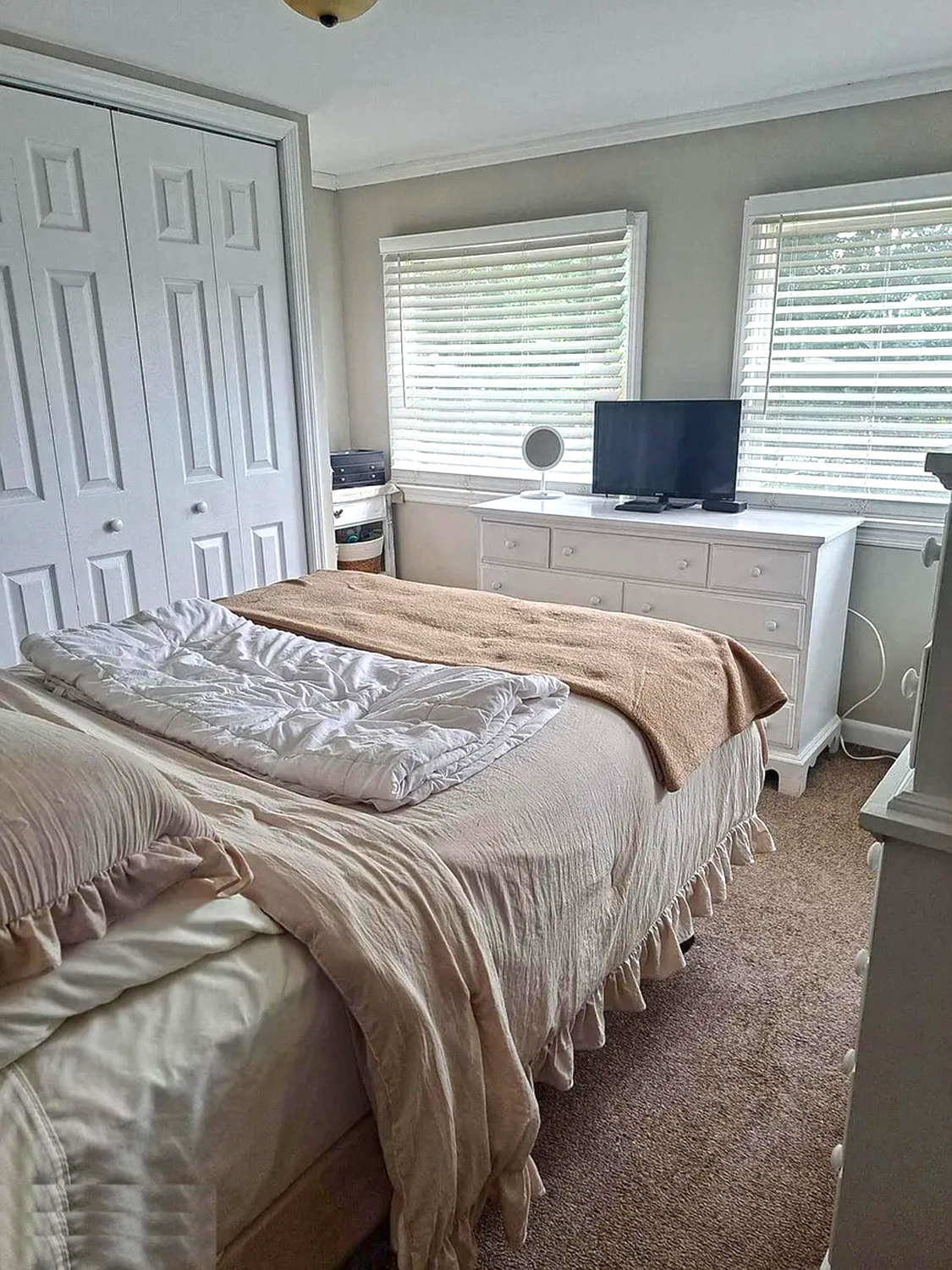
This 1971 mobile home bedroom is a beautiful blend of simplicity and coziness, proving that even small spaces can be made stylish and comfortable. Let’s take a closer look at why this bedroom works so well.
The overall color scheme is soft and neutral, with shades of cream, beige, and white taking the spotlight. These colors make the room feel light, airy, and open, which is essential for a smaller space. The walls have a soft, muted tone, which helps the natural light from the two windows bounce around the room. This makes the space feel larger and more inviting. The white trim around the windows adds a crisp and clean finish, giving the room a polished look.
The bed is the room’s main focal point, and it’s dressed in layers of cozy bedding. The neutral bedding with ruffle accents adds a touch of texture and softness, making the space feel warm and comfortable. Layering the blankets and having an extra throw draped across the bed gives a cozy, lived-in feel like it’s ready for a good night’s sleep or a relaxing nap. The colors of the bedding tie in perfectly with the rest of the room, creating a cohesive, relaxing atmosphere.
Storage is cleverly managed here without feeling bulky. The white dresser sits beneath the windows and offers much drawer space for clothes and essentials. Its simple design blends well with the rest of the room and doesn’t overpower the space. On top of the dresser, there’s a small TV and a round makeup mirror, showing that the room is not only for sleeping but also practical for getting ready or relaxing with a movie.
Bathroom
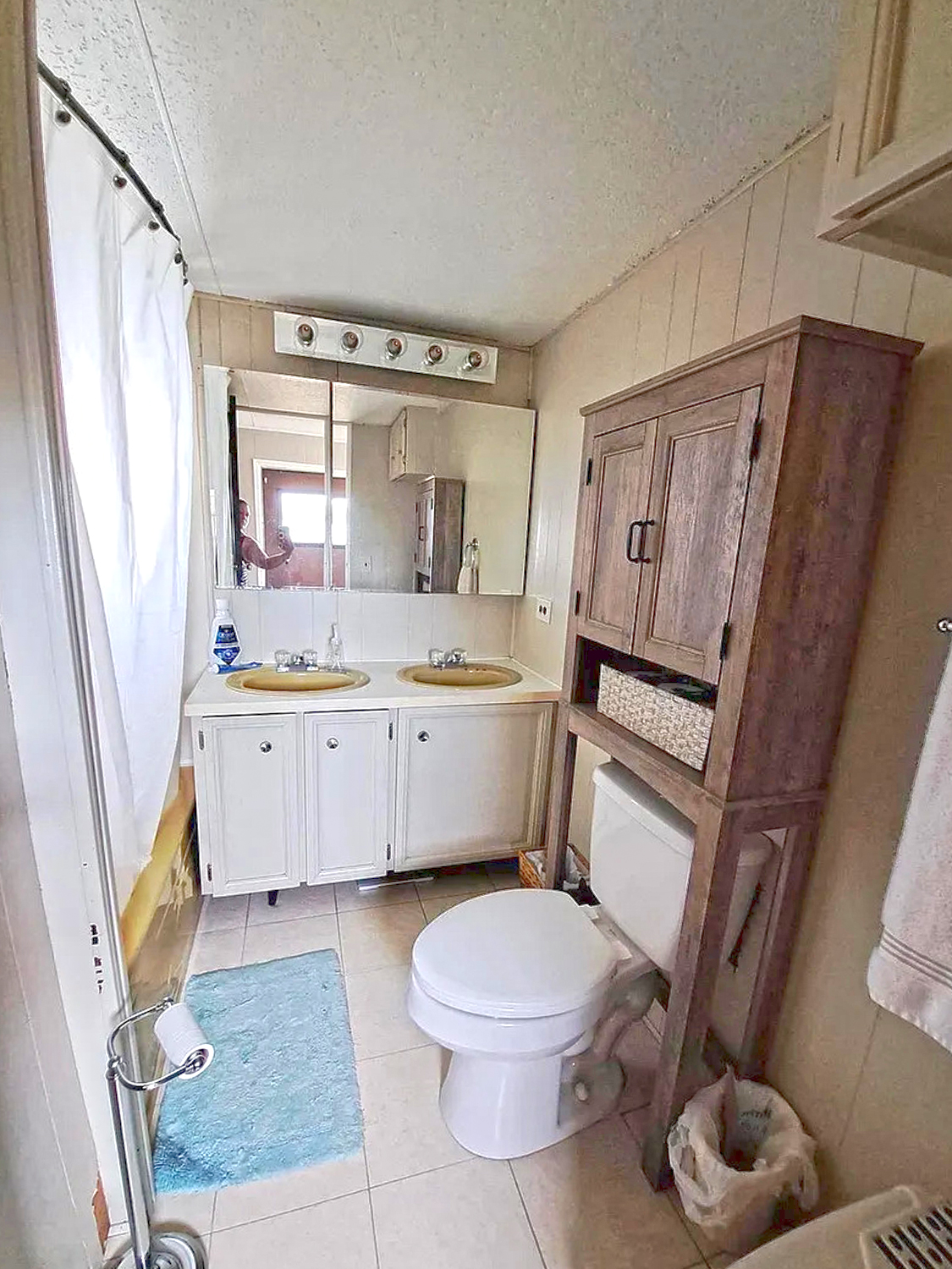
This 1971 mobile home bathroom is a great example of using space wisely and keeping things simple and functional. Even though it’s not huge, the thoughtful design touches help make it both practical and welcoming.
The first thing that catches your eye is the double sink vanity. Double sinks are such a smart feature, especially for a small space like this, since they make it easier for two people to use the bathroom simultaneously without feeling cramped. The sinks have a vintage vibe to them with their muted yellow color, giving a nod to the retro origins of this home. The cabinetry below is painted white, which helps keep the area looking fresh and bright. White is an excellent choice for smaller spaces because it opens them up and makes everything feel a little less tight.
The mirror above the sink runs the length of the vanity, which is perfect for making the room feel larger. A big mirror in a small bathroom is like a magic trick—it reflects light and creates an illusion of more space. Above the mirror is a row of classic globe lights, which adds a bit of vintage charm and ensures the sink area is well-lit. The lighting makes it easy to get ready in the morning, whether shaving or putting on makeup.

