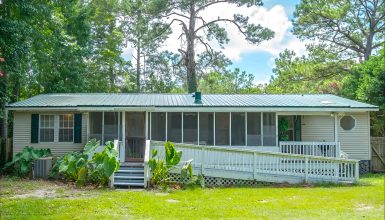
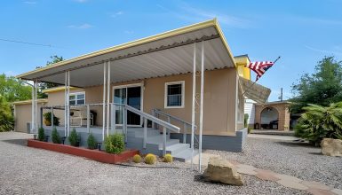
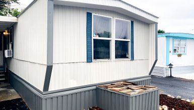
Who says old mobile homes can’t shine? This 1970 single-wide just got a whole new lease on life with a stunning exterior remodel. Picture fresh paint, a charming carport, and an inviting porch that makes you want to kick back and relax. It’s all about smart updates that keep things simple yet stylish. Ready to see how a few key changes turned this classic mobile home into a head-turner? Let’s dive in!
Fresh Paint Job with Neutral Colors
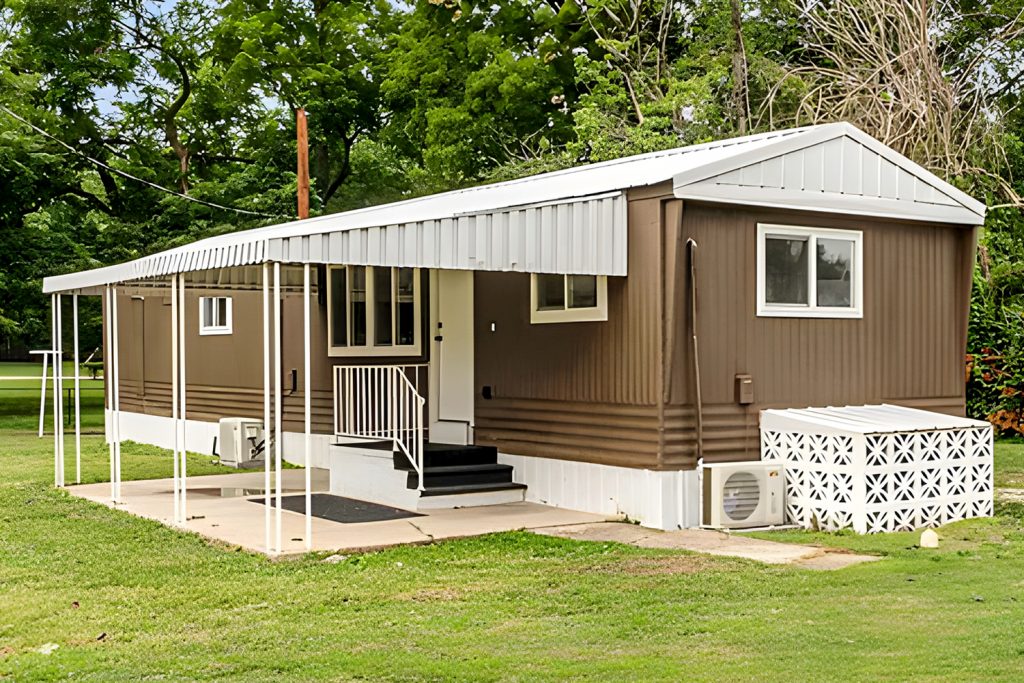
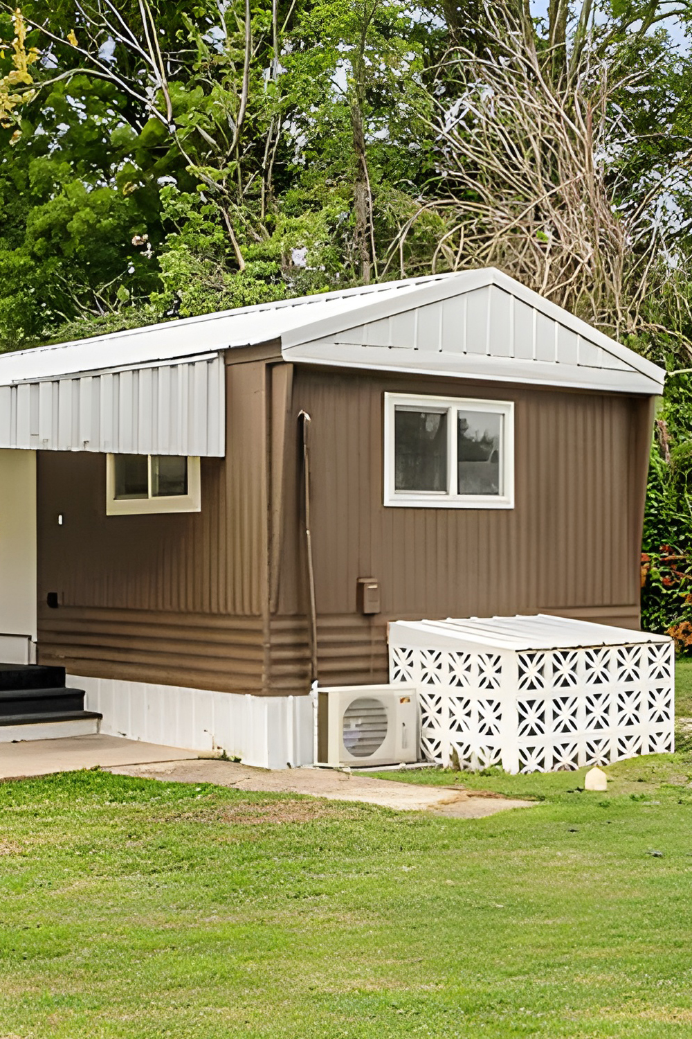
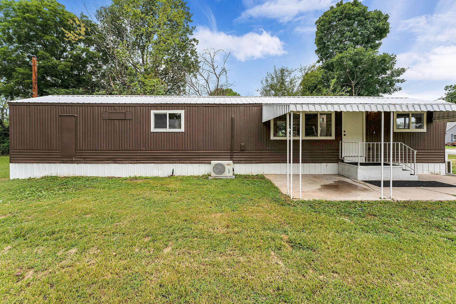
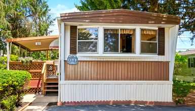
The first thing you’ll notice is the fresh paint job. A rich, earthy brown paired with crisp white trim gives it a sleek but warm vibe. The brown tones help the home blend with the natural landscape, while the white details add crisp accents. This color combo gives a polished look, making the house feel more inviting and modern.
Updated Roof Overhang and Awnings
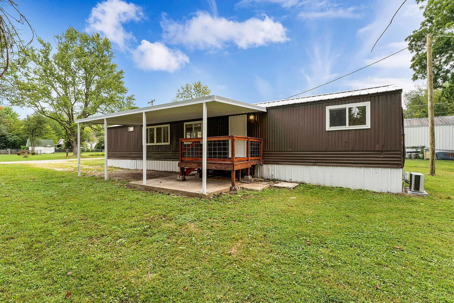
The new roof overhang is one of the standout features. It adds a touch of elegance and serves a functional purpose—protecting windows and the entryway from rain and sun. Notice how the roofline has an extended white awning wrapping around the front. This creates visual interest and adds dimension to an otherwise simple, flat roof. Plus, it provides some shaded outdoor space!
Enhanced Porch Area
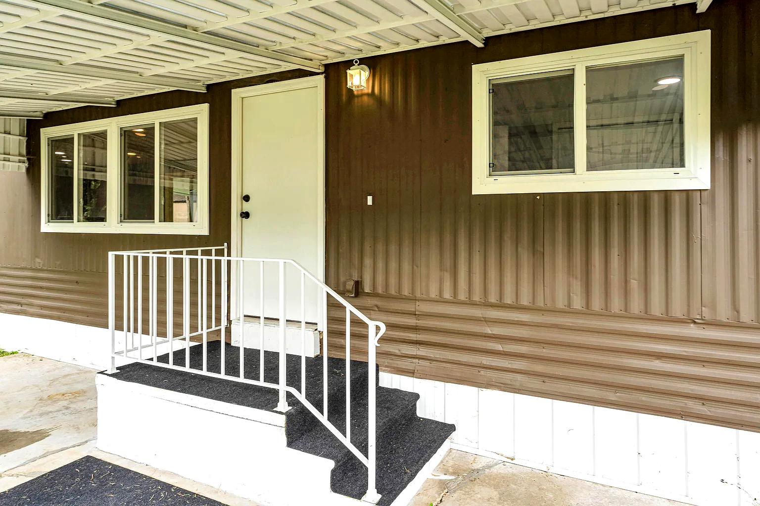
The entrance was also revamped to feel more welcoming. The small porch steps and landing now have a fresh coat of black paint, giving a bold contrast against the white railing and trim. The black steps give the entryway a modern touch, making the whole space feel grounded and sturdy. The white railing is simple yet effective, adding safety without overpowering the design.
Carport Addition
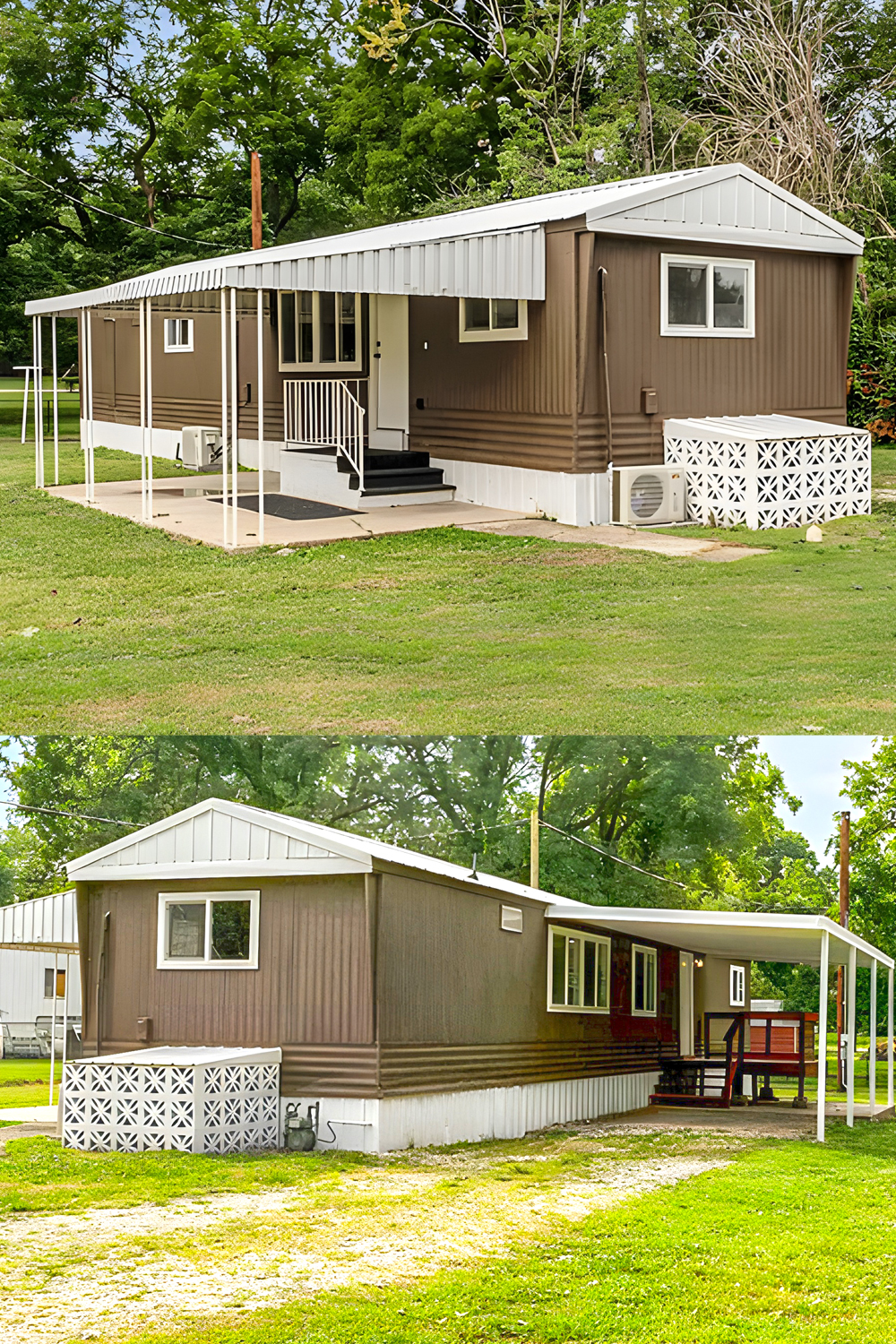
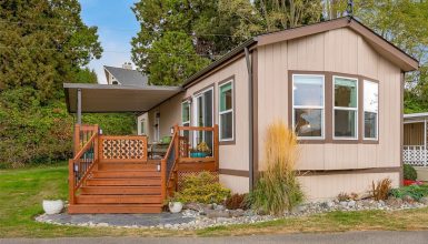
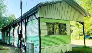
A carport structure was added to one side of the home. This provides covered parking and visually extends the home’s footprint, making it look larger and more like a permanent house. The slim white posts used in the carport design keep it minimal and clean, while the white roof matches the rest of the trim, creating a cohesive look.
Modern Windows
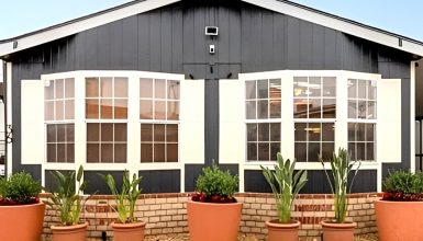
The windows were swapped out for new, energy-efficient models. These updated windows have simple white frames, matching the trim throughout the exterior. Larger windows on the back side allow for more light inside while also balancing out the visual weight of the home’s exterior. It’s a subtle change, but it really freshens up the overall look.
Clean Landscaping
The landscaping around the mobile home is kept simple and tidy. The green lawn provides a lovely contrast to the brown exterior, making the whole scene pop. The open yard helps emphasize the clean lines of the remodel, giving the whole property a bright, uncluttered look.
Small Decorative Elements
Small, thoughtful details elevate this remodel, like the addition of the concrete slab beneath the front steps. This creates a neat and level foundation for the steps, making them feel secure. Similarly, the air conditioning unit is placed neatly to the side, with lattice panels partly concealing it, which keeps the look tidy without blocking ventilation.
Back Deck
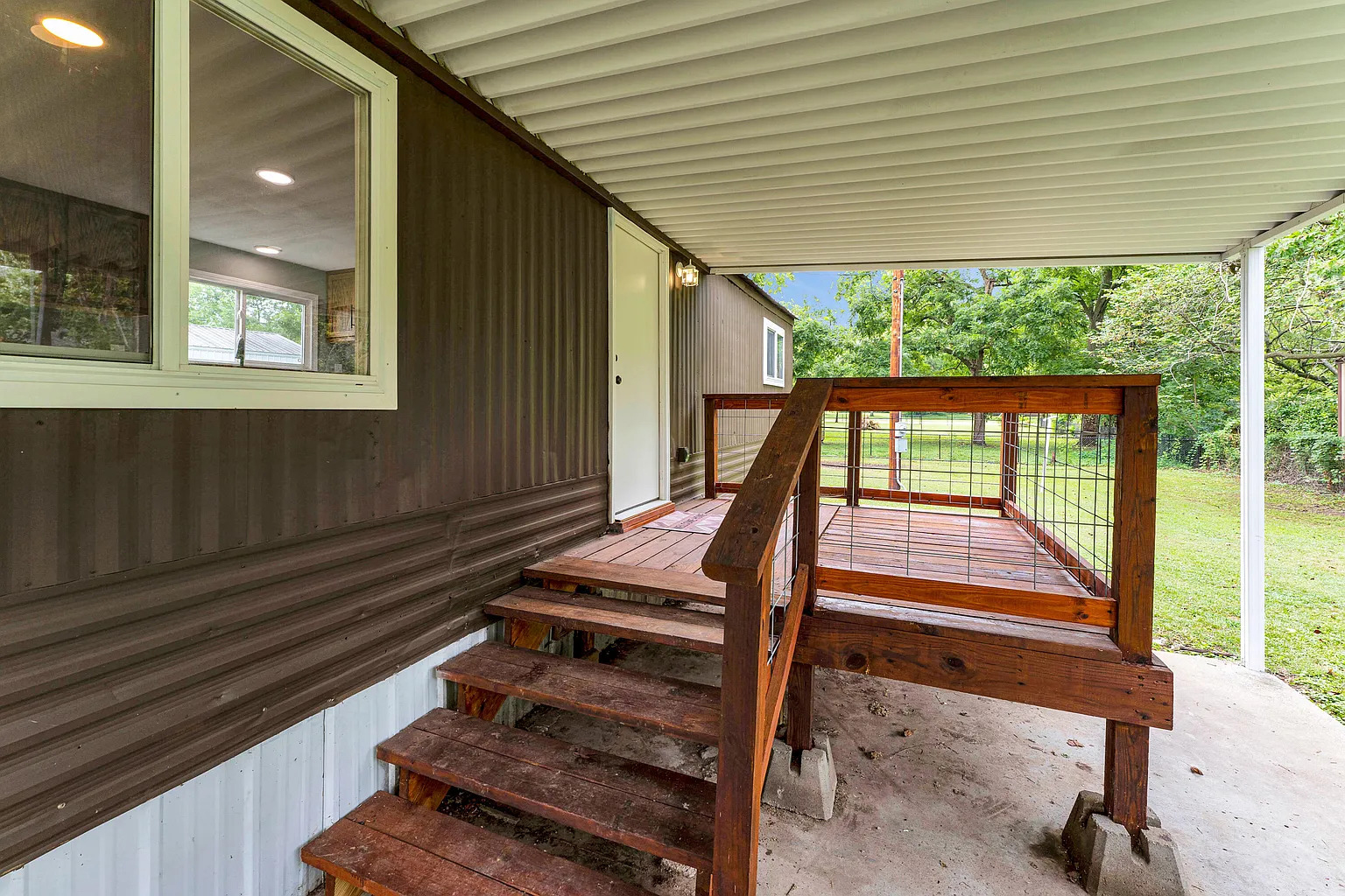
Lastly, take a look at the back side of the house. There’s a new small deck that provides a secondary entrance. Painted a deep redwood shade, it brings a pop of warmth and complements the earth-tone exterior. The covered back deck also adds some functional outdoor living space, perfect for relaxing on a warm evening.

