Can a mobile home feel open, stylish, and full of personality? This one shows how smart choices can make a big impact. The open-concept layout creates an easy flow from the kitchen to the living room. Warm wood tones, soft gray finishes, bold green accents, and plenty of plants add a cozy modern feel. Outside, the large deck gives the home even more room to relax and enjoy daily life.
Here is a closer look at the design ideas that make this mobile home work so well.
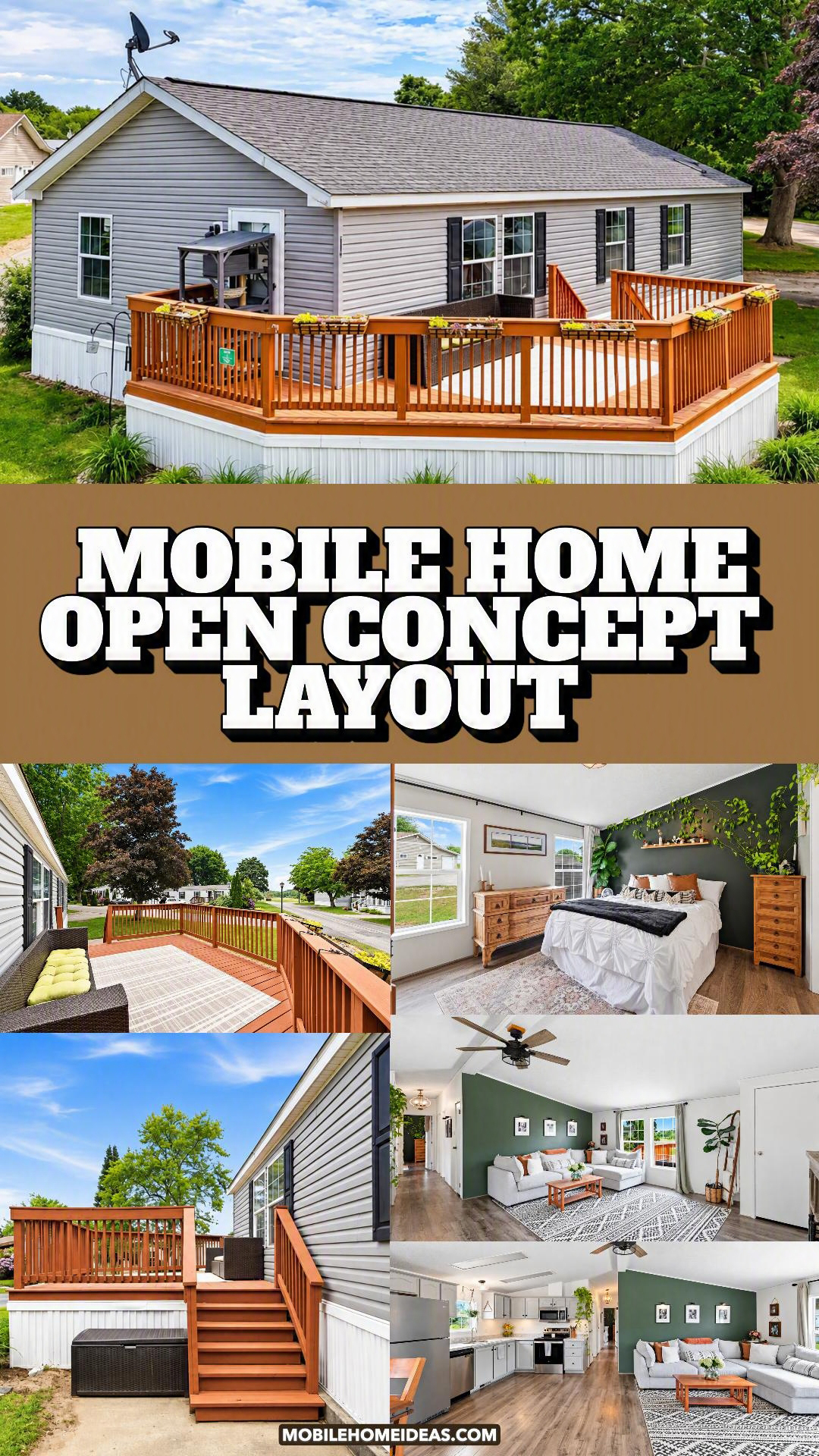
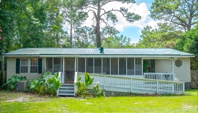
1. A Simple Gray Exterior Gets a Fresh, Polished Look
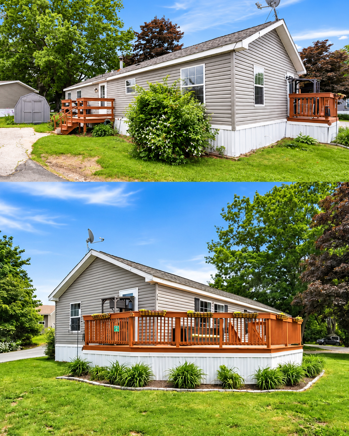
The exterior starts with a classic mobile home shape. Yet the color choices make it feel updated.
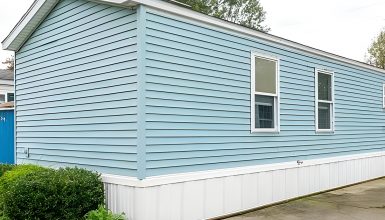
Soft gray horizontal siding covers most of the home. The shade feels calm and neutral. It also works well with the green lawn and mature trees around the property.
White trim creates clean lines around the roof, windows, and base of the home. White skirting also gives the structure a finished look. More importantly, it reduces the visual gap between the home and the ground.
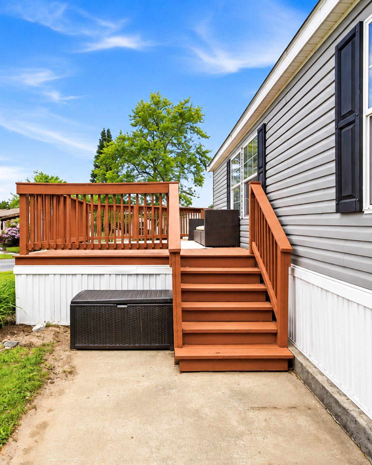
Black shutters appear beside several windows. They add contrast without making the exterior too busy. Because black repeats in small amounts, it gives the gray siding more depth.
The simple gable roof keeps the overall shape familiar. It also suits the home’s relaxed style. There are no heavy architectural details competing for attention.
That simplicity is part of the appeal.
Rather than trying to disguise the home with too many decorative elements, the design improves what is already there. The result feels clean, tidy, and easy to maintain.
Design cues
- Soft gray horizontal siding
- Bright white exterior trim
- White skirting
- Simple gable roof
- Black window shutters
- Large white-framed windows
- Minimal exterior decoration
- Neutral colors that work with the landscape
2. The Wood Deck Adds a Whole New Living Zone
One of the strongest features sits outside the home.
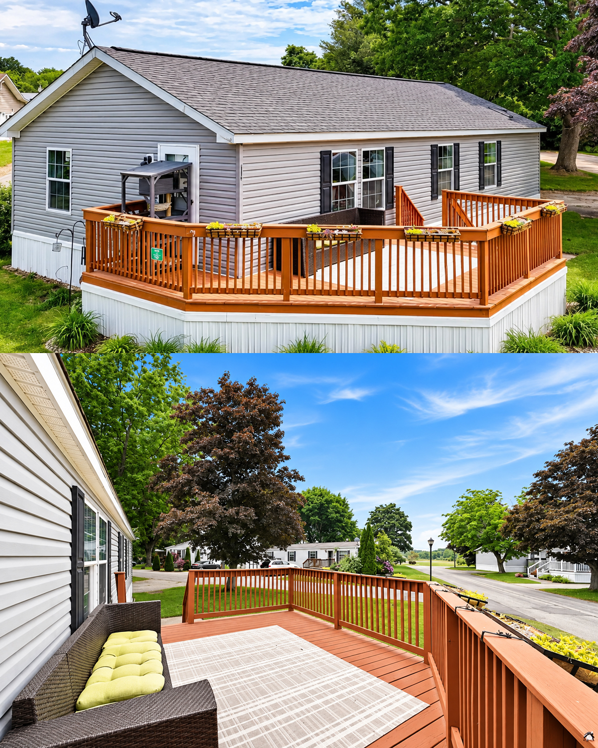
The large deck wraps around part of the exterior and creates a useful outdoor living area. Its warm brown finish stands out against the cool gray siding.
That contrast works well.
The gray exterior stays quiet, while the wood brings warmth and character. The deck also helps the mobile home feel more connected to its site.
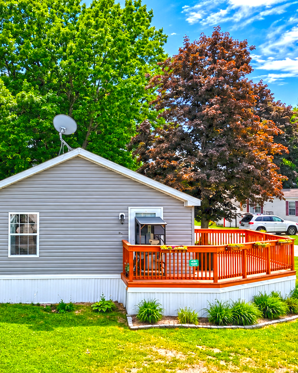
Wide stairs make the space easy to reach. Wood railings create a clear border without making the deck feel closed in. Their narrow vertical rails still allow long views of the yard.
There is also plenty of open floor space. That means the deck can hold outdoor seating, a table, planters, or a small grilling station.
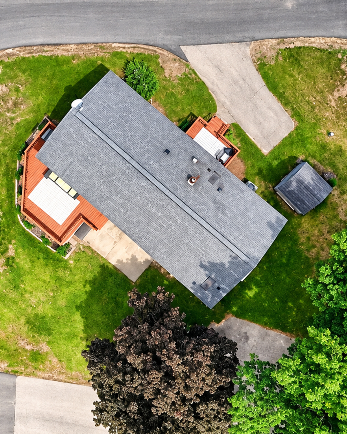
In one area, a woven outdoor sofa turns the deck into a casual lounge. A pale outdoor rug softens the wood underfoot. Meanwhile, small flower boxes along the railing add another layer of charm.
This outdoor area does more than improve curb appeal. It increases the usable living space.
For a mobile home, that can make a huge difference.
Design cues
- Warm brown deck boards
- Matching wood railings
- Wide exterior stairs
- Outdoor lounge seating
- Large outdoor rug
- Railing-mounted flower boxes
- Open views toward the yard
- Space for several outdoor functions
3. The Open Layout Makes the Interior Feel Bigger
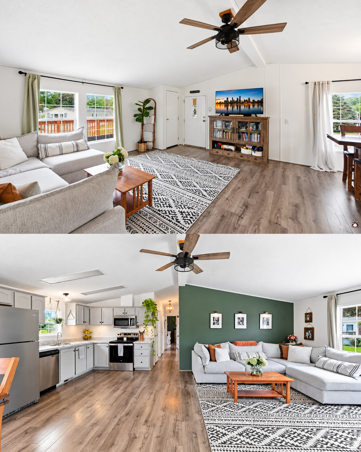
Step inside, and the layout changes the whole mood.
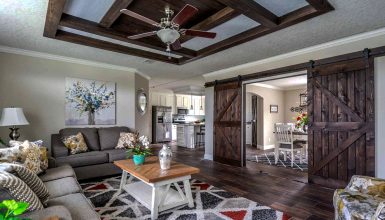
The living room and kitchen sit next to each other with almost no visual barrier between them. Instead of breaking the home into several small rooms, the design creates one larger shared space.
This is one of the best ways to make a narrow home feel wider.
The eye can travel from the kitchen across the living room without stopping at a wall. The flooring continues through the spaces as well. That creates another strong visual link.
The ceiling also plays an important role.
Over the main living area, the ceiling rises toward the center. This extra height gives the room more breathing space. A ceiling fan draws attention upward and helps show off that height.
Although the areas connect, each one still has its own identity.
The kitchen uses cabinetry and appliances to define its work zone. The living room uses a large rug and sectional sofa to mark its seating area.
That is the key to a good open layout. The spaces feel connected, but they do not feel confused.
Design cues
- Open kitchen and living room
- Long sight lines
- Few interior barriers
- Continuous flooring
- Raised ceiling over the main living area
- Large area rug defining the lounge
- Furniture used to create separate zones
- Simple visual flow from room to room
4. A Deep Green Accent Wall Anchors the Living Room
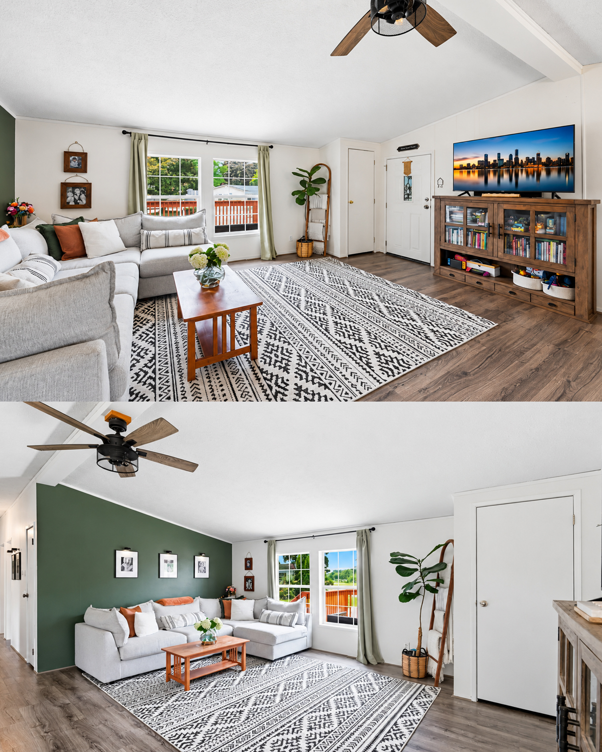
The living room has a strong focal point, and it does not require expensive materials.
A deep green accent wall runs behind the sectional.
This single color choice changes the entire room.
Most of the surrounding walls stay white. As a result, the green feels rich without making the space dark. It also helps the pale sectional stand out.
The color has a natural quality. That works well with the plants, wood coffee table, and views of the trees outside.
Three small framed pieces hang across the accent wall. Their simple placement keeps the wall from feeling crowded.
Small wall lights above them add another useful layer. They help turn basic art into a stronger focal display.
Meanwhile, touches of rust and warm brown appear in the pillows and coffee table. These warmer shades keep the green from feeling too cool.
The lesson here is simple. A small home does not need to avoid dark color.
In fact, one dark wall can create depth. It can make a room look more intentional and give the eye a clear place to rest.
Design cues
- Deep forest-green accent wall
- White surrounding walls
- Pale gray sectional
- Rust-colored accent pillows
- Warm wood coffee table
- Small black-framed artwork
- Picture lights
- Green plants
5. A Large Sectional Creates a Cozy Living Zone
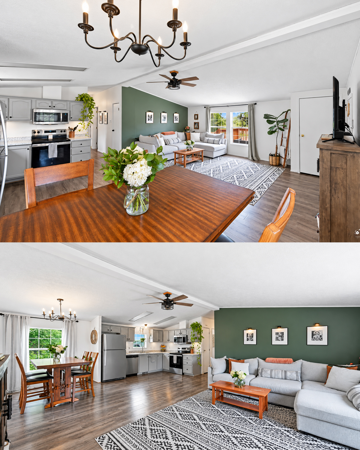
Large furniture can work in a small home when the scale and placement make sense.
This living room proves it.
A generous L-shaped sectional fills one side of the space. At first, that may sound like too much furniture. Yet the sectional actually simplifies the room.
Instead of using a sofa, several chairs, and extra side pieces, one large seat handles most of the job.
Its light gray fabric also helps. A dark sofa of the same size could feel much heavier. Here, the pale upholstery blends with the light walls.
The sectional hugs the edge of the room. That keeps the center open.
A slim wood coffee table sits on the patterned rug. Its simple shape leaves enough floor area around it for easy movement.
Across from the sofa, a rustic wood media cabinet supports the television. The cabinet adds storage while repeating the warm wood colors found elsewhere.
A tall houseplant fills the corner near the door. It brings height without using much floor space.
Together, these pieces create a comfortable room that feels relaxed rather than crowded.
Design cues
- Large L-shaped sectional
- Light neutral upholstery
- Black-and-white patterned rug
- Slim wood coffee table
- Rustic media cabinet
- TV placed opposite the seating
- Tall plant in an unused corner
- Open walking paths
6. Gray Cabinets Give the Kitchen a Soft Modern Look
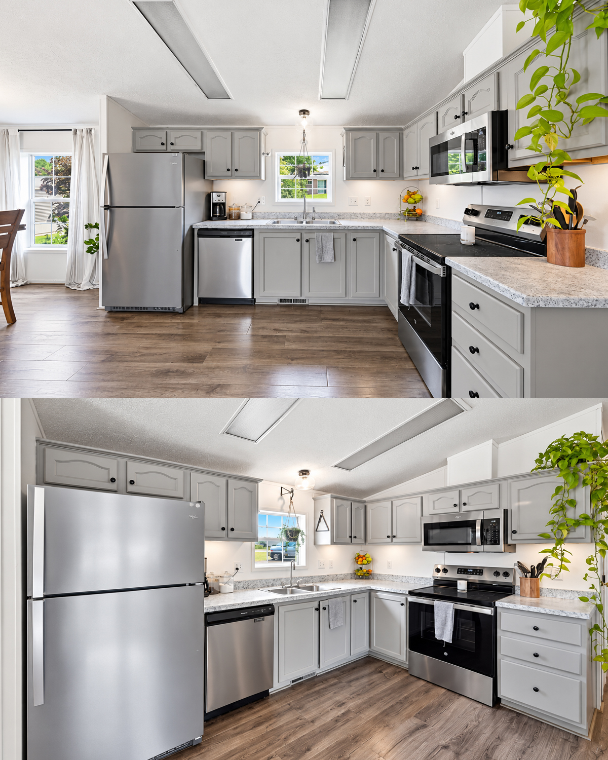
The kitchen uses a simple L-shaped layout.
That makes sense in a mobile home because it keeps the center open while giving the cook useful counter space.
Soft gray cabinets create a gentle contrast with the white walls. The color feels modern, but it is not too cold.
Black knobs sharpen the cabinet fronts. These small details also connect the kitchen to other black accents throughout the home.
Stainless steel appliances add a clean finish. The refrigerator, dishwasher, microwave, and range share a similar look, so the kitchen feels coordinated.
Light counters keep the work zone bright.
The kitchen window above the sink is another smart feature. It brings daylight right into the work area and gives the room a visual connection to the outdoors.
Plants soften the harder surfaces. A trailing vine near the edge of the cabinets draws the eye downward and adds movement.
There is no oversized island taking up the center of the room. That choice matters.
Instead, the open floor area becomes part of the circulation path between the kitchen, dining area, and living room.
Design cues
- L-shaped kitchen
- Soft gray cabinetry
- Black cabinet hardware
- Light countertops
- Stainless steel appliances
- Window above the sink
- Trailing indoor plants
- Open floor space instead of a large island
7. The Dining Nook Uses Natural Light to Its Advantage
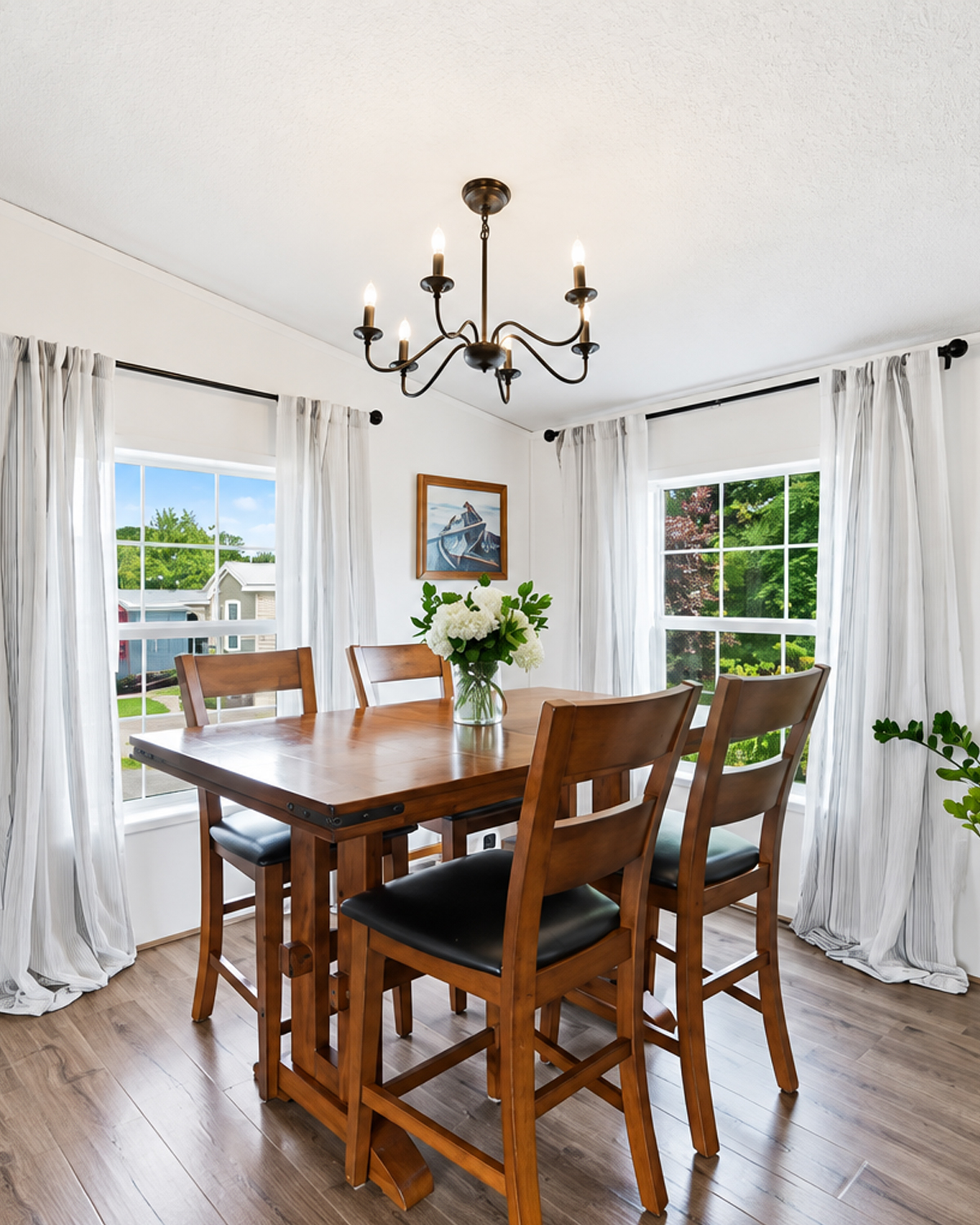
The dining area sits beside two large windows.
That turns a simple corner into one of the brightest parts of the home.
A rectangular wood table brings warmth to the mostly white space. Matching chairs keep the look consistent. Their dark seat cushions add a subtle contrast.
The table has a modest footprint, yet it can seat several people.
That makes it a smart choice for a compact home. It provides a real dining space without blocking the path into the kitchen.
Light curtains hang high around the windows. Their soft fabric keeps the area casual while still allowing plenty of daylight to enter.
A dark metal chandelier hangs over the table.
It gives the dining zone a clear center point. More importantly, it helps separate the area from the kitchen even though there is no wall between them.
A plant in the corner adds another touch of green.
The overall design feels easy and approachable. Nothing is too formal. Yet the light fixture, curtains, and table create enough structure to make the dining space feel complete.
Design cues
- Compact rectangular dining table
- Warm wood furniture
- Dark seat cushions
- Two large windows
- Light floor-length curtains
- Black curtain rods
- Metal chandelier
- Small corner plant
8. Continuous Wood-Look Flooring Connects the Home
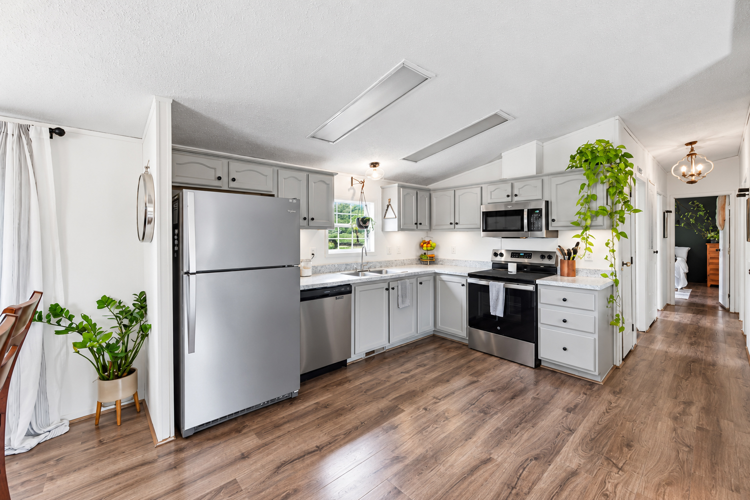
One material appears again and again throughout the interior: wood-look flooring.
This is a smart move in a long, narrow home.
Using many different flooring types can make a small floor plan feel chopped up. Here, the same medium brown flooring links the kitchen, living room, hallway, bedroom, office, and laundry areas.
That creates visual flow.
The color also gives the otherwise light interior more warmth.
It has enough variation to mimic natural wood, but the finish still feels relaxed. It works with gray cabinets, black accents, natural wood furniture, and green walls.
Area rugs then soften specific zones.
The living room uses a large black-and-white rug. The bedroom has a muted vintage-style rug. The office gets another warm patterned rug.
Each one adds personality without interrupting the overall flooring plan.
This approach works especially well in mobile homes. Keep the main surface consistent. Then add smaller layers where you need comfort, pattern, or color.
Design cues
- Medium brown wood-look flooring
- One main floor finish through several rooms
- Warm natural tone
- Patterned area rugs
- Strong visual flow
- Easy transition between spaces
- Neutral base for many decor styles
9. The Bedroom Mixes Drama With Soft Texture
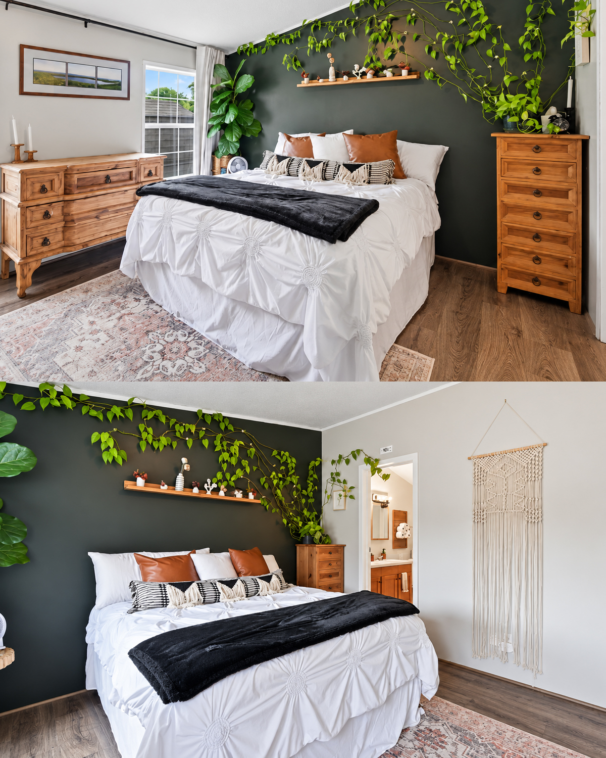
The main bedroom takes a bolder approach than the living area.
A nearly black accent wall creates a dramatic backdrop behind the bed.
Yet the room does not feel gloomy.
Large windows bring in plenty of daylight. White bedding also reflects light. Soft gray walls on the other sides keep the space balanced.
The black wall makes the bed the main feature.
Then greenery adds a surprising twist.
Long trailing vines spread across the upper part of the dark wall. Their bright green leaves stand out against the black background and bring a lush, almost indoor-garden feel to the room.
A simple floating wood shelf runs above the headboard. Small decorative objects sit on top without taking up floor space.
Natural wood dressers add warmth on both sides of the room.
The bedding blends white, black, tan, and rust. These colors connect the bedroom to the rest of the home’s palette.
A vintage-style rug softens the floor and makes the room feel more layered.
Design cues
- Black feature wall
- Bright white bedding
- Rust and tan pillows
- Trailing wall plants
- Floating wood shelf
- Natural wood dressers
- Large windows
- Soft vintage-style rug
- Simple black-and-white accents
10. Plants Become Part of the Interior Design
Plants appear throughout this home, and they do much more than fill empty corners.
They act almost like a repeating color.
Green appears on the living room wall. Then real plants carry that shade into the kitchen, bedroom, bathroom, hallway, and office.
This repetition connects the rooms.
Trailing plants work especially well because they use vertical space. Instead of placing every plant on the floor, vines hang from cabinets, shelves, and higher wall areas.
That is a useful trick in a mobile home.
Floor space is valuable. Vertical decor gives you personality without making walkways tight.
Large leafy plants fill awkward corners. Smaller plants soften shelves and counters.
The bedroom takes this idea even further, using vines almost like wall art.
Plants also soften the home’s harder elements. Stainless appliances, black metal fixtures, straight cabinet lines, and gray walls can all feel crisp. Greenery makes them feel warmer and more relaxed.
Design cues
- Trailing pothos-style plants
- Tall leafy floor plants
- Small potted plants
- Green used throughout several rooms
- Plants placed above cabinets
- Vertical plant displays
- Natural decor instead of heavy accessories
11. The Bathroom Packs Style Into a Small Footprint
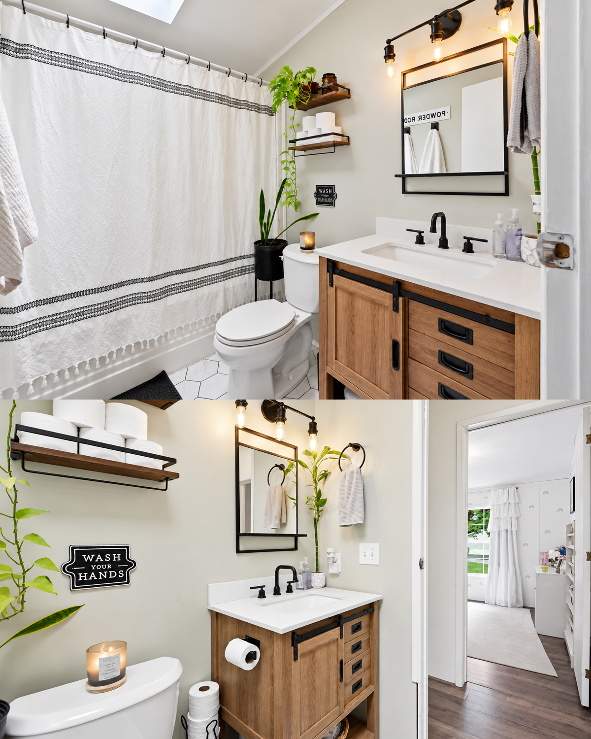
The bathroom may be compact, but it has several strong design details.
The vanity leads the look.
Warm wood grain gives it a rustic feel. Black metal hardware adds an industrial touch. The sliding barn-door-style detail on the cabinet front makes the piece feel more like furniture.
A white counter keeps the vanity bright.
Above it, a black-framed mirror creates a clean focal point. A matching dark faucet and black light fixture tie the entire sink area together.
Open wall shelves provide useful storage.
They hold extra paper, decor, and plants without the bulk of a large wall cabinet.
The shower curtain stays mostly white. That is important in a small bathroom. A dark curtain could make the room feel closed.
Instead, a simple black pattern connects it to the fixtures while keeping the space bright.
Even a small plant beside the tub adds freshness.
The design works because it mixes light surfaces with a few strong dark details.
Design cues
- Warm wood vanity
- Black metal cabinet hardware
- White vanity top
- Matte black faucet
- Black-framed mirror
- Industrial-style vanity lights
- Floating wood shelves
- White patterned shower curtain
- Compact indoor plants
12. The Hallway Becomes a Strong Visual Spine
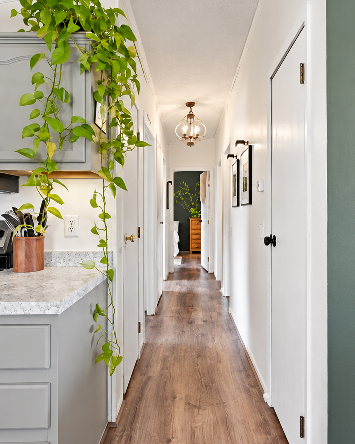
Mobile homes often rely on a long central hallway.
This home uses that shape to its advantage.
The warm floor draws the eye from the kitchen toward the private rooms at the other end. White doors and walls keep the narrow passage bright.
Small lights and framed art add interest without taking up floor space.
From the kitchen, you can also see the dark bedroom accent wall in the distance. That deep color creates a visual endpoint.
This helps the hallway feel more intentional.
The trailing plant beside the kitchen softens the transition into the corridor. Meanwhile, the green living room wall sits just beside the opening.
These touches create layers of color rather than one long plain tunnel.
The result shows how small changes can improve a narrow hall. You do not need bulky furniture. Instead, use flooring, art, lighting, and a strong color at the far end.
Design cues
- Long central hallway
- Continuous wood-look floor
- Bright white doors
- Light wall color
- Simple framed art
- Decorative ceiling light
- Dark accent color at the far end
- Clear walking path
13. A Spare Room Works as a Practical Home Office
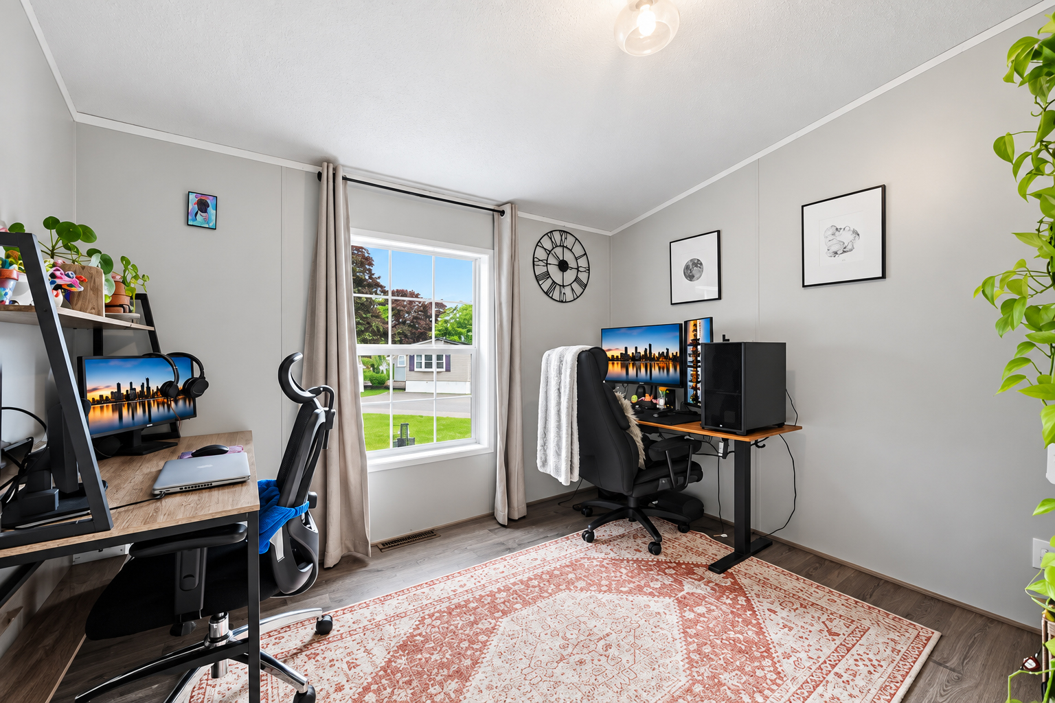
The extra room shows how flexible mobile home spaces can be.
Instead of filling the room with large furniture, the design gives most of the floor area to two workstations.
One desk uses tall open shelving. The second has a simpler table-style base.
This arrangement can support two people, several computer screens, or a mix of work and hobby needs.
A large window brings in daylight.
Light curtains soften the opening without making the room too formal.
The walls stay pale gray, while black frames and dark furniture provide contrast. A faded red area rug adds warmth and helps define the work zone.
There is also room for plants and small decorative pieces.
Most of all, the room feels useful.
That is an important lesson for smaller homes. A spare bedroom does not always need a bed. It can become a home office, craft room, gaming space, or study.
The best use depends on how you actually live.
Design cues
- Two compact workstations
- Open shelving
- Large central window
- Neutral gray walls
- Light curtains
- Dark office furniture
- Warm patterned rug
- Simple framed wall art
- Multi-use layout
14. The Laundry Area Turns Utility Into a Design Feature
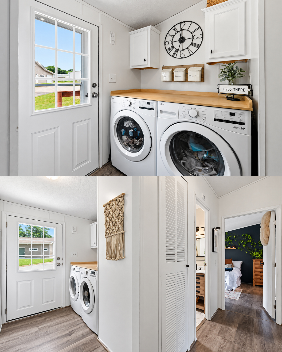
Even the laundry area gets thoughtful treatment.
A front-loading washer and dryer sit side by side under a wood counter.
That counter is one of the smartest details in the space.
It creates a flat work surface for folding clothes, storing supplies, or sorting laundry. At the same time, it visually connects the two machines.
White wall cabinets provide storage above.
A large black metal clock adds a bold graphic touch. Small wall containers and simple decor help the area feel finished.
The warm wood counter also repeats a material used in other rooms.
That matters.
Repeating wood, black metal, white walls, and green plants creates consistency from one end of the home to the other.
A nearby exterior door gives the laundry zone natural light. It also makes the space feel less enclosed.
Nothing here feels luxurious for the sake of luxury. It simply shows how useful details can also look good.
Design cues
- Side-by-side front-loading machines
- Wood folding counter
- White wall cabinets
- Large black wall clock
- Small wall-mounted storage
- Exterior door with window
- Simple neutral palette
- Practical use of vertical space
Conclusion
This mobile home proves that a simple layout can still feel fresh and inviting. The open living space makes the interior feel larger, while warm wood, black accents, and greenery add character. The deck, cozy bedroom, compact bathroom, home office, and smart laundry area all make good use of the available space. It is a practical home with plenty of style.