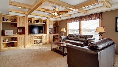
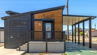
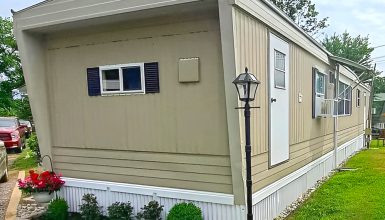
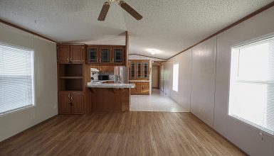
Mobile homes from the early ‘70s have their own unique charm. Think of cozy spaces packed with character. They remind us of a simpler time. But we also love modern comfort, right? So, mixing the old with the new can give these classic homes a fresh lease on life. That’s what we’re aiming for with these remodel ideas. It’s about keeping that retro vibe while enjoying today’s style and technology. It’s the best of both worlds. You keep the memories and add in today’s ease and looks. Ready to give your vintage mobile home a modern twist? Let’s dive in.
Exterior
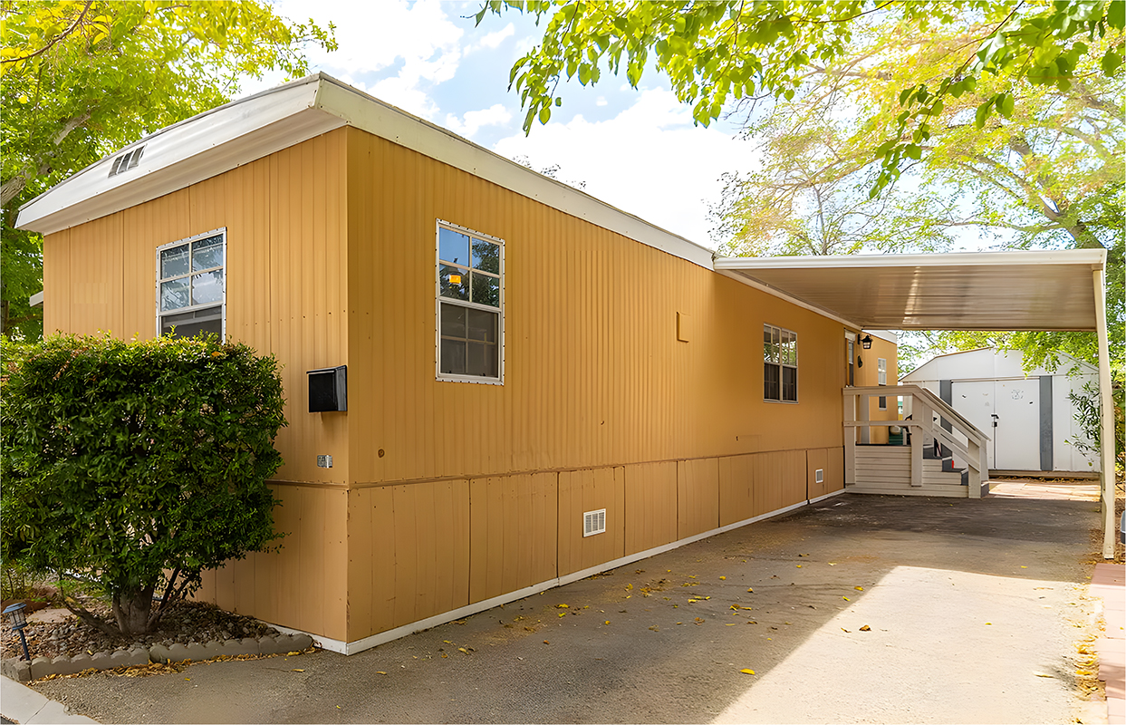
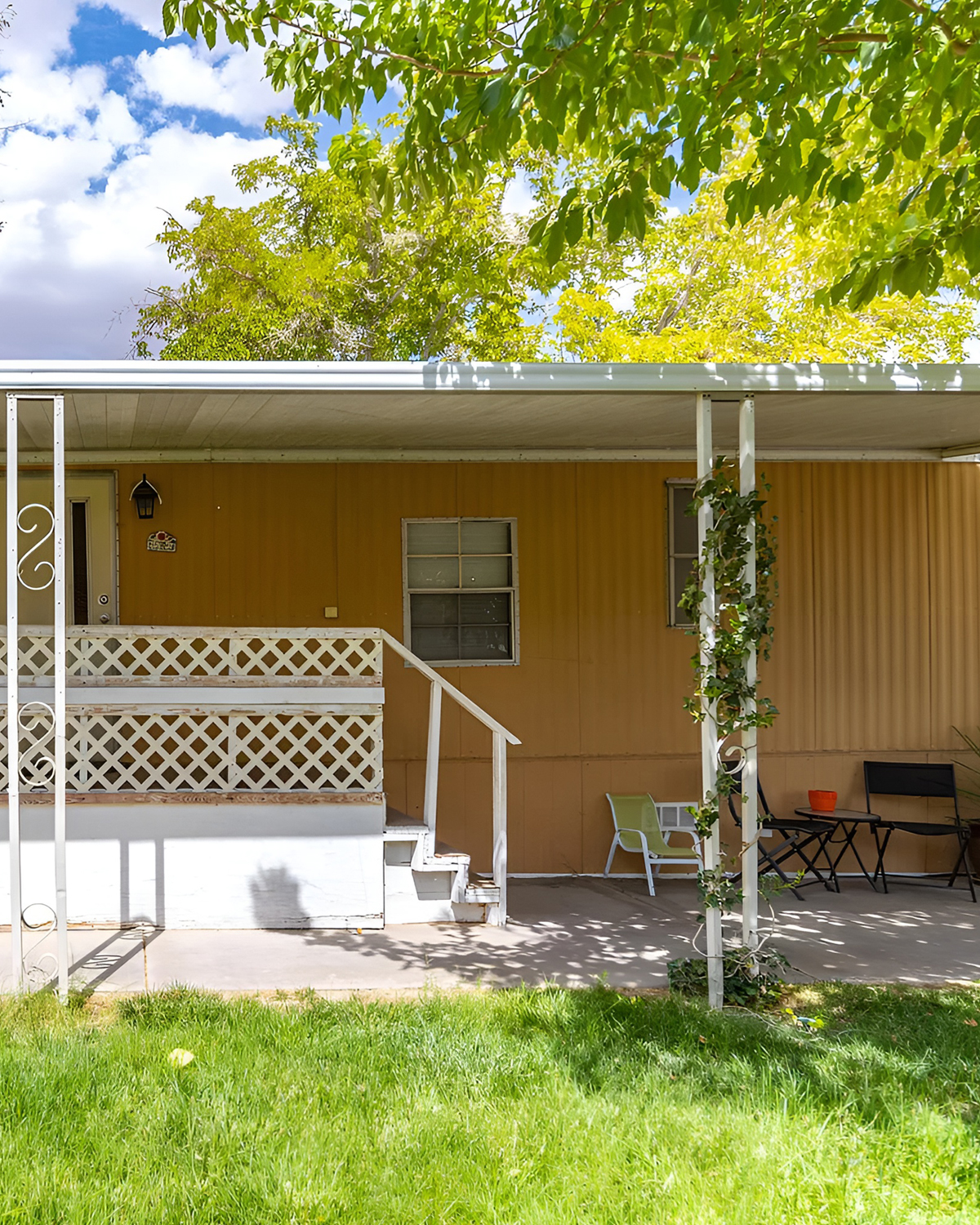
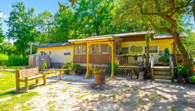
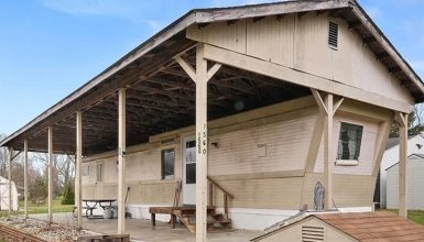
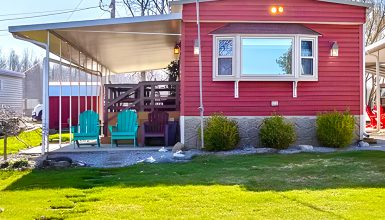
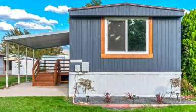
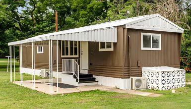
This classic 1973 mobile home is all about no-fuss living. The outside is painted mustard yellow, a total throwback to the ’70s. And those walls? They’ve got vertical metal panels. They’re tough and easy to look after, so you saw them a lot back then.
Up top, the roof has a sharp peak and is covered in metal. This is great when it rains; it keeps the house light and budget-friendly. Around the bottom, there’s skirting that could be metal or vinyl. It covers up the underparts and gives everything a neat finish.
The windows are pretty straightforward with white trim. They’re probably single-pane, which was all the rage before we started discussing saving energy. They’re up high, so you can enjoy the sunlight without giving up any privacy.
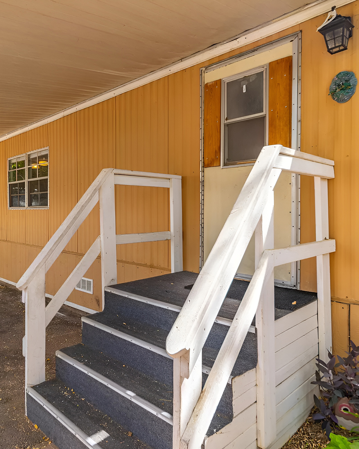
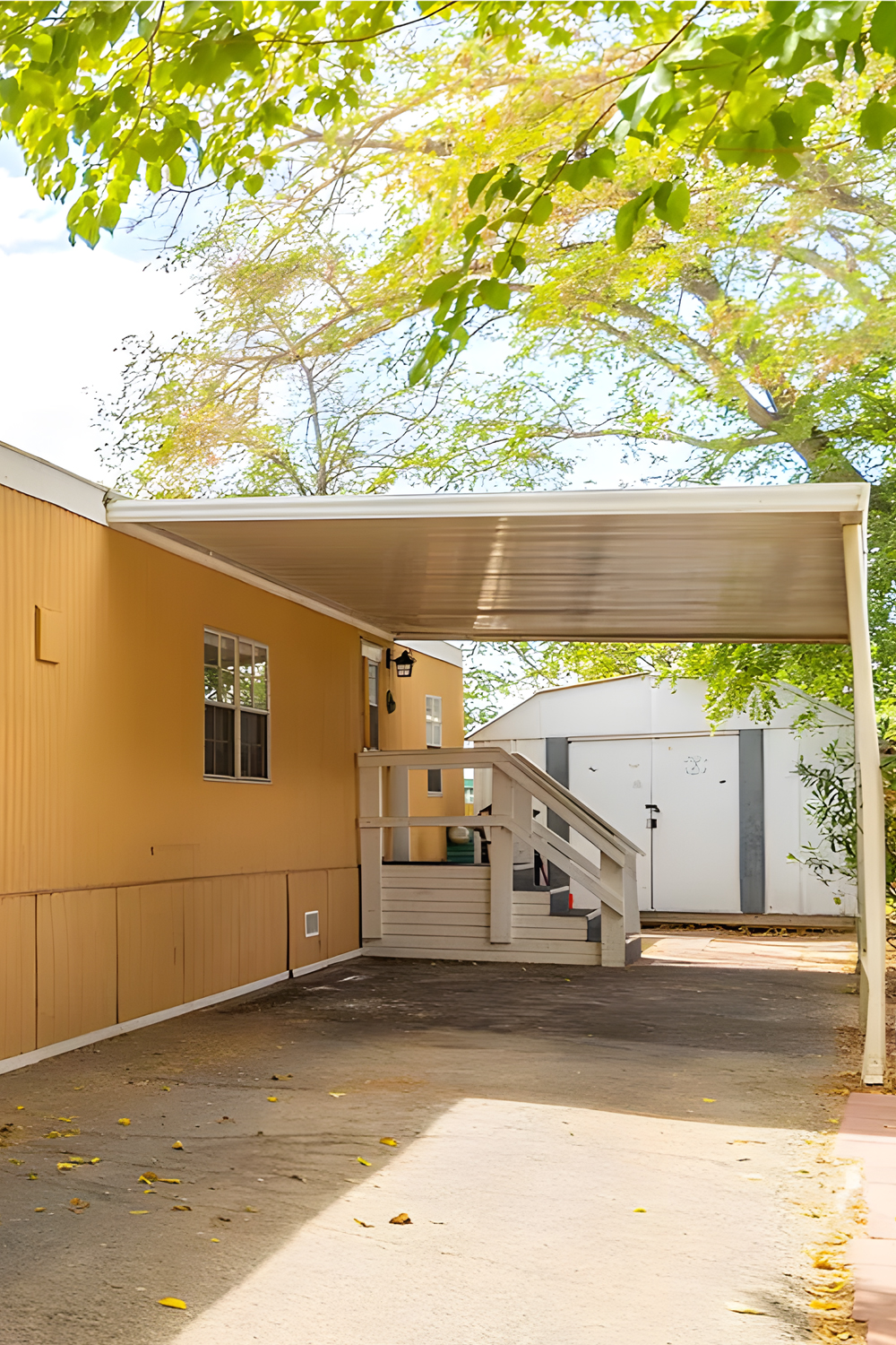
Over on the right, there’s a carport with a metal top to keep your car dry. It’s built just like the rest of the house—smart and simple. The steps up to the door mean the place is raised off the ground, which keeps things dry and cool.
This mobile home shows how people went for smart and cost-effective homes in the ’70s. It’s all about being practical and saving a penny where you can.
Living Room
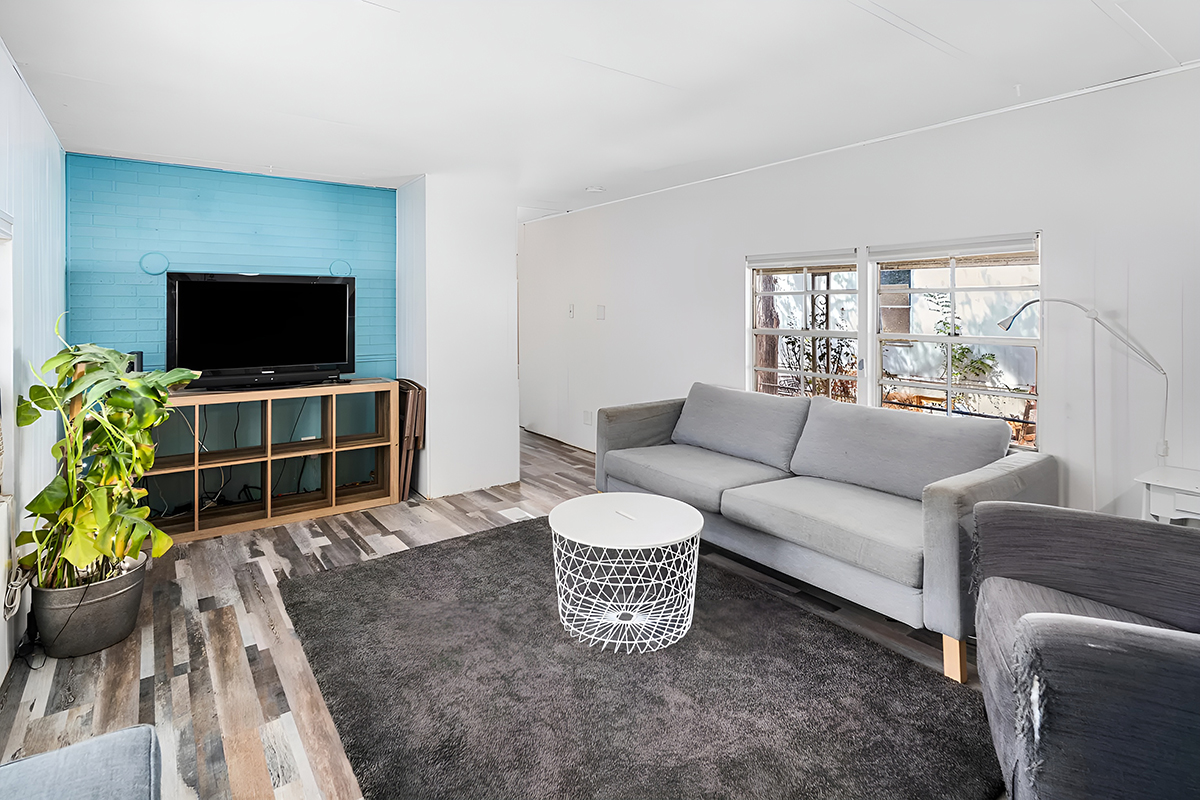
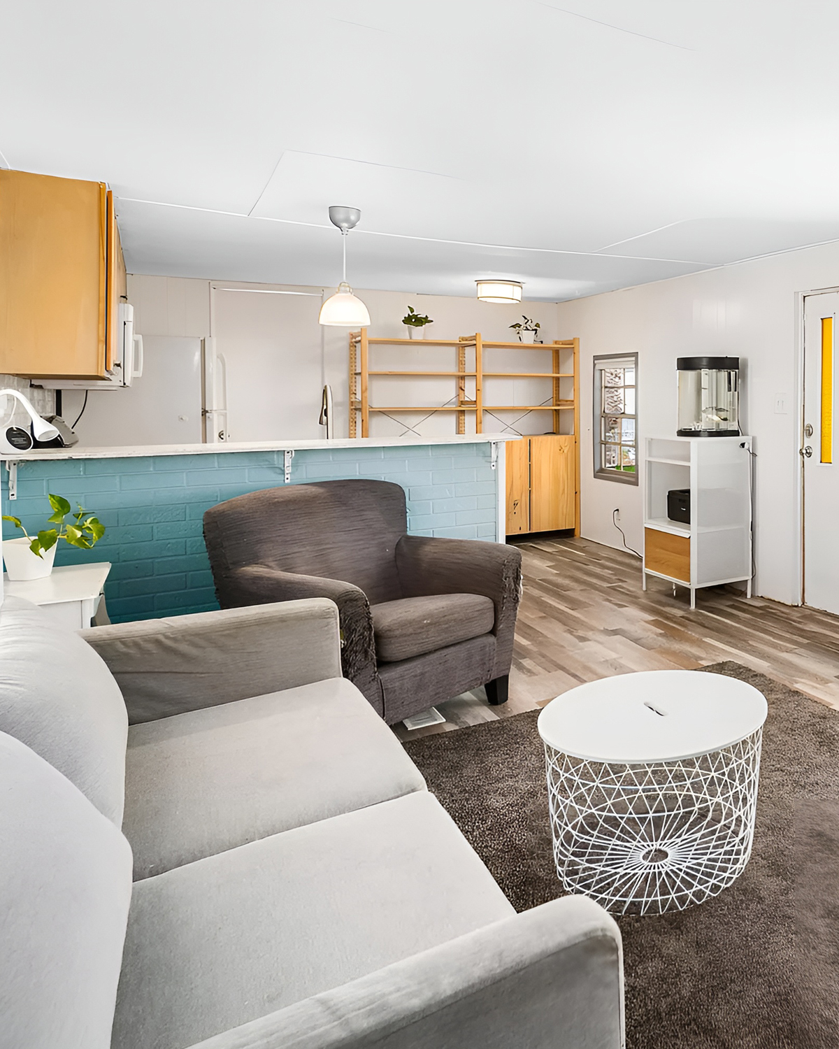
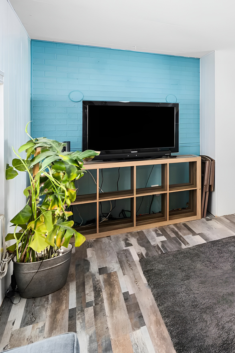
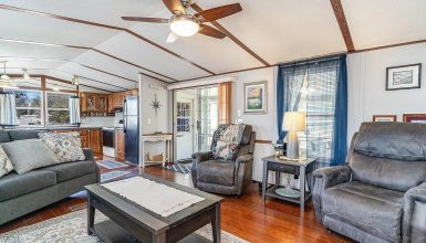
This 1973 mobile home’s living room is an excellent mix of old-school cool and new-school style. It’s got plenty of space and light, and one wall is painted a chill light blue. That splash of color really stands out against the rest of the room’s calm colors.
On another wall, there’s a white beadboard, which gives the place a classic ’70s look and a bit of texture. The floors have a laminate that looks like old wood but can handle much foot traffic and still look good.
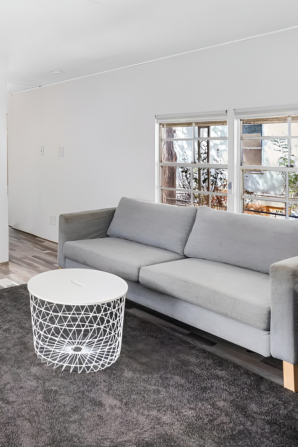
The furniture? This comfy gray sofa looks sharp and feels great to sit on. There’s also a matching chair, so there’s plenty of room for everyone. The gray color ties everything together.
Right in the middle, there’s a round coffee table with an excellent geometric design. It’s both functional and a neat piece to look at. The rug underneath is a darker gray, adding some depth to the room.
The windows let in lots of light but have simple curtains that give you privacy. And there’s a big green plant in the room, making it feel fresh and alive.
There’s a neat setup for watching TV with a flat-screen on a wooden stand with a ’60s vibe. This room shows you can have the best parts of the past and still be up to date.
Kitchen
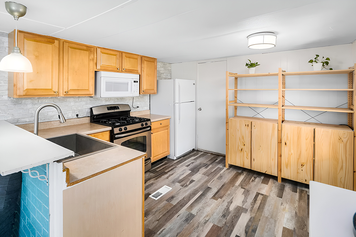
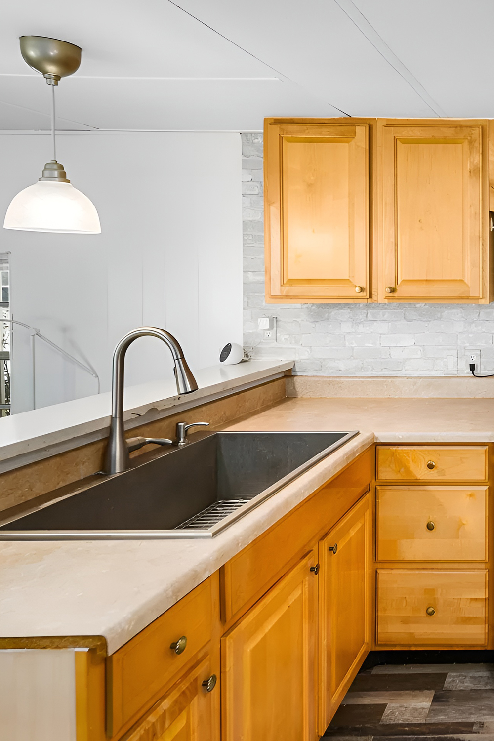
This 1973 mobile home kitchen is a neat mix of old and new. Right away, you’ll notice the wooden cabinets. They have a cozy, vintage vibe that takes you back in time. And the simple handles? They keep things looking classic.
The countertops are laminate. They’re easy to take care of and don’t cost a lot, which is perfect for a mobile home. There’s also a shiny new faucet at the sink that adds a modern touch.
You’ve got all the kitchen must-haves, like a white fridge and a gas stove. And there’s a microwave above, saving you some precious counter space. Smart thinking for a small kitchen, right?
The backsplash has these cool tiles that look like stone. They add a bit of a modern country feel and are a breeze to clean. Plus, they make the kitchen look more attractive.
The floors match what you’ve got in the living room, making the whole place feel tied together. This flooring can handle a lot of action, perfect for a busy kitchen.
For lighting, there’s a stylish pendant light above the sink. It makes doing dishes a bit nicer. Another light in the ceiling brightens up the whole room. There’s also this wooden rack for your dishes and glasses. It’s handy and looks good, too.
Overall, this kitchen blends the original charm of the mobile home with some cool updates. It’s all about making things work better while keeping that cozy feel.
Bedroom
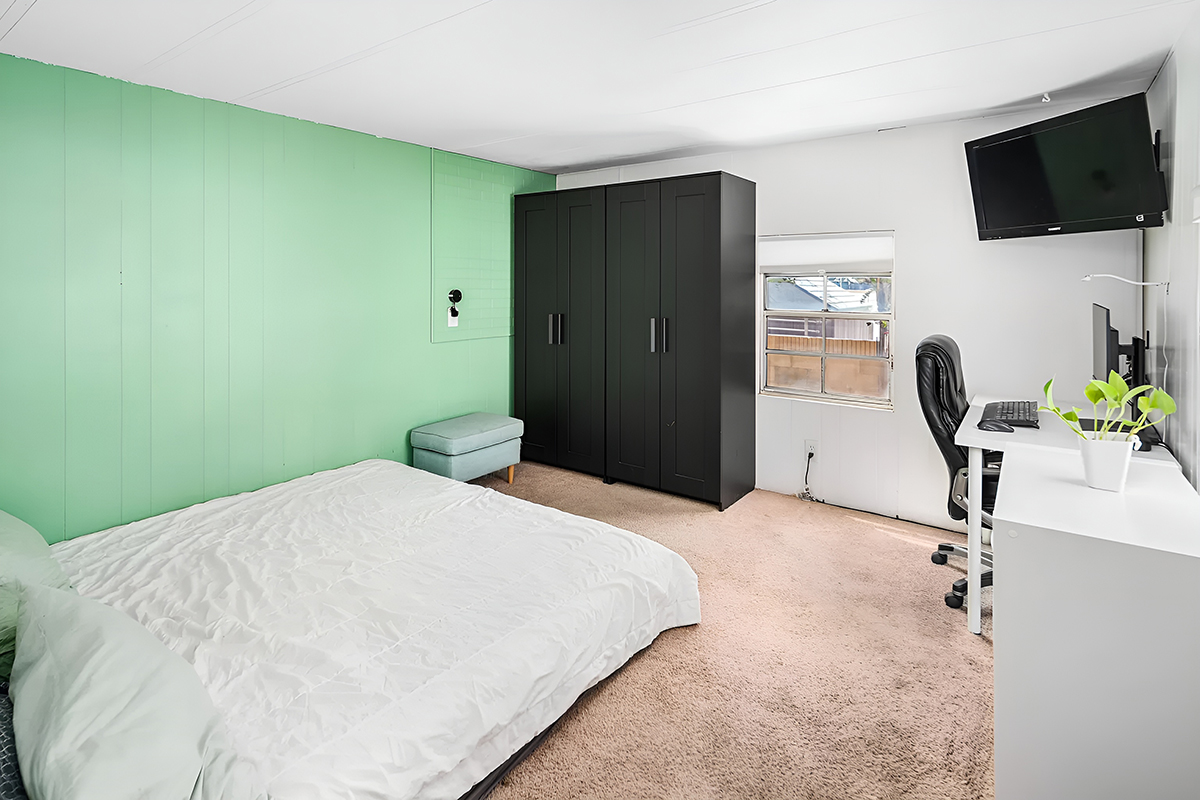
In this 1973 mobile home bedroom, old meets new in a cool way. There’s one wall painted a lively mint green. It’s bright and gives the room a fun, retro vibe. The rest of the walls are white, making the room feel brighter and bigger, a clever move in a cozy space like this.
The floor has a light beige carpet. It’s soft under your feet and adds warmth, making the green wall stand out even more. In the ’70s, carpet like this was all the rage for its coziness.
There’s a big, modern black wardrobe that holds a ton of stuff. Its sharp look is a nice contrast to the green wall. This kind of storage is super useful, especially when closet space is tight.
The bed is low, which makes the ceiling seem higher and the room look bigger. There’s also an ottoman at the end of the bed. It’s handy for sitting or laying out tomorrow’s outfit.
Off to the side, there’s a spot for getting work done or doing some online shopping. It’s got a white desk and a black chair. A green plant sits on the desk, adding a bit of nature to the room.
Up on the wall, there’s a flat-screen TV. It keeps the room from cluttering and lets you watch your favorite shows from bed. The window lets in plenty of light and has a simple white blind for privacy.
All in all, this bedroom does a great job mixing cozy old vibes with neat new touches. It’s set up well for sleeping, storing stuff, and even getting some work done without feeling cramped.
Bathroom
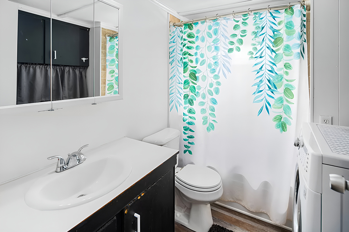
This 1973 mobile home bathroom is smart. It’s got a big mirror over the vanity that runs along one whole wall. This trick makes the bathroom look way bigger than it is. The vanity itself is sleek, with a black bottom and a white top. It’s a sharp look that feels both classic and modern at the same time.
The faucet’s shiny chrome looks super clean and bounces light around. A simple black curtain over the window by the toilet keeps things private but still matches the vanity’s vibe.
The shower’s got a curtain with green leaves all over it. It brings a fun pop of color and a bit of nature inside. Plus, you can switch it out anytime you want a new look without spending a lot.
There’s even a washing machine in there. Mixing laundry and bathroom space to save room is a clever move. That’s handy in a mobile home.
The floors match the rest of the place, so everything flows together. The material is excellent for bathrooms since it can handle water and is easy to keep clean.
Image credit: Zillow

