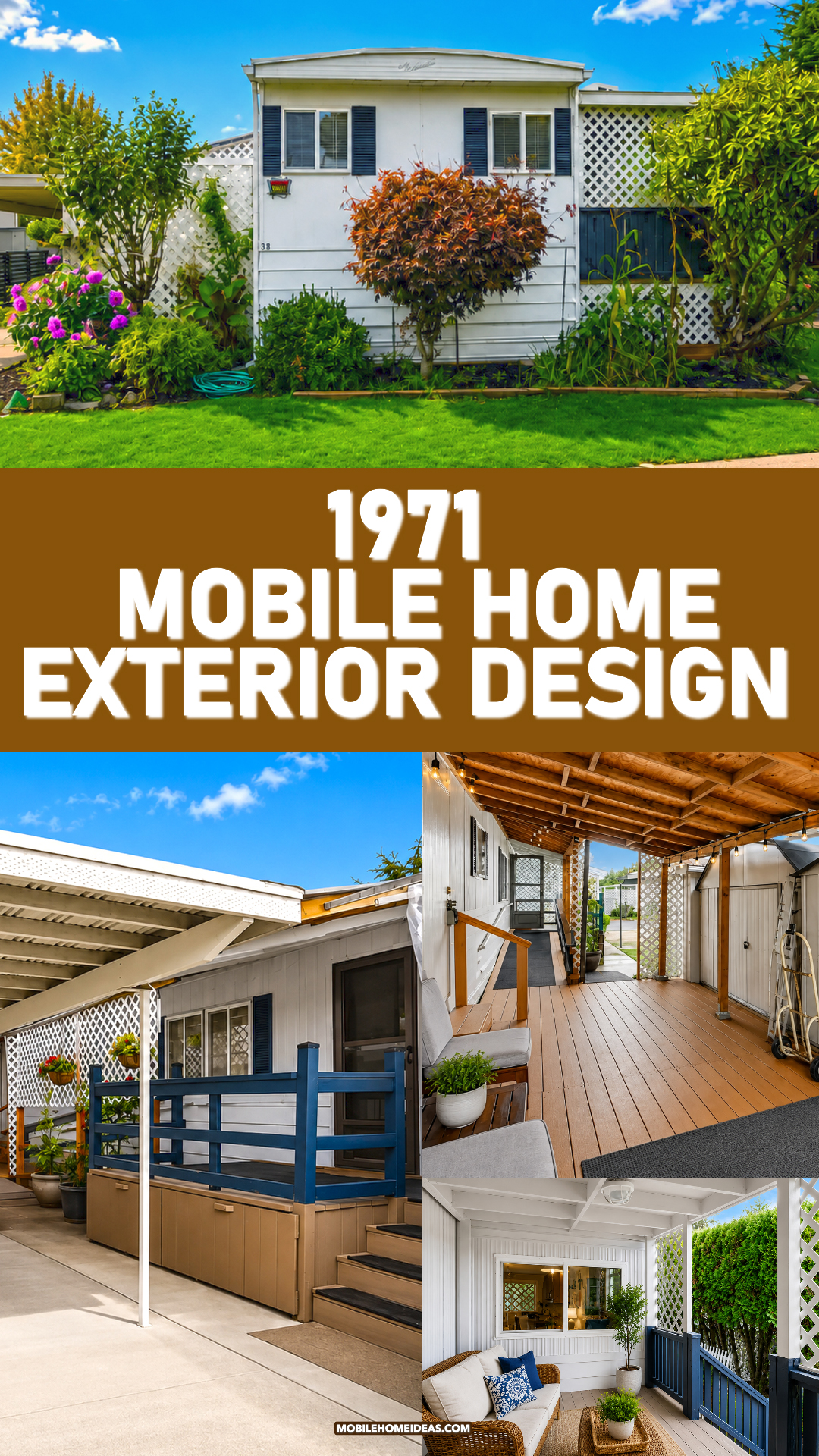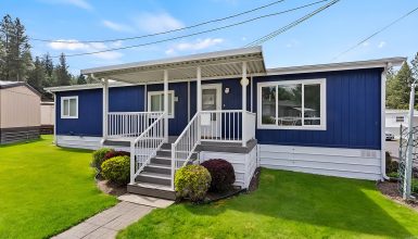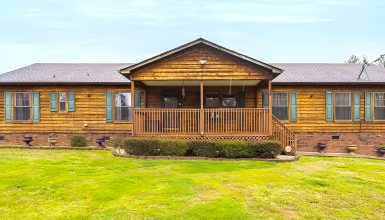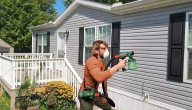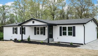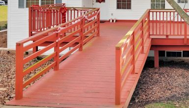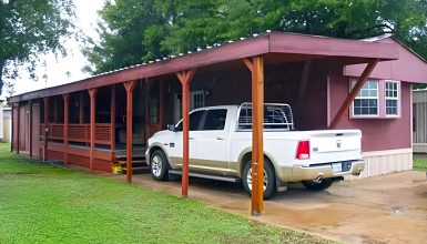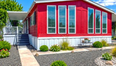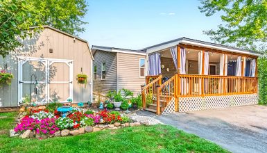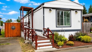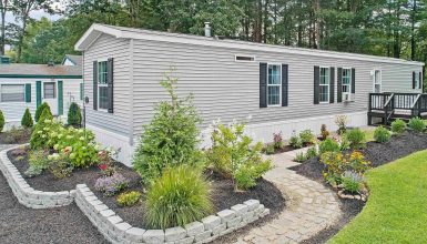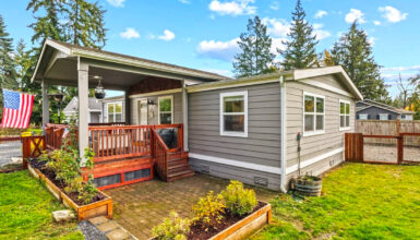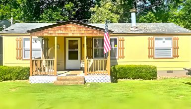
What can make a 1971 mobile home feel fresh more than 50 years later? This charming exterior shows how simple updates can make a big difference. Crisp white siding, dark shutters, cozy porches, lush gardens, and warm wood details give the home a bright and welcoming look. Better yet, each outdoor space adds both beauty and function.
1. The Classic Low-Slung Mobile Home Shape
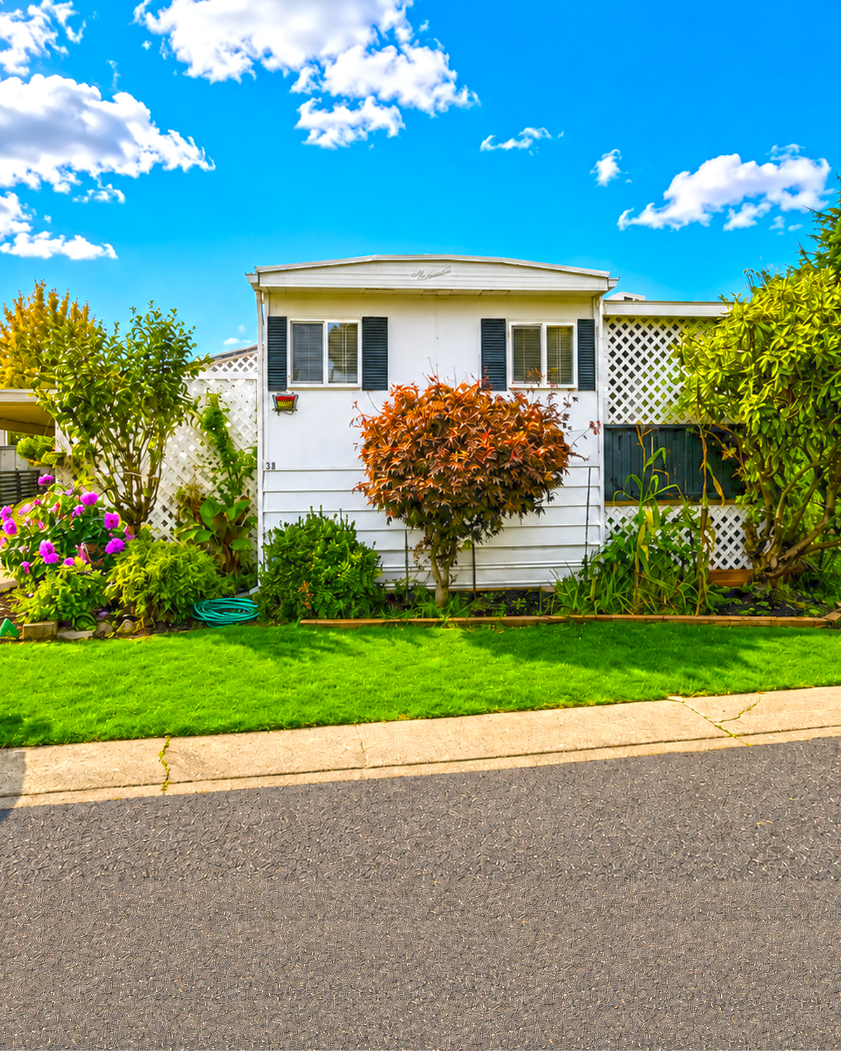
The first thing you notice is the long and low profile.
That shape is one of the clearest clues to the home’s mobile-home roots. The main structure stretches across the lot rather than rising upward. The roof also stays close to the walls.
This simple form gives the home a relaxed look.
Instead of changing the basic structure, the exterior design uses trim, plants, porches, and outdoor additions to create more depth. That approach makes sense for an older mobile home. Large structural changes can become costly. Smaller visual changes often give far more impact for the money.
The front also has a slightly raised center roofline. It breaks up the long horizontal shape. As a result, the home does not look like one flat box.
Even small roof details like this can make an older mobile home feel more like a cottage.
Design cues
- Long, low exterior profile
- Simple rectangular main structure
- Shallow roof pitch
- Slightly raised front roof section
- Strong horizontal lines
- Compact proportions
- Additions that extend the living space outdoors
2. Crisp White Siding Keeps the Home Fresh
White is doing a lot of work here.
The pale exterior keeps the home from feeling heavy. It also reflects light, which helps a smaller structure feel larger.
The siding appears in more than one pattern. Some areas use vertical lines, while lower sections create a more horizontal effect. That mix gives the walls subtle texture.
This is important on a simple home.
When a building has few architectural details, texture helps stop the exterior from looking flat.
White also works well with the garden. Green leaves, pink flowers, dark shrubs, and autumn foliage all stand out against the clean background.
That connection between house and landscape is one of the strongest parts of this design.
The white exterior also links the original home with the later outdoor structures. Carport posts, lattice panels, porch ceilings, and trim all repeat the same light tone.
The result feels planned rather than pieced together.
Design cues
- Bright white exterior
- Light-colored trim
- Vertical siding texture
- Horizontal lower siding
- Matching white additions
- Consistent color across old and new features
- High contrast with green landscaping
3. Black Shutters Add Just Enough Contrast
A completely white mobile home can feel plain.
Here, narrow dark shutters solve that problem.
The shutters frame several windows and create clear points of contrast across the facade. Their dark tone also draws your eye toward the windows.
That small detail makes the front feel more finished.
The shutters do not overwhelm the house. Their slim size works with the scale of the windows. They also repeat the dark tones found in the mailbox, porch details, and outdoor equipment.
This is an easy lesson to borrow.
You do not need to cover an older mobile home in bold color. A few dark accents can create definition while keeping the main exterior calm.
The white-and-dark combination also feels timeless. It can work with cottage, farmhouse, coastal, or traditional decor.
Design cues
- Slim dark shutters
- White-and-black color contrast
- Dark accents used in small amounts
- Simple window trim
- Repeated dark details across the exterior
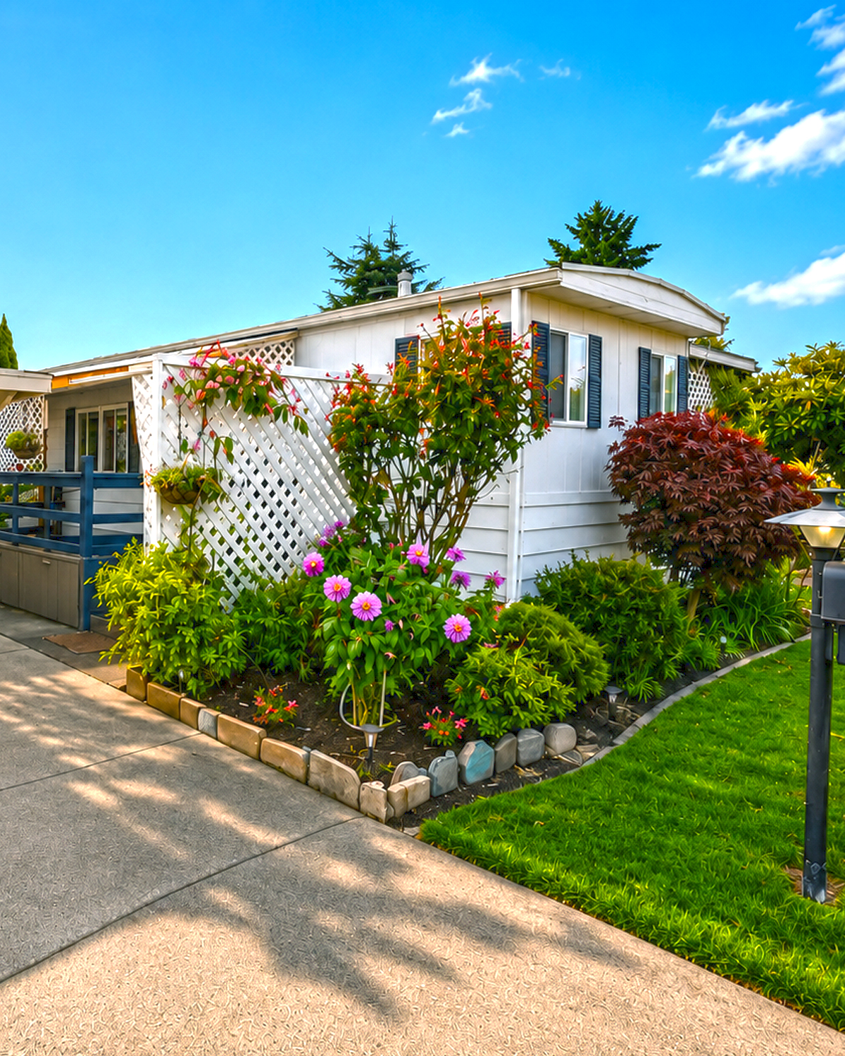
4. Landscaping Softens the Straight Exterior Walls
The garden may be the star of this exterior.
Older mobile homes often have long, flat walls. Without landscaping, those walls can look even longer.
Here, plants break up those straight lines.
Small trees stand near the front windows. Rounded shrubs sit closer to the foundation. Flowering plants fill the lower areas. Taller plants rise in several spots.
That range of height creates layers.
The landscaping also helps the home feel settled into its site. Instead of looking like a structure placed on top of a lot, the house feels connected to the ground around it.
A deep red Japanese maple-style shrub near the front adds strong color. Nearby pink flowers bring softer tones. Dark green shrubs then fill the gaps.
The effect feels full but not formal.
This type of landscape works especially well with an older mobile home because it adds detail without changing the building.
Design cues
- Layered planting beds
- Low foundation plants
- Medium-height flowering shrubs
- Small ornamental trees
- Deep red foliage
- Pink and purple flowers
- Dense green borders
- Curved or softly edged garden beds
- Plants placed close to the home
5. A Neat Lawn Gives the Small Lot Structure
The lawn adds another useful design element.
It creates a clean green frame around the house.
Because the garden beds are lush, a simple lawn keeps the yard from feeling too busy. It gives the eye a place to rest.
The grass also separates the planting beds from the road and neighboring homes. That creates a stronger sense of private space, even on a compact mobile home lot.
The lawn stays narrow in places. Still, it makes an impact.
That is a good reminder for smaller properties. You do not need a huge yard to use grass well. A tidy strip can be enough to soften pavement and bring color to the front of the home.
Design cues
- Trimmed green lawn
- Clear lawn edges
- Narrow grass strips
- Garden beds along the foundation
- Strong contrast between lawn and white siding
6. The Carport Adds Practical Covered Space
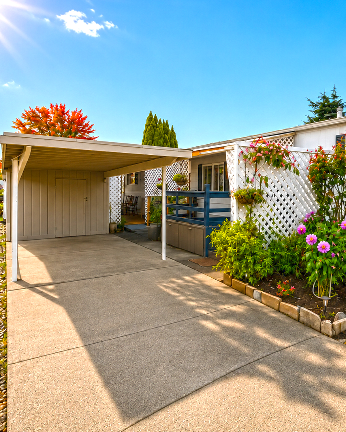
The side carport is simple, but it plays a major role in the exterior.
Its roof extends the home outward. That gives the structure more width and presence.
It also creates useful sheltered parking.
The carport has slim posts and a light-colored roof structure. Because the frame stays visually light, it does not make the small lot feel crowded.
The open sides also allow plenty of daylight through.
A storage area appears at the far end. This is another smart feature. Mobile homes often have limited indoor storage. An exterior storage room can take pressure off closets and living areas.
The clean concrete drive also keeps this side of the home easy to maintain.
Rather than trying to make the carport look like a formal garage, the design embraces its simple purpose.
That honesty works.
Design cues
- Attached side carport
- Simple flat or shallow roof
- Slim support posts
- Concrete parking pad
- Covered path to the entrance
- Integrated exterior storage
- Open-sided design
7. The Raised Entry Makes the Door Feel Important
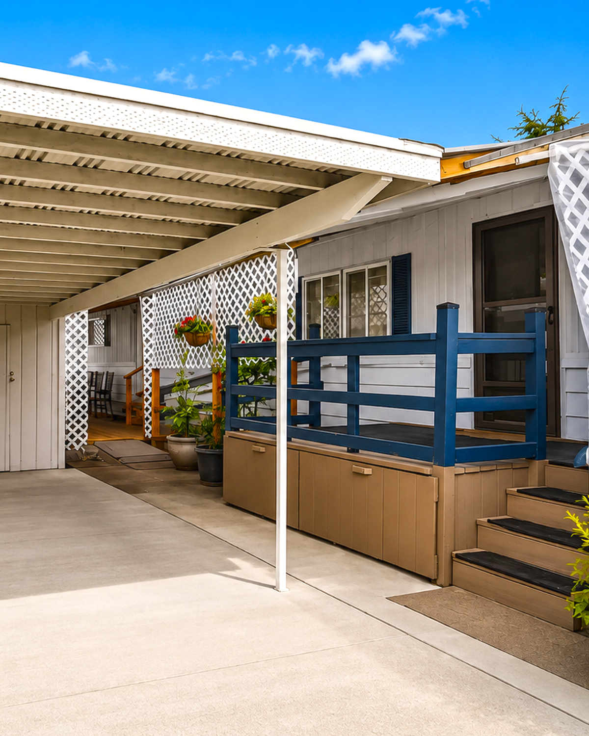
Mobile home entrances can sometimes feel like an afterthought.
This one does not.
The door sits on a small raised landing with a dark blue railing. Steps lead up from the carport area.
That change in height gives the entrance its own identity.
The blue door also creates a strong focal point against the white siding. It feels friendly without being loud.
Meanwhile, the railing makes the landing look more like a small porch than a basic set of steps.
Storage has even been worked beneath the raised platform. That turns unused space into something practical.
This is a strong example of designing around the limits of a small home.
Nothing needs to be oversized.
A clear door color, a sturdy railing, and a defined landing can be enough.
Design cues
- Raised side entrance
- Small landing
- Short staircase
- Dark blue front door
- Matching navy railing
- Storage beneath the platform
- Covered entry location
8. Navy Blue Gives the Exterior Personality
The dark blue accents deserve special attention.
They appear on railings, posts, and the door. That repeated color helps connect the home’s different outdoor areas.
Blue also works well with white.
It brings a coastal feel without turning the house into a themed space. At the same time, it feels softer than pure black.
This makes it a good choice for a garden-heavy exterior.
The color also works well beside tan decking and warm wood.
That creates a balanced palette:
white for freshness, blue for depth, tan for warmth, and green for life.
It is a simple color plan. Yet it feels layered.
Design cues
- Navy or deep blue railings
- Matching blue entry door
- White main exterior
- Warm tan flooring
- Natural wood accents
- Green plants as a major color element
9. White Lattice Brings Cottage Character
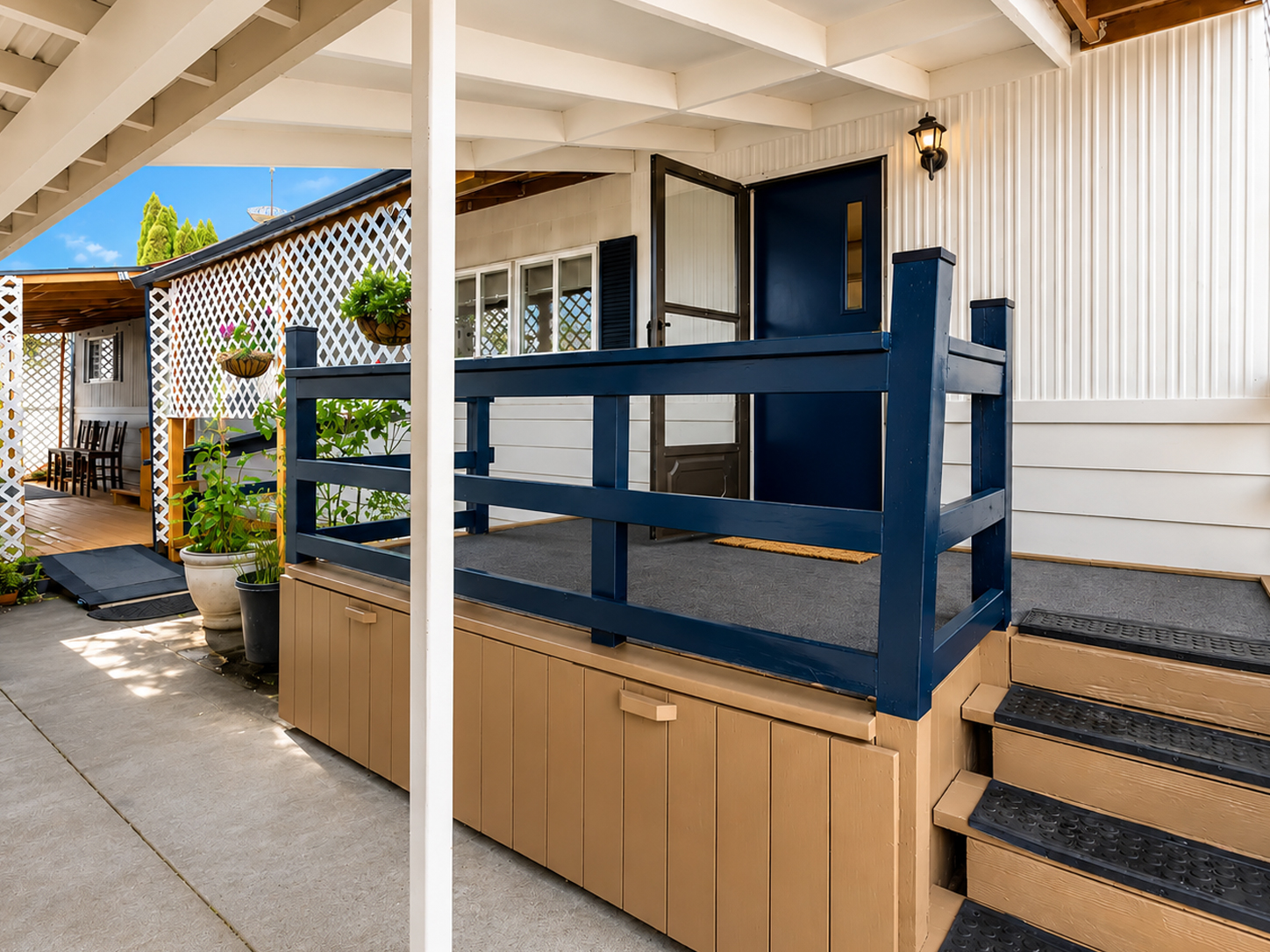
White lattice appears in several outdoor areas.
It may seem like a small detail, but it changes the character of the home.
Lattice makes a basic porch or carport feel softer. It adds pattern without blocking all the light.
It also offers a bit of privacy.
Around the front porch, lattice panels create a semi-enclosed room. You can still see the landscape through them, but the sitting area feels separate from the street.
Along the side, lattice divides different outdoor zones.
This is especially useful on a narrow lot.
Rather than building solid walls, the design uses an open pattern. Air and sunlight can still move through the space.
Plants can also grow near the lattice, which helps the structure blend into the garden.
Design cues
- White diamond-pattern lattice
- Semi-private porch walls
- Open-air screening
- Light-filtering panels
- Repeated lattice around several additions
- Cottage-style outdoor detail
10. The Covered Porch Works Like an Outdoor Room
One of the best features is the covered sitting porch.
It is not huge. Still, it feels like a real room.
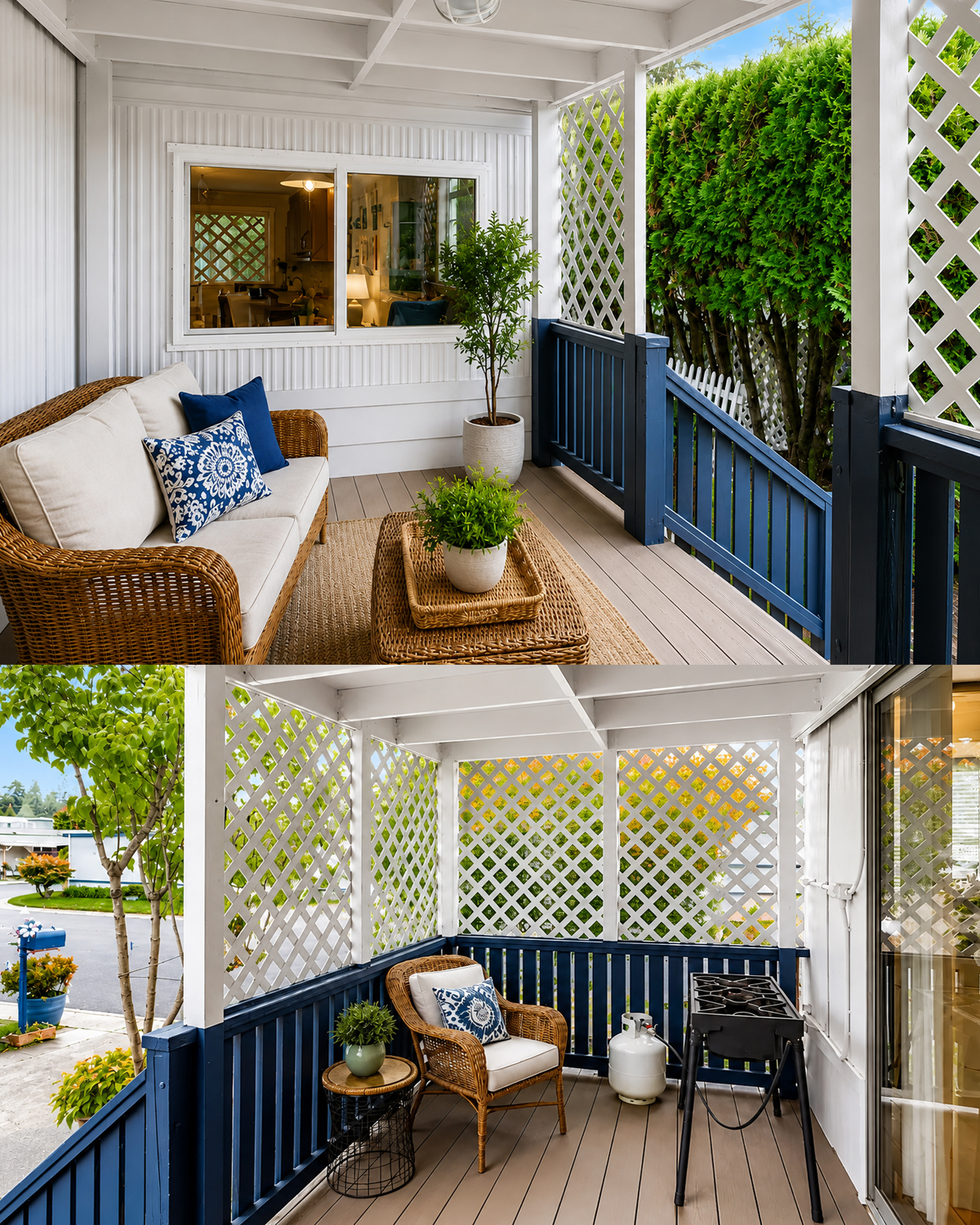
The porch has a roof, railings, furniture, a rug, and a table. Those pieces create a clear purpose.
A wicker sofa with pale cushions makes the area comfortable. Blue pillows tie the seating back to the railings. A woven coffee table adds texture.
A potted tree gives the porch life.
Together, these pieces make the space feel more like a small living room than a passageway.
This is a smart way to expand a mobile home.
You may not need a costly room addition. A well-planned covered porch can provide another place to sit, read, visit, or enjoy a meal.
The porch also brings more charm to the exterior because furniture and decor can change with the seasons.
Design cues
- Covered outdoor sitting area
- Wicker furniture
- Light neutral cushions
- Blue accent pillows
- Natural fiber rug
- Woven coffee table
- Potted greenery
- Open views through lattice
11. The Porch Uses Privacy Without Feeling Closed In
Privacy matters when homes sit close together.
This design handles it well.
Lattice screens cover parts of the porch. Tall shrubs also form natural walls around the property.
Together, they reduce direct views from neighboring lots.
Yet the space still feels open.
This balance matters.
A solid wall could make the porch dark. Full fencing could make the lot feel smaller. Instead, lattice and plants screen certain views while letting light pass through.
The result feels private but not boxed in.
That idea can work for many mobile home communities where lots sit close together.
Design cues
- Lattice privacy screens
- Tall evergreen shrubs
- Partial rather than full enclosure
- Open upper sections
- Plants used as living screens
- Furniture placed away from public views
12. A Long Covered Side Deck Adds Major Living Space
Another outdoor area runs along the side of the home.
This one feels more practical.
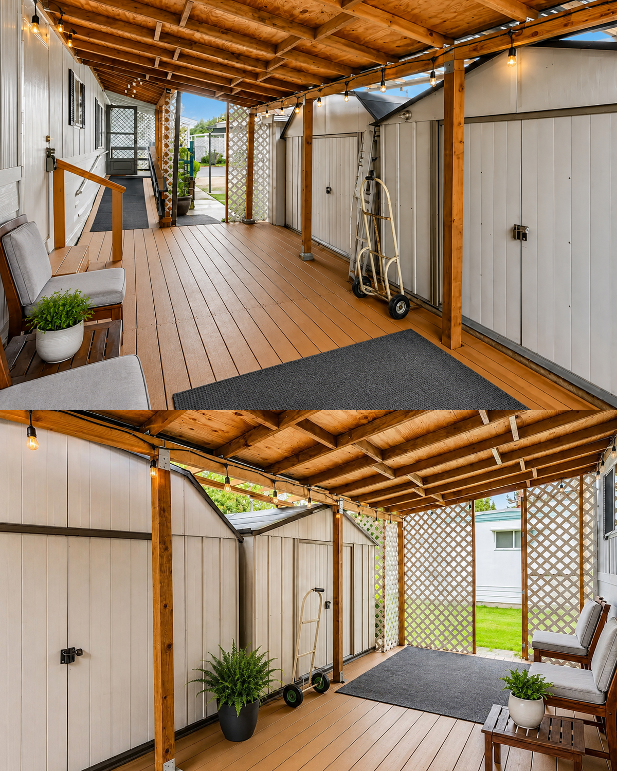
The long covered deck creates a sheltered walkway and storage zone. It also gives the residents another place to sit.
The warm brown deck boards bring welcome color to the mostly white exterior.
Natural wood posts support the roof. Above, exposed plywood and framing remain visible.
Instead of hiding the structure, the porch lets it show.
That creates a relaxed look.
String lights run along the beams. At night, they likely turn this simple passage into a warm outdoor space.
This area shows how valuable a side yard can become.
A narrow strip beside a mobile home may look unimportant at first. Add a roof and flooring, though, and it can become a useful outdoor room.
Design cues
- Long covered side deck
- Warm brown decking
- Natural wood posts
- Exposed roof framing
- Simple outdoor benches
- String lights
- Wide walking path
- Shelter from sun and rain
13. Storage Has Been Built Into the Exterior Plan
Storage often becomes a challenge in a compact home.
This property uses the exterior to solve it.
Large storage sheds line part of the covered side deck. Their pale walls blend with the main home.
That is key.
Instead of making storage look like clutter, the design turns it into part of the architecture.
The covered location also makes the sheds easy to reach in poor weather.
Smaller storage compartments appear beneath the raised entry as well.
These choices allow the outdoor areas to stay tidy.
Garden tools, seasonal items, outdoor cushions, and maintenance gear can all have a home.
Good mobile home design is not only about appearance. It should also make daily life easier.
Design cues
- Built-in exterior storage
- Large side storage units
- Storage below the entrance deck
- Matching light exterior colors
- Covered access
- Storage placed along unused wall space
14. String Lights Add Warmth After Dark
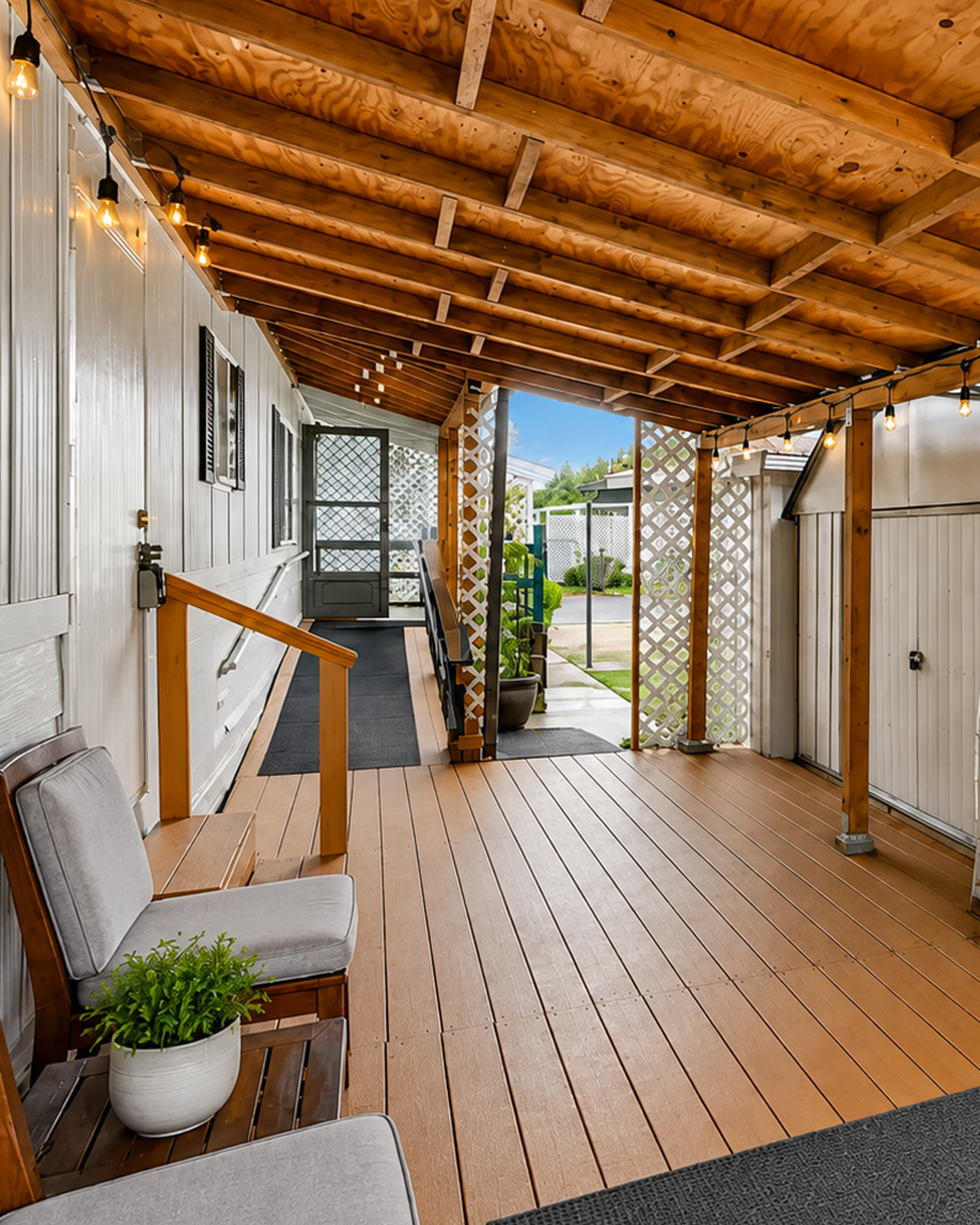
The string lights are a simple touch.
Yet they make the wood-covered deck feel welcoming.
Small bulbs hang along the roof beams. They repeat in a straight line, which suits the long space.
During the day, they almost disappear.
At night, they can create soft pools of light.
That is often better for a porch than one harsh overhead fixture.
String lights also bring a casual mood. They make the area feel like a place where people want to sit rather than just walk through.
For an older mobile home, this type of update can be especially effective. It costs far less than a major remodel but adds real atmosphere.
Design cues
- Warm string lighting
- Exposed bulbs
- Lights attached to wood beams
- Even spacing
- Soft outdoor lighting
- Casual porch atmosphere
15. Warm Wood Keeps the White Exterior From Feeling Cold
White can look clean, but too much of it may feel stark.
The wood tones stop that from happening.
Natural posts, brown deck boards, wicker furniture, and woven decor all bring warmth.
These materials also connect the home to the garden.
The blend of white and wood creates a relaxed cottage feel.
It does not look too modern or too rustic.
Instead, it feels lived in.
That matters with a 1971 mobile home. A highly polished modern exterior could fight against the home’s original shape. Warm materials make the updates feel more natural.
Design cues
- Natural wood framing
- Brown decking
- Wicker seating
- Woven accessories
- Warm tan storage panels
- Soft neutral outdoor fabrics
16. The Backyard Feels Like a Small Garden Retreat
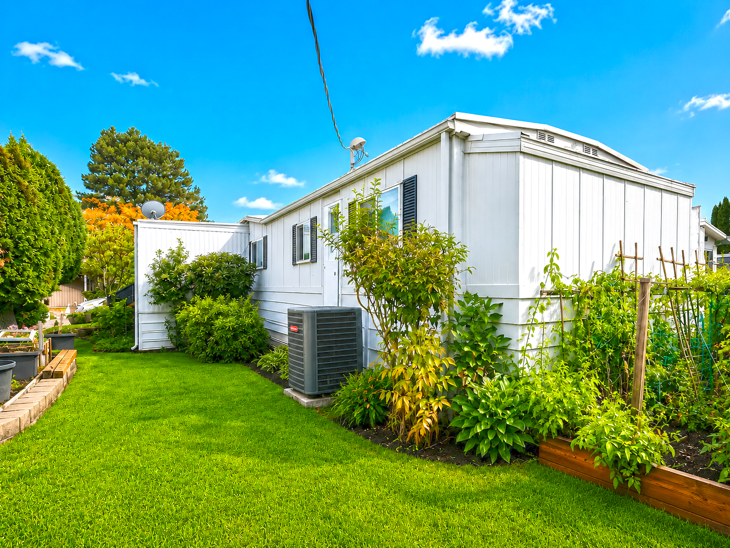
The rear and side yard continue the same garden theme.
A smooth green lawn creates a path beside the home. Planting beds hug the walls.
There is even space for edible plants supported by simple wood stakes.
That gives the property a practical garden feel.
The plants also hide some of the home’s mechanical features.
An outdoor HVAC unit remains accessible, but surrounding greenery keeps it from becoming the main visual focus.
This is a smart approach.
Mechanical equipment does not need to disappear. However, good planting can help it blend into the setting.
The garden beds also create a soft edge around the home’s base.
Without them, the long white wall would feel much more exposed.
Design cues
- Narrow backyard lawn
- Foundation planting
- Vegetable or edible garden beds
- Wooden plant supports
- Mixed shrubs and perennials
- Landscaping around mechanical equipment
- Dense garden borders
Conclusion
This 1971 mobile home exterior proves that older homes can still feel stylish and inviting. White siding keeps the look fresh, while navy accents, wood decking, lattice screens, and colorful plants add warmth and character. Most of all, the porches, carport, storage, and gardens make every inch of the property useful. It is a simple design with plenty of charm.