
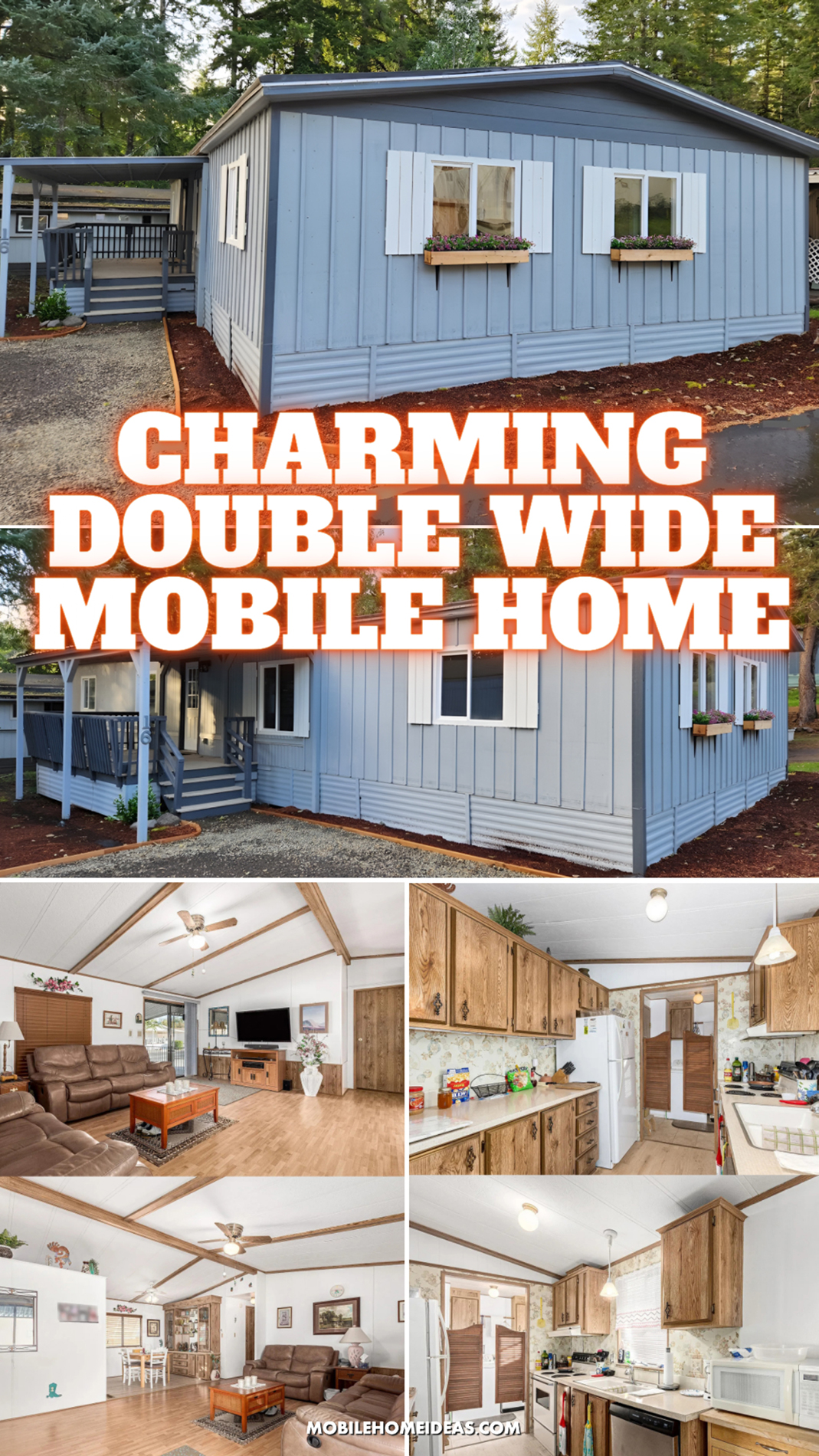
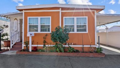
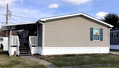
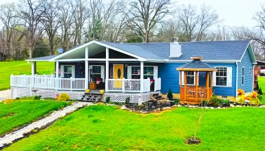
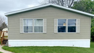
A double wide mobile home can feel far more charming than many people expect. This one proves it. From the fresh gray-blue exterior to the open living area and warm country-style details inside, this home feels inviting from the very first glance. It mixes simple updates with classic character, and that balance gives it a look that feels both cozy and practical. If you love homes that feel easy to live in, this one is full of ideas worth saving.
A Soft Gray Exterior That Feels Fresh and Calm
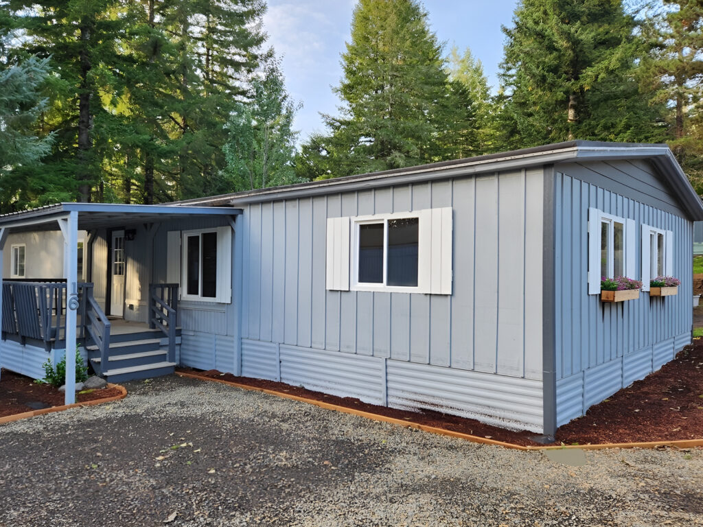
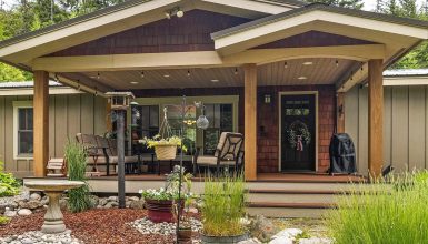
The first thing that stands out on this double wide is the exterior color. The gray-blue siding gives the home a quiet, grounded look. It feels clean and fresh, but it does not feel cold. That balance matters. A lot of mobile home exteriors look best when the color is soft enough to blend into the setting, yet strong enough to define the shape of the home. This shade does both.
The vertical panel look also helps. It gives the exterior more rhythm and makes the walls feel taller. That is especially helpful on a low-profile home like this one. Instead of drawing attention to the home’s length, the vertical lines pull the eye upward. As a result, the structure feels more balanced and a little more tailored.
The trim color plays a big role too. White shutters and white flower boxes brighten the siding and add contrast without making the home feel too busy. Because the palette stays simple, the details feel sweet instead of fussy.
Design cues to notice here:
- Soft gray-blue siding creates a calm, updated feel.
- Vertical lines make the home look taller and more finished.
- White trim adds brightness and clean definition.
- A limited color palette keeps the exterior neat and cohesive.
Shutters and Flower Boxes Add Cottage Charm
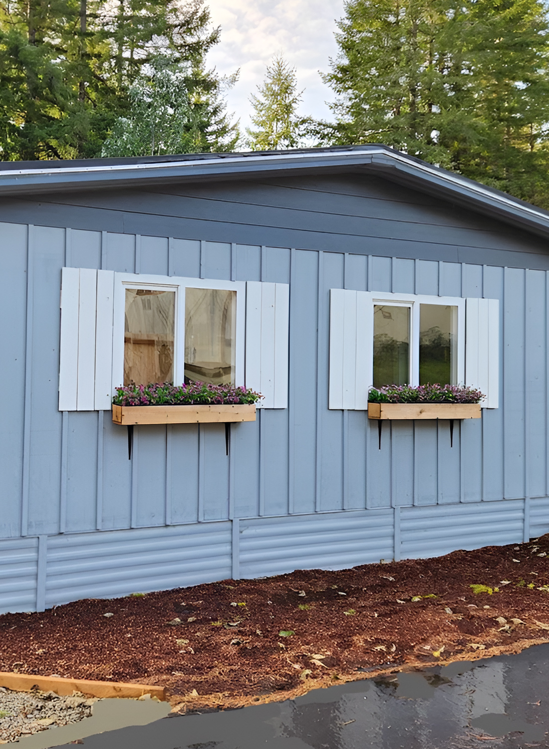
One of the nicest parts of this exterior is how the shutters and flower boxes soften the home’s shape. Mobile homes often have long, flat walls, so little accents like these can make a big difference. Here, they break up the siding and make the windows feel more intentional.
The shutters are simple, which is smart. They do not try to overpower the windows. Instead, they frame them and add that classic cottage cue people tend to love. Then the flower boxes bring in another layer. Even when the planting is simple, boxes under the windows make the home feel cared for and cheerful.
These details also help the double wide connect with its wooded setting. The exterior does not compete with the trees around it. It feels tucked into them. That makes the home feel more welcoming and more personal.
Cues worth borrowing:
- Add shutters to give plain windows more presence.
- Use flower boxes to bring color and softness to the facade.
- Keep trim details simple so the home still feels relaxed.
- Match exterior accents to the setting around the home.
A Covered Porch Makes the Entry Feel Friendly
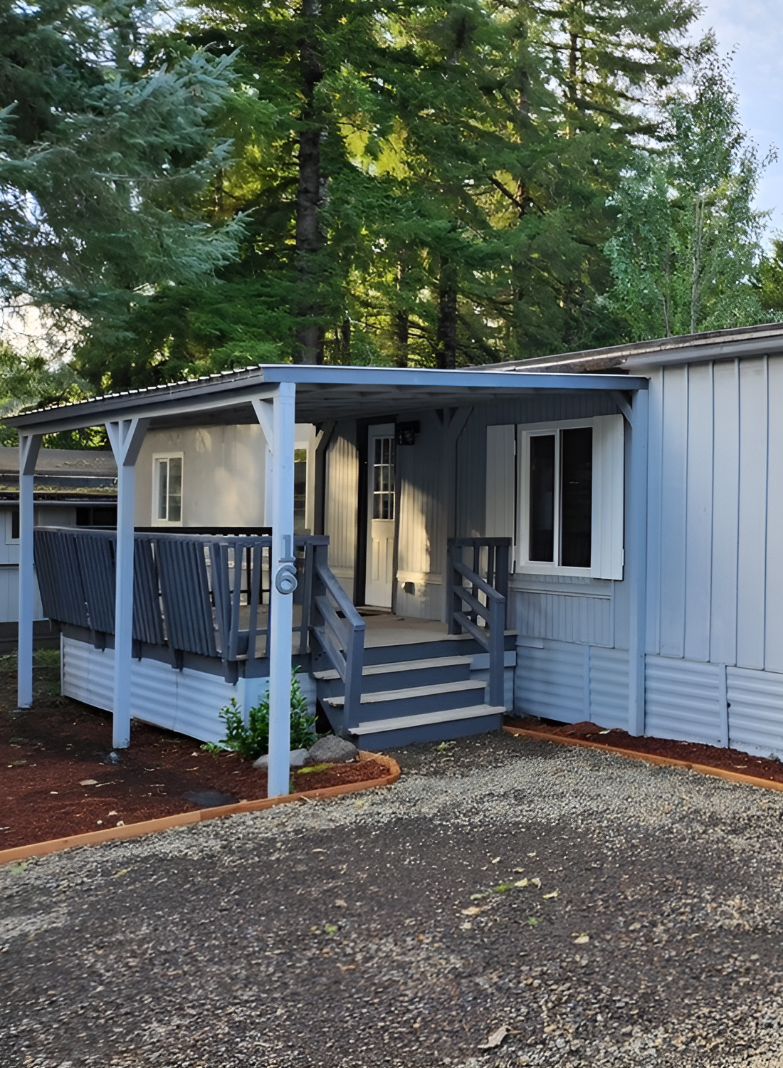
The covered porch is another strong feature. It is modest in size, yet it adds a lot to the front of the home. First, it creates a clear entrance. Second, it gives the exterior depth. And third, it makes the home feel more social and inviting.
That is often the magic of a porch on a mobile home. Even a small one can shift the whole mood. Without it, the front might feel flat. With it, the home gains shape, shelter, and a stronger sense of arrival.
The painted railings and posts also help tie the porch to the rest of the exterior palette. They feel clean and practical, not overly decorative. That keeps the front elevation from feeling cluttered.
Why this works so well:
- The porch creates a clear focal point at the entry.
- Covered space adds depth to a long exterior wall.
- Railings and posts repeat the exterior colors for a pulled-together look.
- The entry feels usable, not just decorative.
Simple Landscaping Keeps the Home Clean and Easy to Maintain
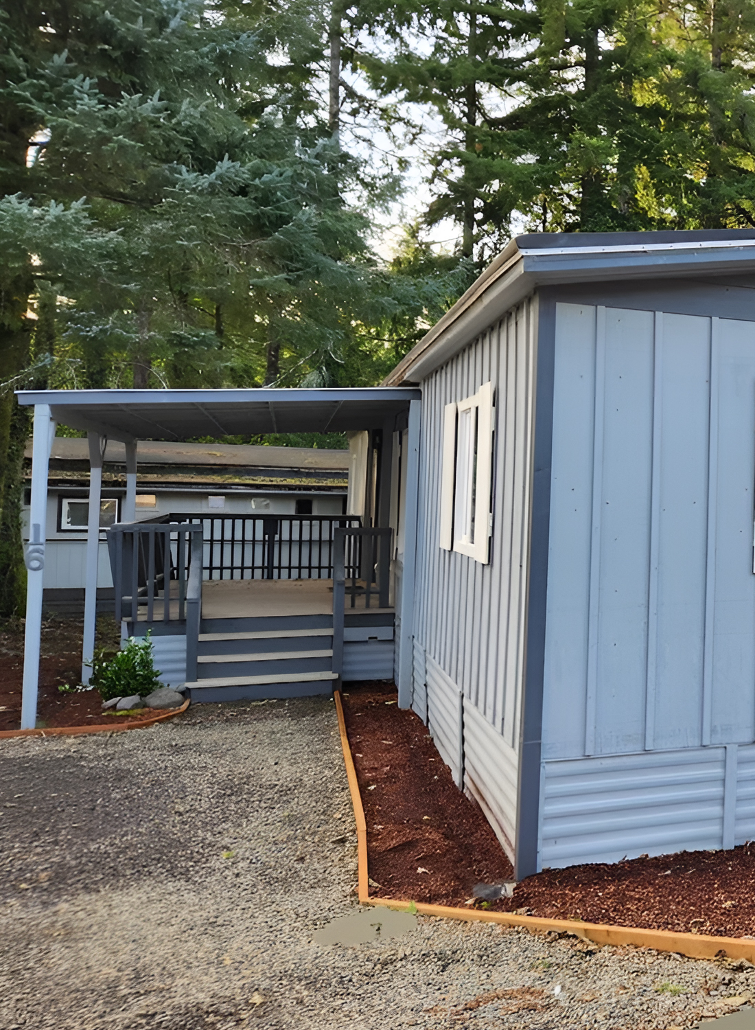
The landscaping around the home is another smart move. It is minimal, but it is neat. Fresh mulch, tidy edging, and gravel around the front all help the exterior look maintained without adding a lot of upkeep. That fits the style of the home well.
Not every mobile home needs elaborate landscaping to look good. In fact, simple landscaping often works better. It gives the house a clean frame and keeps the attention on the structure itself. Here, the edging lines sharpen the perimeter, while the mulch warms up the base of the house.
Because the home sits in a wooded area, the simpler landscaping also feels appropriate. It lets the trees stay the star.
Useful design cues:
- Gravel is practical and clean for mobile home entries.
- Mulch adds warmth and contrast against cool siding.
- Crisp edging makes even simple landscaping look polished.
- Let the natural setting do part of the design work.
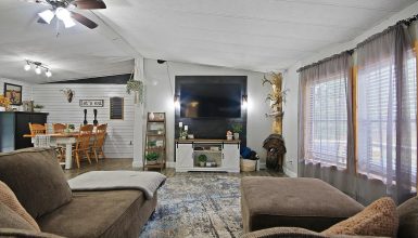
The Kitchen Shows Classic Double Wide Character
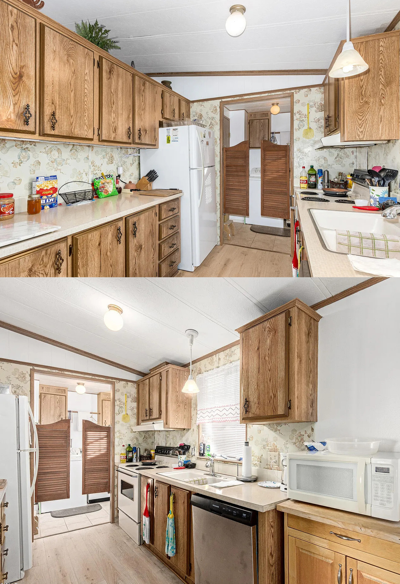
Inside, the kitchen tells a very different story from the exterior. While the outside feels freshly updated, the kitchen keeps a strong classic mobile home look. That is not a bad thing. In fact, it gives the home a lot of personality.
The first major feature is the wood grain cabinetry. There is a lot of it, and that gives the kitchen a warm, established feel. The cabinets run nearly to the ceiling, which adds storage and makes the room feel enclosed in a cozy way. The decorative hardware adds to that traditional look.
This kitchen also uses a galley layout, which is common in many double wides. That shape works well here because it keeps everything close and efficient. There is a long run of counter on one side and the sink and cooking zone on the other. So even though the room is narrow, it functions well.
The light countertops help balance all that wood. Without them, the room might feel too heavy. Instead, the counters brighten the kitchen and make the work surfaces stand out.
Key kitchen cues:
- Full-height upper cabinets maximize storage.
- Wood grain cabinetry creates warmth and classic charm.
- Light counters help offset darker wood tones.
- A galley layout keeps the kitchen efficient.
Wallpaper and Wood Create a Strong Vintage Mix
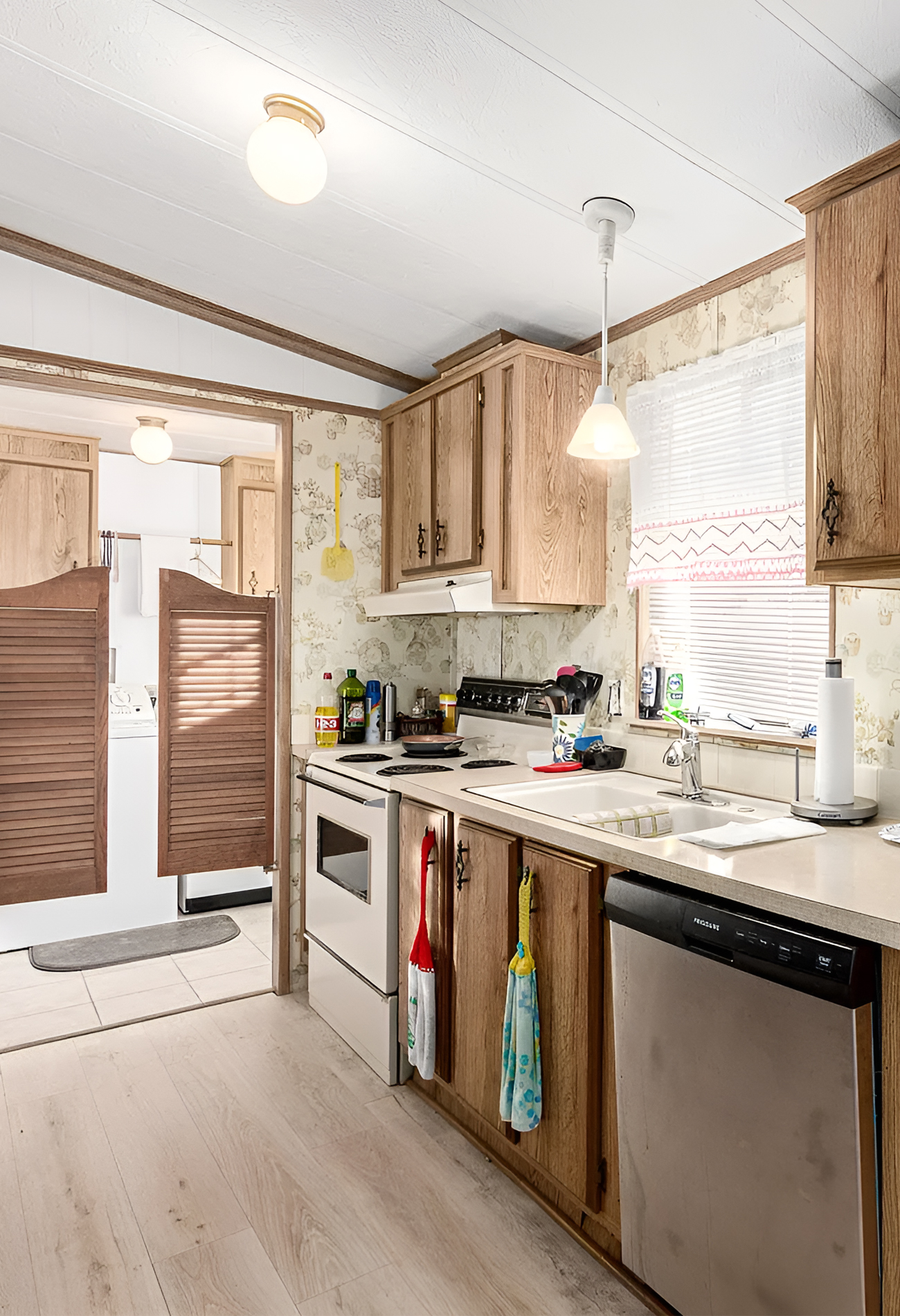
One detail that really defines the kitchen is the wallpaper. It has a soft, vintage pattern that pairs with the oak-toned cabinets in a very traditional way. This combination will not be for everyone, but it absolutely creates a distinct mood. It feels nostalgic, homey, and rooted in an older design era.
What matters most is that the room feels consistent. The cabinetry, trim, wallpaper, and lighting all belong to the same visual story. That sense of consistency gives the kitchen more charm than a random mix of mismatched upgrades would.
For someone looking at this home as inspiration, there are two directions to take from this. You could lean into the vintage look and make it even sweeter with retro accessories and warm metals. Or, you could use this as a base and slowly modernize it by changing the wallpaper, hardware, and lighting while keeping the cabinet layout.
Either way, the kitchen already has a strong identity.
The Dining Area Feels Bright, Practical, and Connected
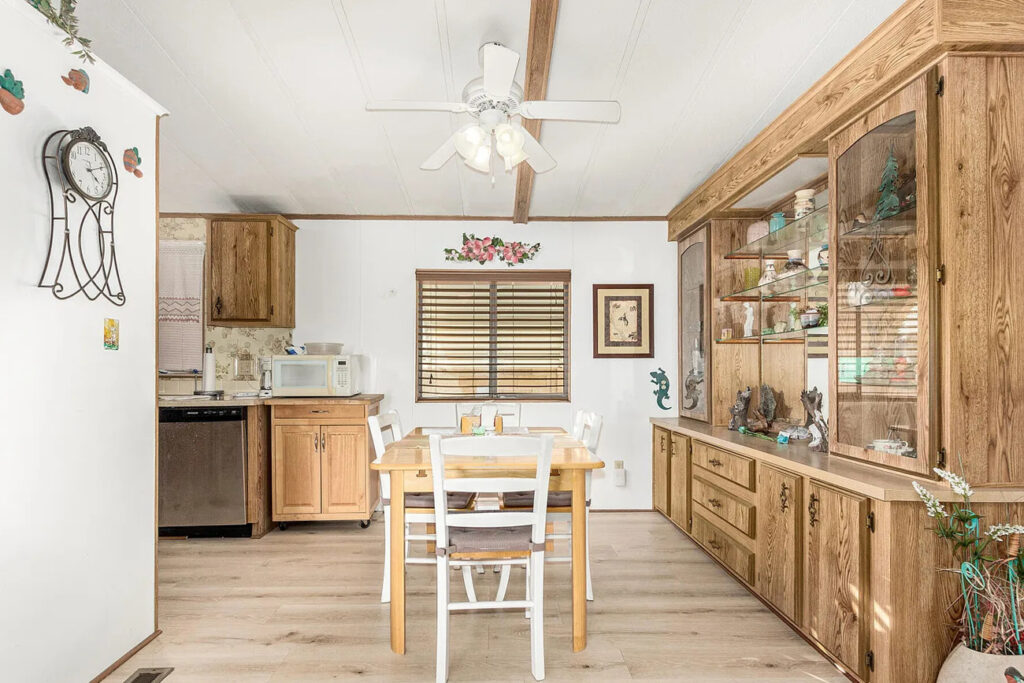
Next to the kitchen, the dining area is simple but very effective. It gets natural light from the window, and it sits in a comfortable spot between the kitchen and living space. That placement matters because it helps the home feel open without making it feel too exposed.
The table size is also right for the room. It allows enough space to move around, which keeps the area feeling airy. In many double wide homes, oversized furniture can make the layout feel crowded fast. Here, the dining set fits the footprint well.
Then there is the built-in display cabinet along the wall. This is one of the most classic double wide details in the house. It adds storage, yes, but it also adds presence. Built-ins like this make a home feel more settled. They anchor the room and create a place for personal items, dishes, or seasonal decor.
Dining area cues to note:
- Natural light makes a small dining space feel open.
- Correct furniture scale keeps the room easy to move through.
- Built-in cabinetry adds function and character.
- A dining area works best when it feels connected to both kitchen and living room.
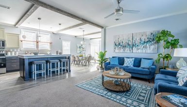
The Open Living Room Feels Bigger Because of the Layout
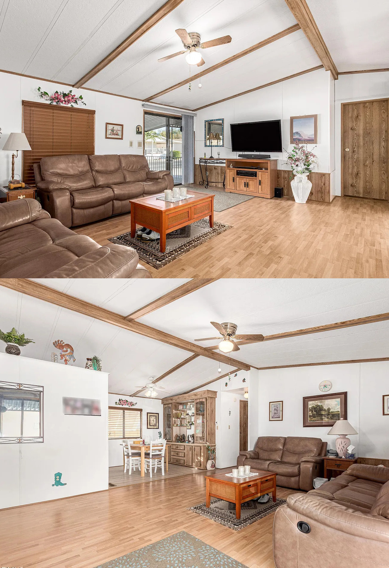
The living room is one of the strongest parts of this home. Right away, it feels spacious. That comes from the open floor area, the simple wall treatment, and the vaulted ceiling line with exposed trim beams. Those beams help define the ceiling and give the room more visual structure.
The furniture layout is easy to understand, and that is a big win. Two reclining sofas face inward toward the coffee table and TV wall. This creates a clear conversation zone while still leaving lots of open walking space around it. The room does not feel packed. Instead, it feels usable.
The sliding glass door helps too. It brings in light and offers a direct link to the outside. That makes the room feel less boxed in. Even the modest rug under the coffee table helps define the seating area without chopping up the floor.
This is a good reminder that a living room does not need lots of layers to work. It needs clear zones, good scale, and enough breathing room.
Why the living room works:
- Open floor space makes the room feel larger.
- Vaulted ceiling lines add height and shape.
- The seating arrangement creates a clear focal point.
- Natural light from the sliding door opens the room up.
Ceiling Beams Give the Main Space More Definition
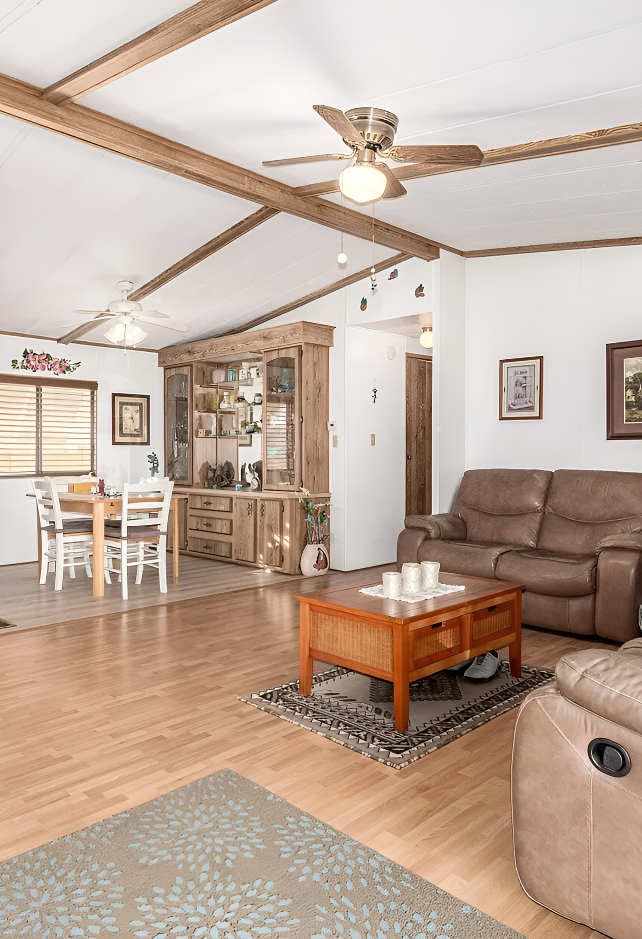
One feature that adds a lot of charm to the shared living and dining area is the wood-look ceiling trim. It creates the effect of beams, which gives the ceiling more movement and interest. In a large open room, that kind of detail helps prevent the ceiling from feeling flat or blank.
These beam lines also echo the wood cabinetry and trim in other parts of the home. That repetition ties the rooms together. Even when the finishes are simple, repeating one or two strong elements helps the house feel whole.
This is especially useful in double wide homes because the open spaces can sometimes feel visually loose. The ceiling trim helps organize the room without using walls.
The Living Area Mixes Warm Tones in a Comfortable Way
Color is another reason the interior feels welcoming. Most of the tones are warm and familiar. You see tan, brown, honey wood, beige, and soft white all working together. These are not dramatic colors, but they make the home feel comfortable.
The brown leather seating plays a big role. It adds depth and makes the living room feel grounded. Then the lighter walls and floors stop the room from feeling too dark. The mix feels balanced.
Artwork, lamps, mirrors, and floral accents add personality without overwhelming the space. There is a lived-in quality here that makes the home feel real and easy to imagine.
The Bedroom Feels Spacious and Calm
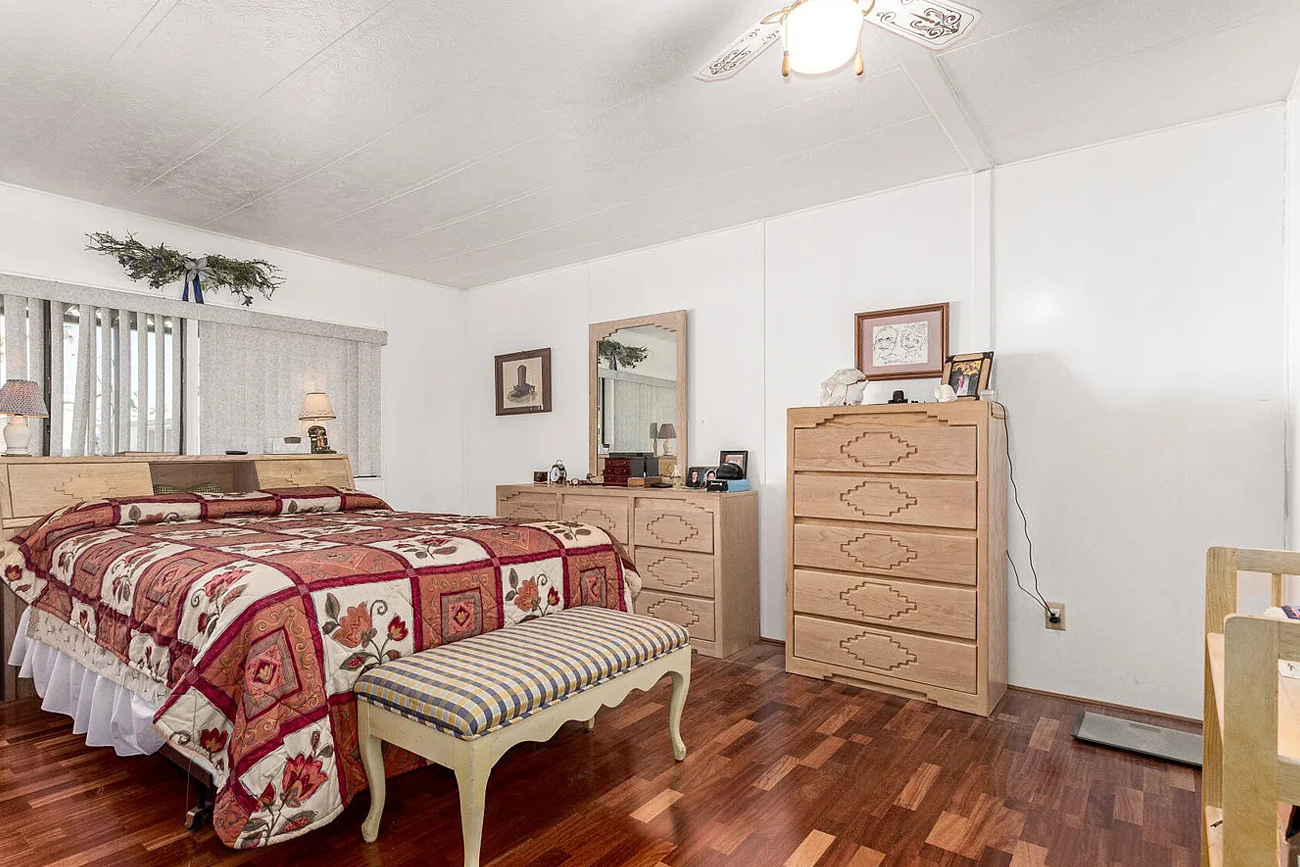
The bedroom is another pleasant surprise. It has a generous footprint, which gives it a calm, uncluttered feel. Large bedrooms are one of the biggest perks of many double wide layouts, and this room shows why. There is space for the bed, nightstands, dresser, chest, and even a bench, yet the room still feels open.
The flooring brings warmth with its rich wood tone. That deeper floor color helps the room feel cozier than the main living areas. Meanwhile, the white walls keep it from becoming too heavy.
The furniture is traditional and light-toned, which gives the room a softer look against the darker floor. The patterned bedding adds a little energy and keeps the room from feeling too plain.
Bedroom cues worth borrowing:
- Keep wall colors light to make large rooms feel restful.
- Use warm wood flooring for a cozy base.
- Choose furniture that fits the room without overcrowding it.
- Add one patterned textile to keep the space from feeling flat.
The Bathroom Is Compact but Functional
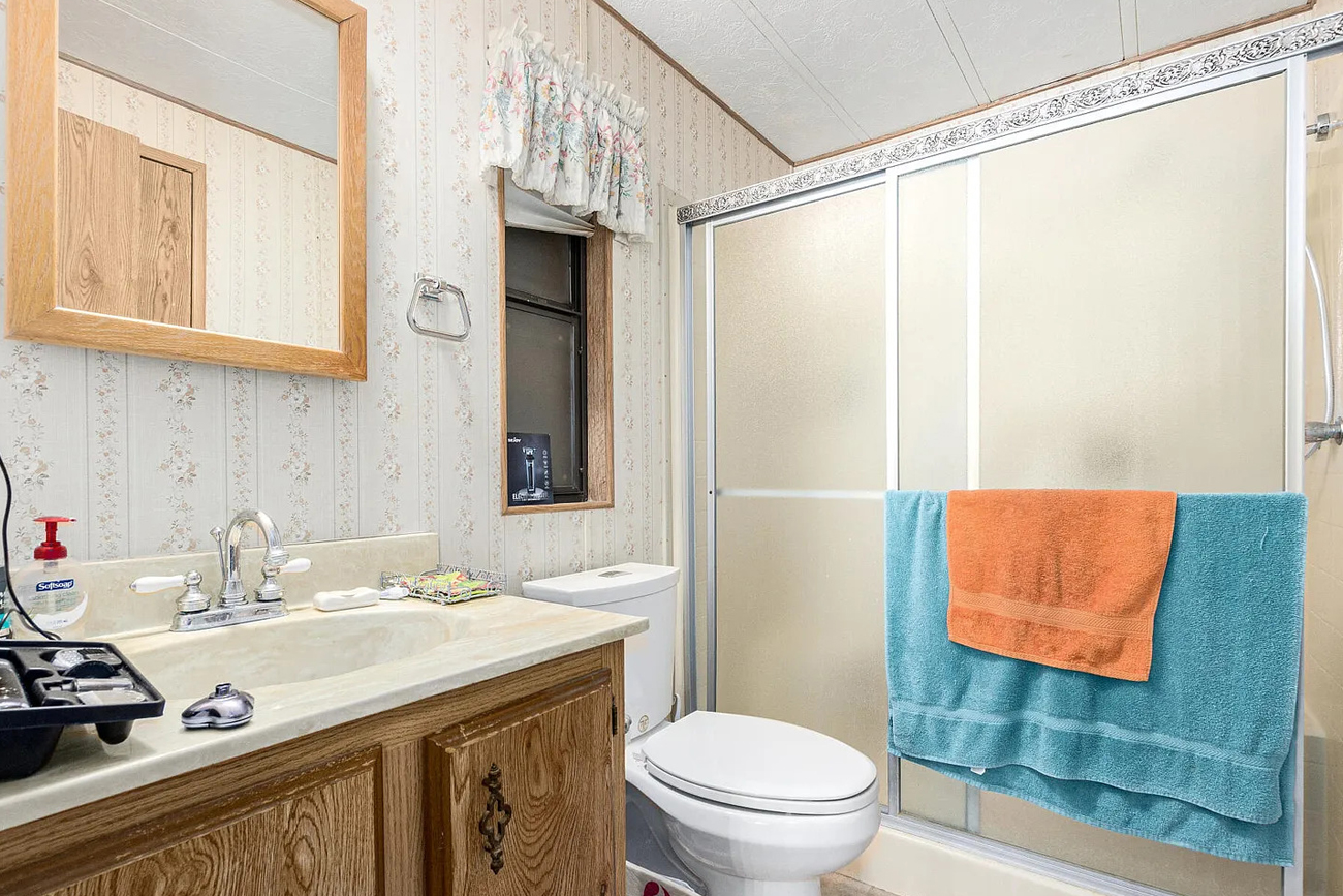
The bathroom follows the same overall design language as the rest of the home. It has wood grain vanity cabinetry, light counters, wallpaper, and practical fixtures. The layout is tight, but it uses the space well.
The sliding shower doors are a smart choice in a smaller bathroom because they do not need swing space. The long vanity gives useful counter room, which is always valuable in a compact bath. The framed mirror and patterned wall treatment add a little extra character, even though the room remains simple.
This bathroom shows that function often leads the design in mobile homes, and that is okay. A room can feel basic and still work well.
Conclusion
This double wide mobile home shows how much beauty can come from thoughtful, simple design. The exterior feels fresh and friendly, while the interior feels open, warm, and comfortable. Every room leans into function, yet there is still plenty of charm in the details. If you are looking for double wide mobile home ideas that feel realistic, welcoming, and full of inspiration, this home offers a smart mix of curb appeal and everyday comfort.