Mobile homes from 1969 have a special charm. They’re like a time capsule of style and simplicity. Picture a home that combines smart design and a touch of the past. These homes are not just places to live. They hold stories and a sense of warmth that newer models often miss. They’re small but clever with space. Every corner shows character and a style that’s both fun and cozy. It’s not just about the vintage look. It’s about feeling at home the moment you step inside.
Exterior
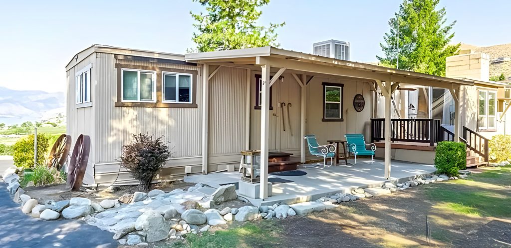
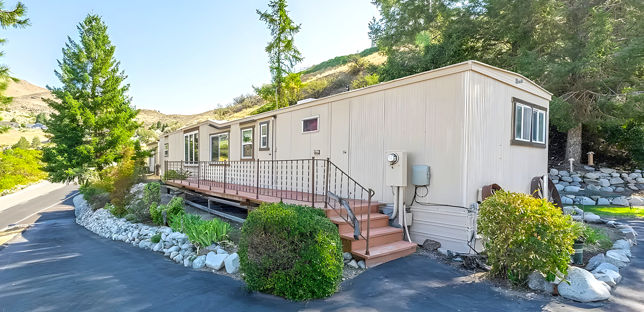
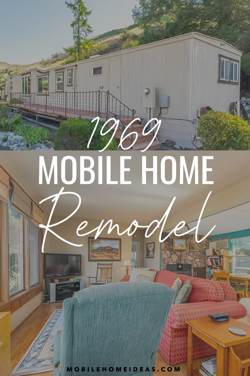
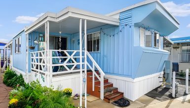
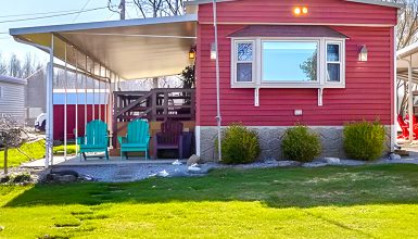
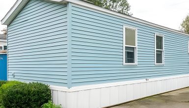
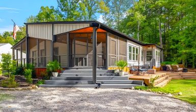
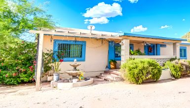
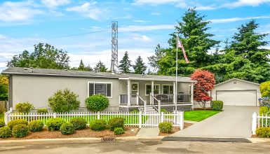
Let’s explore the exterior of this 1969 mobile home. It has a classic style with a long, flat look that was popular back then. The home’s sides are a soft beige color. White trim goes around the windows and roof, giving it a look that never gets old and is easy to take care of.
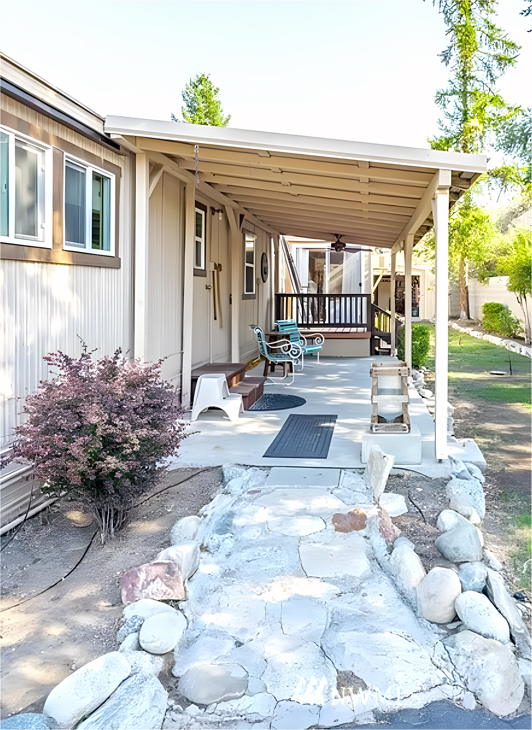
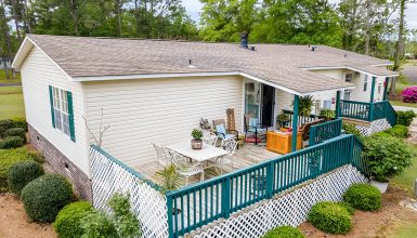
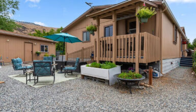
The roof slants down and sticks out a bit. This keeps the home safe and looks great, especially with the covered porch area. You can chill out here on bright teal chairs that stand out against the home’s soft colors. The porch steps fit right in and look just right.
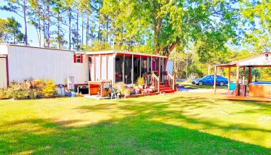
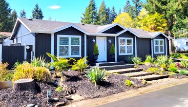
The yard is essential, too. There are stone paths and a garden with rocks that don’t need much water. This is a good choice for saving water. Big rocks add a bit of nature and go well with the home’s simple style.
The bottom of the mobile home has skirting. This looks good because it covers up the bottom part. It also works well to keep out the weather and keep the home warm.
Living Room
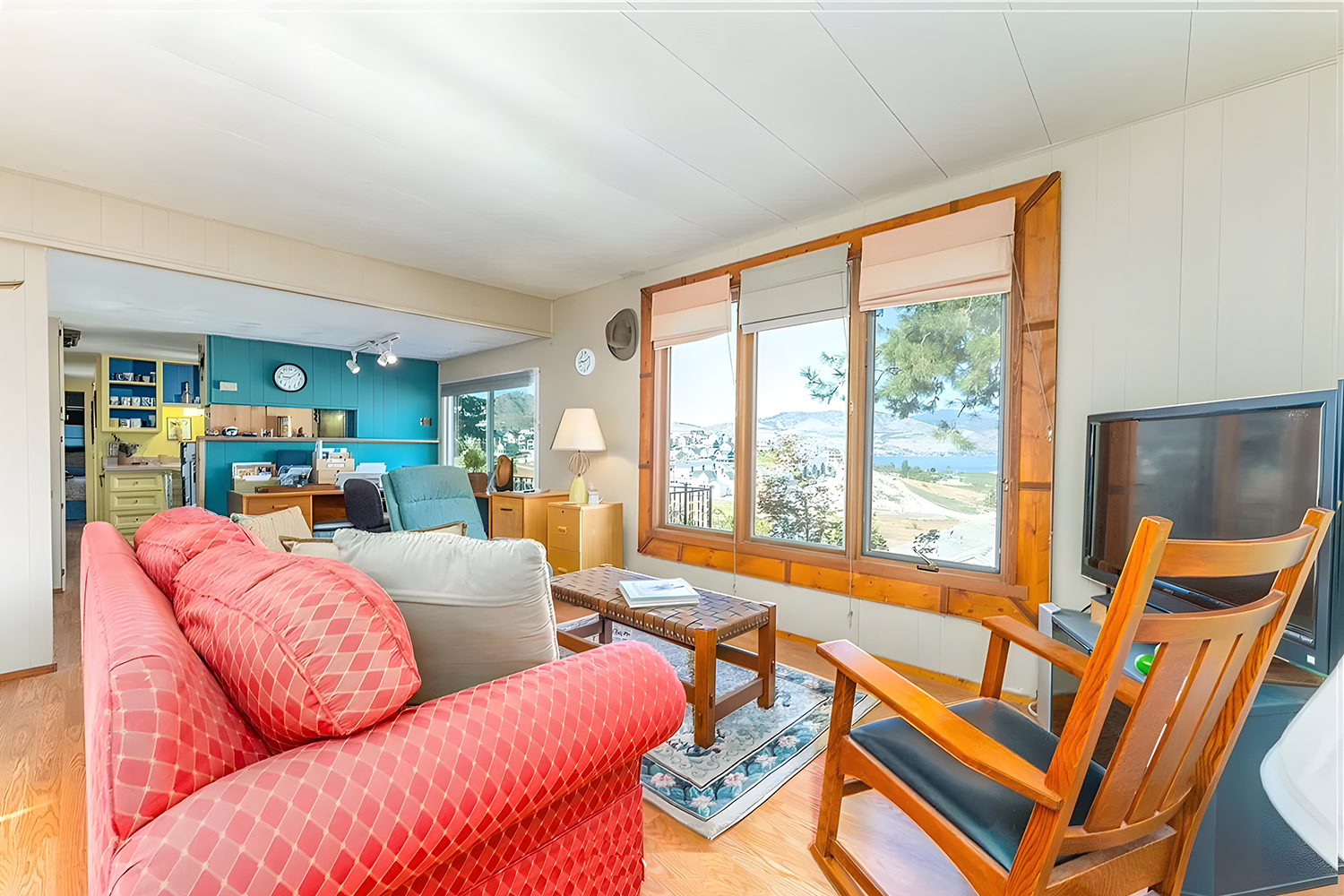
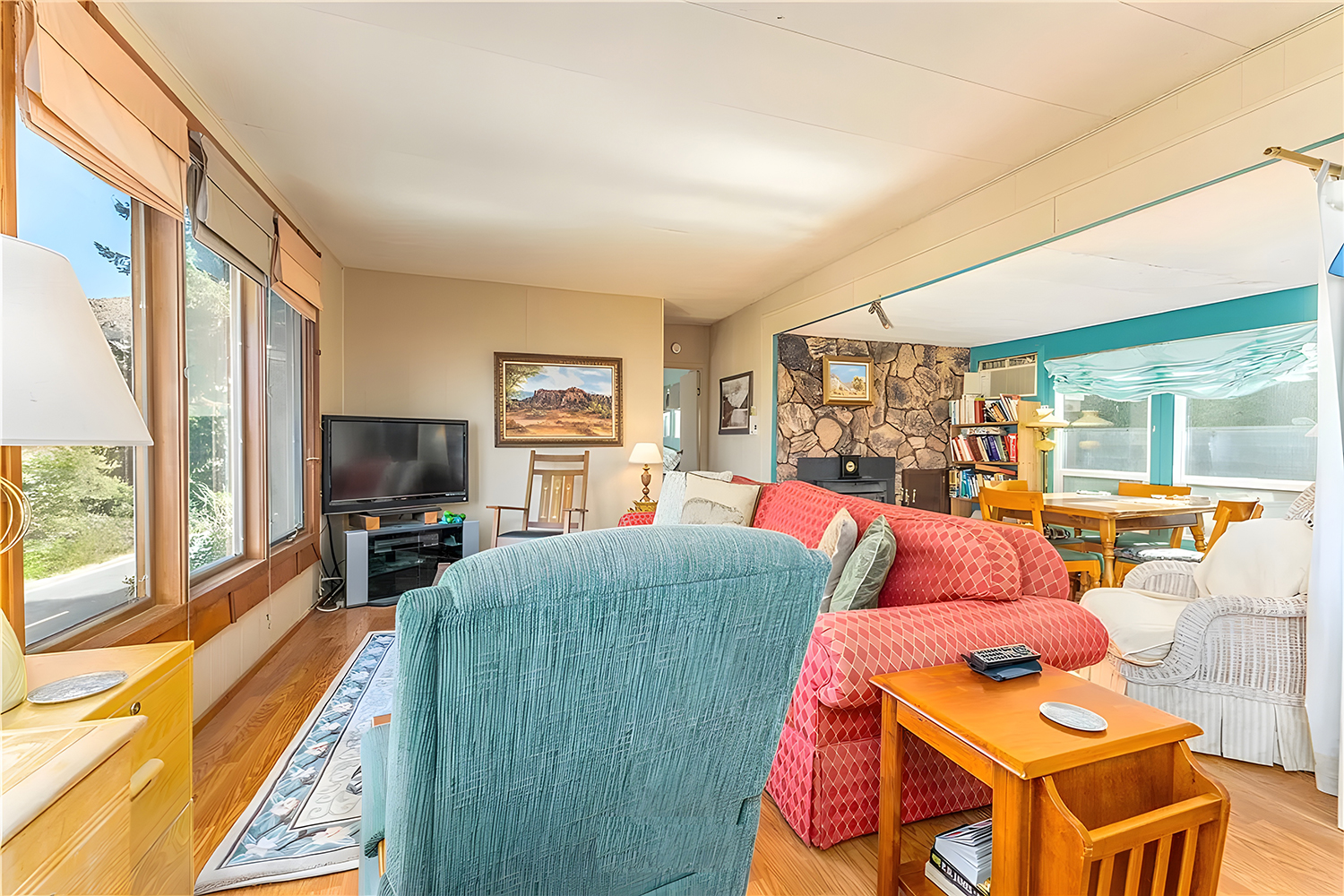
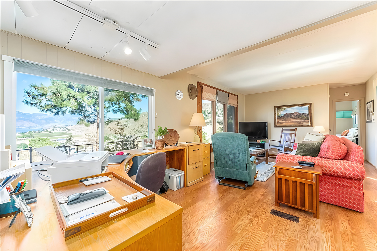
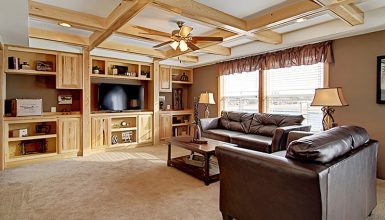
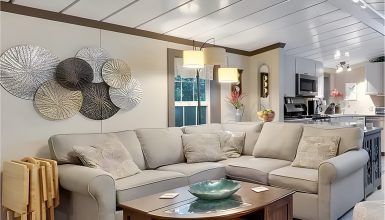
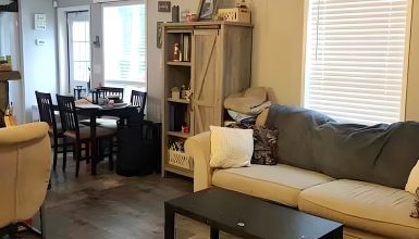
The living room in this 1969 mobile home has a cozy, homey vibe. It features a bright coral sofa that’s super comfy and grabs your attention. It’s the heart of the room. Wooden finishes on the windows and along the bottom of the walls add a touch of the outdoors inside.
There’s this blue wall that stands out. It brings a fun burst of color to the room and contrasts coolly with the softer wall colors. It’s not just for looks – it surrounds the shelves and desk, making a neat spot to work or relax.
The furniture is built to last, like the solid chairs and the coffee table. They’re made for everyday use. The room’s design lets you move freely and is great for hanging out with friends or family. The floors are either laminate or wood, which looks good with the rest of the wood in the room and is a snap to clean.
Up above, the white ceiling keeps things light and bright. The big windows let in lots of sunlight and light on the ceiling, so this room is always pleasant and bright whether it’s day or night.
Workspace
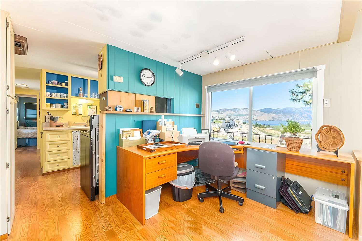
The workspace is set up to help you get lots done, even though it’s in a small spot. The desk sits in front of a big window that shows off a great view, perfect for sparking new ideas or just relaxing.
The room’s colors really pop. A teal wall meets light yellow cabinets, making the space feel fun and full of life—just what you need in a home office. The desk’s wood look brings in a cozy feel and matches the house’s style.
The way things are stored is pretty neat, too. Shelves above the desk hold all you need without making it look messy. And they make good use of the high-up space, so there’s more room to move around.
There’s also a comfy rolling chair and a file cabinet. These help you stay tidy and make the space more than just a place to work. It shows you can have everything you need to work well, even in a tight space.
Kitchen
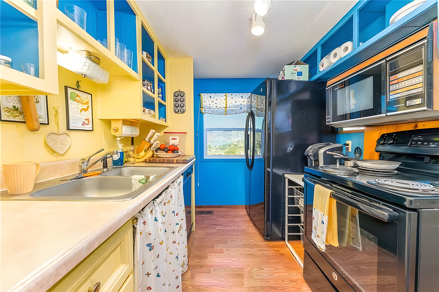
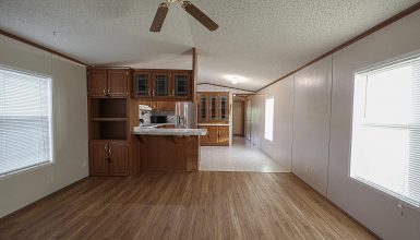
This 1969 mobile home’s kitchen is full of life with its bright yellow and blue colors. It’s got a fun, old-school feel that makes you smile. The blue wall stands out behind yellow cabinets and looks playful and warm.
Even though it’s a snug space, everything’s set up just right to make cooking easy. The countertops might be laminate, which is good because they’re a cinch to wipe down and last a long time. The yellow shelves are open so that you can grab your dishes and other items without a hassle.
All the kitchen stuff, like the fridge and oven, is right where you need it. And they’ve got a classic look that’s all about the ’60s. Under the counter, a curtain hides the less pretty bits. It’s a neat touch that makes things feel homey.
A window with a pretty top piece lets in the sunshine and shows off the view. This kitchen is a smart mix of old-style charm and smart design. It’s more than a place to cook—it’s a happy spot in the home.
Dining Area
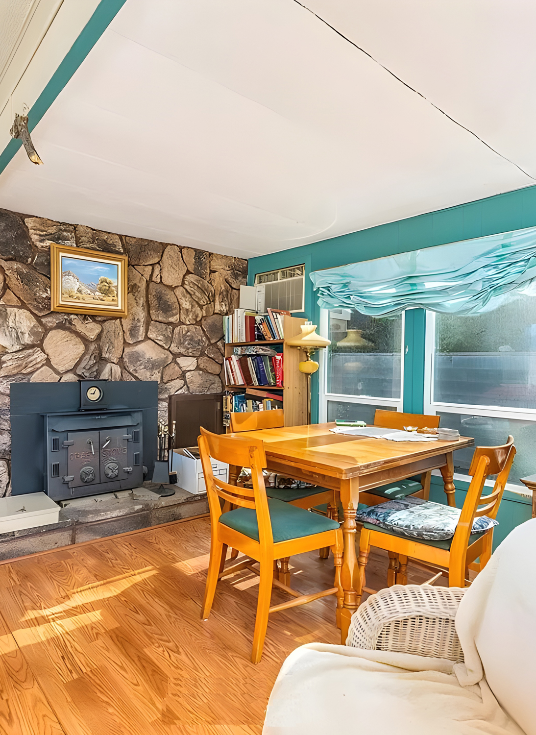
The dining area in this 1969 mobile home is just right for sharing meals and good times. It feels both fancy and comfy at the same time, with special little details that make it stand out.
The table and chairs are all wood, making a timeless spot that says, “Stay a while and chat.” Cushions on the chairs bring a cozy feel and a splash of color that fits right in with the bright colors in the rest of the home.
The big thing here is the stone fireplace. It’s charming and old-fashioned and will surely be the room’s heart when it gets cold. It makes the dining spot snug, perfect for close-knit meals.
The teal color from the living room keeps going in the dining area, tying the two spaces together. It looks great against the stone and wood and adds some personality.
Light comes in softly through the sheer curtains on the window. They let you peek outside while still giving you a little privacy, making the whole space feel gentle and calm.
The room feels like it’s lived in, with art on the walls and cute things like a clock and a lamp. It shows off the owner’s taste, making it clear this place is for having a good time, not just for eating.
Bedroom
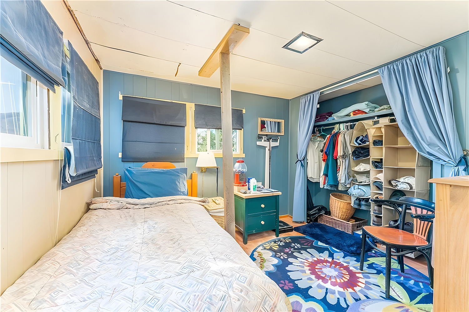
This bedroom is all about smart use of space and feeling comfy. You’ll see bright blues on things like the curtains that really stand out against the light beige walls.
The bed’s got a neat pattern on it and is tucked in just right to give you more room to move around. Those blue curtains at the window keep the bright light out when you need it and match the colors in the room.
You’ll spot shelves and places to hang clothes. They’re handy for keeping things in order without taking up too much room. Plus, there’s a curtain you can pull to hide your stuff and keep the place looking neat.
There’s this big wood post that supports part of the house. It fits in without getting in the way. There’s also a little desk and chair—perfect for writing, reading, or hopping on the computer. It shows you can do more than just sleep in this space.
And check out the rug. It’s got a big flower pattern that makes the room feel friendly and fun. It pulls everything together and really shows off who you are.
This room packs in what you need to live in a mobile home. It’s cozy, has your style all over it, and makes the most of every inch.
Bathroom
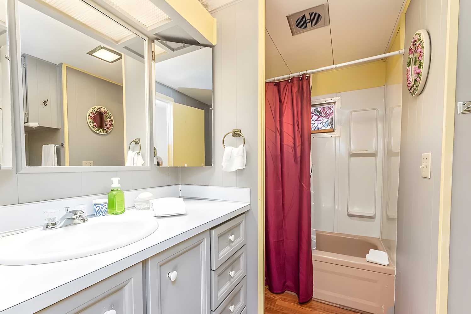
This bathroom is all about being simple and smart with space. It has everything you need without feeling cramped. The vanity has a big mirror, making the room look bigger and brighter. The cabinets are painted a calm gray that looks clean and modern. The drawers and cabinets have lots of space to put things away.
The white countertop keeps the bathroom’s look fresh and bright. It’s probably made of laminate, which lasts a long time and is easy to clean. The sink is part of the countertop, which means fewer cracks for dirt to get stuck.
There’s a full-size shower with a seat and a grab bar, which is safe and handy. Picking a shower instead of a tub saves room, which is a smart move in a small bathroom.
A colorful shower curtain gives the room a bit of fun, and the window in the shower lets in sunlight and fresh air, helping keep the bathroom from getting damp.
A few pictures on the wall make it feel like home without taking up too much space. Things like the towel holder and toilet paper holder are right where you need them.

